 ChatGPT
 Perplexity
 Claude
 Grok
Grok Google AI Mode
An exit-intent popup is the last message a visitor sees before they go. The brands below each found a different reason for that visitor to stay, and every example ends with the one move worth copying. Already sold on the idea? The setup steps are near the end of this post. Not yet? Then, let's explain exit-intent popups better.
What is an exit-intent popup?
Exit-intent means tracking mouse movements and scrolling behaviors of website visitors and detecting when a visitor is about to leave your website. An exit-intent popup is displayed when a visitor decides to bounce.
It is used to collect more forms, generate more email subscribers, and reduce cart abandonment by showing a popup once a visitor's cursor leaves the frame of your website.
On desktop, Popupsmart reads the speed of the visitor's mouse movement, and you choose how eager that reading is with a low, medium or high sensitivity setting, as our exit-intent targeting guide explains.
Exit-intent technology in mobile devices
What if there is no cursor movement like in mobile devices?
When a visitor comes to your landing page and scrolls back up quickly, the exit popup will appear to prevent the user from going back to previous page results. Popupsmart reads how fast the visitor scrolls up the page, and there's one setting to remember: the campaign has to be switched on for mobile devices, or it won't show on phones at all.
On mobile the median popup converts 1.02% vs 0.57% on desktop. That figure covers all popups, not exit intent alone, but it's a good reason not to leave phones out.
How do exit-intent popups work?
Exit intent overlay is an excellent opportunity to present an exclusive offer for a product if you target the right pages, the right audience, at the right time.
They work perfectly on landing pages, commercial websites, and online e-commerce stores.
Here's how that plays out in a store.
A user visits an e-commerce website and decides to leave without any conversions.
If you show them an exit-intent popup with an irresistible offer that provides higher value than your landing page, they are more likely to purchase an item from your store.
Or if a visitor comes to your store and adds a few products to the cart. Then, they decide to leave to do some research about the same products from other online stores.
Voila, an exit-intent popup appears and offers a "40% off" coupon code that expires within 10 minutes. Congratulations, you have a new order!
The size of that coupon isn't the lesson, though. In our data, bigger discounts did not convert measurably better than smaller ones, although the larger-discount samples are small; the numbers are in the discount section below.
The cart is where this matters most. According to Baymard Institute, the documented average online shopping cart abandonment rate is 70.22%, calculated from 50 studies. And popups on cart and checkout pages convert 4.57% of their displays vs 1.07% on the home page (median campaign); blog pages convert 0.23%.
One more thing: we do not recommend that you show exit intent popups to those who have already taken action because it may annoy your customers!
What our 2026 benchmark says about exit-intent popups
Exit intent on its own shows no reliable edge in our data, while the offer, the audience and the page show clearer gaps. The table puts the exit-intent result next to four settings you'll see at work in the examples. The trigger itself (sensitivity, timing, testing) gets its full treatment in our analysis of whether exit intent popups work, and the other tips we checked against the same data are in our popup best practices.
| Setting | With | Without | What the test says |
|---|---|---|---|
| Exit intent on the most sensitive setting vs none | 1.10% | 0.78% | Not statistically reliable; could be chance |
| Signup popup with a discount code vs without | 1.46% | 0.75% | Holds up: a reliable gap |
| Targeted at new visitors only vs everyone | 1.13% | 0.77% | Holds up: a reliable gap |
| Cart and checkout page vs home page | 4.57% | 1.07% | Holds up: a reliable gap |
| First-person button ("Send my code") vs neutral wording (English popups) | 1.18% | 0.80% | Holds up: a reliable gap |
Lead rate = leads with an email or phone number ÷ popup displays, median campaign, January 2024 – September 2026. Source: Popupsmart 2026 benchmark report.
I read this table as an order of work for the examples below. The trigger has the weakest evidence on it, so I'd copy each popup for its offer, its audience and its page, not for the fact that it fires on exit. If you want to know whether exit intent beats your current trigger, that's a test to run, not an assumption to make.
How I read these 55 examples
I read each popup through four lenses, and the "Copy this" line under each example picks the lens where that popup is strongest:
- The offer: what the visitor gets for staying, whether that's a code, a course, a demo or a laugh.
- The audience and the page: who sees the popup and where, such as cart holders only, pricing-page visitors or readers of one topic.
- The copy: the headline, the button and the decline link.
- The design: what the eye lands on first, and where it's pointed next.
A note on the screenshots: they come from this post's first edition (February 2020), and some are older. They show each popup as it looked then, not what the brand runs today. We re-checked every brand link on 27 September 2026. Links to sites that are offline, closed, parked or password-protected were removed (Green Mountain Mustard, Zodeys, Basic Outfitters, Roadside Vapes, Diamond Candles), and so was Matthew Barby's, whose domain now redirects elsewhere. Bounce Exchange is now Wunderkind, and the VisualDNA link, which pointed at another site, is gone.
55 exit-intent popup examples at a glance
Let's have a look at 55 exit-intent popup examples and the exit popup hacks that keep visitors engaged. Of course, the conversion rate may vary according to your business type, store quality, or your target market. The numbers in the table match the headings below.
| # | Brand | Goal | The tactic to copy |
|---|---|---|---|
| 1 | Zutano | Discount | A coupon code so leavers come back |
| 2 | Roadside Vapes | Discount | Emotional appeal plus 10% off |
| 3 | Green Mountain Mustard | Discount | Humour amplified by a 10% discount |
| 4 | Canvas Factory | Discount | A massive, tempting discount |
| 5 | World of Watches | Discount | Full-screen visual, discount amount visible |
| 6 | Leesa | Discount | $100 off in the brand's visual identity |
| 7 | Hidrate Spark | Discount | Discount, urgency, testimonial, one clear CTA |
| 8 | Style Runner | Discount | Discount plus a sense of community |
| 9 | Milledeux | Cart recovery | Positive feelings in exchange for an email |
| 10 | Xero Shoes | Cart recovery | Urgency, shown only to cart holders |
| 11 | Sivana | Cart recovery | A coupon for checkout leavers |
| 12 | Pricefalls | Cart recovery | "Your order has not been placed" |
| 13 | Baby Age | Cart recovery | A direct link to checkout |
| 14 | Diamond Candles | Cart recovery | Free shipping for cart abandoners |
| 15 | Everlane | Cart recovery | Free shipping for non-cookied visitors |
| 16 | Mic | Newsletter | A popup relevant to the article |
| 17 | JCrew | Newsletter | Exclusive sales, minimized opt-out |
| 18 | GQ | Newsletter | A list matched to recent reading |
| 19 | Skin Science | Newsletter | "VIP Insider" status plus value |
| 20 | KBauthority | Newsletter | Help to continue the task later |
| 21 | Cosmopolitan | Newsletter | Curiosity about extra "secrets" |
| 22 | Which Test Won | Newsletter | Minimal design that states the value |
| 23 | Zendesk | Lead magnet | A free demo after the pricing page |
| 24 | Gr8t Fires | Lead magnet | An installation cost calculator |
| 25 | Matthew Barby | Lead magnet | An eBook mockup image |
| 26 | Snack Nation | Lead magnet | A free sample box |
| 27 | Graphic Stock | Lead magnet | Seven days of free downloads |
| 28 | Ryan Robinson | Lead magnet | A newsletter framed as a free course |
| 29 | General Assembly | Lead magnet | The class curriculum as the offer |
| 30 | Copy Hackers | Lead magnet | Video course access for an email |
| 31 | Quick Sprout | Social proof | A money-back guarantee |
| 32 | Booking | Social proof | Others viewing the same offer |
| 33 | Muubaa | Social proof | Proof that the clothing is wanted |
| 34 | Dog Lovers | Social proof | Social proof plus emotion |
| 35 | Site Point | Social proof | "Over 100,000 web developers" |
| 36 | Timothy Sykes | Social proof | A "Top Trader" authority badge |
| 37 | Help Scout | Social proof | An exact subscriber count |
| 38 | Skullcandy | Persuasion | A humorous negative decline line |
| 39 | Backlinko | Persuasion | A negative CTA and fear of missing out |
| 40 | Social Triggers | Persuasion | The psychology of choice |
| 41 | Crazy Egg | Persuasion | Assumes the visitor wants a plan |
| 42 | Tim Ferriss | Persuasion | Bold red CTA, small opt-out |
| 43 | Bounce Exchange | Persuasion | Loss aversion |
| 44 | CoSchedule | Interactive | A progress bar (Zeigarnik effect) |
| 45 | Casper | Interactive | A short survey that earns a discount |
| 46 | VisualDNA | Interactive | Personality quizzes |
| 47 | Zodeys | Interactive | A spin-to-win wheel for an email |
| 48 | Lush | Design | An unmissable design with humour |
| 49 | Aestheticare | Design | A message that resonates |
| 50 | KlientBoost | Design | An emoji that makes visitors smile |
| 51 | Kindlepreneur | Design | Arrows pointing to the CTA |
| 52 | Marie Forleo | Design | Key words highlighted in pink |
| 53 | Basic Outfitters | Design | Headline, benefits and a stunning visual |
| 54 | Taft | Design | Talks like a retail store assistant |
| 55 | Pet Flow | Design | A cute pug asking visitors to subscribe |
Discount exit-intent popup examples
A coupon is the classic exit offer: if price is why the visitor is leaving, change the price. These eight stores make that same offer eight ways, with humour, emotion, a full-screen visual, a dollar amount or a stack of persuasion around the code. Watch how few of them rely on the size of the discount alone.
1. Zutano: a coupon to come back
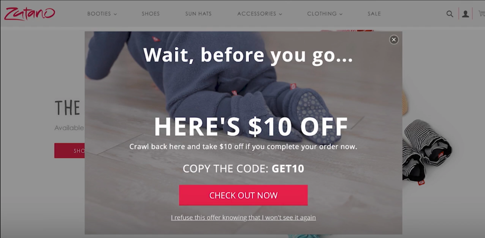
Zutano offers a coupon code for their about-to-leave visitors to make sure they will return to the store.
Copy this: Deliver the code by email, not on screen. The visitor leaves with a reason to return sitting in their inbox, and you keep the address either way.
2. Roadside Vapes: emotion first, 10% second
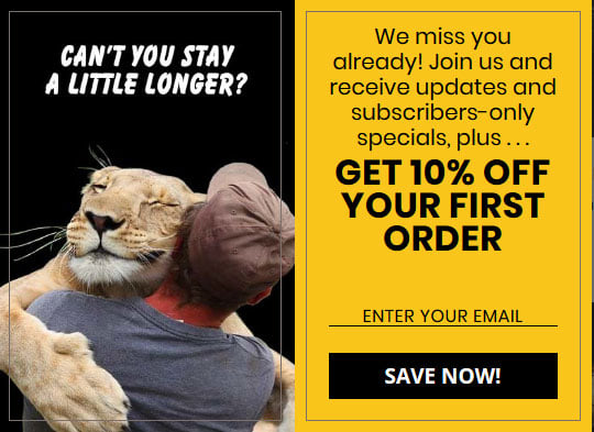
Roadside Vapes genuinely designed an exit-intent popup with emotional appeal and also offered 10% off to make their visitors come back.
Copy this: Lead with the feeling, then the number. Write the headline about the visitor and let the discount sit underneath as the reason to act now.
3. Green Mountain Mustard: humour plus a discount
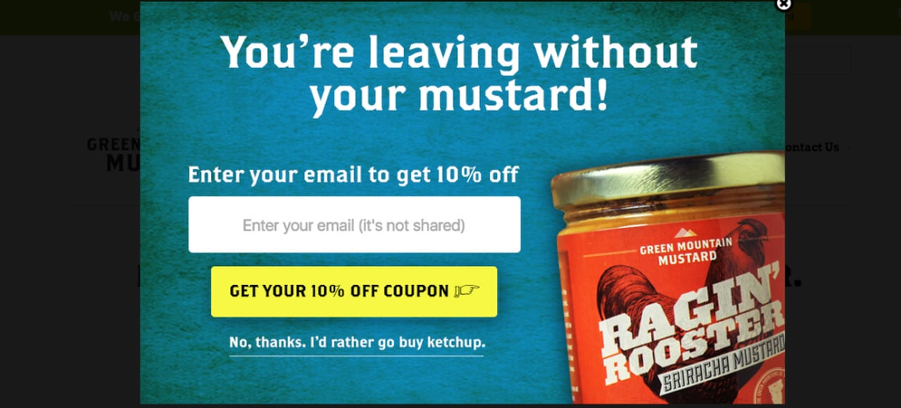
Green Mountain Mustard did a great job by showing a message that is amplified by a 10% discount and includes humor.
Copy this: Write the joke in your product's voice. A mustard brand can be playful about mustard; humour unrelated to what you sell reads like filler.
4. Canvas Factory: a massive discount
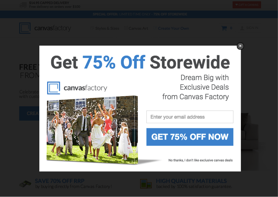
Canvas Factory offers a massive discount, which is very tempting. If massive discounts are sustainable in your store, then why not try it?
Copy this: Check the margin before the headline. I'd test a deep discount against a smaller one first, because our data couldn't show that bigger discounts convert better.
5. World of Watches: a full-screen discount
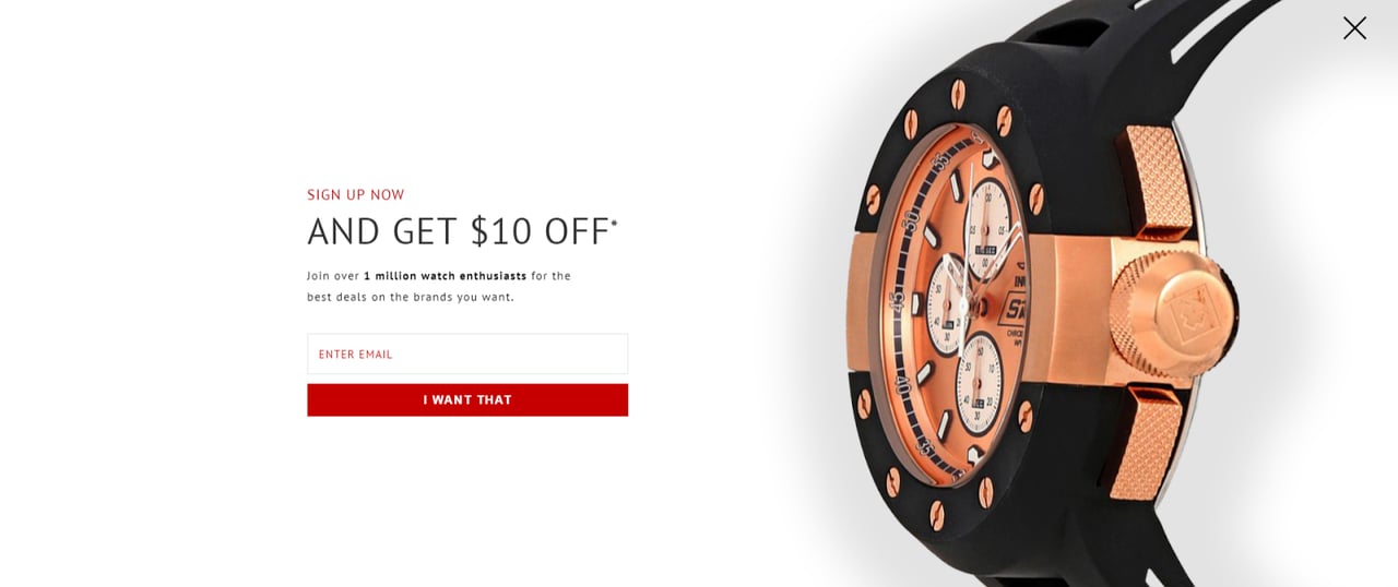
WOW displays a full-screen exit-intent popup that makes sure visitors won't miss the proposal. The visual is simply stunning and also includes a visible discount amount to encourage even the most reluctant people to subscribe to their newsletter.
Copy this: Put the discount amount inside the visual, not in the small print. If you go full-screen, keep it for desktop (see the mistakes below).
6. Leesa: a dollar amount on brand
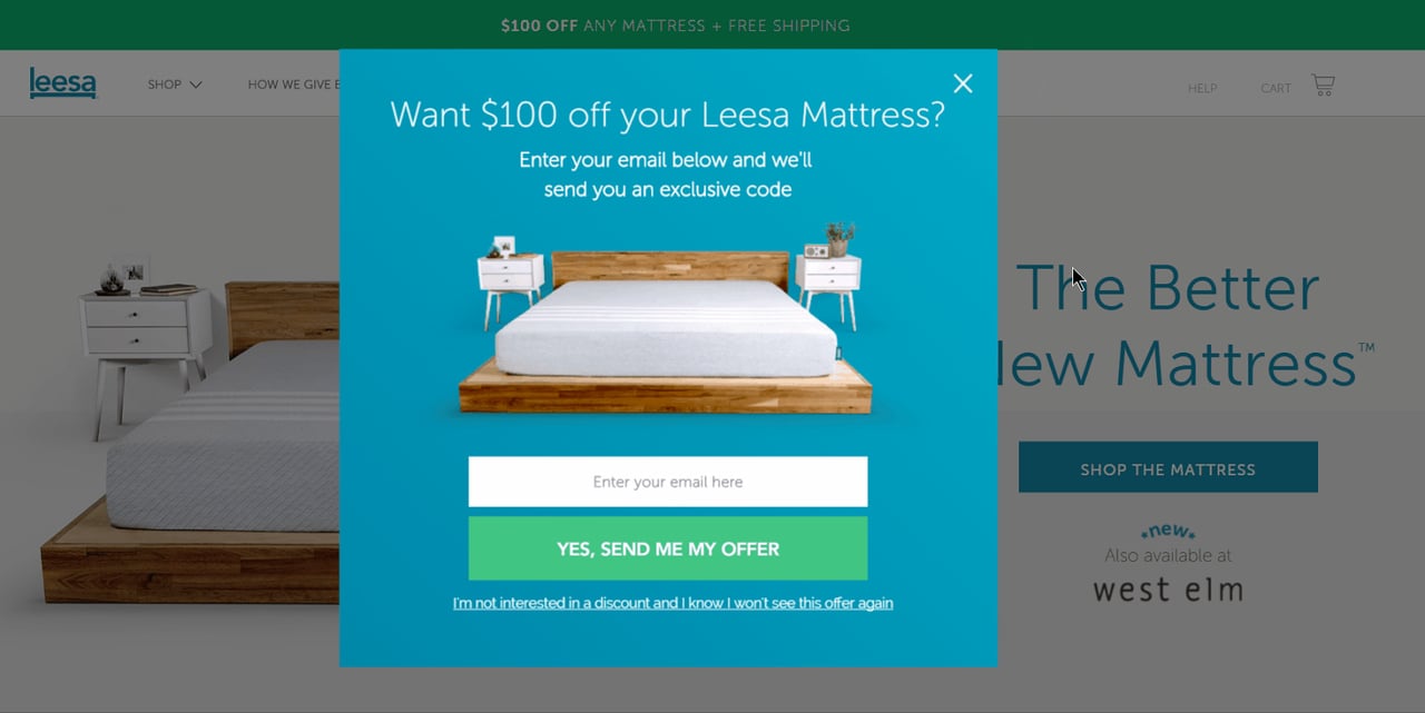
A $100 discount is a great way to arouse the interest of website users. Leesa shows an exit-intent popup that perfectly matches with their visual identity.
Copy this: On a high-priced product, try the discount in dollars instead of percent, and build the popup from your store's own fonts and colours.
7. Hidrate Spark: every element at once
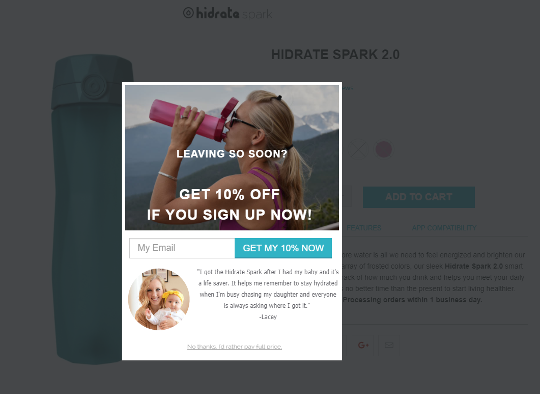
Hidrate Spark includes practical elements such as a discount, sense of urgency, testimonial comment, and a definite call to action to create an irresistible exit-intent popup.
Copy this: Use it as a checklist, not a layout: an offer, a reason to act now, one line of proof and a single button.
8. Style Runner: a discount and a community
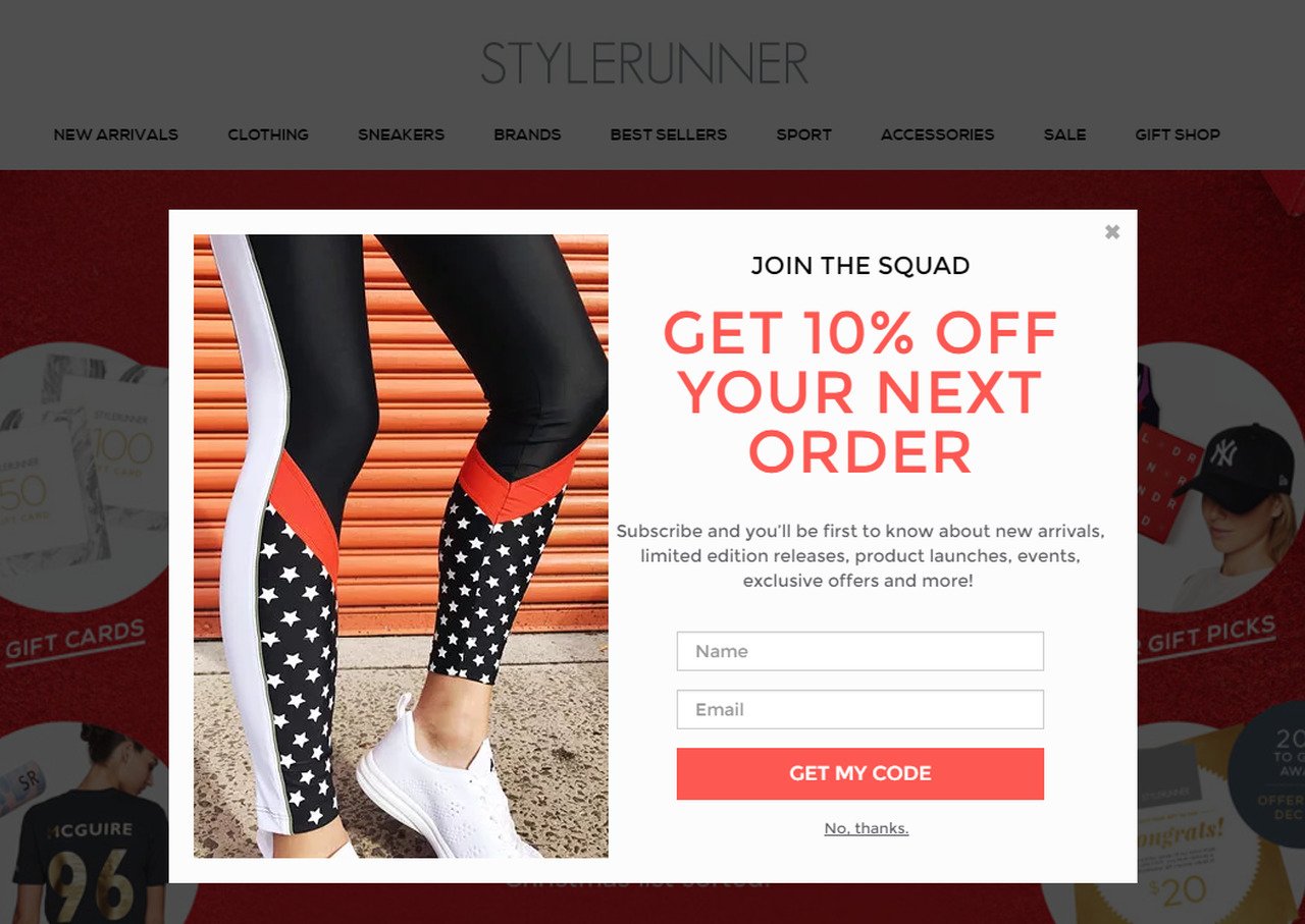
Style Runner adds all the ingredients of conversion-ready exit-intent popup like a discount, a sense of community, a call to action highlighting the benefits of subscribing their newsletter.
Copy this: Say what the subscriber joins, not only what they save. A line about the community gives the list a reason to matter after the first order.
Cart abandonment exit-intent popup examples
These seven popups fire when money is closest: a full cart or a half-finished checkout. Two of them swap the coupon for free shipping, which answers the most common complaint in Baymard Institute's survey: 40% of US shoppers who abandoned a checkout (excluding those just browsing) said extra costs such as shipping, tax and fees were too high. The rest remove friction or remind the shopper what's at stake.
9. Milledeux: warmth at the cart
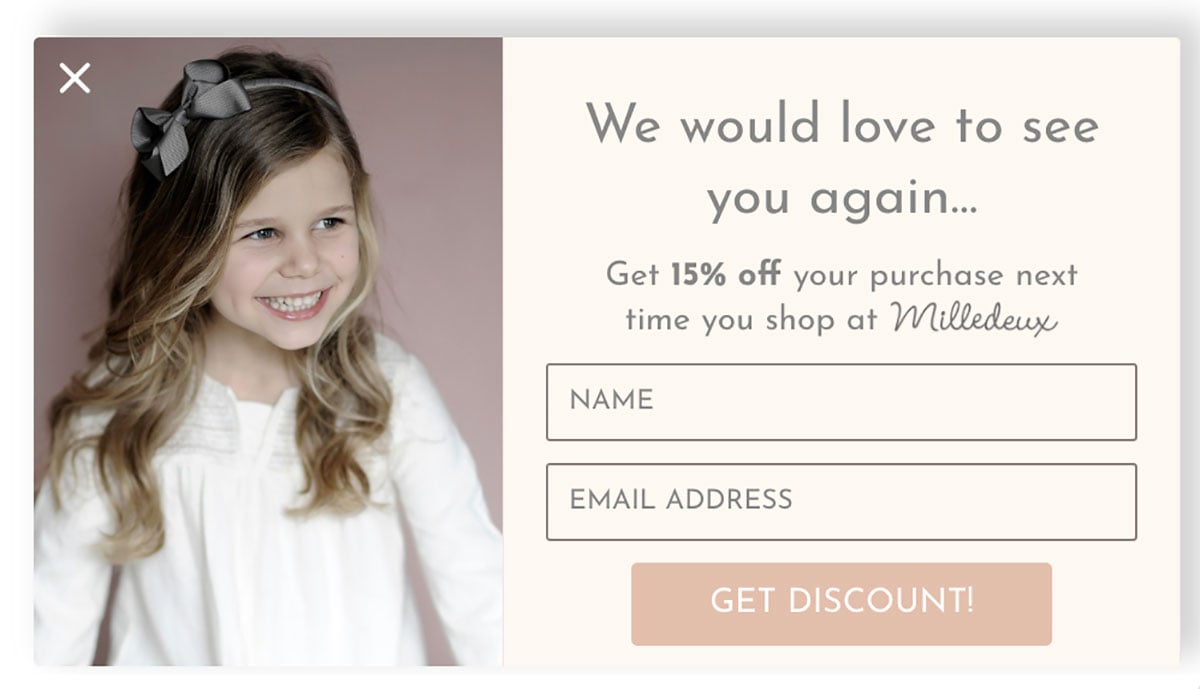
Clothing retailer Milledeux evokes positive feelings to get visitors' email addresses when they are abandoning their carts.
Copy this: Ask for the email before the visitor goes, so you can follow up on the cart. A friendly tone makes the ask feel like a service.
10. Xero Shoes: urgency for cart holders only
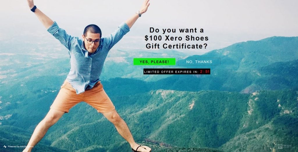
Xero Shoes popup creates a sense of urgency and only appears to those who have something in their cart.
Copy this: Show urgency only to visitors with a cart, and make it true: a real deadline or a real stock level. Our scarcity examples show honest versions.
11. Sivana: a coupon at checkout
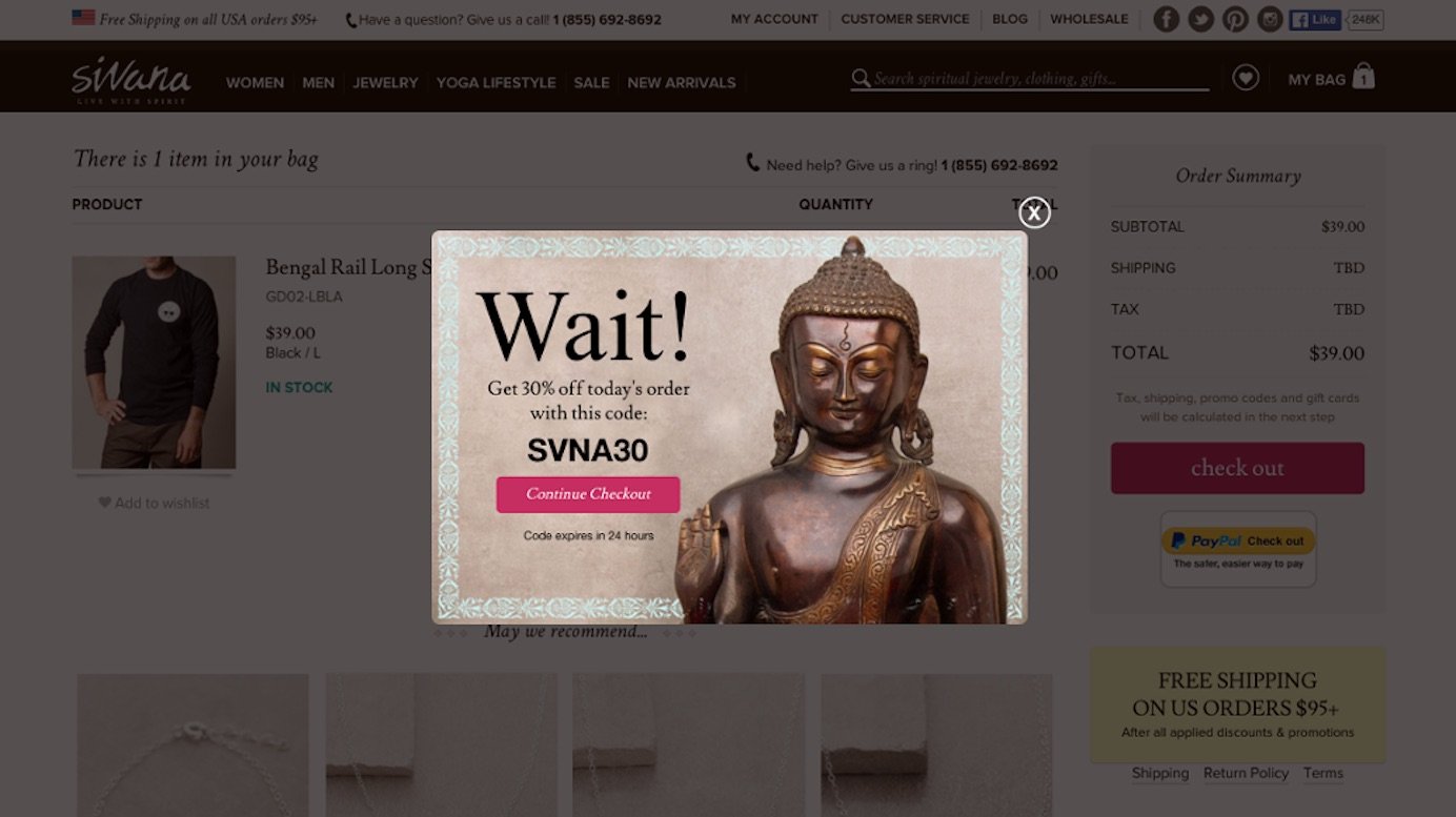
Sivana provides a coupon code in the exit-intent popup to users who try to leave the checkout page without any conversions.
Copy this: Keep the checkout coupon on the checkout page. Shown sitewide, a code can teach visitors to wait for it; at checkout, it answers a last-step price doubt.
12. Pricefalls: the order isn't placed yet
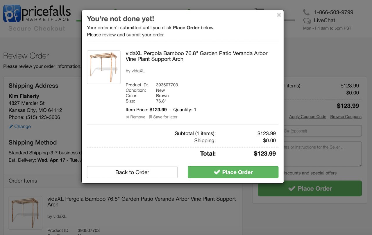
Pricefalls catches users with an exit-intent popup, which lets them know the order has not been placed. They use reasonably polite and a little presumptive language.
Copy this: State the fact the visitor may have missed: the order isn't placed yet. For someone who thinks they're done, a plain status line can do more than a pitch.
13. Baby Age: a direct link to checkout
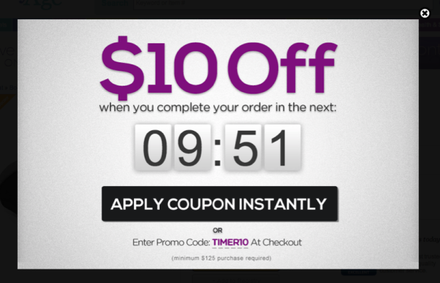
Baby Age makes the buying process easier by including a link to shoppers' checkout pages. There is no additional action required to complete the purchase. Perfect!
Copy this: Make the button the shortcut: link straight to checkout with the cart intact, so one click stands between the visitor and the order.
14. Diamond Candles: free shipping, not discounts
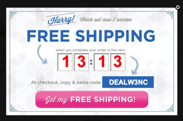
Diamond Candles offers free shipping to cart-abandoning users to encourage them to complete the checkout process.
Copy this: If shipping costs stall your carts, answer with free shipping instead of a price cut, and set a minimum order value to protect small-cart margins.
15. Everlane: free shipping for new visitors
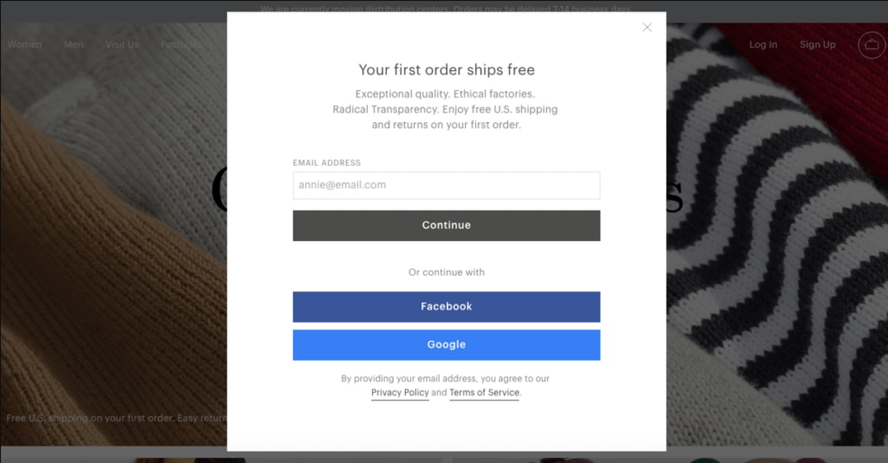
'Free shipping' is an alternative to discount code offer. Everlane provides free shipping to non-cookied visitors in their exit-intent popup to drive conversions.
Copy this: Treat "non-cookied visitors" as the lesson: show first-order perks to new visitors only (see the benchmark table) and keep returning customers out of them.
Newsletter exit-intent popup examples that sell the content
On a content site, the reader has to want more of what they just read, so these seven sell the next email, not the list. Aim them at first-time readers: new visitors convert on popups more often than visitors who were on the site in the previous 7 days, and the same popup converts better for new visitors in 75% of campaigns (median gap 0.30 percentage points; pooled 1.28% vs 0.54% of displays).
16. Mic: a popup for the story
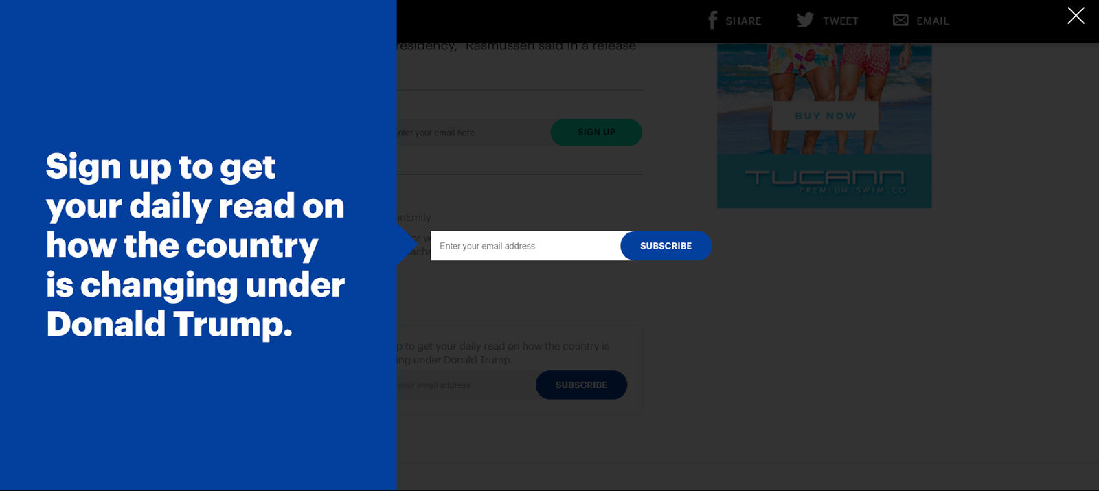
This popup appeared on articles about Trump on mic.com. It is very visible and very relevant to its context. An example of thinking smart!
Copy this: When one topic drives a traffic spike, write a popup for that topic's readers, target it at those pages, and retire it when the spike ends.
17. JCrew: exclusive access for an email
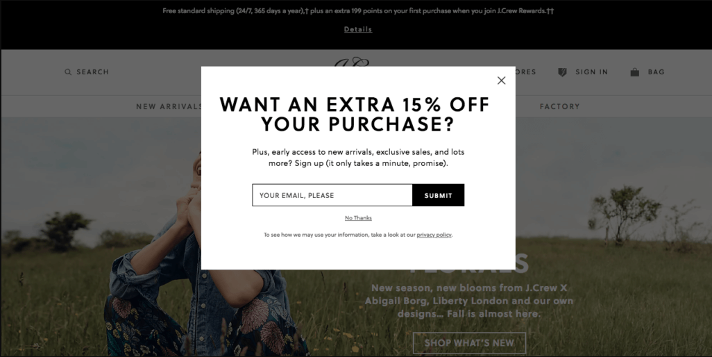
J Crew team does a great job of presenting their value proposition with a minimized opt-out choice: submit an email address for accessing exclusive sales.
Copy this: Sell access, not a newsletter. "Exclusive sales" tells the visitor what the email gets them; a smaller decline option leaves the space to that promise.
18. GQ: newsletters by recent reading
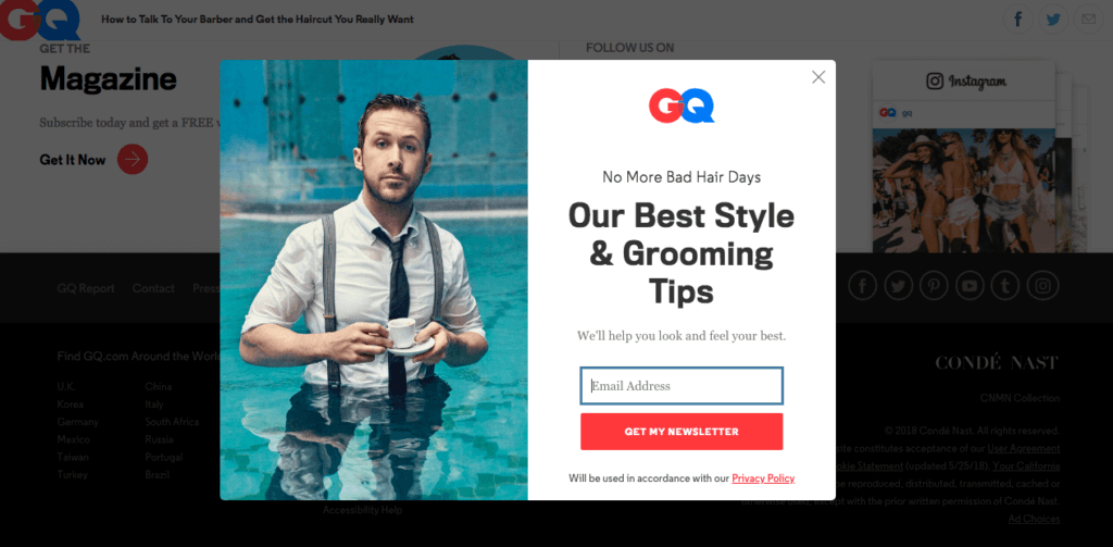
GQ designed a minimalistic and slick exit-intent popup. Rather than providing a sign up for their general email list, the popup appears depending on what content their visitors were looking at most recently.
Copy this: If you run several newsletters or email segments, map each popup to a content section and send its signups to the matching list.
19. Skin Science: the VIP Insider label
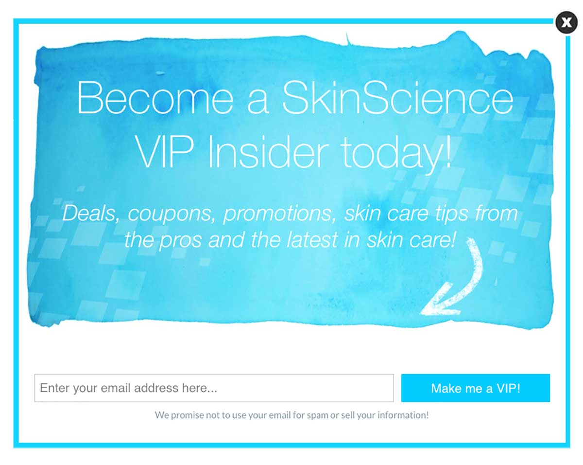
Skin Science creates an exit-intent popup appealing to an emotional need by using the words “VIP Insider.” They also provide value in their offer.
Copy this: Name the list after the status it gives, then pair the label with one concrete benefit so "VIP" doesn't read as empty flattery.
20. KBauthority: help to finish later
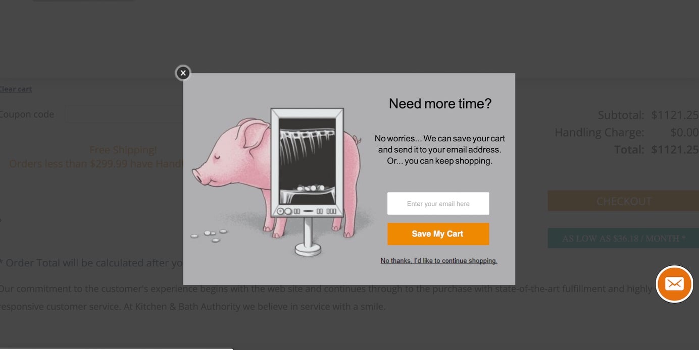
KBauthority approaches its users as they would like to help users continue their tasks in the future rather than merely asking them to sign up for their newsletter.
Copy this: Frame the signup as saving progress. A button like "Send me this guide" gives a reader in the middle of a project a practical reason to share an email.
21. Cosmopolitan: curiosity about the secrets
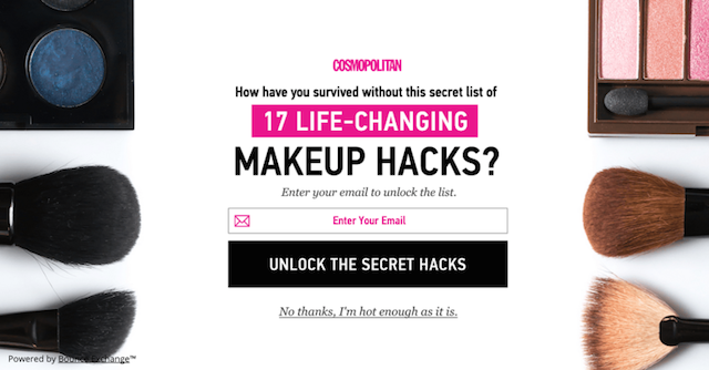
Cosmopolitan plays on its users' curiosity very well! Visitors give their emails in return to get those makeup hacks with extra 'secrets.'
Copy this: Promise the part the article left out. A curiosity gap is only fair when the next email actually delivers the extra tips it teased.
22. Which Test Won: value in one line
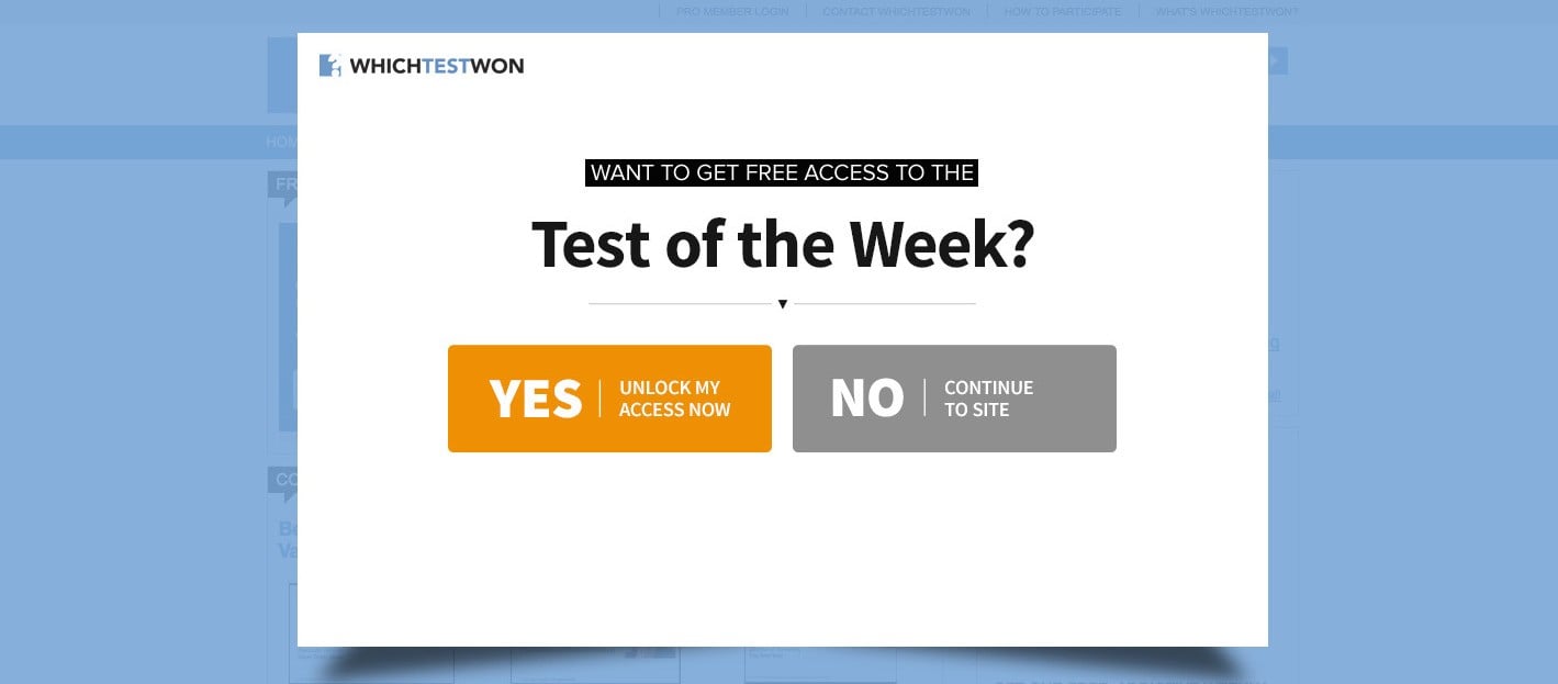
Which Test Won designs a minimal and attention-grabbing exit-intent popup to put across value to visitors.
Copy this: Cut the popup to a headline, one line of value and a field. If the value needs two lines, fix the offer before the design.
Lead magnet and demo exit-intent popup examples
When you can't or won't discount, give something away: a demo, a calculator, an ebook, a sample box, a course. These eight suit SaaS, B2B and long sales cycles. Name the value on the button, too. CTA buttons that promise value ("Get", "Claim", "Unlock") look stronger than "Subscribe" / "Join" buttons (1.06% vs 0.77%, English popups, median campaign), but the gap is not statistically reliable.
23. Zendesk: a demo after pricing
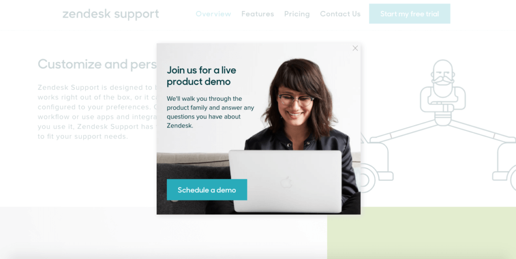
Zendesk aims to regain its visitors who have checked their pricing plans by offering a free product demo with an exit-intent popup.
Copy this: For a SaaS pricing page, this is the example I'd copy first: a leaving visitor has a question the page didn't answer, and a demo answers it.
24. Gr8t Fires: a cost calculator
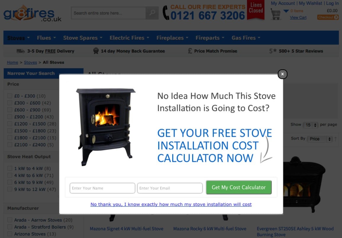
Gr8tFires, a gas and wood-burning fireplace provider, offers an "installation cost calculator" to their abandoning visitors because their sales cycle is a bit long and requires knowledge about the aspects of the products.
Copy this: For a long sales cycle, offer a tool that answers the visitor's next question: a calculator, a sizing guide or a quote form.
25. Matthew Barby: a mockup of the ebook
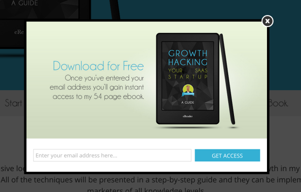
Matthew Barby includes an appealing mockup of his Growth Hacking eBook and uses an image of the product in his exit-intent popup.
Copy this: Show the lead magnet as a physical thing. A cover mockup makes a PDF feel like something the visitor receives, not something to imagine.
26. Snack Nation: a free sample box
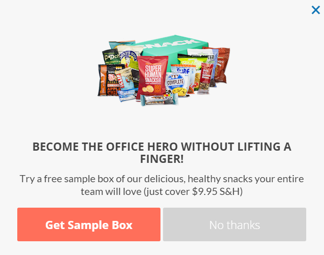
Snack Nation offers a free sample box to obtain a chance to engage with their prospects and to sell more in the future.
Copy this: If you sell a physical product to businesses, a sample is a lead magnet, and the delivery details you ask for qualify the lead at the same time.
27. Graphic Stock: seven days of free downloads
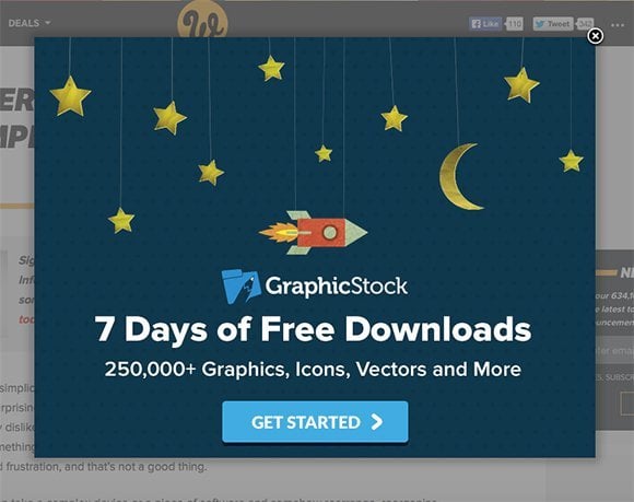
Web Designer Depot offers seven days of free downloads to attract the attention of leaving users and encourage them to shop.
Copy this: Give a trial a clock and a unit. "Seven days of free downloads" says exactly what the visitor gets and for how long.
28. Ryan Robinson: a newsletter as a course
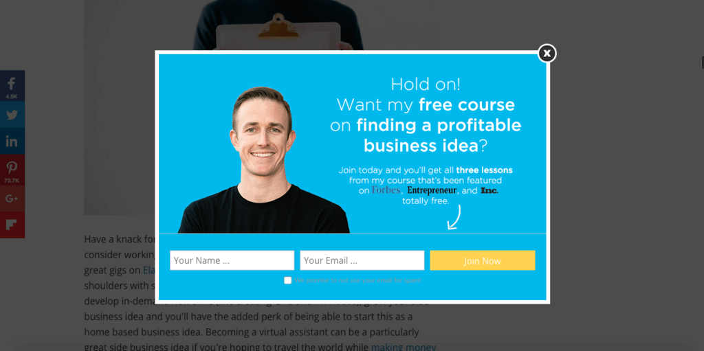
Ryan Robinson positions his email newsletter signup as a free course rather than simply presenting the exit-intent popup as a lead generation form. Wonderful marketing!
Copy this: Rename your newsletter after its outcome. A free course has lessons, an end and a promise; "subscribe to updates" has none of them.
29. General Assembly: the curriculum as the offer
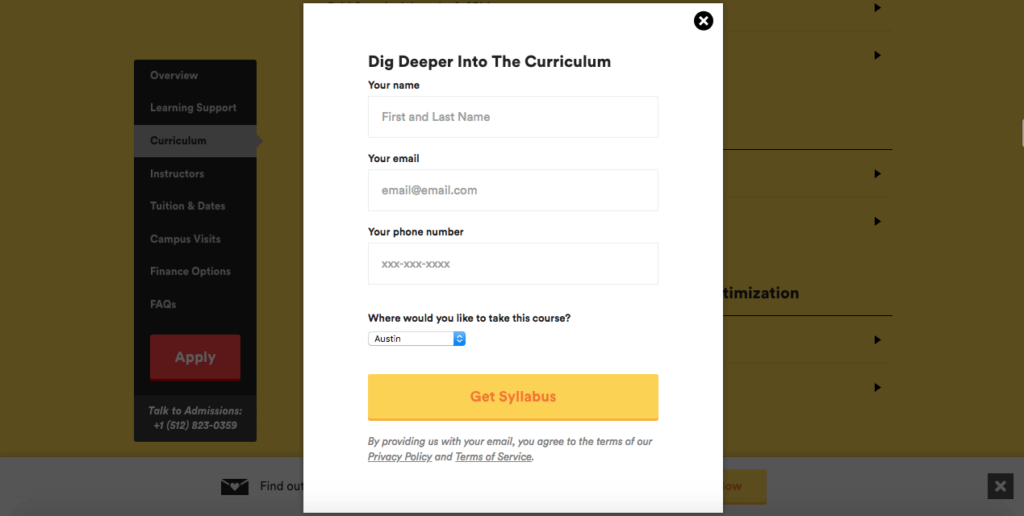
General Assembly influences website visitors' mind by presenting the curriculum for their Digital Marketing class with an exit intent popup. It provides value very well.
Copy this: Offer the syllabus before the sale. For a course or a long service, the outline is what a visitor who's still comparing options wants to keep.
30. Copy Hackers: a course for an email
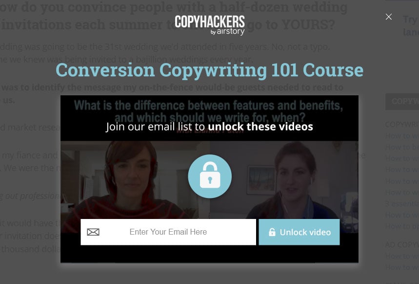
Copy Hackers display a deal in their exit intent popup: a video course access in exchange for the email address of a leaving visitor. Interesting!
Copy this: State the trade in one line: what the visitor gets and what you ask for. They should be able to judge the deal in a second.
Exit-intent popups that use social proof
Social proof and trust signals tell a leaving visitor that staying is safe: a subscriber count, a guarantee, a badge, other visitors eyeing the same offer. Our benchmark has no statement on social proof, so these seven are here for the pattern, not for a measured lift. Use real, current numbers only.
31. Quick Sprout: a money-back guarantee
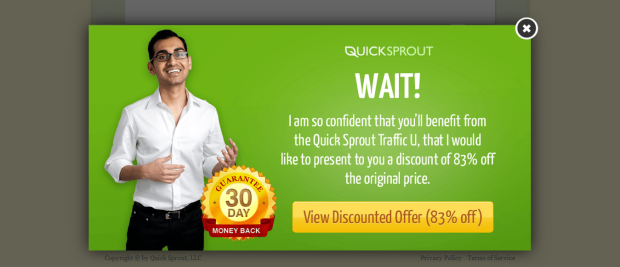
One of the most significant objections of shoppers is the regret of purchase. Neil Patel overcomes this issue by including a money-back-guarantee on the exit-intent popup.
Copy this: Answer purchase regret inside the popup. If you offer a guarantee or free returns, put it next to the button, where the doubt shows up.
32. Booking: others are looking too
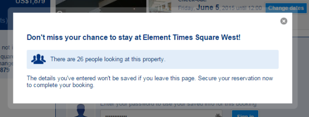
Booking uses an exit-intent popup during the reservation process to show how many other visitors are looking at the same offer. It is a good method to encourage the desired action.
Copy this: Show live demand only if the count is real and current. A number from your own data is proof; a made-up one is a lie visitors can catch.
33. Muubaa: proof of desirability
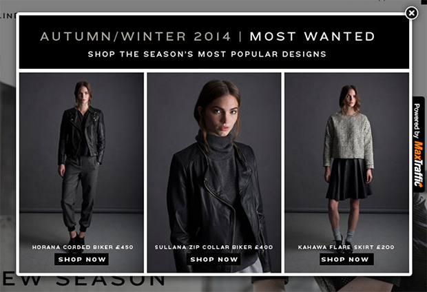
Muubaa reinforces the desirability of their clothing by providing some social proof on their exit-intent popup.
Copy this: Let customers describe the product in the popup. A short buyer quote about the item itself carries weight that your own adjectives can't.
34. Dog Lovers: proof plus emotion
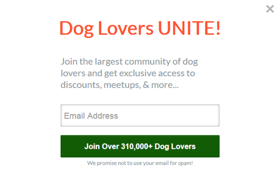
Dog Lovers affect their website visitors with social proof and emotional triggering approach in their exit-intent popup.
Copy this: Pair a number with a feeling. For an audience that cares deeply about something, a line about how many people share that care speaks to both.
35. Site Point: 100,000 developers can't be wrong
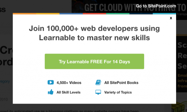
Site Point is also using social proof in their exit-intent popup to make them think, "Over 100,000 web developers cannot be wrong; let me try!"
Copy this: Name who the crowd is, not just its size. "Web developers" tells a developer they're among peers, which a bare subscriber count can't do.
36. Timothy Sykes: an authority badge
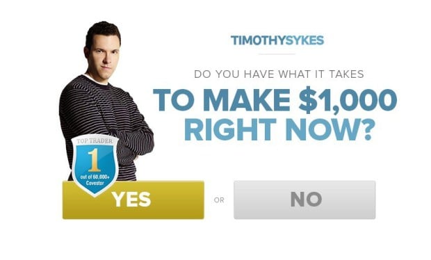
Timothy Sykes displays his "Top Trader" badge in the exit-intent popup; hence authority is a strong sense to maximize conversions.
Copy this: Show the credential this visitor would recognise. An award, a certification or a press mention earns its place only if the reader cares about it.
37. Help Scout: an exact subscriber count
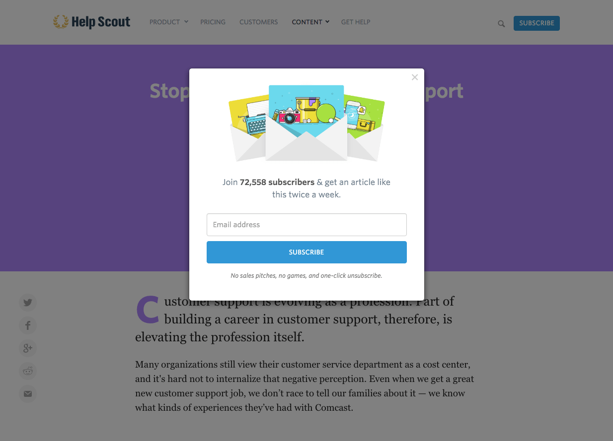
Help Scout uses a strong persuasion tool, social proof, which makes their visitors say that "They have 72,588 subscribers. Am I missing something valuable?"
Copy this: Use an exact number rather than a rounded one: "72,588" looks counted. Update it as the list grows, or drop it once it goes stale.
Exit-intent popups with persuasive decline buttons
The "no thanks" link is part of the offer. These six examples use the decline button, the framing of the choice or the fear of losing out to push the visitor toward yes. Some read as clever and some as pushy, depending on your audience; the mistakes section explains why our data can't settle which.
38. Skullcandy: a joking decline line
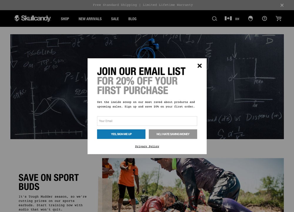
Skullcandy includes negative language, "No, I hate saving money," aiming to persuade visitors to accept their offer. Great sense of humor!
Copy this: Aim a jokey decline line at the offer, not at the visitor, and read it in your brand's voice before you decide how far to go.
39. Backlinko: fear of missing out
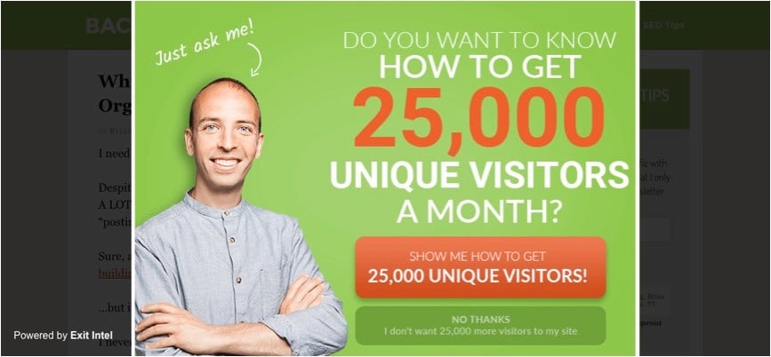
Backlinko has used a negative CTA in its exit-intent popup, which successfully establishes the fear of missing out effect in website visitors.
Copy this: Name what the visitor loses by leaving, and be specific: "miss the next case study" says something; "don't miss out" says nothing new.
40. Social Triggers: the psychology of choice
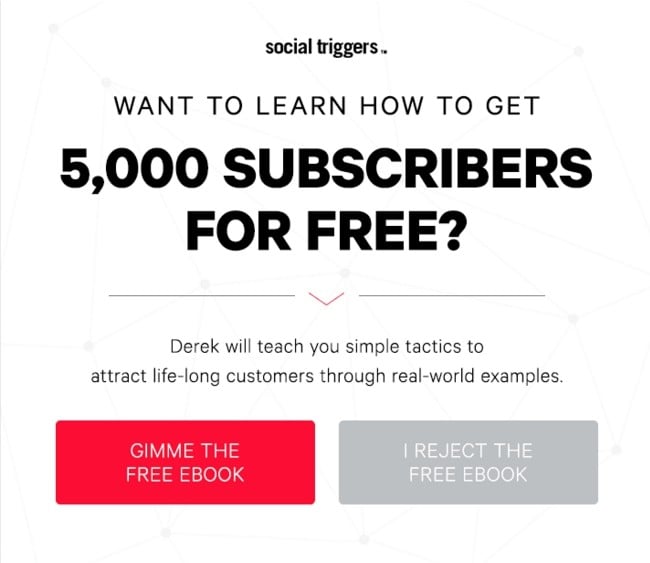
Social Triggers tries to increase their conversions with the help of the psychology of choice: when people have a choice of not doing something, they are more likely to want to do this thing. Clever idea!
Copy this: Make the choice explicit with two buttons, yes and no, both written out in full. A respectful "no" makes the "yes" feel like the visitor's own.
41. Crazy Egg: assume the sale
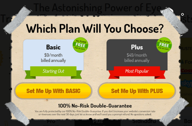
Crazy Egg assumes that a visitor wants to buy one of their plans and does not try to sell a webinar at all. Interesting approach, but it may work!
Copy this: On a plan or product page, skip the lead magnet and help the visitor choose: answer "which plan is right for me?" inside the popup.
42. Tim Ferriss: bold button, quiet opt-out
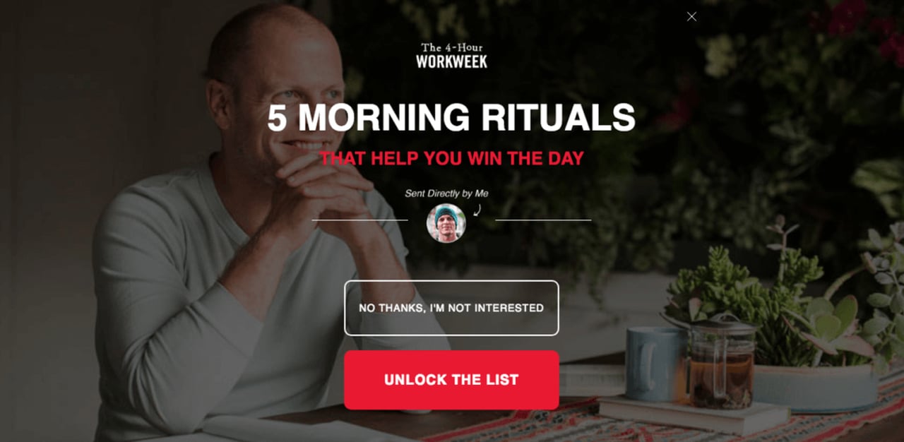
Tim Ferriss encourages clicking on the desired call to action button in bold red type and discourages clicking on opt-out in a simple and small type.
Copy this: Give the popup one visual winner: the button is the biggest, highest-contrast element, and the decline link is plain text. Keep that text readable.
43. Bounce Exchange: loss aversion
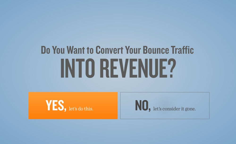
Bounce Exchange (now Wunderkind) uses loss aversion in their exit intent popup because they know losing money is more painful than receiving money.
Copy this: Frame the offer as something the visitor already has: "your discount is saved for you" asks them to keep it, not to want it.
Interactive exit-intent popups: quizzes, surveys and games
Interaction gives a leaving visitor something to do instead of something to close. These four use a progress bar, a survey, a quiz and a prize wheel. They get attention, but count what they collect: a click isn't a lead. For the mechanics of prize wheels, see our guide to spin-to-win wheel popups.
44. CoSchedule: a progress bar
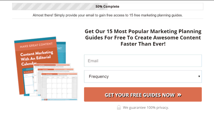
The progress bar alludes that your customers are halfway to receiving a reward. Coschedule does a good job of persuading its visitors with the Zeigarnik effect.
Copy this: On a two-step popup, show the bar half full after the first click. People tend to want to finish what they've already started.
45. Casper: a survey for a discount
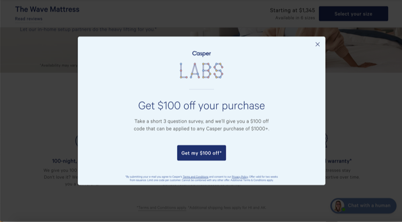
An online mattress retailer Casper shows an exit-intent popup and gives the user a way to earn a fair discount by filling out a short survey.
Copy this: Ask one or two survey questions you'll actually use, such as why the visitor is leaving. One popup then gives you the lead and the reason.
46. VisualDNA: a quiz about the visitor
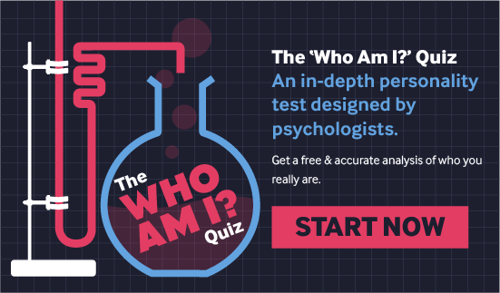
Visual DNA presents quizzes to gather audience insights. Their website users take quizzes to learn who they are in psychological theory. Brilliant!
Copy this: Show a short quiz result on screen, then ask for the email to send the full version. The payoff is information about the visitor themselves.
47. Zodeys: a wheel for an email
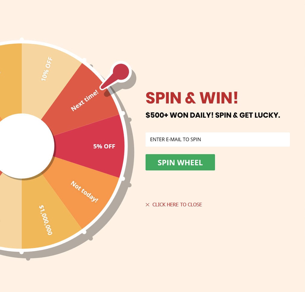
Who does not like to play? Zodeys presents an entertaining game in the form of a wheel exit intent popup that can be spun out in exchange for a visitor's email address. Smart idea to generate leads!
Copy this: If you run a wheel, I'd judge it by leads collected, not spins. Put the email field before the spin and make every slice a real prize.
Exit-intent popup designs that direct the eye
The last eight win on design: an unmissable joke, a pink highlight, an arrow, a pug. Design decides where the eye lands, and a leaving visitor doesn't give it long: 71% of visitors who close a popup do so within 5 seconds of it appearing. Emoji in the headline or button come with a slightly higher click rate (2.76% vs 2.20%) but no measurable difference in leads; the click difference is not statistically reliable.
48. Lush: an unmissable joke
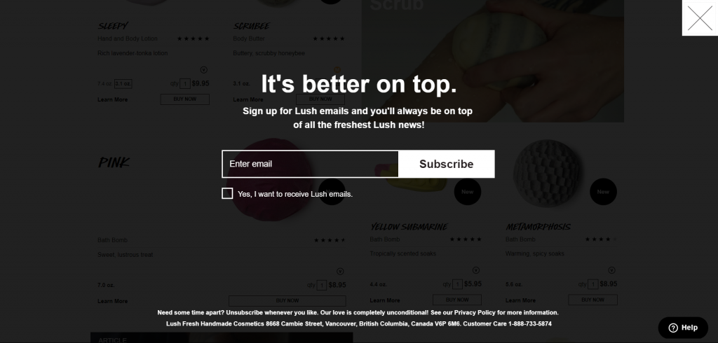
Lush created an unmissable design to attract attention, and their humor makes you subscribe right away!
Copy this: If you use humour, make it the headline and make it readable at a glance. It has to land before a hand reaches for the close button.
49. Aestheticare: a message that resonates
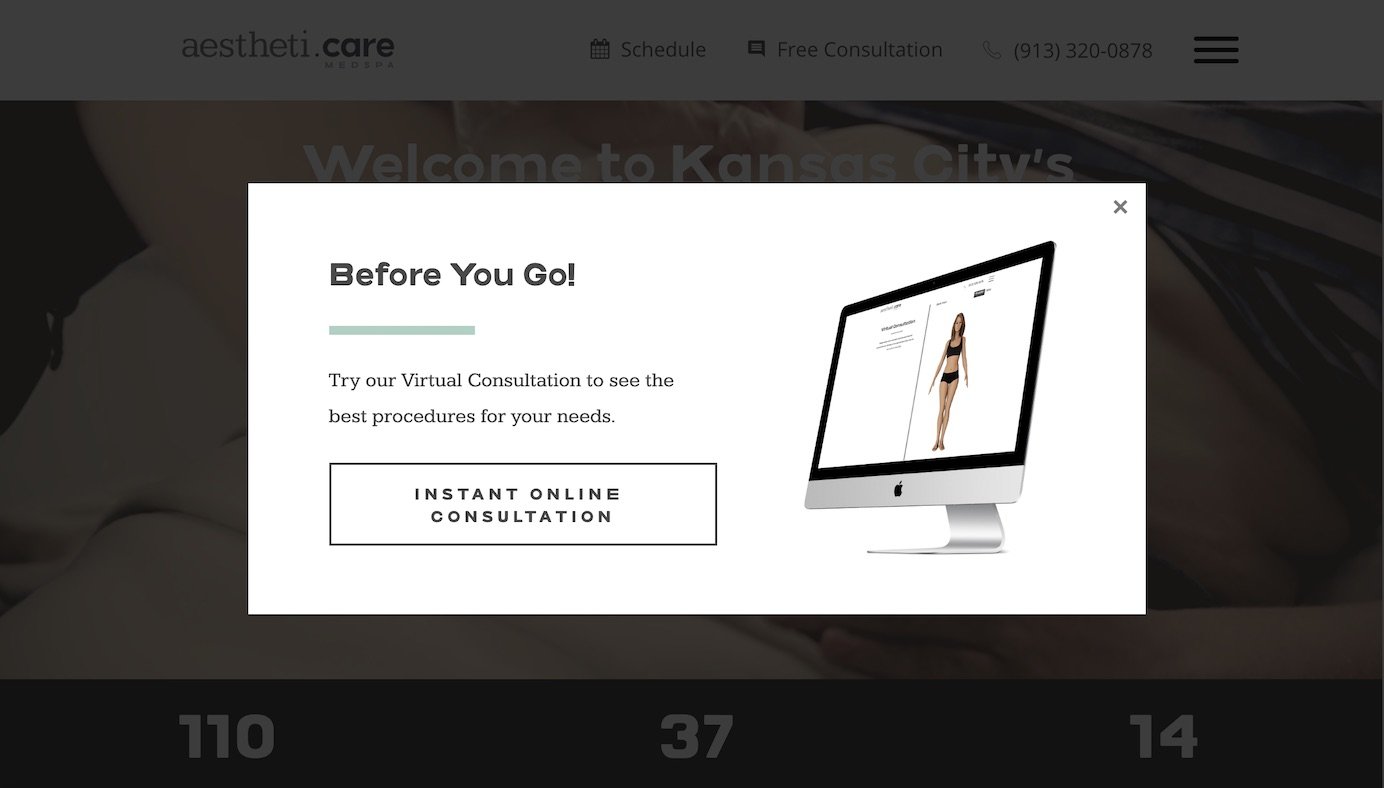
A medical spa center Aestheticare intercepts users with an exit-intent popup that could resonate with website visitors.
Copy this: For a clinic or a spa, show the result the service delivers, not the building or the team: the visitor is picturing life after the treatment.
50. KlientBoost: an emoji for a smile
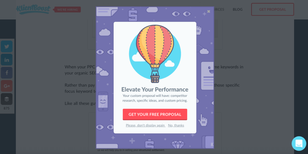
KlientBoost uses the "pile of poo" emoji in their exit-intent popup to make their visitors smile. Evoking positive feelings will take them up on the parting offer.
Copy this: In our data, emoji made no measurable difference to leads (see above), so test the playful version against a plain one and keep the better collector.
51. Kindlepreneur: arrows toward the button
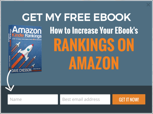
Arrows help the reader comprehend information better than written directions due to selective attention. Kindlepreneur uses arrows on their exit-intent popup to direct viewers' attention towards the call to action.
Copy this: Point at the button. An arrow, a gaze in a photo or a line from the headline gives the eye a path to the one action you want.
52. Marie Forleo: key words in pink
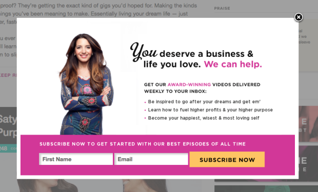
Marie Forleo designs an exit-intent popup that emphasizes certain words with the color pink so that people attract more attention to those words than an opt-in box at the bottom.
Copy this: Highlight the two or three words that carry the offer in your brand colour, and keep everything else neutral so they stand out.
53. Basic Outfitters: headline, benefits, visual

Basic Outfitters presents a catchy headline, a content reminding the benefits of subscribing, and a stunning visual design in their exit-intent popup.
Copy this: Put the subscriber benefits right under the headline. The headline earns a second look; the benefit line is what the visitor reads before deciding.
54. Taft: the shop assistant's voice
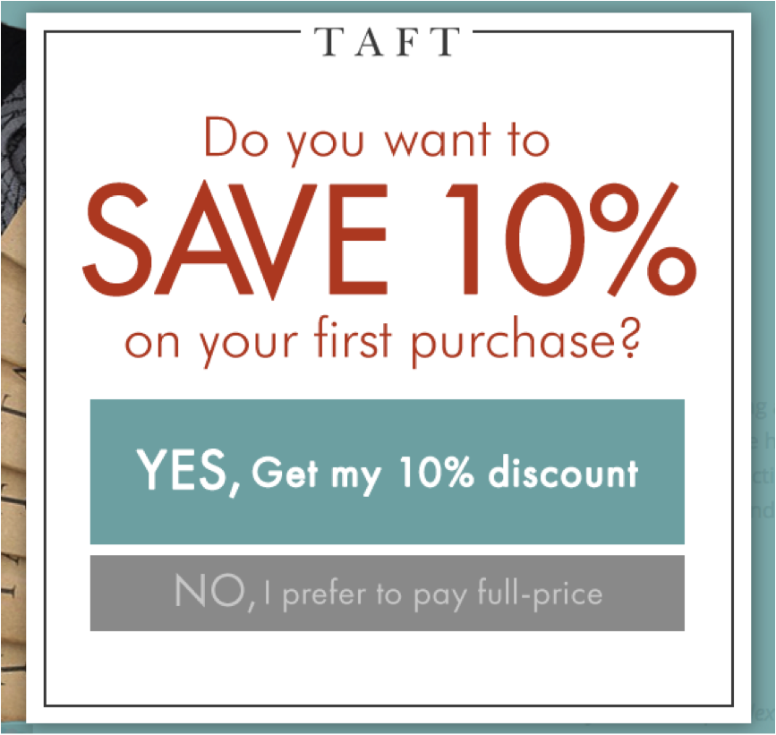
Taft presents an exit intent popup that gives a sense of speaking directly to their users in a retail store. Very good!
Copy this: Write it the way a good shop assistant talks: second person, short sentences, the question you'd ask at the door. Then read it aloud.
55. Pet Flow: a cute pug
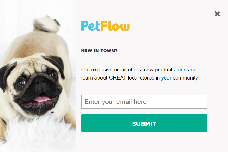
Pet Flow is aware that nobody in their target audience can resist a cute pug saying that subscribe to hear from us. Smart and relevant!
Copy this: Choose an image your audience already loves and let it make the ask. For a pet store that's a pet; find your own store's equivalent.
Exit-intent popup mistakes to avoid
Each of these mistakes is a setting or a line of copy, so each one is quick to fix.
- Showing it to visitors who already converted. This was the original advice in this post, and it still stands: someone who just subscribed or bought has nothing left to say yes to. In Popupsmart, set the popup to stop once a visitor submits their email, and keep buyers out of first-order discount popups.
- Showing it too often. Showing a popup a second time caused no measurable drop in conversion within the same campaign; the decline begins with the third showing. Cap repeat views.
- Running one sitewide popup instead of matching the page. A blog reader and a shopper at the cart are different visitors: blog pages convert 0.23% of their displays (median campaign), well below the cart and checkout figure above. Write one popup per page type.
- Over-discounting. Bigger discounts did not convert measurably better in our data, though the samples for large discounts are small. Start with the smallest discount your margins like, and raise it only if a test says so.
- A full-screen takeover on mobile. Google Search Central is direct: "Don't obscure the entire page with interstitials." It recommends banners that take up a small fraction of the screen, so give phones a smaller format with an obvious close button.
- A decline line that insults the visitor. Skullcandy's line (#38) pokes fun at the offer; a line that mocks the visitor is confirmshaming. Our data found no measurable effect from urgency words (the data are too noisy to rule out modest effects), and we have no data on shaming declines either way. It's a judgment call, and I'd only publish one I'd be comfortable reading aloud to a customer.
Fix these before you touch a headline or a colour.
How to create an exit-intent popup with Popupsmart
Here's the setup in Popupsmart, from template to test, with the benchmark table and the mistakes above built in.
Pick a template
Start from a design in the popup templates library that fits the offer you picked from the examples, and edit it.
Write the offer
Put the offer in the headline and name it on the button. First-person wording ("Send my code") has a reliable gap in our data.
Add the exit-intent trigger
In the popup builder, open Segment and click Edit Segment. Under User Behaviour, click Add user behavior targeting, then click Add next to Exit Intent.
Set the sensitivity
Choose low, medium or high. On low, the cursor has to come very close to the close icon; on high, the slightest move to leave fires the popup. Medium suits most cases.
Switch it on for mobile
On phones, Popupsmart reads how fast the visitor scrolls up, but the campaign only shows there once you activate it for mobile devices. Preview the mobile layout too.
Exclude converters and cap the frequency
In Frequency Settings, choose how often the popup can appear and set it to stop when the visitor submits their email, so subscribers stop seeing it. The display frequency guide lists every option.
Test it against your current trigger
Run the same offer on exit intent and on your current trigger, change nothing else, and compare leads per display. Our guide to A/B testing for popups covers the setup.
On Shopify or WordPress? See our roundups of Shopify exit intent popup apps and examples and WordPress popup plugins. Popupsmart offers a free plan, so you can build and test your first exit popup before paying.
Frequently asked questions
What is an example of an exit intent popup?
A common example is a coupon that appears as the visitor moves to leave: Zutano (#1) offers a coupon code so about-to-leave visitors come back to the store. Zendesk (#23) offers a free product demo to visitors who checked its pricing plans, and Casper (#45) lets visitors earn a discount by filling out a short survey. What they share is the trigger: the popup fires on a sign of leaving, a fast cursor move toward the top of the browser on desktop or a quick scroll up on mobile.
Do exit intent popups work?
They collect leads, but in our data they don't reliably beat other triggers. In Popupsmart's 2026 benchmark, popups on the most sensitive exit-intent setting converted 1.10% of their displays vs 0.78% without exit intent (median campaign), a gap that could be chance. The offer, the page and the audience showed clearer, reliable gaps. So test exit intent where leaving costs you something, such as the cart or checkout, against your current trigger with the same offer. Our post on whether exit intent popups work goes deeper.
Do exit intent popups work on mobile?
Yes, with a different signal. There's no cursor on a phone, so Popupsmart reads how fast the visitor scrolls up the page, and the campaign has to be switched on for mobile devices before it shows there. Popups in general do well on phones: in our 2026 benchmark, the median popup converts 1.02% of its displays on mobile vs 0.57% on desktop, a figure for all popups, not exit intent alone. Keep the mobile version small, since Google's guidance on intrusive interstitials warns against covering the whole page.
What is the best offer for an exit intent popup?
For a store, a discount code has the clearest support in our data. In Popupsmart's 2026 benchmark, signup popups that offer a discount code convert 1.46% vs 0.75% for signup popups without one, and popups stating 10% off convert 1.25% vs 0.67% for popups that state no discount. Bigger discounts did not convert measurably better, though those samples are small. If you can't discount, match the offer to the page: free shipping on the cart, a demo on the pricing page, a guide on a blog post.
How often should an exit intent popup show?
Twice a week to the same visitor is a sensible ceiling. In Popupsmart's 2026 benchmark, the first two times a visitor sees a popup in a week convert at similar rates (1.33% and 1.22% of displays, pooled); from the third view conversion falls, and from the sixth view it is 0.41%, 31% of the first-view rate. Stop showing it once a visitor signs up: in Popupsmart, both the cap and the stop-on-submit rule sit in the frequency settings of the Segment step.
How do you create an exit intent popup with JavaScript?
Listen for the mouse leaving the page through the top of the browser window. A common approach attaches a mouseout listener to the document and fires when the event has no related target (the pointer left the page, not just an element) and the pointer's clientY is at or below 0. Show the popup once and remember that in a cookie or localStorage. Mobile needs a different signal, such as a fast scroll up. A no-code builder handles sensitivity, mobile detection and frequency caps for you.
When should you not show an exit intent popup?
Don't show it to visitors who already converted: a subscriber or buyer who sees the same signup offer again has nothing left to say yes to. Hold it back while a checkout is in progress unless it brings a real offer, such as free shipping or a code, because an empty "Wait!" only adds a step before the order. And don't show it where it would cover the content on a phone: keep a full-screen design for desktop and give phones a smaller version.
Start with one example
I hope this content has given you some clear ideas about exit popups and how to use them to increase your conversions. Don't try all 55 at once. Pick the example closest to your page and your offer, build it, and run it against what you have now.
If you are looking for an easy way to create popups, give Popupsmart a try: its free plan lets you build one today, and you can upgrade if you like it. For more layouts to start from, browse our popup design examples and free templates.
What changed in this post
The 55 examples are regrouped by goal and renumbered, with an overview table and a "Copy this" line under each. Unsourced customer figures were replaced with Popupsmart's 2026 benchmark (January 2024 to September 2026). Every brand link was re-checked on 27 September 2026: dead links were removed and Bounce Exchange now points to Wunderkind. New sections cover mistakes, the setup in Popupsmart and common questions. New author: Mert Özeren.
55 examples.