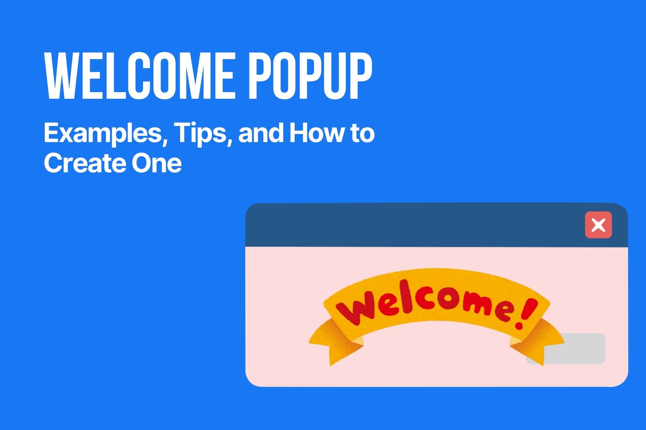
Welcome Popup: Examples, Tips, and How to Create One
This guide explains what makes a welcome popup work, shares practical examples, and shows how to create one with Popupsmart without making it feel intrusive.
I use a welcome popup to greet new visitors, capture emails, promote first-order discounts, and guide people toward action before they leave. A strong welcome popup design feels clear, timely, and relevant, not pushy. In this guide, I’ll walk through welcome popup examples, practical tips, and a real welcome popup tutorial showing how I’d create one with Popupsmart.
What Is a Welcome Popup?
I think of a welcome popup as the digital version of a good first impression. It appears when someone lands on a website and gives them a reason to stay, click, sign up, or shop. Sometimes that reason is a discount. Sometimes it is a useful reminder, a free resource, or a simple invitation to join an email list.
Unlike popups that show up at the end of a visit, a website welcome popup is usually meant to catch attention early. That is exactly why it needs care. If the message is vague, badly timed, or visually messy, it can feel like friction. But if the welcome popup design is clean and the offer is relevant, it can feel surprisingly helpful.
I usually see welcome popups used for a few core goals:
- collecting email signups
- offering a first-order discount
- promoting free shipping
- highlighting a seasonal campaign
- guiding people to bestsellers or key pages
- introducing a lead magnet, demo, or webinar
This is also where many brands get the balance wrong. They assume every welcome popup should scream “10% OFF” in giant letters. That can work, sure. But not every audience responds to the same thing. A SaaS brand may need a softer welcome popup template built around a demo or newsletter. An e-commerce brand might do better with a discount, free shipping, or product discovery angle.
What matters most to me is not just having a welcome popup, but making sure it earns its place on the page. That means the message should be easy to understand, the CTA should be obvious, and the timing should make sense.
A good welcome popup says, “Here’s something useful.” A bad one says, “Interrupting you was more important than helping you.”
That difference is everything 🙂
Why Welcome Popups Still Work
I’ve noticed that people love to argue about popups in extremes. Either they treat them like a conversion miracle, or they act like every popup is automatically annoying. My experience sits somewhere in the middle. A welcome popup still works, but only when I use it with intent.
The reason is simple: attention is fragile.
When someone lands on a site, I usually have a very small window to make the value clear. If I use that moment well, a website welcome popup can support the page instead of fighting with it. It can give a visitor a clear next step, a relevant offer, or a reason to stay a little longer.
There is also a practical reason I keep coming back to welcome popups: email capture still matters. Owned audiences are more stable than rented attention from ads or social platforms. That is one reason so many brands still rely on email list growth as a core use case. According to HubSpot’s email marketing stats, email continues to deliver strong ROI for many businesses, which makes even a simple email signup welcome popup template worth taking seriously.
I also think welcome popups work because they reduce hesitation when the offer is strong. A first-time visitor may not be ready to browse twenty pages. But they might respond to one clear message like:
- Get 10% off your first order
- Join my newsletter for weekly insights
- Explore the new collection
- Take the quiz and find the right product
- Claim free shipping today
That kind of clarity matters. And it matters even more when page speed and user expectations are already tight. Google has long emphasized that slower experiences increase abandonment risk, which is a good reminder that a welcome popup design should feel lightweight, fast, and intentional, not overloaded.
I also like to look at welcome popups through a conversion lens. Most visitors do not convert on their first pageview. Baymard’s research continues to show that ecommerce abandonment is a real challenge, which means I need more than just a product page and hope. A well-timed welcome popup can become one of those small conversion assists that helps recover attention before it disappears.
Still, I never assume a popup works just because it exists. It works when I get a few things right:
| What helps a welcome popup work | Why it matters |
|---|---|
| A clear offer | People understand the value fast |
| Strong timing | The popup does not feel premature |
| Relevant targeting | The message fits the visitor |
| Clean design | The popup is easy to read and act on |
| Simple CTA | People know exactly what to do next |
That is why I do not think the real question is, “Do welcome popups still work?”
I think the better question is: Can I make this welcome popup useful enough that people won’t mind seeing it?
When the answer is yes, results usually follow. ✨
12 Welcome Popup Examples to Inspire Your Campaign
This is the part I always enjoy most, because a strong welcome popup usually starts with a strong angle. I do not begin with colors or button shapes. I begin with the reason someone should care.
When I look for welcome popup examples, I usually ask one question first: *What do I want this first interaction to do for me? *Do I want an email signup? A first purchase? A product discovery moment? A softer introduction?
That one question changes the entire welcome popup design.
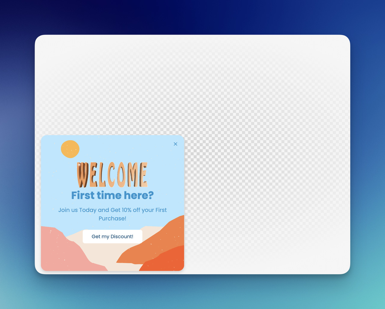
Discount Welcome Popup
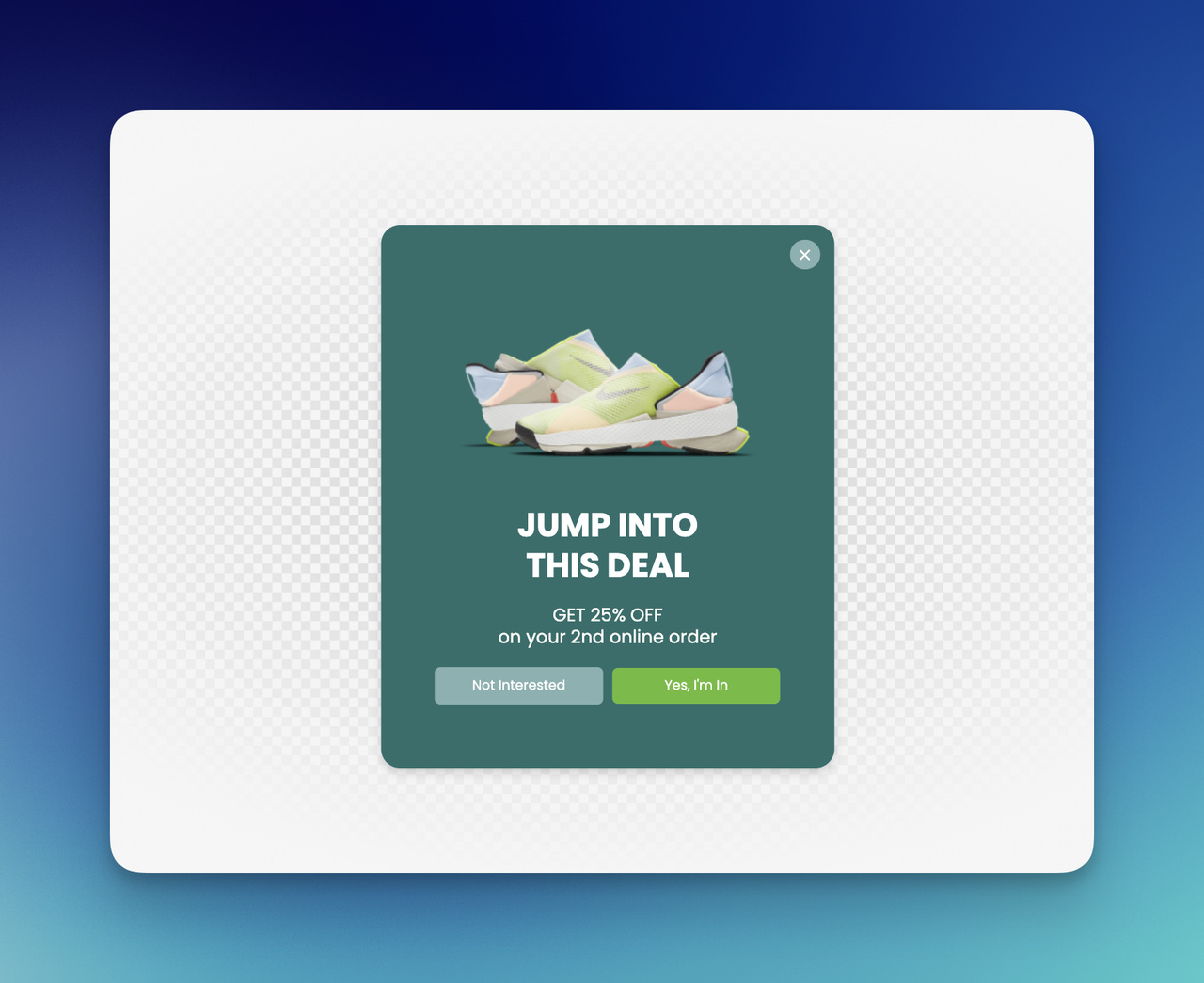
This is probably the most familiar format, and honestly, it still works when I keep it simple.
I’d use a discount popup template when my goal is first-order conversion. The message is direct, the value is immediate, and the CTA is easy to understand.
Example copy:
Welcome 👋 Here’s 10% off your first order. Use code: FIRST10 [Unlock Your Discount]
What I like here:
- immediate value
- low cognitive load
- strong fit for first-time visitors
- easy to pair with ecommerce campaigns
What I’d watch out for:
- weak design hierarchy
- generic discount wording
- showing it too fast
If I use a discount, I want it to feel earned, clean, and worth noticing, not desperate.
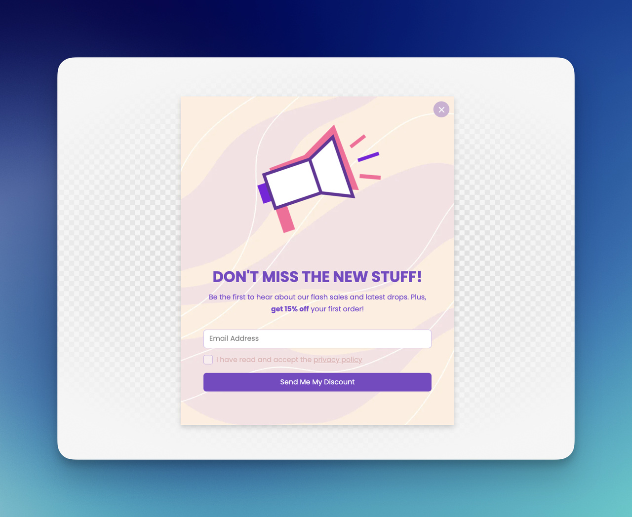
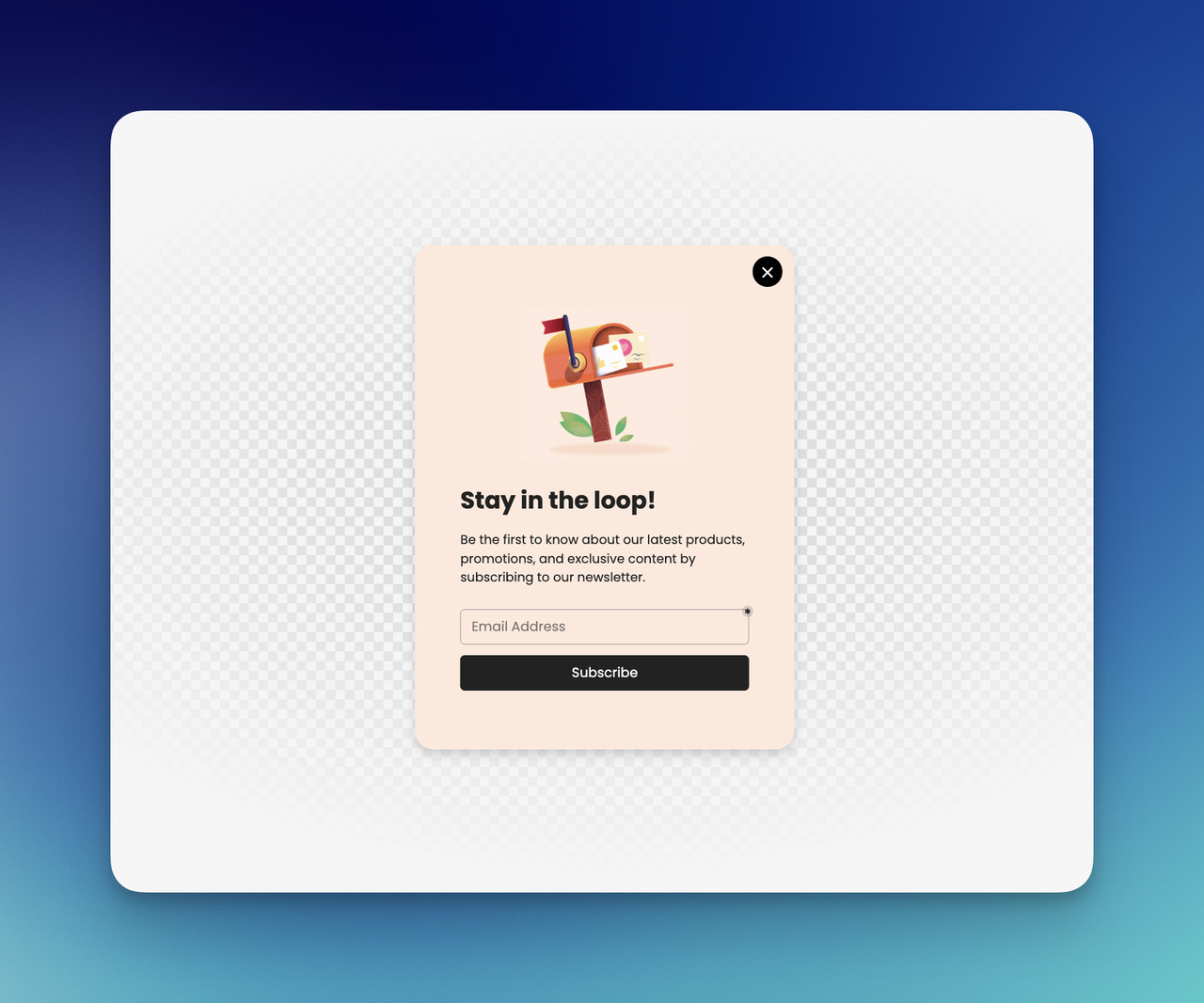
Email Signup Welcome Popup
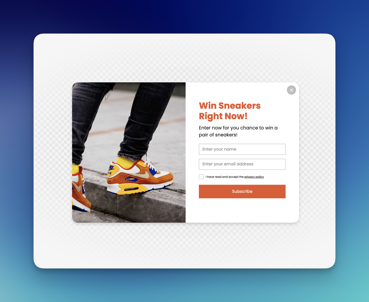
Sometimes I do not want to lead with a discount at all. Sometimes I want the website welcome popup to feel softer and more brand-led.
That is where an email signup format works well.
Example copy:
Join our list for weekly ideas, new arrivals, and small conversion wins ✨ [Sign Up]
I like this format for:
- content brands
- SaaS products
- personal brands
- stores that do not want to rely on discounts
A good email signup welcome popup design usually needs:
- one clear promise
- one field at most
- one CTA
- no extra clutter
If I ask for too much too early, I can feel the friction instantly.
Free Shipping Welcome Popup
I think free shipping is one of the most underrated welcome popup offers for ecommerce.
Sometimes a visitor does not need a percentage discount. Sometimes the hesitation is simpler than that. Shipping cost can be the thing that creates resistance. So I like using a welcome popup that removes that tension right away.
Example copy:
Good news, shipping’s on me 🚚 Enjoy free shipping on my your order today. [Shop Now]
This works especially well for:
- lower-margin stores that want an alternative to discounts
- brands with average order value goals
- campaigns where margin protection matters
This kind of welcome popup example feels practical, and practicality often converts.
Seasonal Campaign Welcome Popup
I love seasonal campaigns because it gives a welcome popup freshness. It stops the message from feeling permanent and forgettable.
A seasonal welcome popup template can be built around:
- Black Friday
- back-to-school
- holiday gifting
- summer launch
- end-of-season sale
Example copy:
Our Spring Edit is here 🌿 Shop fresh arrivals before they’re gone. [See the Collection]
What makes this one work for me is timing. It feels current. It gives the homepage a pulse.
New Collection Welcome Popup
Sometimes I want the popup to act less like a coupon and more like a guide.
If a store has a new drop, a refined category, or a standout collection, I can use the popup to direct attention instead of asking for a signup right away.
Example copy:
New arrivals just landed ✨ I picked the pieces worth seeing first. [Explore New In]
I like this approach when I want:
- product discovery
- homepage guidance
- a cleaner brand feel
- less discount dependence
This kind of welcome popup design feels more editorial, which I personally enjoy a lot.
Product Recommendation Welcome Popup
This one works best when a catalog is large and browsing can feel overwhelming.
Instead of letting a first-time visitor wander, I can help narrow the path.
Example copy:
Not sure where to start? I can help find the right fit in a minute. [Show Bestsellers]
Or:
Looking for the right match? Start with our most-loved picks. [Browse Favorites]
I like this format because it reduces decision fatigue. It feels less like an interruption and more like guidance.
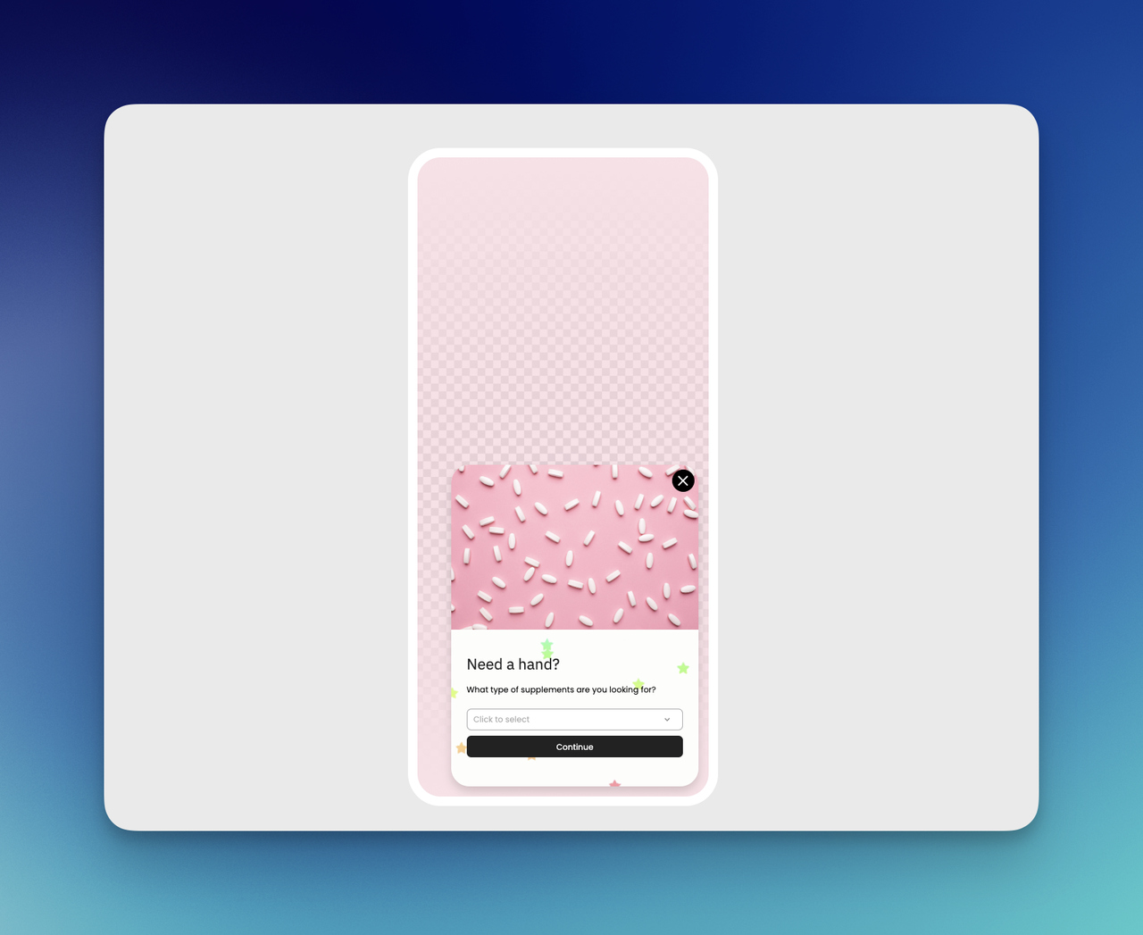
Quiz Welcome Popup
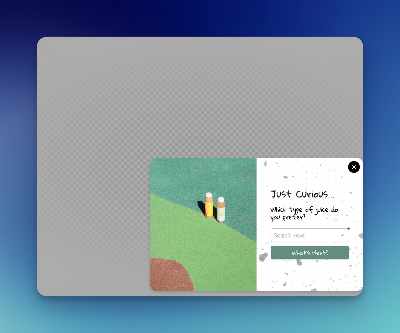
I think quiz popups are great when I want engagement and personalization in the same moment.
They work especially well for:
- skincare
- fashion
- supplements
- home decor
- gifting
Example copy:
I can help find the right product for me in 30 seconds ✨ Take the quick quiz. [Start the Quiz]
This is one of my favorite welcome popup examples because it turns passive attention into active curiosity.
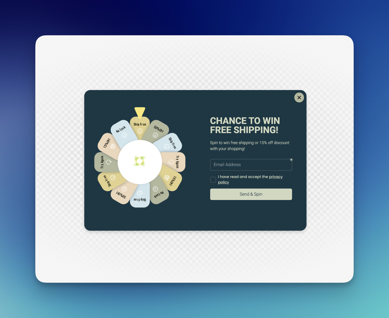
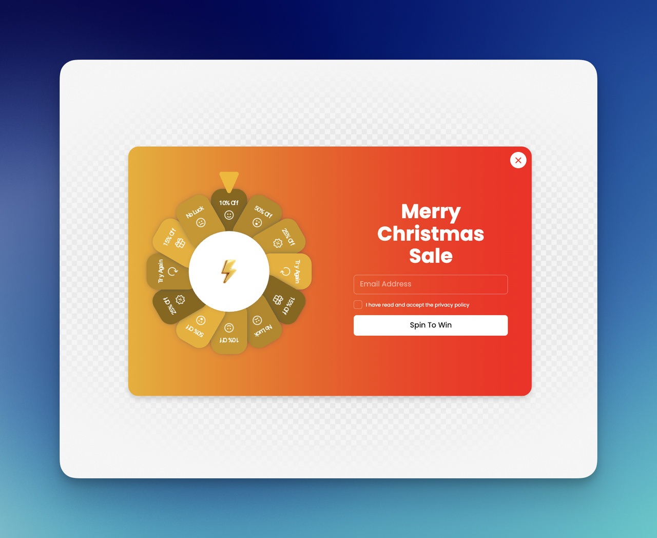
Spin-to-win Welcome Popup
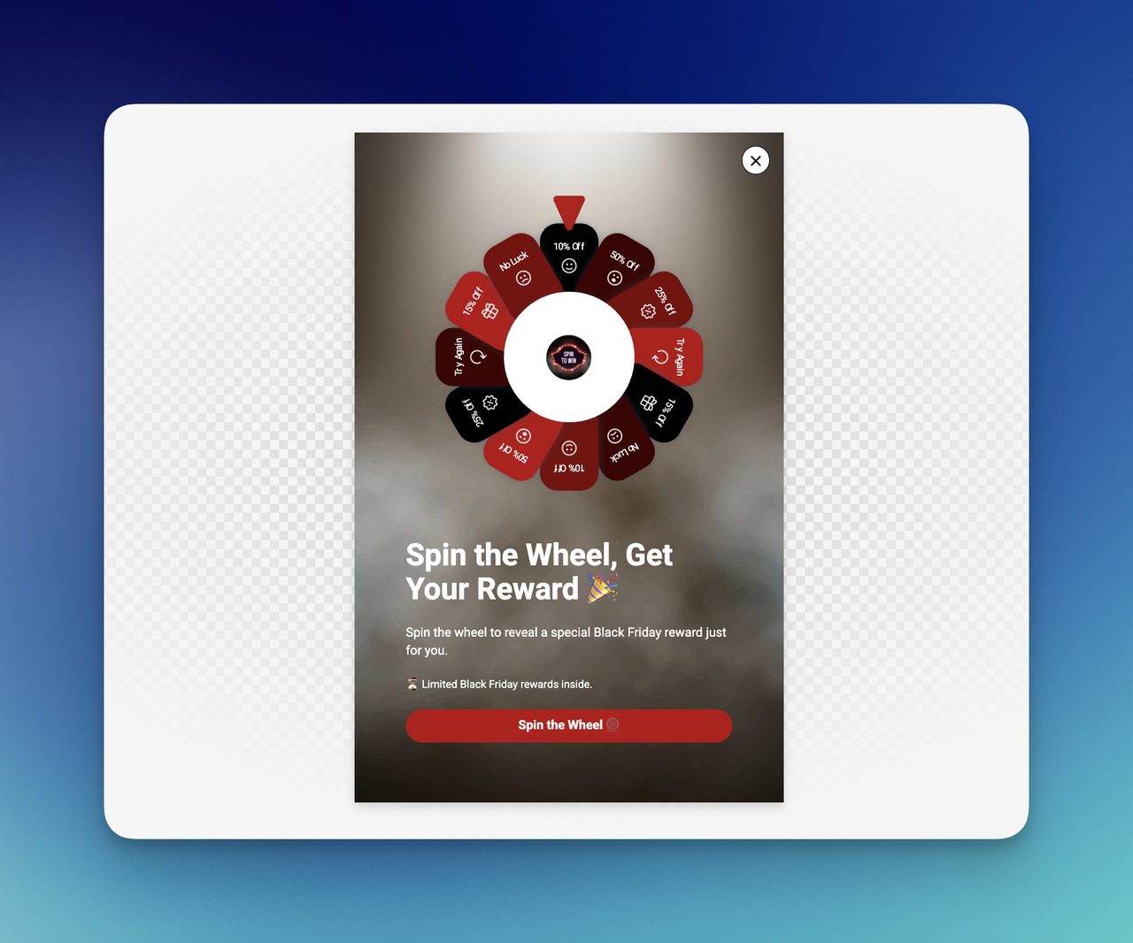
This one is more playful, and I only use it when the brand tone can carry that energy.
A spin-to-win style welcome popup template can feel fun, but only if the site already has a lively, promotional personality. Otherwise, it can feel like too much.
Example copy:
Feeling lucky? 🎉 Spin to unlock our surprise offer. [Spin Now]
I’d use this for:
- promotional ecommerce brands
- high-energy campaigns
- list growth with gamified interaction
I would not use it for:
- luxury positioning
- minimalist premium brands
- serious B2B experiences
Tone matters here. A lot.
Lead Magnet Welcome Popup
For content-led brands, agencies, SaaS tools, or consultants, a lead magnet is often stronger than a discount.
This kind of welcome popup tutorial angle usually works well when I have something genuinely useful to offer.
Example copy:
I made a free checklist for better conversions. Grab it here. [Download the Guide]
I like this because:
- it builds trust
- it attracts more qualified leads
- it aligns with expertise-driven brands
A welcome popup does not always need to sell immediately. Sometimes it only needs to begin the relationship well.
Webinar or Demo Signup Welcome Popup
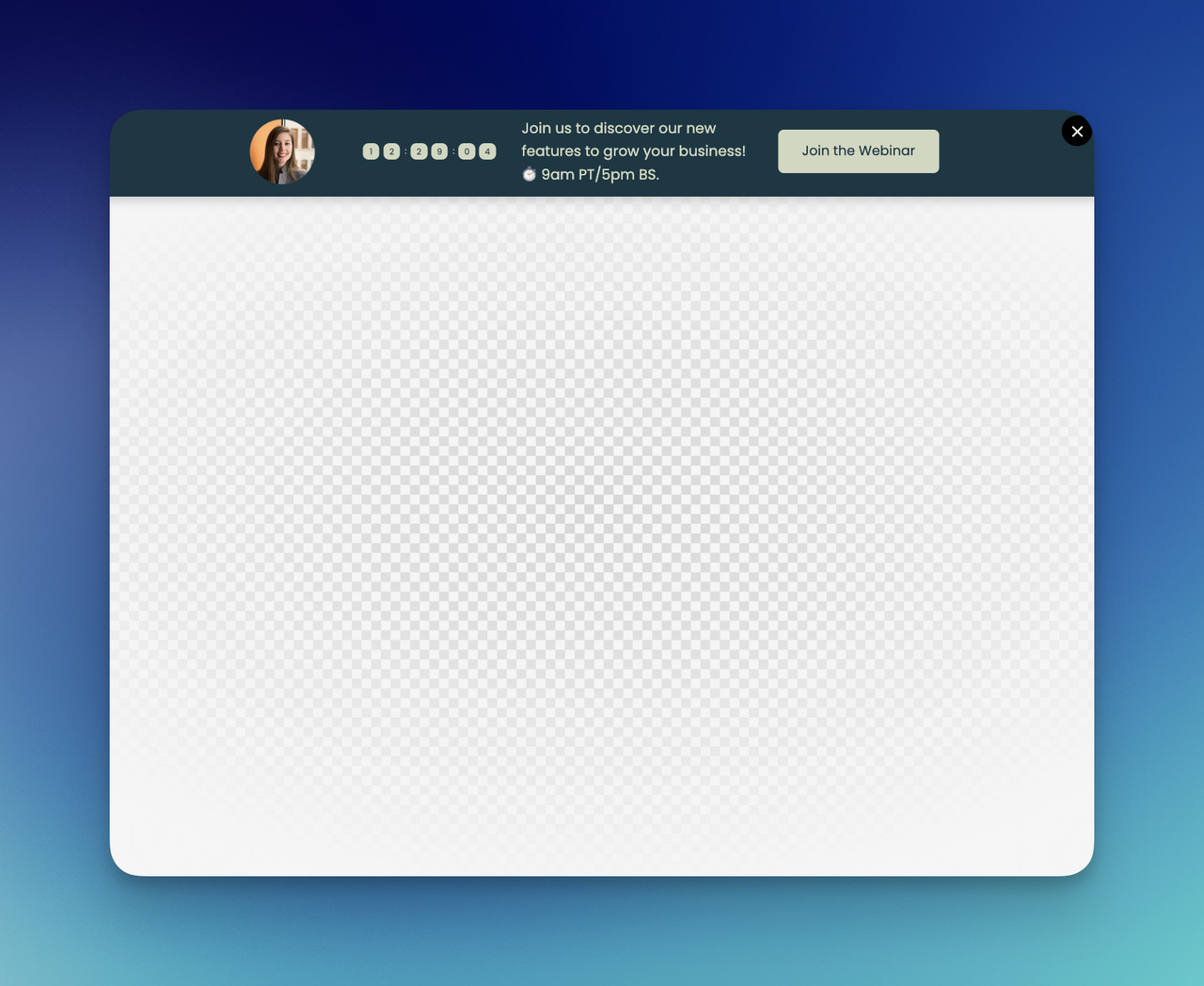
This is a strong fit for B2B, SaaS, service businesses, and education-focused offers.
Example copy:
I’m hosting a free demo this week. See how I’d solve this problem step by step. [Save Your Spot]
Or:
Want a closer look? Book a demo and see it in action. [Book a Demo]
This works best when I want a welcome popup to support pipeline, not just traffic.
Mobile-friendly Welcome Popup
I never treat mobile like a smaller desktop. That is how popup performance gets ruined.
A mobile-first welcome popup design usually works better for me when I keep:
- the copy shorter
- the form lighter
- the CTA larger
- the layout cleaner
- the close option obvious
Example copy:
10% off your first order 📱 [Get Your Code]
That is it. Short. Clear. Easy to tap. No drama.
Welcome Popup for First-time Visitors
This is where targeting makes everything sharper. I do not always want the same popup for every visitor.
For first-time visitors, I usually want a message that introduces value fast.
Example copy:
First time here? I’ve got 10% off, bestsellers, and a few good reasons to stay. [Start Here]
I like this format because it feels welcoming in the actual sense of the word. Not just promotional, welcoming.
**A quick way to choose the right example:
| Goal | Welcome popup example I’d use |
|---|---|
| Grow an email list | Email signup popup |
| Increase first purchase rate | Discount popup |
| Protect margins | Free shipping popup |
| Promote a campaign | Seasonal popup |
| Guide browsing | Product discovery popup |
| Personalize shopping | Quiz popup |
| Offer a resource | Lead magnet popup |
| Drive meetings or trials | Demo or webinar popup |
For me, the best welcome popup examples are never just visually nice. They are strategically matched. That is what makes them useful.
Tips for Creating a Welcome Popup That Converts
I’ve seen a lot of welcome popup campaigns fail for the same reason: they ask for attention before they earn it. A popup does not convert because it exists. It converts because the offer is clear, the timing makes sense, and the whole thing feels easy to act on.
So when I build a welcome popup design, I usually focus on a few simple conversion truths rather than trying to make it “look impressive.”
Offer clarity
If a visitor needs more than a second or two to understand what I’m offering, I already know the popup is weaker than it should be.
That is why I keep the value proposition sharp. One offer. One message. One action.
Here’s what usually works better for me:
- “Get 10% off your first order”
- “Join our list for weekly marketing tips”
- “Get free shipping today”
- “Take the quiz to find the right product”
Here’s what I try to avoid:
- vague language
- too many competing benefits
- overly clever headlines that hide the offer
- paragraphs inside the popup
I want the visitor to understand three things instantly:
| Question | What the popup should answer |
|---|---|
| What is this? | A discount, signup, guide, or offer |
| Why should I care? | There is a clear benefit for me |
| What do I do next? | Click, sign up, shop, or download |
That kind of clarity is not boring. It is persuasive.
Timing and targeting
Timing can make a perfectly good welcome popup template feel either helpful or unbearable.
If I show it the second someone lands on the page, I’m talking before I’ve even introduced myself. That can work in some aggressive campaigns, but most of the time I prefer a more intentional trigger.
I usually think in terms of visitor readiness:
- a few seconds of delay
- some scroll depth
- first-time visitor targeting
- landing-page-specific behavior
- exit intent, if I want a later interruption
This is where targeting becomes the difference between “smart” and “random.”
For example, I would not show the same welcome popup to:
- a first-time homepage visitor
- someone already on the checkout page
- a returning blog reader
- someone coming from a paid ad campaign
Those are different states of mind. So I try to respect them.
According to the Nielsen Norman Group, people often leave web pages quickly if they do not find clear value, which is exactly why timing and message relevance matter so much in early interactions.
Design and CTA best practices
I love good visuals, but I never let visual ambition ruin conversion clarity.
A strong welcome popup design should feel easy on the eyes and even easier to act on. That usually means:
- a short headline
- one supporting sentence
- one CTA
- enough white space
- strong contrast
- an obvious close option
If I’m using a form, I keep it light. In many cases, just one email field is enough. Every extra field adds hesitation.
I also pay close attention to the CTA. A weak button can flatten a good offer.
I’d rather say:
- Get Your Discount
- Join Our List
- Show the Collection
- Download the Guide
than:
- Submit
- Continue
- Learn More
Those generic buttons rarely carry enough energy.
Here’s the quick checklist I use before publishing:
| Element | What I look for |
|---|---|
| Headline | Clear, specific, benefit-led |
| Body copy | Short and supportive |
| CTA | Action-focused and obvious |
| Layout | Clean, not crowded |
| Form | As short as possible |
| Close button | Easy to find |
| Mobile view | Fast, readable, tappable |
One more thing matters here too: trust.
If I’m asking for an email, I want the popup to feel credible. That can mean better branding, cleaner copy, or a more thoughtful promise. The Content Marketing Institute has long highlighted that useful, relevant content builds engagement more effectively than generic messaging, and I think the same principle applies to popup copy as well.
I always ask myself this:
Would I click this if I saw it on someone else’s site?
That question cuts through a lot of noise.
If the offer feels weak, too early, too generic, or too messy, I usually know it before the data even tells me.
A good welcome popup does not need to shout. It just needs to make the next step feel worth taking. ✨
How to Create a Welcome Popup With Popupsmart
When creating a welcome popup with Popupsmart, there is no need for a complicated setup. I usually break it into a few simple steps and keep my focus on the goal, the message, and the visitor experience.
1. Create a new popup campaign
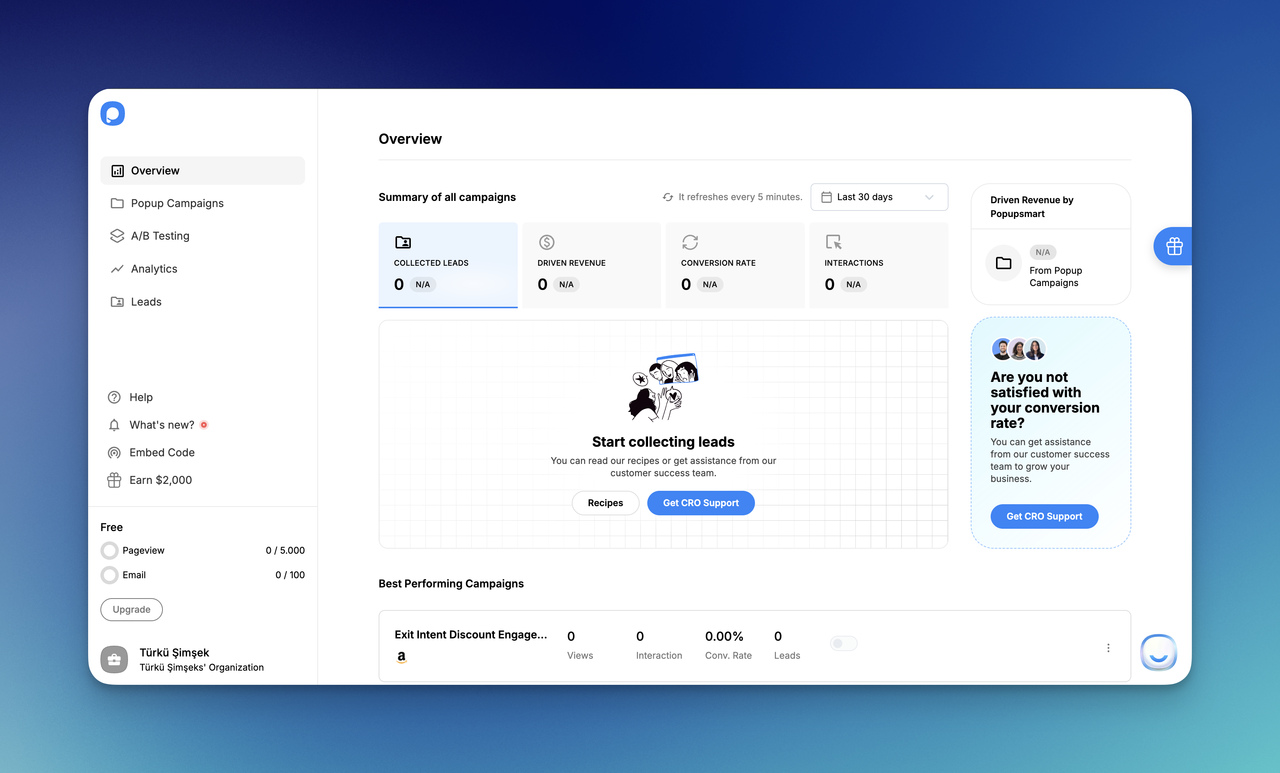
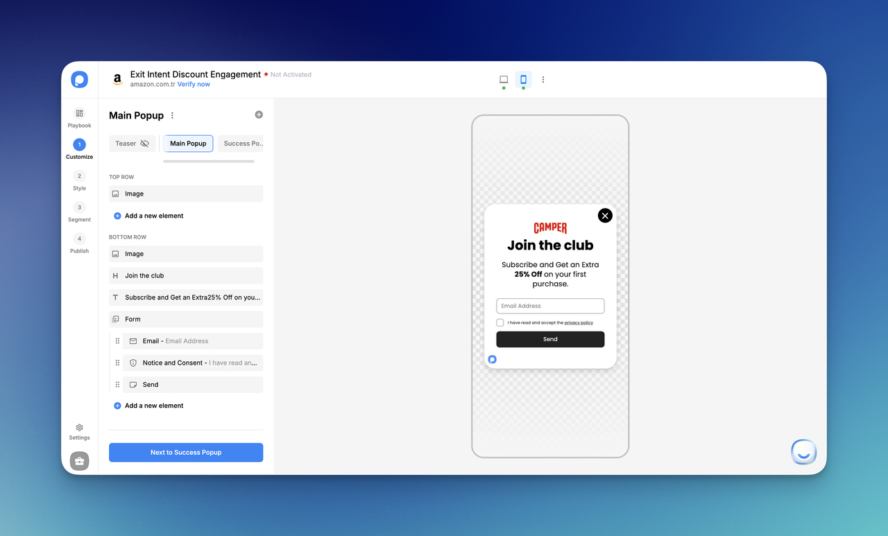
First, I sign up to Popupsmart, go into the dashboard, and start a new campaign. At this point, I decide what I want my website welcome popup to do. Do I want to collect emails, offer a discount, announce something, or guide visitors to a collection? I like to answer that first, because the goal shapes everything else.
2. Choose a welcome popup template and edit it
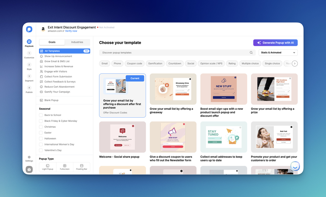
Next, I pick a welcome popup template that fits my goal. Then I customize it with my own headline, supporting text, image if needed, and CTA button. I keep the copy short, clear, and easy to understand.
For example, I might write:
- Get 10% off my first order
- Join my list for weekly updates
- Explore the new collection
I do not try to say too much here. A good welcome popup design should feel quick to read.
3. Set the display rules
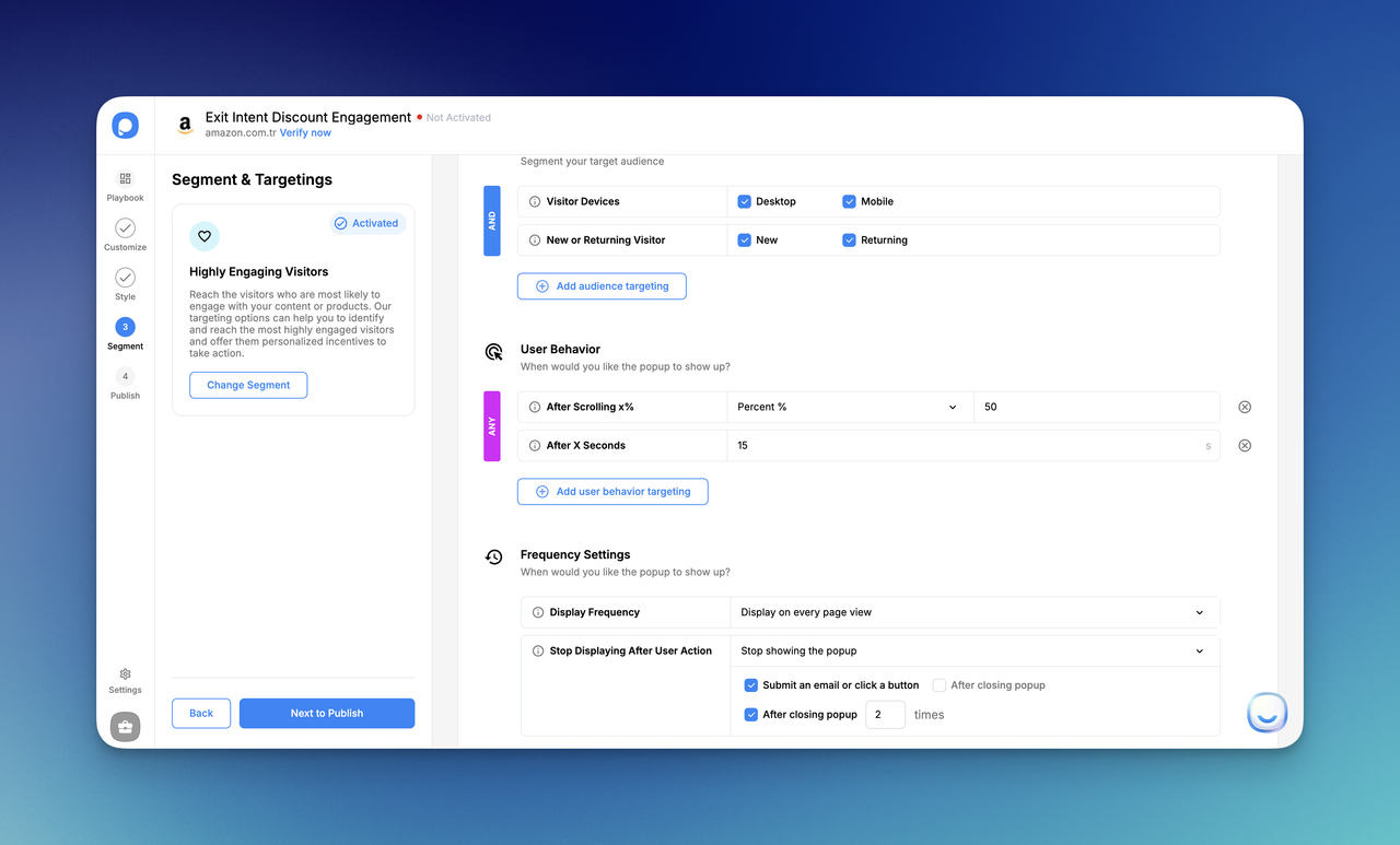
After the design is ready, I decide who should see the popup and when. This is where I make the popup smarter. I might show it only to first-time visitors, only on specific pages, or after a few seconds instead of instantly.
This step matters a lot. Even a strong welcome popup can feel annoying if I show it to everyone at the wrong moment.
4. Make sure it looks good on mobile
Before publishing, I always check the mobile version. I make the text shorter, keep the button easy to tap, and make sure the popup is not overwhelming on a smaller screen. If a welcome popup tutorial ignores mobile, it is missing a huge part of real performance.
5. Publish and test it
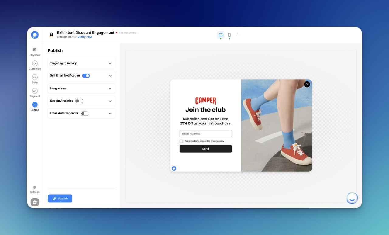
Finally, I publish the popup on my site and test how it feels. I check whether it appears at the right time, whether the CTA is clear, and whether the whole experience feels smooth. Then I keep improving it based on results.
That is really it. My process is simple:
| Step | What I do |
|---|---|
| 1 | Create a new campaign |
| 2 | Choose and customize a welcome popup template |
| 3 | Set targeting and timing rules |
| 4 | Check the mobile version |
| 5 | Publish and test |
I think the best workflow is the one that stays simple. I do not need to overbuild the popup. I just need to make it clear, relevant, and easy to act on.
Welcome Popup Mistakes to Avoid
I’ve noticed that most weak welcome popup campaigns do not fail because popups are a bad idea. They fail because the execution feels careless. The offer is vague, the timing is off, or the popup asks for too much too soon.
Here are the mistakes I would avoid first.
1- Showing the popup too early
This is probably the fastest way to make a website welcome popup feel annoying.
If the popup appears the exact second I land on a page, I have not even had time to understand where I am yet. That kind of interruption can feel pushy, especially when there is no context.
I usually prefer to give visitors a small moment first. A few seconds, a little scroll depth, or first-time visitor targeting can make the experience feel much more natural.
2- Using weak or generic copy
A lot of popups sound like they were written in a hurry.
Things like:
- Subscribe now
- Join us
- Don’t miss out
- Submit
can technically work, but they usually do not say enough.
I want my welcome popup copy to answer one simple question: Why should I care? If the popup cannot answer that clearly, it is not ready.
Instead of generic wording, I try to make the benefit specific:
- Get 10% off my first order
- Join my list for weekly growth tips
- Explore the new collection
- Download the free checklist
That small shift changes the whole feel of the popup.
3- Asking for too much information
I see this mistake all the time in lead generation popups. Someone wants an email, first name, company name, website URL, phone number, and maybe a small piece of your soul too. 🙂
I keep it lighter whenever I can.
If I am using a welcome popup template for email capture, one field is often enough. Every extra field adds friction, and friction quietly kills conversions.
4- Overdesigning the popup
I love good visuals, but a popup is not the place for design showing off.
A cluttered welcome popup design can hurt performance fast:
- too many colors
- too much text
- too many buttons
- busy backgrounds
- unclear visual hierarchy
I want the popup to be easy to scan, not something people have to decode.
5- Ignoring mobile experience
This one is expensive because so much traffic now comes from phones.
If my popup looks fine on desktop but takes over the whole mobile screen, has tiny text, or hides the close button, I am creating friction right where I should be reducing it.
That is why I always check:
- text length
- button size
- spacing
- image use
- close visibility
A mobile welcome popup should feel lighter, not crammed.
6- Treating every visitor the same
Not every visitor needs the same message.
A first-time visitor may respond well to a discount or email signup. A returning visitor might be better served by a product recommendation or campaign reminder. When I ignore that difference, the popup becomes less relevant.
That is why targeting matters so much. Relevance makes popups feel smarter.
My quick “don’t do this” checklist:
| Mistake | Why it hurts |
|---|---|
| Showing the popup instantly | It feels intrusive |
| Using vague copy | The value is unclear |
| Asking for too much | Friction increases |
| Overdesigning it | Readability drops |
| Ignoring mobile | UX gets worse |
| Showing the same popup to everyone | Relevance disappears |
For me, the goal is never just to make a popup visible. The goal is to make it feel worth seeing.
A good welcome popup can absolutely help conversions. A lazy one just teaches people to close it faster.
Conclusion
I think the best welcome popup is the one that earns attention instead of demanding it. When I keep the offer clear, the timing thoughtful, and the design simple, a popup can do much more than collect emails. It can guide new visitors, support first purchases, highlight campaigns, and make the first interaction with a brand feel more intentional.
That is why I never treat welcome popup design as just a visual task. It is really a messaging task, a timing task, and a user-experience task all at once. The right welcome popup template is not the flashiest one. It is the one that fits the goal, the audience, and the page it appears on.
If I had to keep it simple, this is what I would focus on:
- lead with one clear offer
- keep the copy short
- make the CTA obvious
- check the mobile experience
- test and improve over time
If you’re ready to turn these ideas into a real campaign, try creating your first welcome popup with Popupsmart and see what works best for your audience.
Frequently Asked Questions About Welcome Popups
Do welcome popups still work?
Yes, they do, but only when you use them well. A website welcome popup still works when the offer is relevant, the timing makes sense, and the experience does not feel disruptive.
What is the best welcome popup type?
The best welcome popup template depends on the goal. If I want email signups, I use a simple signup popup. If I want first purchases, I use a discount popup. If I want product discovery, I use a collection or bestseller popup.
How long should a welcome popup stay on screen?
I want it to stay long enough to be noticed, but not so long that it feels like a trap. In most cases, I focus more on timing and targeting than duration alone.
Should I show a welcome popup on mobile?
Yes, but I handle mobile carefully. A mobile welcome popup should have shorter copy, a clear CTA, enough spacing, and an easy-to-close layout.
How do I create a welcome popup with Popupsmart?
I keep it simple. I create a new campaign, choose a welcome popup template, customize the copy and design, set display rules, check the mobile version, and publish it. That is the easiest way to approach a practical welcome popup tutorial without making the setup feel heavy.

How would you rate your experience with this article? 😊