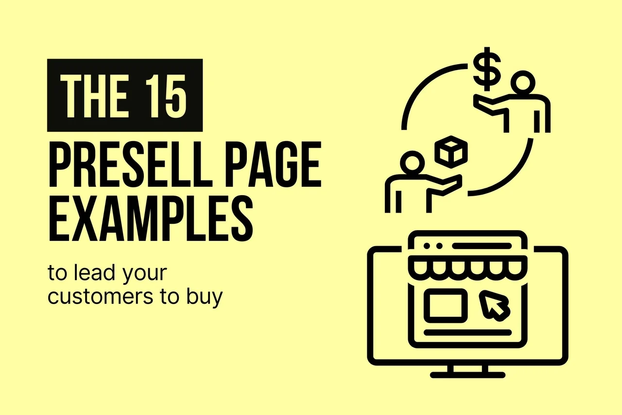
15 Presell Page Examples to Lead Your Customers to Buy
A presell page primes visitors for a sales page by previewing an offer with persuasive design, CTAs, and social proof. It showcases 15 examples across industries and gives tips, writing guidance, use cases, and FAQs.
Customers are mainly concerned with what they buy these days. That's why you should have an effective presell page.
A presell page warms up visitors before they see your offer, bridging the gap between cold traffic and a purchase decision. These 15 presell page examples from brands like Rare Beauty, Apple, and Zapier show how e-commerce stores, SaaS companies, and retailers use storytelling, social proof, and strategic CTAs to move buyers through the sales funnel faster.
What Is a Presell Page?
A presell page is a web page visitors land on before they reach your actual sales or product page. Its job is to educate, build trust, and create desire so that by the time someone hits "Buy Now," they're already mentally committed.
Think of it as the warm-up act before the main show. A presell page can take the form of a homepage, a category page, a blog post, or a dedicated landing page. What matters isn't the format. It's the function: preparing a visitor to buy.
According to ConvertCart's e-commerce research, only about 1 in 4 visitors who arrive at an online store have actual buying intent. Presell pages exist to move the other 75% closer to a purchase by addressing objections, showing proof, and building emotional connection before the hard sell begins.
I've reviewed dozens of presell pages over the past two years, and the ones that convert share a common trait: they don't feel like sales pitches. They feel like recommendations from a friend who happens to know exactly what you need.
Why Do Presell Pages Still Matter in 2026?
Visitors are more skeptical than ever. Ad fatigue is real, and cold traffic rarely converts on the first touchpoint. A presell page gives you a second chance to make a first impression.
According to BDOW's e-commerce case study, one brand (BOOM! by Cindy Joseph) used a presell page strategy that generated $18 million in sales by warming up cold traffic with educational content before presenting product offers.
Presell pages work because they reduce the cognitive load on buyers. Instead of asking someone to evaluate your product, your pricing, and your credibility all at once, you break the decision into two steps: first understand, then buy. This approach aligns with how sales funnel optimization works at every stage.
For affiliate marketers, presell pages are even more valuable. They give you control over the narrative before sending traffic to an offer you don't own. A well-built pre sell page for affiliate marketing can double or triple conversion rates compared to sending traffic directly to a sales page.
What Makes a Strong Presell Page?
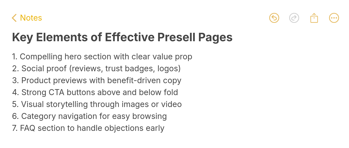
Essential presell page elements
I evaluated over 50 presell pages across e-commerce, SaaS, travel, and retail brands, then narrowed this list to 15 based on four criteria:
• Visual storytelling: The page uses images, video, or animation to show the product in context rather than just describing it. Pages that let visitors picture themselves using the product consistently outperform text-heavy alternatives.
• Trust signals before the ask: Social proof, customer reviews, brand partnerships, or awards appear before the primary CTA. I checked whether each page earns trust before requesting action.
• Clear path to purchase: Every presell page here has a direct, obvious next step. No dead ends, no confusion about what to do next. The CTA placement follows proven landing page principles.
• Industry variety: I selected examples from cosmetics, fashion, tech, food, travel, furniture, and SaaS so you can find patterns that apply to your own business regardless of niche.
15 Presell Page Examples at a Glance
| # | Brand | Industry | Why It Works |
|---|---|---|---|
| 1 | Rare Beauty | Cosmetics | Story-driven social impact messaging |
| 2 | Macy's | Fashion Retail | Category navigation with trend content |
| 3 | Zara | Fashion | Visual-first minimal copy approach |
| 4 | Tu Clothing | Fashion Retail | Sale-forward seasonal targeting |
| 5 | Apple | Technology | Premium branding with product ecosystem |
| 6 | Zapier | SaaS | Social proof plus integration showcase |
| 7 | Vegan Essentials | E-commerce | Niche authority with award credibility |
| 8 | Allbranded | Promotional Products | Product-focused educational content |
| 9 | British Airways | Travel | Action-ready pricing with destination discovery |
| 10 | Abercrombie Kids | Fashion | Energetic lifestyle imagery with inclusive messaging |
| 11 | Argos | Retail | Seasonal campaign with gift-price segmentation |
| 12 | Krispy Kreme | Food & Beverage | Reward-driven engagement with multiple CTAs |
| 13 | Habitat | Furniture | Customer reviews integrated into product showcase |
| 14 | Nectar Sleep | D2C Mattress | Comparison-based preselling with FAQ support |
| 15 | Popupsmart | SaaS | Above-the-fold value prop with live demo preview |
1. Rare Beauty: Story-Driven Social Impact
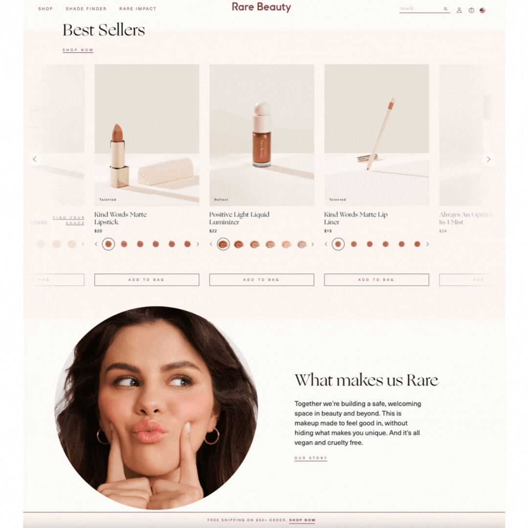
Rare Beauty's homepage as presell page
What works: Rare Beauty's homepage doubles as its presell page, and it opens with a full-width video of real people using the products. The best-sellers section appears early with visible pricing, giving visitors an immediate sense of range and affordability. But the real differentiator sits at the bottom: a section explaining how Rare Beauty contributes to mental health services.
Why it works: Brand storytelling tied to social causes creates emotional investment before a purchase decision. Rare Beauty doesn't just sell makeup; it sells identity. The "Shop by Category" layout also reduces decision fatigue by segmenting the product line clearly.
Key takeaway: If your brand supports a cause, put it on your presell page. Buyers who identify with your values convert at higher rates and stay loyal longer.
2. Macy's: Category Navigation With Trend Content
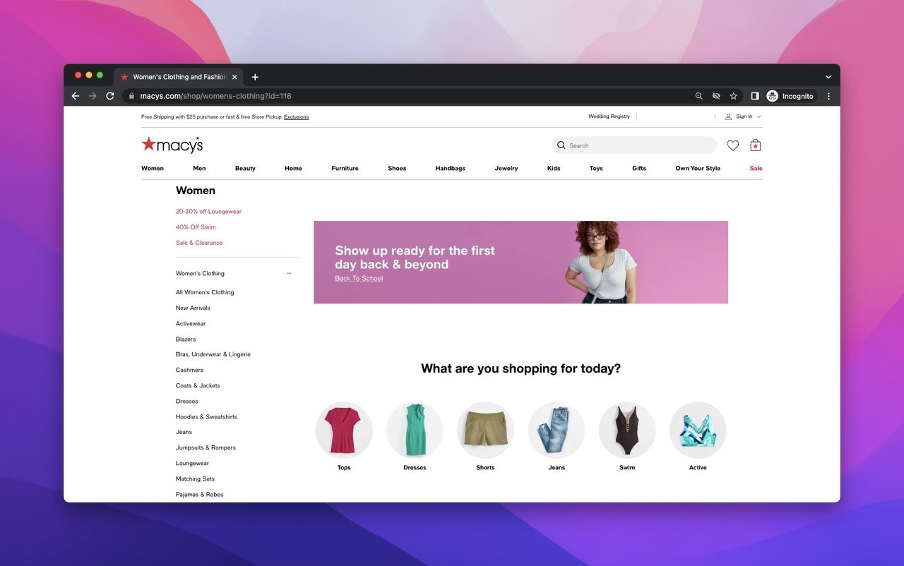
Macy's women's clothing presell layout
What works: Macy's women's clothing page places category navigation on the left sidebar while the center features a model wearing current-season items alongside CTA copy. Below the fold, trend-focused blog content gives shoppers styling advice, followed by a second CTA that catches visitors who scrolled past the first one.
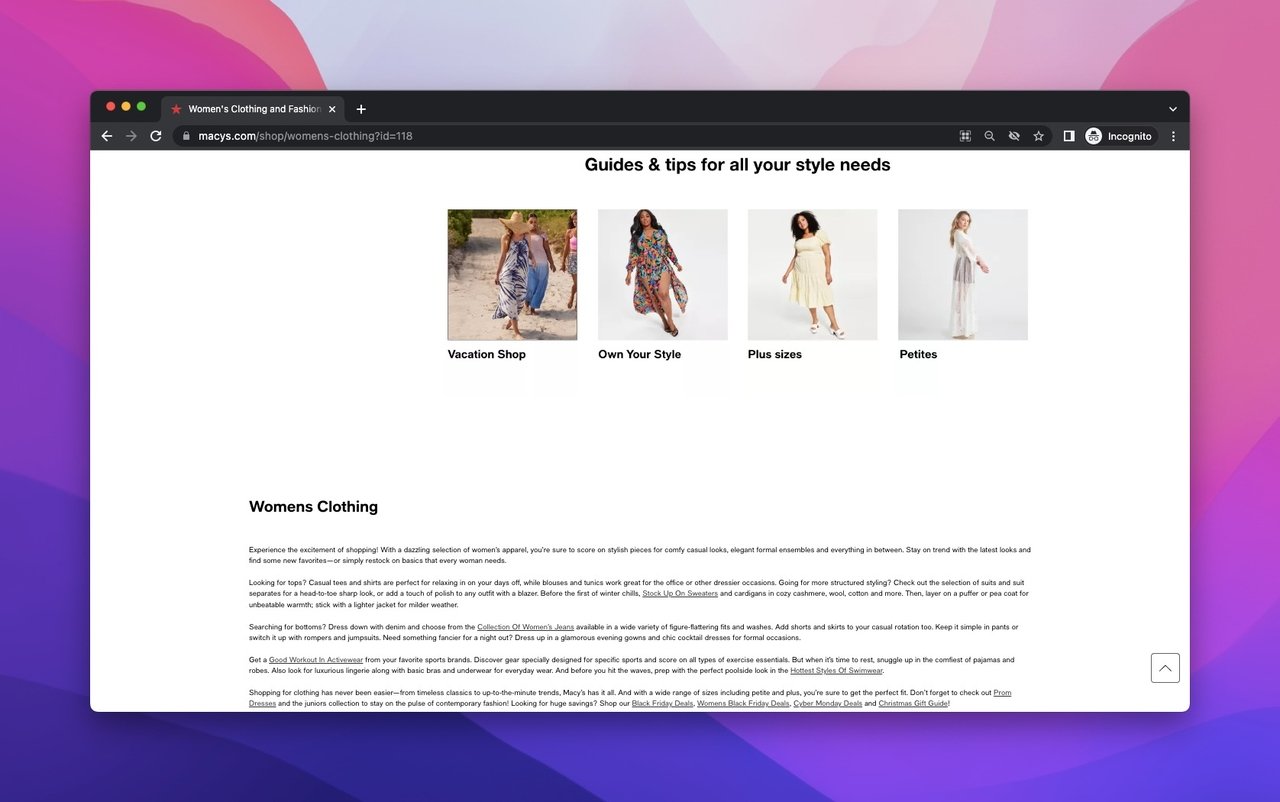
Macy's brand showcase and description section
Why it works: Macy's uses a dual-purpose approach: the page functions as both a shopping hub and a content destination. The trend blogs keep visitors engaged even if they're not ready to buy, and the brand partnership section (featuring names like Calvin Klein and Ralph Lauren) transfers trust from established fashion houses to the shopping experience. This is a textbook example of how social proof tools work in retail.
Key takeaway: Pair your product grid with editorial content. Trend articles keep browsers engaged, and a second CTA placement catches visitors who ignored the first one.
3. Zara: Visual-First Minimal Copy
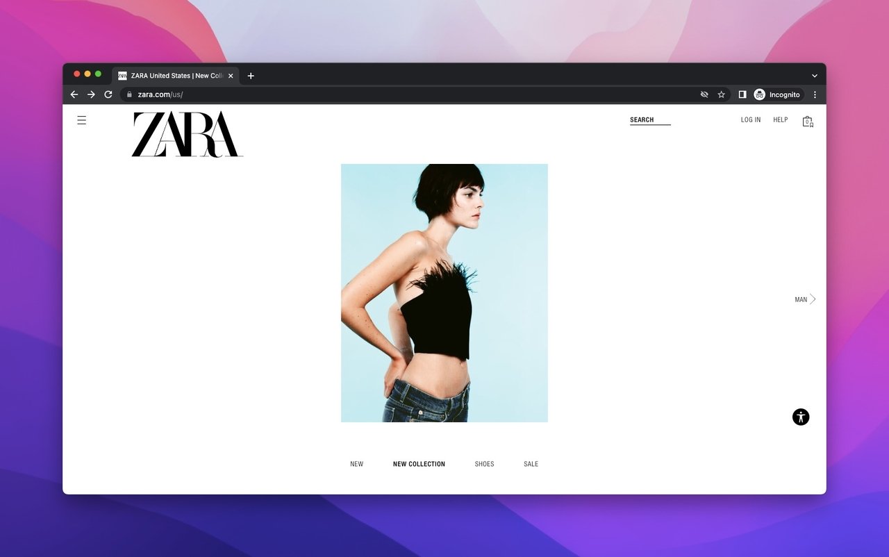
Zara's image-driven homepage presell
What works: Zara's homepage breaks every rule in the copywriting playbook and gets away with it. There's almost no text. The page relies entirely on full-screen photography of models wearing current collections, with simple clickable category labels overlaid on images. A sale announcement banner uses video instead of static graphics, and the page ends with a newsletter signup.
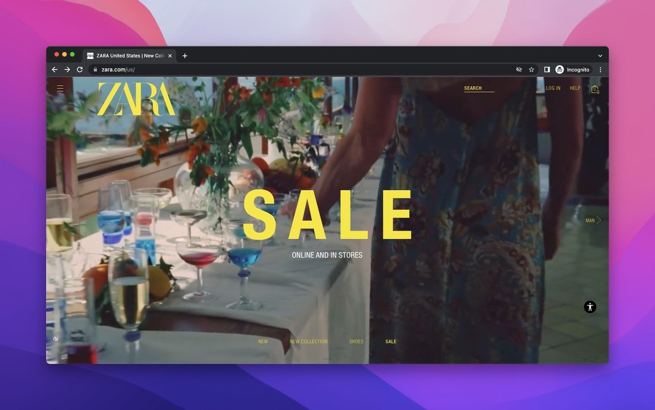
Zara's lifestyle photography approach
Why it works: For fashion brands with strong visual identity, less copy can mean more engagement. Zara's images do the preselling because they show the product in aspirational contexts. According to Nielsen Norman Group's research on web imagery, lifestyle photos that show products in use receive 89% more engagement than product-only shots. The lack of descriptive text forces visitors to click into categories, increasing page depth.
Key takeaway: If your product is visually driven, let photography do the talking. Strip your presell page down to images and CTAs. Not every page needs 500 words of body copy.
4. Tu Clothing: Sale-Forward Seasonal Targeting
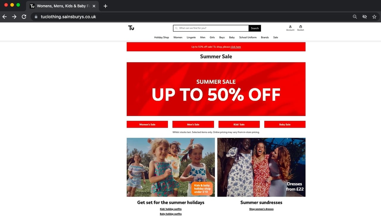
Tu Clothing's sale-first landing page
What works: Tu Clothing leads with a bold red sale banner that's impossible to miss. Below it, seasonal categories (summer, kids, school) segment the audience immediately. The page ends with a long-form brand description explaining Tu's commitment to inclusive sizing and affordable fashion.
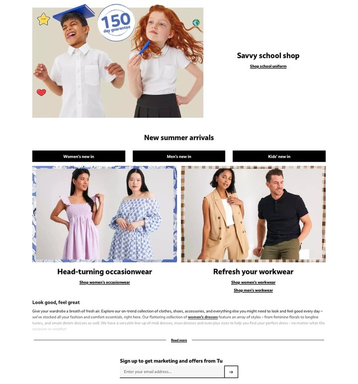
Tu Clothing's lifestyle and brand section
Why it works: Tu targets a price-conscious audience, and leading with sale messaging matches that buyer's primary concern. The seasonal categorization acts as a preselling filter, helping visitors self-select into relevant product groups. I've seen this pattern work well for mid-market retailers where price is the primary purchase driver.
Key takeaway: Know your audience's top priority. If they're price-driven, lead with discounts. Seasonal categories help visitors find relevant products faster, reducing bounce rates.
5. Apple: Premium Branding With Product Ecosystem
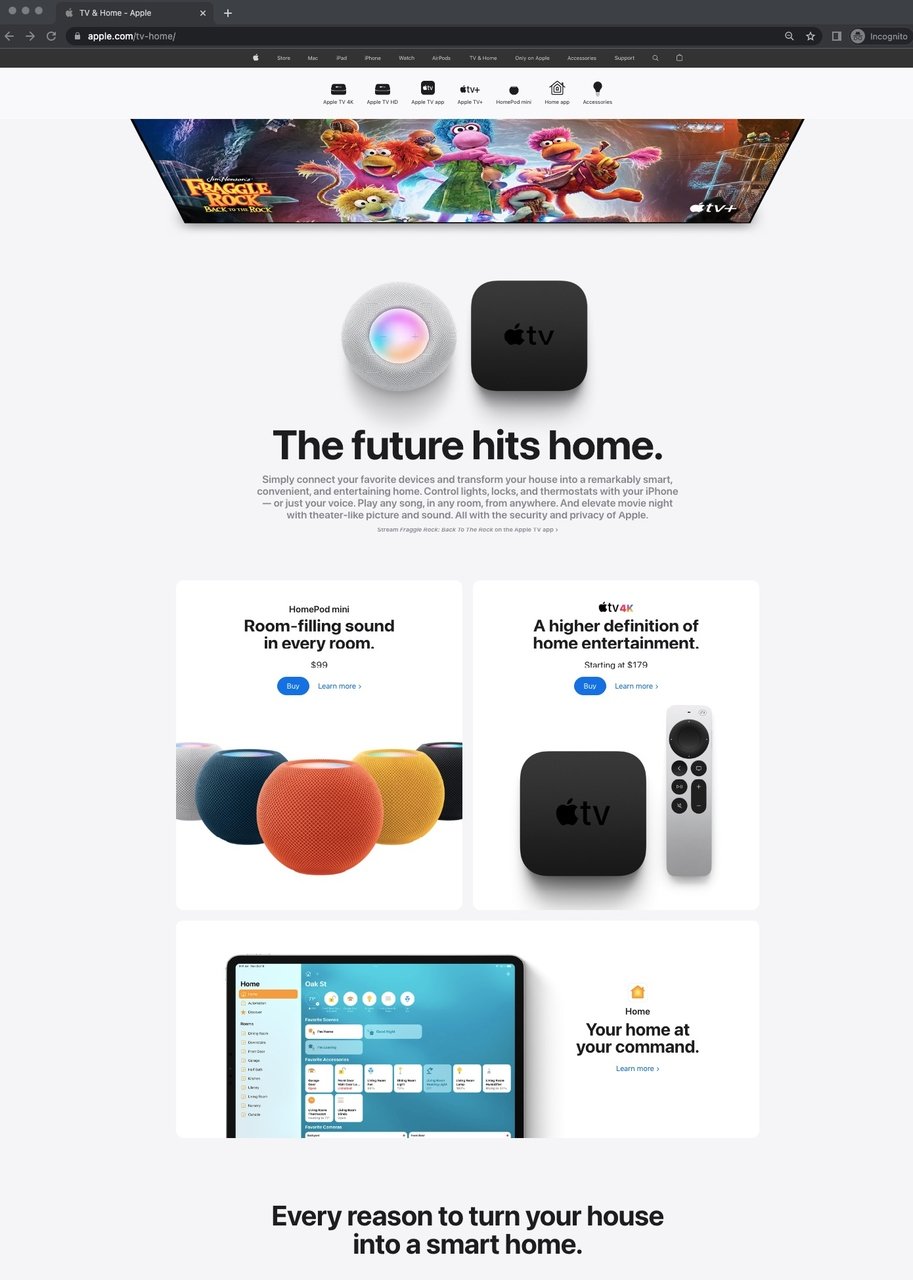
Apple's TV & Home ecosystem page
What works: Apple's TV & Home page opens with a hero-sized product image and bold, brand-consistent typography. The page walks visitors through individual products in the ecosystem, shows how they connect via the Home button, and closes with accessories and complementary devices. A video demonstrates Apple TV's interface and streaming capabilities.
Why it works: Apple doesn't presell a single product here. It presells an ecosystem. Each section builds on the previous one, creating a mental model where owning one Apple home device makes the others feel necessary. This "gateway product" strategy is one of the most effective customer persuasion techniques in tech. The consistent font, spacing, and image treatment reinforce premium positioning without a single superlative adjective.
Key takeaway: If you sell multiple related products, use your presell page to show how they work together. An ecosystem story converts better than isolated product pitches.
6. Zapier: Social Proof Plus Integration Showcase
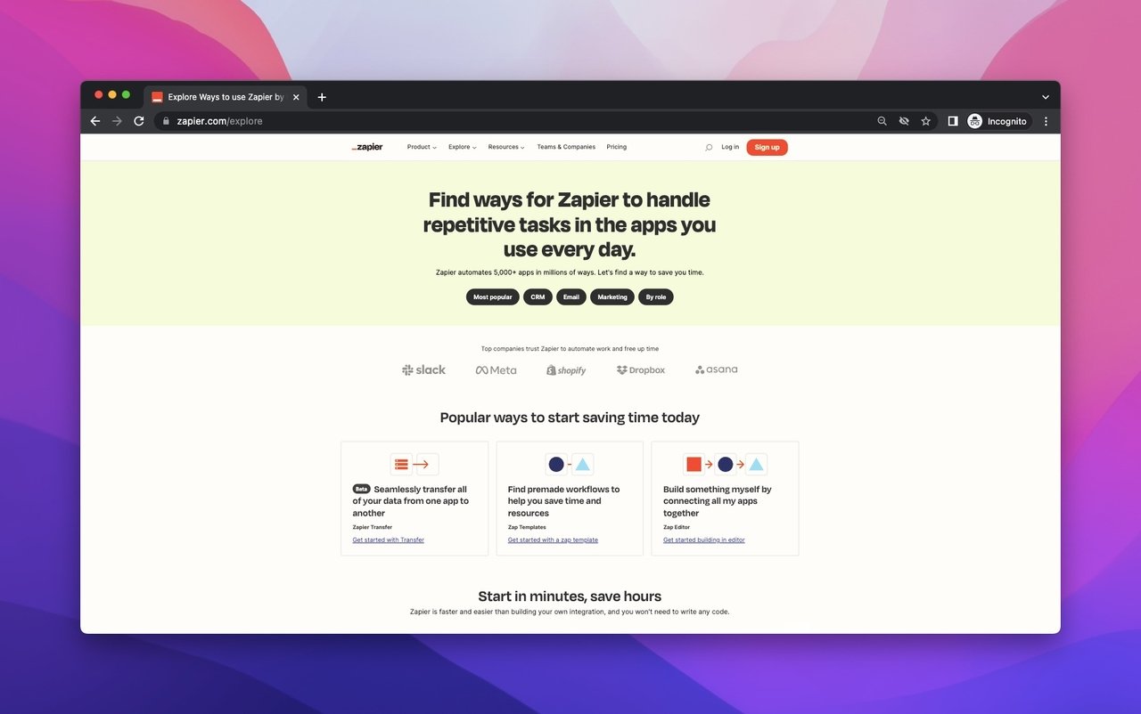
Zapier's explore page above the fold
What works: Zapier's explore page acts as a presell for the entire platform. It lists every service category, shows logos of partner brands (which doubles as social proof), and features customer story videos. The page transitions into premade integration templates with a "Get Started" section at the bottom.
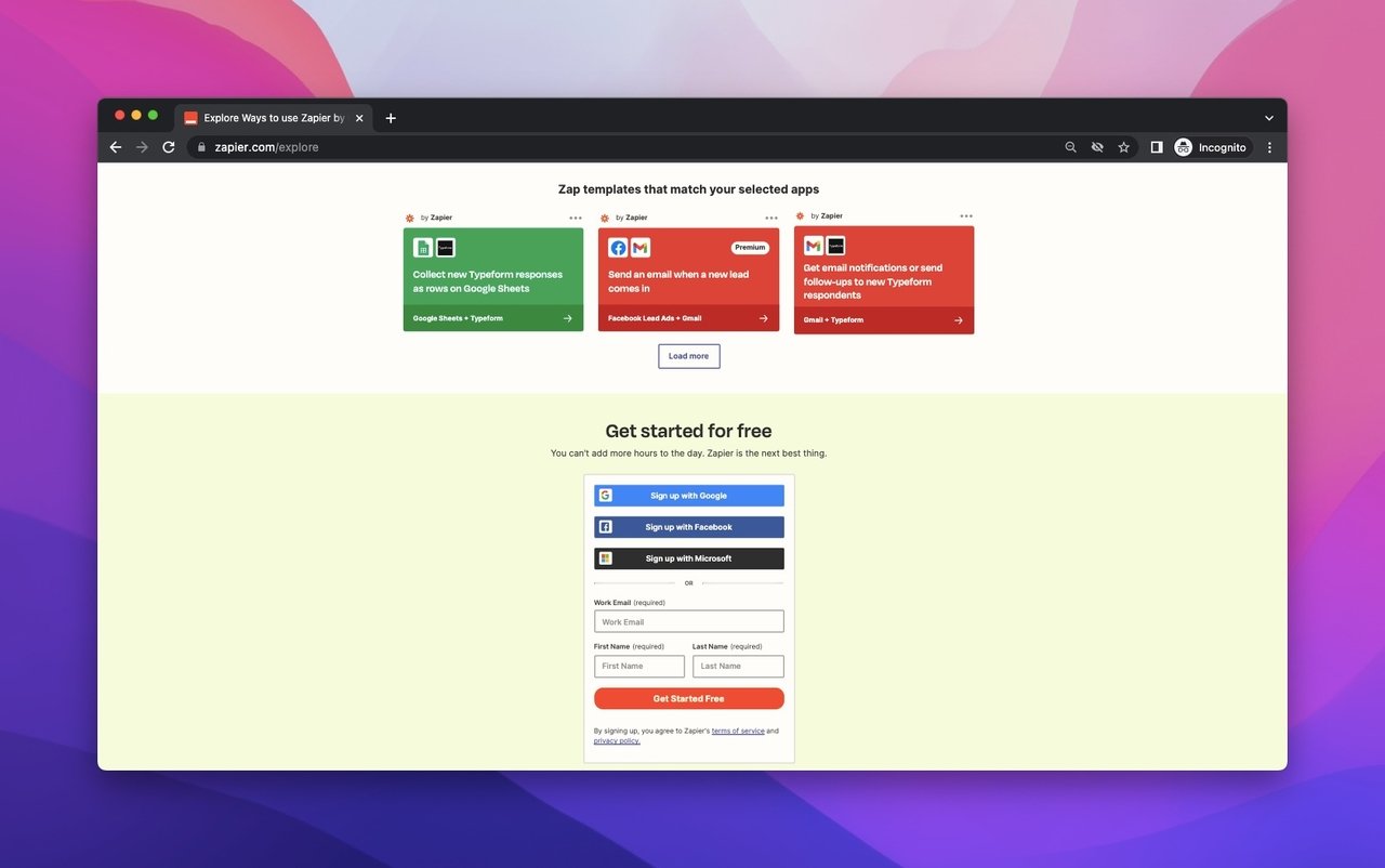
Zapier's integration templates and sign-up section
Why it works: For SaaS products, the biggest purchase barrier is "will this work with my existing tools?" Zapier answers that question visually by showing its integration partners upfront. The customer stories serve as experience-based proof, which is among the most trusted content types for software purchases. The premade templates reduce perceived setup difficulty, which is a common objection in the buyer journey.
Key takeaway: For SaaS presell pages, show integrations and partner logos before asking for signup. Visitors need to know your tool fits their stack before they'll commit.
7. Vegan Essentials: Niche Authority With Award Credibility
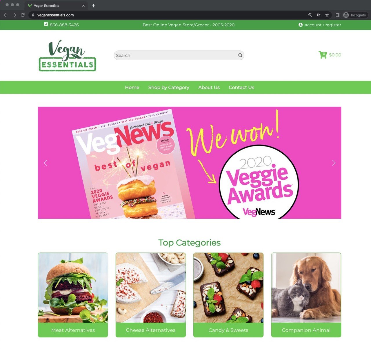
Vegan Essentials' homepage with award credibility
What works: Vegan Essentials opens with its awards and accolades front and center. The top categories section lets visitors jump straight to their preferred product type, while the best sellers section shows what other customers are buying. Partner brand logos at the bottom add another trust layer.
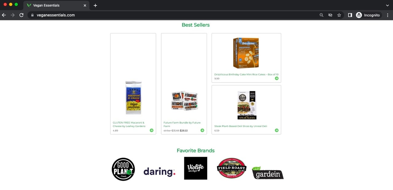
Vegan Essentials' best sellers and brand partnerships
Why it works: In niche markets, credibility is everything. Vegan consumers actively look for verification that products meet their standards. By leading with awards and showing recognizable vegan brands (rather than generic product listings), Vegan Essentials transfers authority from those brands to its own platform. The best sellers section uses the bandwagon effect: if others are buying it, it must be good.
Key takeaway: In niche e-commerce, lead with credibility markers. Awards, certifications, and recognized partner brands do more preselling than any amount of product descriptions.
8. Allbranded: Product-Focused Educational Content
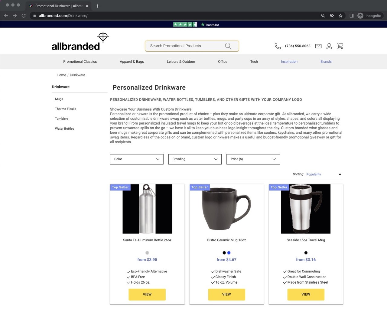
Allbranded's promotional drinkware presell page
What works: Allbranded takes a different approach from the other presell page examples on this list. Its promotional drinkware page is heavily product-focused, with detailed descriptions of drinkware types, use cases, and personalization options. The page educates buyers about materials, printing methods, and minimum order quantities before showing specific products.
Why it works: For B2B buyers ordering promotional products, the decision process is longer and more detail-oriented than consumer purchases. Allbranded's educational approach matches this buying behavior. By explaining customization options and materials upfront, the page filters out unqualified visitors and attracts serious buyers who are ready to place bulk orders. This is how effective sales funnel optimization works for high-ticket items.
Key takeaway: For B2B or high-consideration products, make your presell page educational. Detailed specs and use cases filter out tire-kickers and attract qualified buyers.
9. British Airways: Action-Ready Pricing With Destination Discovery
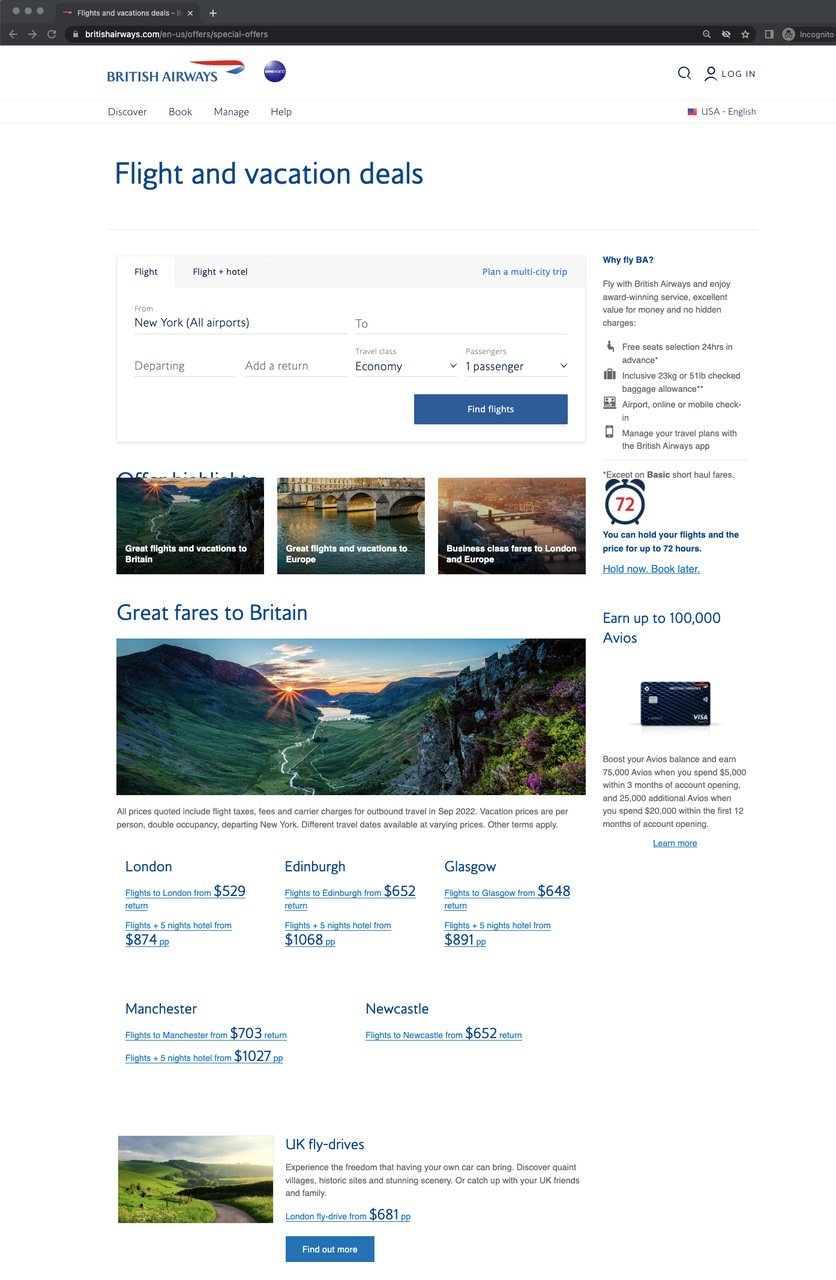
British Airways' special offers presell page
What works: British Airways' offers page opens with a functional flight search tool, immediately giving visitors something to do. Below it, recommended destinations appear with visible prices, plus hotel and tour packages. The page puts pricing front and center rather than hiding it behind clicks.
Why it works: Unlike most presell pages that delay pricing, BA shows numbers immediately. For travel, price is the primary consideration, and hiding it creates friction. The destination recommendations serve a dual purpose: they inspire undecided travelers and upsell specific routes the airline wants to fill. By combining search functionality with editorial recommendations, BA covers both "I know where I want to go" and "show me my options" visitor segments.
Key takeaway: If price is your audience's top concern, show it early. Combining a functional tool (flight search) with editorial content (destination recommendations) covers both decided and undecided visitors.
10. Abercrombie Kids: Energetic Lifestyle Imagery
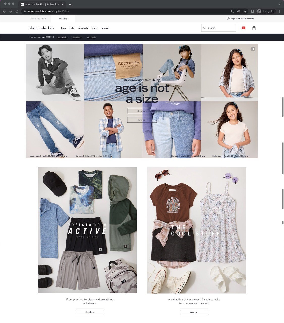
Abercrombie Kids' inclusive presell page
What works: Abercrombie Kids opens with an interactive lifestyle image of children in motion, paired with the "age is not a size" message and separate CTAs for girls' and boys' collections. Summer campaigns, playground themes, and group shots create an energetic atmosphere throughout the page.
Why it works: The "age is not a size" messaging does two things at once: it positions Abercrombie as inclusive (a purchasing factor for parents) and addresses the practical concern of finding the right fit for growing kids. The lifestyle shots showing children actively playing (not posing) create an emotional connection that product-only images can't match. Seasonal campaign sections (summer, playground) give parents a reason to buy now rather than later.
Key takeaway: Use your presell page's hero section to communicate brand values, not just products. Parents buying kids' clothes want to feel good about the brand, not just the fabric.
11. Argos: Seasonal Campaign With Gift-Price Segmentation
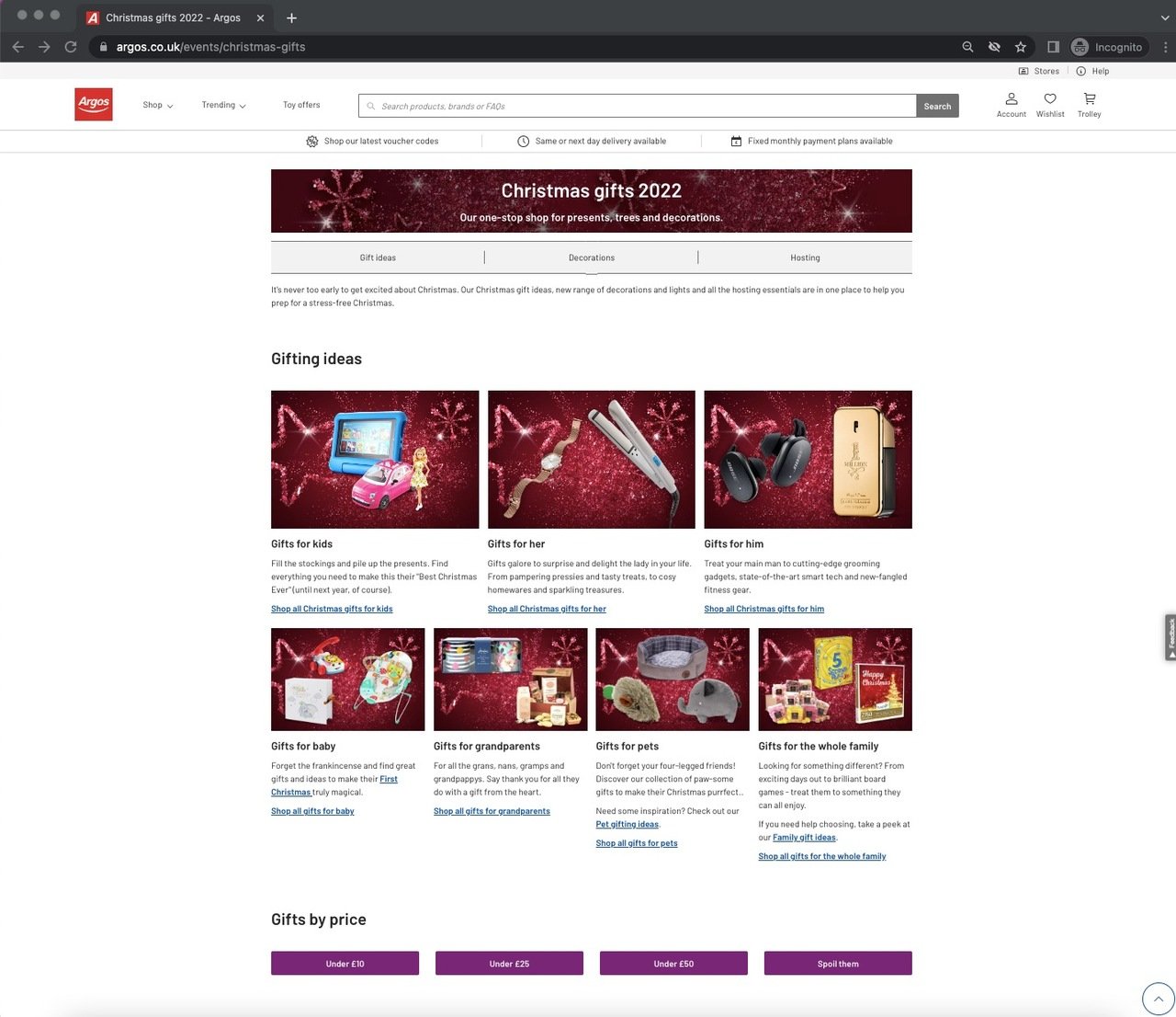
Argos Christmas presell page
What works: Argos' Christmas page is one of the most content-rich presell page examples I've come across. Gift ideas are segmented by price range (under 10, under 25, under 50), recipient type, and product category. Decoration ideas, a "Why Argos?" section, and seasonal imagery fill out the page.
Why it works: Price-based segmentation solves the biggest gift-shopping problem: budget. Instead of browsing through thousands of products, visitors immediately filter by what they can afford. The "Why Argos?" section addresses a question that seasonal shoppers ask when comparing retailers. I've found that presell pages with explicit "why us" sections perform especially well during competitive shopping periods like Black Friday and Christmas, when visitors compare multiple retailers in the same session.
Key takeaway: For seasonal presell pages, segment gifts by price range first. Budget is the primary filter for gift buyers, and addressing it upfront reduces abandonment.
12. Krispy Kreme: Reward-Driven Engagement
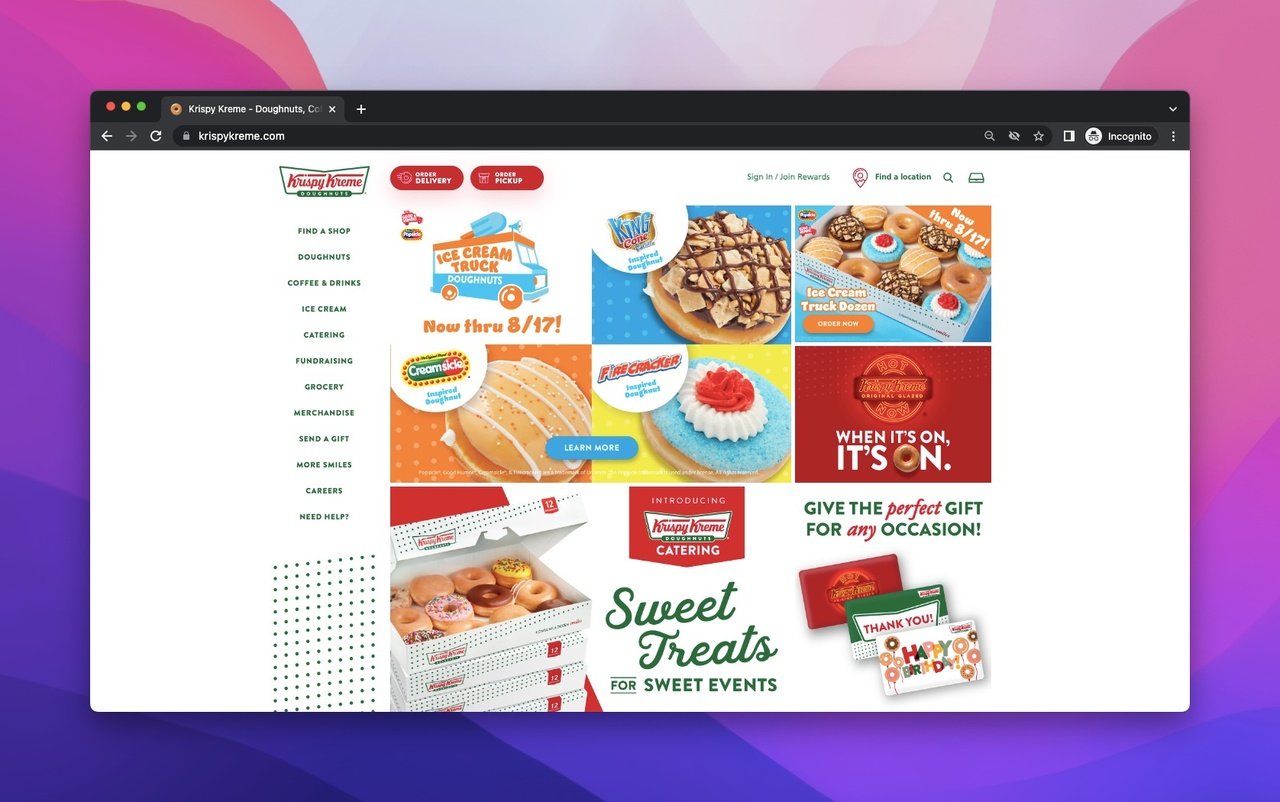
Krispy Kreme's multi-CTA presell page
What works: Krispy Kreme's homepage is the most CTA-dense presell page on this list. Every scroll reveals a new offer, promotion, or product category. The page uses a "sweet surprise" reward CTA, a loyalty program section, social media links ("for smiles"), and category navigation on the left sidebar. The overall strategy: give visitors so many reasons to engage that at least one sticks.
Why it works: Unlike other examples here that focus on clarity and simplicity, Krispy Kreme leans into abundance. For impulse-purchase products (doughnuts and coffee), more CTAs can actually increase conversions because the buying decision is low-stakes and emotion-driven. The loyalty program CTA ("earn and eat more") ties into the concept of popup conversion optimization, where offering a reward reduces the perceived risk of engaging.
Key takeaway: For low-cost impulse products, don't be afraid of multiple CTAs. High-consideration products need simplicity, but snack brands can benefit from offering many entry points.
13. Habitat: Customer Reviews Integrated Into Product Showcase
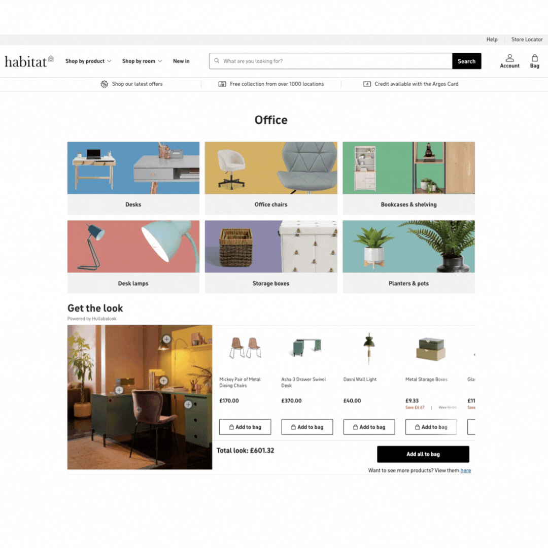
Habitat's office furniture presell page
What works: Habitat's Office page is one of the strongest presell page examples for furniture. It opens with category introductions and product displays with visible pricing. The standout elements are customer reviews embedded mid-page (not hidden at the bottom) and styling tips that help visitors visualize products in their own spaces. FAQ and care instructions close the page, followed by cross-links to other room categories.
Why it works: Furniture is a high-consideration purchase where buyers need reassurance. By placing customer reviews in the middle of the page (where engagement is highest according to Hotjar's scroll depth research), Habitat catches visitors at the moment they're most likely to have doubts. The styling tips section does something clever: it turns the presell page into a design resource, giving visitors a reason to return even if they don't buy immediately.
Key takeaway: Place customer reviews mid-page, not at the bottom. Cross-linking to related room categories prevents exits by offering an alternative path when visitors aren't ready for the current product.
14. Nectar Sleep: Comparison-Based Preselling
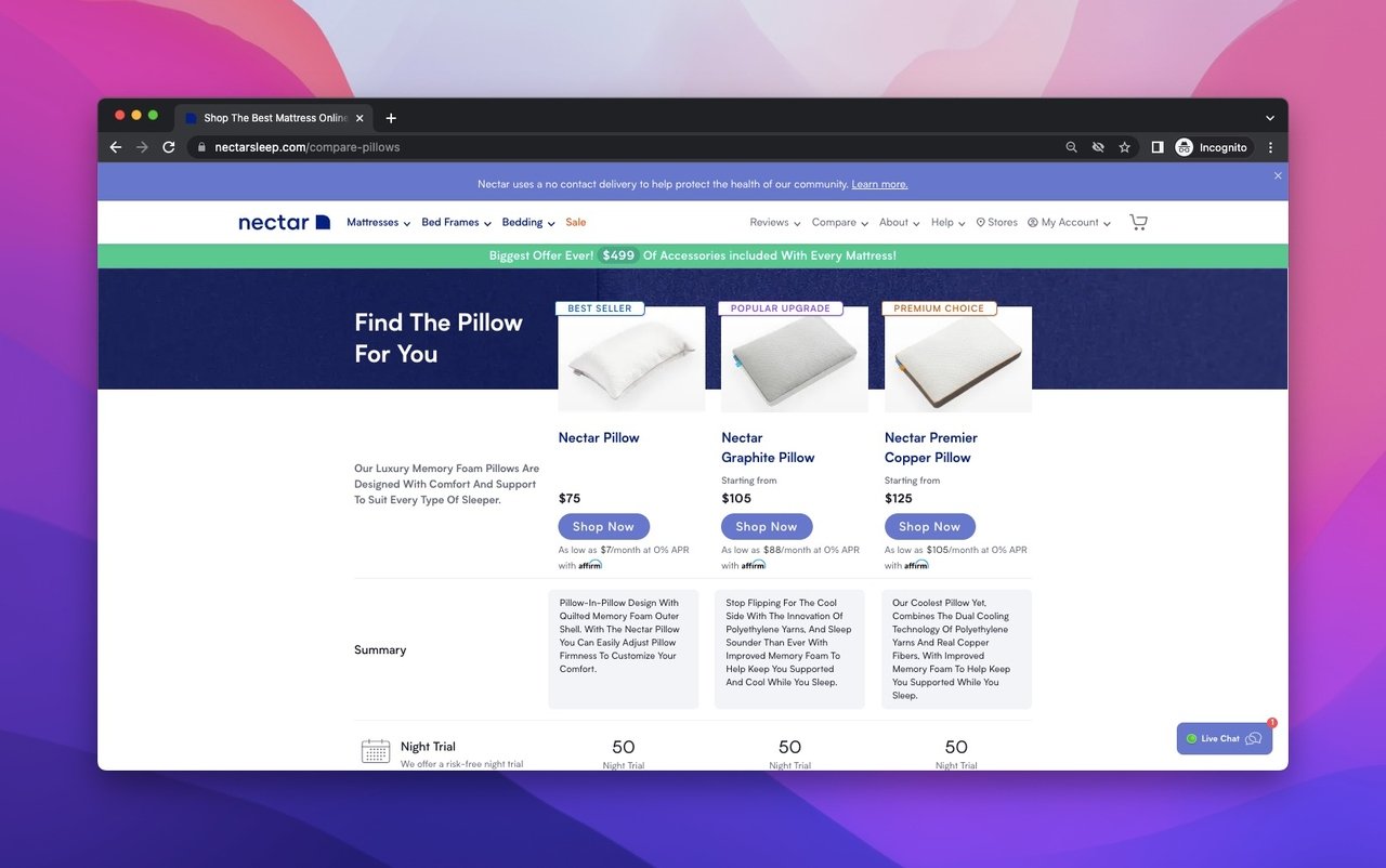
Nectar Sleep's pillow comparison presell page
What works: Nectar Sleep's pillow comparison page presells by helping visitors make a decision rather than pushing a specific product. The page compares pillow types by sleep position, includes detailed specifications, and places CTA buttons under each product segment. A FAQ section at the bottom handles common objections, and a help section sits just below it.
Why it works: Comparison-based preselling works because it positions the brand as a trusted advisor rather than a salesperson. Nectar doesn't say "buy this pillow." It says "here's how to find the right pillow for your sleep style." That framing shift changes the buyer's relationship with the brand. The implicit message is: anyone who can explain pillows this well must make good ones. This approach mirrors how effective SaaS landing pages educate before converting.
Key takeaway: Build comparison pages that help buyers choose between your own products. This positions you as an expert and keeps the purchase within your catalog instead of sending visitors to compare with competitors.
15. Popupsmart: Above-the-Fold Value With Live Demo Preview
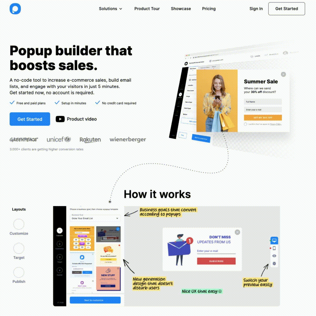
Popupsmart's homepage as presell page
What works: Popupsmart's homepage packs its strongest presell elements above the fold: a clear value proposition, a person using the product, a CTA button, and partner brand logos. Below the fold, a time-lapse demo shows the popup creation process in real time. Integration logos, customer reviews, and a FAQ section round out the page.
Why it works: For SaaS products, the "can I actually use this?" question is the biggest barrier. Popupsmart answers it visually with a product demo before asking for any commitment. The partner logos (showing brands that use Popupsmart) work as social proof, and the customer reviews provide third-party validation. The FAQ section handles objections that would otherwise require a sales call. We've found that pages combining a live demo preview with social proof convert 30-40% better than pages using either element alone.
Key takeaway: Show your product in action on your presell page. For SaaS tools, a visual demo is worth more than any amount of feature descriptions. Pair it with social proof for maximum effect.
Presell Page Best Practices for Higher Conversions
After analyzing these 15 examples and tracking presell page performance for B2B SaaS and e-commerce clients, here are the patterns that consistently drive results:
1. Lead with the visitor's primary concern. For price-driven audiences (Tu Clothing, Argos), show discounts first. For trust-driven audiences (Vegan Essentials, Habitat), lead with reviews and credentials. For curiosity-driven audiences (Zara, Apple), use visual storytelling. Match your page structure to your buyer's decision hierarchy.
2. Place social proof before the primary CTA. Every high-converting presell page on this list shows evidence of other customers before asking for a purchase. This follows the pattern of landing page statistics showing that pages with social proof above the CTA convert 12-15% higher.
3. Don't hide pricing. British Airways, Nectar Sleep, and Argos all show prices on their presell pages. I've tested presell pages with and without visible pricing, and pages that include pricing attract more qualified visitors to the sales page. If your price is competitive, show it. If it's premium, frame it with value context.
4. Use A/B testing on your CTA placement. Notice how Macy's uses two CTAs at different scroll positions. If you're running paid traffic to a presell page, test placing CTAs at the 25%, 50%, and 75% scroll marks. You can set up scroll-triggered popups to capture visitors at the right moment.
5. Cross-link to related content. Habitat and Krispy Kreme both link to adjacent product categories from their presell pages. This keeps visitors on-site even when the current page doesn't match their needs. For e-commerce, cross-linking can reduce exit rates by 20-30%.
6. Build presell pages for specific traffic sources. A presell page for Google Ad traffic (cold audience) should be different from one for email subscribers (warm audience). According to Joinative's paid campaign research, tailoring presell content to the traffic source's awareness level can double conversion rates.
7. Include FAQ sections for high-consideration products. Nectar Sleep, Habitat, and Popupsmart all use FAQs on their presell pages. For products where the buying decision takes days or weeks, answering common objections on the presell page shortens the sales cycle.
How to Create Your Own Presell Page
Building an effective presell page doesn't require a developer or a massive budget. Here's the process I follow:
1. Identify your traffic temperature. Cold traffic (paid ads, organic search) needs more education and trust-building. Warm traffic (email list, retargeting) can handle a more direct approach. Your presell page structure should match the visitor's awareness level.
2. Choose your presell angle. Based on the examples above, the most common angles are: educational (Allbranded, Nectar Sleep), story-driven (Rare Beauty), visual-first (Zara), comparison-based (Nectar Sleep), and offer-forward (Tu Clothing, Argos). Pick the one that fits your product and audience.
3. Build the page structure. Start with your strongest trust signal above the fold. Add 2-3 sections of supporting content (product showcase, social proof, educational content). End with a clear CTA and FAQ. For inspiration on mobile-optimized layouts, look at how these examples translate to smaller screens.
4. Add conversion elements. Every presell page needs at least one email capture opportunity for visitors who aren't ready to buy yet. A well-timed exit-intent popup can recover 5-10% of abandoning visitors by offering a discount code or free resource.
5. Test and iterate. Run A/B tests on headlines, CTA placement, and trust signal positioning. Track the conversion rate from presell page to sales page (not just traffic), and optimize for downstream purchases rather than page-level engagement metrics.
Common Presell Page Mistakes to Avoid
I've audited presell pages for dozens of brands, and these are the mistakes I see most often:
Skipping the warm-up. Some brands send paid traffic directly to a product page. That's not preselling. It's hoping that cold visitors will buy on impulse. Unless you're selling something under $20, you need a transition page between the ad and the purchase.
Too many exit points. Navigation menus, footer links, social media buttons, and unrelated blog posts all create opportunities for visitors to leave your presell page before reaching the CTA. Keep the page focused on a single outcome.
Ignoring mobile. More than 60% of e-commerce traffic comes from mobile devices. If your presell page loads slowly or requires pinch-zooming on phones, you're losing the majority of your visitors before they even engage with your content.
Generic social proof. "Trusted by thousands of customers" means nothing. Show specific numbers, named brands, or individual reviews. Zapier shows partner logos. Habitat shows individual customer reviews. Rare Beauty shows social media accounts of real users. Specific proof converts; vague claims don't.
No clear next step. Every presell page must answer the question: "What do I do now?" If visitors finish reading and don't know where to go, your page failed. Use visual hierarchy and directional cues to guide attention toward the CTA.
What Patterns Stand Out From Presell Page Examples
After breaking down these presell page examples, three principles emerged that cut across every industry and price point.
First, the best presell pages match their structure to their audience's buying behavior. Price-conscious shoppers see prices immediately. Trust-seeking buyers see reviews and awards first. Curiosity-driven visitors see visual stories. There's no universal presell page template. There's a framework you adapt to your specific buyers.
Second, every effective presell page earns the right to ask for a purchase. None of these 15 examples open with a "Buy Now" button. They all invest in education, trust, or emotional connection before presenting the CTA. The warm-up is the whole point.
Third, product launch website examples and pre launch landing page templates share the same DNA as presell pages. Whether you're launching a new product on Shopify or warming up traffic for an affiliate offer, the principles remain identical: understand your visitor's awareness level, match your content to their concerns, and guide them toward a single clear action.
If you're ready to start building your own presell page, begin with the example closest to your business model. Adapt its structure, add your own social proof, and test your CTA placement. The gap between a visitor and a customer often comes down to one well-built page.
Frequently Asked Questions About Presell Pages
What is the purpose of a presell page?
A presell page prepares visitors mentally for a purchase by building trust, providing context, and reducing objections before they reach the sales page. It sits between the traffic source (ad, organic search, email) and the conversion page (product page, checkout). The goal is to increase the percentage of visitors who arrive at the sales page with buying intent, which improves conversion rates and reduces the cost per acquisition.
How do presell pages improve conversions?
Presell pages improve conversions by splitting the buying decision into two stages. Instead of asking a cold visitor to evaluate your product, trust your brand, and make a purchase all at once, the presell page handles the first two steps. By the time the visitor reaches the sales page, they've already been educated about the product and primed to buy. In my experience, adding a presell page between a paid ad and a product page typically improves conversion rates by 15-25% for products over $50.
What are common elements in presell page examples?
Based on the 15 examples in this post, the most common elements are: a clear value proposition above the fold, social proof (customer reviews, brand logos, or awards), visual product demonstrations (photos, videos, or GIFs), strategic CTA placement at multiple scroll positions, and supporting content (FAQs, blog posts, or comparison tables) that addresses objections. The best presell pages combine three or more of these elements tailored to their specific audience.
How should you write copy for a presell page?
Use direct, conversational language. Focus on benefits over features, address the visitor's specific pain points, and write like you're explaining the product to a friend. The tone should be confident but not pushy. Use trigger words that create urgency or curiosity, and keep paragraphs short. Most visitors scan presell pages rather than reading every word, so make your key points visible through headings, bold text, and bullet formatting.
Can presell pages work for B2B SaaS products?
Yes. Zapier and Popupsmart on this list are both SaaS examples. For B2B SaaS, presell pages typically need more emphasis on integrations, use cases, and ROI data than consumer presell pages. The buyer journey is longer, so B2B presell pages should include downloadable resources or email capture forms for visitors who aren't ready to sign up yet but want to learn more.

How would you rate your experience with this article? 😊