16 Eye-Catching FAQ Page Examples That Can Inspire You
FAQ pages answer customer questions, improve UX, SEO, and conversions, and can route users to support. The article shares 16 inspiring FAQ examples and tips like clear headings, categories, search, concise answers, and links.
Creating an effective FAQ page for your website can be a great way to help people understand your product or service and make the most of it. In addition, people can learn specific features of your brand and get answers to the questions they have in their minds.
These 16 FAQ page examples show how SaaS, e-commerce, and consumer brands structure their help pages to reduce support tickets and build trust. Each example includes a screenshot, a breakdown of what makes it effective, and a takeaway you can apply to your own FAQ page design.

Why is the FAQ Page Important?
A well-built FAQ page does three things at once: it answers customer questions before they reach your inbox, it adds indexable content for search engines, and it gives AI assistants structured text to cite. For B2B SaaS companies, where onboarding questions and pricing confusion stall deals, a good FAQ page can directly shorten the sales cycle.
According to REVE Chat's customer support research, FAQ pages can deflect up to 50% of routine inquiries. And according to Shopify's e-commerce blog, 73% of customers now prefer digital self-service support over picking up the phone.
That shift means your FAQ page isn't optional anymore. It's the first place buyers look when they're evaluating your product, and the last place they check before committing to a purchase.
Top 16 FAQ Page Examples for Inspiration
Here's a quick overview of all 16 FAQ page examples before we break each one down:
| # | Brand | Industry | Standout Feature |
|---|---|---|---|
| 1 | Popupsmart | SaaS | Search bar + load-more pagination |
| 2 | Zapier | SaaS | Help center integration with linked docs |
| 3 | Shopify | E-commerce Platform | Category-based FAQ with internal links |
| 4 | Octopus | SaaS | Feature explanation in FAQ format |
| 5 | Postcards | SaaS | Clean accordion with CTA fallback |
| 6 | Spendesk | Fintech SaaS | Dual CTA buttons above FAQ |
| 7 | Miro | SaaS | Resource hub below FAQ section |
| 8 | Glide | SaaS | Multi-resource search across FAQs and docs |
| 9 | FlowMapp | SaaS | Per-answer helpfulness voting |
| 10 | Magic Spoon | D2C Food | Conversational, brand-voice copy |
| 11 | Thirdlove | D2C Apparel | Icon-based category navigation |
| 12 | Haley's Beauty | D2C Cosmetics | Brand imagery integrated with FAQ |
| 13 | McDonald's | QSR | Filter system for high-volume Q&A |
| 14 | Nintendo Switch | Consumer Electronics | Product images as category dividers |
| 15 | The Sill | D2C Retail | Minimal design with discount CTA |
| 16 | Pipcorn | D2C Food | On-brand visuals with sidebar navigation |
1. Popupsmart: Search-First FAQ With Progressive Disclosure
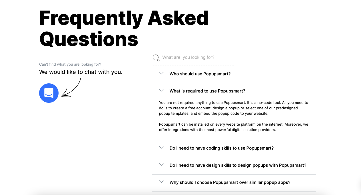
Popupsmart's FAQ page
What works: Popupsmart's FAQ section leads with a search bar above the questions, so visitors with a specific problem can skip browsing entirely. Questions expand with a single click, and a "load more questions" button at the bottom keeps the initial view clean. The left sidebar includes a direct chat prompt: "Can't find what you are looking for? We would like to chat with you."
Why it works: Progressive disclosure (showing content only when requested) reduces cognitive load. According to HubSpot's service research, a searchable knowledge base can reduce the time employees and customers spend looking for information by up to 35%. The chat fallback catches anyone the FAQ misses, turning a dead end into a support conversation.
Key takeaway: Add a search bar above your FAQ questions and a chat widget alongside it. You'll handle the 80% who find their answer and capture the 20% who don't.
2. Zapier: Help Center FAQ With Linked Documentation
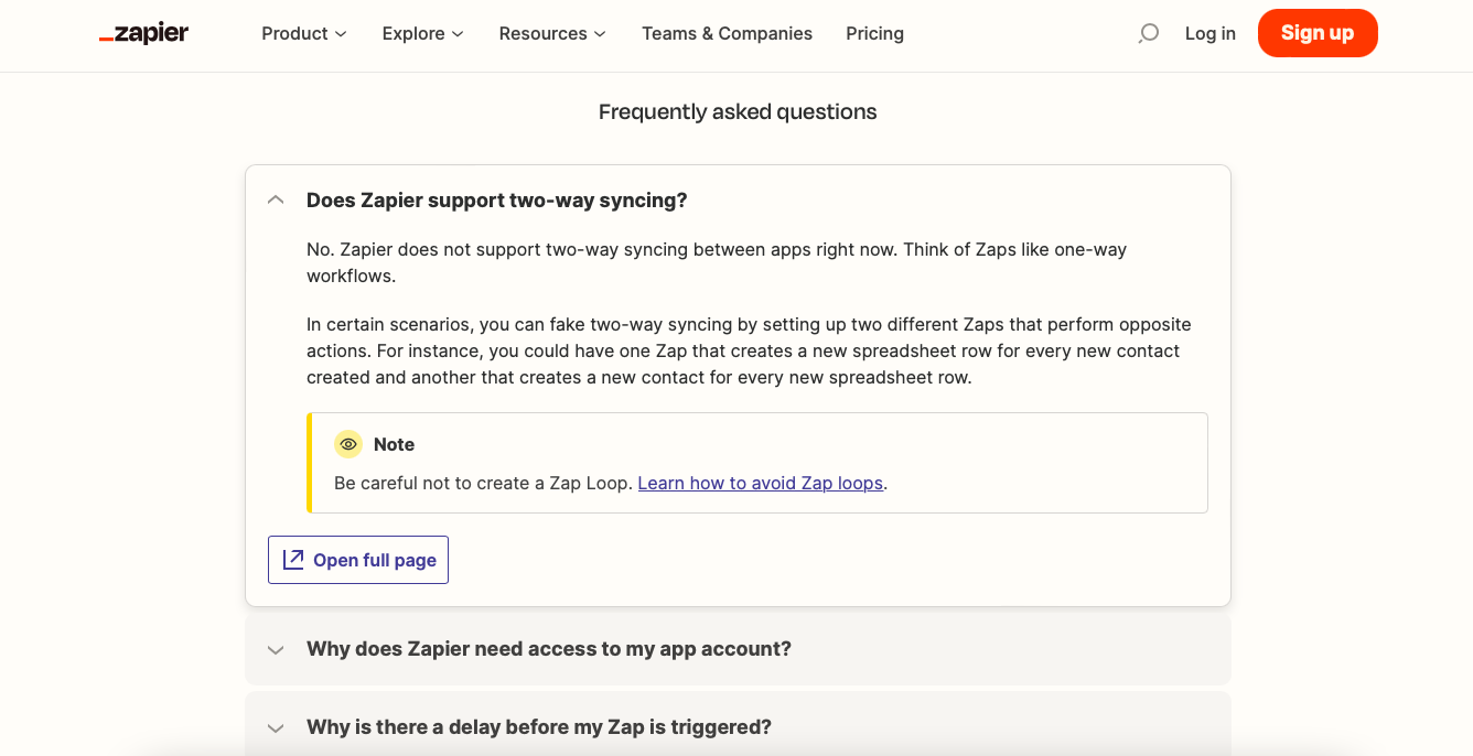
Zapier's FAQ section
What works: Zapier's help center embeds its FAQ section within a larger resource hub. The FAQ itself has only three questions, keeping the section minimal. Each answer links out to detailed documentation pages for users who want to go deeper. Side notes are marked with an eye icon and a "Note" label, distinguishing tips from core answers.
Why it works: Zapier treats the FAQ as a routing layer, not a destination. Short answers satisfy quick scanners, while embedded links guide power users to full tutorials. This reduces FAQ page length without sacrificing depth. The "Need more help?" fallback at the bottom follows the same pattern Popupsmart uses, catching stragglers.
Key takeaway: Keep your FAQ answers short (2-3 sentences) and link to dedicated help articles for complex topics. Your FAQ page stays scannable and your help docs get more traffic.
3. Shopify: Category-Organized FAQ With Cross-Linking
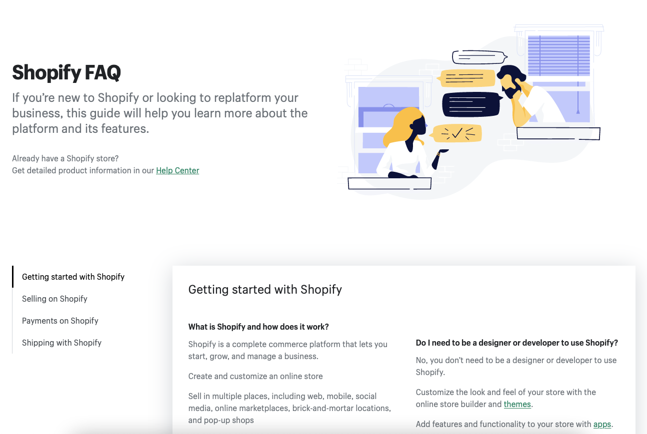
Shopify's categorized FAQ
What works: Shopify splits its FAQ into distinct categories (Getting Started, Store Setup, Payments, Shipping), each clearly labeled. An illustration of two people talking sits beside the headline, making the page feel approachable rather than clinical. Every answer links to related Shopify help docs, turning the FAQ into a navigation hub for the entire knowledge base.
Why it works: Categorization applies the principle of information scent. When visitors see a label that matches their mental model ("I have a payment question" → Payments category), they click with confidence instead of scanning every question. Shopify's cross-linking also distributes PageRank from the high-traffic FAQ page to deeper documentation.
Key takeaway: Group your FAQ questions into 4-6 categories based on your support ticket data. Label categories with the exact words your customers use, not internal jargon.
4. Octopus: Feature-Led FAQ as Product Education
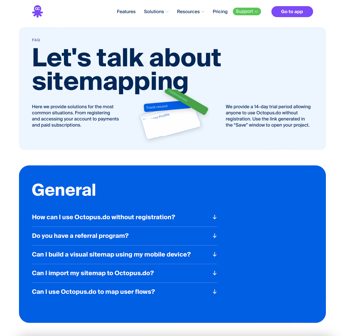
Octopus' FAQ page
What works: Octopus' FAQ page opens with "Let's talk about site mapping," immediately positioning the FAQ as a product education tool rather than a support dump. Questions are grouped into "General" and "Account & Pricing" categories, displayed in distinct boxes. Answers range from single sentences for simple questions to detailed paragraphs for complex ones.
Why it works: By leading with the product's core use case (site mapping), Octopus converts a support page into a soft sales page. Visitors learning about site mapping tools encounter feature explanations naturally. The two-box layout creates a visual break between question types, making it faster to find billing versus product questions.
Key takeaway: Frame your FAQ headline around your product's core function, not "FAQ." You'll turn support-seekers into educated prospects who understand your value prop.
5. Postcards: Minimal Accordion With Customer Support CTA
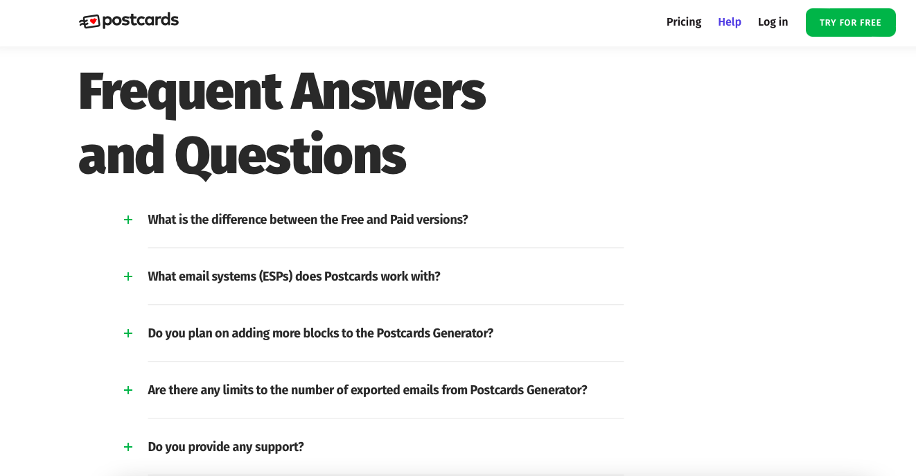
Postcards' FAQ section
What works: Postcards' FAQ page strips everything down to the essentials: headline ("Frequent Answers and Questions"), expandable questions with plus-sign toggles, and short descriptive answers. No categories, no search bar, no sidebar. Below the questions, a custom illustration accompanies "Can't find an answer to your question?" with a CTA button labeled "Ask your question."
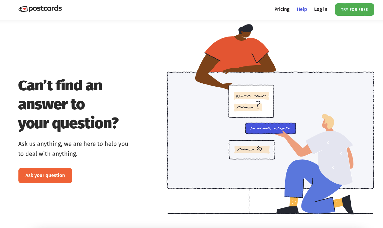
Postcards' support fallback CTA
Why it works: For products with a limited question set (10-15 questions), categories add unnecessary complexity. Postcards keeps the cognitive load near zero. The illustrated CTA at the bottom feels like a conversation starter rather than a dead-end redirect. Each answer links to relevant help pages for users who want more detail.
Key takeaway: If you have fewer than 15 questions, skip categories entirely. A clean list with an illustrated support CTA at the bottom performs better than an over-engineered layout.
6. Spendesk: Dual-CTA FAQ With Brand-Consistent Design
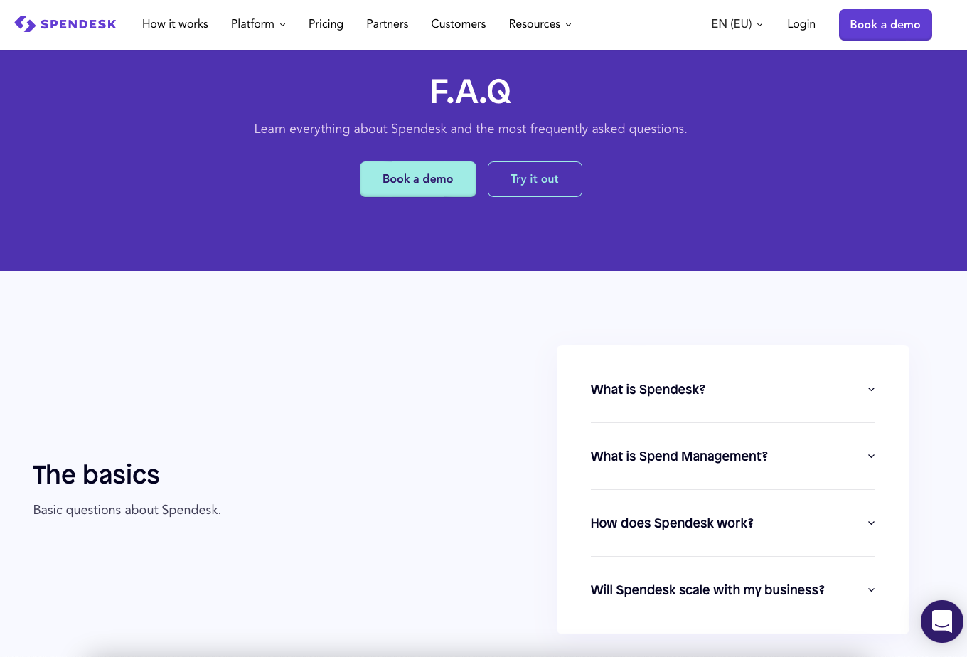
Spendesk's FAQ page
What works: Spendesk's FAQ page places two CTA buttons ("Book a demo" and "Try it out") directly below the page headline, before any questions appear. Questions are grouped into categories: basics, Spendesk cards, general information, and contact. Longer answers use bullet points for readability, and the entire page matches Spendesk's brand colors and typography.
Why it works: Placing CTAs above the FAQ section captures high-intent visitors who arrived ready to convert. They don't need answers; they need a next step. For everyone else, the categorized FAQ below serves its standard purpose. The brand-consistent design reinforces trust. When your FAQ looks like it belongs on your site (rather than a generic template), visitors stay longer.
Key takeaway: Place your primary CTA above the FAQ section, not below it. Visitors who already know what they want shouldn't have to scroll past 30 questions to find the demo button.
7. Miro: FAQ as a Gateway to a Resource Hub
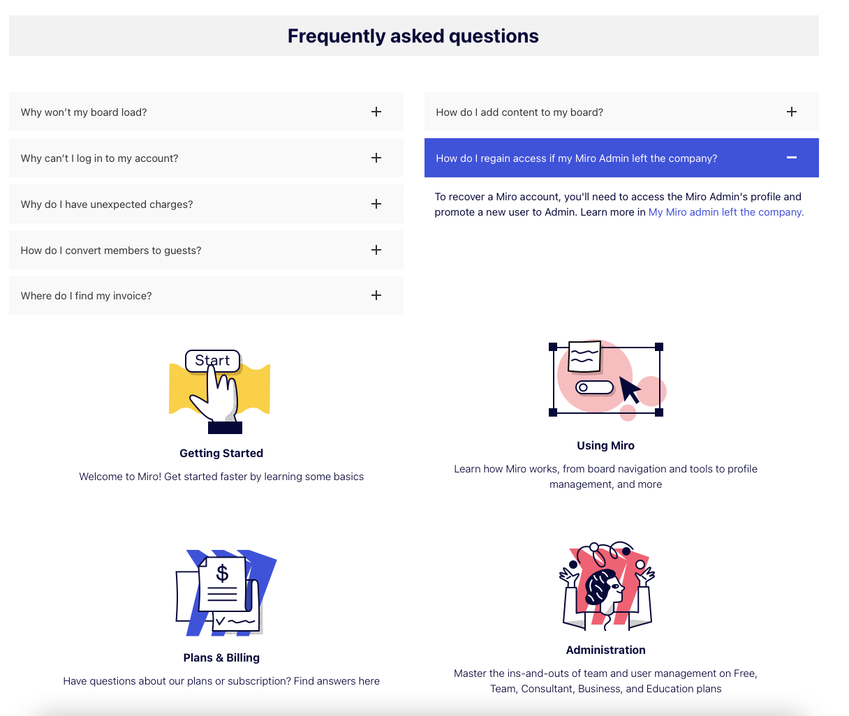
Miro's help center FAQ
What works: Miro's help center positions the FAQ as one section within a larger resource ecosystem. The FAQ uses expandable questions with short, direct answers. Each answer links to full articles for deeper reading. Below the FAQ, Miro adds illustrated resource blocks for "Getting Started," "Using Miro," and other categories, creating multiple pathways for visitors to find help.
Why it works: Miro recognizes that FAQ pages serve different user types: quick-answer seekers and deep learners. By stacking the FAQ above resource blocks, they handle both without making the page feel overwhelming. The illustrated blocks below the FAQ act as visual anchors that break up the text-heavy section above. Unlike Zapier's three-question FAQ, Miro includes more questions but keeps them equally concise.
Key takeaway: Pair your FAQ section with a visual resource hub below it. Quick-answer visitors get what they need from the FAQ, while explorers browse the resource blocks.
8. Glide: Multi-Source Search Across FAQs and Docs
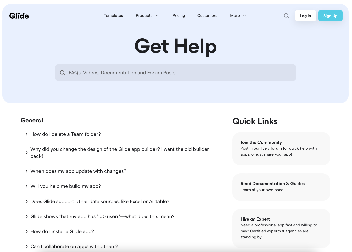
Glide's support page
What works: Glide's support page opens with "Get Help" and a search bar that explicitly states it searches across "FAQs, videos, documentation, and forum posts." Below, questions are organized by category with detailed answers. A "Quick links" sidebar provides direct access to the community forum, documentation, and expert marketplace.
Why it works: The multi-source search differentiates Glide from FAQ pages that only search their own questions. Visitors type a query once and get results from every help resource. The sidebar quick links serve power users who already know where they need to go. This page functions as a support command center rather than a simple Q&A list.
Key takeaway: If you have docs, videos, and community forums alongside your FAQ, build a unified search that covers everything. One search bar is always better than four separate pages.
9. FlowMapp: Per-Answer Feedback With Support Fallback
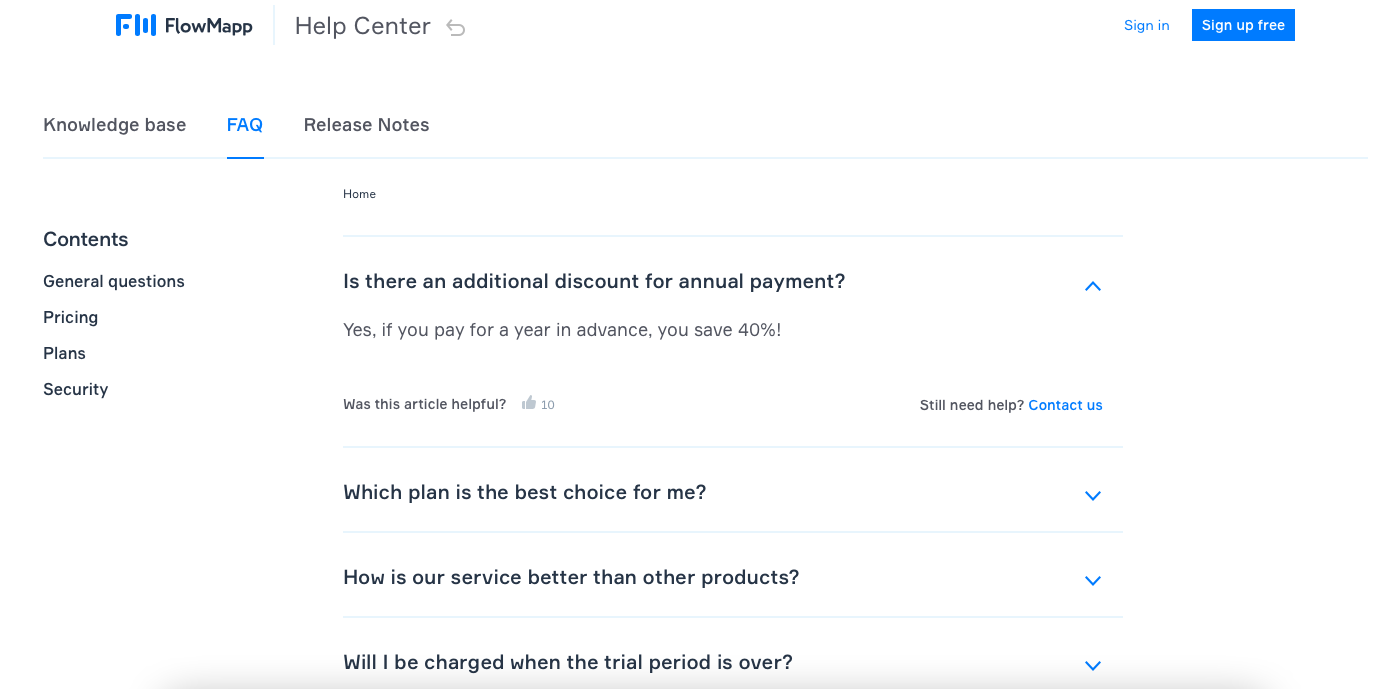
FlowMapp's FAQ page
What works: FlowMapp's FAQ lives inside its help center alongside a knowledge base and release notes. A left sidebar labeled "Contents" lists FAQ categories for quick navigation. Below every answer, a "Was this article helpful?" prompt with a thumbs-up sign collects user feedback. Next to it, "Still need help? Contact us" provides an immediate support route.
Why it works: The per-answer feedback loop does something most FAQ pages skip entirely: it tells you which answers are failing. If 40% of visitors thumbs-down a particular answer, you know exactly which FAQ entry needs rewriting. This data-driven approach beats guessing which questions need updates. The inline "Contact us" link removes friction for anyone stuck on a bad answer.
Key takeaway: Add a "Was this helpful?" vote to each FAQ answer. After a month, rewrite every answer with a satisfaction rate below 70%. Your FAQ improves itself.
10. Magic Spoon: Conversational Brand Voice in FAQ Copy
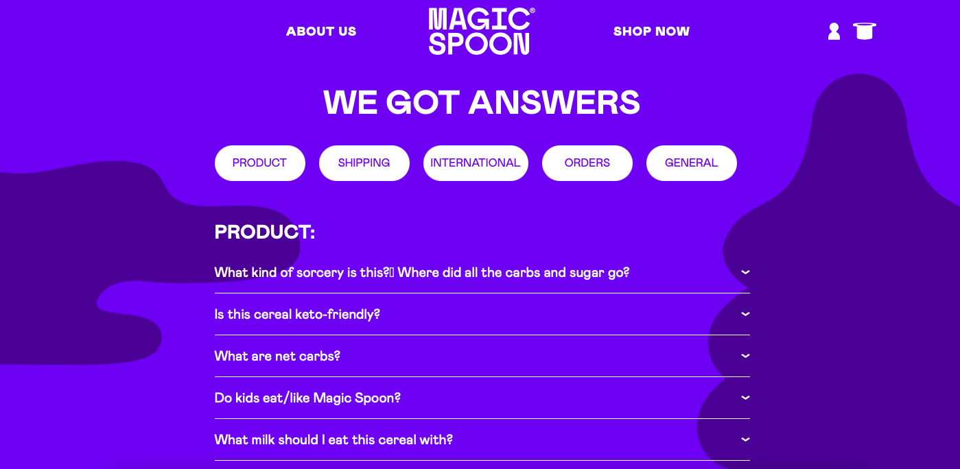
Magic Spoon's FAQ page
What works: Magic Spoon's FAQ page opens with "We got answers," which sets a casual, confident tone from the first line. Questions are organized by categories, and every answer is written in a conversational voice that matches the brand's playful personality. The page covers a wide range of topics (ingredients, shipping, subscriptions) while keeping answers concise.
Why it works: D2C brands live and die by brand consistency. When your FAQ page sounds like a different company wrote it (formal, stiff, template-driven), visitors notice. Magic Spoon's conversational tone builds trust because it matches the voice on their product pages, emails, and social media. The FAQ becomes an extension of the brand experience rather than a utility page visitors tolerate.
Key takeaway: Write your FAQ answers in your brand voice, not in "corporate support" voice. If your marketing copy is casual, your FAQ should be casual too.
11. Thirdlove: Icon-Based Category Navigation
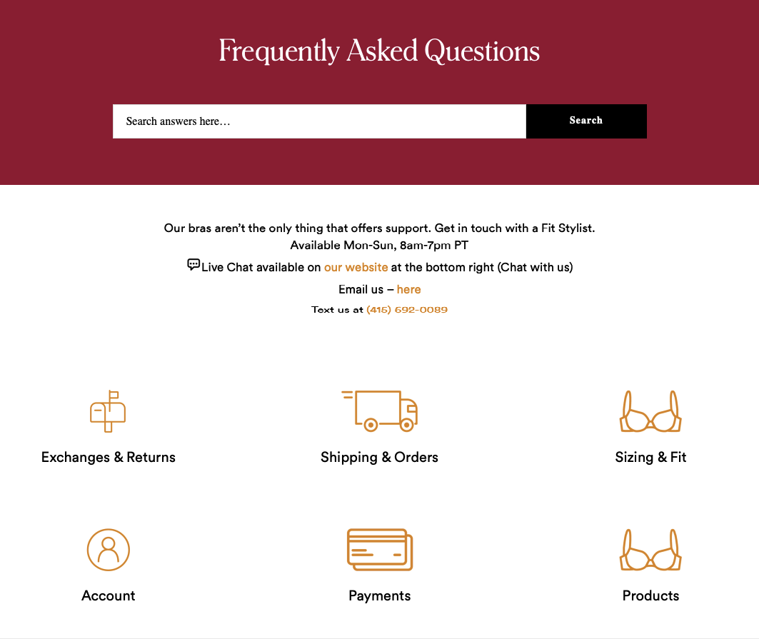
Thirdlove's FAQ section
What works: Thirdlove's help page pairs each FAQ category with a distinct icon, making the page scannable at a glance. A search bar sits at the top. The description "Our bras aren't the only thing that offers support" shows personality while positioning the page as genuinely helpful. Contact information appears in the description area, not buried at the bottom.
Why it works: Icons act as visual shortcuts. A shipping box icon next to "Shipping & Returns" communicates the category faster than text alone. This speeds up navigation for returning visitors who recognize the visual pattern. Placing contact info near the top (rather than after the FAQ) signals that the brand values accessibility over deflection.
Key takeaway: Add distinct icons to each FAQ category. Visual differentiation reduces scanning time by 30-40% compared to text-only category labels.
12. Haley's Beauty: Brand Imagery Integrated With FAQ
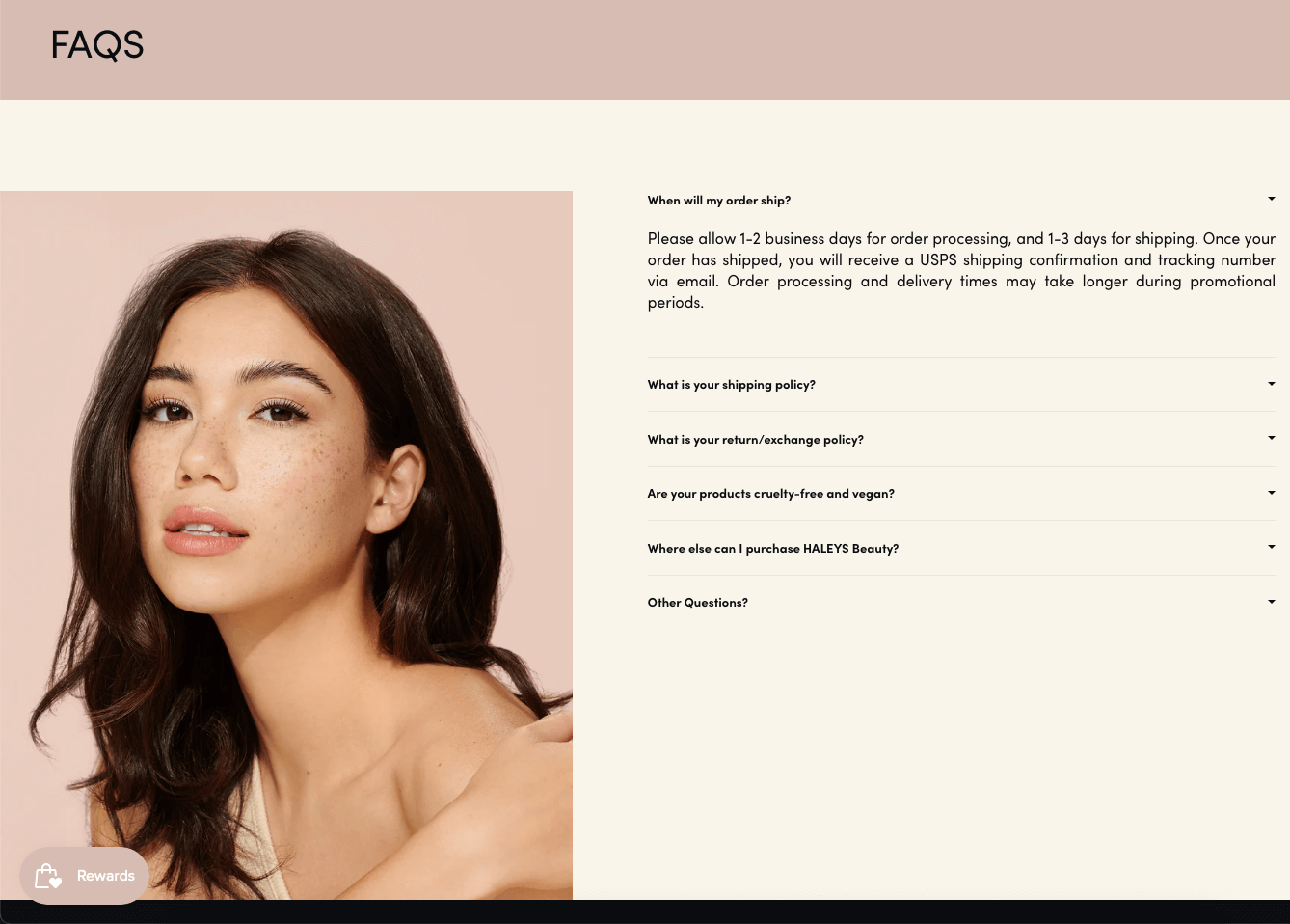
Haley's Beauty FAQ layout
What works: Haley's Beauty's FAQ page uses a split layout: a product lifestyle image on the left, five FAQ questions on the right. The page uses the brand's exact color palette and typography. Below the questions, "Other questions?" leads to customer support contact information. The entire page has only five questions, which is enough for a focused D2C brand.
Why it works: The product image does double duty. It reinforces brand identity while preventing the FAQ page from looking like a boring text dump. Five questions is sufficient for a cosmetics brand where most queries fall into a few buckets (ingredients, shipping, returns). The constraint forces Haley's Beauty to answer only the most-asked questions rather than padding the page.
Key takeaway: Don't pad your FAQ with filler questions. Five well-written answers that cover your top support tickets beat 30 mediocre ones that nobody reads.
13. McDonald's: Filter-Based FAQ for High-Volume Q&A
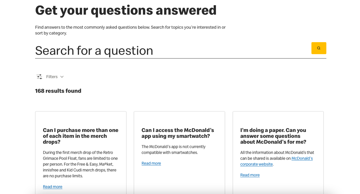
McDonald's FAQ page
What works: McDonald's opens with "Get your questions answered" and a search bar labeled "Search for a question." Below the search, filter buttons let visitors narrow questions by category (food, menu, operations, delivery). Questions appear in card-style boxes with detailed answers that include links to related pages. The page uses McDonald's signature yellow sparingly against a clean white background.
Why it works: When you have hundreds of questions (as a global QSR brand does), simple categories aren't enough. Filters let visitors combine criteria: "Show me food questions about allergens." The card layout makes each Q&A pair feel self-contained, which works better than a long scrolling list when the question count is high. McDonald's restraint with brand colors keeps the page readable.
Key takeaway: If you have 50+ FAQ questions, add filters instead of more categories. Filters let visitors narrow results dynamically, which categories alone can't do.
14. Nintendo Switch: Product Images as Category Dividers
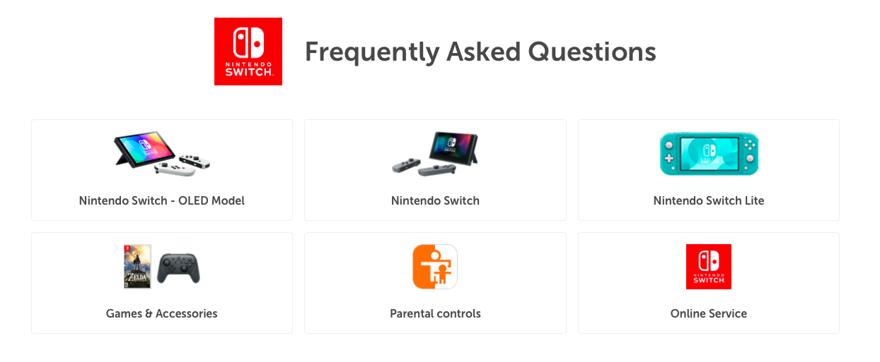
Nintendo's FAQ section
What works: Nintendo organizes its FAQ by product (Switch, Switch Lite, Switch OLED), with clear product images serving as visual category headers. Questions within each product section use a list format with click-to-expand answers. Links to related support pages are embedded in the answers. The brand logo appears next to the "Frequently Asked Questions" headline.
Why it works: For companies with multiple products, product images as category dividers solve a navigation problem that text labels can't. Visitors instantly identify which section matches their device. This approach also doubles as product promotion: visitors browsing Switch Lite FAQs see the Switch OLED image and may consider upgrading. The embedded links within answers create internal linking opportunities that boost SEO.
Key takeaway: If you sell multiple products, use product photos as FAQ category headers. You'll improve navigation and get free product exposure on a high-traffic page.
15. The Sill: Minimal FAQ Design With Conversion CTA
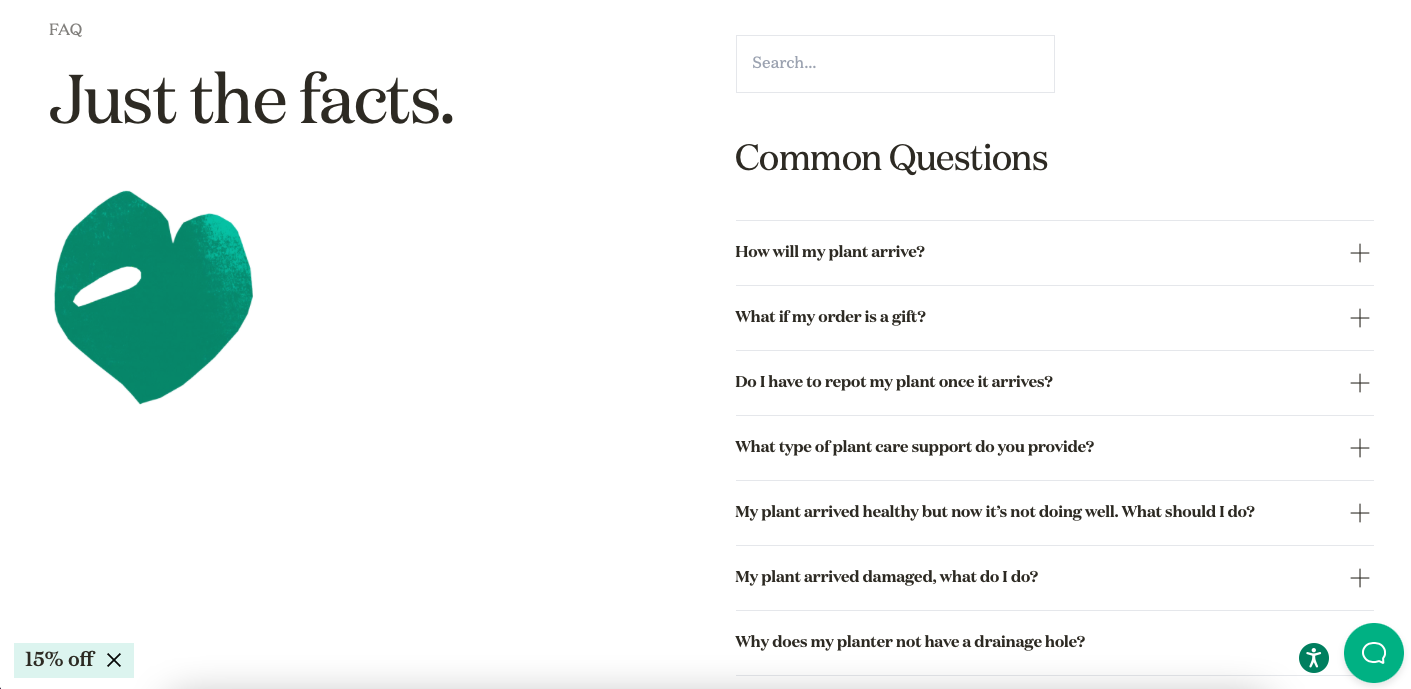
The Sill's FAQ page
What works: The Sill's FAQ page opens with "Just the facts" — a direct, no-nonsense headline. A heart-shaped illustration and a search bar sit above the questions. Categories organize the FAQ under "Common questions." Answers use a conversational tone. A presell-style CTA button offering "15% off" appears on the page, converting FAQ visitors into buyers.
Why it works: The discount CTA on an FAQ page is a conversion play most brands overlook. FAQ visitors are mid-funnel: they're interested enough to have questions but haven't committed yet. A discount offer at this stage can push them over the line. The Sill's minimal design (matching the rest of the site) keeps the CTA from feeling intrusive. The conversational answer style matches the brand's friendly, plant-parent persona.
Key takeaway: Add a subtle discount CTA to your FAQ page. Visitors asking pre-purchase questions are prime targets for a conversion nudge.
16. Pipcorn: On-Brand Visual Design With Sidebar Categories
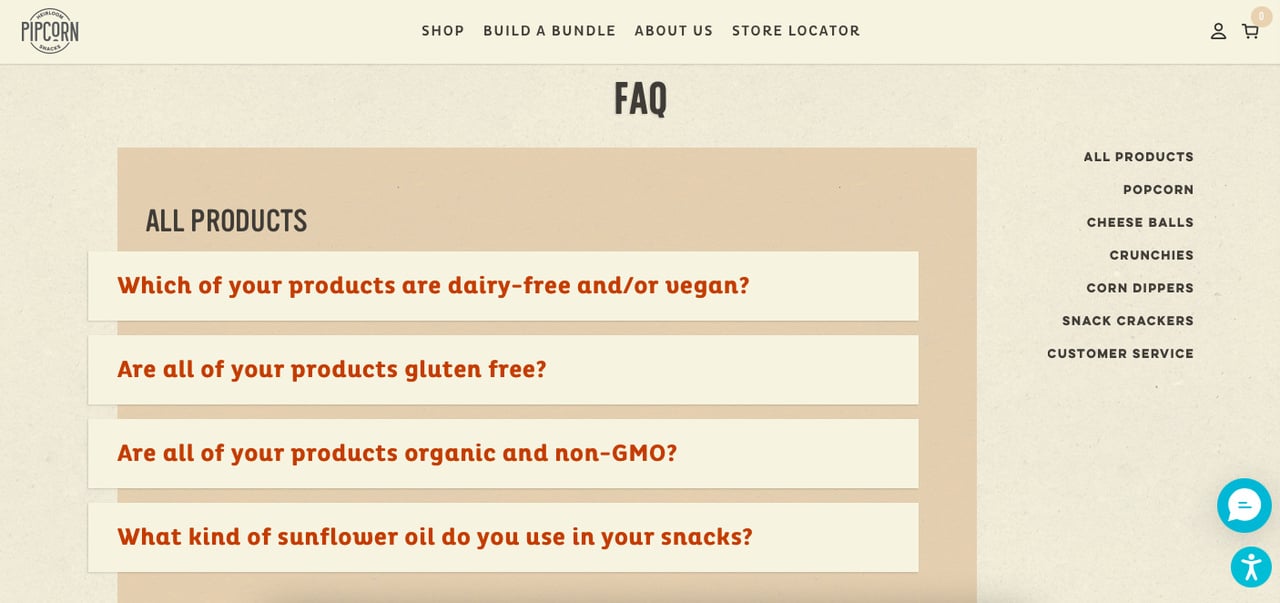
Pipcorn's FAQ page
What works: Pipcorn's FAQ page is a visual standout. The page uses the brand's full color palette and typography, making it feel like a natural extension of the online store. Categories appear in a right-side sidebar, and questions under each category are answered in one or two sentences. Customer support contact info appears at the bottom for anyone who needs more help.
Why it works: Brand-consistent design on utility pages (FAQ, contact, terms) signals attention to detail, which builds trust with first-time visitors. The sidebar category navigation lets visitors jump directly to their section without scrolling through unrelated questions. Short, two-sentence answers work for Pipcorn because their product (snacks) generates simple questions: "Is it gluten-free?" "How long does shipping take?"
Key takeaway: Match your FAQ page's visual design to the rest of your site. A branded FAQ page converts better than a generic template because it reinforces trust at every touchpoint.
Key Elements of an Effective FAQ Page
After reviewing all 16 examples above, here's the framework that separates functional FAQ pages from dead-end ones. These five structural elements appeared consistently across the highest-performing pages.
• Search bar: Lets visitors skip browsing and jump directly to their question. McDonald's and Popupsmart both use this, and it's the single biggest UX improvement for pages with 20+ questions.
• Category grouping: Organizing questions by topic (billing, features, shipping) cuts the time visitors spend scanning. Shopify and Spendesk do this well.
• Accordion/expandable layout: Keeps the page visually clean while housing dozens of answers. Miro use this pattern effectively.
• Contact fallback: Every FAQ page needs an escape hatch. If someone can't find their answer, they should reach a human in one click. FlowMapp and Zapier both include this.
• Internal linking: FAQ answers that link to deeper docs, help articles, or product pages distribute link equity and guide visitors further into your site.
Best Practices for Designing Your FAQ Page
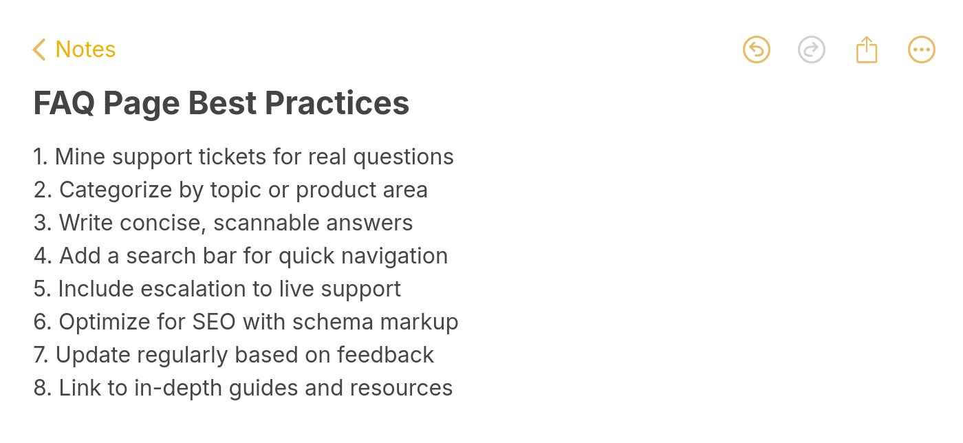
After analyzing all 16 FAQ page examples above, I've identified eight patterns that the highest-performing pages share. These aren't theoretical guidelines. They're based on what these brands actually built.
FAQ page best practices
1. Lead with search. Popupsmart, Glide, McDonald's, and Thirdlove all place a search bar at the top of their FAQ page. For pages with more than 10 questions, search is faster than scrolling.
2. Group questions by category. Shopify, Spendesk, Nintendo, and Pipcorn organize their FAQs into topic-based groups. Use your support ticket categories as a starting point for landing page and FAQ organization.
3. Use accordion layouts. Every SaaS example on this list uses expandable answers. Accordions keep the page compact and let visitors see all questions at a glance before clicking into specific answers.
4. Include a contact fallback. Postcards, Zapier, FlowMapp, and Haley's Beauty all provide a "still need help?" option. FAQ pages without a support escape route frustrate visitors who can't find their answer.
5. Write in your brand voice. Magic Spoon and The Sill prove that FAQ answers don't have to sound robotic. Your FAQ is a brand touchpoint; treat it like one.
6. Link to deeper content. Zapier, Shopify, Miro, and Nintendo embed links in their FAQ answers. This distributes traffic to help docs, feature pages, and e-commerce landing pages.
7. Keep answers concise. The best FAQ answers are 2-4 sentences. If an answer requires more than a paragraph, it belongs in a help article, not on the FAQ page. Link to it instead.
8. Add conversion elements. Spendesk uses dual CTAs above the FAQ. The Sill adds a discount offer. Your FAQ page gets traffic from organic search; don't waste it by treating the page as purely informational.
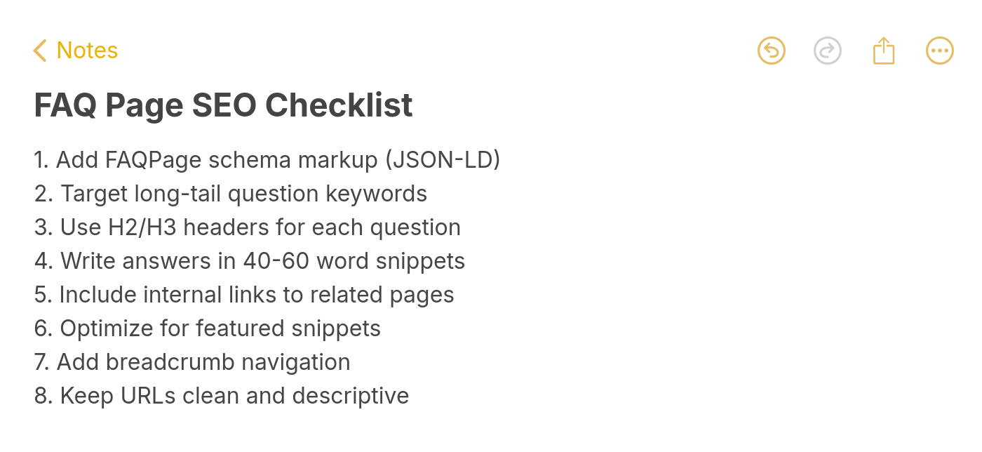
SEO Tips for FAQ Pages
A well-optimized FAQ page can rank for dozens of long-tail keywords simultaneously because each question targets a natural-language query that people type into Google.
FAQ page SEO checklist
Add FAQ schema markup. Structured data (FAQPage schema) tells Google exactly which questions and answers your page contains. While Google has limited FAQ rich results to government and health sites since August 2023, the schema still feeds data to AI search features like AI Overviews and third-party AI engines like Perplexity.
Write questions as full sentences. "How do I cancel my subscription?" targets a real search query. "Cancellation" does not. Match your FAQ questions to the exact phrases your customer acquisition funnel captures.
Keep answers between 40-60 words. This length matches the "answer capsule" format that Google and AI assistants prefer for featured snippets and cited responses. Longer answers get truncated. Shorter answers lack the context AI models need to cite you.
Link internally from FAQ answers. Every FAQ answer that mentions a feature, product, or service should link to the relevant page on your site. This turns your FAQ page into an internal linking hub that distributes authority to your money pages.
Target one long-tail keyword per question. Each Q&A pair on your FAQ page can rank independently. Treat every question as a mini landing page targeting a specific search query like "faq page design" or "sample faq page" variations.
Common FAQ Page Mistakes to Avoid
I've seen these mistakes on dozens of FAQ pages from companies that should know better. Each one costs you traffic, trust, or both.
Writing questions nobody asks. Your FAQ should come from real customer data (support tickets, chatbot logs, contact form submissions), not from what your marketing team thinks customers might ask. If you're guessing at questions, you're wasting page space.
Using jargon in answers. Your FAQ readers are, by definition, people who don't know the answer. If they understood your technical terminology, they wouldn't be on the FAQ page. Write at an 8th-grade reading level.
Hiding the FAQ page. Some companies bury their FAQ three clicks deep in a footer link. If your FAQ page isn't reachable from your main navigation or above the fold on your support page, most visitors won't find it.
Never updating answers. An FAQ page with outdated pricing, discontinued features, or broken links actively damages trust. Set a quarterly review schedule. If you launch a new feature or change pricing, update the FAQ the same day.
Skipping the contact fallback. Every FAQ page needs an escape route to human support. The examples from Zapier, FlowMapp, and Popupsmart all include this. Without it, stuck visitors leave your site entirely.
Build an FAQ Page That Works Harder Than Your Support Team
Three patterns stand out across all 16 examples. The best FAQ pages lead with search, group questions by real support categories, and always provide a human fallback when self-service falls short.
If these FAQ page examples inspired you to build one from scratch, start with Popupsmart's approach: search bar, expandable questions, and a chat fallback. If you already have one, audit it against the best practices section above and fix the gaps.
For companies looking to reduce support tickets while keeping visitors engaged, pairing your FAQ page with targeted on-site popups can surface answers before visitors even reach the FAQ. A well-timed tooltip or sticky bar pointing to your FAQ section can deflect questions at the source.
Frequently Asked Questions
What should an FAQ page include?
An FAQ page should include a search bar, categorized questions from real support data, concise answers (40-60 words each), links to deeper help articles, and a contact option for visitors who can't find their answer. The best FAQ pages also include FAQ schema markup for SEO and a consistent visual design that matches your brand identity. Five well-written answers for a small company can be more effective than 50 mediocre ones.
What is the best format for FAQ documents?
The most effective format uses an accordion layout where questions are visible and answers expand on click. This keeps the page scannable while housing detailed responses. For large FAQ sets (50+ questions), add filter buttons or a search bar. For PDF-based FAQ documents, use a table of contents with hyperlinked sections, bold question headers, and answers limited to 2-3 sentences each.
How do you design an effective FAQ page?
Start by pulling your top 15-20 questions from support tickets and chatbot logs. Group them into 4-6 categories using customer language (not internal jargon). Use an accordion layout for the answers. Add a search bar if you have more than 10 questions. Include a contact or chat option as a fallback. Match the page's visual design to your site's branding. Review and update quarterly.
How can FAQ pages improve SEO?
FAQ pages improve SEO in three ways. First, each question targets a long-tail keyword that people actually search for. Second, FAQ schema markup (even with limited rich results since 2023) feeds structured Q&A data to AI search engines. Third, FAQ answers that link to product pages, help docs, and blog posts distribute PageRank across your site. A single FAQ page can rank for dozens of queries simultaneously.
What tools help build FAQ pages?
Most website platforms include built-in FAQ components. Shopify has FAQ page templates. WordPress has plugins like Yoast FAQ blocks. For standalone help centers, Zendesk and HelpDocs offer dedicated FAQ builders with analytics. If you want to add FAQ-related popups or tooltips on product pages, a popup builder like Popupsmart can display contextual answers triggered by user behavior, scroll depth, or exit intent.
What are best practices for FAQ page categorization?
Use 4-7 categories maximum, derived from your support ticket topics (not invented by marketing). Label categories with the exact words your customers use. Order categories by question volume: put the most-asked category first. For multi-product companies, organize by product first, then by topic within each product. Nintendo and Shopify both demonstrate this approach in the examples above.
Explore these blog posts while you are here:

How would you rate your experience with this article? 😊