15 Hello Bar Examples That Drive Conversions in 2026
A hello bar is a sticky top/bottom webpage banner used to promote offers, updates, lead magnets, or content without blocking UX; examples show tactics like urgency, free shipping, social proof, and scarcity, plus steps to build one in Popupsmart.
Hello bars, or "floating banners", can boost your website's conversions by engaging both new and returning visitors.
They're used to share updates, promote campaigns, or offer lead magnets.
Hello bar examples are slim, sticky banners pinned to the top or bottom of a website that announce offers, capture emails, or drive a single click without blocking content. The 15 examples below — pulled from brands like Prose, Warby Parker, Nordstrom, and Bombas — show what actually moves conversions in 2026.
What is a hello bar?
A hello bar is a thin, persistent banner pinned to the top or bottom of a webpage that stays visible while a visitor scrolls. Some teams call it a sticky bar, a floating bar, or an announcement bar. They all describe the same UI pattern: one row of copy, usually one button, never blocking the page underneath.
I've shipped hello bars across dozens of stores at Popupsmart, and the format wins for one reason. It earns attention without taking it. A modal popup interrupts. A hello bar coexists with whatever the visitor came to do, then nudges them toward a side action — newsletter signup, free shipping callout, sale countdown, new feature alert.
The shape is constrained on purpose. You get roughly 6 to 12 words of copy and one CTA. That forces clarity. It also makes hello bars one of the easiest formats to A/B test, because there's almost nothing on the page to confound the result. For more on the underlying UI pattern, our floating bar definition walks through the variants.
Why hello bars convert in 2026
Hello bars survive because they ride the same scroll surface as your nav. They're always in the peripheral vision, never blocking, and dismissible with one tap. That UX trade — visibility without friction — is why the format keeps showing up in conversion benchmarks.
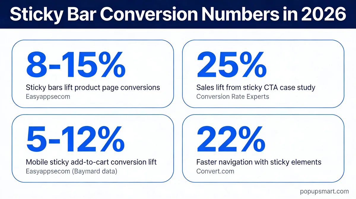
Sticky bar conversion benchmarks for 2026.
The numbers back this up. According to EasyApps, sticky add-to-cart bars lift conversion rates by 8 to 15 percent on long product pages because the buy button never disappears as users scroll. On mobile specifically, Baymard Institute usability research ties a sticky add-to-cart bar to a 5 to 12 percent mobile conversion lift.
The lift isn't only on commerce pages. According to Convert.com, sticky menus are 22 percent quicker to navigate, which translates to lower task friction across the full session. And in a controlled test, Conversion Rate Experts reported a 25 percent sales lift from a sticky CTA in a complex market.
One caveat I've watched play out: not every sticky element wins. Per a Medium teardown by Thomas Daamen, sticky elements can sometimes hurt conversion when they crowd the primary CTA or get dismissed defensively. Test it. Don't assume the lift.
15 hello bar examples that drive conversions
I picked these 15 across DTC, SaaS, media, and template businesses. Each one shows a distinct pattern — personalization, urgency, free shipping, content promotion, scarcity, social proof, and a few hybrids. The order roughly tracks how often I see each pattern in the wild, starting with personalization (the rarest, most under-used) and finishing with brand-storytelling bars (the most niche).
1. Prose: personalization opt-in
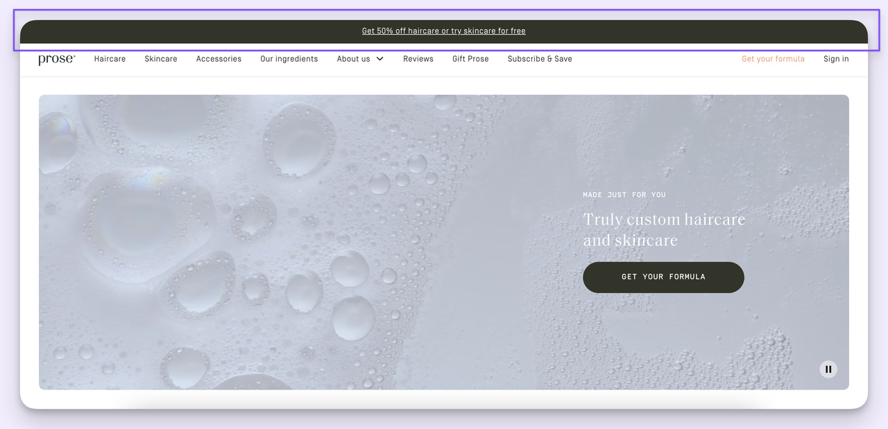
Prose: "Get 50% off haircare or try skincare for free."
What works: Prose runs a hello bar with two parallel offers stacked into one line — 50 percent off haircare, free skincare trial. The structure forces a self-segmentation moment. A haircare shopper sees the discount; a skincare-curious visitor sees the trial. One bar, two intents, no extra real estate.
Why it works: Personalization without a quiz. The bar lets the visitor pick the path that matches their intent before they even land on a category page. That's the same psychological move as a welcome quiz, compressed into 12 words. According to stickyctas.com, one test of a sticky CTA on mobile PDPs reported a 10 percent overall conversion rate lift with a 3 percent drop in bounce rate — bars that signal "we have something for you" hold attention longer.
Key takeaway: If you sell two product lines that attract different buyers, write one hello bar with two offers. Skip the quiz. The self-segmentation happens in the click.
2. Warby Parker: appointment booking with urgency
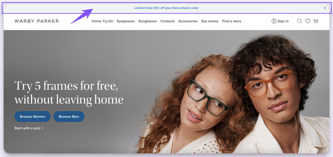
Warby Parker: "Limited time! 25% off your first contacts order."
What works: Two-word urgency cue, then a specific number, then a tightly scoped offer. "Limited time!" is the trigger. "25% off" is the magnitude. "Your first contacts order" narrows the eligibility to net-new contact buyers — a high-margin acquisition cohort for Warby Parker. No fuzziness about who the bar is for.
Why it works: First-purchase discounts tied to a specific category beat sitewide percentage offers. They protect margin on existing customers and pull a clearly defined new-buyer segment over the line. The urgency cue is doing a lot of lifting too — without "Limited time!" the same offer feels evergreen and gets ignored.
Key takeaway: Tie your discount to a category and a customer state, not to "everything sitewide." A 25 percent first-order offer outperforms 15 percent off everything because it forces the right person to act now.
3. Taika: brand announcement
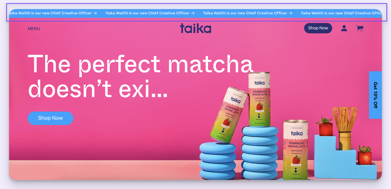
Taika: "Taika Waititi is our new Chief Creative Officer."
What works: Most hello bars sell. Taika's bar narrates. Announcing Taika Waititi as Chief Creative Officer pulls double duty — it's an earned-media moment for press pickup, and it's a personality signal for the kind of buyer who cares about who's behind the brand. No CTA button. The bar itself is the message.
Why it works: Hello bars don't have to be transactional. When a brand has a story worth telling — a hire, a milestone, a partnership — the bar becomes a free press release surface. Visitors who already trust the brand absorb the signal; visitors who don't recognize the name still register that something noteworthy happened.
Key takeaway: Reserve one hello bar slot per quarter for brand storytelling, not promotion. A hire announcement, a milestone, or a partnership keeps the bar from feeling like a pop-up store window.
4. Nordstrom: free shipping with location targeting
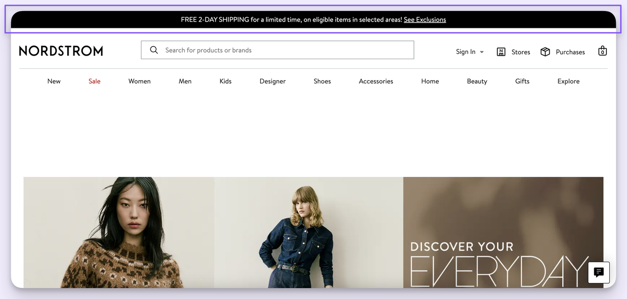
Nordstrom: "FREE 2-DAY SHIPPING for a limited time, on eligible items in selected areas."
What works: Nordstrom's bar layers three signals in one line — free shipping, speed (2-day), and a soft scarcity cue ("limited time"). The "selected areas" language is what gives the team room to geo-target without breaking the offer for shoppers outside the eligible zone.
Why it works: Shipping cost is the leading abandonment trigger at checkout. Surfacing "free 2-day" before the cart removes that mental objection up front. Visitors price the order in their head with shipping already at zero. By the time they hit checkout, the number matches their expectation and friction drops.
Key takeaway: If you offer conditional free shipping (over a threshold, in certain regions, on certain SKUs), put the conditions in the bar but lead with the word "FREE." Eligibility details land in the visitor's head; the headline word does the conversion work.
5. Bombas: free shipping threshold
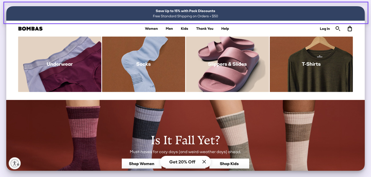
Bombas: "Save Up to 15% with Pack Discounts. Free Standard Shipping on Orders $50+."
What works: Two offers, one bar. Bombas pairs a pack discount (sells more units per order) with a free shipping threshold (forces basket size up to $50). Each offer pulls in the opposite direction — the discount lowers per-unit price, the threshold raises basket value — and the net result is higher AOV without nuking margin.
Why it works: The free-shipping threshold is one of the oldest tricks in DTC and it still works because shoppers anchor on shipping cost more than total cost. According to a SaveMyCent shopper study, 73 percent of shoppers decide to purchase if the order qualifies for free shipping. Pair that with a pack incentive and the bar turns into a basket-building machine.
Here's a free shipping bar I built in Popupsmart — same pattern, different brand:
A free shipping banner template configurable in the Popupsmart builder.
Key takeaway: If you can only run one hello bar, run a free shipping threshold tied to your AOV target. Set the threshold 10–15 percent above your current average order value and watch basket size climb.
6. Taylor Stitch: first-purchase discount with brand voice
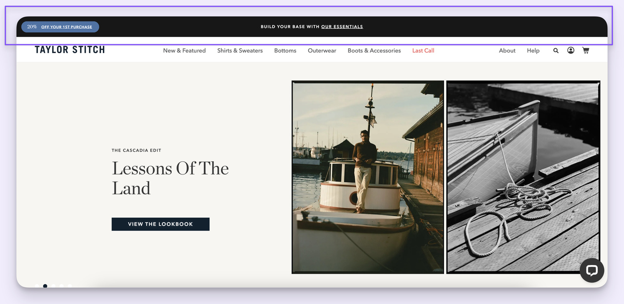
Taylor Stitch: "20% OFF YOUR 1ST PURCHASE. BUILD YOUR BASE WITH OUR ESSENTIALS."
What works: The discount headline pulls the click. The second line — "build your base with our essentials" — is a merchandising move disguised as copy. It tells first-time buyers what to start with, which reduces the analysis paralysis a new visitor feels on a 200-SKU catalog.
Why it works: Most first-purchase bars stop at the discount. Taylor Stitch adds a category nudge in the same breath, which steers traffic toward the line they want net-new buyers to start with (and presumably the line that has the strongest reorder rates). It's a discount and a recommendation in one bar.
Key takeaway: Pair your first-purchase discount with a starting-point recommendation. "20% off your first order — start with [hero product line]" converts and merchandises in one move.
7. Allbirds: discount plus sustainability brand cue
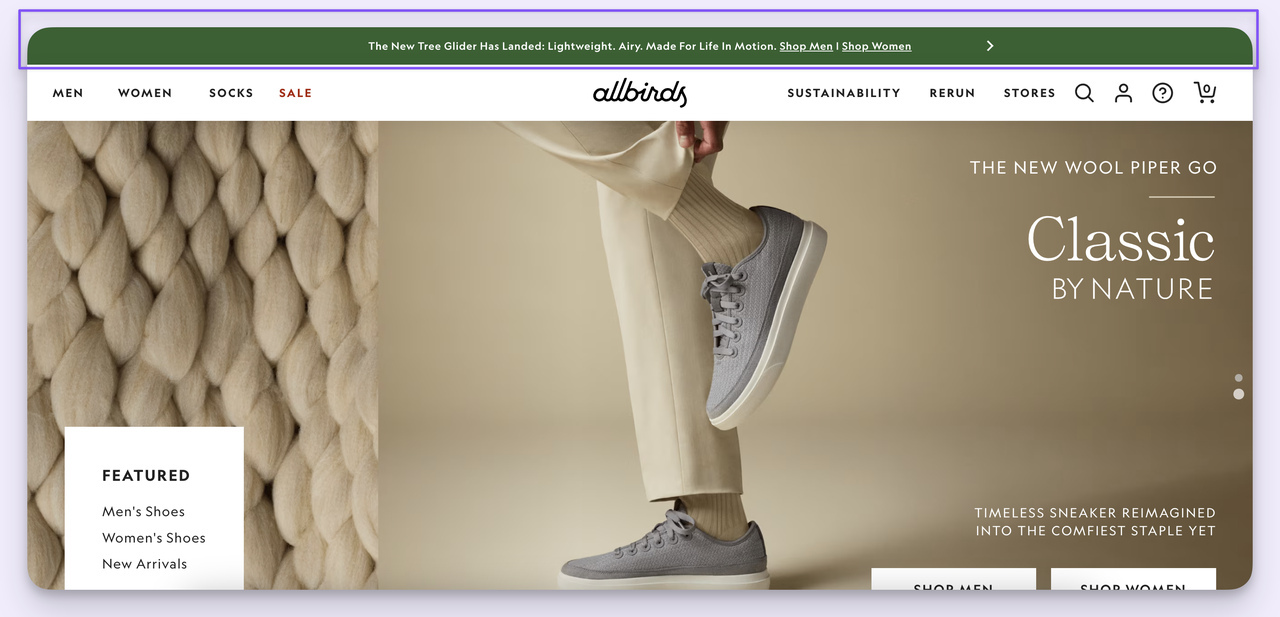
Allbirds: "20% OFF YOUR 1ST PURCHASE." with sustainability framing in the secondary copy.
What works: On the surface, Allbirds runs a familiar first-purchase discount. The interesting part is what they don't do — there's no countdown, no "ends today," no flash-sale theatrics. The bar reads calm. That tonal restraint matches the brand's positioning around sustainability and quietly attracts the buyer who'd be turned off by aggressive scarcity.
Why it works: Tone is targeting. A loud, urgent bar pulls a deal-hunter cohort. A calm, brand-led bar pulls a values-aligned cohort. Both convert; they just convert different people. Allbirds picks the cohort that matches their margin model.
Key takeaway: Match the energy of your hello bar to the buyer you want to attract. If your unit economics depend on full-price loyalists, dial down the urgency cues even when you're running a discount.
8. Ubersuggest: SaaS feature announcement
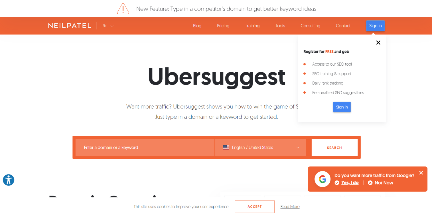
Ubersuggest: "New Feature: Type in a competitor's domain to get better keyword ideas."
What works: The bar tells the user what the new feature is and what to do with it in the same line. There's no "Learn more" abstraction — the instruction is the offer. Drop in a competitor domain, get keyword ideas. That's a one-step value prop, not a marketing promise.
Why it works: SaaS feature launches usually die in the changelog. A hello bar surfaces the feature on every logged-in page, so users encounter it in context — not as a marketing email they'll ignore. The exclamation icon in the design works as a visual anchor without being a banner ad.
Key takeaway: For SaaS feature launches, write the bar as an instruction, not an announcement. "Try [feature]: do [action] to get [outcome]" beats "We just launched [feature name]." Users want the action, not the press release.
9. Envira Gallery: countdown timer flash sale
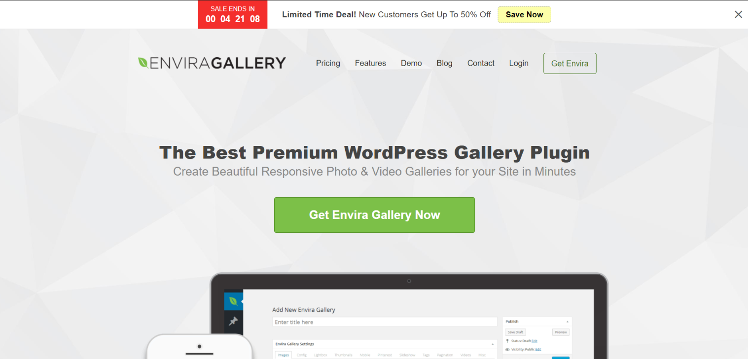
Envira Gallery: "Limited Time Deal! New Customers Get Up To 50% Off, Save Now" with live countdown.
What works: A live countdown ticking down in the bar is the strongest scarcity cue you can put on a page that isn't a checkout. Envira pairs it with a new-customer eligibility filter so existing users don't get fatigued by the same flash sale every visit. Two design choices, both deliberate.
Why it works: Countdowns work because they convert an abstract deadline ("limited time") into a visible, depleting resource. Visitors process the running clock as loss in real time. The new-customer scoping is the polish — it keeps the offer fresh for the audience who hasn't already converted, instead of nuking the whole list every Friday.
Key takeaway: If you run flash sales, put a live countdown in the bar instead of a static "ends today" text. Then scope the offer to a buyer state (new visitor, returning non-buyer) so it doesn't burn out for the rest of your audience.
10. Search Engine Journal: trending content promotion
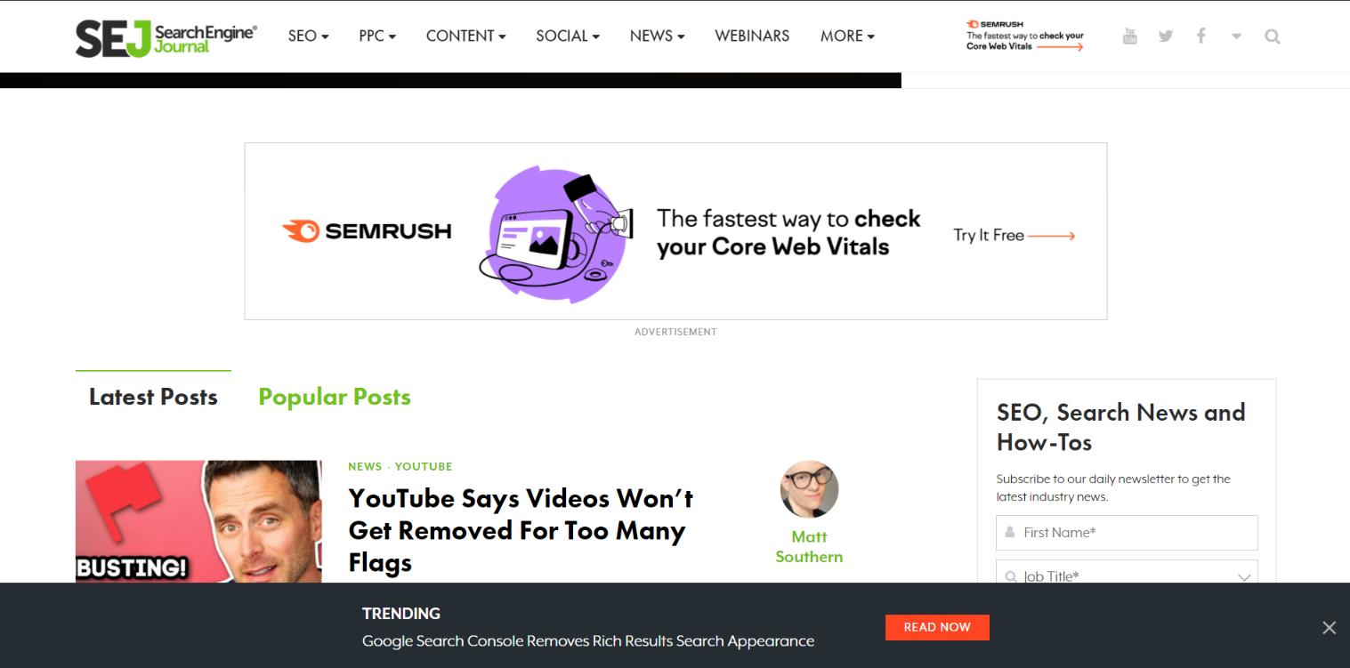
Search Engine Journal: "Trending: Google Search Console Removes Rich Results Search Appearance. Read Now."
What works: A media site uses the bar to promote a single trending article. The word "Trending:" works as social proof — it implies other readers are already reading this. Then the headline gives the actual story. CTA is a two-word "Read Now."
Why it works: For content sites, the hello bar is essentially a featured-post slot above the fold on every page. It's a way to push pageviews on the article that's already winning, instead of hoping people stumble into it via the homepage feed. Same logic the homepage editor uses, applied to every page.
Key takeaway: Publishers: rotate your hello bar weekly to feature the article with the highest current pageview velocity. The bar acts as a second editorial slot that compounds the post that's already trending.
11. Elegant Themes: free trial conversion bar
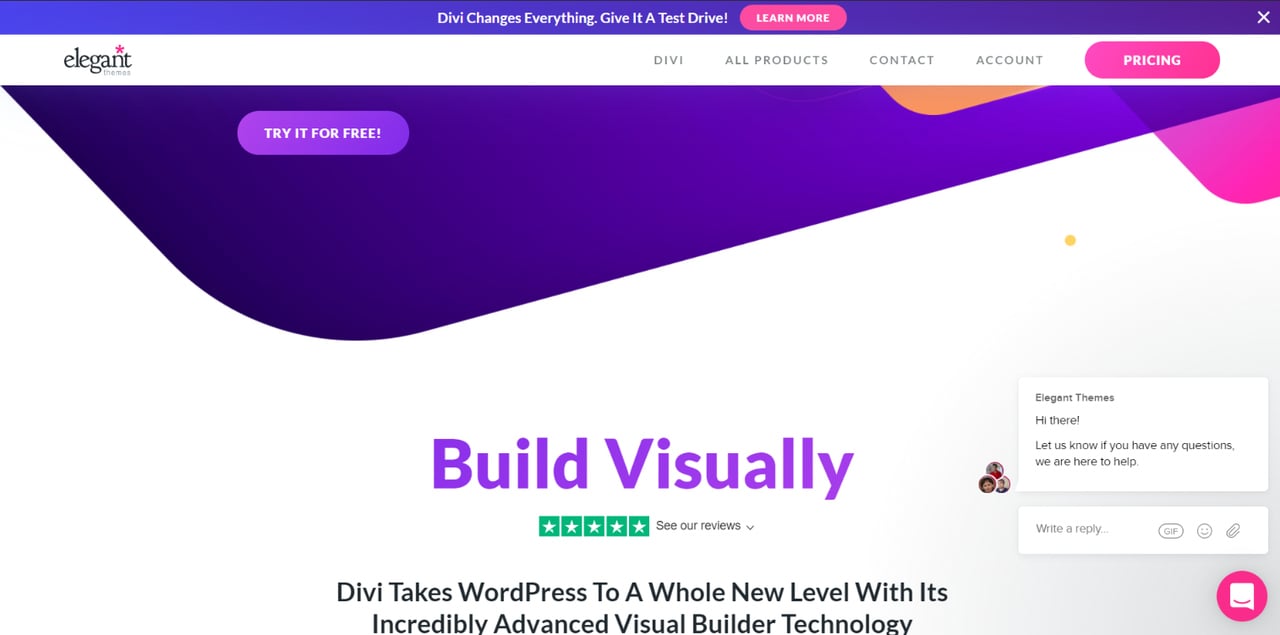
Elegant Themes: "Divi Changes Everything. Give It A Test Drive! Learn More."
What works: The bar leads with a product claim ("Divi Changes Everything") and follows with the lowest-friction next action — a test drive, not a purchase. The two-step framing lets a cold visitor convert into a trial without the price-tag flinch.
Why it works: SaaS and template businesses live and die on trial-to-paid conversion. The hello bar is one of the few surfaces where you can pitch the trial without competing with the rest of the page's calls to action. According to NextAfter, adding a testimonial to a sticky bar drove an 11.9 percent increase in free trial starts at a 98 percent confidence level — proof that this surface moves the trial number when the copy is right.
Key takeaway: If you sell software or templates, your hello bar should sell the trial, not the product. "Try it free" outperforms "Buy now" on cold traffic because it drops the asking price to zero in the visitor's head.
12. Goodfair: social proof stack with guarantee
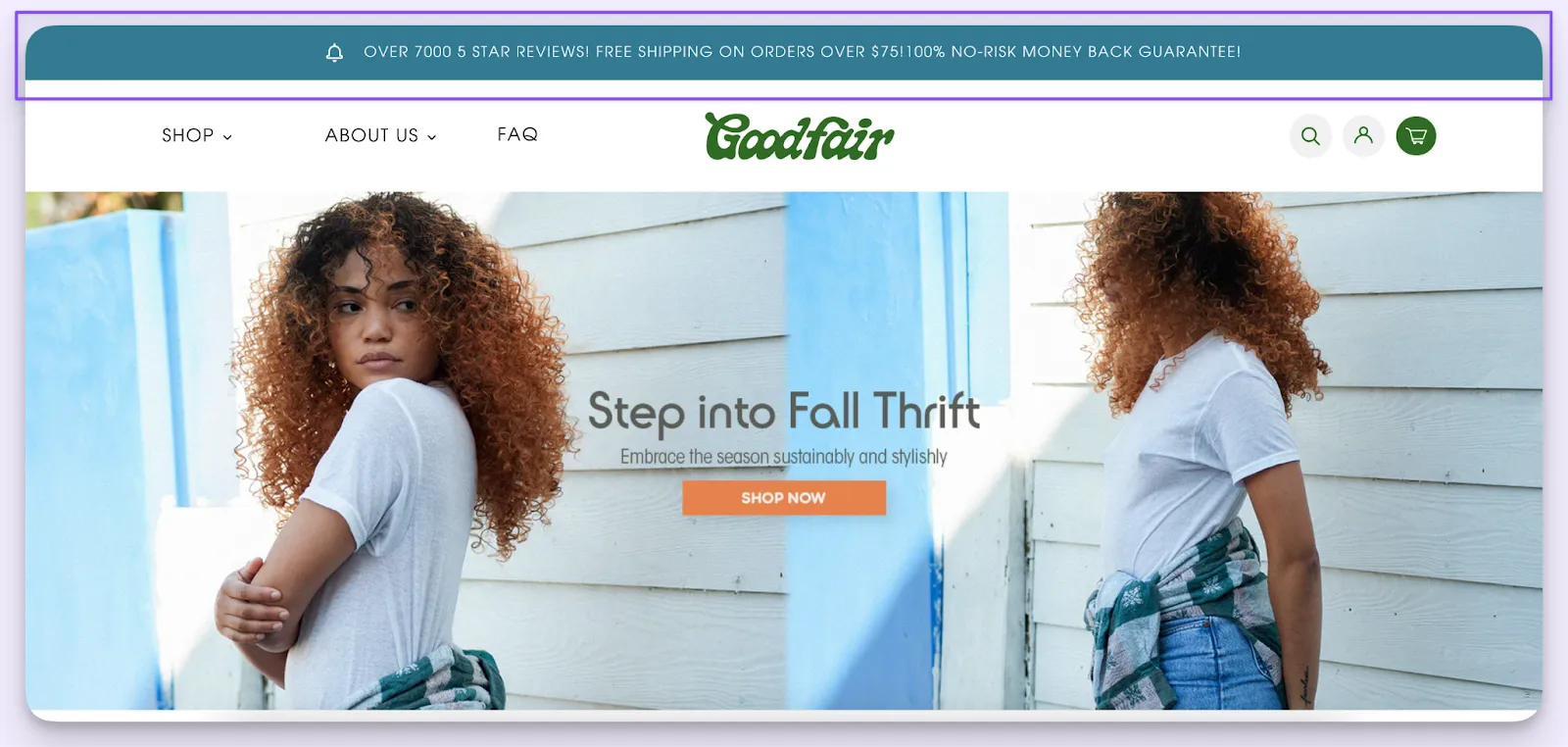
Goodfair: "OVER 7000 5 STAR REVIEWS! FREE SHIPPING ON ORDERS OVER $75! 100% NO-RISK MONEY BACK GUARANTEE."
What works: Three trust cues stacked into one bar — review count, free shipping threshold, money-back guarantee. The all-caps treatment looks loud on paper, but in context it reads as a guarantee strip you'd see on a checkout page, brought up to the global header.
Why it works: First-time buyers ask three questions before they trust a new brand: do other people like it, what's the catch on shipping, and what happens if I hate it. Goodfair's bar answers all three above the fold. By the time the visitor reaches a product page, those objections have already been pre-empted.
Key takeaway: For new brands without paid-media reach, use the hello bar to compress your trust cues — review count, shipping policy, return policy — into one persistent strip. It removes objections before the visitor even forms them.
13. Silk & Willow: sneak peek and social handles
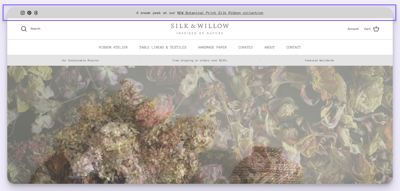
Silk & Willow: social media icons plus "A sneak peek at our NEW Botanical Print Silk Ribbon collection."
What works: Silk & Willow uses the bar as a hybrid — social proof rail on one side, product tease on the other. The "sneak peek" framing taps insider language that converts existing fans into a pre-launch click before the collection officially drops.
Why it works: Pre-launch teasers create an audience advantage — the people who click the sneak peek become the warm list when the collection actually launches. Silk & Willow's bar is doing email-list-quality lead gen without an opt-in form, just by routing curious visitors to a curated landing page they'll want to bookmark.
Key takeaway: Before a launch, run a "sneak peek" hello bar for 7–14 days that links to a teaser page (not the live product). Capture the curious cohort first; they're your warmest list when the collection goes live.
14. GOODEE and Bruvi: newsletter signup and scarcity for DTC
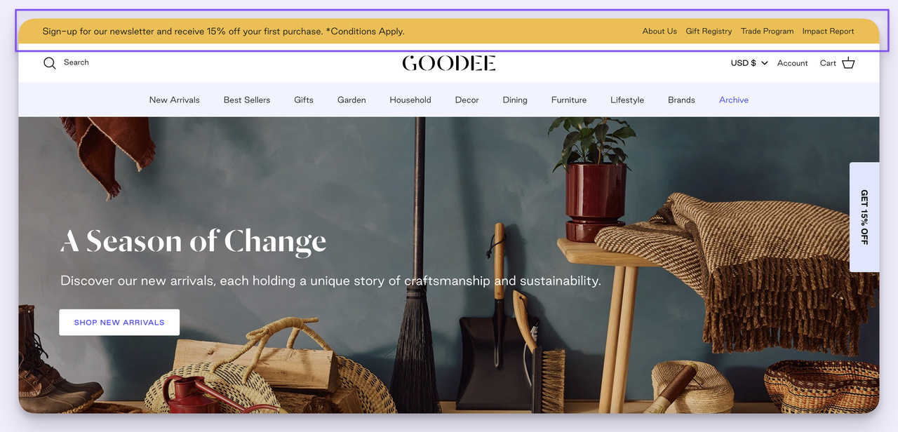
GOODEE: "Sign-up for our newsletter and receive 15% off your first purchase."
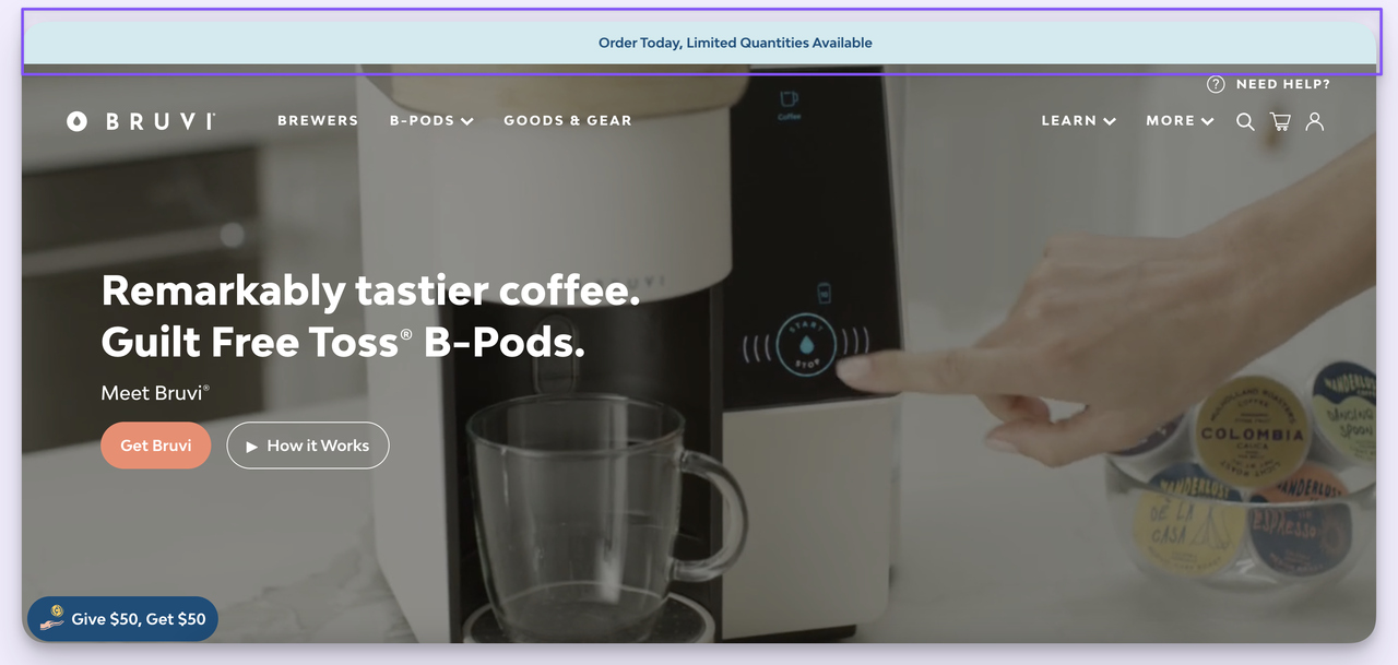
Bruvi: "Order Today, Limited Quantities Available."
What works: Two DTC bars, two opposite levers. GOODEE bribes for an email — 15 percent off in exchange for newsletter consent. Bruvi shoves on scarcity — limited quantities, today only. Same surface, opposite jobs: GOODEE builds the asset (email list), Bruvi pulls the action (purchase). Smart brands run both, sequenced.
Why it works: Newsletter discount bars trade margin for owned audience — every email captured is a future zero-cost touchpoint. Scarcity bars trade trust for immediacy — they work harder on visitors who are already mid-decision. The trick is knowing which job your bar should do, based on whether the visitor is new or returning.
Key takeaway: Show the newsletter discount bar to new visitors and switch to a scarcity bar for returning non-buyers. One bar, two audiences, two jobs — set up with simple visitor-state targeting.
15. Cowboy: community and investment offer
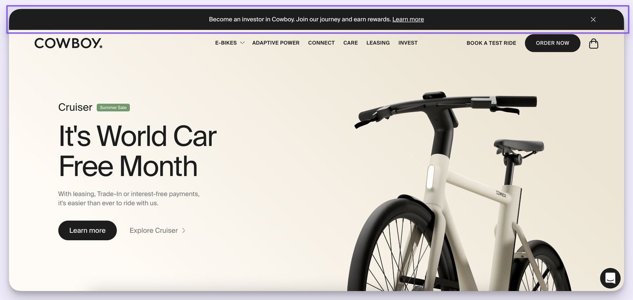
Cowboy: "Become an investor in Cowboy. Join our journey and earn rewards. Learn more."
What works: Cowboy turns the hello bar into a Series-A pitch. Instead of selling product or capturing email, the bar invites visitors into a crowdfunding round. The line "earn rewards" gives the offer an upside hook that goes beyond brand love.
Why it works: A hello bar isn't only a marketing surface — it's a strategic announcement channel. When a brand opens up equity participation to its customer base, the bar reaches the audience most likely to invest (existing buyers who already use the product). The conversion goal isn't a sale; it's a much higher-LTV action.
Key takeaway: Reserve the hello bar for non-promotional asks once or twice a year — equity rounds, beta program signups, podcast launches, conference invites. The audience you've already earned is the right audience for high-trust offers.
Common patterns in high-converting hello bars
After analyzing hundreds of sticky bar campaigns, the same eight patterns keep showing up in the bars that convert. Here's the short list — treat this as the QA checklist before you ship.
• One offer, one CTA: Every winning bar has one job. Two CTAs split attention and tank the click rate. Pick the one action you most want and cut the rest.
• Specific numbers over vague claims: "Save 25% on your first order" beats "Big savings inside." Specificity converts because it sets a concrete reward expectation the brain can price.
• Urgency cue when warranted: "Limited time," a countdown, or a stock cap. Don't fake it — visitors recognize evergreen "urgency" within two visits and start ignoring every bar you ship.
• Visitor-state targeting: Show different bars to new vs. returning visitors. New visitors get the welcome offer; returning visitors get content, scarcity, or product news.
• Mobile-first design: The bar has to legibly fit one line on a 375-pixel viewport. If your copy wraps to three lines on mobile, cut it. Most of the conversion lift Baymard Institute 2025 reports for sticky implementations comes from mobile devices, not desktop — design for the small screen first.
• Strong contrast against the page: The bar should be visually distinct from your site nav. Same color as your header and visitors literally don't see it.
• Easy to dismiss: A visible close button signals respect. Trapping a visitor with a sticky bar they can't dismiss is the fastest way to teach them to ignore everything you ship next.
• Single-line copy under 12 words: Anything longer is a banner ad. The constraint is the format. Lean into it.
How to create a hello bar in Popupsmart
I've built dozens of hello bars in Popupsmart over the years. The flow comes down to four steps: name the campaign, pick a template, customize copy and design, then set targeting and publish. Total time on a fresh build is under 15 minutes for a clean bar.
1. Name your campaign: Open the dashboard and click "+ New Campaign." A naming dialog appears. Use a name your future self will recognize three months from now — something like "Free shipping bar — over $50 — US returning visitors." Pick the right domain from the dropdown and save.
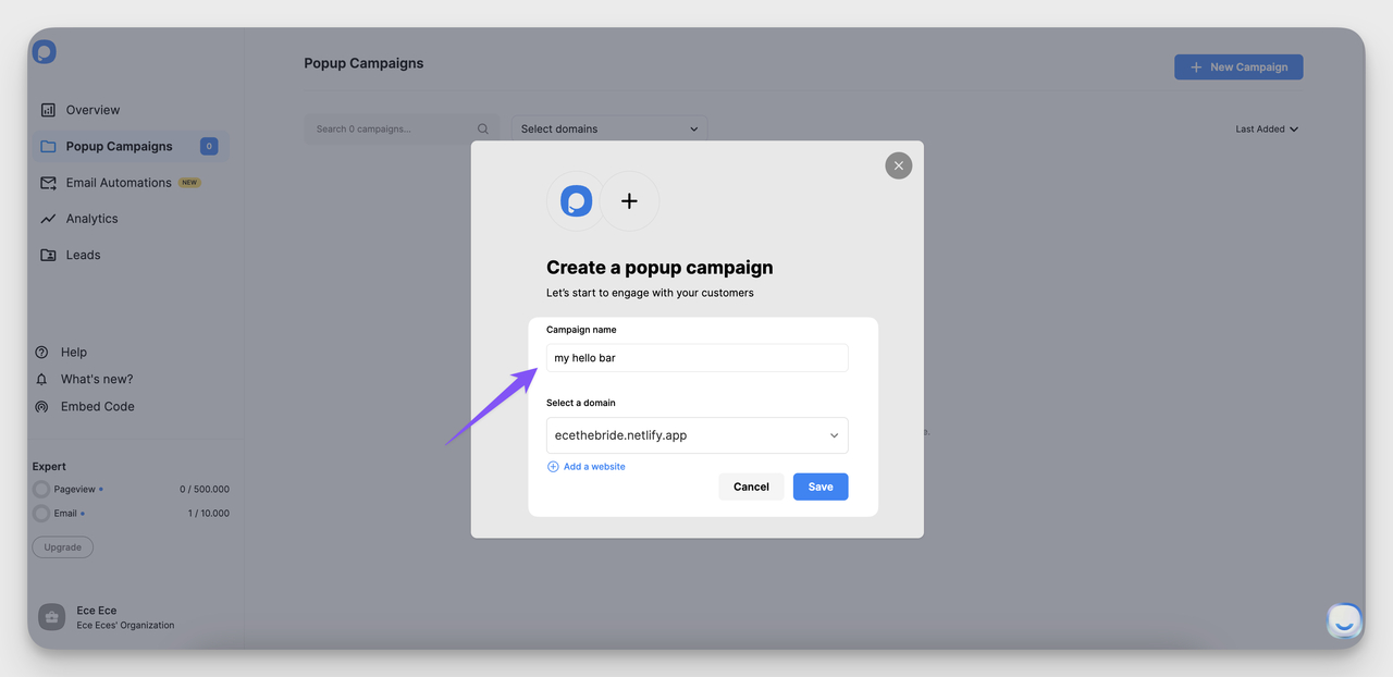
Naming the campaign in the Popupsmart dashboard.
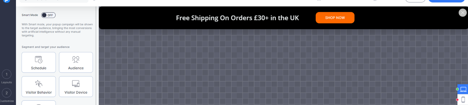
2. Choose a template: Under "Popup Type," pick "Floating Bar." Then browse the template gallery. There are starter layouts for free shipping, newsletter capture, sale countdowns, announcements, and feature launches. I usually start from a template even when I'll fully redesign — it's faster than building blocks from scratch.
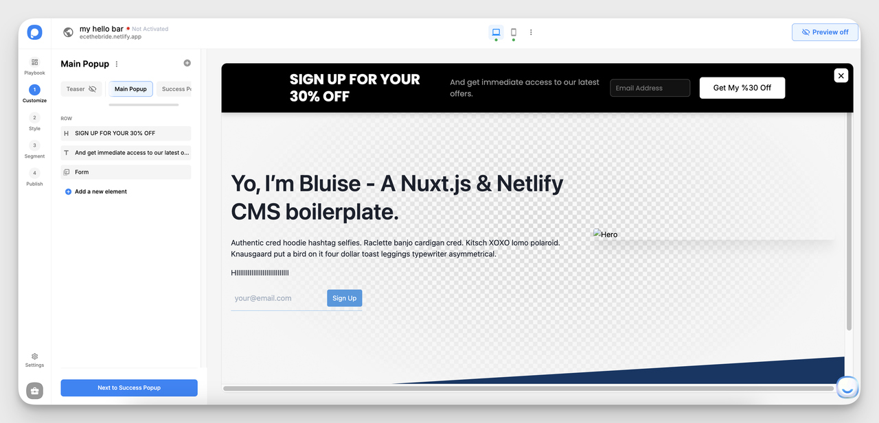
Picking a floating bar template in the gallery.
3. Customize design and copy: Edit the headline, button label, colors, and icon. Two design rules I follow on every bar: contrast the bar background against your site header (so it doesn't blend in), and keep the copy under 12 words on the longest variant. Add a countdown timer if the offer is time-limited.
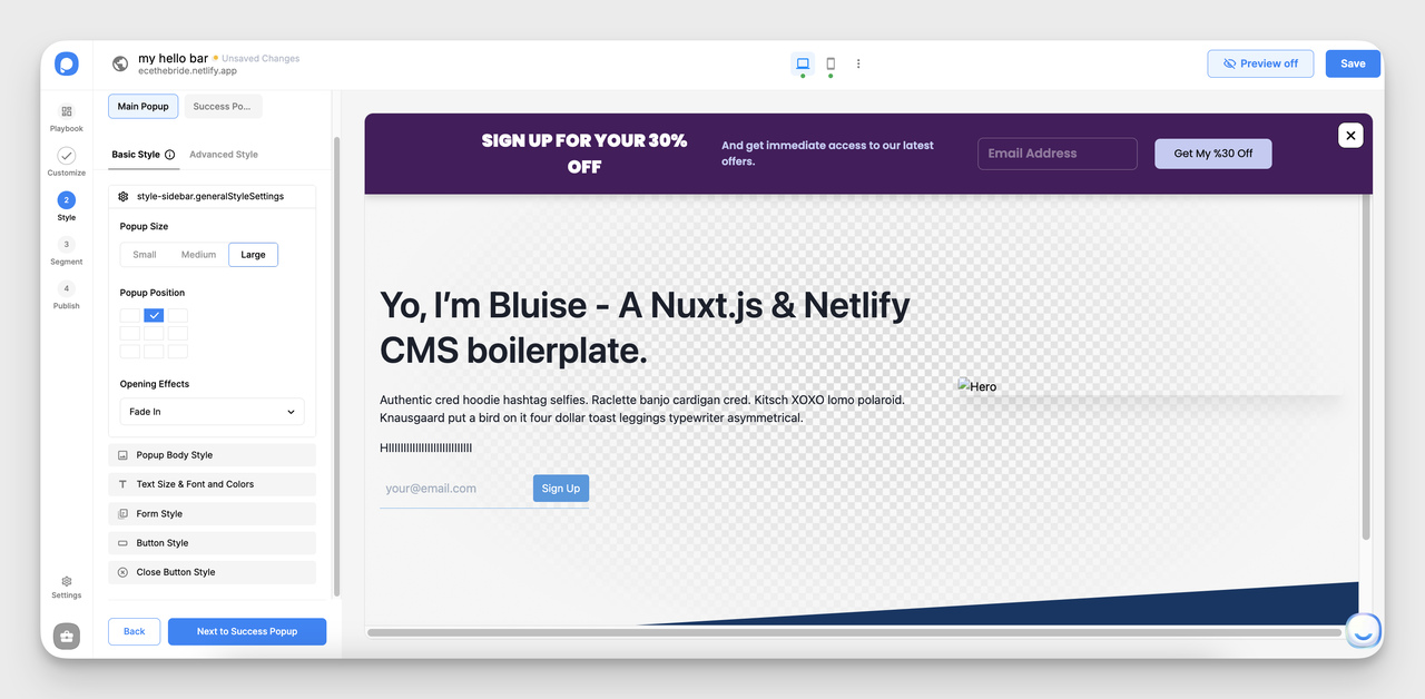
Editing copy, colors, and CTA in the design step.
4. Set targeting and publish: Under "Segment & Targeting," pick devices (desktop, mobile, both), visitor state (new vs. returning), and trigger timing (immediate, after X seconds, on scroll, on exit intent). For free-shipping bars I usually trigger immediately on every page. For newsletter bars I delay 5 seconds so the bar doesn't fight the page load. Save and hit publish.
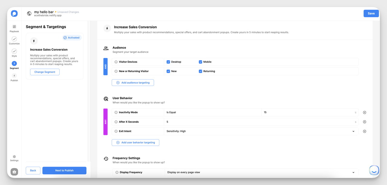
Configuring targeting rules and trigger timing.
Need more layout inspiration before you build? Browse our website popup examples and above-the-fold examples for adjacent patterns you can borrow.
Hello bar best practices for higher conversion
The patterns above tell you what to put in the bar. These practices tell you how to run the bar so it keeps converting after the launch-week novelty wears off.
• Rotate your bars every 2–4 weeks: The same bar shown to the same returning visitor for 60 days straight gets tuned out. Schedule rotation the same way you'd schedule email campaigns. Keep the offer fresh and the audience attentive.
• Test one variable at a time: Headline copy, then CTA color, then offer magnitude. If you change three things at once, you'll never know which one moved the number. Single-variable tests are slow but they actually teach you something.
• Match bar offer to landing page: If the bar promises 25 percent off, the page that opens after the click must show the discount applied or unmistakably reachable. Mismatched promises are the #1 reason post-click conversion drops.
• Use exit intent on the bar, not just popups: Bar variants triggered on exit intent catch visitors at the moment they're about to leave. Pair with a stronger offer than your default bar — the visitor was already gone, you've got nothing to lose.
• Geo-target where it matters: Free shipping for the US, free returns for the EU, store opening hours for the local market. A bar that knows the visitor's region converts better than a one-size-fits-all bar. Our geo-targeted popups guide walks through the setup.
• Don't stack bars with popups: Running a hello bar AND a welcome popup AND an exit-intent modal on the same page trains visitors to dismiss everything reflexively. Pick the surface that matches the moment and ship just that one.
• Track the click-through, not just the impression: Impressions are vanity. CTR is the real metric for a hello bar. If a bar gets 100,000 impressions and 100 clicks (0.1 percent CTR), the bar is invisible — rewrite the copy or change the contrast and re-test.
• Use the bar to qualify, not just convert: A bar that says "Building a Shopify store?" with a Yes/No tap is doing zero-cost segmentation. The Yes-tappers go into a Shopify-specific funnel; the No-tappers see a different bar next visit. That's segmentation as a bar, not as a quiz.
Common hello bar mistakes to avoid
I've audited a lot of underperforming hello bars. The same three or four mistakes show up over and over.
• Two CTAs in one bar: "Shop Now" + "Sign Up" inside the same bar splits the attention budget. The visitor processes both, picks neither, scrolls past. Pick one action per bar. If you need two, build two bars and rotate.
• Copy that wraps to three lines on mobile: A hello bar should be one line. If it's wrapping to three on a 375-pixel viewport, you've turned a sticky bar into a banner ad and lost the format's core advantage. Cut words until it fits.
• Fake urgency that never expires: "Today only!" running for 90 days teaches every returning visitor that your urgency cues are noise. The same goes for countdowns that reset at midnight forever. Real scarcity converts; theatrical scarcity poisons trust.
• No close button or a hidden close button: Trapping the visitor inside a bar they can't dismiss is the fastest path to a permanent ignore-list addition. A visible close icon is a respect signal. It also reduces the rage-quit bounce rate I've seen on bars that hide the dismiss control.
Ship your first hello bar this week
Pick one offer. Free shipping over your AOV target is the safest bet if you sell physical product. A first-purchase discount is the safest bet if you're acquiring net-new buyers. A trial CTA is the safest bet if you sell software.
Build the bar in Popupsmart in under 15 minutes using the four steps above. Set it to show on every page, every visitor, immediate trigger. Let it run for 7 to 14 days. Then look at click-through rate and post-click conversion. If CTR is under 1 percent, rewrite the copy. If post-click conversion is low, fix the landing page mismatch.
The brands above didn't get to high-converting hello bars on the first version. They iterated. The shortest path to your own version of a Bombas or Warby Parker bar is shipping a v1 this week and running the loop. Once the format is live, our lead capture tool comparison and landing page optimization guides cover what to layer in next.
Frequently asked questions
What do businesses use hello bars for?
Businesses use hello bars to capture attention without disrupting the page underneath. Common jobs include announcing promotions, sharing free shipping thresholds, capturing newsletter signups with a discount incentive, promoting trending content, surfacing new product features, and running flash sales with countdown timers. The bar's strength is that it stays visible while the visitor browses, so it earns repeat impressions without forcing a modal interaction.
How do I create a hello bar for my website?
Use a no-code builder like Popupsmart. Open the dashboard, click "+ New Campaign," name it, then pick "Floating Bar" under Popup Type. Choose a template, edit the copy and colors to match your brand, and set targeting (devices, visitor state, trigger timing). Hit publish and the bar goes live on the domain you connected. Total build time on a fresh bar is usually under 15 minutes.
Are hello bars mobile-friendly?
Yes, hello bars are designed to work on both desktop and mobile, but mobile takes more discipline. The biggest mobile constraint is line length — copy that fits comfortably on desktop often wraps to two or three lines on a 375-pixel viewport. The fix is to write a shorter mobile variant or use a builder like Popupsmart that lets you set device-specific copy. You can also choose to show the bar on one device only.
What's the difference between a sticky bar and a popup?
A sticky bar (the same thing as a hello bar or floating bar) pins to the top or bottom of the page and stays visible while the visitor scrolls, never blocking content. A popup overlays the page and requires the visitor to interact with it — close, accept, or dismiss — before continuing. Sticky bars are subtler and earn passive impressions; popups are louder and force a single-moment decision. Most sites benefit from running both for different jobs.
How long should hello bar copy be?
Aim for 6 to 12 words on the longest variant. Anything longer turns the bar into a horizontal banner ad and loses the "always visible, never intrusive" advantage of the format. If the offer needs more explanation, link to a landing page from the bar instead of stuffing the bar with detail. The bar's job is to earn the click; the page's job is to close the sale.
How do I measure hello bar performance?
Track click-through rate (clicks divided by impressions) as the primary metric, not impressions alone. A bar with 100,000 impressions and 100 clicks has a 0.1 percent CTR and is effectively invisible — rewrite the copy or change the design. Secondary metrics: post-click conversion rate (did the click translate to the offer's intended action?), and dismissal rate (high dismissal means the offer or timing is wrong, not the bar itself).
Articles you would like to read:

How would you rate your experience with this article? 😊