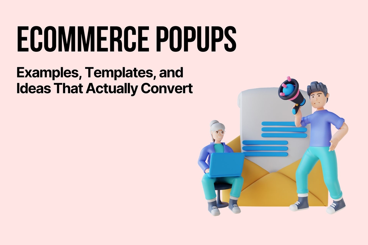
Ecommerce Popups: Examples, Templates, and Ideas That Actually Convert
Ecommerce popups help boost conversions with smart timing, targeting, and messaging. Learn ideas, templates, best practices, mistakes, and measurement strategies to improve performance without annoying users.
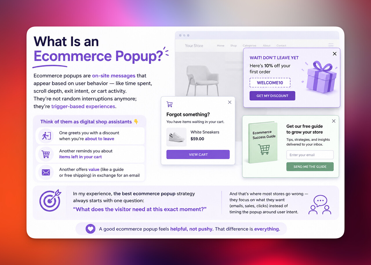
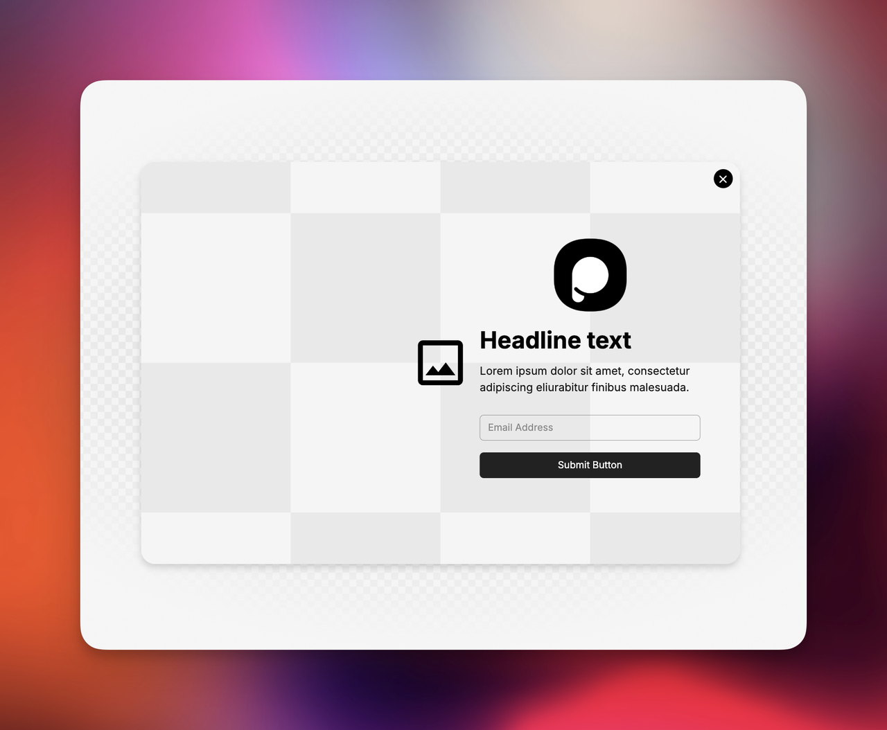
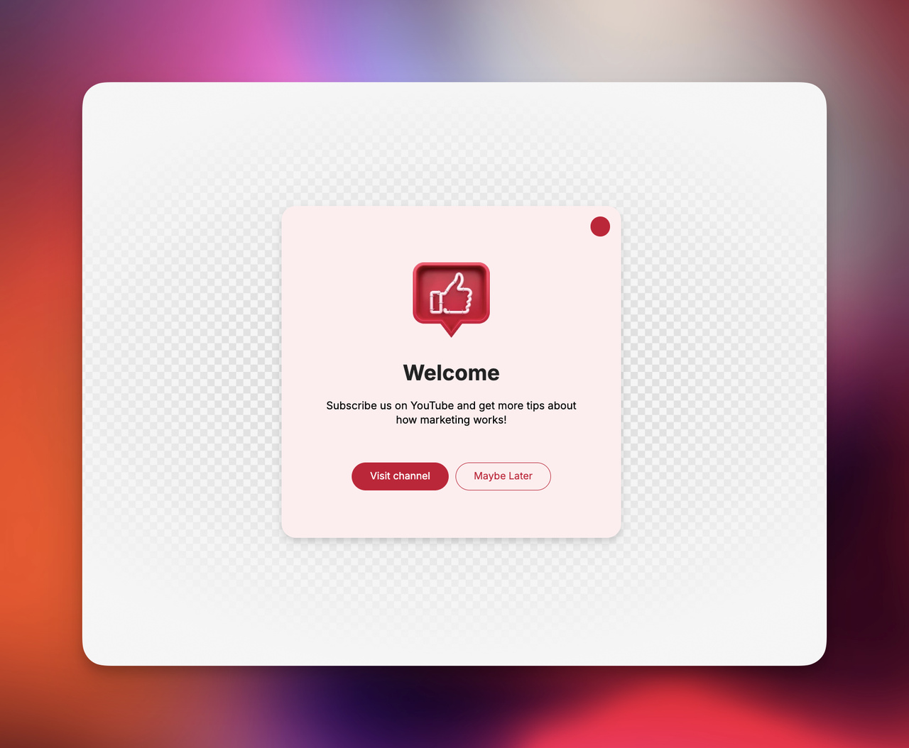
An ecommerce popup is a small message window that appears on an online store to encourage visitors to take action; like joining an email list, claiming a discount, discovering a product, or completing a purchase. When designed well, ecommerce popups help stores capture leads, reduce cart abandonment, and increase conversions without disrupting the shopping experience. In this guide, I'll share practical ecommerce popup ideas, real strategies, and proven approaches I've seen work across ecommerce sites so you can create popups that actually convert instead of annoy.
What Is an Ecommerce Popup?
When I first started working on ecommerce SEO, I used to think popups were just those slightly annoying boxes you rush to close. But honestly, that’s an outdated view. A modern ecommerce popup is more like a well-timed conversation starter between your store and a visitor.
In simple terms, ecommerce popups are on-site messages that appear based on user behavior; like time spent on page, scroll depth, exit intent, or cart activity. They’re not random interruptions anymore; they’re trigger-based experiences.
Think of them as digital shop assistants 👇
- One greets you with a discount when you’re about to leave
- Another reminds you about items left in your cart
- Another offers value (like a guide or free shipping) in exchange for an email
In my experience, the best ecommerce popup strategy always starts with one question: “What does the visitor need at this exact moment?”
And that’s where most stores go wrong, they focus on what they want (emails, sales, clicks) instead of timing the popup around user intent.
A good ecommerce popup feels helpful, not pushy. That difference is everything.
Why Ecommerce Popups Still Work in 2026
There’s a strange myth floating around that popups are “dead.” I’ve seen it too many times, especially from people who had a bad experience with poorly designed ones.
But data tells a different story.
According to research from HubSpot, well-targeted popups can significantly increase lead generation when compared to static forms. And honestly, that matches what I’ve seen in real ecommerce campaigns I’ve worked on; timing + relevance beats everything.
So why do ecommerce popups still work?
Because behavior hasn’t changed:
- People still browse quickly
- They still get distracted
- They still need a small push to decide
- And they still respond to clear value offers
The real evolution is not whether popups work, but how they work.
Modern ecommerce popups are:
- Behavior-based instead of random
- Personalized instead of generic
- Value-driven instead of aggressive
- Mobile-optimized instead of desktop-first
Let me put it simply: A bad popup interrupts. A good ecommerce popup assists.
And when you shift your mindset from “capture emails” to “help the shopper decide,” conversion rates usually follow naturally.
Types of Ecommerce Popups Every Store Should Use
Not all ecommerce popups are created equal. In fact, I usually think of them as different “roles” in your store experience; each one has a job.
Here are the core types I recommend almost every ecommerce store to test:
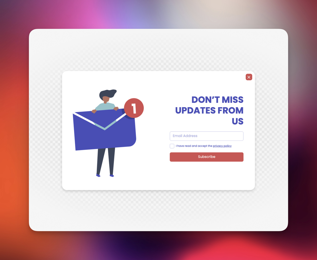
1. Email Signup Popups
The classic one. Still powerful when done right.
- Offer a reason (discount, guide, early access)
- Keep it simple
- Avoid asking too much upfront
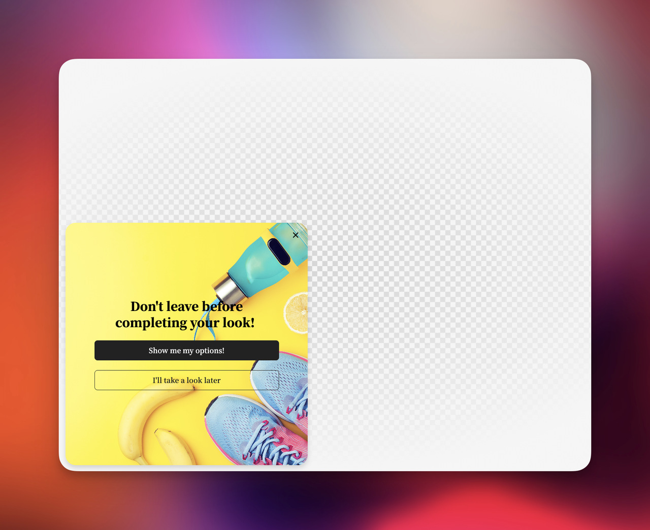
2. Exit-Intent Popups
These appear when a visitor is about to leave.
Why they work: they catch lost attention, not interrupt active browsing.
3. Discount & Promotion Popups
Probably the most common ecommerce popup idea.
- “10% off your first order”
- “Free shipping today only”
- “Limited-time offer”
But be careful, overusing discounts can hurt perceived brand value.
4. Cart Abandonment Popups
These are triggered when users leave items in their cart.
I’ve seen these recover a surprising amount of revenue when paired with urgency or reminders.
5. Gamified Popups
Spin-to-win, scratch cards, mystery discounts.
They work because they tap into curiosity and reward psychology. But they should match your brand tone — otherwise they feel gimmicky.
Quick Comparison Table
| Popup Type | Best Use Case | Conversion Strength |
|---|---|---|
| Email Signup | List building | Medium–High |
| Exit Intent | Recover visitors | High |
| Discount Popup | First-time buyers | High |
| Cart Abandonment | Lost sales recovery | Very High |
| Gamified Popup | Engagement + fun | High (if on-brand) |
12 High-Converting Ecommerce Popup Ideas
When I look at ecommerce popup ideas that actually perform in production, I don’t think in terms of “creative examples.” I think in terms of conversion intent + behavioral trigger + message match.
A good ecommerce popup is not just a message. It’s a response to user behavior.
In my experience working with popup campaigns—especially when using tools like Popupsmart—the difference between a popup that converts and one that gets ignored usually comes down to how well it reacts to user intent.
Below are the most effective ecommerce popup types I’ve consistently seen work; not as isolated tactics, but as part of a structured funnel strategy.
1. First-Visit Value Exchange Popup
This is one of the most common ecommerce popup examples, but also one of the most misused.
High-performing version:
“Get 10% off your first order when you join today”
Why it converts:
- Targets cold traffic hesitation
- Reduces first-purchase friction
- Works best after 5–10 seconds or scroll trigger
This is not just a discount popup, it’s a trust acceleration mechanism.

2. Exit-Intent Risk Recovery Popup
Triggered when cursor movement indicates intent to leave.
Example:
“Before you go — here’s a 15% discount reserved for you”
Why it works:
- Captures users at peak abandonment probability
- Converts “lost sessions” into recoverable opportunities
- Performs best on high-intent product pages
In my experience, exit-intent ecommerce popupsare the closest thing to “revenue recovery automation” you can deploy without CRM complexity.
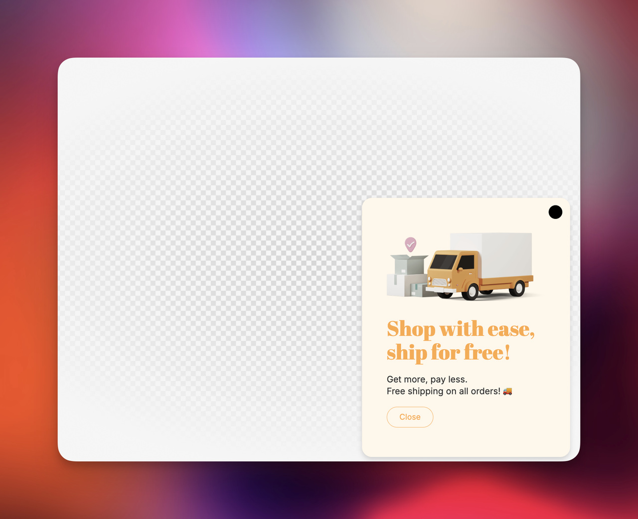
3. Cart Value Optimization Popup
Instead of chasing new conversions, this focuses on increasing order value.
Example:
“You’re $18 away from free shipping 🚚”
Why it works:
- Uses goal-gradient psychology
- Encourages incremental spending
- Increases average order value (AOV), not just conversion rate
This is one of the most financially efficient ecommerce popup ideas.
4. Cart Abandonment Reminder Popup
Not all abandonment is rejection. Often it’s interruption.
Example:
“Your cart is waiting for you 👀 Complete your order before items sell out”
Why it works:
- Re-engages interrupted intent
- Reduces cognitive load (“what was I buying again?”)
- Works especially well on mobile traffic
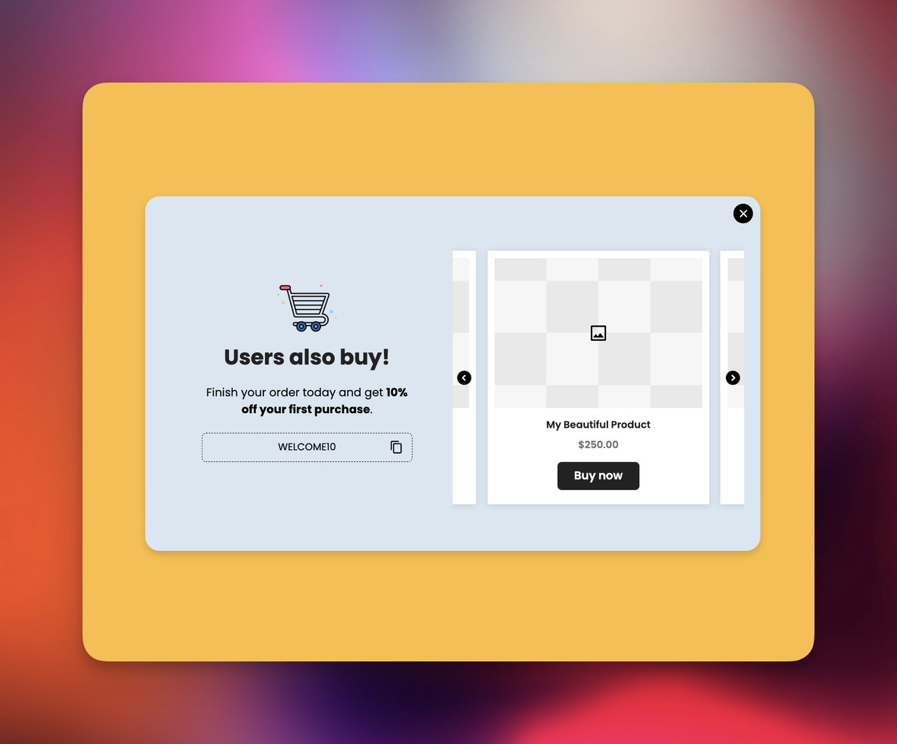
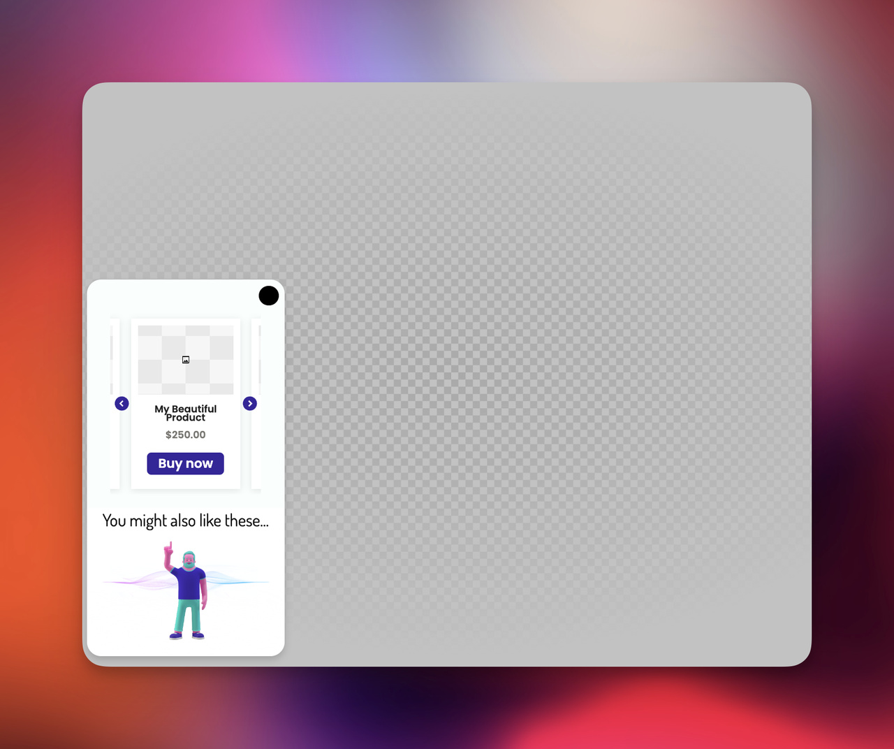
5. Behavioral Product Recommendation Popup
This is where ecommerce popups become intelligent.
Example:
“Customers who viewed this item also purchased…”
Why it works:
- Uses collaborative filtering logic
- Reduces decision fatigue
- Increases product discovery without navigation friction
This is one of the strongest ecommerce popup strategies for large catalogs.
6. Bundle & Upsell Popup
Instead of single-item conversion, this drives package value.
Example:
“Complete the set and save 20% when you buy together”
Why it works:
- Anchors perceived value
- Encourages multi-item purchases
- Works especially well in fashion, beauty, and electronics
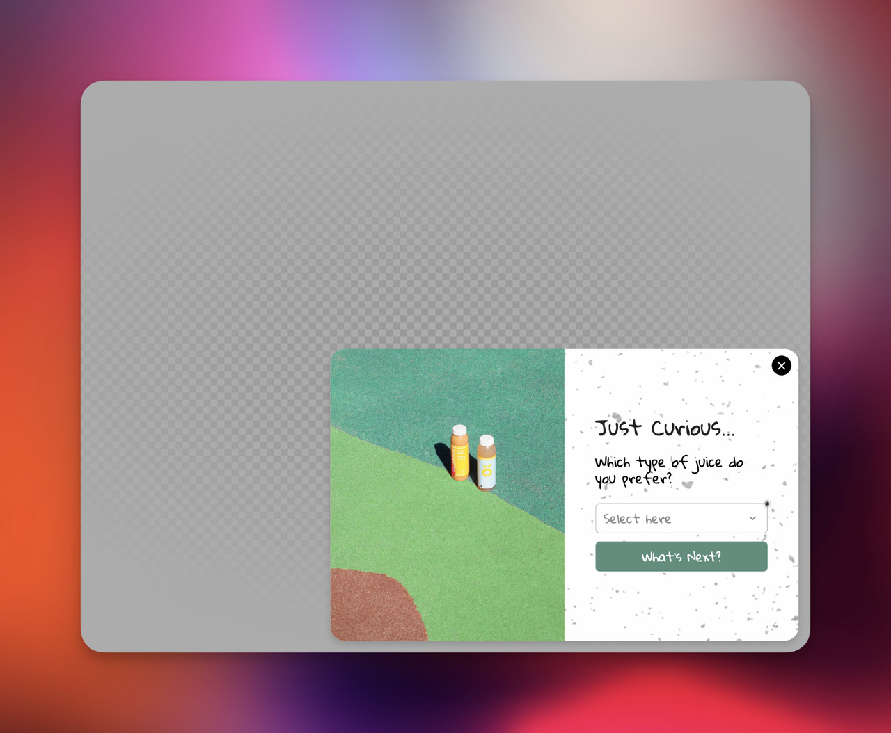
7. Quiz-Based Recommendation Popup
This replaces browsing with structured decision support.
Example:
“Not sure what to choose? Take a 30-second quiz and find your match”
Why it works:
- Reduces choice overload
- Feels interactive rather than promotional
- Collects zero-party data (high value for segmentation)
8. Email Capture Value Stack Popup
The mistake most stores make is asking for emails without value context.
Better approach:
“Get exclusive drops, restocks & private discounts in your inbox”
Why it works:
- Shifts from transactional to benefit-driven messaging
- Builds expectation of ongoing value
- Improves opt-in rates significantly compared to generic signup forms
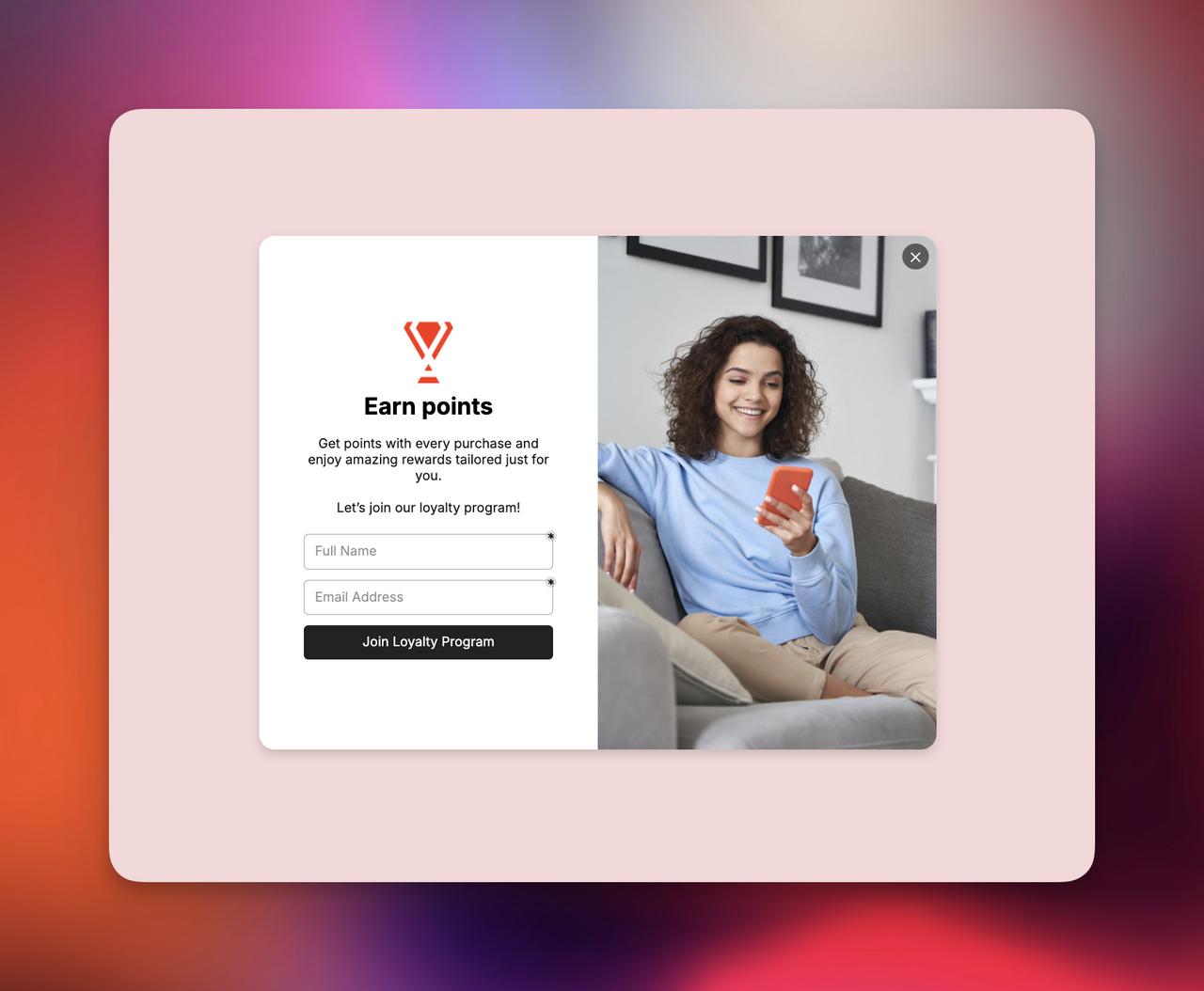
9. Loyalty Program Entry Popup
Designed for post-first-purchase or engaged visitors.
Example:
“Join our rewards program and earn points instantly 🎁”
Why it works:
- Creates switching cost
- Encourages repeat purchases
- Strengthens long-term customer lifetime value (CLV)
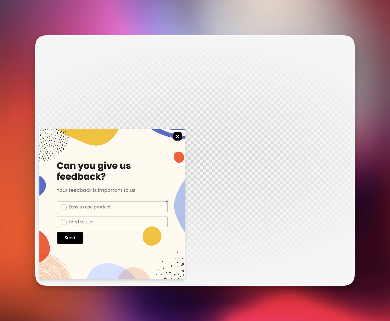
10. Micro-Survey Popup
This is less about conversion, more about insight acquisition.
Example:
“What stopped you from purchasing today?”
Why it works:
- Captures objection data
- Improves funnel optimization decisions
- Builds user participation loop
According to research from Hotjar, micro-surveys significantly improve qualitative conversion insights when placed at exit points.
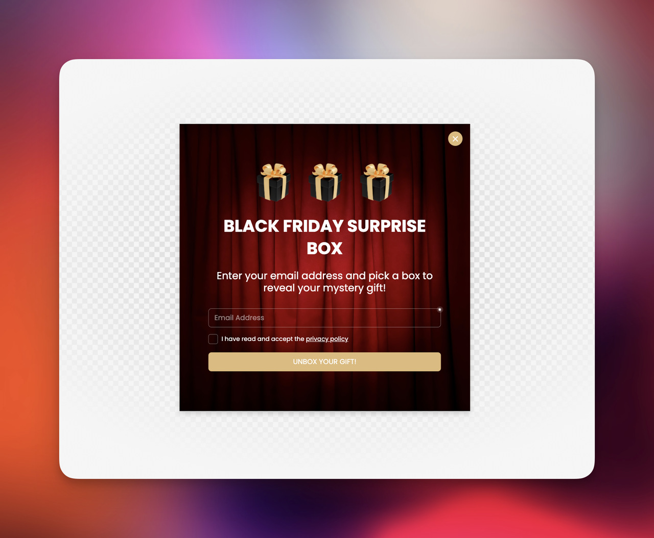
11. Campaign-Based Scarcity Popup
Used for promotions, seasonal events, and product drops.
Example:
“Black Friday early access is live for members only ⚡”
Why it works:
- Introduces urgency + exclusivity
- Works best with time-bound ecommerce popup campaigns
- Amplifies peak-season revenue windows
12. Returning Visitor Personalization Popup
This is one of the most underused ecommerce popup ideas.
Example:
“Welcome back 👋 Still thinking about this?”
Why it works:
- Leverages familiarity bias
- Restores previous browsing context
- Increases return-session conversion rates
Strategic Summary
If I compress all of this into a simple mental model, I’d say:
A high-converting ecommerce popup always answers one of these questions:
- Am I losing this visitor? (exit-intent)
- Can I increase order value? (AOV popups)
- Can I reduce decision friction? (recommendations & quizzes)
- Can I recover attention? (cart & re-engagement)
- Can I create a reason to act now? (urgency & campaigns)
Anything outside this framework usually becomes noise.
Ecommerce Popup Best Practices
If there’s one thing I’ve learned after years of working around ecommerce SEO and CRO, it’s this: most ecommerce popup problems are not design problems; they are timing and intent problems.
You can have the best ecommerce popup ideas in the world, even a perfectly designed ecommerce popup template, but if it shows up at the wrong moment, it simply won’t convert. Worse, it annoys people.
So in this section, I want to break down what actually matters when you optimize ecommerce popups in a real store environment.
1. Timing: Don’t Interrupt, Respond
I always think of timing as the “invisible UX layer” of ecommerce popups.
A popup shown at the wrong time feels aggressive. The same popup shown at the right moment feels helpful.
Here’s a simple mental model I use:
- 0–5 seconds: Only brand/value introduction (no hard selling)
- 5–20 seconds: Soft engagement (newsletter, content, value offer)
- After scrolling: Product-related ecommerce popup ideas
- Exit intent: Strong offer or recovery message
👉 The key idea: you’re not pushing a message, you’re responding to behavior.
2. Segmentation: One Popup Does Not Fit All
In my experience, this is where most ecommerce popup strategies fail silently.
A first-time visitor is emotionally different from someone who already added a product to cart.
So your ecommerce popups should change accordingly:
- New visitor → welcome offer or value exchange
- Returning visitor → personalized reminder or product continuation
- Cart user → urgency or free shipping incentive
- Product viewer → recommendation or comparison
Think of segmentation as translation of intent into messaging.
3. Copy Matters More Than Design
This is a little uncomfortable truth: most ecommerce popup examples fail not because of visuals, but because of words.
Compare these two:
❌ “Subscribe to our newsletter” ✅ “Get early access to new drops + exclusive discounts 👀”
Or:
❌ “10% discount available” ✅ “Before you go — here’s 10% off, just for you 🎁”
Same ecommerce popup template. Completely different emotional impact.
I think good popup copy should feel like a human interruption, not a marketing banner.
4. Mobile Experience Is Not Optional
If your ecommerce popup doesn’t work well on mobile, it doesn’t really work.
No matter how strong your ecommerce popup ideas are, mobile users will drop instantly if:
- Close button is hard to find
- Popup covers entire screen
- Text feels cramped or unreadable
- Load delay breaks experience
Mobile popups should feel like a light overlay, not a takeover.
5. Use Behavior-Based Triggers
Static timing is outdated. The strongest ecommerce popups today are behavior-driven.
Some of the most effective triggers I use:
- Scroll depth (shows engagement level)
- Exit intent (drop-off signal)
- Time on page (attention duration)
- Cart inactivity (purchase hesitation)
- Product interaction (intent signal)
This is where ecommerce popup strategy becomes intelligent instead of random.
6. Test Messaging, Not Just Layout
A lot of teams obsess over colors and button styles.
But in reality, messaging changes outperform design changes almost every time.
What I usually test:
- Offer framing (discount vs value-based incentive)
- Headline tone (direct vs conversational)
- CTA wording (“Get discount” vs “Unlock offer”)
- Timing vs trigger combinations
Even small copy tweaks inside ecommerce popup campaigns can shift conversion rates noticeably.
7. Track Meaningful Metrics
Clicks are not enough.
If you want to evaluate ecommerce popup performance properly, focus on:
- Conversion rate after popup interaction
- Revenue per popup view
- Email quality (not just quantity)
- Cart recovery rate
- Bounce rate impact
A popup that gets clicks but no real revenue impact is not a successful ecommerce popup.
💡 Simple Mental Model I Use
Whenever I review ecommerce popup ideas or campaigns, I ask myself:
- Does this match what the user is doing right now?
- Does it reduce friction or create pressure?
- Would I personally feel helped or interrupted?
If it feels like interruption, I rethink it.
Common Ecommerce Popup Mistakes to Avoid
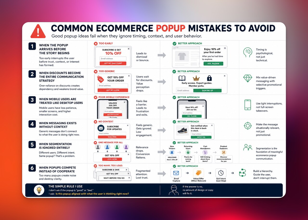
When I audit ecommerce stores, I rarely see “bad popup ideas.” What I usually see are good ideas executed without restraint, timing logic, or context awareness.
And that’s the key difference.
Most ecommerce popup problems are not creative problems, they are structural ones. The popup is treated as a standalone tactic instead of a behavioral response system.
Let’s break down where things usually go wrong.
When the popup arrives before the story begins
One of the most common mistakes is simply impatience.
A visitor lands on the site, barely scrolls, and the ecommerce popup appears immediately. Technically, it’s “on time” based on a timer. Practically, it’s too early in the user’s cognitive process.
At that moment, the user hasn’t built:
- trust
- context
- or even interest clarity
So the popup isn’t converting intent, it’s interrupting formation of intent.
In my experience, early-trigger popups almost always create one of two outcomes: dismissal or bounce. Rarely engagement.
Timing is not a technical setting. It’s a psychological one.
When discounts become the entire communication strategy
Another pattern I see often is over-reliance on price incentives.
Discount-based ecommerce popups are effective, but only when they are part of a broader messaging ecosystem. When they become the default response to every situation, something subtle happens.
The brand slowly stops communicating value and starts communicating dependency on incentives.
Over time, users begin to wait for popups before purchasing. And once that behavior forms, it’s very difficult to reverse.
A healthier approach I’ve seen work better is mixing:
- value-driven messaging (guides, access, exclusivity)
- with selective promotional triggers
Not every ecommerce popup needs to reduce price friction. Some should increase perceived value instead.
When mobile users are treated like desktop users
Mobile behavior is fundamentally different from desktop behavior, yet many ecommerce popups are still designed as if the screen size is the only difference.
On mobile, attention is more fragile. Interaction cost is higher. And patience is lower.
So when a popup:
- takes over the entire screen without hierarchy
- hides the close action
- or loads slowly
it doesn’t just interrupt experience, it blocks it.
I often think of mobile popups as “light interruptions,” not full overlays. If it feels like a barrier, it has already failed its UX purpose.
When messaging exists without context
This is one of the most underestimated issues.
A popup might be well-designed, well-timed, and technically correct, but if the message is generic, it still underperforms.
Messages like:
- “Sign up for updates”
- “Get exclusive offers”
- “Subscribe now”
don’t fail because they are wrong. They fail because they are context-free.
They don’t connect to what the user is doing in that moment.
Compare that to:
- “Get notified when this item is back in stock”
- “See recommendations based on what you’re viewing”
- “Unlock early access to upcoming drops”
Now the popup becomes situationally relevant, not just promotional.
That shift is subtle, but it’s often the difference between ignored and engaged.
When segmentation is ignored entirely
If there is one mistake that quietly limits almost every ecommerce popup strategy, it is this one.
Treating all users the same.
New visitors, returning users, cart abandoners, and product explorers are not in the same mental state. Yet many systems show them identical messaging structures.
What happens then is predictable:
- relevance drops
- attention weakens
- conversion flattens
Segmentation is not a “growth feature.” It is the foundation of meaningful ecommerce popup communication.
Without it, even strong ideas become average.
When popups compete instead of cooperate
The final issue is less visible, but very damaging: stacking too many popup layers in a single session. Email capture, then discount, then exit intent, all competing for attention without hierarchy. At that point, the user is no longer interacting with a guided system. They are navigating interruptions. And once attention becomes fragmented, decision clarity disappears.
A good ecommerce popup strategy behaves like a sequence. A bad one behaves like noise.
A simple way I evaluate all of this
When I look at ecommerce popup setups now, I don’t ask whether they are “good” or “bad.” I ask something simpler:
Is this popup aligned with what the user is thinking right now?
If the answer is no, no amount of design or copy fixes it.
How to Measure Ecommerce Popup Performance
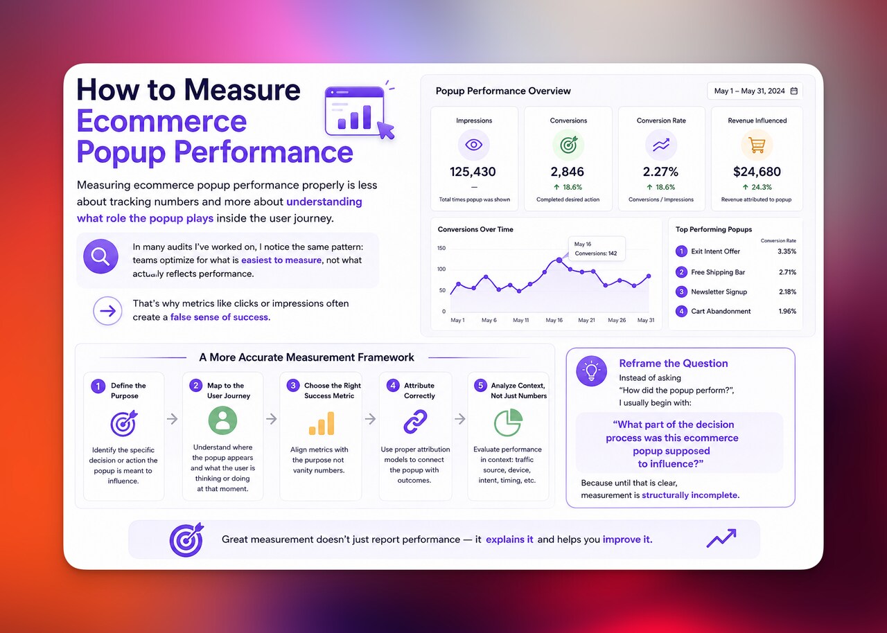
Measuring ecommerce popup performance properly is less about tracking numbers and more about understanding what role the popup plays inside the user journey. In many audits I’ve worked on, I notice the same pattern: teams optimize for what is easiest to measure, not what actually reflects performance. That’s why metrics like clicks or impressions often create a false sense of success. A more accurate approach starts by reframing the question entirely.
Instead of asking “How did the popup perform?”, I usually begin with:
“What part of the decision process was this ecommerce popup supposed to influence?”
Because until that is clear, measurement is structurally incomplete.
Start with behavioral impact, not conversion data
Before looking at conversions, I always examine whether the popup changed anything in user behavior at all.
At this level, the focus is not on outcomes but on interaction quality signals, such as:
- whether bounce rate increased or decreased after activation
- how session depth changed compared to baseline traffic
- whether scroll behavior indicates continued exploration or early exit
- whether users return to navigation after closing the popup
These signals matter because they reveal something more fundamental than clicks: alignment with intent.
A well-performing ecommerce popup should integrate into behavior flow, not disrupt it. If engagement drops immediately after exposure, the issue is almost always timing or contextual mismatch rather than design execution.
Evaluate intent progression, not just interaction
The second layer is more important but often overlooked: intent movement.
A popup is not an endpoint — it is a transition point.
So instead of measuring “Did the user click?”, I look at whether the popup moved the user forward in their journey:
- from browsing to product exploration
- from product viewing to cart consideration
- from cart activity to checkout initiation
- from exit intent to re-engagement
This is where ecommerce popup ideas either create real value or remain surface-level interactions.
Two popups can have identical click-through rates, yet one produces stronger downstream behavior simply because it aligns better with intent stage.
Measure conversion in context, not in isolation
Only after understanding behavior and intent do I evaluate conversion metrics.
But even here, I avoid treating conversion rate as a standalone indicator.
Instead, I separate it into functional outcomes:
- email capture rate (for lead-focused ecommerce popups)
- cart recovery rate (for abandonment flows)
- product engagement rate (for recommendation-based popups)
- purchase completion rate (for incentive-driven popups)
The key distinction is this: a conversion is only meaningful if it reflects the intended role of the popup.
Without that context, a high conversion rate can still represent low-quality engagement.
Revenue per impression reveals the real efficiency
If I had to choose a single metric that best represents ecommerce popup effectiveness, it would be revenue per popup impression. It removes bias from raw engagement and focuses on output efficiency: how much business value is generated per exposure.
This is where differences between ecommerce popup templates become obvious. Some variations generate high interaction but low monetization, while others produce fewer interactions but stronger downstream revenue behavior.
This metric helps separate “popular” popups from profitable ones.
A/B testing should validate logic, not aesthetics
One of the most common inefficiencies in optimization workflows is focusing on visual changes instead of behavioral variables.
In practice, meaningful tests are usually concentrated around:
- message framing (value proposition vs discount vs urgency)
- trigger logic (time-based vs behavior-based vs exit intent)
- audience segmentation (new vs returning vs high-intent users)
- offer structure (incentive-led vs utility-led messaging)
Design variations rarely produce significant long-term differences unless they affect clarity or usability.
In ecommerce popup optimization, logic consistently outperforms cosmetics.
A framework I use to interpret performance
To simplify evaluation, I often reduce everything into a single progression model:
Exposure → Interaction → Intent shift → Revenue outcome
If any stage in this chain is weak or missing, the popup cannot be considered fully optimized, regardless of its surface-level performance.
This framework also helps avoid over-optimizing early-stage signals like clicks, which can be misleading when detached from downstream value.
The shift that changes how you evaluate everything
At some point, I stopped asking:
“How many users interacted with this ecommerce popup?”
And started asking:
“What decision did this popup meaningfully influence?”
That shift usually separates tactical execution from strategic optimization.
Because in the end, ecommerce popups are not measured by how often they appear or how often they are clicked — but by how effectively they guide user decisions inside a constrained attention environment.
Final Thoughts
If there’s one thing I’d leave you with, it’s this: ecommerce popups don’t fail because they exist — they fail because they don’t respect timing, intent, and context.
In my experience, the best-performing ecommerce popup setups feel almost invisible in how natural they are. They appear at the right moment, say the right thing, and then get out of the way.
Ready to build higher-converting ecommerce popups?
If you want to test smarter ecommerce popup ideas, improve your ecommerce popup templates, and increase conversions without annoying your visitors, start by experimenting with timing, segmentation, and messaging—not just design.
👉 Try applying one new ecommerce popup strategy to your store this week and measure the difference.
Frequently Asked Questions
1. What is an ecommerce popup used for?
An ecommerce popup is used to guide visitors toward a specific action on an online store, such as subscribing to emails, claiming a discount, recovering abandoned carts, or discovering products. When used correctly, ecommerce popups help increase conversions by aligning with user intent at the right moment.
2. Do ecommerce popups really increase conversions?
Yes, when they are well-timed and relevant. In my experience, ecommerce popups perform best when they are behavior-based (like exit intent or scroll triggers) and offer clear value. According to data from OptinMonster, optimized popups can convert a small but meaningful percentage of visitors into leads or customers.
3. What makes a good ecommerce popup template?
A good ecommerce popup template is simple, clear, and value-driven. It usually includes a strong headline, a short supporting message, and one clear call-to-action. The best ecommerce popup templates also adapt to context—showing different messages for new visitors, returning users, or cart abandoners.
4. What are the best ecommerce popup ideas for beginners?
Some of the most effective ecommerce popup ideas for beginners include first-order discount popups, email signup popups with value offers, exit-intent discount popups, and cart abandonment reminders. These are easy to implement and provide quick insights into user behavior and conversion performance.
- You might also like:
- 60+ Types of Popups for Every Goal and Beyond
- Top 13 Popup Use Cases To Increase Conversions

How would you rate your experience with this article? 😊