How to Conduct an E-commerce CRO Audit: 6 Steps & Checklist
An e-commerce CRO audit reviews data, UX/design, copy, key pages, performance, and trust signals to find friction causing drop-offs and boost conversions. It outlines steps to set goals, analyze behavior, test changes, and use tools like a free CRO checker.
If your store pulls steady traffic but the sales numbers don't budge, the bottleneck almost never lives in the ad account. It lives in the post-click experience. An ecommerce CRO audit is how you find it, and 2026 is a year where the gap between average and top-decile stores has widened to the point that ignoring it costs real revenue every month.
An ecommerce CRO audit is a structured review of your online store that pinpoints the friction killing conversions across data, UX, product pages, checkout, trust signals, and copy. A complete audit takes 1-2 weeks, surfaces 15-40 fixable issues, and typically lifts conversion rates by 10-40% within 90 days of implementation.
What you'll need before starting:
• Analytics access: Google Analytics 4 (or equivalent), Search Console, and your store's native dashboard (Shopify, WooCommerce, BigCommerce)
• Behavior tooling: A heatmap and session-recording tool (Hotjar, Microsoft Clarity, or Lucky Orange)
• Time: 8-15 working hours for a small store, 25-40 hours for a mid-market catalog
• Skill level: Beginner-friendly if you follow the checklist; intermediate if you want to act on the findings yourself
• A test environment or staging theme for trying changes before pushing live
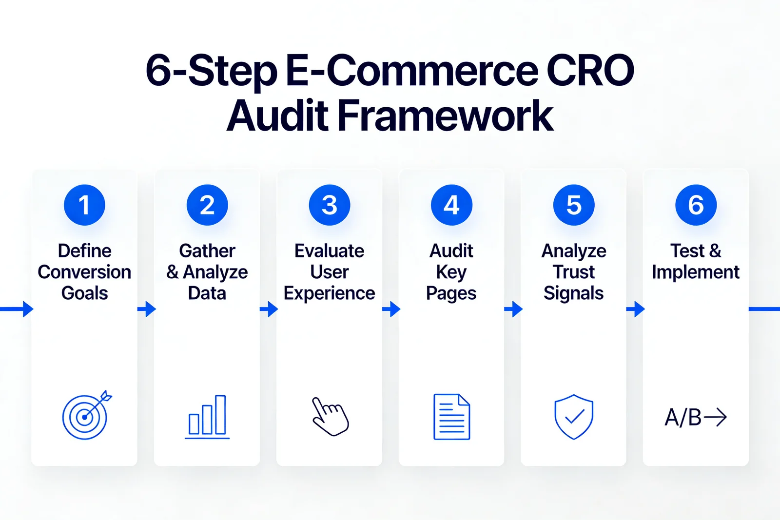
Quick overview of the 6-step process:
1. Define conversion goals: Pick the exact actions you want measured (purchase, add-to-cart, email signup) and write them down with dollar values.
2. Gather and analyze data: Pull 90 days of GA4, heatmaps, and session recordings to find drop-off pages.
3. Evaluate UX: Score navigation, page speed, mobile responsiveness, and CTA clarity against current benchmarks.
4. Audit key ecommerce pages: Examine homepage, category pages, PDPs, cart, and checkout with a friction-first lens.
5. Analyze trust signals and content: Check reviews, badges, return policy visibility, and copy quality on revenue pages.
6. Test and implement changes: Prioritize findings, run A/B tests on the highest-impact items, and document what wins.
What Is an E-Commerce CRO Audit?
An ecommerce CRO audit is a structured diagnostic of your online store designed to find the specific reasons visitors don't convert into buyers. It blends quantitative data (analytics, funnel reports) with qualitative behavior research (heatmaps, recordings, user testing) to map the gap between the journey you think customers take and the journey they actually take.
Put simply, a CRO audit answers two questions: where are people abandoning the path to purchase, and what specific edits will get more of them to finish?
A useful audit isn't a generic checklist run end to end. It examines the user journey, tests the assumptions baked into your design, and uses behavioral data to expose friction points that are invisible from the inside of the business.
The four pillars of an ecommerce CRO audit:
• Data-driven evaluation: Pulls behavior data from GA4, heatmap tools, and session recordings to map where users click, scroll, and bail.
• UX and design audit: Reviews navigation, layout hierarchy, mobile responsiveness, and visual flow so the path to purchase is obvious on every device.
• Content and copy analysis: Evaluates product descriptions, headlines, and calls-to-action against jobs-to-be-done — does the page answer the question the visitor arrived with?
• Page performance: Measures load times, Core Web Vitals, and rendering on real devices, because every second of LCP delay costs a measurable slice of conversion rate.
Why Your E-Commerce Business Needs a CRO Audit in 2026
The cost of skipping a CRO audit in 2026 is bigger than it was two years ago, and the math is no longer subtle. According to DigitalApplied's 2026 benchmark study, the median website conversion rate is 2.35% but top performers reach 11.45%, and the gap between median and top-decile rates has widened in 2026. Translated: a store doing 2% on $500K monthly traffic is leaving roughly $45K-$90K a month on the table that a competitor in the top decile is collecting.
Here's the short version of why running an audit is now table-stakes:
• Improve user experience: A CRO audit surfaces design, navigation, and usability problems that frustrate visitors before they ever see a product page. Fix those and visitors stay longer, engage with more SKUs, and convert at a higher clip.
• Recover lost revenue from cart abandonment: According to Atwix's audit research, Baymard Institute tracks the global average cart abandonment rate at 70.19% across 49 independent studies. That's the single largest revenue leak in ecommerce, and an audit tells you which of the seven main abandonment causes are hitting your store hardest.
• Identify friction points: Slow product pages, vague CTAs, hidden shipping costs, complicated checkouts — an audit isolates the specific ones costing you sales, so you stop guessing and start fixing.
• Stay competitive: Buyer behavior has shifted hard since 2023, and stores that update their ecommerce optimization stack annually keep pace while everyone else slips down the rankings.
• Maximize marketing ROI: CRO compounds with every paid acquisition channel. Double the conversion rate and you've effectively halved your customer acquisition cost without renegotiating a single CPM.
The wide spread between median and top-decile performance is the audit opportunity. Most stores aren't broken — they're untuned.
How to Perform an E-Commerce CRO Audit: 6 Steps
Six steps, in order, covering every part of the funnel that touches revenue. Each step gets a goal, the exact things to look at, a definition of "done," the mistakes I see teams repeat, and a pro tip from running these on Popupsmart customer stores.
Step 1: Define Your Conversion Goals
Pick the actions on your store that actually move the business, then assign each one a dollar value. Without this step, the rest of the audit drifts — you can't prioritize fixes if you don't know which page is worth most when it improves.
What to do:
1. List every conversion action on the store — completed purchase, add-to-cart, account creation, email capture, wishlist add, "notify me when back in stock" signup, chat-to-rep, downloaded size guide. Don't skip the micro-conversions. They're predictive.
2. Assign each action a dollar value. A purchase = AOV minus COGS. An email signup = (email-to-customer rate) x (AOV). A wishlist add = (wishlist-to-purchase rate) x (AOV). Yes, you'll be estimating. Estimating is fine — relative ranking is what matters.
3. Set up the goals in GA4. Mark Events > Mark as Conversion for purchase, generate_lead, sign_up, and your micro-conversions. Confirm they fire by checking the DebugView pane after a test event.
4. Align with business objectives. If the quarter's goal is repeat purchase rate, the audit should weight cart, checkout, and post-purchase pages heavier than top-of-funnel. If it's new customer acquisition, weight homepage, category, and first-time-visitor checkout instead.
You'll know it's working when: You can write a one-page memo that says "here's our north-star conversion event, here are the three supporting micro-conversions, and here's what each one is worth." If you can't, redo this step.
Watch out for:
• Tracking only purchases: If you measure only the final conversion, you can't see why people bail at step 3 of 5. Track the whole funnel from product view through thank-you page.
• Conflating goals with KPIs: Sessions, bounce rate, and time-on-page are KPIs, not goals. A goal is an action with revenue attached. Don't optimize for engagement when you're trying to grow revenue — they're not the same thing.
• Skipping post-purchase events: Repeat customer rate is the cheapest growth lever most stores ignore. Treat it as a goal if you sell anything with a refill cycle.
Pro tip: I've watched teams spend two weeks instrumenting events that nobody ever reports on. Write the report template first — the actual rows and columns you'll fill in at the end — and you'll instantly see which events you need. Everything else is noise.
Step 2: Gather and Analyze Data
Goals set, now collect 90 days of behavior. This is the step where most teams either underinvest (gut-check one report) or overinvest (export everything and stare at it). The shortcut: pull three specific report sets and triangulate them.
What to do:
1. Pull GA4 funnel exploration. Open Explore > Funnel exploration. Set the steps to view_item > add_to_cart > begin_checkout > add_payment_info > purchase. Set the date range to the last 90 days, segment by device (desktop / mobile / tablet), and export the drop-off percentages. The biggest drop-off is the loudest signal.
2. Identify high-traffic, low-conversion pages. In GA4 Reports > Engagement > Landing page, sort by Sessions descending, then add a secondary metric for "Session conversion rate." Any page in the top 20 by traffic that's below your store's average conversion rate is a Tier-1 fix candidate.
3. Install heatmaps and session recordings on the bottom 5 conversion-rate pages. Microsoft Clarity is free, Hotjar starts at $32/month, Lucky Orange at $39/month. Run them for at least 2 weeks to gather a stable sample. Watch 15-20 recordings per page personally — no, you can't skip this part.
4. Cross-reference with Search Console. A page with high impressions but low CTR has a meta-description and title-tag problem. A page with high CTR but low conversions has a content-to-promise mismatch.
You'll know it's working when: You can name the top 5 pages costing you the most revenue, rank them by lost-revenue size, and explain why each one is losing money in a single sentence.
Watch out for:
• Mistaking traffic for opportunity: A homepage gets the most sessions but rarely the most lost revenue per visitor. Cart and checkout almost always rank higher on a revenue-weighted list.
• Ignoring small but high-intent pages: A size-guide page with 800 sessions and a 60% bounce rate is leaking the most motivated shoppers you have. Don't skip small pages just because their session count is unimpressive.
• Looking at one metric in isolation: Bounce rate alone is misleading — pages can have high bounces and great revenue (FAQ, contact). Always pair it with conversion rate and revenue per session.
Pro tip: The trick that's saved me the most hours: after pulling reports, write a single Google Doc titled "Hypotheses, ranked." For every drop-off you spot, add one row with the page, the suspected cause, and a one-sentence prediction of what a fix would lift. You'll catch yourself before you go chasing the wrong fix three weeks later. The first time I did this for a fashion DTC client, three of my top five hypotheses were wrong — the recordings showed the real culprits, and we shipped fixes 11 days faster than the previous audit cycle.
Step 3: Evaluate User Experience (UX)
Now look at the store the way a first-time visitor does. The point of this step isn't to redesign — it's to find the specific UX patterns that are quietly costing conversions. Mobile gets the heaviest weight here, for a reason that becomes obvious below.
According to DigitalApplied's 2026 benchmark research, mobile accounts for 65% of all website traffic but converts at only 1.82% compared to desktop's 3.14% — a 42% conversion gap that almost every audit traces back to UX, not product or pricing.
What to do:
1. Run page-speed tests against real targets. Use PageSpeed Insights on your top 5 landing pages, your top 5 PDPs, your cart, and your checkout. Aim for LCP under 2.5 seconds and INP under 200ms on both desktop AND mobile. If LCP is over 4 seconds, that page is bleeding conversions before the user even sees an "Add to Cart" button.
2. Test mobile responsiveness on actual devices. Browser emulators lie. Pick up an iPhone, an Android mid-tier (like a Samsung A-series), and a tablet, and walk through the full purchase flow on each. Look for: text overflow, tap targets under 44x44px, buttons that get hidden by the keyboard, forms that auto-zoom.
3. Score navigation clarity. Can a first-time visitor get from homepage to a specific product in 3 clicks or fewer? If your top-level nav has more than 7 items, you're forcing visitors to think instead of click.
4. Audit every primary CTA. CTAs should be specific ("Add to Bag", "Get My Discount Code"), high-contrast, above the fold on mobile, and singular per screen. Vague CTAs ("Learn More", "Submit") are the most common low-effort audit finding I see.
You'll know it's working when: You've got a prioritized list of UX issues with each tagged as homepage / category / PDP / cart / checkout and as desktop / mobile / both. No issue should be unattached to a page and a device.
Watch out for:
• Testing only on flagship devices: The latest iPhone Pro doesn't show you what the median visitor sees. Test on a 3-year-old Android mid-tier — that's closer to reality for most ecommerce traffic.
• Ignoring INP (Interaction to Next Paint): INP replaced FID in March 2024 and Google now uses it as a Core Web Vital. If buttons feel "laggy" but you don't measure INP, you're guessing.
• Calling navigation "fine" without testing it: Run a 5-second test on UsabilityHub. Show first-time visitors your homepage for 5 seconds, then ask them what the store sells. If 30% can't say correctly, your hero needs work.
Pro tip: When I audit a Shopify store, I always run the mobile checkout flow with one hand on a phone that's been sitting in my pocket for an hour. The screen smudges, the autocomplete acts up, and the "Apple Pay vs guest checkout" decision feels harder than it does on a clean desktop simulation. That single test has caught more checkout-friction bugs than any tool I've used.
Step 4: Audit Key E-Commerce Pages
Five page types decide whether revenue happens: homepage, category, product detail, cart, and checkout. Each one has a job, and each one fails in predictable ways. This step pulls them apart one by one.
What to do:
1. Homepage: Above the fold should answer three questions in under 5 seconds — what do you sell, who is it for, why should I buy from you. If your hero is a rotating carousel, it's almost certainly hurting you (Notre Dame's research found carousels get 1% of clicks on the second slide). Replace with a single value-prop hero.
2. Category and collection pages: Check that filters work, "out of stock" SKUs are clearly marked (don't hide them — out-of-stock signals demand), and that the first 6 products visible are the best sellers, not chronological order.
3. Product detail pages (PDPs): Audit photo quality, image count (4-7 is the sweet spot), descriptive copy length, video presence, review visibility, in-stock signaling, shipping cost transparency, and "size and fit" content for apparel. The single biggest PDP fix I see week-to-week: surfacing shipping cost and return policy above the fold.
4. Cart page: Cross-sells, applied discounts, shipping estimate, and a high-contrast "Checkout" CTA that's reachable in one thumb-tap on mobile. If the cart introduces a coupon-code field at the top, you're inviting visitors to leave and Google for codes — move it lower.
5. Checkout: Count the steps. Guest checkout enabled? Required fields minimized (asking for phone when you don't need to call is a common kill switch)? Apple Pay / Google Pay / Shop Pay buttons present? Trust badges near the payment field? Error messages clear and inline (not at the top of the form)?
You'll know it's working when: Each of the five page types has a one-page memo with screenshots, the specific issues found, and the suspected revenue lift if fixed. If a page type passes audit clean, write that down explicitly so you don't re-audit it next cycle.
Watch out for:
• Skipping the cart page because "checkout is what matters": Cart is where price sticker shock lives. Make sure shipping is either free, shown clearly, or has a "spend $X more for free shipping" progress bar to reframe the decision.
• Auditing PDPs without checking reviews integration: If your reviews are loaded by JavaScript that fires below the fold, they're invisible to scrollers AND to Google. Move them inline.
• Forgetting mobile-specific checkout problems: Autofill failures, "expiration date" fields that don't accept "/", and credit-card icons that aren't tappable. Test the full checkout on mobile with real card data at least once.
Pro tip: Audit your checkout from a friend's iPhone using a credit card you've never used on that store. Halfway through, navigate away and come back to see if the cart persists. If it doesn't, that's a recovery flow worth building — and it's a 30-minute Klaviyo setup, not a project.
Step 5: Analyze Trust Signals and Content Quality
Trust is the thing visitors quietly check for before they hand over their card. It's also the cheapest part of an audit to fix — most trust signals are a copy-and-paste or a checkbox in a theme setting, not a redesign.
What to do:
1. Reviews and testimonials: Aim for 4+ reviews on every product, with at least one detailed review (50+ words) and at least one with a photo. Stores that switched to photo reviews see add-to-cart rates lift, in my experience by around 15-25%. If you don't have reviews on a SKU, send a post-purchase request via Klaviyo or Loox 14 days after delivery.
2. Trust badges and security signals: SSL padlock, payment processor logos (Visa, MC, AmEx, PayPal, Shop Pay), and a money-back guarantee or return policy near the "Add to Cart" and "Place Order" buttons. For deeper guidance on placement and which badges actually move the needle, our guide to ecommerce trust badges walks through the six placements I see lift checkout conversions most.
3. Return and shipping policy visibility: Move these out of the footer link maze and surface them on every PDP and in the cart. Visitors who can find a return policy in under 3 seconds convert at a noticeably higher rate than those who have to hunt.
4. Copy audit on revenue pages: Headlines should be benefit-first, not feature-first. Product descriptions should answer the top 5 questions a buyer would ask before purchasing — and those 5 questions should come from real customer support tickets, not your imagination. If your product copy reads like a spec sheet, rewrite it as a conversation with a curious buyer.
5. Social proof beyond reviews: Press logos, customer counts ("over 40,000 happy buyers"), real-time activity ("3 people are viewing this product"), and user-generated content. Pick the ones that fit your brand — overdoing UGC on a luxury brand reads as desperate.
You'll know it's working when: A first-time visitor can find a review, a return policy, a security signal, and a clear answer to "what if I don't like it?" within 10 seconds on any product page.
Watch out for:
• Faking urgency: "Only 2 left!" when there are actually 50 destroys trust the moment a returning visitor notices. Use real inventory data or skip the tactic entirely.
• Generic stock-photo trust badges: A "100% Secure Checkout" badge with no payment processor logos is decoration. Show the actual badges visitors recognize (Visa, MC, AmEx, PayPal, Shop Pay, Apple Pay, Google Pay).
• Hiding the return policy: Burying it 4 clicks deep in the footer signals you don't want people reading it. Confident brands surface the return policy. So should you.
Pro tip: Read every product description out loud. If you sound like a brochure, the copy is wrong. The strongest PDPs I've ever audited read like a knowledgeable friend describing the item, including a flaw or trade-off — that one honest sentence (the size runs small; the battery life is shorter than the spec sheet suggests) outperforms three more bullet points of marketing speak every time.
Step 6: Test and Implement Changes
You now have a list. The next mistake is doing all of it at once, which makes it impossible to know what worked. Prioritize, test, ship, measure, document. Then repeat.
According to SiteTuners' case study library, ecommerce sites have increased sales by 200%+ through simple checkout optimizations and urgency messaging — and the unsexy truth is that most of those wins came from changes anyone could have shipped in an afternoon if they'd known which change to make. The audit is what tells you which one.
What to do:
1. Prioritize with an ICE or PIE score. ICE = Impact x Confidence x Ease, each scored 1-10. Sort the audit findings by ICE score descending. Anything with a score under 100 goes to the backlog. Anything above 200 goes to "ship this week."
2. Build hypotheses, not feature requests. A bad ticket: "make the CTA bigger." A good ticket: "We hypothesize that increasing PDP CTA size by 40% and changing the label from 'Add to Cart' to 'Add to Bag - $X' will lift PDP-to-cart conversion by 5-12% because session recordings show users scrolling past the current CTA on mobile."
3. Run A/B tests on high-traffic changes, ship the low-risk ones directly. If a page gets less than 1,000 weekly sessions, A/B testing won't reach significance for months — just ship and watch the trailing 14-day moving average. For homepage and checkout changes with 10K+ weekly sessions, test properly with a tool like Convert, Optimizely, or VWO. Always test one variable at a time.
4. Build CTA-driven exit-intent and behavioral popups for cart and PDP abandoners. Done well, this is the single fastest revenue lift in any audit. Done poorly, it's the most annoying. Our ecommerce popup guide covers the timing rules and offer types that actually work without tanking organic engagement.
5. Document what you ship and what it moved. A simple spreadsheet: date shipped, page, change description, hypothesis, primary metric, lift observed, statistical confidence, ship-or-revert decision. After 6 months you'll have a CRO playbook nobody else in your category has.
You'll know it's working when: Your trailing 90-day conversion rate is moving up, and you can attribute the lift to specific changes — not "we did a bunch of stuff and it got better." That's how you defend the budget for the next audit cycle.
Watch out for:
• Testing multiple changes simultaneously: If you change the headline AND the CTA AND the image at once, you can't know which one moved the metric. Test isolated changes, even though it's slower.
• Calling tests early: Stop checking the dashboard after day 3. Statistical significance needs sample size, and tests called early in either direction are usually wrong. Set a minimum runtime of 14 days OR 1,500 conversions per variant, whichever is longer.
• Shipping fixes without telling customer support: When the checkout copy changes, support will get questions. Tell them what changed and why, or they'll route confused customers back to engineering.
Pro tip: Build a "shipped fixes" page in Notion and link every CRO ticket to it. Six months in, the page becomes the most useful onboarding document for new team members — they see what you've tried, what won, what failed, and the reasoning behind every change. I've watched a single CRO doc cut new-hire ramp time in half on the analytics team I ran in 2024.
Ecommerce CRO Audit Checklist (2026 Edition)
The structured walk-through above is the framework. This checklist is the run-sheet — print it, work through it, and you'll have your audit findings in a day for a small store, a week for a larger one. Each item is binary: pass or fix.
Goals and tracking (do once):
• 1. Conversion events instrumented in GA4 for purchase, add_to_cart, begin_checkout, sign_up, generate_lead.
• 2. Each conversion event has a dollar value attached (estimated is fine).
• 3. Funnel exploration report saved for view_item -> purchase, segmented by device.
Data and behavior (do once per audit cycle):
• 4. 90-day GA4 export reviewed for traffic, conversion rate, and revenue per session by landing page.
• 5. Top 5 lowest-converting high-traffic pages identified.
• 6. Heatmaps installed on those 5 pages for at least 14 days.
• 7. At least 15 session recordings watched per priority page.
• 8. Search Console queries cross-referenced for high-impression, low-CTR pages.
UX and performance:
• 9. LCP under 2.5s on top 10 pages, mobile and desktop.
• 10. INP under 200ms on all interactive pages.
• 11. Mobile responsiveness tested on a real mid-tier Android and an iPhone.
• 12. Top-level nav has 5-7 items maximum.
• 13. Every primary CTA is specific, high-contrast, and above the fold on mobile.
Page-level audit:
• 14. Homepage hero communicates what / who / why in 5 seconds.
• 15. Category pages surface best sellers in the first 6 tiles.
• 16. PDPs have 4-7 images, video where possible, and reviews inline.
• 17. Cart page shows shipping cost or free-shipping progress.
• 18. Checkout has guest option, minimized required fields, and Apple Pay / Shop Pay buttons.
Trust and content:
• 19. Every SKU has at least 4 reviews with at least one photo review.
• 20. SSL padlock, payment logos, and money-back guarantee visible near checkout CTA.
• 21. Return and shipping policies linked from every PDP and the cart.
• 22. Product descriptions answer the top 5 buyer questions sourced from support tickets.
Testing and ship:
• 23. Findings scored with ICE / PIE and prioritized.
• 24. A/B test plan documented with hypotheses, primary metrics, minimum runtime.
• 25. Shipped-fixes log started with date, change, hypothesis, and observed lift.
Run Your First Pass With the Popupsmart Free CRO Checker
If a full audit feels heavy and you want the first 15 minutes to feel like a quick win, the Popupsmart Conversion Rate Optimization & Performance Checker is a free tool that scans a URL and surfaces speed, UX, and conversion-readiness signals in plain language.
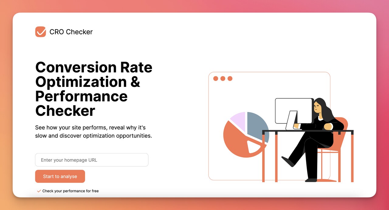
Enter your homepage URL, wait about 30 seconds, and it returns a report covering page load metrics, optimization gaps, and CTA placement opportunities. It's not a replacement for the 6-step audit above — it's a way to confirm the diagnosis on a couple of high-value pages before you commit to the full process.
What the CRO Checker is useful for:
• Performance scan: Highlights slow pages and points at specific blockers (large images, render-blocking scripts, slow third-party tags).
• Optimization spotting: Flags missing or weak CTA placement, hidden trust signals, and content-to-promise mismatches on the page.
• Conversion lens: Surfaces friction points the audit framework above will then go deeper on — think of it as triage before surgery.
• Free and no setup: No install, no tracking pixel, no waiting for data to accumulate. URL in, report out.
Use it as the first 15 minutes of your audit, then move to GA4 and the full 6-step process for everything the scanner can't see (funnel drop-offs, session recordings, repeat-customer behavior). The full audit is where the real revenue lift is — the checker is the on-ramp.
Common CRO Audit Mistakes to Avoid
I've watched smart teams sink weeks into audits that produced zero revenue lift. Almost always, the root cause is one of the four patterns below. Avoiding them is more valuable than any specific tactic.
• Auditing without a hypothesis log: Teams export reports, stare at them, and end up with a folder of CSVs and no decisions. Fix: write hypotheses as you spot drop-offs, not after. One row per hypothesis, ranked by suspected revenue impact.
• Skipping mobile because "we'll get to it later": Mobile is now 65% of traffic and converts 42% worse than desktop in the median store. If you only audit desktop, you've audited a third of the problem.
• Optimizing for vanity metrics: Bounce rate, time on page, and pages per session are diagnostic, not goals. The only metric that matters is revenue per session (and its supporting funnel metrics). If a change improves engagement but tanks revenue, ship the change to the trash.
• Running too many tests at once: Five concurrent A/B tests on overlapping page traffic means none of them will reach valid significance, and you can't disentangle which variant caused which lift. Run one test per page-area at a time. Boring. Slow. Reliable.
• Auditing once and stopping: A CRO audit isn't a project, it's a habit. The conversion rate that earned you the lift last quarter is also the new baseline competitors are measuring against. Re-audit every 6 months at minimum.
• Ignoring qualitative data: Numbers tell you what's happening. Recordings, surveys, and customer support tickets tell you why. Skipping the why means your fixes are guesses with a coat of paint.
Ecommerce CRO Audit Template and Examples
Two questions come up at this point: "What does an actual audit deliverable look like?" and "Can I see one for a store like mine?" Here's a template structure that's worked across 30+ audits I've reviewed at Popupsmart, followed by two anonymized examples.
Template structure (one Google Doc, 8-12 pages):
1. Executive summary (1 page): Current conversion rate, target rate, top 3 friction points, projected revenue lift if all fixes ship.
2. Goal definitions and event tracking (1 page): Listed conversion events with dollar values, GA4 setup confirmation, funnel report screenshots.
3. Data findings (2-3 pages): Top 5 lowest-converting high-traffic pages with screenshots, traffic numbers, current vs target conversion rate, and lost-revenue calculation.
4. UX and performance audit (1-2 pages): Core Web Vitals scores per page type, mobile screenshots, navigation issues, CTA audit.
5. Page-by-page audit (3-4 pages): One page per ecommerce page type (home, category, PDP, cart, checkout), with annotated screenshots and friction findings.
6. Trust and content audit (1 page): Review presence, badge placement, return policy visibility, copy quality scores.
7. Prioritized fix list (1 page): ICE-scored findings, top 10 to ship in the next 30 days, projected lift per fix.
8. Test plan (1 page): Hypotheses, test design, primary metric, minimum runtime, and "ship or revert" criteria for each.
Example 1: Apparel DTC, $4M annual revenue. Audit found a 23-second LCP on the PDP (large hero video that wasn't optimized), an "Add to Cart" CTA below the fold on mobile, and reviews loaded by JavaScript that fired below the fold. Fix priority: optimize hero video, move CTA up, server-side render reviews. Projected lift: 18%. Trailing 90-day actual after ship: 24% conversion rate increase.
Example 2: Beauty subscription brand, $12M annual revenue. Audit found a 5-step checkout, no Apple Pay button on mobile, and no return-policy link on the cart page. Fix priority: collapse checkout to 2 steps, add Apple Pay, surface return policy on cart and PDP. Projected lift: 12%. Trailing 90-day actual: 16% lift, with most of the win coming from Apple Pay alone (the team was surprised — recordings later showed mobile users had been bailing at the credit-card form for months).
The lesson from both: the highest-impact fixes were boring. Boring CRO works.
What Results to Expect
Here's the honest range, based on what I've seen across Popupsmart-customer stores and the broader benchmark data. According to Lucky Orange's conversion rate research, the average website conversion rate across industries sits between 2% and 5%, and that's the band most stores are starting from when they begin an audit.
What you should expect in the first 90 days after implementing audit findings:
• Quick wins (week 1-2): Page-speed fixes, missing trust badges, broken CTAs, and exit-intent popups typically deliver a 3-8% conversion rate lift on the affected pages. These are the "obvious in hindsight" fixes.
• Mid-term lifts (weeks 3-8): Checkout simplification, mobile UX improvements, and review-presence work deliver another 5-15% lift, usually compounding on the quick wins.
• Long-tail wins (months 3-6): A/B tested copy changes, full PDP rewrites, and category-page personalization tend to deliver 2-7% incremental lifts that stack as you ship them.
Aggregate range for a first audit cycle: 15-40% conversion rate improvement, with the wide spread driven by how broken the starting baseline was. A store starting at 1.2% has more room to lift than one already at 4.5%.
For deeper benchmark context across industries and channels, our ecommerce conversion rate research covers what "good" looks like in your specific category before you start the audit.
Ship Your First Three CRO Fixes This Week
The whole point of an audit is action. If you've read this far and you're not sure where to start, here's the smallest version that still moves the needle: run the Popupsmart CRO Checker on your three highest-traffic pages, watch 20 session recordings on your top-converting PDP, and ship the top 3 ICE-scored findings within 7 days. That's the smallest cycle that produces real revenue lift. Everything else in this guide is for the next round.
For deeper conversion-strategy context as you build the next cycle, the good conversion rate benchmarks piece is the natural follow-up read — it tells you what target rate to aim at next, not just where you are today.
Frequently Asked Questions
Can a CRO be audited?
Yes. A CRO (conversion rate optimization) audit reviews your store's data, UX, page-level performance, trust signals, and checkout flow to identify why visitors aren't converting and which fixes will lift the conversion rate the most. The audit itself produces a prioritized fix list — not the fixes. Shipping the fixes is the next phase. Most teams underestimate the gap between "we found the problems" and "we shipped the solutions."
What is the ecommerce CRO checklist?
An ecommerce CRO checklist is a binary pass / fix run-sheet covering the structural items every store should have right: conversion event tracking, page-speed baselines, mobile responsiveness, navigation clarity, CTA presence and placement, PDP completeness (images, reviews, descriptions), cart and checkout friction, trust signals (badges, policies, reviews), and a documented test plan. The 25-item checklist above covers each one with the specific pass criteria.
How to perform an ecommerce CRO audit in 2026?
Follow the six-step framework: define conversion goals with dollar values, gather and triangulate 90 days of data (GA4, heatmaps, recordings, Search Console), evaluate UX and Core Web Vitals on real devices, audit the five revenue page types (homepage, category, PDP, cart, checkout), analyze trust signals and copy quality, then prioritize fixes with ICE scoring and test or ship them. The 2026-specific updates are mobile-first weighting (mobile is now 65% of traffic) and INP as a Core Web Vital (replaced FID in 2024).
What tools are best for a CRO audit?
The lean stack: GA4 for funnel data, Microsoft Clarity or Hotjar for heatmaps and recordings, PageSpeed Insights for Core Web Vitals, Search Console for organic CTR diagnostics, and an A/B testing tool (Convert, Optimizely, or VWO) for changes that need statistical validation. For a quick first-pass scan, the Popupsmart CRO Checker surfaces speed and UX issues without setup. Beyond those, only add tools when a specific question you can't answer demands one.
Where can I find an ecommerce CRO audit example?
The two anonymized examples in the "Template and Examples" section above show what a finished audit looks like in practice — the apparel DTC case (24% conversion lift) and the beauty subscription case (16% lift). Both followed the 8-section template structure and the 6-step audit framework. For more conversion-strategy depth and how operators talk about audit findings, our CRO experts guide profiles practitioners and the kinds of audit frameworks they publish.
How often should you conduct a CRO audit?
Every 6 months at minimum, with a full audit annually. Spot-check audits triggered by specific events — a major site redesign, a new theme, a checkout platform migration, a 10%+ traffic shift — should run between the scheduled ones. The 6-month cadence keeps you ahead of buyer-behavior drift and catches the slow conversion-rate decay that happens when you ship features without measuring their CRO impact.
How long does a CRO audit take?
A focused audit on a small Shopify store ($500K-$2M annual revenue) takes 8-15 hours over 3-5 days. A mid-market store ($2M-$20M) takes 25-40 hours over 2 weeks because there are more SKUs, page types, and traffic segments to look at. Above $20M, it's usually a 3-4 week effort with a dedicated analyst, because the data slicing alone (by channel, by device, by customer segment) becomes a project of its own.
Can small businesses benefit from CRO audits?
Yes, and they often benefit more per dollar spent. A small store with 5,000 monthly sessions and a 1.8% conversion rate has more conversion-rate headroom than a store already converting at 4%, and the audit itself is cheaper because there are fewer pages and SKUs to review. Small businesses that audit annually and ship even 5 of the top-10 findings usually see the audit pay for itself in the first month. For a Shopify-specific take, see our Shopify conversion rate guide.
More guides worth reading next:
• Good Average Website Conversion Rate in 2026
• E-commerce Growth Statistics for 2026

How would you rate your experience with this article? 😊