15 Announcement Bar Examples for Ecommerce in 2026
Website announcement bars are customizable top/bottom site messages used to promote offers, updates, and CTAs without disrupting browsing; examples include sales, free shipping, launches, social proof, policies, and loyalty/referrals, plus steps to build one in Popupsmart and key benefits for conversions.
Announcement bars, also known as floating bars, sticky bars, or hello bars, are simple yet powerful tools for ecommerce websites.
These 15 announcement bar examples from real ecommerce brands show how a single line of text at the top of your site can drive purchases and build trust. Each example covers free shipping bars, flash sales, social proof, and loyalty nudges with a breakdown of what converts and how to replicate it.
What Makes a Great Announcement Bar? Selection Criteria
I reviewed over 80 ecommerce announcement bars across fashion, food, beauty, and DTC brands during the past year and selected these 15 based on four criteria:
• Message clarity: Can a visitor understand the offer within two seconds of landing? Bars with ambiguous copy or multiple competing messages didn't make the cut.
• Design integration: The bar must complement the site's visual identity without clashing or disappearing into the header. Contrast ratio, font weight, and color harmony all factored in.
• Conversion mechanism: Each bar needs a clear path to action — whether that's a CTA button, a coupon code, or a threshold that nudges cart value upward.
• Reproducibility: A marketer with a no-code tool like Popupsmart's popup builder could recreate any of these in under 15 minutes.
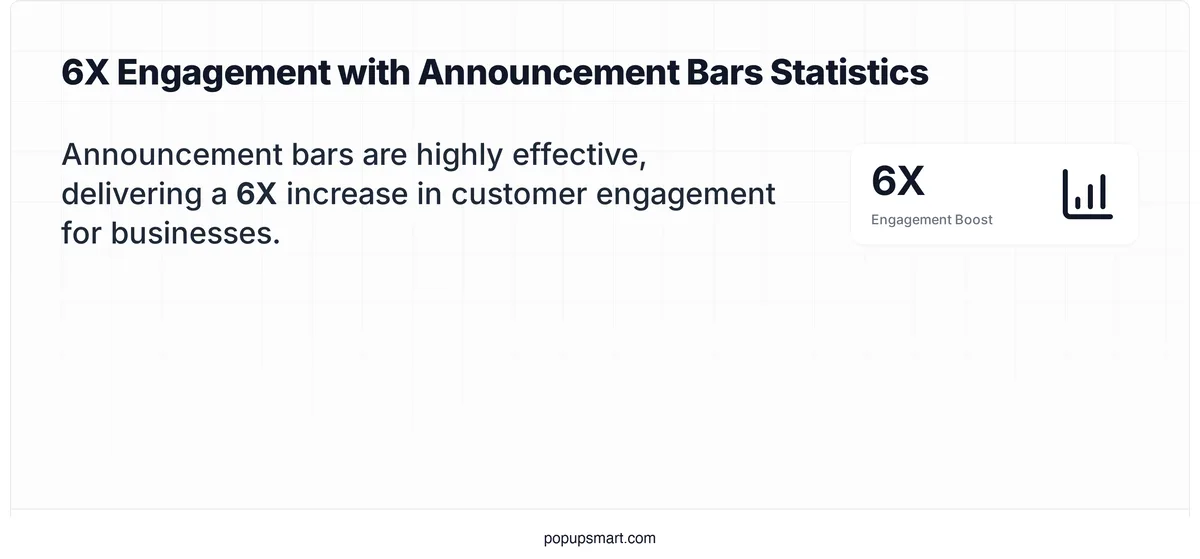
Announcement bars and customer engagement
According to AiTrillion's engagement research, spending just four minutes setting up an announcement bar can produce a 6X increase in customer engagement. That's a strong return on a minimal time investment.
1. Birkenstock: The Seasonal Sale Bar
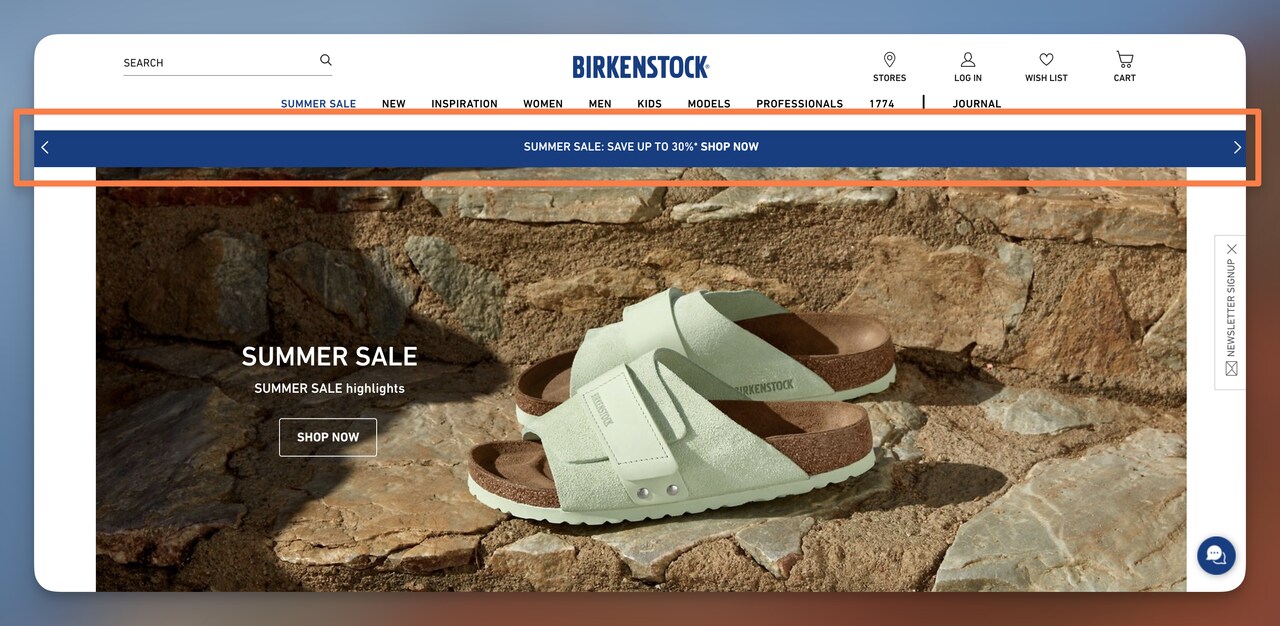
Birkenstock's summer sale announcement bar
What works: Birkenstock's bar delivers a single message in seven words: "SUMMER SALE: SAVE UP TO 30%." The blue background creates a 4.5:1 contrast ratio against white text, passing WCAG AA standards. A "Shop Now" CTA button sits right next to the discount percentage, shortening the cognitive path from awareness to click. There's no secondary message competing for attention.
Why it works: Loss aversion is stronger than gain framing. "SAVE UP TO 30%" frames the discount as money you'd lose by not acting. Birkenstock pairs this with a single CTA — no "Learn More" alternative — which applies Hick's Law to reduce decision time. Fewer choices mean faster clicks.
Key takeaway: Keep your sale bar to one offer and one button. If you're running multiple promotions simultaneously, rotate them on a timer rather than cramming two messages into the same bar.
2. Skims: The Free Shipping Threshold Bar
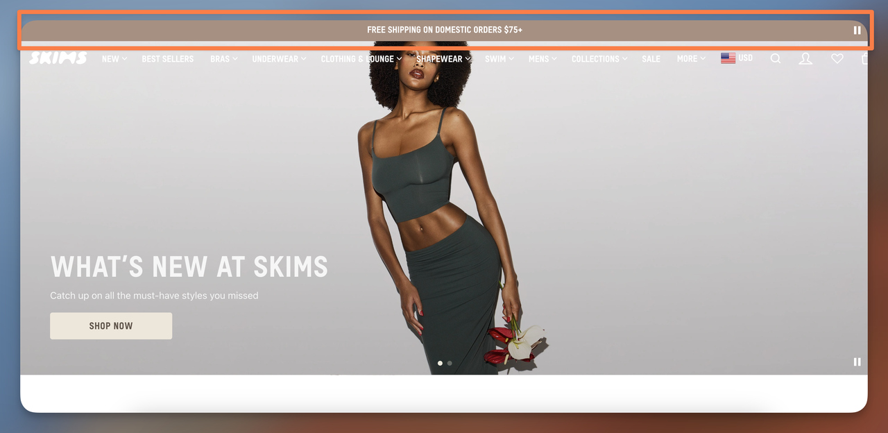
Skims' free shipping threshold bar
What works: "FREE SHIPPING ON DOMESTIC ORDERS $75+" is the entire message. No decorative copy, no brand tagline crowding the bar. The neutral-toned background merges with the site header so it feels native rather than promotional. The $75 threshold is specific and achievable — just high enough to push most carts one item higher.
Why it works: According to Growave's consumer research, 88% of shoppers are more likely to buy from a site that offers free shipping. By surfacing this offer on every page — not buried in the cart — Skims captures the average order value lift before the shopper even adds a first item.
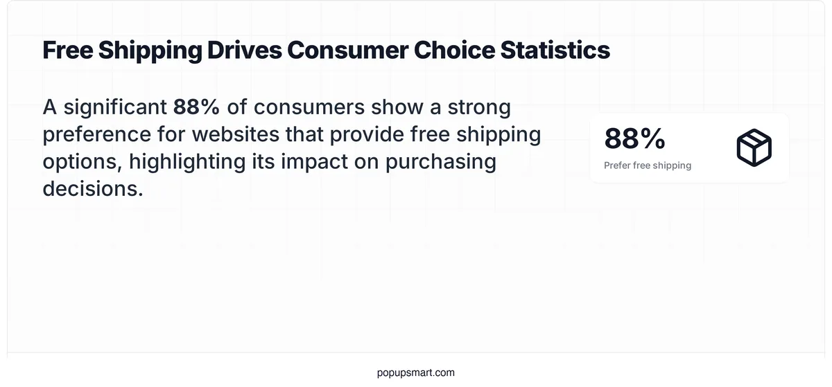
Free shipping preference among online shoppers
Key takeaway: Set your free shipping threshold 15-20% above your current average order value. This turns the bar into a revenue tool, not just a perk announcement.
3. Haven's Kitchen: The New Product Launch Bar
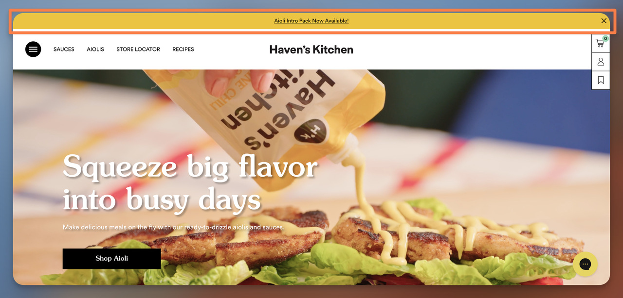
Haven's Kitchen product launch bar
What works: The bright yellow background breaks from Haven's Kitchen's otherwise muted color palette. That contrast is intentional — it forces the eye to the bar before anything else on the page. The close button gives visitors control, which matters because dismissible bars create a sense of agency rather than intrusion. The copy names the exact product (Aioli Intro Pack) instead of a vague "new arrivals" label.
Why it works: The Von Restorff isolation effect says items that visually stand out from their surroundings are remembered better. Haven's Kitchen applies this by choosing a bar color that exists nowhere else on the page. The result: visitors process the product name even if they immediately dismiss the bar.
Key takeaway: For product launches, pick a bar color outside your normal brand palette. The visual disruption signals "this is new" without adding extra copy.
4. Away: The Payment Flexibility Bar
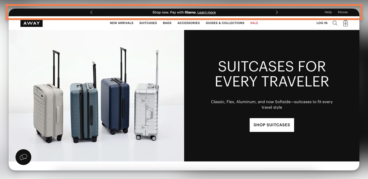
Away's Klarna payment bar
What works: "Shop now. Pay with Klarna." Five words that address the biggest objection for Away's $275+ suitcases: price. The slim black bar blends into the site's dark header, avoiding the promotional "banner ad" look that triggers banner blindness. By naming Klarna specifically — a brand shoppers already trust — Away borrows credibility from the payment provider.
Why it works: Buy-now-pay-later messaging in the announcement bar pre-qualifies visitors who might otherwise bounce on price. The bar sits above the product imagery, so the payment option registers before sticker shock hits. This is especially effective for brands with average order values above $150, where cart abandonment rates spike due to total cost surprise.
Key takeaway: If your products cost over $100, test a BNPL announcement bar against your standard promo bar. Position it as a payment option, not a financing pitch.
5. Magic Spoon: The Social Proof Bar
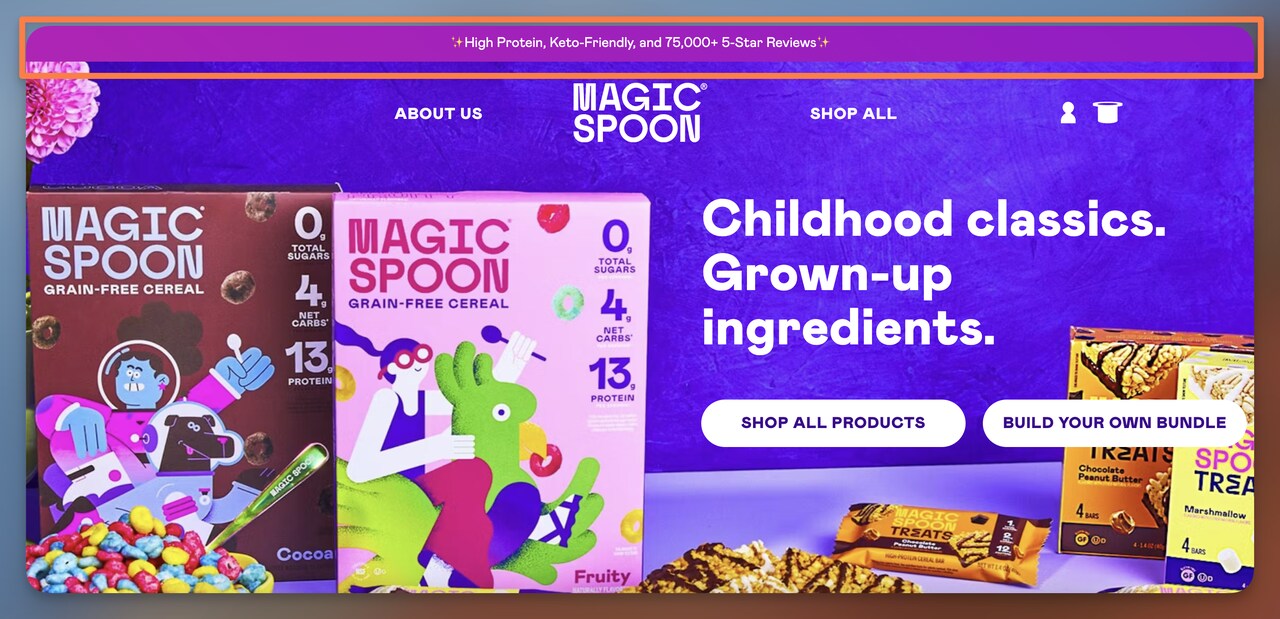
Magic Spoon's social proof announcement bar
What works: Magic Spoon packs three data points into one bar: "High Protein, Keto-Friendly, and 75,000+ 5-Star Reviews." The first two are product attributes that speak to their health-conscious audience. The third — the review count — is the conversion driver. Notice they didn't round down to "thousands of reviews." The specific number 75,000 feels more credible than a vague quantity. The purple background with sparkle emojis matches their brand voice without looking childish.
Why it works: Social proof is the strongest persuasion trigger for DTC brands that lack the physical shelf presence of grocery store competitors. According to VWO's UX research, 72% of users will tell five or more people about a positive experience, which means that 75K review count represents a much larger word-of-mouth circle. Displaying this stat in the announcement bar — the first thing visitors see — front-loads trust before any product evaluation begins.
Key takeaway: If you have 1,000+ reviews, put the exact count in your announcement bar. Specific numbers outperform vague claims like "loved by thousands" because they're verifiable.
6. Wellah: The Spending Threshold Bar
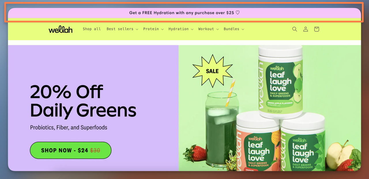
Wellah's cart value threshold bar
What works: Wellah’s announcement bar promotes a gift-with-purchase incentive instead of a standard discount. The message “Get a FREE Hydration with any purchase over $25” instantly communicates both the reward and the spending threshold. This type of offer feels more tangible than a percentage discount because customers clearly understand what they’re getting.
Why it works: Free product incentives trigger the zero-price effect, a well-documented behavioral economics principle showing that people disproportionately value items labeled “free.” Instead of evaluating a discount mathematically, customers focus on the perceived bonus they receive. The $25 threshold also nudges shoppers to slightly increase their cart value in order to unlock the reward.
Key takeaway: Gift-with-purchase offers are often more persuasive than discounts in announcement bars. A clear threshold plus a tangible reward (“Free product over $X”) increases perceived value and encourages customers to add one more item to qualify.
7. Swoon: The Social Media Follow Bar
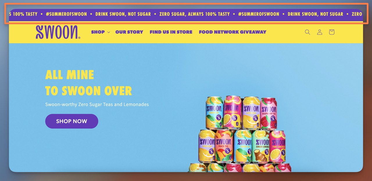
Swoon's social media promotion bar
What works: Most brands reserve announcement bars for sales. Swoon takes a different approach by using theirs to promote social media channels. This makes strategic sense for a brand whose Instagram presence drives discovery — followers on social become repeat visitors, and repeat visitors convert at 2-3x the rate of first-timers. The bar keeps the ask simple: follow us. No coupon code, no threshold, just a relationship invitation.
Why it works: Not every announcement bar needs to push an immediate transaction. Swoon recognizes that their customer journey starts on social media, so the bar aligns with the actual path to purchase. This is an underused strategy, I've tracked over 80 ecommerce announcement bars this year, and fewer than 5% promote social channels. That rarity itself gives Swoon a differentiation edge in above-the-fold examples.
Key takeaway: If your brand drives more than 30% of traffic from social media, test a social-follow announcement bar during non-sale periods. It keeps the bar active without discount fatigue.
8. Olaplex: The Product Spotlight Bar
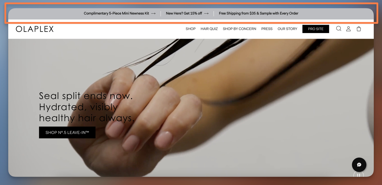
Olaplex's product spotlight bar
What works: Olaplex dedicates their announcement bar to a single hero product rather than a site-wide sale. The bar names the product, includes "Shop Now" as the CTA, and uses minimal copy. This approach works because beauty brands often have 50+ SKUs, and new visitors don't know where to start. The bar acts as an editorial recommendation — "if you buy one thing, buy this."
Why it works: The paradox of choice, studied by psychologist Barry Schwartz, shows that too many options can paralyze decision-making. By pointing visitors to a specific product, Olaplex reduces the cognitive load of browsing a large catalog. This is especially useful during product launches when the brand wants to concentrate traffic on a single SKU for initial sales velocity.
Key takeaway: Use product spotlight bars during launches or when you want to push a hero SKU. Name the product directly — don't hide it behind "See what's new."
9. Loisa: The Bundle Discount Announcement
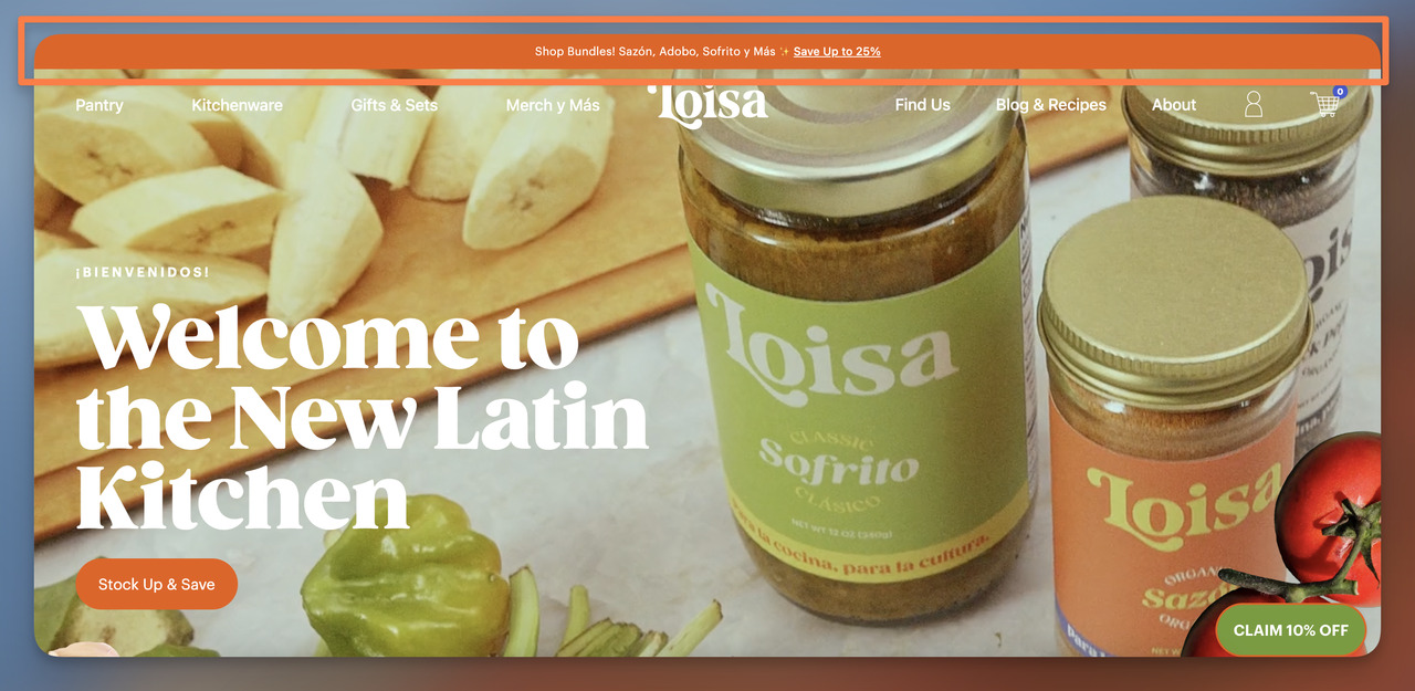
Loisa's bundle discount announcement bar
What works: Loisa uses the announcement bar to highlight bundle offers with a clear savings incentive. The message “Shop Bundles… Save Up to 25%” immediately communicates value while grouping multiple products together. This is especially effective for food brands because bundles encourage customers to explore complementary products rather than purchasing a single item.
Why it works: Bundles reduce decision friction and increase average order value at the same time. Instead of evaluating many individual products, visitors can choose a curated set that already makes sense together (e.g., Sazón, Adobo, Sofrito). The “Save Up to 25%” message reinforces the perception of a smart purchase, which nudges customers toward buying more items in one order.
Key takeaway: Announcement bars are a powerful place to promote product bundles instead of single-item discounts. Bundles simplify decisions, increase cart size, and introduce customers to multiple products at once — making them especially effective for food, skincare, and consumable brands.
10. Bruvi: The Return Policy Confidence Bar
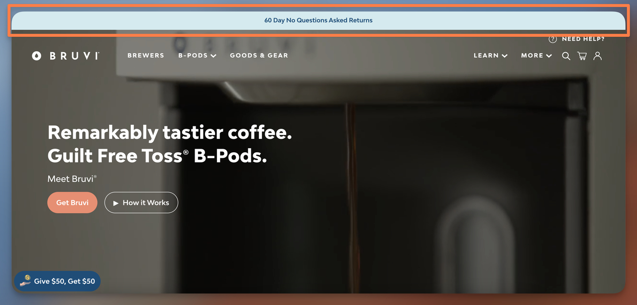
Bruvi's return policy bar
What works: Bruvi skips the typical discount message entirely and uses their bar to highlight a 60-day no-questions-asked return policy. For a single-serve coffee machine that competes against Keurig and Nespresso, this is a smart play. The light blue bar sits quietly at the top — no flashing, no urgency — because the message itself carries weight. "No-questions-asked" does the heavy lifting.
Why it works: Risk reversal removes the primary purchase barrier for high-consideration products. A shopper comparing Bruvi to an established brand like Nespresso is weighing an unknown against a known quantity. The 60-day return policy collapses that risk gap. Unlike a discount — which can signal desperation — a generous return policy signals that the brand is confident you'll keep the product.
Key takeaway: If your product costs more than $50 and has established competitors, lead with return policy in the announcement bar instead of a discount. Confidence sells better than cheapness.
11. Suta: The Bulk Discount Code Bar
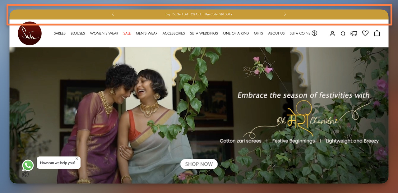
Suta's bulk discount announcement bar
What works: "Buy 15, Get FLAT 12% OFF | Use Code: SB15G12." Suta's bar does something unusual — it puts the coupon code directly in the announcement bar, eliminating the extra step of searching for a promo code at checkout. The 15-item threshold targets their wholesale and gift-buying customers (Suta sells saris, and weddings often require multiple pieces). The code format "SB15G12" is short enough to remember between the bar and the checkout field.
Why it works: According to EaseNotify's conversion research, floating coupon bars can increase redemption rates by up to 50% compared to burying codes on a separate promotions page. Suta's approach works because it targets a specific buying behavior (bulk purchases) rather than offering a blanket discount that erodes margins on single-item orders.
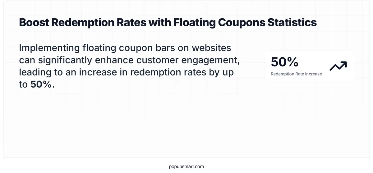
Coupon bar redemption rate impact
Key takeaway: Display the coupon code in the bar itself rather than hiding it behind a click. If the code is visible, shoppers don't abandon checkout to Google "brand name coupon code."
12. Cowboy: The Community Investment & Rewards Bar
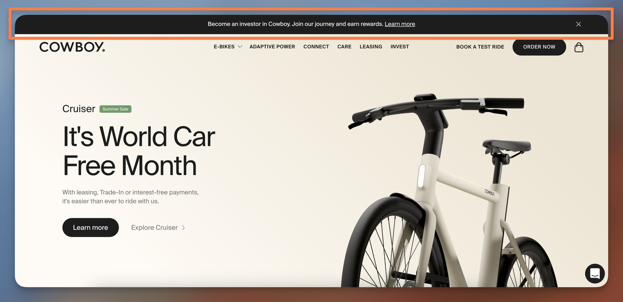
Cowboy's investment-focused announcement bar
What works: Cowboy uses its announcement bar to highlight a community investment opportunity rather than a promotion or discount. The message invites visitors to “Become an investor in Cowboy”, positioning customers as potential stakeholders in the brand’s journey. This approach signals confidence, growth, and transparency while reinforcing the idea that the company is building something worth investing in.
Why it works: Inviting users to become investors activates psychological ownership. Instead of treating visitors as buyers, Cowboy frames them as potential partners in the company’s future. This builds stronger trust and emotional connection while also communicating that the brand is growing and financially credible. For premium products like $2,000–$4,000 e-bikes, signals of long-term stability and ambition can reduce purchase hesitation.
Key takeaway: Announcement bars don’t always need to push promotions. They can highlight credibility signals, company milestones, or community participation opportunities. If your brand has initiatives like fundraising, partnerships, or major launches, using the announcement bar to showcase them can strengthen trust and brand perception.
13. The Honey Pot Company: The Referral Program Bar
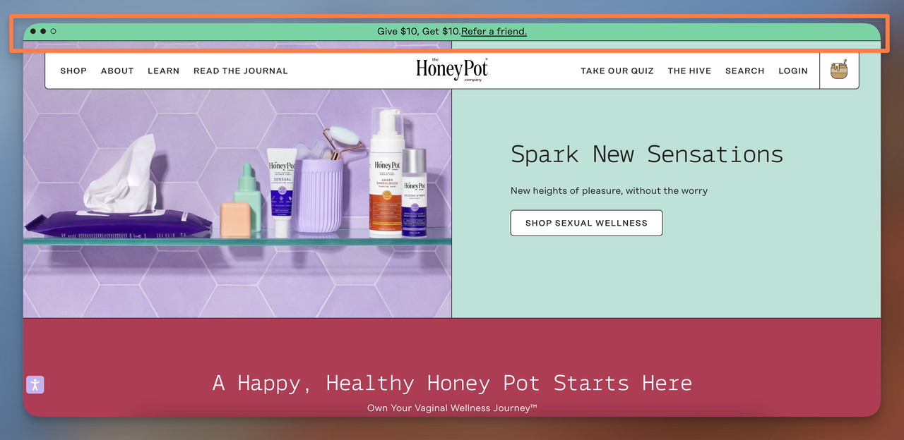
The Honey Pot's referral bar
What works: "Give $10, Get $10. Refer a friend." The copy is symmetrical on purpose — the matching dollar amounts make the deal feel fair to both parties. The Honey Pot doesn't bury this in a footer link or a separate referral page; they put it in the highest-visibility spot on the site. The bar's bright color scheme matches their brand personality and stands out against the product pages below.
Why it works: Dual-sided incentives outperform one-sided referral programs because they remove the awkwardness of asking friends to buy something. The referrer isn't just promoting a brand — they're giving their friend actual money off. According to involve.me's personalization research, personalized calls-to-action convert 202% better than generic ones. A referral bar is inherently personalized — it speaks directly to the existing customer's relationship with their network.
Key takeaway: Place your referral program in the announcement bar, not just on a dedicated page. Existing customers need to see the offer repeatedly before they act, and the bar provides that repetition without being pushy.
14. Lulu and Georgia: The Free Service Promotion Bar
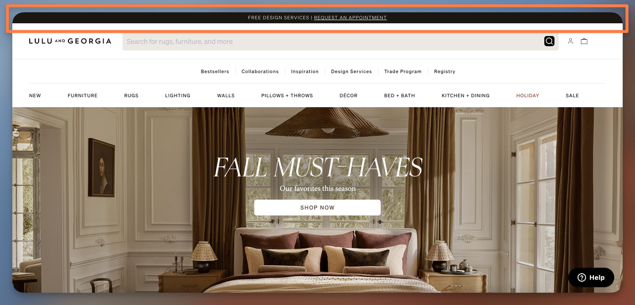
Lulu and Georgia's service promotion bar
What works: Rather than discounting products, Lulu and Georgia promote a free design consultation service in their announcement bar. The sleek black bar with white text feels premium — it doesn't look like a clearance sale. The CTA directs visitors to schedule an appointment, which serves double duty: it captures a lead and pre-qualifies them as serious buyers. Furniture shoppers who book a design consultation have a much higher purchase intent than casual browsers.
Why it works: Service-based bars work well for high-ticket categories like furniture, where the buying decision involves room measurements, color matching, and style coordination. By offering expert help for free, Lulu and Georgia remove the hesitation that comes with a $3,000 sofa purchase. The bar positions them as a partner in the design process rather than just another retailer. This is similar to how well-designed popups build trust by offering value before asking for a purchase.
Key takeaway: If you sell complex or high-ticket products, test a service-based bar instead of a discount. Free consultations, style guides, or sizing help convert better than percentage-off deals for considered purchases.
15. Rebecca Minkoff: The Loyalty Program Bar
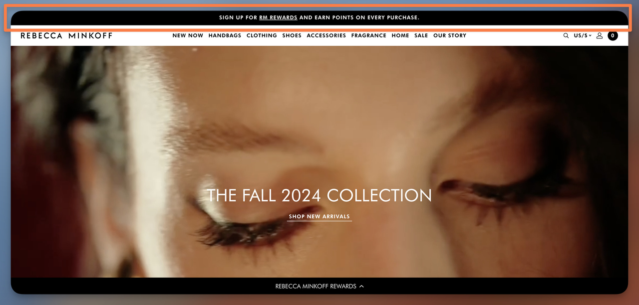
Rebecca Minkoff's loyalty rewards bar
What works: Rebecca Minkoff uses the announcement bar to promote their RM Rewards program with a clear "Sign Up" CTA. The bar doesn't try to explain the entire program — it just mentions earning points on every purchase and nudges visitors toward enrollment. This restraint is smart; a full rewards breakdown would clutter the bar. The message targets two audiences: new visitors who haven't joined yet and returning customers who might have forgotten they're not enrolled.
Why it works: Loyalty program bars are long-game conversion tools. They don't generate immediate sales like a discount bar, but they increase lead capture rates by offering ongoing value. The points mechanic creates a sunk-cost dynamic — once a customer has earned points, they're more likely to return to spend them rather than shop elsewhere. Rebecca Minkoff places this at the top of every page so the enrollment prompt becomes part of the browsing experience.
Key takeaway: Run a loyalty program bar as your default announcement during non-sale periods. It builds your customer database without cannibalizing margins, and it pairs well with popup messages that trigger on exit intent.
How to Create an Announcement Bar with Popupsmart in 5 Minutes
Building a professional announcement bar doesn't require a developer. Here's how to set one up with Popupsmart's floating bar feature:
1. Log in to your Popupsmart account
Head to your Popupsmart dashboard. If you don't have an account, you can sign up to Popupsmart for free. The free plan includes announcement bar functionality.
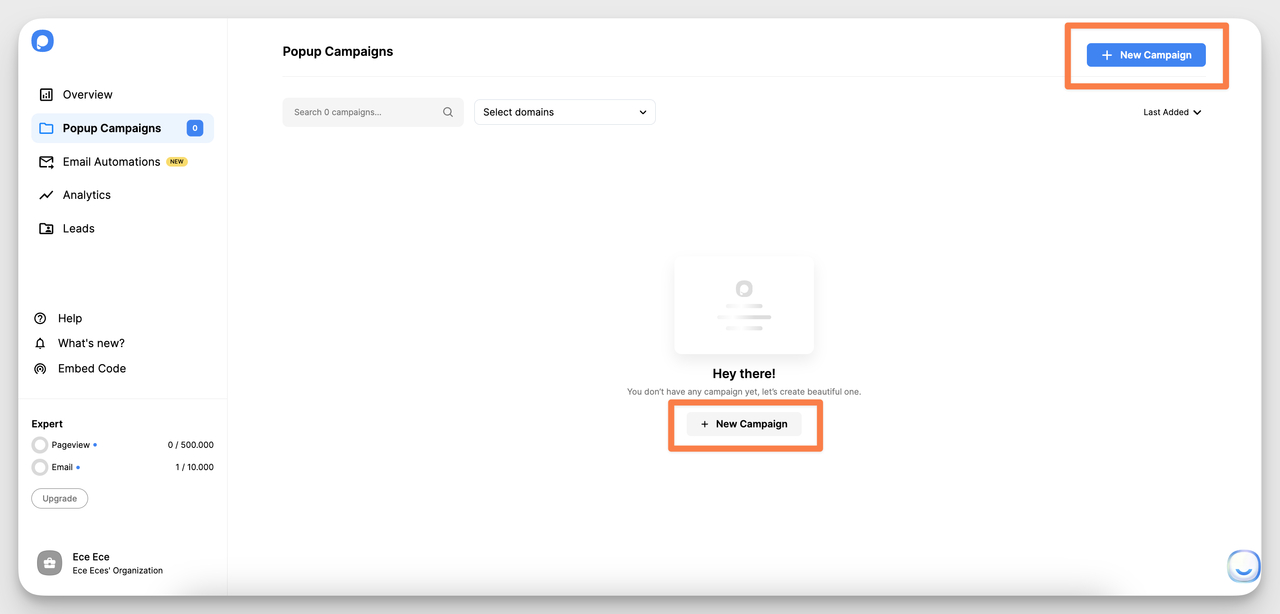
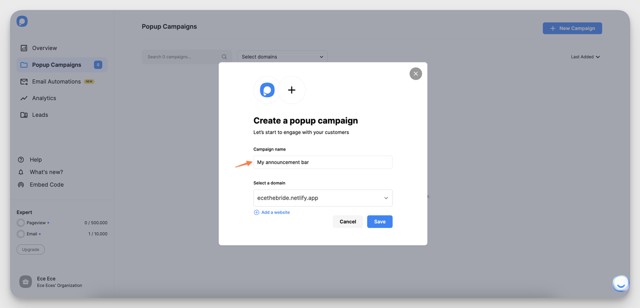
2. Create a new campaign
Click the "+ New Campaign" button in the upper-right corner.
Creating a new campaign in Popupsmart
3. Name your bar and select your domain
Enter a descriptive name (e.g., "Summer Free Shipping Bar") and select your website domain from the dropdown.
Naming your announcement bar campaign
4. Choose "Show Up Announcement" as your goal
Under the Goals section in the left sidebar, select "Show Up Announcement." This tells Popupsmart you're building a notification bar, not a popup.
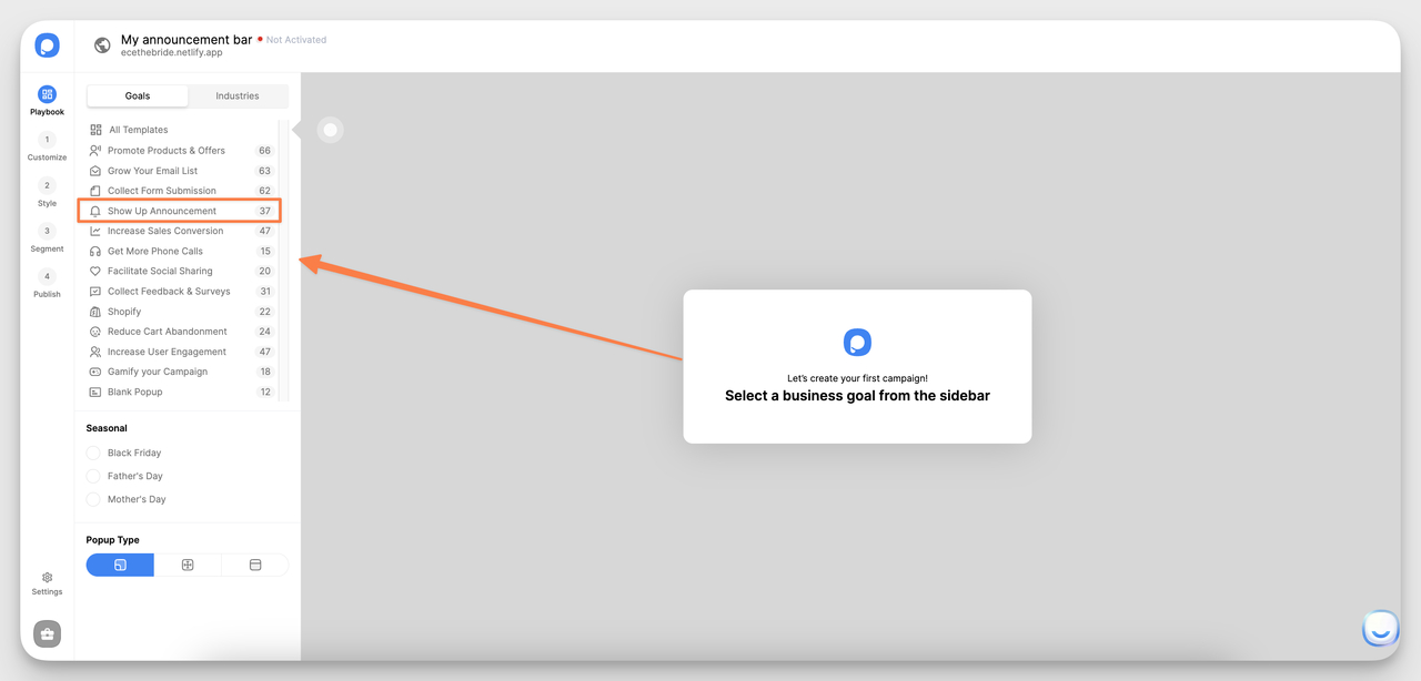
Selecting the announcement business goal
5. Select "Floating Bar" as the popup type
Scroll to the Popup Type options and choose "Floating Bar." This creates a bar that sticks to the top or bottom of the page.
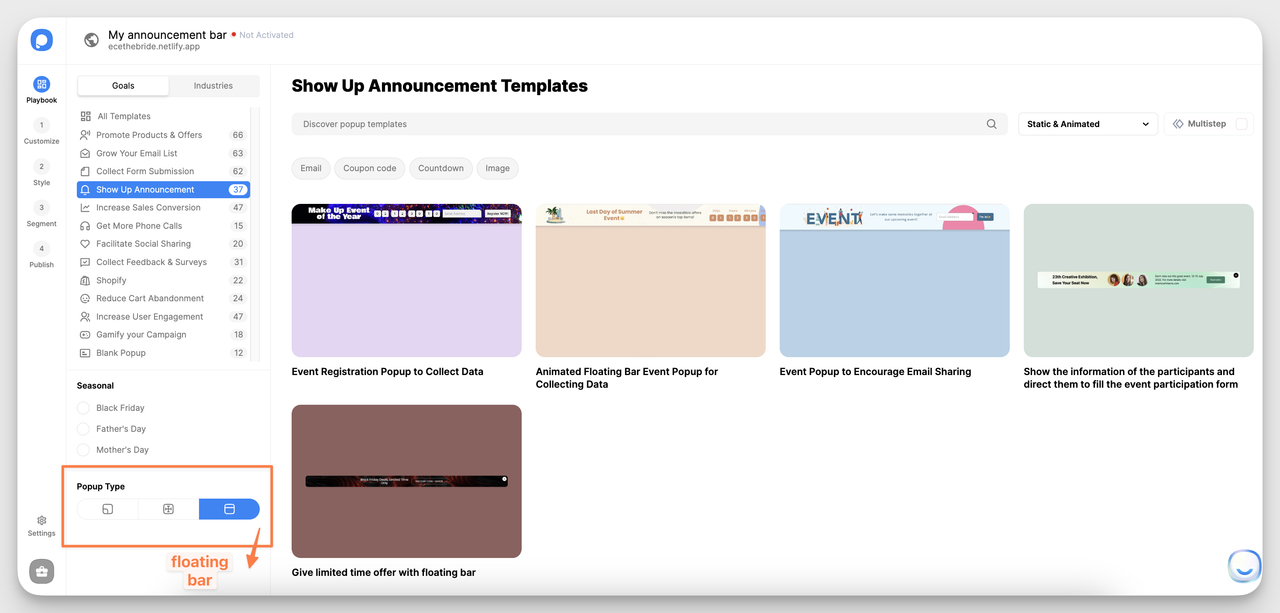
Choosing the floating bar type
6. Pick a template and customize
Browse the announcement bar templates and select one that fits your campaign. Customize the text, colors, CTA button, and optional countdown timer.
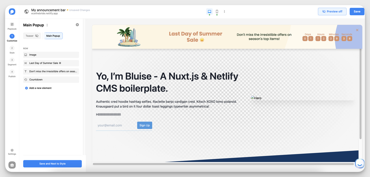
Announcement bar template gallery
7. Set display rules and publish
Configure when and where the bar appears (all pages, specific URLs, device targeting). Click "Save" and publish. Your announcement bar is live.
What Are the Best Practices for Announcement Bar Design?
After analyzing these 15 examples and testing announcement bars across dozens of ecommerce sites, a few patterns consistently outperform:
- Keep copy under 10 words. The best-performing bars in our collection — Birkenstock, Skims, Away — all use fewer than 10 words. Your announcement bar isn't a landing page. It's a headline.
- Use one CTA maximum. Bars with two competing actions (e.g., "Shop Sale" and "Learn More") split attention. Choose one action and make it the only clickable element. A good website conversion rate for ecommerce sites falls between 2% and 5%, and every competing click path dilutes that number.
- Match or contrast your header color intentionally. Away's black bar blends into their header for a subtle, integrated feel. Haven's Kitchen's yellow bar clashes with everything — on purpose. Both work because the color choice was deliberate. What doesn't work is picking a random brand color without considering how it interacts with your header.
- Make it dismissible. Bars without a close button frustrate visitors, especially on mobile where they consume a larger percentage of screen space. A dismissible bar earns trust; a permanent one earns resentment.
- Rotate messaging, don't stack it. If you have multiple announcements (sale + free shipping + new arrivals), rotate them on a 5-second timer rather than cramming everything into one bar. Tools like Shopify popup apps support this natively.
- Test mobile separately. An announcement bar that looks sharp on desktop can eat 20% of the viewport on a phone. Always preview on a real mobile device before publishing. Check that text doesn't wrap awkwardly and that CTA buttons have enough tap target size — Google recommends at least 48x48 pixels for touch targets.
Making Your Announcement Bar Convert
Three patterns emerge from these 15 announcement bar examples that separate high-converting bars from decorative ones.
First, the best bars answer one question: "What do I get?" Birkenstock answers it (30% off), Skims answers it (free shipping), Bruvi answers it (60-day returns). Bars that try to communicate brand values or tell a story in the announcement bar almost always underperform bars with a concrete offer.
Second, design serves function. Every color choice, font size, and CTA placement in these examples exists to support the message, not decorate the page. Haven's Kitchen uses yellow to signal newness. Away uses black to signal sophistication. None of these were arbitrary.
Third, the announcement bar is not a standalone tool. It works best when paired with other on-site elements — lead capture forms, exit-intent triggers, and cart-value rules. Think of the bar as the first touchpoint in a system, not a silver bullet.
If you want to start building your own announcement bars, popup builder Popupsmart's free plan includes floating bars with targeting rules, countdown timers, and mobile-responsive templates. You can set one up in under five minutes, no code needed.
Frequently Asked Questions
What should you put in an announcement bar?
The most effective announcement bars focus on one message: a free shipping threshold, a limited-time discount, a new product launch, or a loyalty program signup. Keep copy under 10 words and include a single call-to-action. Avoid cramming multiple offers into one bar — it splits attention and reduces click-through rates. If you have several announcements, rotate them on a timer using a tool like a Shopify popup app that supports scheduled campaigns.
How can announcement bars improve ecommerce conversions?
Announcement bars improve conversions by surfacing relevant offers at the moment visitors arrive, before they start browsing. Free shipping threshold bars increase average order value by anchoring a spending target. Coupon code bars reduce checkout abandonment because shoppers don't leave to search for promo codes. Social proof bars (like Magic Spoon's 75K reviews) build trust that shortens the decision cycle. The key is matching the bar message to the visitor's stage: awareness-stage visitors respond to credibility signals, while cart-stage visitors respond to incentives.
What is the difference between a sticky bar, notification bar, and announcement bar?
These terms overlap, but there are practical distinctions. A sticky bar stays fixed on screen as visitors scroll — it never leaves the viewport. A notification bar typically alerts visitors to time-sensitive information (shipping delays, policy changes, maintenance windows) and is usually dismissible. An announcement bar is the broadest term, covering any top-of-page banner used for promotions, launches, or key messages. In practice, most modern implementations combine all three: they stick on scroll, can be dismissed, and carry promotional or informational content. Popupsmart's floating bar feature handles all three use cases from a single builder.
How to make a catchy announcement bar?
Start with the value proposition, not the product name. "Free shipping over $50" works better than "Check out our shipping policy." Use numbers when possible — "$10 off," "30% savings," "75,000 reviews" — because specific figures process faster than abstract language. Add a single contrasting CTA button ("Shop Now," "Claim Offer") and ensure the bar color creates enough contrast to be noticed without clashing. I've found that bars with countdown timers consistently outperform static bars for limited-time offers, because the ticking clock adds urgency without extra copy.

How would you rate your experience with this article? 😊