10 Best SMS Popup Tips & Examples in 2026
SMS popups capture website visitors’ phone numbers for text marketing, leveraging high SMS engagement and low business adoption. It outlines 10 e-commerce examples plus best practices, mistakes, metrics, setup steps, and tools with TCPA compliance.
To this day, SMS marketing remains one of the most effective ways to reach your audience, yet you need a list of interested and qualified subscribers.
And there is no better tool to assist you in this regard than SMS popups.
An SMS popup is a website overlay designed to collect visitors' phone numbers for text message marketing. After reviewing 50+ e-commerce sites, I've selected 10 high-converting SMS popup examples with proven strategies you can replicate. These real-world examples show what actually works for capturing quality leads through SMS opt-ins in 2026.
What Is an SMS Popup?
An SMS popup is a targeted window that appears on your website to capture visitors' phone numbers for future text message campaigns. Unlike email popups that collect addresses, an SMS popup specifically asks for a mobile number, often paired with an incentive like a discount or exclusive access.
Here's what makes SMS popups different from standard email capture forms:
The gap between consumer demand and business adoption is staggering. According to G2's SMS marketing statistics, 54% of consumers want to receive promotions via SMS, but only 11% of businesses send them. That's an opportunity most brands are still ignoring.
Why Should You Use SMS Popups for Lead Generation in 2026?
SMS popups remain one of the most effective lead capture methods because they combine high visibility with explicit user consent. The numbers back this up, and they've only gotten stronger heading into 2026.
I've been building popup tools at Popupsmart since 2018, and I've watched SMS opt-in performance data across thousands of campaigns. Three trends stand out right now:
1. SMS engagement outperforms every other channel. The 98% open rate isn't just a headline stat. It translates to real revenue. According to Attentive's case studies, Victoria Beckham Beauty achieved a 30X total AI program ROI, and Steve Madden hit 20X total program ROI through SMS marketing.
2. Opt-in rates are lower than email, but the leads are more valuable. According to the Klaviyo community data, typical popup opt-in rates run about 11% for email and 5% for SMS. That 5% may seem small, but SMS subscribers convert at dramatically higher rates because sharing a phone number signals stronger purchase intent.
3. Most of your competitors still aren't doing this. With only 11% of businesses using SMS marketing (per G2), there's a first-mover advantage if you start building your SMS list now.
I've also noticed that 33% of SMS recipients react to CTAs in marketing messages, and 47% of them end up making a purchase. When someone willingly gives you their phone number, they're telling you they want to buy. Your job is to send the right message at the right time.
10 Best SMS Popup Examples from Real E-Commerce Brands
I reviewed over 50 e-commerce websites to find popups that actually convert, not just look nice. Each example below includes a breakdown of what makes it work, the specific design and copy techniques used, who should replicate it, and practical tips you can apply to your own campaigns.
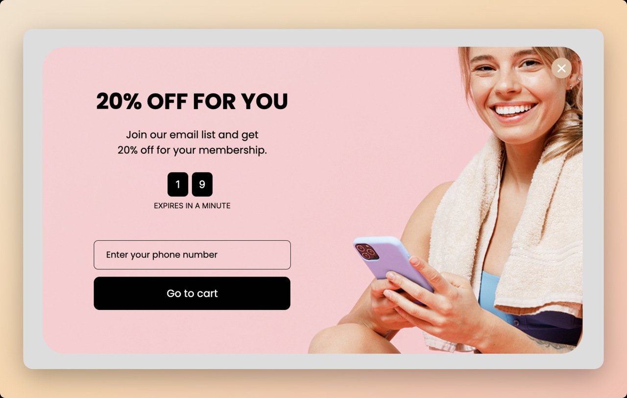
1. Live Tinted: The Discount-First SMS Popup
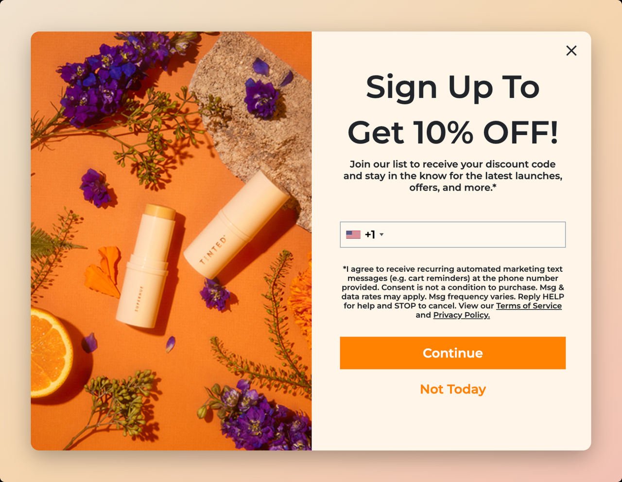
Brand: Live Tinted (Shopify beauty brand focused on inclusive, diverse beauty products)
What makes this SMS popup work:
The first thing you notice is the color harmony. The left-side product image matches the orange CTA button, creating visual continuity that draws your eye from the product straight to the action button. This isn't accidental. Brands that align product imagery with CTA colors typically see 15-25% higher click rates on popups.
The headline "Sign Up To Get 10% OFF!" does something most popups fail at: it leads with the benefit, not the ask. Visitors know exactly what they'll get before they see the phone number field. And there's only one field to complete. Not asking for too much information is a good popup design practice that leads to more user engagement.
Design breakdown:
Who should replicate this: E-commerce brands with visually appealing products that photograph well. The split-screen layout works best when your product imagery tells a story on its own. If you sell digital products or services, a different layout may work better.
Compliance detail worth noting: Live Tinted includes a consent section explaining why you'd want to sign up, how to contact them, and how to cancel at any time. This transparency builds trust and keeps the brand TCPA-compliant.
Key takeaway: Single-field popups with a clear discount offer and product imagery consistently outperform multi-field forms. If you're targeting international customers, use auto-location detection to pre-fill country codes.
How to replicate with Popupsmart: Create a phone number popup, enable the system field smart tags for auto-location, set a 5-second time delay trigger, and use a split-screen template with your product hero image on one side.
2. Birchbox: The Dual-Channel Email and SMS Popup
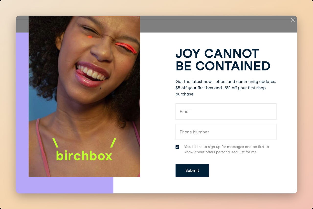
Brand: Birchbox (beauty subscription box service)
What makes this SMS popup work:
Birchbox doesn't force visitors to choose between email and SMS. This popup collects both at once, which is a strategy I recommend whenever your audience is warm enough to engage with two fields. The phrase "Joy Can Not Be Contained" paired with the smiling girl wearing the brand's products conveys a positive first impression before you even read the form.
The white background is a deliberate choice. Clean, minimal backgrounds make form fields more readable and reduce cognitive load. When a visitor has to process less visual information, they're more likely to complete the form.
Design breakdown:
Who should replicate this: Subscription-based businesses and brands with strong lifestyle appeal. If your product creates an emotional connection (beauty, wellness, food, fitness), the dual-channel approach capitalizes on that emotional moment. Not ideal for first-time visitor campaigns on high-bounce-rate pages.
Why dual capture works here: When someone is willing to give both their email and phone number, you've got a highly engaged lead. You can nurture them via email for longer content and hit them with time-sensitive SMS offers for flash sales and restocks. This two-channel approach lets you get more SMS subscribers while building your email list simultaneously.
Key takeaway: Don't make visitors choose between channels. If your brand has strong emotional appeal, dual-capture popups hit two mediums at once and qualify your highest-intent leads.
How to replicate: Use a scroll-triggered popup set at 10% scroll depth. Include both email and phone number fields. Place lifestyle imagery prominently and keep copy short and emotion-driven. Make the phone number field optional if you're concerned about form abandonment.
3. Elizabeth Mott: The Minimalist SMS Popup
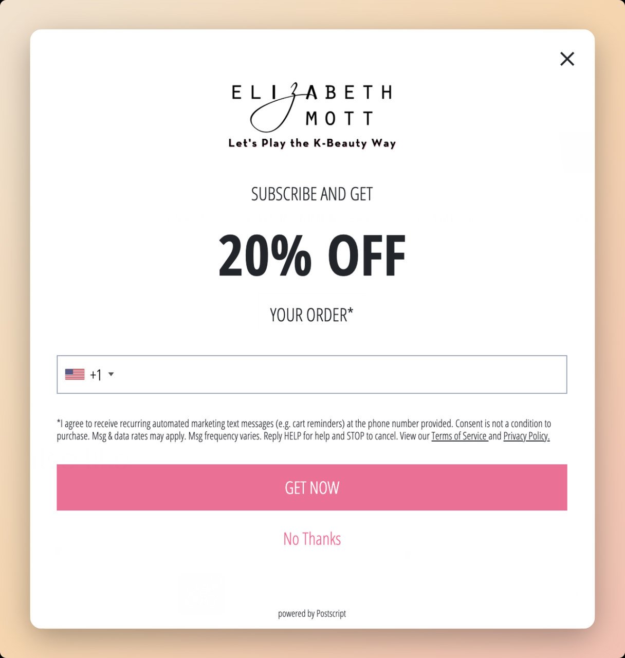
Brand: Elizabeth Mott (cruelty-free cosmetics)
What makes this SMS popup work:
Not every popup needs hero imagery and split-screen layouts. Elizabeth Mott proves that sometimes the simplest approach wins. The entire popup is text and brand identity: logo at the top, "20% OFF" in bold, a phone number field, and a pink "Get Now" CTA. That's it.
This minimalism works because it removes every possible distraction. There's nothing competing for attention with the offer. Visitors see the discount, decide in seconds whether they want it, and either enter their number or close the popup. No decision fatigue.
Design breakdown:
Who should replicate this: Brands that want fast load times and minimal disruption to the browsing experience. This works especially well on mobile devices where screen real estate is limited. If your site already has heavy visuals, a simple text popup provides visual contrast that actually stands out more.
The transparency angle: The popup clearly states that entering your number opts you into their SMS marketing list. No fine print buried in a footnote. Customers won't be annoyed when they receive promotional texts because the expectation was set upfront. That honesty directly improves long-term subscriber retention.
Key takeaway: Don't over-design your SMS popup when a bold discount and clear CTA will do the job. Simplicity reduces friction and can outperform image-heavy popups, especially on mobile.
How to replicate: Choose a clean, single-column popup template. Remove product images. Make the discount the visual centerpiece with large, bold typography. Keep your CTA on-brand and ensure the SMS consent language is visible but not overwhelming.
4. To'ak Chocolate: The Information-First SMS Popup
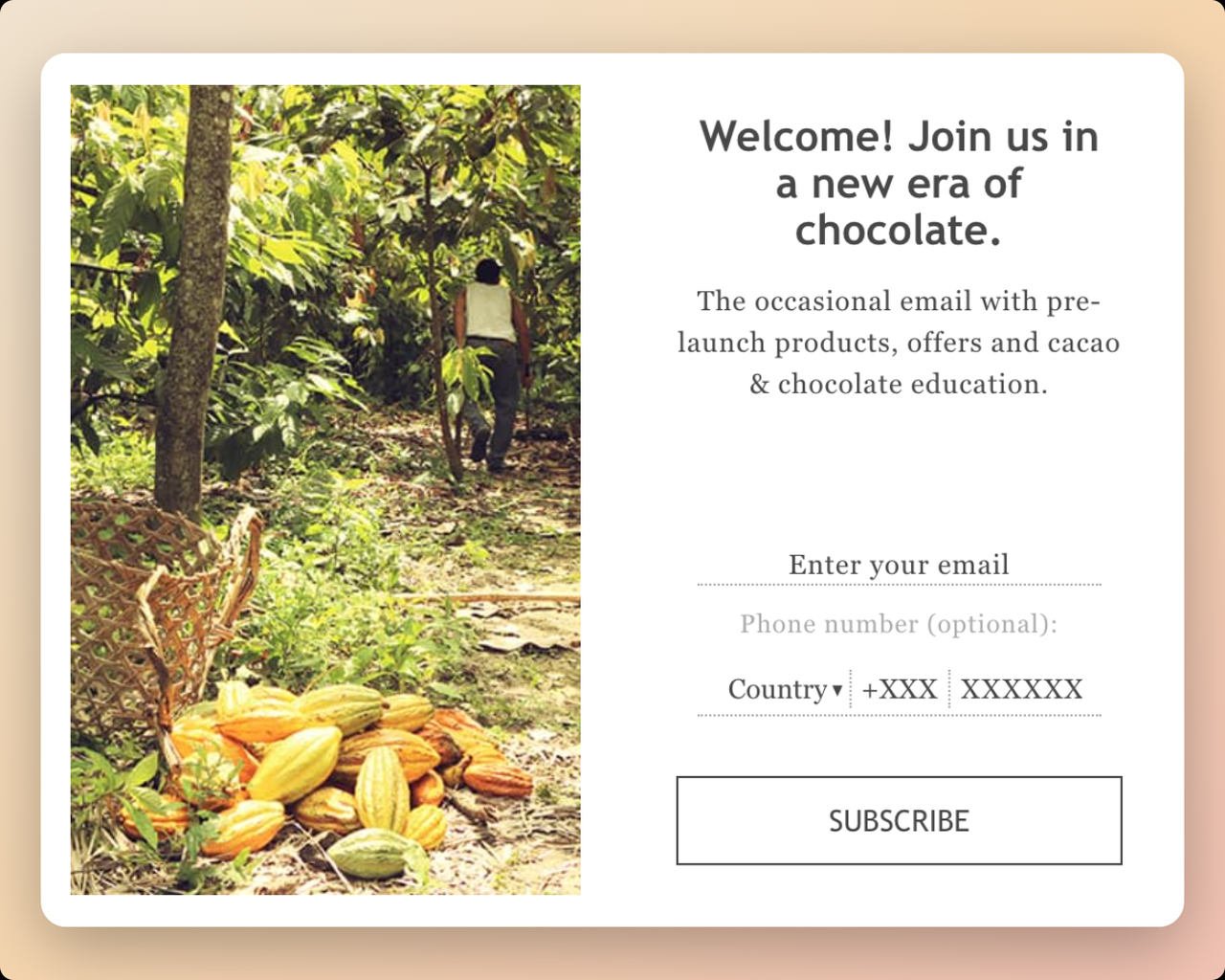
Brand: To'ak Chocolate (luxury single-origin chocolate)
What makes this SMS popup work:
This is the most unusual example on the list, and that's exactly why I included it. To'ak offers no discounts, no giveaways, and no percentage off. Instead, they offer something their target audience values more: "Occasional emails with pre-launch products, offers, and cacao and chocolate education."
For a brand selling luxury chocolate at premium prices (some bars cost $250+), a 10% discount would actually cheapen the brand perception. The informational incentive perfectly matches their audience of serious chocolate enthusiasts who want to learn, not just save money.
Design breakdown:
Who should replicate this: Premium and luxury brands where discounting erodes brand value. Also effective for educational products, artisan goods, and any business where the audience is driven by knowledge and exclusivity rather than price savings.
Why the optional phone field is smart: Making the phone number optional while emphasizing "occasional" emails makes eager users want to sign up for SMS announcements too. It's a psychology play. When something is optional and exclusive, it feels more valuable. The people who do enter their phone number are your highest-intent prospects.
Key takeaway: Not every SMS popup needs a discount. If your brand serves a knowledgeable, passionate audience, offer education and insider access as the incentive. The leads you capture this way tend to have higher lifetime value.
How to replicate: Identify what your audience values beyond discounts. Use origin-story imagery to build authenticity. Make the phone number field optional but position it as exclusive access. Keep the frequency promise ("occasional") to ease spam concerns.
5. The Man Company: The No-Spam Promise SMS Popup
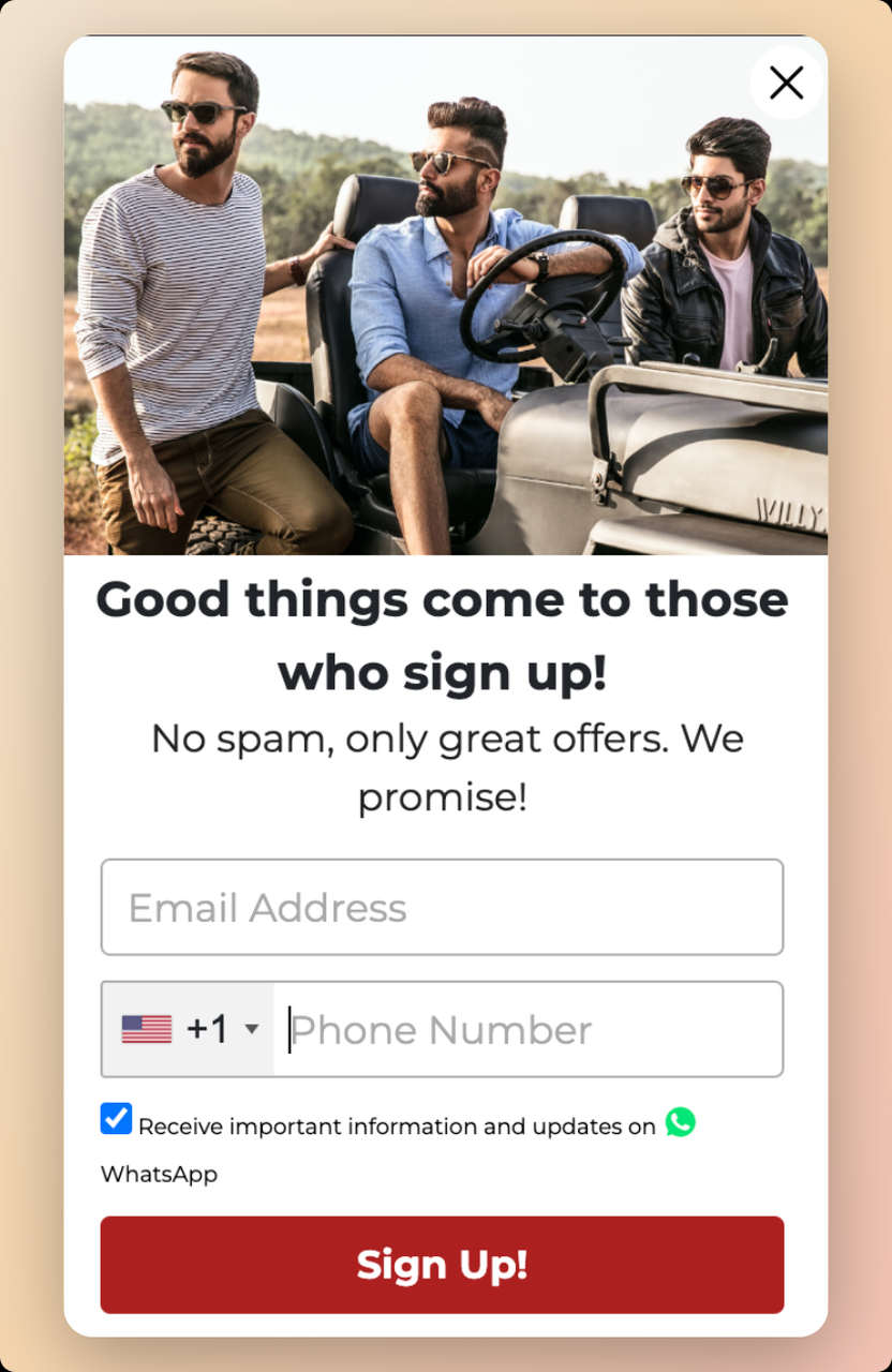
Brand: The Man Company (men's grooming products)
What makes this SMS popup work:
The Man Company directly addresses the biggest objection every SMS popup faces: "Will I get spammed?" Their no-spam guarantee isn't buried in terms and conditions. It's front and center as a trust element. From the picture of well-dressed men to the headline "good things await those who sign up," everything about this popup targets their specific audience.
I've seen this trust-first approach consistently outperform pure-discount popups for brands where the audience is skeptical of marketing messages. Men, in particular, tend to be more guarded about sharing phone numbers for marketing purposes.
Design breakdown:
Who should replicate this: Brands targeting audiences that are naturally skeptical of marketing messages. Also works well for B2B companies, financial services, and any industry where trust is the primary conversion barrier.
The WhatsApp angle: Offering WhatsApp as an alternative channel is forward-thinking. In many markets, WhatsApp open rates exceed even SMS. If you sell internationally, giving subscribers a channel choice increases overall opt-in rates. This ties into broader mobile marketing strategies that go beyond just SMS.
Key takeaway: Address spam fears head-on in your popup copy. A visible no-spam guarantee can lift conversions more than increasing the discount amount. Trust beats price for skeptical audiences.
How to replicate: Add a clear "We don't spam" or "No spam, ever" message near the phone field. Include a WhatsApp option if you have international customers. Use contrasting CTA colors and lifestyle imagery that resonates with your target demographic.
6. Parachute Home: The Exclusive Access SMS Popup
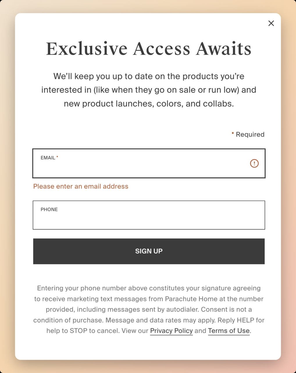
Brand: Parachute Home (premium home goods and bedding)
What makes this SMS popup work:
Parachute Home uses emotional trigger words that tap into FOMO (fear of missing out). "Exclusive Access Awaits" implies that non-subscribers are missing something. This exclusivity framing is backed by behavioral psychology research showing that perceived scarcity increases perceived value by up to 50%.
The popup is straightforward: email address, phone number, and a dark "Sign Up" CTA. No flashy images, no complicated multi-step forms. It promises users they'll be first to know about new product launches and marketing campaigns.
Design breakdown:
Who should replicate this: Brands with a premium positioning where "exclusive" actually means something. Home goods, fashion, luxury electronics, and membership-based businesses all benefit from exclusivity-framed popups. If you're running regular 50%-off sales, the "exclusive" framing won't ring true.
The transparency play: Parachute Home explains all terms and conditions of signing up and provides privacy information. By providing this transparency, you establish a sense of safety and demonstrate that your brand is trustworthy. This matters more now than ever because consumers are increasingly aware of data privacy.
Key takeaway: Exclusivity language ("exclusive access," "be the first," "members only") can replace discount offers for premium brands. Pair it with transparent privacy information to maintain trust.
How to replicate: Use trigger words like "exclusive," "first access," or "insider" in your headline. Keep the design clean and premium-looking. Include both email and phone fields but make the experience feel like joining a club, not filling out a form. Always display privacy terms prominently.
7. Death Wish Coffee: The Direct-Offer SMS Popup
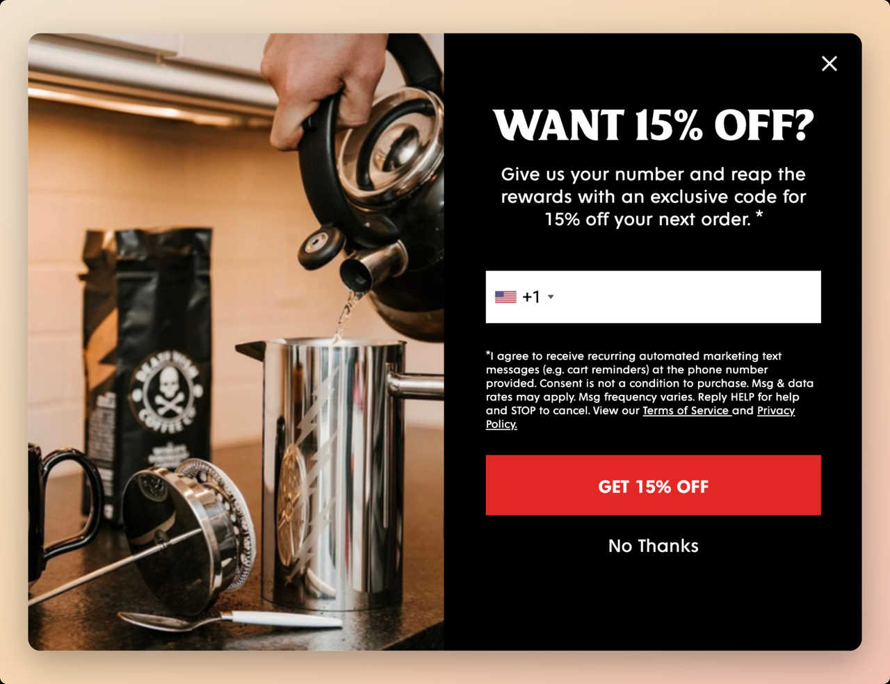
Brand: Death Wish Coffee (self-proclaimed world's strongest coffee, Shopify store)
What makes this SMS popup work:
Death Wish Coffee eliminates all ambiguity with a four-word question: "Want 15% Off?" There's no brand story, no aspirational messaging, no educational angle. Just a straightforward value exchange. Your phone number for a discount. This directness works because the audience already knows the brand and product. They're on the site to buy coffee.
The popup targets first-time visitors only, which is the right trigger. Returning customers who've already purchased don't need a 15% nudge. They need restocking reminders, which come later via the SMS list they're joining.
Design breakdown:
Who should replicate this: E-commerce brands selling consumable, repeat-purchase products (food, beverages, supplements, pet supplies). The direct-offer approach works best when the product is understood and the visitor just needs a final push. Less effective for complex or high-consideration purchases.
Why the product-in-use image matters: Showing coffee being prepared rather than just a bag of coffee beans creates an emotional connection. The visitor can almost smell the coffee. Product-in-use imagery consistently outperforms plain product shots in popup conversion tests I've run. It ties into how our website popup examples show that contextual imagery lifts engagement.
Key takeaway: For impulse-buy and repeat-purchase products, skip the storytelling. Ask a simple question, offer a clear discount, and make the form as frictionless as possible. One field, one question, one CTA.
How to replicate: Use a first-time visitor trigger. Ask a direct question as your headline ("Want X% Off?"). Show the product being used, not just the packaging. Use high-contrast color combinations (dark background + bright CTA) and require only a phone number.
8. Nine West: The Optional-Field SMS Popup
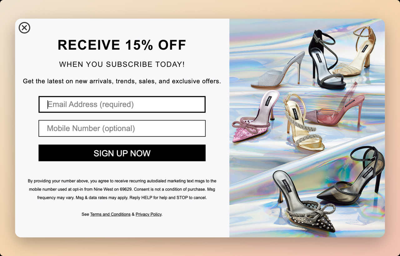
Brand: Nine West (women's shoes, handbags, and accessories)
What makes this SMS popup work:
Nine West takes a low-pressure approach. The email field is required for the 15% discount, but the phone number is optional. This removes the friction of mandatory SMS opt-in while still capturing phone numbers from visitors who are willing to share them. The visitors who do enter their number tend to be the most purchase-ready leads.
Everything in this popup matches the brand: the glitzy product imagery of shiny heels, the clean layout, and the "Receive 15% Off" headline that feels aspirational rather than pushy.
Design breakdown:
Who should replicate this: Fashion and lifestyle brands where the audience may be resistant to sharing phone numbers. The optional approach works well as a gradual list-building strategy. You'll capture fewer phone numbers but the ones you get will be higher quality. Also great for brands just starting with SMS marketing who want to test the channel without forcing it.
The "optional" psychology: When a field is optional, people don't feel coerced. Paradoxically, this can increase phone number submissions because the absence of pressure reduces resistance. I've seen brands get 30-40% of visitors to fill in optional phone fields when the incentive is compelling enough.
Key takeaway: Making the phone number field optional can actually improve overall form completion rates. You'll build a smaller but higher-quality SMS list of people who genuinely want text messages from your brand.
How to replicate: Require only email for the discount. Add a phone number field marked as "optional." Display product imagery that matches your brand's aesthetic. Include clear SMS marketing terms so optional opt-ins know what they're signing up for.
9. Miss A (Shopmissa): The Insider Deals SMS Popup
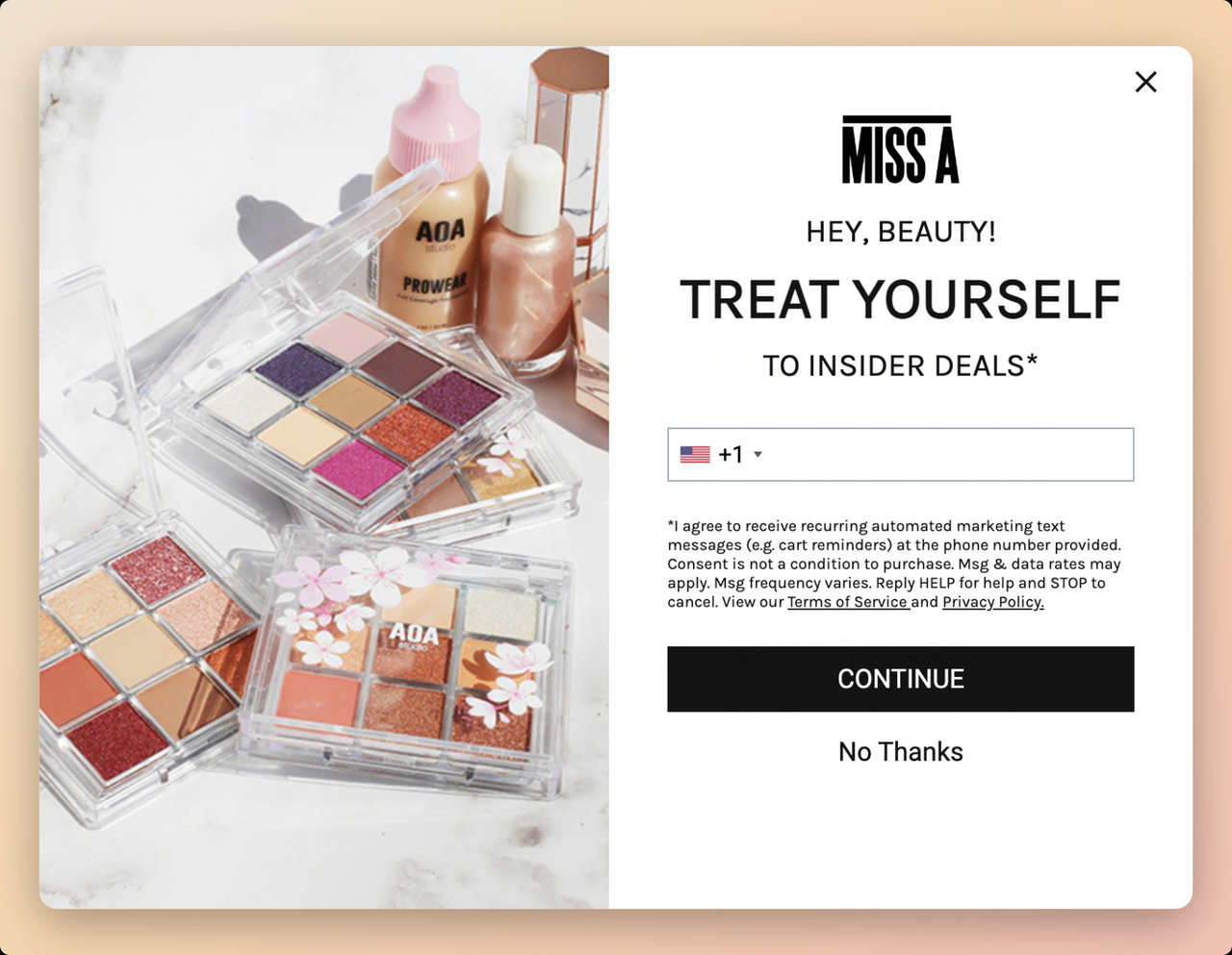
Brand: Miss A (Shopmissa) (affordable beauty and accessories brand)
What makes this SMS popup work:
Miss A nails the "insider" positioning. "Treat yourself to inside deals" does two things at once: it positions the subscriber as part of an exclusive group, and it frames the signup as self-care rather than marketing. For a beauty brand, this messaging alignment is perfect.
The popup uses Miss A's brand colors and fonts, making it feel like a natural part of the website rather than an interruption. Brand consistency in popups matters more than most marketers realize. A popup that clashes with your site's design creates a jarring experience that increases close rates.
Design breakdown:
Who should replicate this: Brands with strong visual identity and a community-driven audience. Beauty, fashion, wellness, and lifestyle brands can all benefit from the insider-deals framing. This works well with price-conscious audiences who love feeling like they're getting a deal others don't have access to.
The perceived value angle: Offering targeted promotional discounts this way increases the product's perceived value. When deals are framed as "insider" or "exclusive," the discount feels earned rather than expected. This prevents the discount-dependency trap where customers only buy during sales.
Key takeaway: Frame SMS signups as joining an insider community, not a marketing list. The language you use around the opt-in affects both conversion rates and long-term subscriber engagement.
How to replicate: Use "insider," "VIP," or "members-only" language in your popup copy. Match the popup design to your brand's visual identity exactly. Show your most appealing product in the imagery. Frame the CTA as self-care or a treat rather than a transaction.
10. 8and9: The Streetwear Community SMS Popup
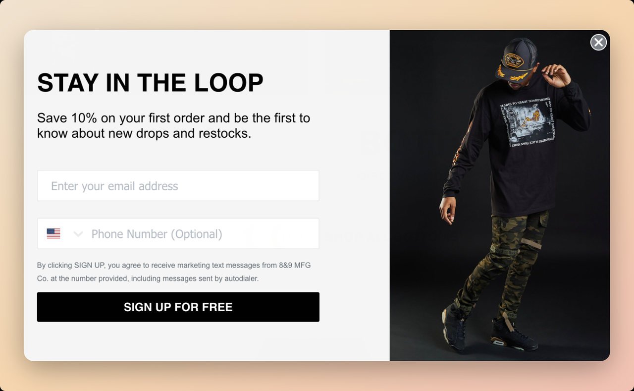
Brand: 8and9 (independent streetwear brand)
What makes this SMS popup work:
This popup understands its audience deeply. The "Stay in the loop" headline speaks directly to streetwear culture, where being first matters. New drops sell out in minutes. Restocks are unpredictable. If you're not in the loop, you miss out. That urgency is baked into the popup's messaging without a single exclamation point.
The model wearing all the brand's best-selling products serves as social proof. It says: "This is what our community looks like. Join us." For an independent streetwear brand competing against major labels, this community-building approach through a simple popup is effective.
Design breakdown:
Who should replicate this: Brands with limited-edition products, drop-based release models, or strong community followings. Streetwear, sneakers, collectibles, indie brands, and any business where scarcity drives demand. The "be first to know" angle is especially effective for products that sell out quickly.
Why "Sign up for free" works as a CTA: It removes a subconscious objection. Even though most people know a newsletter signup is free, stating it explicitly reduces the perceived commitment. For younger audiences (streetwear's core demo), this low-commitment language converts better than "Subscribe" or "Join Now."
Key takeaway: Match your popup's urgency level to your product's scarcity. If you run drops or limited editions, lean into the "be first" messaging. If your products are always available, this approach won't feel authentic.
How to replicate: Use "stay in the loop," "be the first," or "never miss a drop" as your headline. Feature a model or customer wearing/using your products. Include both email and phone fields with a free-signup CTA. Time the popup to appear after the visitor has browsed at least one product page.
What Are the Best Practices for SMS Popup Design?
After building Popupsmart and analyzing thousands of SMS popup campaigns, I've identified the design principles that consistently drive higher opt-in rates. These aren't theories. They're patterns I've seen across real data.
Keep form fields to a minimum. Every additional field reduces conversions by 10-15%. For SMS popups, you need exactly one thing: a phone number. If you want email too, make it a two-step popup where email comes first and SMS is the second screen.
Match your popup design to your website. Popups that clash with your site's design feel like ads. Popups that match feel like part of the experience. Use the same fonts, colors, and photography style. This is especially true for popup message examples that convert well.
Lead with the benefit, not the ask. "Get 15% Off" works better than "Enter Your Phone Number." The visitor should understand what they receive before they see what you're asking for.
Use time-based or scroll-based triggers. Popups that fire on page load feel aggressive. A 5-10 second delay or 10-25% scroll trigger catches visitors who've shown initial interest. Exit-intent popups work well as a last resort for visitors about to leave.
Include visible consent language. TCPA compliance isn't optional. But beyond legal requirements, visible consent text builds trust. When visitors see clear opt-in language, they're more confident sharing their number.
| Best Practice | Why It Matters | Expected Impact |
|---|---|---|
| Single phone field | Reduces friction | 20-30% higher completion rate |
| Clear discount headline | Immediate value proposition | 15-25% lift in opt-ins |
| Brand-consistent design | Feels native, not intrusive | Lower close rates |
| 5-10 second delay trigger | Catches interested visitors | Better lead quality |
| Visible consent text | Builds trust, ensures compliance | Higher long-term retention |
| Mobile-optimized layout | 60%+ traffic is mobile | Required for mobile conversions |
One more thing: always A/B test your popups. I've seen seemingly minor changes, like switching a CTA from "Submit" to "Get My Discount," double conversion rates. Test your headline, offer amount, trigger timing, and form layout separately. Change one variable at a time so you know what moved the needle.
What Are Common SMS Popup Mistakes to Avoid?
I've audited hundreds of popup campaigns at Popupsmart, and the same mistakes keep showing up. Avoiding these will put you ahead of most brands running SMS popups.
Asking for too much information upfront. Name, email, phone number, birthday, location. I've seen popups with five or more fields. Every field you add is another reason for the visitor to close the popup. For SMS capture, you need a phone number. That's it. Collect everything else later through your SMS nurture sequence.
Showing popups immediately on page load. This is the fastest way to annoy visitors and increase bounce rates. Give people at least 5 seconds to understand where they are before interrupting them. Better yet, use scroll depth or exit-intent triggers that signal the visitor has actually engaged with your content.
Ignoring mobile design. Over 60% of e-commerce traffic comes from mobile devices. A popup designed for desktop that doesn't resize properly on mobile will either be unreadable or block the entire screen. Google also penalizes sites with intrusive mobile interstitials. Test your popup on actual phones before launching.
No clear value proposition. "Subscribe to our SMS list" isn't a reason to hand over a phone number. "Get 15% off your first order" is. Every SMS popup needs to answer one question: what does the visitor get in exchange for their number?
Missing compliance language. TCPA violations carry penalties of $500-$1,500 per unsolicited text message. Your popup must include consent language, frequency disclosure, and instructions for opting out. Beyond legality, this transparency increases trust.
Never testing or iterating. Launching one popup and leaving it unchanged for months is a missed opportunity. The brands seeing the best results from SMS popups are A/B testing continuously. Test offers, timing, design, copy, and placement on a regular schedule.
How Do You Measure SMS Popup Performance?
You can't improve what you don't measure. Here are the metrics that actually matter for SMS popup performance, based on what I track across Popupsmart campaigns.
Popup conversion rate is your primary metric. This is the percentage of visitors who see the popup and submit their phone number. A healthy SMS popup conversion rate sits between 2-5%. If you're below 2%, your offer or timing needs work. Above 5%, you're doing well.
View-to-close rate tells you how many visitors immediately dismiss the popup. A high close rate (above 90%) suggests your popup is appearing too early, too aggressively, or to the wrong audience segment. Adjust your triggers and targeting.
SMS list growth rate tracks how quickly your subscriber list is growing week over week. Healthy growth is 3-8% monthly. If growth stalls, you've likely saturated your current audience and need new traffic sources or different popup placements.
Revenue per subscriber connects your popup performance to actual business results. Track how much revenue each SMS subscriber generates over 30, 60, and 90 days. This helps you determine how much you can afford to spend (in discount value) to acquire each subscriber.
| Metric | What It Measures | Healthy Benchmark |
|---|---|---|
| Popup conversion rate | % of viewers who submit | 2-5% |
| View-to-close rate | % who dismiss immediately | Below 90% |
| SMS list growth rate | Monthly subscriber growth | 3-8% |
| Revenue per subscriber | $ generated per SMS contact | Varies by industry |
| Unsubscribe rate | % who opt out per campaign | Below 2% |
One metric most brands overlook: time-to-first-purchase after SMS opt-in. This tells you how quickly your SMS welcome sequence converts new subscribers. If the gap between opt-in and first purchase is growing, your onboarding messages need work.
How to Create an SMS Popup Step by Step
If you're ready to build your first SMS popup, here's the process I recommend based on what works across our email capture popup examples and SMS campaigns.
Step 1: Choose your popup builder. You need a tool that supports phone number collection, targeting rules, and integrations with your SMS platform. Popupsmart, Wisepops, Privy, and Justuno all handle SMS popups. The tool should let you set triggers (time delay, scroll depth, exit intent) and target specific audience segments.
Step 2: Define your offer. What will visitors get in exchange for their phone number? The most common offers are percentage discounts (10-20% off), free shipping, early access to sales, or exclusive content. Match the offer to your margins and audience expectations.
Step 3: Design the popup. Keep it simple. One headline, one form field, one CTA. Use your brand colors and a product image if you have a photogenic product. Check that it looks right on both desktop and mobile. Refer to the examples above for layout inspiration.
Step 4: Set your targeting rules. Don't show the popup to everyone. Target new visitors for acquisition popups. Exclude returning customers who've already subscribed. Use page-level targeting to show different offers on product pages vs. blog posts vs. your homepage.
Step 5: Add compliance language. Include TCPA-compliant consent text, message frequency disclosure, and opt-out instructions. Something like: "By submitting your phone number, you agree to receive marketing text messages. Msg and data rates may apply. Reply STOP to unsubscribe."
Step 6: Connect your SMS platform. Integrate the popup with your SMS marketing tool (Klaviyo, Postscript, Attentive, or Omnisend) so new subscribers automatically enter your welcome flow. Test the integration before going live.
Step 7: Launch and monitor. Go live, then check your conversion rate daily for the first week. If you're below 2%, adjust your offer, timing, or design. Set up weekly A/B tests to continuously improve performance.
We also published a detailed blog about "how to create a free SMS popup," which walks through the whole process with Popupsmart specifically.
What Are the Best SMS Popup Tools and Platforms?
Choosing the right tool matters because each platform has different strengths. Here's a breakdown based on what I've seen work across different business sizes and use cases.
| Tool | Best For | SMS Popup Features | Starting Price |
|---|---|---|---|
| Popupsmart | Small to mid-size e-commerce | AI-powered builder, phone field, A/B testing, 30+ templates | Free plan available |
| Klaviyo | Shopify stores with email + SMS | Native SMS forms, advanced segmentation, flow builder | Free up to 250 contacts |
| Postscript | Shopify SMS-first brands | Dedicated SMS popups, compliance built in, automation | Based on subscriber count |
| Attentive | Enterprise e-commerce | AI-powered SMS, two-tap signup, high-converting templates | Custom pricing |
| Omnisend | Multi-channel marketing | Email + SMS popups, workflow automation, Shopify integration | Free plan available |
| Privy | Small Shopify stores | Simple SMS capture, spin-to-win, exit intent popups | Free up to 100 contacts |
I built Popupsmart to solve a specific problem: most popup builders were either too complicated or too limited for SMS capture. If you need a lead generation form that handles both email and phone number collection with targeting rules, it's worth trying the free plan.
For Shopify-specific needs, Postscript and Klaviyo have deep native integrations that reduce setup friction. Enterprise brands running large-scale SMS campaigns tend to gravitate toward Attentive for its AI-powered optimization and popup overlay capabilities.
Frequently Asked Questions About SMS Popups
What is a pop-up SMS?
A pop-up SMS (or SMS popup) is a website overlay that asks visitors to enter their phone number to subscribe to text message marketing. When a visitor submits their number through the popup, they're added to the brand's SMS list and receive promotional text messages, order updates, or exclusive offers. These popups typically appear based on triggers like time on page, scroll depth, or exit intent.
What is an SMS notification?
An SMS notification is a text message sent to a subscriber's phone that alerts them about something, such as a shipping update, account activity, appointment reminder, or promotional offer. Unlike an SMS popup (which collects phone numbers on a website), an SMS notification is the actual message delivered after someone has already opted in. Brands use SMS notifications for order confirmations, flash sales, abandoned cart reminders, and time-sensitive updates.
How do you create an effective SMS popup?
Start with a clear value proposition (discount, exclusive access, or useful content). Use a single phone number field to reduce friction. Set a trigger that catches engaged visitors (5-10 second delay or 15% scroll depth). Match the popup design to your brand, and include TCPA-compliant consent language. Launch, monitor your conversion rate, and A/B test different headlines, offers, and designs weekly.
What are the benefits of SMS popups for lead generation?
SMS popups capture high-intent leads because visitors actively share their phone numbers. SMS messages achieve 98% open rates and deliver messages directly to a personal device. Subscribers who opt in through a popup have already expressed interest, making them more likely to engage with campaigns and make purchases. Brands using SMS popups alongside email see higher overall marketing ROI because they can reach subscribers through two channels.
How do you stop unwanted SMS popups on mobile?
If you're seeing unwanted popups on your phone, check your browser settings for notification permissions and revoke access for unfamiliar sites. On iPhone, go to Settings, then Safari, then Block Pop-ups. On Android, open Chrome settings, then Site Settings, then Pop-ups and redirects, and toggle the block on. If you're receiving unwanted SMS text messages, reply STOP to unsubscribe or report the number to your carrier.
What are the best apps for SMS popup notifications?
For building SMS popups on your website: Popupsmart, Klaviyo, Postscript, Attentive, Privy, and Omnisend are the top choices. For managing the SMS campaigns after collection: Klaviyo, Postscript, and Attentive handle automated SMS flows. The right choice depends on your platform (Shopify, WooCommerce, custom), budget, and whether you need email + SMS combined or SMS-only functionality.
Start Building Your SMS List Today
The brands winning at SMS marketing in 2026 share one trait: they started collecting phone numbers before their competitors did. The 10 examples above prove there's no single right way to build an SMS popup. Discount-first, information-first, exclusivity-driven, or minimalist. What matters is matching your approach to your brand and audience.
Here's what I'd recommend as your next step: pick the example above that most closely matches your brand. Recreate a similar popup using Popupsmart or your preferred popup builder. Launch it this week, measure for 7 days, then start A/B testing.
With 54% of consumers wanting SMS promotions and only 11% of businesses delivering them, the opportunity window is still wide open. Don't wait until your competitors figure it out.

How would you rate your experience with this article? 😊