13 Free Trial Email Examples & Templates for 2026
Great free-trial emails use one clear CTA, value-first copy, specific subject lines, and drive users to an “aha” step. Examples show tactics like emotional imagery, short scannable offers, personalization, loss aversion, and timed sequences with templates.
Free trial email examples from SaaS and e-commerce brands show that the best-performing trial emails combine a clear value proposition, urgency triggers, and a single call-to-action button. Below you'll find 13 real free trial email templates broken down by type, with screenshots, copy analysis, and conversion tips for marketing teams running trial campaigns in 2026.
What Makes a Great Free Trial Email?
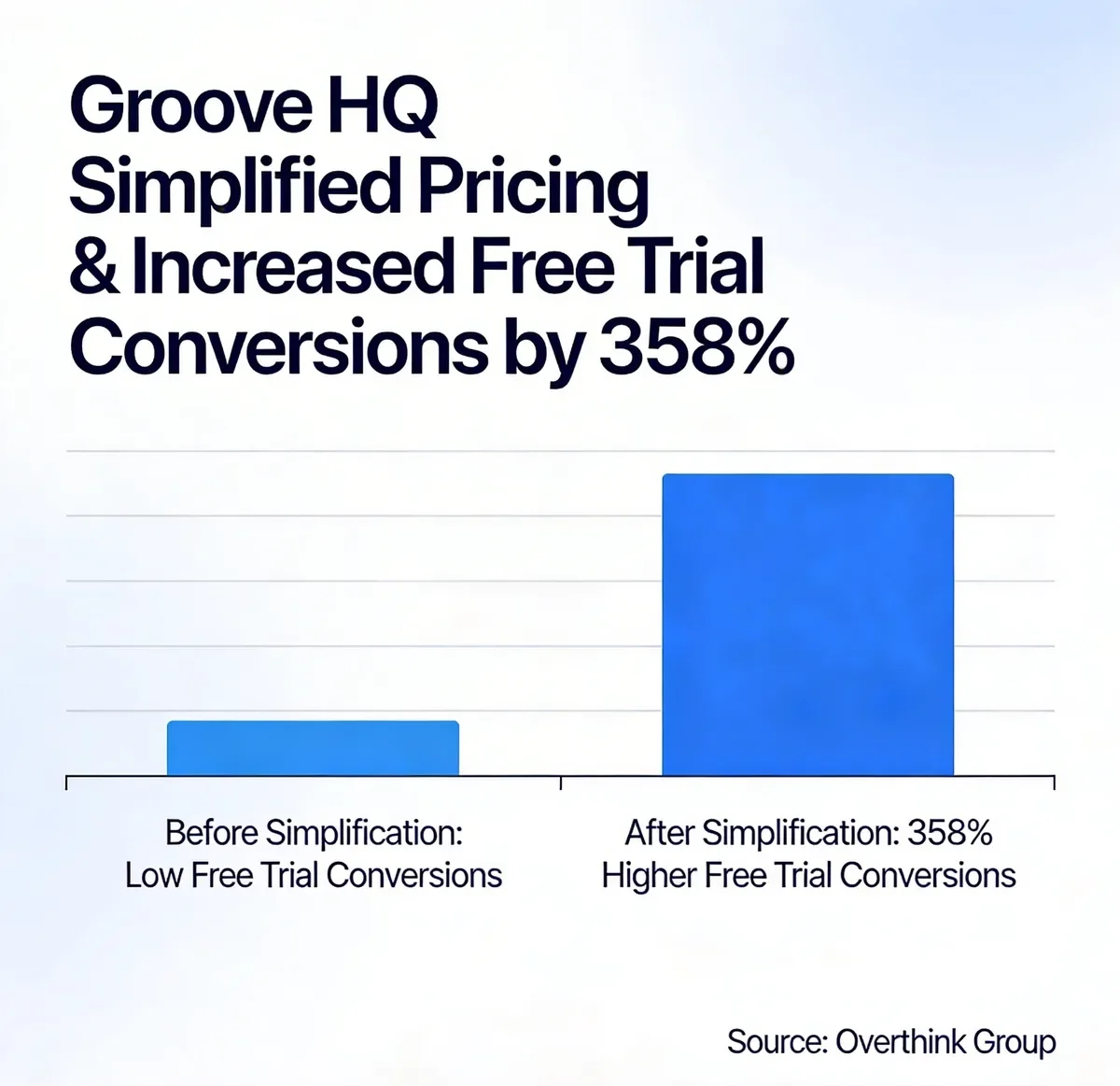
Simplified pricing can dramatically boost free trial conversion rates. Source: Overthink Group
I've reviewed over 100 free trial emails across B2B SaaS, e-commerce, and wellness brands, and selected these based on four criteria:
• Conversion clarity: The email has one goal and one CTA. No competing links, no sidebar distractions. According to Campaign Monitor's 2025 email benchmark report, emails with a single CTA increased clicks by 371% compared to multi-CTA designs.
• Value-first framing: The email leads with what the user gets, not what the product does. There's a measurable difference between "Try our tool" and "Build your first popup in 3 minutes."
• Subject line specificity: Vague subject lines like "Welcome!" underperform. The best free trial email examples use numbers, timeframes, or direct benefit statements that pull open rates above the 21.5% industry average tracked by MailerLite.
• Onboarding momentum: The email doesn't just confirm signup. It pushes the user toward the first "aha moment" with a specific next step, resource, or quick win.
Welcome Free Trial Email Examples
Welcome emails set the tone for the entire trial experience. They're also the highest-opened email type in any SaaS onboarding sequence, with open rates regularly exceeding 60%. Here are five brands that get them right.
1. Open: Sensory Storytelling in a Welcome Email
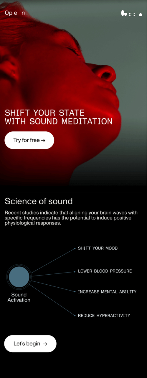
Open's welcome email blends imagery with invitation
What works: Open's email doesn't list features. Instead, it leads with an atmospheric background image that mirrors the product experience (sound-based wellness). The headline focuses on feeling, not function. The "Try for free" button appears twice: once above the fold and once below a brief value description. This dual-CTA placement catches both quick-decision readers and those who need more context before clicking.
Why it works: Emotional priming. Research from the Nielsen Norman Group on emotional design shows that users who feel an emotional connection to a product during onboarding are 2.6x more likely to convert to paid. Open's sensory approach bypasses the logical "do I need this?" filter and targets "do I want this?" instead.
Key takeaway: If your product has an experiential component (audio, visuals, wellness), lead your welcome email with imagery that mirrors the product feeling rather than a feature list. You'll create desire before the user even logs in.
2. Lululemon: Direct Trial CTA with Promo Code
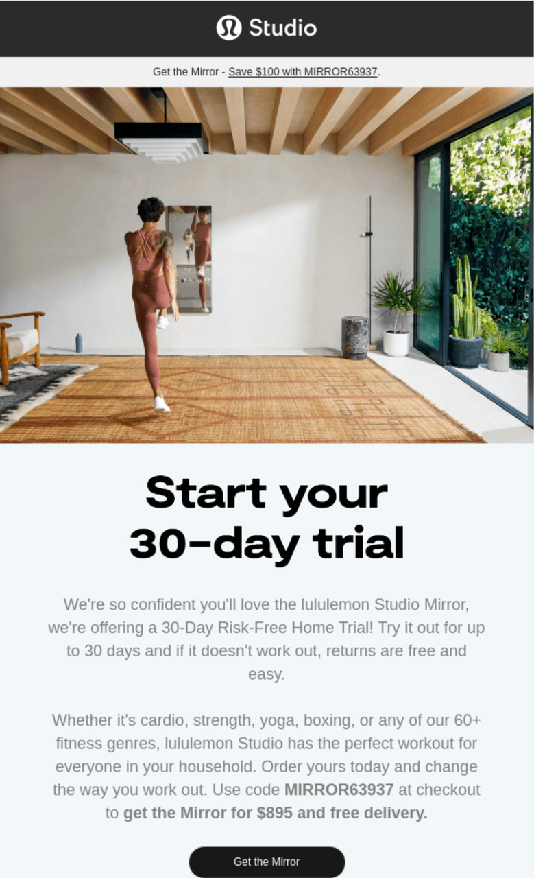
Lululemon's direct approach with promo code
What works: Lululemon opens with "Start your 30-day free trial" in the first line. No warm-up, no brand story. The promo code is bolded in the email body so it's impossible to miss. The email body is under 80 words total, and the single CTA button at the bottom uses action language. This email respects the reader's time.
Why it works: Cognitive load theory. According to Litmus's email UX research, the average person spends 9 seconds reading a marketing email. Lululemon packs trial duration, promo code, and CTA into a scannable block that works within that window. Readers don't need to scroll to understand the offer.
Key takeaway: State your trial length in the first sentence. Bold the promo code. Keep the total email under 100 words. This format works especially well for subscription-based products where the trial is the conversion event.
3. Headspace: The Gift-Framed Welcome
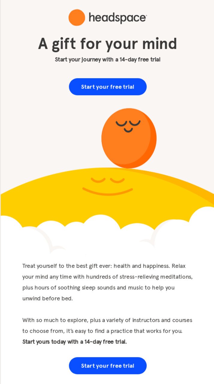
Headspace frames the free trial as a gift
What works: Headspace positions its 14-day free trial as a "gift." The colorful illustration reinforces the brand's playful identity while the dual CTA approach (one near the top, one after details) gives different reader types a path to convert. The copy mentions specific outcomes users can expect, not abstract promises.
Why it works: Reciprocity bias. When users perceive something as a gift rather than a marketing tactic, they feel a social obligation to reciprocate. Dr. Robert Cialdini's principles of persuasion research documents this effect extensively. By framing the trial as "here's something for you" instead of "sign up for our thing," Headspace shifts the psychological framing from transaction to generosity.
Key takeaway: Frame your free trial as a gift, not a sales pitch. Use language like "Here's your free trial" instead of "Sign up for a free trial." This small copy shift triggers reciprocity and increases trial-to-paid conversion by reducing the feeling of being sold to.
4. Weglot: Onboarding Welcome with Personal Touch
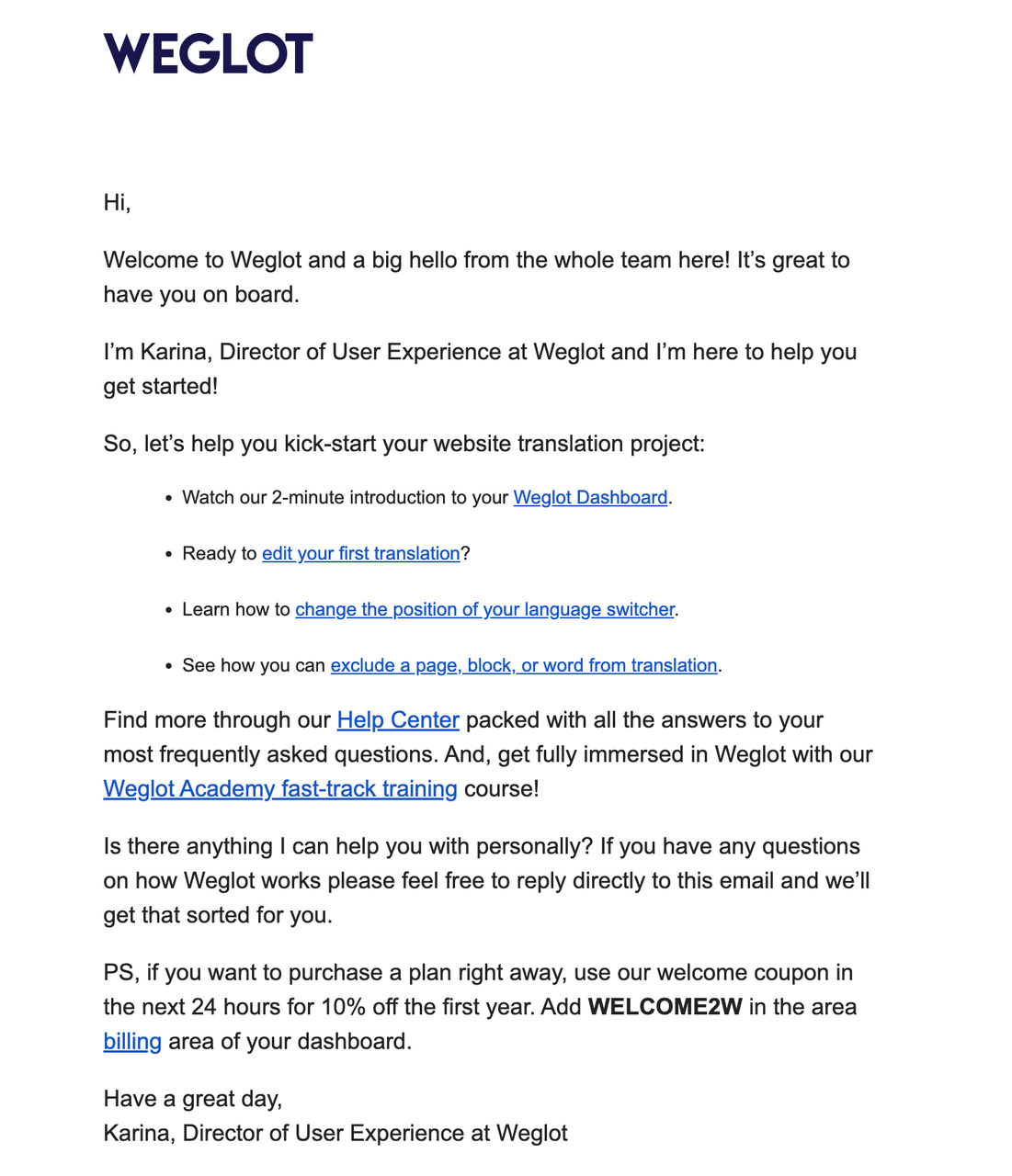
Weglot combines onboarding with personal help
What works: Weglot's email is almost entirely text, which sets it apart from the design-heavy examples above. It welcomes users, then immediately lays out clear steps to get started. The email closes with two powerful elements: a personal offer of help ("reply to this email") and a discount code for upgrading. No visual clutter. Just clear guidance.
Why it works: The text-only format creates a one-to-one feel. It reads like a colleague emailed you, not a marketing team. This approach aligns with what HubSpot's A/B testing data found: plain-text emails can outperform HTML emails in click-through rates because they feel personal. The personal help offer eliminates the fear of getting stuck during setup.
Key takeaway: For technical products (translation tools, developer platforms, integrations), try a text-only welcome email that reads like a personal note. Offer direct reply access to a real person. This approach outperforms designed templates when the product has a setup learning curve.
5. PicMonkey: Risk-Free Language to Neutralize Objections
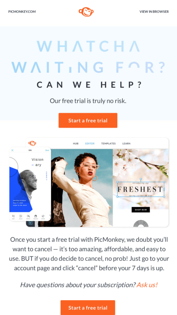
PicMonkey leans on "risk-free" messaging
What works: PicMonkey repeats "risk-free" multiple times throughout the email. The visuals show actual product output (templates, edited images), so users see what they'll create, not just the interface. The email also suggests specific use cases (social media templates) rather than generic "try our tool" messaging.
Why it works: Loss aversion is twice as powerful as gain motivation, according to behavioral economics research on prospect theory. "Risk-free" directly addresses the user's fear of wasting time or money. By pairing this with concrete product output (finished templates), PicMonkey answers both objections at once: "Will I lose anything?" (No, risk-free) and "Will I gain anything?" (Yes, here's what you'll make).
Key takeaway: Use "risk-free" language when your product requires time investment to evaluate. Pair it with screenshots of actual output (not the interface) so users can visualize the result before they commit to the trial.
Onboarding and Activation Free Trial Emails
The welcome email gets opened. Onboarding emails determine whether users actually try the product. According to Wyzowl's customer onboarding research, 86% of users say they'd stay more loyal to a product that invests in onboarding content. These three examples show how to push trial users from signup to first value.
6. Slack: Three-Step Activation Path
What works: Slack's onboarding email breaks getting started into exactly three steps: create a channel, invite a teammate, send a message. Each step has a single-sentence description and a direct link. The email doesn't try to explain everything Slack does. It just gets the user to one moment of collaboration.
Why it works: The "aha moment" framework. Slack's internal data (shared at SaaStr conferences) showed that teams who send 2,000 messages become paying customers at predictable rates. The onboarding email is engineered to reach that threshold faster by eliminating choice paralysis. Three steps, not twelve.
Key takeaway: Identify your product's activation metric (messages sent, projects created, integrations added) and design your onboarding email to reach it in the fewest possible steps. Three steps is ideal for user onboarding emails.
7. Canva: Visual-First Feature Highlight
What works: Canva's trial email is 80% imagery. It shows completed designs (presentations, social posts, posters) rather than explaining features. Each design links directly to a template the user can edit immediately. The CTA isn't "Learn more" but "Start designing," which implies the user is already capable.
Why it works: Self-efficacy theory from psychologist Albert Bandura. When users see finished output and are told "you can do this now," their confidence in using the tool increases. Canva doesn't teach the product in the email. It shows the user what they'll achieve, then puts a pre-built template one click away.
Key takeaway: If your product has visual output, show the finished result in your trial email and link directly to a template or starting point. "Start designing" beats "Learn how to design" every time because it assumes competence.
8. Grammarly: Personalized Usage Check-in
What works: Grammarly sends a weekly email with the user's actual writing statistics: words checked, tone adjustments, and error corrections. The data is personal and specific ("You were more productive than 72% of Grammarly users this week"). The upgrade CTA is positioned below the stats, after the user has absorbed the value they're already getting.
Why it works: The endowment effect documented in behavioral economics explains it: once users see their personal data inside a product, they value it more. Grammarly turns the check-in email into proof of value already received. "You fixed 847 errors this week" is a more persuasive upgrade argument than any feature comparison table.
Key takeaway: Send check-in emails with the user's actual usage data, not generic tips. Personal statistics create an endowment effect that makes switching away from your product feel like losing something they already own.
9. Notion: Template Library as Activation Hook
What works: Notion's trial email doesn't ask users to "explore the product." It links to specific templates for their declared use case (project management, meeting notes, company wiki). Each template is a functional starting point, not a demo. The email also includes a short video (under 2 minutes) showing how to customize a template.
Why it works: Blank page paralysis kills trial adoption. Users who open a new tool and see an empty workspace often leave and never return. Notion sidesteps this by giving users a pre-populated starting point. The template serves as both onboarding and immediate value delivery, which is why Notion's template gallery has become a growth engine for the product.
Key takeaway: If your product starts with an empty canvas (project tools, document editors, design platforms), send templates in your onboarding email. A pre-built starting point cuts time-to-value from hours to minutes.
Upgrade and Conversion Free Trial Emails
Once users have experienced value, the next email goal is conversion. These four examples show different approaches to moving users from free to paid without being pushy.
10. Spotify: Loss Aversion Upgrade Pitch
What works: Spotify's trial expiration email lists exactly what the user will lose: offline downloads, ad-free listening, unlimited skips. It doesn't emphasize what Premium offers. It shows what the user is about to give up. The visual design uses a darker color palette than Spotify's usual bright green, reinforcing the "something is ending" feeling.
Why it works: Loss aversion from Kahneman and Tversky's prospect theory. Losing something feels roughly twice as painful as gaining something equivalent. Spotify flips the standard upgrade email on its head. Instead of "Here's what you'll get," it says "Here's what you'll lose." This approach is significantly more effective for users who've been actively using trial features.
Key takeaway: When trial users have been active, frame the upgrade around what they'll lose, not what they'll gain. List the specific features they've already used. Loss framing outperforms gain framing for engaged trial users by a wide margin.
11. Asana: Team Adoption as Social Proof
What works: Asana's check-in email shows the trial user how many of their teammates have been active, how many tasks the team completed, and which projects are running. The upgrade pitch is positioned as "keep your team's momentum." The email targets the account owner, using their team's investment as the conversion argument.
Why it works: Social proof from within the user's own organization. External testimonials say "other companies use this." Asana's approach says "your colleagues already depend on this." That's far more persuasive because the switching cost is visible. If the trial expires, the team loses their workflows, not just the individual.
Key takeaway: For team-based products, send the upgrade email to the decision-maker with their team's adoption data. "Your team completed 47 tasks this week" is more persuasive than any pricing table because it makes the switching cost tangible.
Trial Expiration and Re-engagement Emails
Expiration emails are your last chance to convert before the user churns. According to Cognism's email marketing data, almost 90% of marketers expect that over three-quarters of their email operations will be AI-supported by the end of 2026. That means your expiration emails will compete with more personalized messages from every other product. These examples show how to stand out.
12. HubSpot: Countdown Timer with Feature Loss Specifics
What works: HubSpot's expiration email includes a literal countdown ("3 days remaining") and lists the five specific features the user accessed most during the trial. The email pairs each feature with the paid plan that includes it, creating a personalized pricing conversation. The CTA is "Keep your tools" rather than "Subscribe now."
Why it works: Specificity beats generality. A generic "Your trial is ending" email gets ignored. "You'll lose your custom email sequences, landing page builder, and A/B testing in 3 days" creates a concrete mental picture of loss. The personalization (showing features the user actually used) makes the email feel like a conversation, not a broadcast.
Key takeaway: Pull the user's top 3-5 most-used features into your expiration email. Match each feature to the plan that includes it. This turns a generic countdown into a personalized buying recommendation.
Feature Highlight and Proactive Trial Emails
Not every email in a trial sequence should focus on conversion. Feature highlight emails keep users engaged and help them find value they might miss on their own. These two examples show how mid-trial emails can drive activation without feeling like a sales pitch.
13. Mailchimp: Time-Limited Discount with Plan Comparison
What works: Mailchimp's discount email arrives on day 10 of a 14-day trial. It offers 30% off the first three months and includes a clean comparison table showing Free vs. Standard vs. Premium features. The discount code has a 48-hour expiration, and the email shows the exact dollar amount saved (not just the percentage).
Why it works: Dollar amounts outperform percentages in email CTAs for purchases under $100. "Save $27/month" creates a concrete reference point, while "Save 30%" requires mental math. The 48-hour window creates real urgency (the code actually expires), and placing it on day 10 of 14 hits the sweet spot where users have enough product experience to evaluate but haven't mentally moved on yet.
Key takeaway: When offering trial discounts, show the dollar amount saved, not just the percentage. Time the discount email for 70% through the trial period (day 10 of 14) when users have enough experience to make an informed buying decision.
Free Trial Email Templates You Can Copy Today
These three free trial email templates cover the most high-impact moments in a trial sequence. Adapt them to your product and brand voice.
Welcome Email Template
Subject: Your [Product] trial is live. Here's your first step.
Hi [Name],
Your [X]-day free trial of [Product] starts now.
Here's what to do first: [One specific action with link].
It takes about [X] minutes, and by the end you'll have [specific outcome].
If you get stuck, reply to this email. I check it daily.
[Your name], [Title] at [Company]
Mid-Trial Check-in Template
Subject: You've [accomplished X] in [Product] this week
Hi [Name],
Quick update on your trial so far:
• [Metric 1]: [Number]
• [Metric 2]: [Number]
• [Metric 3]: [Number]
You haven't tried [Feature] yet. It's our most-used feature, and here's a 2-minute video on how it works: [Link]
[CTA: Try [Feature] now]
Expiration Email Template
Subject: [X] days left: here's what you'll lose
Hi [Name],
Your [Product] trial ends in [X] days. Here's what goes away:
• [Feature 1 they used]
• [Feature 2 they used]
• [Data/content they created]
Keep everything by upgrading: [Link to billing page]
Questions? Reply here.
How to Build a Free Trial Email Sequence That Converts
Individual emails matter, but the sequence is where conversion really happens. Here's the framework I've used to structure trial email sequences for SaaS products, refined across dozens of campaigns since 2019.
Day 0 (Signup): Welcome email with one onboarding step. Get users to their first action within the product. Don't list features. Link to one thing.
Day 1-2: Onboarding email. If the user hasn't completed the first action, nudge them with a quick tutorial or template. If they have, send a second action. Use behavioral triggers like these email campaign examples to adjust timing based on activity.
Day 3-5: Feature highlight email. Show the user a feature they haven't tried yet. Segment by role or use case if possible. Link to a short tutorial.
Day 7 (Mid-trial): Check-in email with usage data. Show them what they've accomplished. Include team adoption numbers if applicable. Pair with a well-timed popup message when they log in to reinforce the email's message.
Day 10: Social proof or case study email. Share how a similar company used your product. Include specific metrics (revenue increase, time saved, tickets resolved).
Day 12: Discount or extension offer. For users who are active but haven't converted, offer a time-limited incentive. For inactive users, offer a trial extension.
Day 13: Expiration warning with feature loss details. List exactly what they'll lose. Use their actual usage data.
Day 14 (Last day): Final email. Short, urgent, one CTA. "Your trial ends today. Keep your data." Nothing else.
According to Knak's 2026 research, 87% of marketing teams now use AI for email workflows, but only 6% qualify as high performers. The difference between the 87% and the 6% is usually the sequence strategy, not the individual email quality.
What to Include in Free Trial Emails
Whether you're writing a welcome, check-in, or expiration email, these seven elements should appear in every free trial email you send. I've audited hundreds of trial emails across SaaS and e-commerce, and missing even one of these elements correlates with lower engagement.
1. A specific subject line: Avoid vague openers. Include the trial duration, a number, or a direct benefit. "Your 14-day trial starts now" outperforms "Welcome to [Product]" because it sets expectations. If you need help crafting subject lines, check these 19 proven tips for catchy email subject lines.
2. One CTA per email: Every free trial email template should have exactly one primary action. Multiple CTAs split attention and reduce click rates. Your CTA button text should start with an action verb: "Start designing," "Build your first campaign," "Invite your team."
3. Value before features: Lead with outcomes ("Create professional designs in minutes") rather than capabilities ("Access our design editor with 50+ tools"). Users care about results, not your product's feature count.
4. Trial duration visibility: State how many days are left or how long the trial lasts. Hidden timelines make users anxious. Visible timelines create productive urgency.
5. A next step, not a tour: Don't say "Explore our product." Give one specific action: "Create your first project," "Import your contacts," "Set up your first automation." Specific beats broad every time.
6. Personal reply option: Include a way to reply directly to a real person. "Reply to this email if you need help" converts better than a link to a help center. This is especially true for B2B SaaS products where the average deal size justifies personal attention.
7. Mobile-ready format: Over half of emails are opened on mobile. Your free trial email template needs a single-column layout, buttons at least 44px tall, and body text at 16px minimum. Test on both iOS and Android before sending.
Common Free Trial Email Mistakes
I've seen these mistakes in trial email campaigns at companies with six-figure marketing budgets. They're common because they feel right but perform poorly.
Sending too many emails: More than 8 emails in a 14-day trial creates fatigue. I've seen unsubscribe rates spike when companies push beyond this threshold. Space your emails based on user activity, not a fixed calendar. Use FOMO subject line techniques selectively, not for every send.
Leading with pricing: Pricing emails on day 1 or 2 kill trials. Users haven't experienced enough value to evaluate cost. Wait until at least day 7 before introducing any pricing conversation.
Generic "How's it going?" check-ins: Check-in emails without data are filler. If you can't include usage metrics, don't send a check-in. Send a feature highlight instead.
No behavioral triggers: Calendar-based sequences treat all users the same. A power user on day 3 should get different emails than someone who hasn't logged in since signup. Set up at least three behavioral segments: active, semi-active, and inactive.
Ignoring mobile: If your email template breaks on a phone screen, you lose more than half your audience. Every email template builder now supports mobile-responsive design. Test before you send.
Burying the CTA: If the user has to scroll past three paragraphs to find the button, most won't. Put your primary CTA within the first scroll (roughly 300px from the top on mobile).
Measuring Free Trial Email Performance
Track these metrics to know if your free trial email examples are working. I've listed them in order of importance for SaaS trial campaigns.
| Metric | Benchmark | What It Tells You |
|---|---|---|
| Trial-to-paid conversion rate | 15–25% (SaaS average) | Overall effectiveness of the full sequence |
| Activation rate (first key action) | 40–60% within 48 hours | Whether your onboarding email drives product usage |
| Email open rate | 25–40% for trial emails | Subject line effectiveness and sender reputation |
| Click-through rate | 3–7% for trial emails | CTA relevance and email body effectiveness |
| Unsubscribe rate | Under 0.5% per email | Whether you're emailing too often or irrelevantly |
| Time to first action | Under 24 hours | Whether your welcome email drives immediate engagement |
If your trial-to-paid conversion rate sits below 15%, the problem is usually in the product experience, not the emails. Emails can drive users to the product, but they can't fix a confusing onboarding flow or a weak value proposition. Pair your email sequence with in-app guidance and well-designed website popups to support conversion at every touchpoint.
Build Your Free Trial Email Sequence Now
Free trial email examples above cover every stage of the trial lifecycle: welcome, onboarding, feature highlight, check-in, upgrade pitch, expiration, and re-engagement. The pattern across all of them is consistent. One CTA per email. Personalized data over generic claims. Behavioral triggers over calendar schedules.
Start with three emails (welcome, mid-trial check-in, and expiration warning) and expand from there based on your conversion data. Use the templates in this guide as starting points, then adapt them to your product's activation metrics and your users' behavior patterns.
If you're collecting email addresses through your website, your confirmation emails and promotional email templates feed directly into your trial sequence. Every touchpoint from different types of emails should connect to create a single path from visitor to trial user to paying customer.
Frequently Asked Questions
How Do You Write a Free Trial Email?
Start with a specific subject line that includes the trial duration or a benefit. Open with one sentence stating what the user gets. Add one clear next step (not a product tour). Include a single CTA button with action-oriented text like "Start building" or "Create your first project." Close with a personal sign-off and a reply option. Keep the total email under 150 words for welcome emails and under 200 words for check-ins. Test on mobile before sending. If you're building a full sequence, follow the day-by-day framework in the section above, adjusting based on your trial length and user activity data.
How Many Emails Should You Send During a Free Trial?
For a 14-day trial, 6-8 emails is the sweet spot. For a 7-day trial, cap it at 4-5. These numbers come from patterns I've seen across dozens of SaaS email sequences. The exact timing matters more than the count. Trigger emails based on user behavior (first login, feature usage, inactivity) rather than fixed schedules. Users who are actively using the product should get fewer emails than those who signed up but haven't engaged. Over-emailing active users is the fastest way to generate an unsubscribe from someone who was going to convert anyway.
What Is the Best Subject Line for a Free Trial Email?
Subject lines with numbers and specifics outperform vague ones. "Your 14-day trial of [Product] starts now" beats "Welcome to [Product]." For mid-trial emails, use the user's name or data: "[Name], you completed 12 projects this week." For expiration emails, state the deadline: "3 days left on your trial." Avoid all-caps, excessive exclamation points, and words like "FREE" in the subject line because they trigger spam filters. Keep subject lines under 50 characters for mobile visibility. Check our B2B email subject line guide for more patterns.
How Do You Handle Free Trial Expired Messages?
Send the expiration email 24-48 hours before the trial ends, not after. List the specific features and data the user will lose. Offer a clear path to upgrade with a direct billing page link. If the user doesn't convert on expiration day, wait 3-5 days and send a "We miss you" email with a limited-time discount or trial extension. Don't send more than two post-expiration emails. If the user doesn't respond to either, add them to your monthly newsletter instead of continuing the trial sequence. Persistence has diminishing returns after two follow-ups.
Can Free Trial Emails Work for Physical Products?
Yes. Subscription box companies, fitness brands (like Lululemon in example #2 above), and food delivery services all use free trial email sequences effectively. The principles are identical: welcome email on day 0, usage tips during the trial, and a conversion pitch before expiration. Physical products have one advantage over SaaS: the user physically interacts with the product, creating stronger endowment effects. The main difference is logistics. Your emails need to account for shipping timelines, return policies, and physical product setup steps that SaaS products don't have. Collect user photos or reviews during the trial and use them as social proof in your conversion emails. For collecting those reviews, consider using opt-in page strategies on your site.

How would you rate your experience with this article? 😊