Conversion Optimization for Small Business Websites (2026)
Improve conversions by fixing friction, not just chasing traffic: simplify forms and CTAs, speed up pages, add trust signals, and optimize the full user journey.
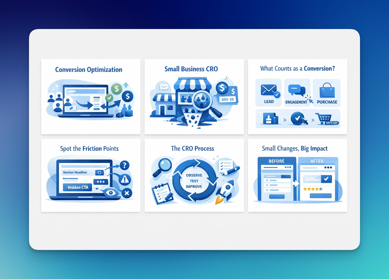
Conversion optimization for small business websites is the process of improving your website so more visitors take meaningful action, such as signing up, contacting you, or making a purchase. Instead of focusing only on getting more traffic, it focuses on removing friction, clarifying your message, and improving the user journey so existing traffic turns into better results.
What Is Conversion Optimization?
Conversion optimization (CR) is the process of increasing the percentage of visitors who take a desired action on your website.
That action could be a purchase, a signup, a click, or any step that moves someone closer to becoming a customer.
So instead of trying to bring more people in… I focus on getting more value from the people who are already there.
That’s the core of conversion optimization for small business websites.
You already have traffic. Now the question is: what are those people actually doing once they arrive?
What Is Conversion Optimization for Small Businesses?
For small businesses, conversion optimization is about efficiency.
You don’t always have the budget to keep increasing traffic. Ads get expensive. SEO takes time.
So I look at what’s already happening on the site and ask:
- Where are people dropping off?
- What’s stopping them from taking action?
- What feels unclear or unnecessary?
That’s why small business conversion rate optimization is less about complex systems and more about fixing friction.
Things like:
- unclear headlines
- too many steps
- weak or hidden CTAs
- lack of trust signals
Fixing these doesn’t require a big team.
But it can completely change your results 💡
What Counts as a “Conversion”?
A conversion is any meaningful action a visitor takes on your website.
It’s not just a sale.
Depending on your goal, it can be:
| Type | Example |
|---|---|
| Lead | Email signup, form submission |
| Engagement | Clicking a CTA, starting a chat |
| Purchase | Completing checkout |
| Micro-conversion | Add to cart, product view |
I don’t treat all conversions the same, but I track all of them.
Because each one tells me something about user intent.
How Conversion Optimization Actually Works
In practice, conversion optimization is a simple loop.
Observe → identify → improve → repeat.
I usually start by looking at behavior:
- where users click
- where they stop scrolling
- where they leave
Then I make targeted changes.
Not random ones.
Things like:
- rewriting a confusing headline
- making a CTA more visible
- reducing form fields
- adding proof where trust is missing
These are small changes.
But when they remove friction, they directly impact conversions.
Conversion Optimization Strategies for Small Business Websites
This is where conversion optimization starts to make a visible difference.
When I work on improving conversions, I usually do not start with complex tests or advanced tools. I start with the fundamentals. Because in many cases, small business websites are not struggling because they need a major redesign. They are struggling because small points of friction are getting in the way of action.
That is why this part matters. Before trying bigger experiments, I focus on the areas that most directly affect conversions: forms, checkout, page speed, trust, CTAs, and the overall user journey.
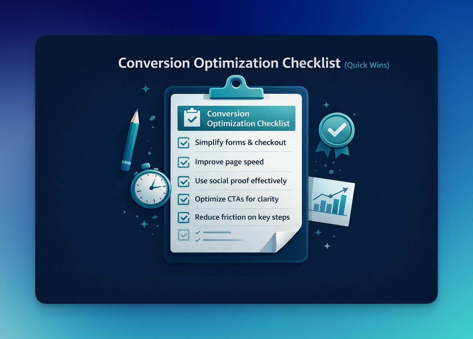
Simplify Forms and Checkout
Forms are one of the clearest decision points on any website.
They are where a visitor stops browsing and starts acting. That is exactly why they need to feel easy. The moment a form looks too long, too demanding, or slightly inconvenient, hesitation begins. And once hesitation appears, abandonment becomes much more likely.
This is why I review every field with a simple question: does this need to be asked right now?
If the answer is no, it probably should not be there.
A lot of small business websites ask for too much information too early. A lead form asks for a phone number before trust is established. A checkout asks users to create an account when they are ready to pay. A contact form turns a simple next step into a minor task. None of these decisions seem dramatic on their own, but together they increase effort at exactly the wrong moment.
What usually works better is restraint.
Instead of treating forms like data enrichment tools, I treat them like conversion points. That shift changes everything. The goal is not to collect as much information as possible. The goal is to make it easy for someone to say yes.
A few principles tend to work especially well here:
- ask only for what is necessary at that stage
- keep the visual structure simple and predictable
- reduce interruptions during completion
- remove anything that makes the process feel heavier than expected
The same logic applies to checkout. By the time someone reaches that stage, they have already shown meaningful intent. If they leave, it is often not because they changed their mind about the product. It is because the path to purchase became more annoying than it needed to be.
Guest checkout, cleaner layouts, fewer distractions, and clearer error handling often do more for conversions than teams expect.
Reduce Perceived Effort
This is where conversion optimization gets more interesting.
Because a process does not only need to be short. It also needs to feel easy.
That distinction matters more than most people realize.
Two forms may ask for the same information, but one feels manageable and the other feels exhausting. Two checkout flows may have the same number of steps, but one feels smooth while the other feels like work. That difference often comes down to perceived effort.
Users respond to signals very quickly. Dense layouts, poor spacing, unclear sequencing, and cluttered interfaces make a task feel longer than it really is. On the other hand, a clean single-column layout, clear spacing, familiar field patterns, and visible progress indicators can make the exact same process feel much lighter.
That lighter feeling matters because momentum matters.
When users feel they are moving through a process with very little mental effort, they continue. When they feel slowed down or burdened, they begin to reevaluate the decision.
So when I look at conversion barriers, I do not only ask, “How many steps are there?” I also ask, “How heavy does this feel?”
That question reveals a lot.
Improve Page Speed
Page speed is often framed as a technical issue. In reality, it is also a conversion issue, a trust issue, and a first-impression issue.
A slow page changes the emotional tone of the visit before the visitor has even processed the message. It creates impatience. It introduces doubt. It makes the website feel less polished, less modern, and sometimes less trustworthy.
For small business websites, that impact is even more important. Larger brands can sometimes survive a weaker first impression because recognition does part of the work. Smaller businesses usually do not have that advantage. The website itself has to earn confidence quickly.
That is why speed matters beyond performance scores.
A fast site feels smoother. More credible. Easier to use. It helps the rest of the page do its job.
When I look at speed improvements, I usually prioritize the fixes that affect the user experience most clearly:
- oversized images that slow down loading
- unnecessary scripts running in the background
- too many third-party tools competing for performance
- delayed content rendering that makes the page feel unstable
You do not need a perfect score to improve conversions. But you do need a fast enough experience that users can engage without friction from the first seconds.
And that first impression carries more weight than most businesses think.
Use Social Proof with More Intention
Social proof works best when it reduces doubt, not when it simply fills space.
That is an important distinction.
A lot of websites include testimonials because they know they should. But not all proof builds trust equally. Generic praise without context tends to blur into the page. Anonymous quotes rarely help much. Large testimonial sections can even become background noise if they are not relevant to the visitor’s decision.
The social proof that performs best is usually more specific.
It shows who the customer was, what problem they had, and what changed. It signals that the experience was real. It gives the visitor something concrete to believe.
That proof can take different forms:
- a testimonial with a name, role, and clear result
- a recognizable customer logo near a high-intent section
- a customer count that signals adoption
- a short before-and-after style result
- a case study reference that reinforces credibility
What matters most is placement.
A strong testimonial near a pricing section, signup CTA, or product explanation often works better than a long wall of reviews lower on the page. The reason is simple: trust is most valuable where hesitation is highest.
So instead of asking, “Do we have social proof?” I prefer asking, “Is the right proof showing up at the right moment?”
That usually leads to better conversion decisions.
Make CTAs Clearer
A CTA is a small piece of copy with a very big job.
It has to turn interest into movement.
And when it is vague, generic, or disconnected from user intent, that movement slows down.
This is why I almost always prioritize clarity over cleverness. A user should not need to interpret a button. They should understand it instantly. The next step should feel obvious.
In most cases, specific CTA wording performs better because it reduces uncertainty.
For example:
- “Start Free Trial” is clearer than “Get Started”
- “Get My Quote” is clearer than “Submit”
- “See Pricing” is clearer than “Continue”
These changes may look small, but they affect how confident users feel about clicking. Clear language lowers hesitation because it sets an expectation.
Placement matters just as much as wording.
A CTA can be technically visible and still poorly positioned. If it appears before the user has enough context, it can feel premature. If it appears too late, momentum may already be gone. On longer pages, repeating the CTA after trust-building content, testimonials, or key product details often works much better than relying on a single button placement.
A good CTA does not force the user to think. It helps them keep moving.
Reduce Friction Across the Journey
This is the part that ties everything together.
Most conversion problems do not come from one dramatic mistake. They come from several smaller points of friction working together. A headline that is a little unclear. A page that loads a bit slowly. A weak CTA. A missing reassurance. A form that asks for one thing too many.
None of those issues looks catastrophic on its own.
But that is exactly why they are dangerous.
They hide in plain sight.
And when several of them appear in the same journey, the experience becomes heavier, less clear, and less trustworthy than it should be. Users may not be able to explain why they left. They just know something did not feel smooth enough to continue.
That is why I try to evaluate websites like a first-time visitor, not like someone who already knows the business.
I look for questions such as:
- What feels unclear?
- What feels unnecessary?
- Where would someone pause?
- What detail is missing right before the decision point?
- What would make this next step feel easier?
This approach is often more useful than obsessing over isolated page elements, because it reflects how users actually experience a site, as a flow, not as separate parts.
Start with What Is Already Slowing People Down
One of the biggest mistakes small businesses make is assuming they need a full CRO program before they can improve results.
Usually, they do not.
Most of the time, the first gains come from fixing what is already visible. A long form. A weak CTA. A slow page. Trust signals that feel too generic. A checkout step that asks for too much effort. These are not glamorous problems, but they are often the ones holding performance back.
That is why I prefer to start with obvious friction before moving into more advanced testing.
It is a more practical approach, and it usually creates faster learning too. Once the most visible barriers are removed, the website becomes easier to use, easier to trust, and easier to convert on. From there, deeper optimization becomes much more valuable.
That is how I think about early-stage conversion work for small business websites.
Not as a hunt for hacks, but as a process of removing the small things that make action harder than it should be.
And once those things are removed, the difference is often felt surprisingly quickly.
| Area | What to Focus On | Why It Matters |
|---|---|---|
| Perceived Effort | Make forms and flows feel easier with clean layouts, spacing, and progress indicators | Users are more likely to complete a process when it feels simple and manageable |
| Page Speed | Improve load experience by optimizing images, scripts, and third-party tools | A faster site creates a stronger first impression and reduces early drop-off |
| Social Proof | Use specific testimonials, recognizable logos, and clear results | Relevant proof reduces hesitation and builds trust before action |
| CTA Clarity | Write clear, specific CTA copy and place CTAs where intent is highest | Users convert more easily when the next step is obvious |
| Journey Friction | Review the full experience for unclear messaging, extra clicks, or missing details | Small friction points add up and can quietly reduce conversions |
| Prioritization | Start with the most visible problems already slowing users down | Fixing obvious friction often creates the fastest early gains |
High-Impact CRO Strategies for Small Businesses
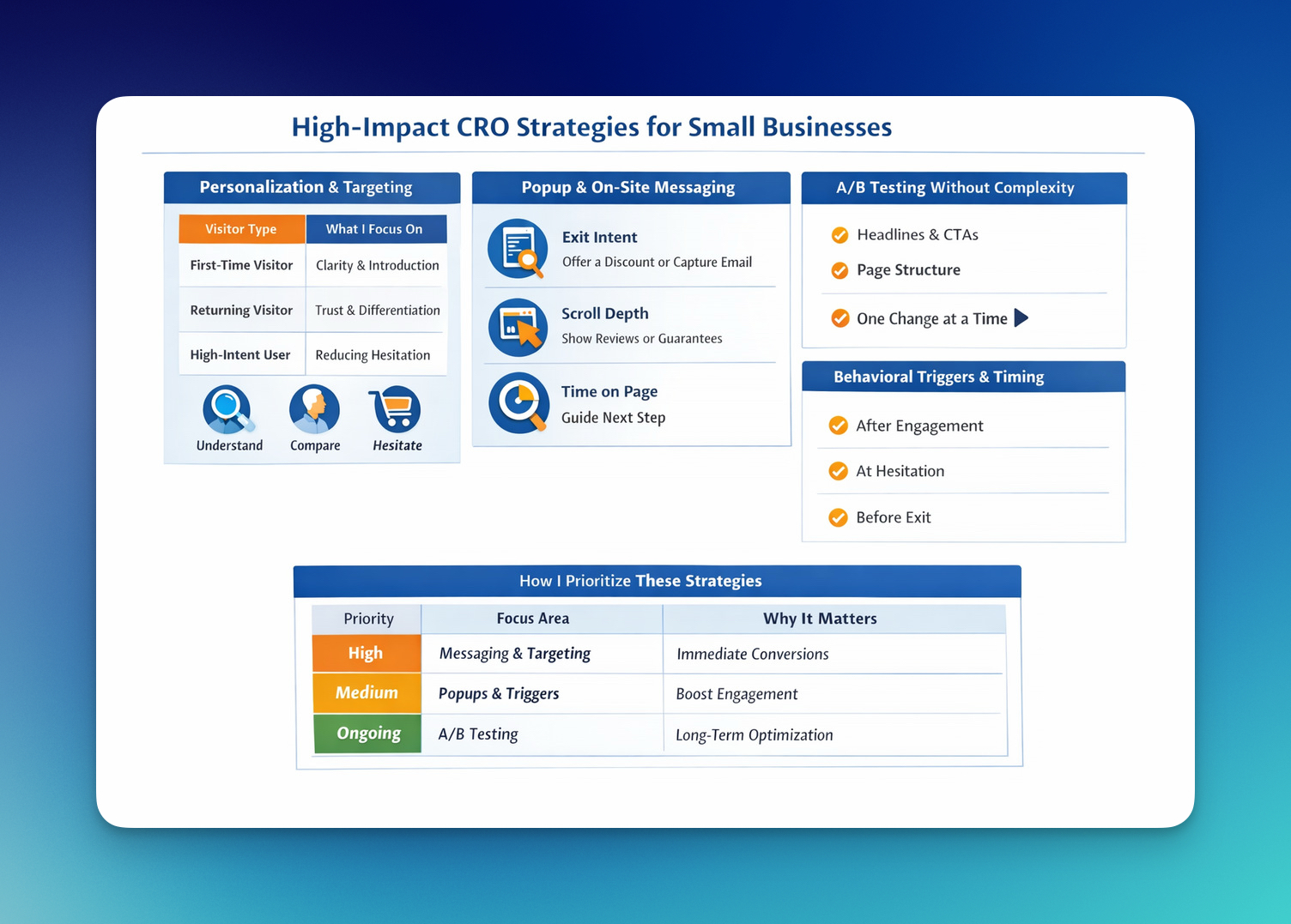
Once I fix the obvious issues, I move into strategies that create consistent growth. This is where conversion optimization shifts from fixing leaks to building momentum.
I don’t apply everything at once. I prioritize based on impact. Some changes give quick wins, others build over time. The goal is simple: make the experience more relevant, more timely, and easier to act on.
Personalization and Targeting
Not every visitor is at the same stage, and when I treat them the same, conversions suffer.
Someone visiting for the first time is still trying to understand. Someone returning is already comparing. Someone who added to cart is hesitating.
So instead of one generic experience, I adjust the message based on behavior.
Here’s a simple way I think about it:
| Visitor Type | What I Focus On |
|---|---|
| First-time visitor | Clarity and introduction |
| Returning visitor | Trust and differentiation |
| High-intent user | Reducing hesitation |
This doesn’t require complex systems. Even small adjustments in messaging can make the experience feel more aligned, and that alone can lift conversions.
Popup and On-Site Messaging Strategies
Popups are often misused, but when they’re tied to behavior, they become very effective.
I don’t trigger them randomly. I wait for signals.
- Exit intent → user is about to leave
- Scroll depth → user is engaged
- Time on page → user is evaluating
Then I respond with the right message.
For example:
- Exit → offer value (discount, reminder, email capture)
- Product page → reinforce trust (reviews, guarantees)
- Longer sessions → guide the next step
The key is relevance. If the message matches the moment, it doesn’t feel intrusive, it feels helpful ✨
Using Popupsmart for Smarter On-Site Messaging
When I implement these strategies, I don’t build everything from scratch.
Tools like Popupsmart make it much easier to turn these ideas into actual campaigns without needing developers.
For example, with Popupsmart you can:
- Trigger popups based on exit intent, scroll depth, or time on page
- Show different messages for different audiences (first-time vs returning visitors)
- Create email capture, discount offers, or product recommendations in minutes
- Use ready-made templates instead of designing from scratch
What I like most is this:
👉 You’re not just showing popups, you’re reacting to user behavior.
And that’s the difference between something that annoys users… and something that actually converts ✨
A/B Testing Without Complexity
A/B testing is often overcomplicated.
At its core, I’m just comparing two versions to see which performs better.
But the important part is what I test.
I don’t test random elements. I focus on high-impact areas:
- Headlines (first impression)
- CTAs (decision points)
- Page structure (flow)
And I keep it controlled.
👉 One change at a time.
If I change multiple things, I lose clarity on what actually worked.
Behavioral Triggers and Timing
Timing changes everything.
The same message can perform very differently depending on when it appears. That’s why I rely on behavioral triggers instead of static experiences.
Instead of showing everything upfront, I introduce things progressively:
- After engagement → show deeper value
- At hesitation → show reassurance
- Before exit → show incentive
This approach feels more natural.
It doesn’t push the user. It supports the decision.
How I Prioritize These Strategies
Not all strategies deserve equal attention.
Here’s how I usually decide where to focus:
| Priority | Focus Area | Why It Matters |
|---|---|---|
| High | Messaging + targeting | Immediate impact on conversions |
| Medium | Popups + behavioral triggers | Improves engagement & recovery |
| Ongoing | A/B testing | Long-term optimization |
I always start with what’s visible and impactful, then layer in testing.
At this stage, I’m no longer just fixing issues. I’m building a system that improves over time.
Why Small Businesses Should Focus on Conversion Optimization
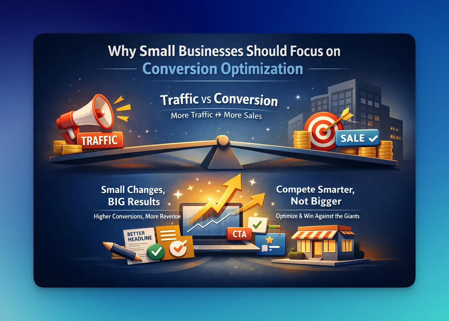
Most small businesses try to grow by getting more traffic.
More ads. More content. More channels.
I get it. It feels like the obvious move.
But here’s what I’ve seen working on conversion optimization for small business websites:
👉 Traffic without conversion is just wasted potential.
Traffic Is Expensive, Conversions Are Leverage
Getting visitors is not cheap anymore.
- Paid ads cost more every year
- SEO takes months (sometimes longer)
- Social reach is unpredictable
So when someone finally lands on your site… that visit is valuable.
Really valuable.
That’s why I focus on increasing website conversions instead of endlessly chasing new traffic.
If you double your conversion rate, you don’t need double the traffic.
You get more results from the same input 💡
Small Improvements, Big Revenue Impact
This is my favorite part about CRO.
You don’t need dramatic changes to see results.
Sometimes it’s:
- changing one headline
- shortening a form
- moving a CTA above the fold
- adding one strong testimonial
Individually, these feel small.
But together?
They compound.
A small increase in conversion rate can lead to a noticeable increase in revenue, especially for small businesses, where every step matters.
Competing with Bigger Brands Without Bigger Budgets
Let’s be real.
You’re often competing with companies that have:
- bigger budgets
- bigger teams
- more traffic
You won’t always win on visibility.
But you can win on experience.
That’s where CRO strategies shine ✨
A clearer message. A smoother journey. A faster page.
These things make your website easier to use, and easier to trust.
And when something feels easier… people move forward.
I don’t try to outspend bigger brands. I try to out-optimize them.
Key Conversion Metrics Small Businesses Should Track
When I work on conversion optimization for small business websites, I don’t try to track everything.
I focus on a few key metrics that actually explain performance. Not just what is happening, but why.
Because if you understand the “why,” optimization becomes much easier.
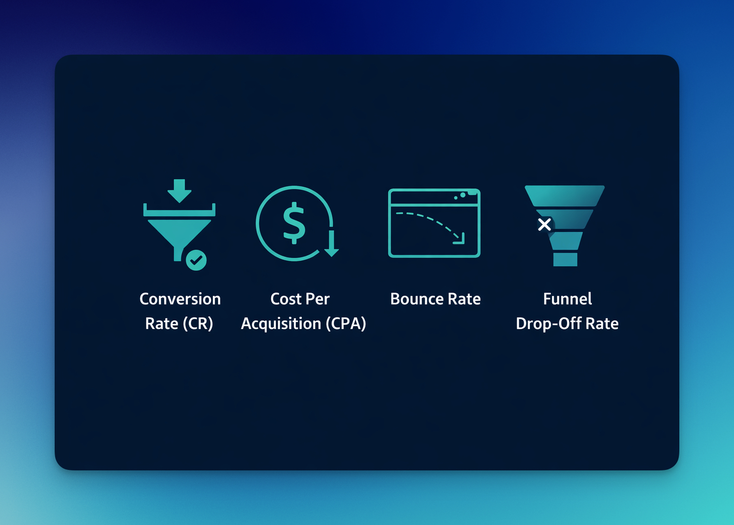
Conversion Rate (CR)
This is the foundation of everything.
Conversion rate shows the percentage of visitors who complete a desired action, purchase, signup, click, or any defined goal.
It answers one simple question:
👉 How efficient is your website at turning traffic into results?
If your traffic is steady but results are low, this is the first place I look.
A low conversion rate often points to:
- unclear value proposition
- weak or hidden CTAs
- too much friction in the flow
- lack of trust signals
This is where small business conversion rate optimization starts.
Cost Per Acquisition (CPA)
If you’re running ads or investing in traffic, CPA becomes critical.
It tells you how much you spend to acquire one customer.
But here’s the important connection:
👉 Higher conversion rate → Lower CPA
So instead of only optimizing campaigns, I focus on improving the page experience.
Because when your website converts better, your marketing becomes more efficient automatically 💡
Bounce Rate
Bounce rate shows the percentage of users who leave your site without interacting.
I don’t treat this as a “bad metric.” I treat it as a signal.
A high bounce rate usually means:
- the page didn’t match user intent
- the message wasn’t clear enough
- the page loaded too slowly
- or it simply didn’t feel relevant
In website conversion optimization, this helps me identify weak entry points.
Exit Rate
Exit rate tells me where users leave during their journey.
This is slightly different from the bounce rate.
Bounce = they leave immediately Exit = they leave after interacting
When I see a high exit rate on a specific page, I ask:
- Is this where friction increases?
- Is something confusing or unnecessary here?
- Is the next step unclear?
These insights are extremely valuable when optimizing funnels.
Funnel Drop-Off Rate
This is where everything connects.
Instead of looking at single pages, I look at the full journey.
For example:
Each drop-off tells a story.
And usually, the biggest opportunity is not at the beginning… but in the middle of the funnel.
When I optimize small business website conversion funnels, I don’t try to fix everything.
I focus on the biggest leak first.
Because even a small improvement at one step can increase overall conversions significantly.
Turning Your Website into a Conversion Engine

After working on conversion optimization for small business websites, I’ve come to see a pattern: most websites don’t struggle because they lack traffic, they struggle because they ask too much from the user while giving too little clarity in return; people arrive with interest, but somewhere between curiosity and action, something feels unclear, unnecessary, or simply not worth the effort, and that’s where conversions quietly disappear.
When I improve a website, I’m not trying to “push” people into converting, I’m removing the small points of friction that make them hesitate, tightening the message so it clicks faster, and making the next step feel obvious instead of optional; and once those pieces come together, conversions stop feeling unpredictable and start becoming a natural outcome of a smoother experience.
A website doesn’t become a growth engine when it gets more visitors, it becomes one when it finally stops giving them a reason to leave 🚀
Start small.
Fix one page. Then another.
Because growth doesn’t come from more visitors…
It comes from turning the ones you already have into customers.
Frequently Asked Questions
How can I increase conversions without more traffic?
You can increase conversions without adding more traffic by improving what happens after visitors land on your website. In many cases, better results come from clearer messaging, stronger CTAs, shorter forms, faster pages, and more visible trust signals. These changes make the experience easier to understand and easier to act on, which helps existing traffic produce more value.
What is a good conversion rate for a small business website?
A good conversion rate depends on the industry, traffic source, and the type of action you are measuring. For many small business websites, a rate between 2% and 5% is often seen as a reasonable benchmark, but the more useful approach is to improve your current baseline step by step. Even small increases in conversion rate can have a meaningful impact on leads or revenue.
What are the most common conversion mistakes small businesses make?
The most common mistakes usually come down to friction and lack of clarity. Many small business websites have vague headlines, weak calls to action, unnecessary form fields, limited trust signals, or a poor mobile experience. These issues are often easy to overlook because they seem small on their own, but together they can significantly reduce conversions.
Do I need tools to start conversion optimization?
You do not need advanced tools to begin. A lot of early conversion gains come from reviewing your website like a first-time visitor and identifying the points where people may feel confused, uncertain, or interrupted. Analytics tools, heatmaps, and testing platforms can become useful later, but the first improvements often come from fixing the obvious friction already visible on the page.

How would you rate your experience with this article? 😊