ChatGPT
 Perplexity
 Claude
 Grok
Grok Google AI Mode
Email popups help you:
- Gather new email leads
- Collect more newsletter subscribers and visitor feedback
- Make visitors take the desired action
- Strengthen your email campaigns, and more
Email popups can raise your ROI and feed your wider inbound strategy. But only if you get a few basics right.
This guide walks through those basics, with examples from brands that already get them right.
The 15 examples come from e-commerce, SaaS, and media brands, and each one ends with a tip you can use on your own site today.
What Is an Email Popup?
An email popup is a website overlay that asks visitors to enter their email address, typically in exchange for a discount, free resource, or newsletter subscription. It's one of the fastest ways to build a subscriber list without changing your core page content.
Email popups come in five main types, each suited for different visitor behaviors and business goals. Picking the right type matters because timing and placement directly affect whether visitors convert or bounce.
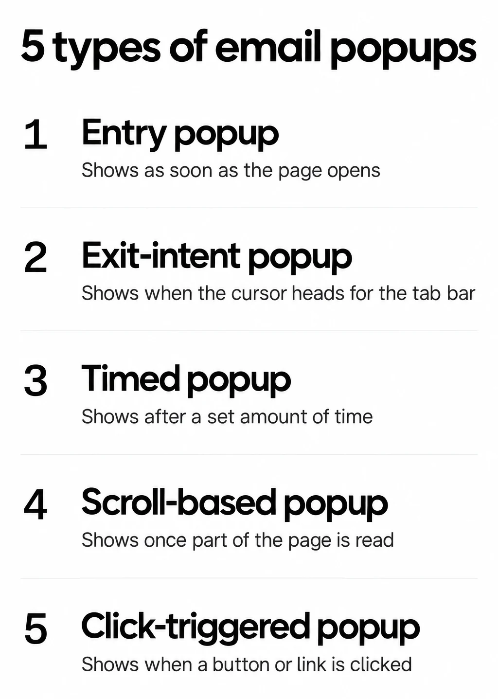
5 types of email popups and what makes each one appear.
Entry popups appear the moment someone lands on your site. They're aggressive but can work on high-traffic pages where you don't mind some friction. Use them sparingly: in our benchmark, popups that wait before appearing convert 0.83% vs 0.61% for popups shown the instant the page loads (median campaign); the direction holds in every year of data but the difference is not statistically reliable, so treat it as a lean, not a rule.
Exit-intent popups trigger when a visitor's cursor moves toward the browser's close button. They're your last chance to capture an email before someone leaves, and they don't interrupt the browsing experience.
Timed popups show after a set delay. They wait until a visitor has had time to engage with your content before asking for anything.
Scroll-based popups activate after a visitor scrolls past a certain percentage of the page. Scrolling that far signals real interest in your content, so the ask feels less intrusive.
Click-triggered popups only appear when someone clicks a specific button or link. They reach the most willing audience because the visitor has already expressed intent.
Why Email Popups Still Work in 2026
Email popups still hold their place in 2026. The firmest data we have is our own benchmark, and it shows a wide gap between the median popup and the best ones. The value of email as a channel makes every new subscriber worth winning.
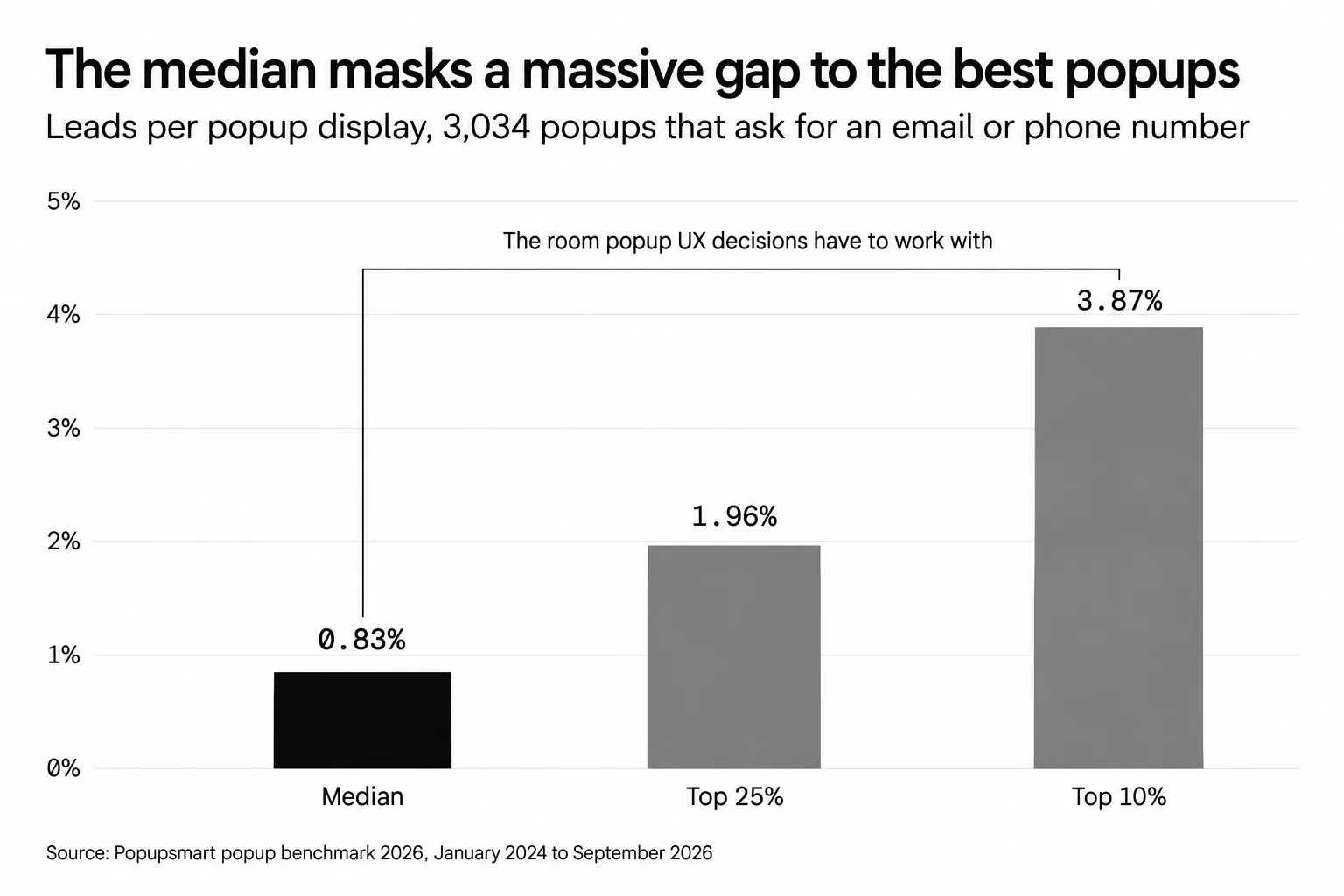
Leads per popup display across 3,034 popups that ask for an email or phone number, January 2024 to September 2026.
According to Popupsmart's 2026 popup benchmark: across 3,034 Popupsmart popups that ask for an email or phone number (January 2024 - September 2026, each with at least 1,000 displays and 14 active days), the median converts 0.83% of its displays into leads; the top 25% reach 1.96% and the top 10% reach 3.87%. A lead is a popup submission that contains an email address or phone number.
That rate may look modest, but keep two things in mind. The median is the campaign in the middle, so a few very high performers can't pull it up. And the rate divides leads by popup displays, not by visitors. Higher figures quoted elsewhere rest on different definitions. For the other popup tips we tested on the same data, see popup best practices from 28,674 campaigns.
Adoption is wide, too. According to Recart's State of Popups report (2025), 6,457 of the top 10,000 Shopify brands use popups. That's roughly two out of three of the most successful e-commerce stores.
Why invest in popups at all? Because email is a channel you own: it reaches your audience directly, without a platform's algorithm in between. Each subscriber a popup brings in is someone you can sell to directly.
| Metric | Value | Source |
|---|---|---|
| Median lead rate, popups that ask for an email or phone number (3,034 popups) | 0.83% | Popupsmart 2026 benchmark |
| Same popups, top 25% / top 10% | 1.96% / 3.87% | Popupsmart 2026 benchmark |
| Signup popups with vs without a discount code | 1.46% vs 0.75% | Popupsmart 2026 benchmark |
| Mobile vs desktop (median popup) | 1.02% vs 0.57% | Popupsmart 2026 benchmark |
| Top 10K Shopify brands using popups | 6,457 | Recart (2025) |
15 Email Popup Examples and Best Practices
I've reviewed dozens of email popups from e-commerce, SaaS, and media brands over the past two years. The 15 examples below stood out because they each demonstrate a distinct conversion principle you can apply to your own site. No two teach the same lesson.
1. Gingiber: The Lightbox That Matches the Brand
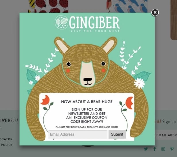
Gingiber's lightbox email popup
What makes it work: Gingiber sells illustrated nursery art, and their popup looks like it belongs in their product catalog. The soft color palette, hand-drawn illustrations, and playful typography all mirror the brand aesthetic. When the lightbox dims the background page, this popup becomes a miniature brand experience rather than an interruption.
Why it works: Visual consistency between a popup and the parent website reduces cognitive dissonance. When visitors feel like the popup "belongs," they perceive it as content rather than advertising. This is the aesthetic-usability effect: people judge attractive designs as more functional and more trustworthy.
Key takeaway: Design your email popup as an extension of your brand identity. Use the same color palette, typography, and illustration style from your website.
Implementation tip: Start with your brand's primary and secondary colors. Pull the exact hex codes from your style guide. If your site uses rounded corners and soft shadows, your popup should too. Consistency builds trust.
2. Chanty: Personality-Driven Design That Stands Out
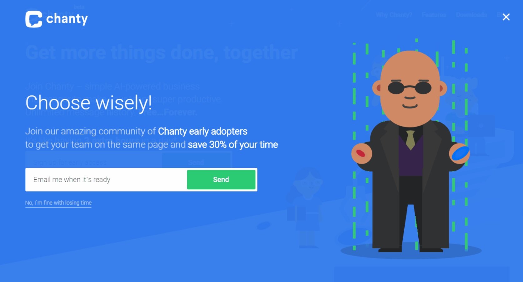
Chanty's themed newsletter popup
What makes it work: Chanty, a team communication tool, took a bold approach by theming their newsletter popup around The Matrix. The dark green palette, code-like typography, and clever copy ("Take the pill") turn a standard signup form into something visitors want to play with.
Why it works: Pattern disruption. After seeing dozens of generic "Subscribe to our newsletter" popups, encountering a themed one triggers curiosity. In psychology, this is the Von Restorff effect: items that stand out from their surroundings are remembered better and engaged with more.
Key takeaway: Inject personality into your popup copy and design. A memorable popup gets shared and talked about, extending its reach beyond your site.
Implementation tip: You don't need a movie reference. A well-placed joke, an unexpected illustration, or copy that speaks in your brand's actual voice (not corporate boilerplate) all work. Test one playful version against your standard design and measure the difference.
3. Sportique: One CTA, Zero Confusion
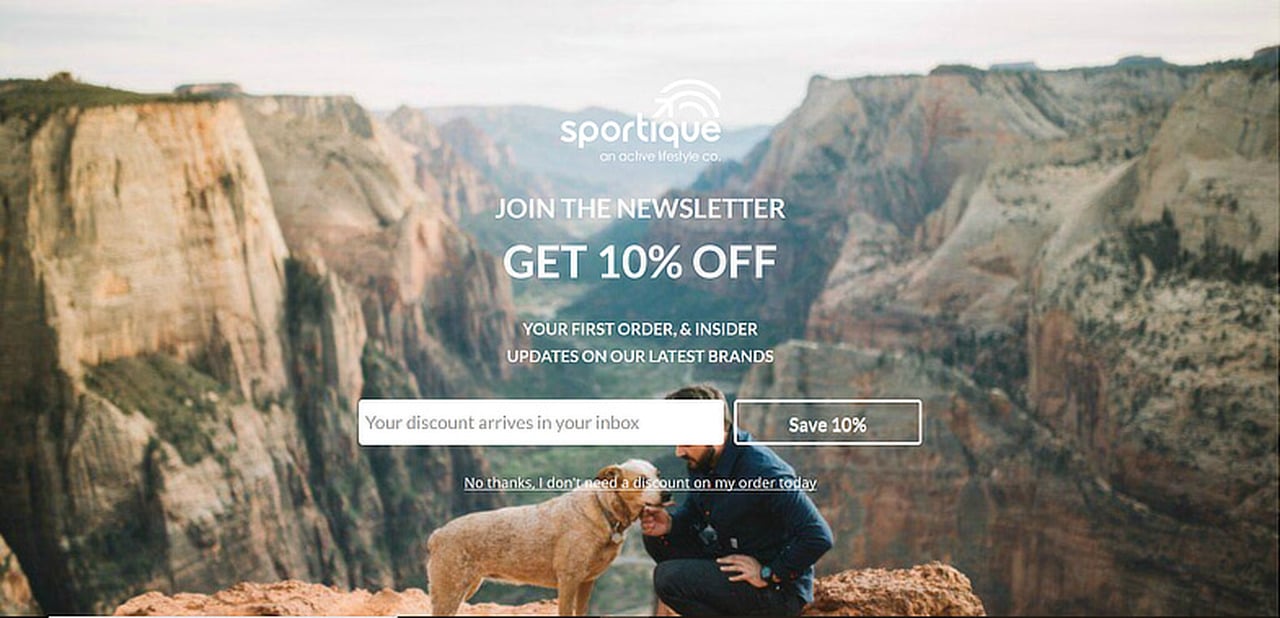
Sportique's single-CTA email popup
What makes it work: Sportique strips their popup down to the essentials: one headline, one email field, one button. There's nothing competing for attention. Compare that to cluttered popups that ask visitors to follow on social media, browse a sale, AND subscribe to a newsletter, all at once.
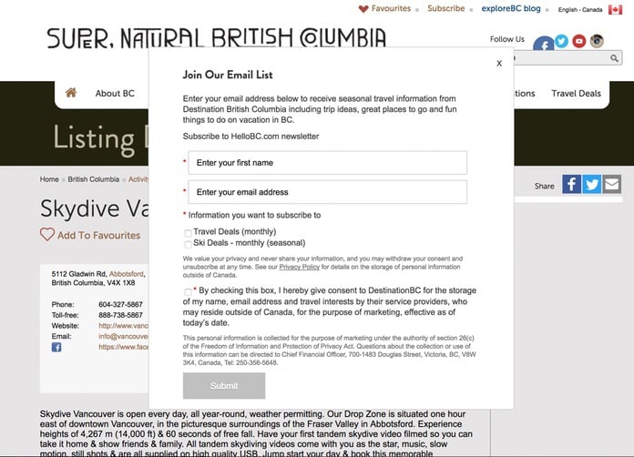
A cluttered popup with too many CTAs
Why it works: Hick's Law states that the time required to make a decision increases with the number of options. Every additional CTA you add to a popup increases the chance that visitors choose the easiest option: closing it. According to Made With Intent's Intent Gap Report (2025), 55% of online shoppers already dislike popups that appear immediately, so adding complexity makes it worse.
Key takeaway: One popup, one goal. Remove every element that doesn't directly support the email capture action.
Implementation tip: Audit your current popup. Count the clickable elements. If there are more than two (the email field and the submit button), cut the rest. You can always create separate popup messages for other goals.
4. Pinterest Source Targeting: The Personalized Popup
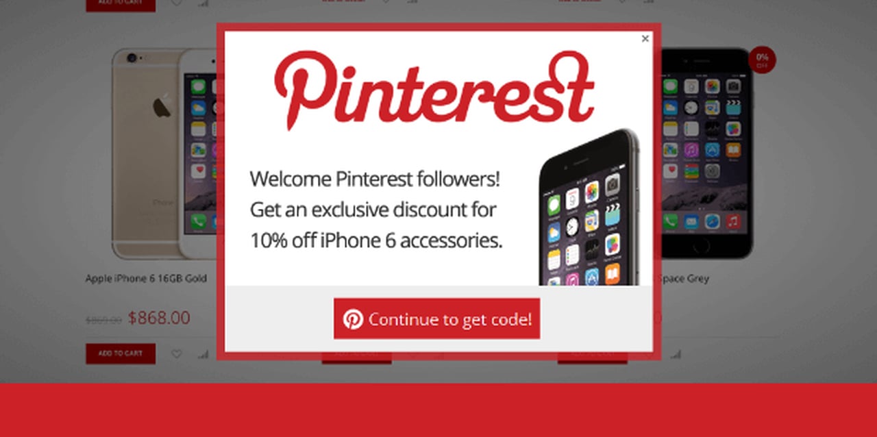
Source-personalized email popup
What makes it work: This popup only appears for visitors arriving from Pinterest. The copy acknowledges where they came from and tailors the offer accordingly. Instead of a generic "Join our newsletter," the visitor sees messaging that connects their Pinterest browsing behavior to the signup value.
Why it works: Personalization based on traffic source creates relevance. When visitors feel recognized, they're more likely to trust the ask. This is the same principle behind retargeting ads, but applied at the popup level. You can segment audiences with advanced audience targeting features that detect referral sources, geographic location, or browsing behavior.
Key takeaway: Segment your popup campaigns by traffic source. A visitor from Google search has different intent than one from Instagram.
Implementation tip: Start with your top three traffic sources. Create separate popup campaigns for each with copy that references where the visitor came from. "Loved what you saw on Pinterest? Get more ideas in your inbox" is a far more relevant message than "Subscribe to our newsletter."
5. ColourPop: The Discount That Converts
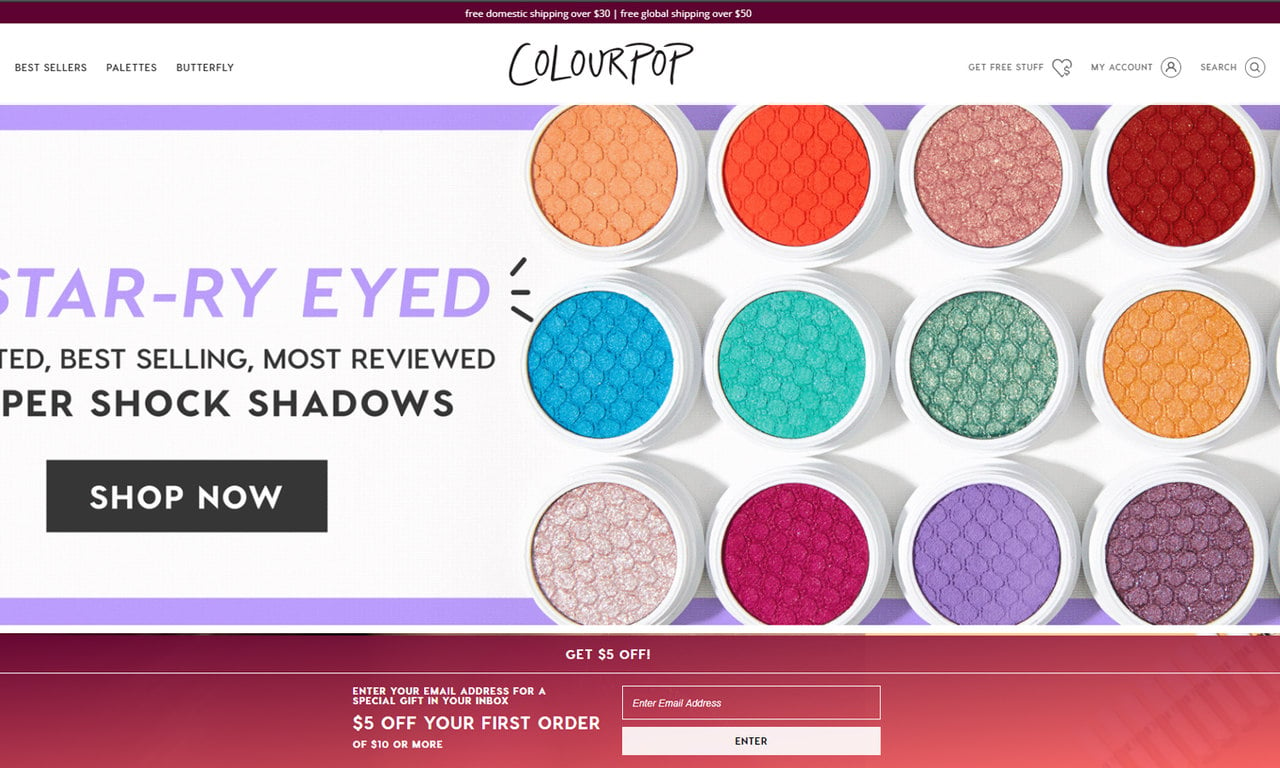
ColourPop's incentive-based popup
What makes it work: ColourPop offers a specific, tangible reward: "$5 Off Your First Order." It names a concrete dollar amount where a weaker popup would promise "exclusive deals" or "special offers." The bright, on-brand design makes the offer feel celebratory rather than pushy.
Why it works: Reciprocity is one of Robert Cialdini's six principles of persuasion. When you give something first (a discount), people feel psychologically compelled to give something back (their email). Our benchmark backs the incentive: signup popups that offer a discount code convert 1.46% vs 0.75% for signup popups without one. A specific amount like "$5 off" also makes the value easier to calculate mentally.
Key takeaway: Offer a specific monetary incentive rather than vague promises. "$5 off" is clearer than "exclusive deals" because the value is immediately obvious.
Implementation tip: Test different incentive types: dollar-off, percentage-off, free shipping, free gift. On lower-priced products a dollar amount may read as more tangible; on higher-priced items a percentage can feel more substantial. Only a test tells you which wins for you. In our benchmark, popups stating 10% off convert 1.25% vs 0.67% for popups that state no discount. Track which incentive captures the most emails AND leads to the most first purchases. Want more Shopify-specific ideas? Check these email capture popup examples for Shopify.
6. Beyond Yoga: Mobile-First Design Done Right
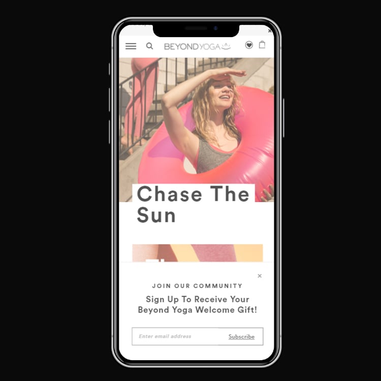
Beyond Yoga's mobile email popup
What makes it work: Beyond Yoga designed their email popup specifically for mobile screens. The input field is large enough for thumbs. The CTA button spans the full width of the popup. And the close button is easy to tap without accidentally hitting the submit button.
Why it works: Google's interstitial guidelines say pages whose mobile popups cover the main content and are difficult to dismiss may not rank as highly. Beyond Yoga's popup stays on the right side of that line and still gets noticed. The full-width layout makes good use of a small screen without putting rankings at risk.
Key takeaway: Design mobile popups separately from desktop. Thumb-friendly buttons and easy dismissal aren't optional; Google's guidelines expect them.
Implementation tip: Preview every popup on at least three screen sizes before launching: iPhone SE (small), iPhone 15 (medium), and iPad (tablet). Your popup builder should have device-specific settings. Learn more about mobile popup optimization to avoid common pitfalls.
7. Pipcorn: The Single-Field Form
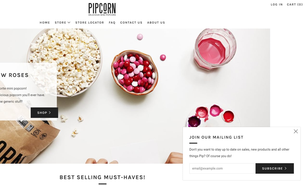
Pipcorn's minimal single-field popup
What makes it work: Pipcorn asks for exactly one thing: an email address. It skips the first name, last name, phone number and company name. The design is clean and inviting, with plenty of white space that makes the single field feel intentional rather than incomplete.
Why it works: The principle is friction reduction: each field is a micro-decision the visitor must make, and each micro-decision is an opportunity to abandon. In our benchmark, popups asking for one or two fields convert 0.88% and 0.94%, against 0.56% for three fields (median campaign; spin-to-win and other gamified popups are counted separately). For initial email capture, you only need the email address. You can collect additional information later through welcome sequences or progressive profiling.
Key takeaway: Ask for only the email address on your popup. Collect names, preferences, and other data after subscription through your email welcome series.
Implementation tip: If you need a name for personalization, test a two-field popup (email + first name) against a single-field version. In our benchmark, adding a name field alongside the email shows no reliable effect: the overall gap in its favour (1.25% vs 0.88% for email only) reverses among campaigns whose form rarely changed (0.74% vs 0.79%). Measure both the conversion rate AND the downstream email revenue to see which one brings in more business.
8. The Success Popup: Keep Traffic Moving After Signup
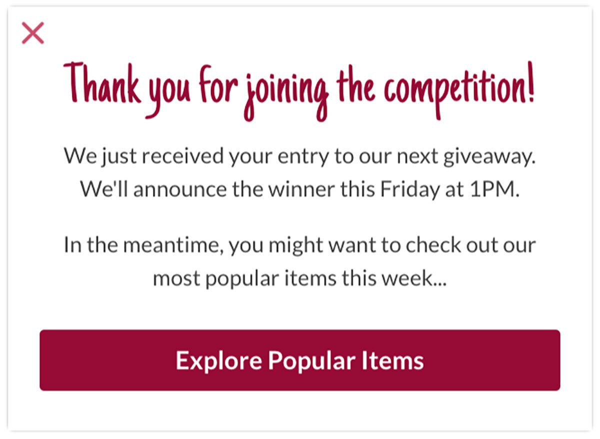
A success popup that drives further engagement
What makes it work: Most email popups end the conversation after the visitor clicks "Subscribe." This success popup does the opposite. After confirming the subscription, it presents a secondary CTA that directs the new subscriber to a featured product, a popular blog post, or a special collection. The visitor's session continues instead of hitting a dead end.
Why it works: Post-conversion momentum. The subscriber just took an action, which means they're in a "saying yes" mindset (commitment and consistency bias from Cialdini). Presenting a relevant next step while they're engaged capitalizes on that momentum. It also increases time on site, which correlates with better popup conversion metrics overall.
Key takeaway: Don't end the experience at "Thank you for subscribing." Add a success popup with a secondary CTA that keeps the visitor engaged on your site.
Implementation tip: Create a success popup that links to your best-selling product, most popular blog post, or a "start here" page. Track clicks on this secondary CTA separately to measure its impact on session depth and immediate conversions.
9. Tigerlily: Product Photography as a Visual Hook
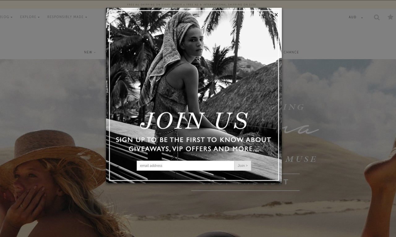
Tigerlily's image-driven email popup
What makes it work: Tigerlily uses a full-bleed black-and-white fashion photograph as the dominant element of their popup. The image takes up more than half the popup real estate, with the signup form tucked beside it. The visual quality signals that this brand takes its aesthetic seriously.
Why it works: Image-first popups tap into the picture superiority effect: people remember pictures better than information given as text alone. When the image is aspirational (a lifestyle photo, a beautiful product shot), it creates desire that the signup form can channel. The visitor wants to be part of that world, and subscribing is the entry point.
Key takeaway: Lead with a high-quality product or lifestyle image that creates aspiration. The email form should feel like a gateway to that world, not a barrier.
Implementation tip: Choose an image that represents the best version of what your brand offers. Avoid stock photos. If you sell clothing, use your own lookbook shots. If you're a food brand, use your actual product photography. Authenticity in imagery directly correlates with trust.
10. The Feedback Popup: Capturing Emails While Learning
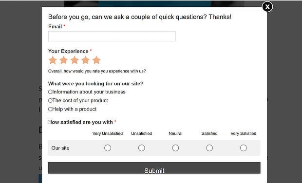
Dual-purpose feedback and email capture popup
What makes it work: This popup does two jobs at once. It asks visitors to rate their experience on the website AND provide their email for follow-up. The frame is "help us improve" rather than "give us your email," and that changes how the whole ask feels.
Why it works: The foot-in-the-door technique. When you ask someone for a small favor (rating your site), they become more likely to agree to a larger request (providing their email). Unlike standard "Subscribe for updates" copy, "Help us improve" positions the visitor as an expert whose opinion matters. That's flattering, and flattery works. You can explore more website popup examples that use this multi-purpose approach.
Key takeaway: Reframe the email ask as a feedback request. Visitors who feel valued are more likely to share their information.
Implementation tip: Add a simple 1-5 star rating or thumbs up/down question above the email field. Route the feedback to your product or UX team, and tag the subscriber with their rating in your email platform for personalized follow-ups.
11. Nike: The Non-Intrusive Floating Bar
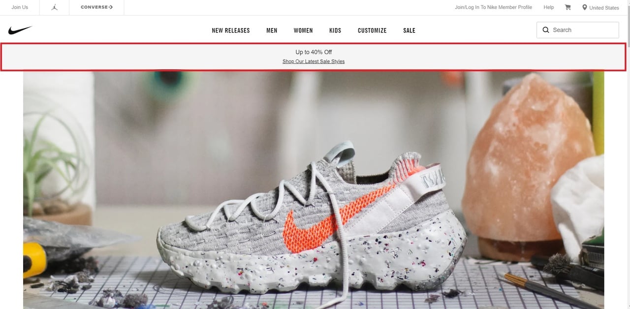
Nike's floating bar email popup
What makes it work: Nike uses a slim floating bar fixed to the top of their page instead of a traditional overlay popup. It's always visible but never blocks content. The bar includes a brief offer ("Free shipping for members") and a CTA that leads to an email signup form. Visitors can browse freely without feeling interrupted.
Why it works: The mere exposure effect. The more often someone sees a message, the more familiar and trustworthy it becomes. A floating bar stays visible throughout the entire browsing session, building familiarity without the annoyance of a modal popup. For B2B sites and content-heavy publications, this format is worth considering because it respects the visitor's reading flow.
Key takeaway: Use a floating bar when your audience is reading-focused or popup-resistant. It trades immediate visibility for sustained, non-intrusive exposure.
Implementation tip: Place the bar at the top of the page, not the bottom, where it sits in the natural reading path. Keep the copy under 10 words. Include a CTA such as "Join Free" that opens the full signup form.
12. Skullcandy: The Exit-Intent Last Chance
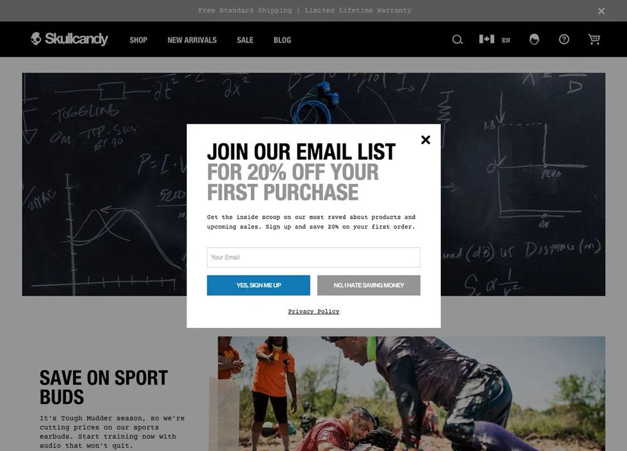
Skullcandy's exit-intent email popup
What makes it work: Skullcandy's popup only appears when a visitor moves their mouse toward the browser's address bar or close button, signaling intent to leave. The offer is bold and urgent: a significant discount paired with a deadline. It doesn't interrupt browsing at all. It only triggers at the moment the visitor would otherwise be lost.
Why it works: Loss aversion. Behavioral economics research by Kahneman and Tversky shows that the pain of losing something is felt more strongly than the pleasure of gaining something equivalent. An exit-intent popup frames the discount as something the visitor is about to lose by leaving. Don't expect exit intent to do the work on its own, though. In our benchmark, exit intent shows no statistically reliable advantage: popups on the most sensitive exit-intent setting converted 1.10% vs 0.78% without exit intent (median campaign), a gap that could be chance. Explore more about how exit-intent popups work to see this principle applied across industries.
Key takeaway: Reserve your best offer for exit-intent. Don't show the same discount to everyone. Visitors about to leave need a stronger reason to stay.
Implementation tip: Set your exit-intent popup to display only once per visitor session. Pair it with a discount code that expires within 24-48 hours to create genuine urgency. Track the redemption rate of exit-intent codes separately from other discount sources.
13. Really Good Emails: The Sidebar With Honest Copy
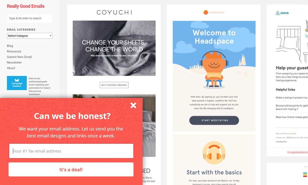
Really Good Emails' sidebar popup
What makes it work: Really Good Emails places their popup as a sidebar that slides in from the edge of the screen. But the real star is the copy: "Can We Be Honest?" It breaks the fourth wall. Instead of pretending the popup isn't an interruption, the brand acknowledges the dynamic and turns it into a conversation.
Why it works: Radical transparency. Most popup copy follows a predictable formula: benefit statement + input field + CTA button. When a popup openly addresses the visitor-publisher relationship ("Yes, this is a popup. We know."), it disarms skepticism. It's called the pratfall effect: admitting a flaw makes you more likable and easier to trust.
Key takeaway: Write popup copy that sounds like a real human talking. Ditch the marketing formulas and have an honest conversation with your visitors.
Implementation tip: Rewrite your popup headline in the voice you'd use texting a friend. "Hey, we write a really good email newsletter. Want in?" beats "Subscribe to our exclusive newsletter for industry insights." Test conversational copy against formal copy to see the impact on your specific audience.
14. Visitor Segmentation: Different Popups for Different People
I've watched brands lose subscribers by showing the same popup to everyone. A returning customer who already subscribes doesn't need a "Join our list" popup. Showing it again makes your site feel broken or spammy.
What makes it work: Segmenting popups between new and returning visitors lets you tailor the message. New visitors get a "Welcome! Here's 10% off" popup. Returning visitors who haven't purchased see a "Still browsing? Here's free shipping." Existing subscribers see no popup at all, or they see a product recommendation instead.
Why it works: Relevance is the difference between a popup that converts and one that annoys. Targeting by visitor type, behavior, or purchase history means every popup feels personal rather than generic. The same audience targeting tools that power ad campaigns can power your popup strategy. You can also explore B2B popup examples for segmentation ideas tailored to lead generation funnels.
Key takeaway: Never show the same popup to everyone. Create at least three popup campaigns: one for new visitors, one for returning non-subscribers, and suppress popups for existing subscribers.
Implementation tip: Use cookie-based targeting to identify returning visitors. Set a "subscribed" cookie when someone completes your popup form, then exclude visitors with that cookie from seeing the popup again. Capping repeat views reduces popup fatigue: in our benchmark, the first two times a visitor sees a popup in a week convert at similar rates (1.33% and 1.22% of displays, pooled); from the third view conversion falls, and from the sixth view it is 0.41%, 31% of the first-view rate.
15. A/B Tested Timing: Data Over Assumptions
Test popup timing instead of guessing. The overall picture in our benchmark: popups that wait before appearing lead as a lean, but the exact delay length (0-5 seconds vs 21-60 seconds) makes no measurable difference to conversion.
What makes it work: Instead of guessing whether to show a popup immediately, after 15 seconds, or after 50% scroll, the best approach is to test all of these against each other and let visitor behavior decide. Timing is a major variable in who sees the popup and at what moment.
Why it works: Every audience is different. Blog readers who arrived from organic search are in a research mindset and tolerate popups later. Social media visitors who clicked a product link are in buying mode and respond better to immediate offers. Testing removes guesswork and replaces it with evidence.
Key takeaway: Test three timing variations (immediate, timed delay, scroll-based) against each other for at least two weeks before committing to one.
Implementation tip: Run an A/B test with equal traffic split between three popup timings: 0 seconds (immediate), 20 seconds, and 40% page scroll. Track both conversion rate and bounce rate. The winner is the timing with the highest conversion rate that doesn't significantly increase bounces. Set a Shopify newsletter popup with built-in A/B testing to automate this process.
How to Create an Effective Email Popup
Building an email popup that converts takes more than picking a template. Here's the process I follow after working with popup campaigns for the past three years.
1. Define one clear goal. Don't try to capture emails, promote a sale, and collect feedback in the same popup. Pick the single action that matters most right now. For most sites, that's email capture.
2. Choose the right popup type. Match the popup format to your audience's behavior. Exit-intent is a common choice for e-commerce. Scroll-based triggers suit blog content. Floating bars fit content-heavy sites where readers dislike interruptions. For playful brands, gamified formats like spin-to-win wheels or multi-step popups are worth testing, but set expectations right: in our benchmark, spin-to-win and other gamified popups get far more clicks (7.33% vs 1.87% of displays, median campaign; the spin itself counts as a click), but do not collect measurably more email or phone leads than plain signup popups. You can easily create a popup form for your website with most modern builders.
3. Write copy that speaks to the visitor. "Subscribe to our newsletter" is the weakest possible headline. Tell visitors what they'll get: "Get weekly conversion tips backed by real data." Be specific about the value and frequency of your emails.
4. Design for your brand and device. Your popup should look like it belongs on your site. Use your brand colors, fonts, and imagery. Then preview on mobile and fix anything that's hard to tap or dismiss. Keep it accessible too: dismissable by keyboard, sufficient text contrast, and touch targets of at least 44px.
5. Set smart targeting rules. Show the popup to the right people at the right time. Exclude existing subscribers. Set frequency caps so the same visitor doesn't see the popup on every page load. Target by traffic source when possible.
6. Test, measure, and iterate. Launch with at least two variations (different headlines, different offers, or different timing). Run each test for a minimum of 1,000 impressions per variation before drawing conclusions. Track the popup conversion rate, and track the quality of the emails it captures too (open rate, click rate, unsubscribe rate).
Common Email Popup Mistakes to Avoid
After reviewing hundreds of email popups, I've noticed the same mistakes appearing across industries. Every one of them is avoidable.
Showing the popup too early. According to Made With Intent's Intent Gap Report (2025), 55% of shoppers dislike popups that appear the moment they land on a site. Yet 37% of retailers still show popups within the first 30 seconds. In our benchmark, popups that wait before appearing convert 0.83% vs 0.61% for popups shown the instant the page loads (median campaign); the direction holds in every year of data but the difference is not statistically reliable, so treat it as a lean, not a rule.
Using too many form fields. Every field beyond the email address is a friction point. I've seen popups asking for email, first name, last name, company, job title, and phone number. That's not a popup. That's an application form. Stick to email only for the initial capture.
Ignoring mobile users. A desktop popup that covers part of the screen can cover all of a mobile screen. That's a terrible user experience, and it can run against Google's guidelines. Always build separate mobile campaigns with smaller footprints and touch-friendly buttons.
Showing the same popup to everyone. A first-time visitor and a returning customer have different relationships with your brand. Treating them identically wastes the returning customer's goodwill and misses the opportunity to tailor the message to each segment.
No close button or hard-to-find close button. If visitors can't easily dismiss your popup, they'll dismiss your entire website. Make the close button visible, accessible, and at least 44x44 pixels for touch targets. Trapping visitors might seem clever, but it destroys trust.
Generic, benefit-free copy. "Stay updated" and "Join our community" tell visitors nothing about what they'll actually receive. Specificity converts. "Get our weekly breakdown of 3 conversion experiments (with real numbers)" gives visitors a reason to subscribe.
FAQ
What is an email popup?
An email popup is an overlay form that appears on a website to capture visitor email addresses. It typically includes a headline, a brief value proposition, an email input field, and a submit button. Email popups can be triggered by various user behaviors including page entry, exit intent, time on page, scroll depth, or specific click actions. In Popupsmart's 2026 benchmark, the median popup that asks for an email or phone number converts 0.83% of its displays into leads.
What are the best email popup examples?
The best email popup examples share common traits: a single clear call to action, a specific incentive, brand-consistent design, and smart targeting. Standout examples include ColourPop's "$5 Off" incentive popup, Nike's non-intrusive floating bar, Skullcandy's exit-intent discount, and Really Good Emails' honest sidebar copy. Each uses a different psychological trigger but all prioritize simplicity and relevance over complexity.
How do I design an effective newsletter popup?
Start with one goal, one input field, and one CTA button. Use your brand's colors and typography so the popup feels native to your site. Write a headline that tells visitors exactly what they'll receive ("Weekly email marketing tips") rather than a generic ask ("Join our newsletter"). Design mobile and desktop versions separately. Test at least two variations before committing to one. In Popupsmart's 2026 benchmark, the top 10% of popups that ask for an email or phone number convert 3.87% of their displays into leads; the median converts 0.83%.
What incentives work best for email popups?
For e-commerce, a specific dollar-off discount ("$10 off your first order") on lower-priced items is often a clearer offer than a percentage, because the value is immediately tangible. Free shipping offers work well for brands with high shipping costs. For SaaS and B2B, free resources (templates, checklists, guides) or free trial extensions stand out. The incentive should align with what the visitor was already looking for on your site. In Popupsmart's 2026 benchmark, signup popups that offer a discount code convert 1.46% vs 0.75% for signup popups without one. The page matters too: popups on cart and checkout pages convert 4.57% vs 1.07% on the home page (median campaign); blog pages convert 0.23%.
How to personalize email popups for better conversions?
Personalize based on three data points: traffic source (display different copy for visitors from Google vs Instagram), visitor type (new vs returning), and on-site behavior (pages viewed, products browsed, time spent). Use cookie-based tracking to suppress popups for existing subscribers. Segment by device type to ensure mobile visitors see mobile-optimized designs. In Popupsmart's 2026 benchmark, popups targeted at new visitors only convert 1.13% vs 0.77% for popups shown to everyone.
Build Email Popups That Respect Your Visitors
Across all 15 examples, the best email popups treat visitors as people first and conversion targets second. They offer real value, show up at the right moment, and make it easy to say yes or no.
Three principles stand out after analyzing these campaigns:
1. Simplicity wins. One CTA, one input field, and a clear value proposition are the safest start against cluttered popups.
2. Timing and targeting matter as much as design. A beautiful popup shown to the wrong person at the wrong time still fails. In our benchmark, button colour, dark vs light popup backgrounds, urgency words and question headlines show no measurable effect on conversion; the data are too noisy to rule out modest effects. Who sees the popup, and on which page, does show differences. Match the trigger to the visitor's behavior.
3. Test everything. Your audience is different from every brand in this article. What works for ColourPop won't necessarily work for a B2B SaaS company. Run A/B tests and let data decide.
If you're ready to create your first email popup (or improve an existing one), start building a popup form using a no-code builder like Popupsmart. Most tools offer free plans, so there's no cost to experiment. The median email popup's 0.83% is the middle of the pack: with the right design, timing, and targeting, you can move toward the 3.87% the top 10% reach.