How to Change Column Grid Size of Popup by Using Custom CSS
Are you ready to find out the best way to customize your popup? Learn how to modify the column grid size of your popup using custom CSS.
Before we start:
- There should not be any space between page ID and device type.
- There should be a space between "block" and the previous definitions.
- If you don’t specify the device type, changes will apply to all.
Sometimes codes conflict, so it’s important to add a "!important" tag at the end of your CSS code to make sure it works perfectly.
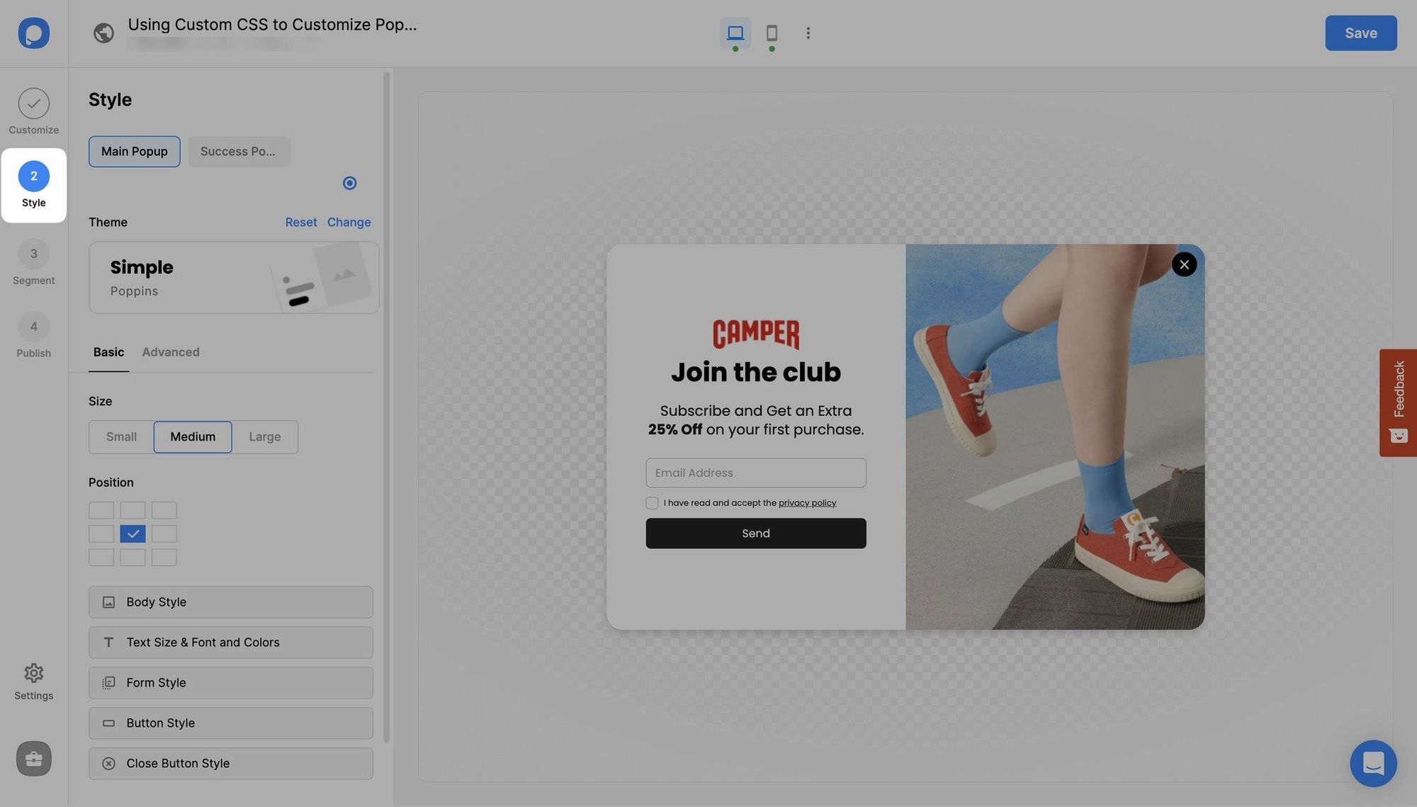
1. Create a new campaign, choose a popup, and go to Popupsmart's popup builder's "Style" step.

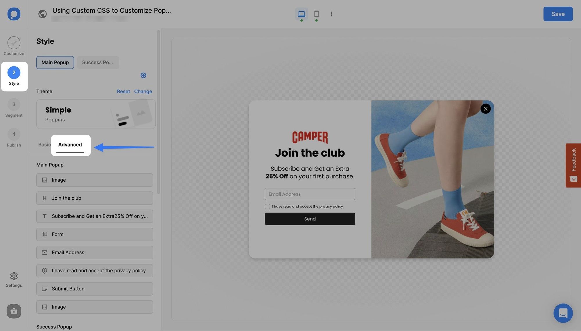
2. Navigate to “Advanced” and scroll down to "Custom CSS."

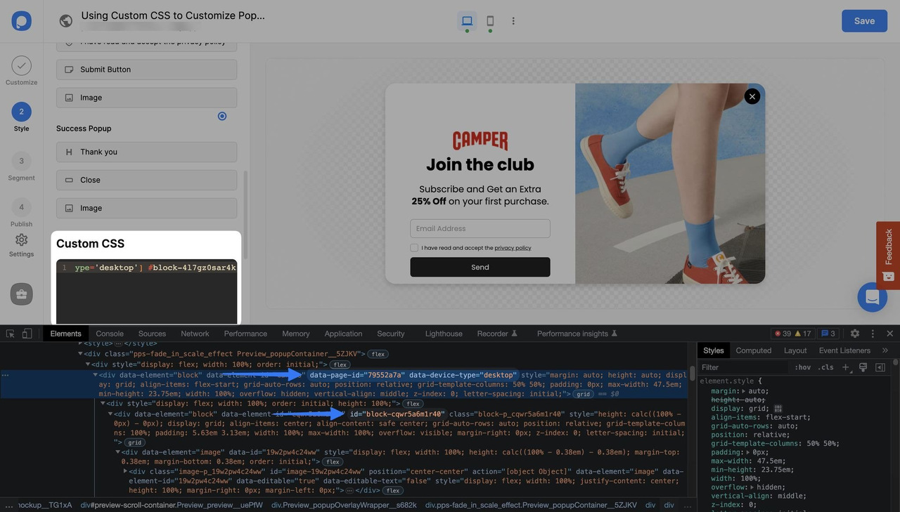
3. Right-click on your popup, click inspect and find “data-page-id”. After pasting it to the custom CSS window in box brackets, enter data-device-type, which is desktop, in box brackets again to target desktop only.

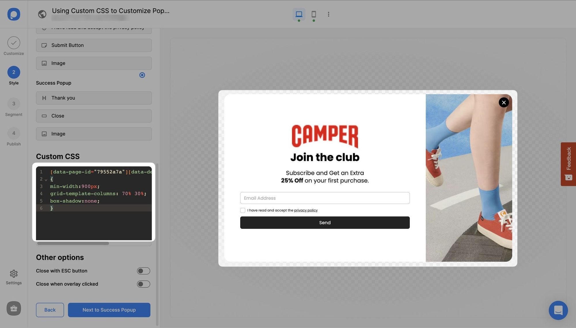
4. Now, we’ll resize the popup and the blocks. In this example, we want the popup bigger and the left block to be larger than the right side. For this, we should write “min-width:900px;” and “grid-template-columns: 70% 30%;”
Optionally, you can remove the shadow below the popup by writing “box-shadow:none”.
So it will look as in the image below:

For this kind of change, you can use the code below by changing its page id:
pre code:not(.hljs):not([class*=language-]) { background: #f8f8f8; line-height: 1.5; display: block; overflow-x: auto; padding: 1rem !important; color: inherit; border-radius: 2px; }
[data-page-id="79552a7a"][data-device-type='desktop']{ min-width:900px; grid-template-columns: 70% 30%; box-shadow:none; }
Do you have additional questions about how to add custom CSS to your popup? Contact Us!
How is this guide?