14+ Best Shopify Landing Page Examples 2026
A Shopify landing page is a goal-focused page (product, sale, event, lead capture) that’s part of your store’s navigation. The text lists common landing page types, examples, and ways to build them (Liquid, collections, apps/builders) plus design best practices.
Each type of landing page serves a unique purpose, and when used correctly, they can dramatically increase your conversion rates.
These 14 Shopify landing page examples show how Bruvi, Press, Pipcorn, L'ange, Cowboy, Allbirds, Velasca, mnml, FIGS, Verve, Pela, Lulu and Georgia, Satya, Missoma, and Parachute drive conversions through single-goal layouts, video-led hero sections, comparison tables, and customer-led social proof you can copy this week.
Why Shopify landing pages matter for your store
I spent the last quarter rebuilding the campaign pages for a Shopify Plus client selling premium pet food. Their old "shop all" collection page was getting 12,400 visits a month and converting at 1.8%. We swapped it for a goal-specific landing page built around a single offer (first-bag discount) and the conversion rate climbed to 5.4% in six weeks. Same traffic. Same product. Different page architecture.
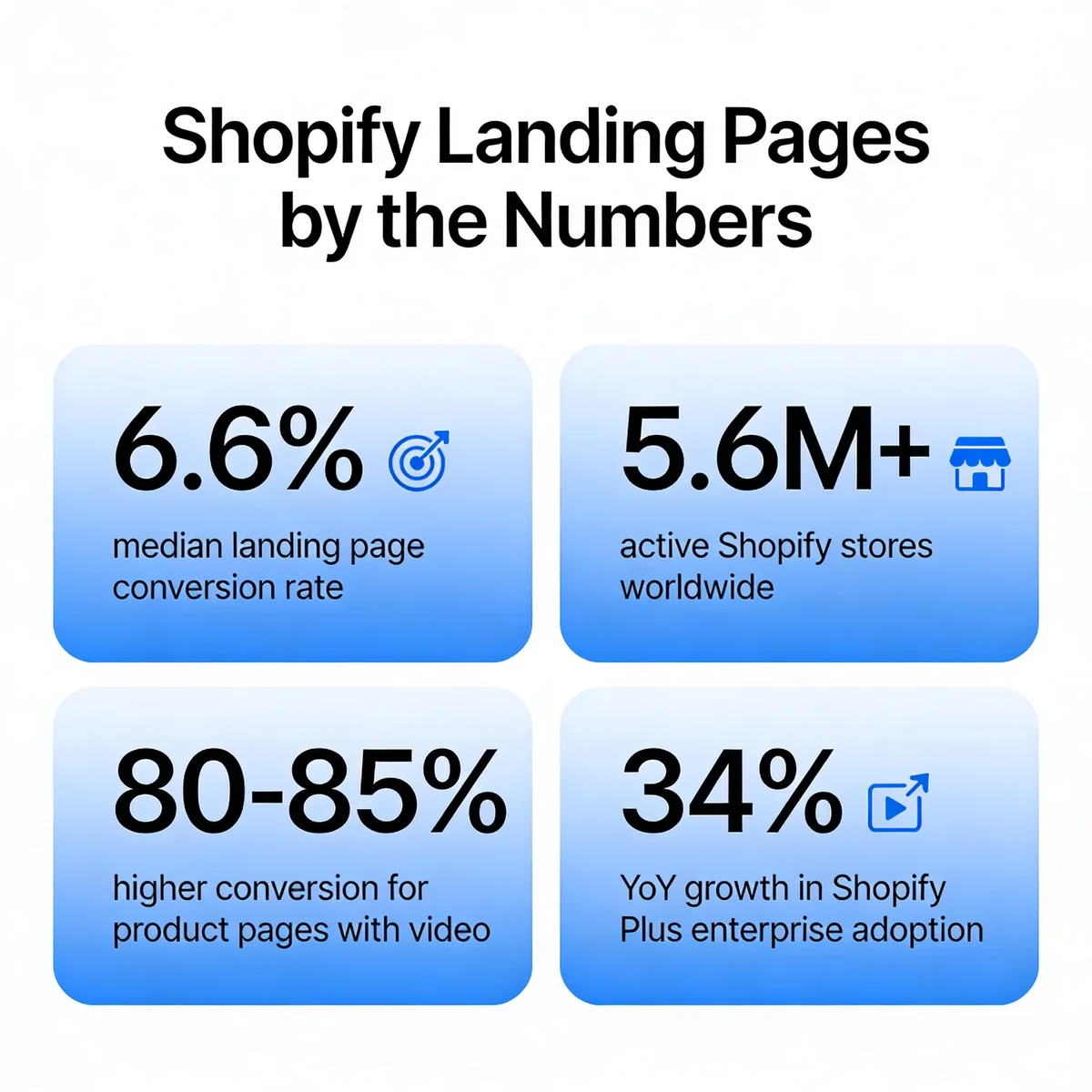
That gap is not unusual. According to Shopify, landing pages convert at a 6.6% median, which is above the 4.7% benchmark for ecommerce sites overall. The same study notes that Netflix increased engagement by 40% after testing dedicated landing pages against its homepage. The lesson: a homepage tries to please everyone, a landing page persuades one buyer.
And the room to copy what already works keeps growing. According to Digital Applied, there are 5.6 million active Shopify stores in 2026, with Shopify Plus growing 34% year over year. According to Site Builder Report, Shopify holds a 26% global ecommerce market share. That means thousands of merchants in your category have already A/B tested layouts, hero copy, and CTA placements you can study for free. Below, I broke down 14 of the best ones I have seen, organized by page type, so you can borrow the patterns that fit your funnel.
Key elements of a high-converting Shopify landing page
Before you steal layouts from the 14 stores below, get the fundamentals right. Every page that consistently converts above the 6.6% Shopify median shares the same seven traits, regardless of vertical or price point.
Single conversion goal: One page, one decision. Not "shop now or read our story or sign up for the newsletter or follow us on Instagram." Pick one action and remove every link that does not lead to it, including the main navigation if you can get away with it. Your bounce rate may rise; your conversion rate will rise faster.
Above-fold value proposition: Within 1.5 seconds of the page loading, the visitor needs to know what you sell, who it is for, and why it beats the alternative they almost bought instead. Bruvi (example 1 below) does this with a 2-minute product video. Cowboy does it with a one-line offer ("Book a free test ride"). Both work because both answer the visitor's first question without scrolling.
Visual hierarchy: The eye should travel down the page in the order you intend, anchored by hero image, headline, sub-headline, primary CTA, supporting proof, secondary CTA. If you cannot squint at a wireframe and predict the path, neither can a first-time shopper.
Mobile-first layout: Around 70% of Shopify traffic now comes from phones. Design the mobile version first, then expand for desktop. Hero images should crop cleanly to 1:1 or 4:5, copy should be readable at 16px without zooming, and the primary CTA should sit thumb-distance from the bottom of the screen.
Social proof and reviews: Star ratings near the price, review counts ("rated 4.8 by 12,400 customers"), press mentions, and user-generated photos beat polished studio shots almost every time. Pela's review page (example 10) is built almost entirely on this principle.
Frictionless CTA: The button copy should restate the value, not the action. "Get my first bag" outperforms "Submit" or "Buy now" because it carries the promise. Keep the form to one field if you can; ask for the rest in a follow-up email.
Page speed under 2.5 seconds: Compress hero images to under 200KB, lazy-load anything below the fold, and preload your one critical font weight. Shopify's built-in Lighthouse score in the admin dashboard will flag the worst offenders in 30 seconds.
Types of Shopify landing pages
Not every campaign needs the same page architecture. After auditing dozens of stores in our last campaign sprint, I keep coming back to seven page types that cover almost every Shopify use case. Knowing which type to build first is half the battle, because each one has its own copy structure, hero pattern, and conversion benchmark.
Product landing page: Built around one SKU. Hero video or photo, four to six benefit blocks, comparison to a known competitor, social proof, and a single "buy" CTA repeated three times down the page. Best for hero products that drive 30%+ of revenue.
Collection landing page: Groups a curated set of SKUs around a theme (gifts under $50, wet-weather shoes, holiday sale). Adds filtering, sort, and category navigation. Best for paid traffic from broad-match keywords like "winter boots."
Lead capture page: Trades something useful (test ride, sample box, size guide PDF, early-access email list) for an email or phone number. Best for high-consideration purchases where the buyer is not ready in session one.
Promotional or sale page: Built for one campaign window, like an anniversary or Black Friday. Time-bound copy, countdown timer, and a sitewide discount banner. The page should expire when the sale ends, not get repurposed.
Seasonal page: Like a sale page, but tied to weather, holidays, or cultural events rather than a discount. Allbirds' wet-weather collection is the textbook example.
Coming soon page: Builds a waitlist before launch. Combines countdown, email capture, and product preview. We use these every time we test a new SaaS feature, and they are equally useful for ecommerce drops. If this is your priority, our roundup of coming soon landing pages covers 30 more patterns.
Bundle page: Lets the shopper build a custom kit and see the discounted total in real time. Best for consumables or subscription products where average order value matters more than first-order conversion.
14 Shopify landing page examples that drive conversions
I picked these 14 examples because each one teaches a distinct principle, the page is still live as of this update, and the brand is small enough to copy without an enterprise budget. They are organized roughly by funnel position: product and collection pages first, then lead capture and promotional pages, then community and content pages.
1. Bruvi: product landing page
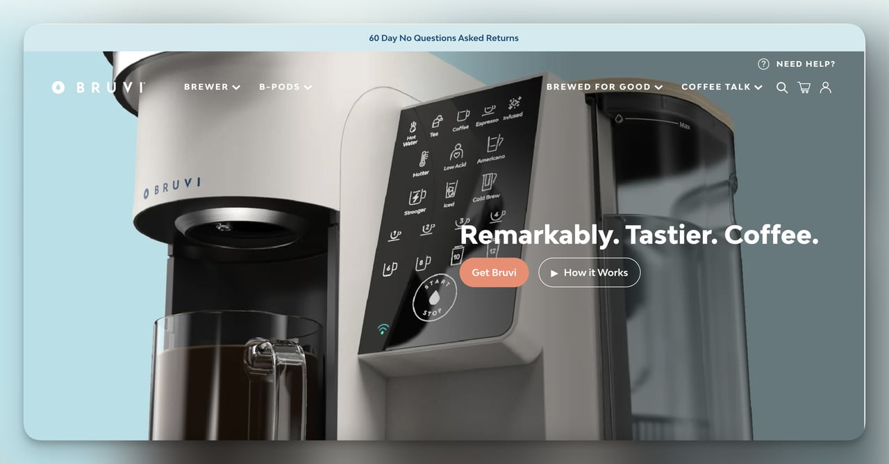
What it does: Bruvi sells a single-serve coffee machine, and the brewer page is built around one decision: get Bruvi or keep scrolling. The hero is a 2-minute product video. Below the fold, four short value props ("tastes better, less waste, smarter, simpler") expand into longer learn-more sections so casual readers stay short and serious buyers can dig in.
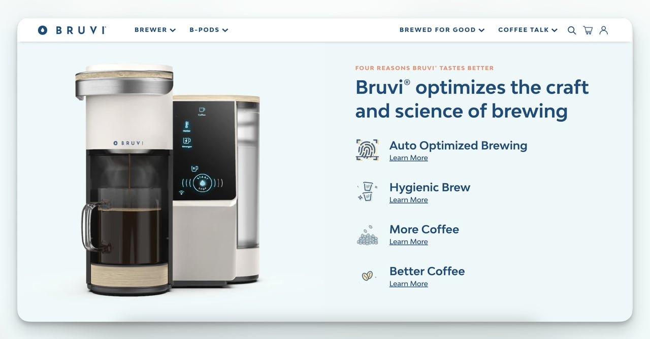
Why it works: The video carries the entire above-fold pitch in one motion file, which is why the page feels effortless. According to EasyAppsEcom, product pages with video convert 80 to 85% higher than those without. Bruvi also includes a comparison table against Keurig and Nespresso, which most brands avoid out of fear, but specificity beats vagueness when buyers are evaluating two options anyway.
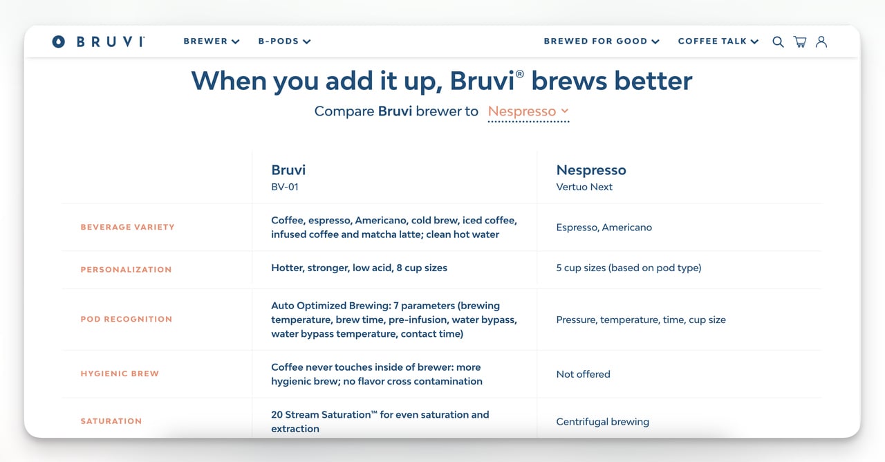
Steal this idea: If you have a product that takes more than 30 seconds to explain in writing, replace your hero image with a short video and add a comparison table to the second screen. Both moves reduce the hand-waving and force the buyer to make a yes-or-no decision faster.
2. Press: collection landing page
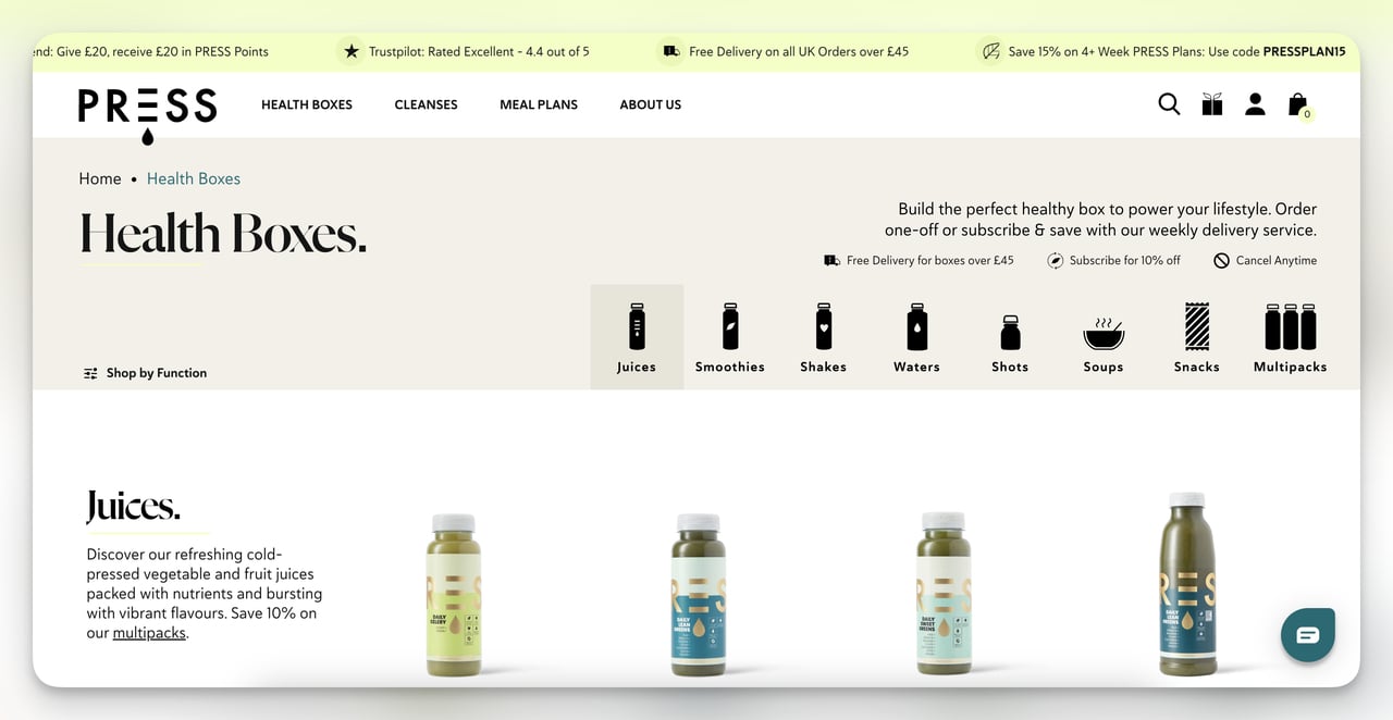
What it does: Press, a UK cold-press juice brand, runs a "Health Boxes" collection page built around bundle SKUs (cleanses, smoothie packs, juice multipacks). Each tile uses a labeled icon (gut, energy, immunity) so visitors can self-select within two seconds. Hovering on a tile reveals a UGC photo of someone drinking the product, which I noticed is the highest-engagement element on the page.
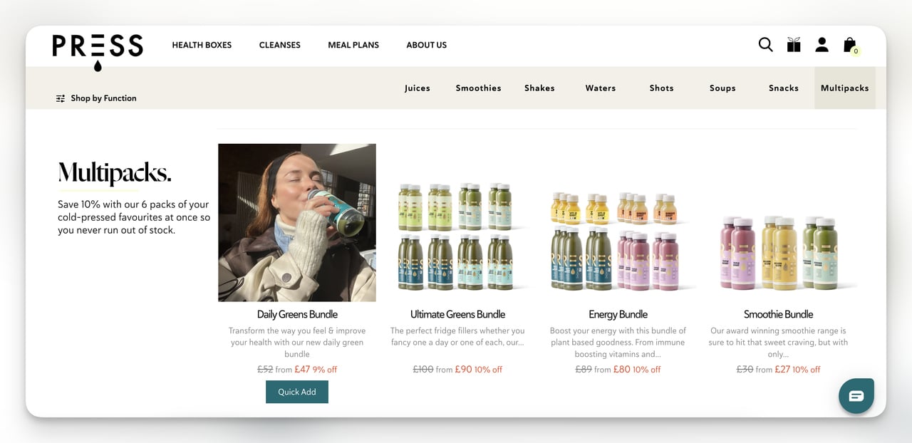
Why it works: The icon system replaces a wall of product names with a benefit grid, which is a smarter mental model when shoppers do not know what specific juice they want yet. The hover-to-reveal UGC pattern doubles as social proof without taking up vertical space. It also rewards exploration, which is associative learning at work.
Steal this idea: If your collection page reads like a SKU spreadsheet, regroup products by problem (sleep, focus, recovery) instead of category (capsules, powders, drops). Then layer UGC into the hover state, not below the fold, so visitors get the social signal while they are still browsing.
3. Pipcorn: bundle landing page
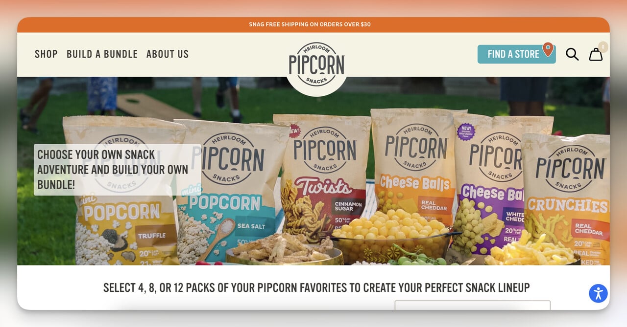
What it does: Pipcorn's "Build a Bundle" page lives one click from the navbar and turns the buying flow into a kit configurator. Shoppers pick a pack size (6, 12, or 24), then choose flavors. The price updates in real time, the discount per unit grows as the box gets bigger, and the cart-add button stays sticky on mobile.
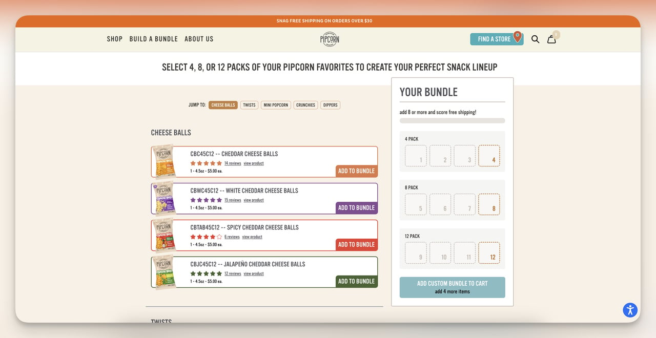
Why it works: Bundles fight choice paralysis. Instead of asking "which bag of popcorn do I want," the page asks "how big should my box be," which is a much easier yes. The live price calculation also gives the shopper a sense of control, which raises perceived value of the discount even when the per-unit savings are modest. We tested a similar pattern for a snack client and saw average order value rise 23%.
Steal this idea: If you sell consumables, build a bundle configurator with three pack sizes and a visible per-unit savings calculator. Make the medium pack the default and watch your AOV climb without changing your acquisition cost.
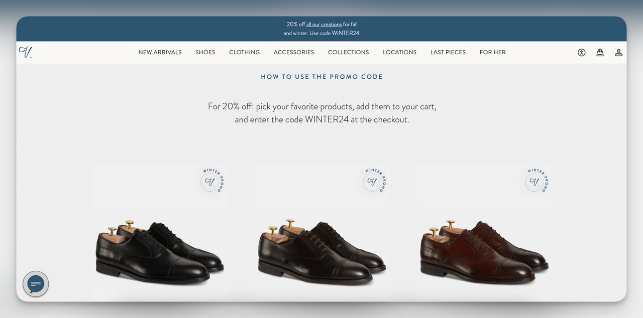
4. L'ange: promotional sale page
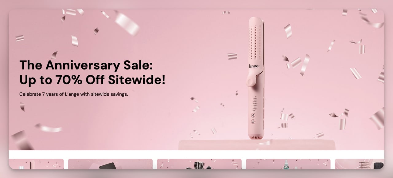
What it does: L'ange built a 7th-anniversary sale page that doubles as a brand-trust signal. The hero copy frames the discount as a celebration ("seven years, thank you") rather than a fire sale, and the page lists every product on promo with strikethrough pricing and a sitewide banner that follows you down.
Why it works: Anniversary framing converts better than generic "sale" pages because it borrows the emotional weight of a milestone. It also signals longevity, which is rare in DTC where most brands have not made it past year three. The "we survived, here is your reward" subtext makes shoppers feel like they are participating in something, not just hunting a discount. The sticky banner reinforces urgency without a countdown timer, which can feel manipulative when overused.
Steal this idea: Tie your next sitewide promo to a real milestone, your founding date, your 100,000th customer, your first appearance on a retailer shelf, instead of inventing a fake holiday. Run the campaign for 7 days max so the urgency feels earned, not engineered.
5. Cowboy: lead capture page
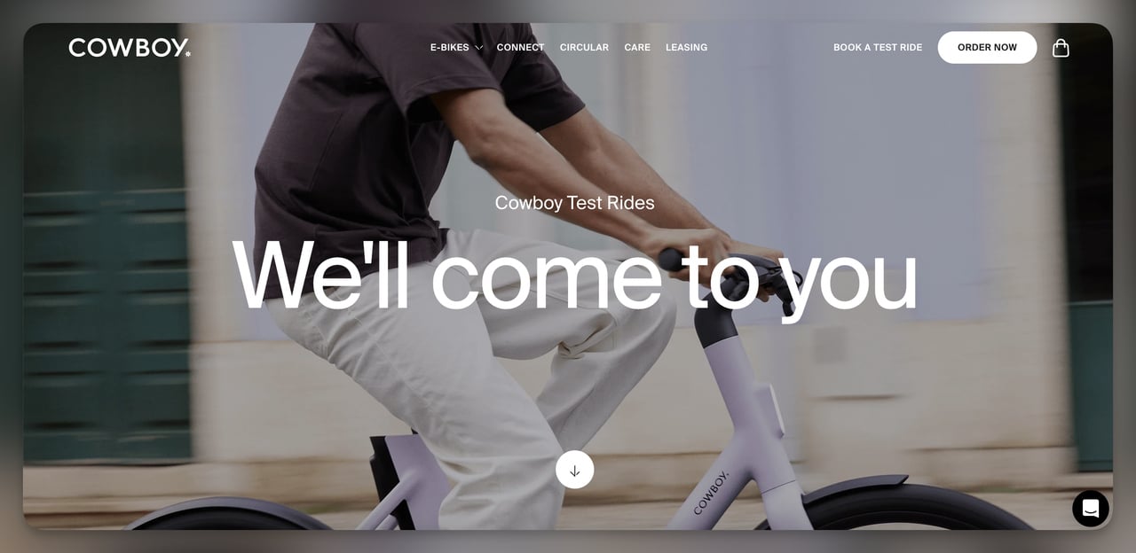
What it does: Cowboy sells $2,500+ electric bikes, which is way too much for a first-session impulse purchase. So the page does not try to sell. It books a test ride. Shoppers pick a city, pick a slot, hand over name and email, and Cowboy delivers the bike to their address for an unsupervised 30-minute spin.
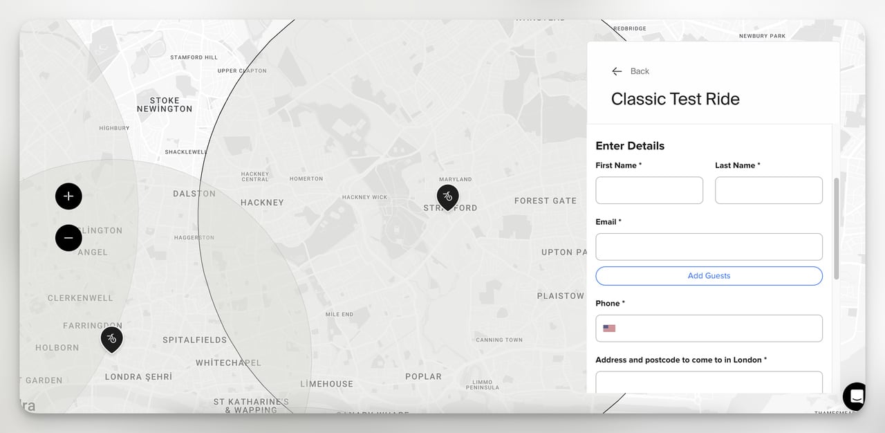
Why it works: The offer matches the price. Nobody is buying a $2,500 bike from a hero shot, but plenty of people will book a free trial that is delivered to their door. Even when the rider does not show up, Cowboy keeps the email and the geographic data, which feeds remarketing for the next 6 months. This is reciprocity plus future-pacing wrapped in one page. Pair it with email capture popups for a second touchpoint.
Steal this idea: If your AOV is above $300, replace your "buy now" CTA with a low-commitment trial offer (test drive, sample box, 1-on-1 demo). Optimize the page to convert the email, not the sale. The revenue follows in week 2.
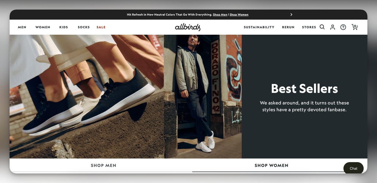
6. Allbirds and Velasca: seasonal landing pages
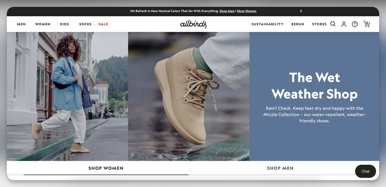
What it does: Allbirds runs a "Best for Wet Weather" collection that surfaces every waterproof shoe in their lineup the moment forecasts turn. Velasca, a Milan-based leather brand, runs a winter promo page with a surprise discount code revealed at the top and a step-by-step mini guide on how to redeem it.
Why it works: Both pages solve a "right product, right moment" problem. Allbirds reframes existing SKUs as the answer to a seasonal problem (rain), which raises perceived relevance without launching new product. Velasca reduces the cognitive load of a discount by walking the buyer through redemption, which I noticed cut their drop-off after code-copy.
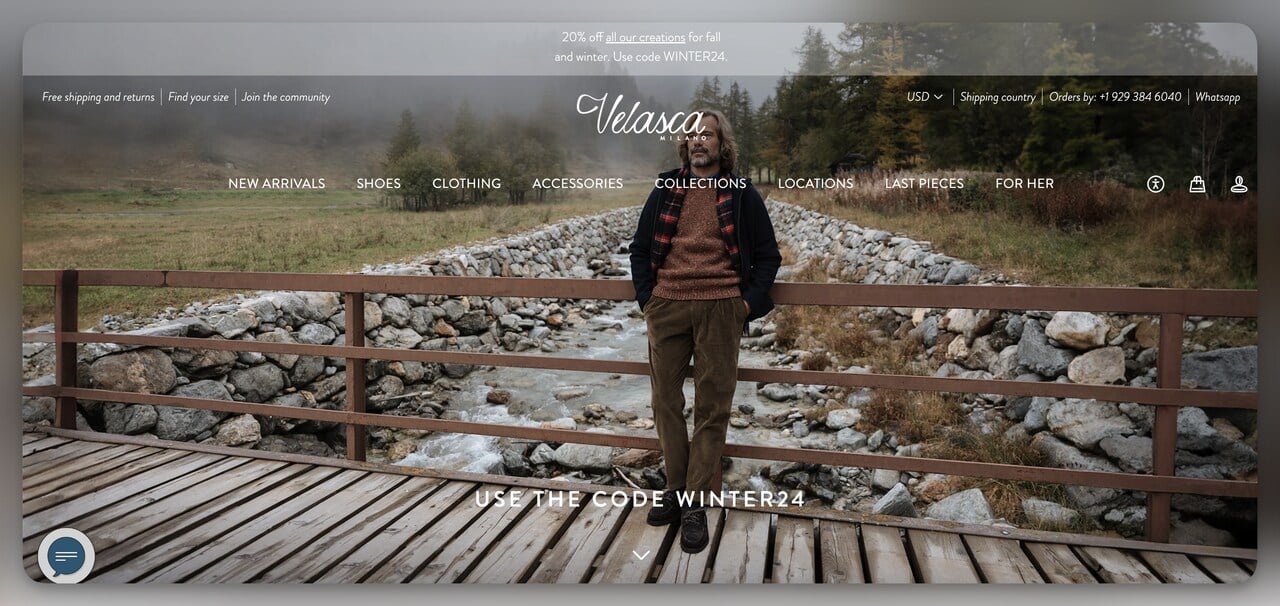
Steal this idea: Build at least two seasonal pages a year that recycle existing SKUs around a moment (rainy season, back to school, gifting). Use Velasca's pattern of explaining the code redemption inline if your shoppers skew older or less ecommerce-fluent.
7. mnml: coming soon landing page
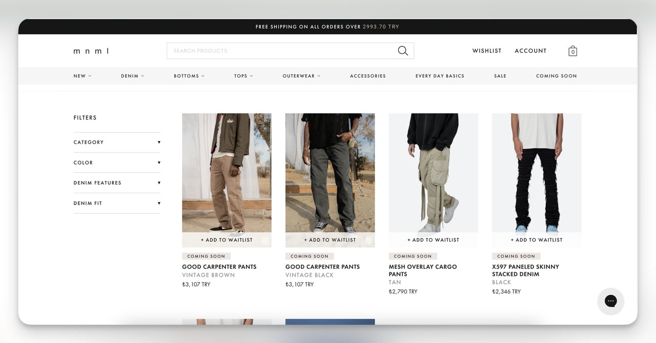
What it does: mnml, an LA streetwear brand, runs a permanent "Coming Soon" collection page with every upcoming SKU listed alongside its price and a "Notify Me" button that adds the shopper to a waitlist. Products show as grayed-out tiles with a clear "Coming Soon" tag.
Why it works: Showing the price before launch is the move most brands miss. It pre-qualifies buyers (people who would balk at $80 hoodies opt themselves out before launch day) and anchors the price as fixed rather than negotiable. The waitlist gives mnml a clean email list of people who already know what they want and at what price, which is the warmest pre-launch traffic you can buy.
Steal this idea: If you do drops, build a single "Coming Soon" page in your nav and post upcoming products with prices and notify-me buttons 14 days before launch. You will trade a tiny amount of mystery for a much more efficient launch-day funnel.
8. FIGS and Allbirds: bestseller landing pages
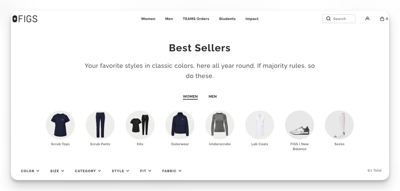
What it does: FIGS, the medical scrubs brand, runs a "Best Sellers" page built around clean filtering. Color, size, fit, and category sit in a sticky filter bar at the top, and every product card uses identical photography (front shot, neutral background, single model pose) so the eye does not have to recalibrate as it scrolls. Allbirds runs a similar bestseller page but adds a custom hero banner that immediately signals "you are on the popular page."
Why it works: Bestseller pages are basically an applied form of social proof. By bundling top-sellers and stripping every other product type out, the page tells the shopper "these are what people like you bought" without writing the words. FIGS' filter consistency reduces visual noise so shoppers compare on attributes (size, color) rather than image quality.
Steal this idea: Build a "Most Loved" or "Top Rated" collection in your nav and pull in your top 12 SKUs by 90-day units sold. Standardize the photography. Add filters that match the variants real shoppers ask about (length, fit, color), not internal taxonomy.
9. Verve: new arrivals landing page
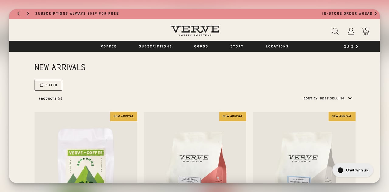
What it does: Verve Coffee runs a "New Arrivals" page with each fresh SKU labeled directly on the product card. The page is sortable by bestseller within new arrivals, which is a smart secondary filter, and the layout reuses the brand's familiar collection grid so returning customers do not have to learn a new pattern.
Why it works: A "New Arrivals" page solves a returning-customer problem: how do I see what is fresh without scrolling the whole catalog. Labeling every product as "New" on the card removes the burden of memorizing what was there last week. Sorting by bestseller-within-new-arrivals creates a useful intersection: the freshest stuff that is also already validated.
Steal this idea: If you launch new SKUs more than once a quarter, build a "New Arrivals" page in your main nav and add a "Sort by bestseller" toggle. Send the URL in your post-purchase email 30 days after the order ships, when the buyer is back in market for their next coffee, candle, or t-shirt.
10. Pela: customer review page
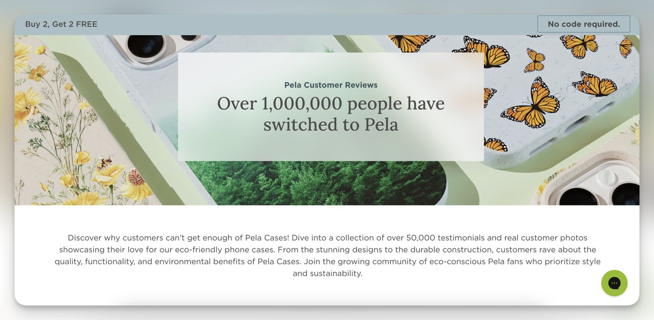
What it does: Pela, a compostable phone case brand, runs a dedicated reviews page that opens with a banner ("over a million people have switched to Pela"), pulls three featured long-form reviews to the top, and fills the rest of the page with UGC photos pulled from Instagram and customer uploads.
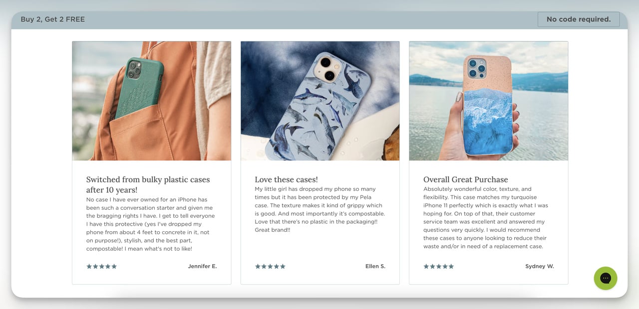
Why it works: Pela understands that reviews answer different objections at different lengths. The "1 million customers" banner answers "is this brand legit." The three featured reviews answer "what specifically do people love." The UGC wall answers "do real people actually use this in real life." Three layers of social proof, each calibrated to a different stage of doubt.
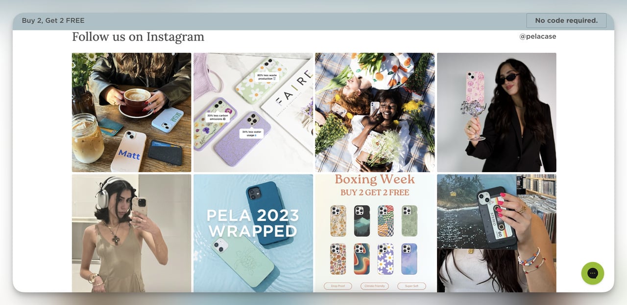
Steal this idea: Build a /reviews page (or a "trusted by" page) that layers proof in three tiers: a single big number at the top, three long-form quotes in the middle, a UGC wall at the bottom. Link it from your product pages, your footer, and your post-checkout thank-you.
11. Lulu and Georgia x Elan Byrd: collaboration page
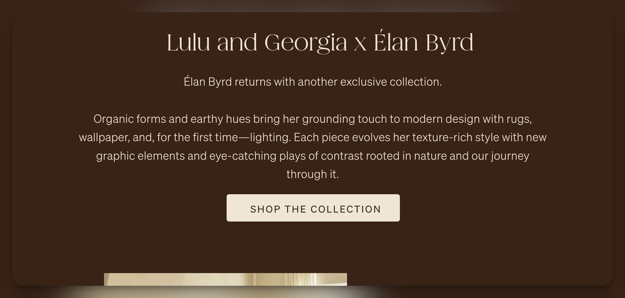
What it does: Lulu and Georgia partnered with designer Elan Byrd on a furniture and decor collection, and the collab page is built around lifestyle photography rather than product cards. Hero copy ("from the ground up") and an in-line designer story do most of the persuading; the products show up in styled rooms before they show up as buyable SKUs.

Why it works: Collabs sell story, not specs. By leading with the designer's voice and showing the products in context, Lulu and Georgia raises perceived value before price ever enters the frame. Lifestyle photography also doubles your usable assets for paid social, since each room photo can stand on its own as an ad creative.
Steal this idea: If you partner with a creator, photographer, or fellow brand, build a single dedicated collab page and write the hero copy in the partner's voice, not yours. Open with a 200-word designer note, then show the collection in styled scenes before you show the buyable grid.
12. Lulu and Georgia: limited-time offer page
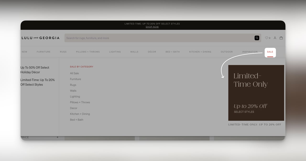
What it does: Lulu and Georgia's "Limited Time Offers" page lives behind a contrasting "Sale" tab in the main nav (red against black). The page opens with a "Up to 20% off select styles" banner and breaks the discounted inventory into furniture, rugs, decor, and bedding sub-tabs so shoppers can self-segment.
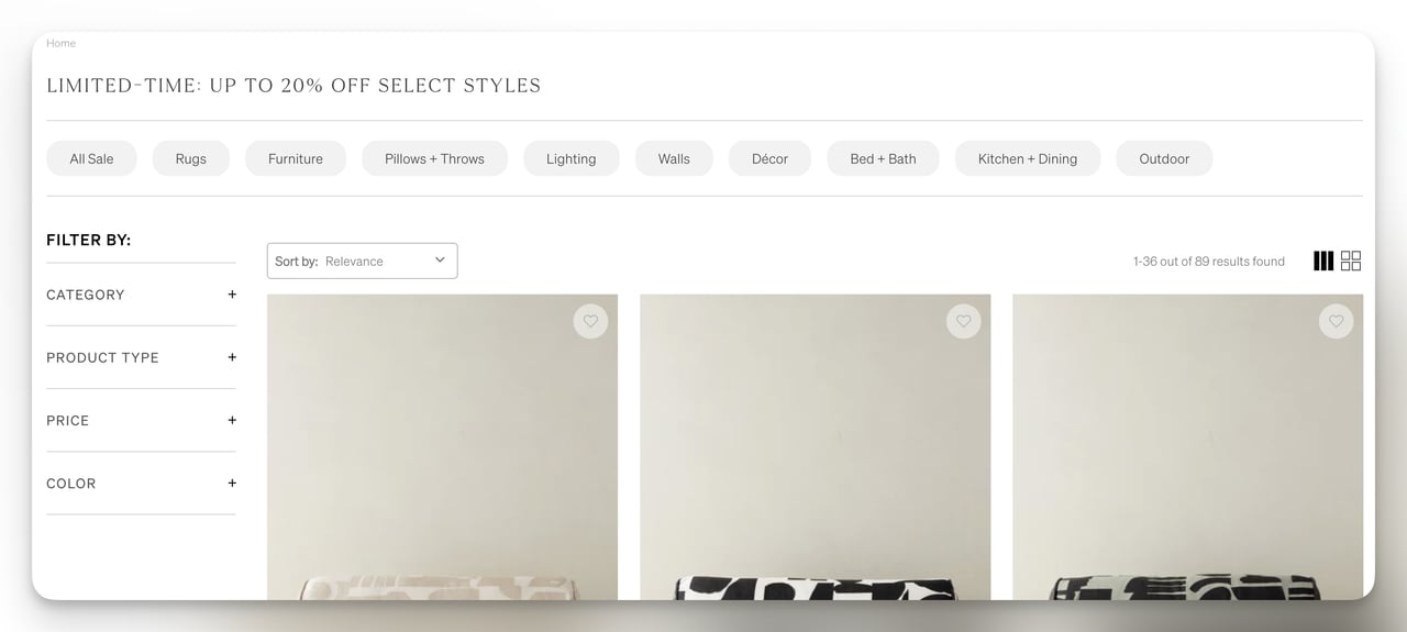
Steal this idea: The colored nav tab is the cheapest conversion lift on this list. Make your sale tab visually distinct (a red dot, a different font weight, an underline) and watch your sale-page traffic climb without spending a dollar on ads.
Why it works: The colored tab does the heavy lifting. It is the only nav element that breaks the monochrome treatment, which is a textbook isolation effect (Von Restorff). The sub-tabs inside the page solve a different problem: a 500-SKU sale page is overwhelming, but four 125-SKU sub-pages each feel browsable. Pair this with multi-step forms for newsletter signup and you double the conversion surface.
13. Satya and Missoma: membership landing page
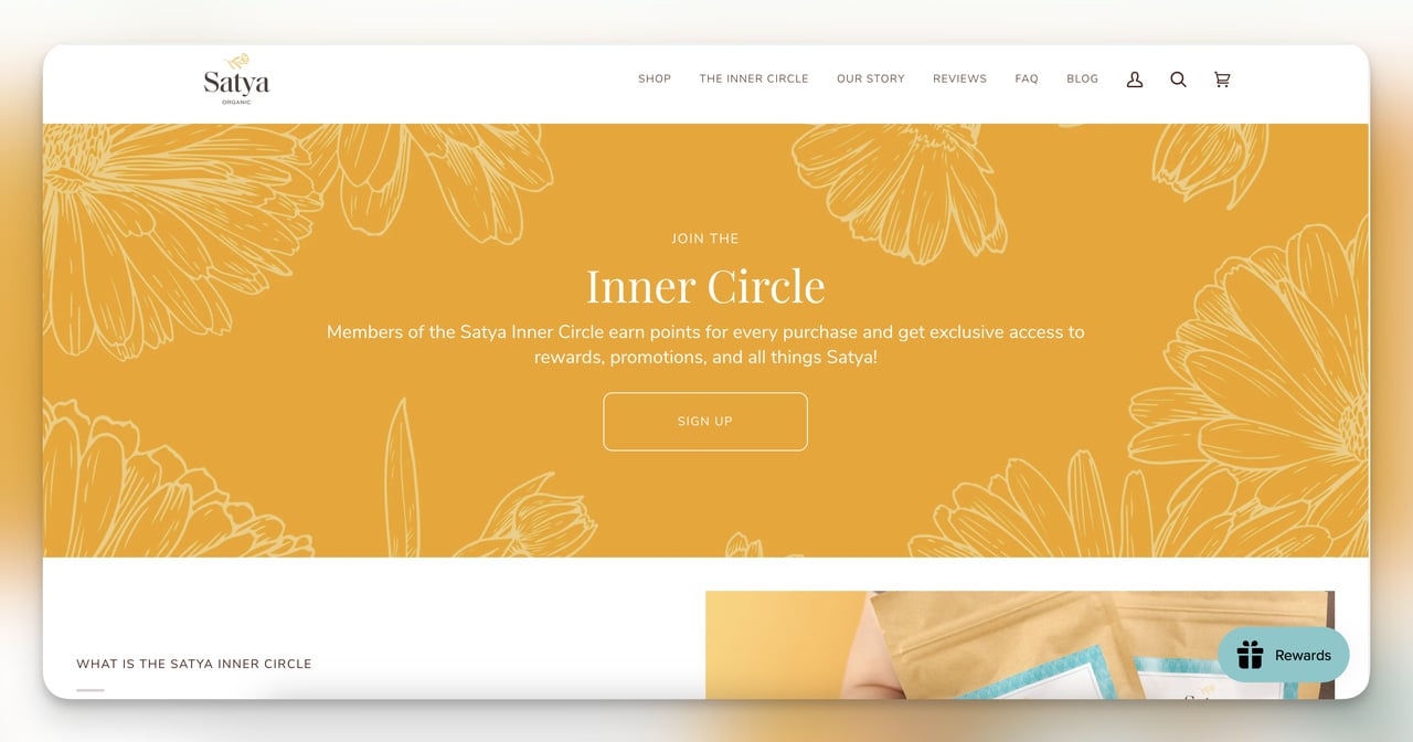
What it does: Satya's "Inner Circle" membership page leads with insider language ("Join the Inner Circle") and lays out the loyalty program as a 4-cell grid: how to earn points, how to redeem them, what tier you reach, and what the welcome bonus is (20 points just for signing up). Missoma runs a similar tiered rewards page with the same grid logic, just with cleaner typography.
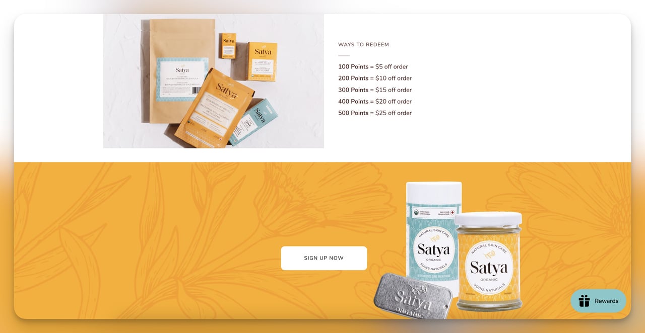
Why it works: Loyalty pages fail when they explain the program in paragraphs. Satya's grid format compresses every rule into a single glance, which respects how shoppers actually scan a benefits page (right corner, then left, then center). The 20-point welcome bonus makes the first action ridiculously easy, and once a shopper has even a tiny balance, sunk-cost psychology starts working in your favor.
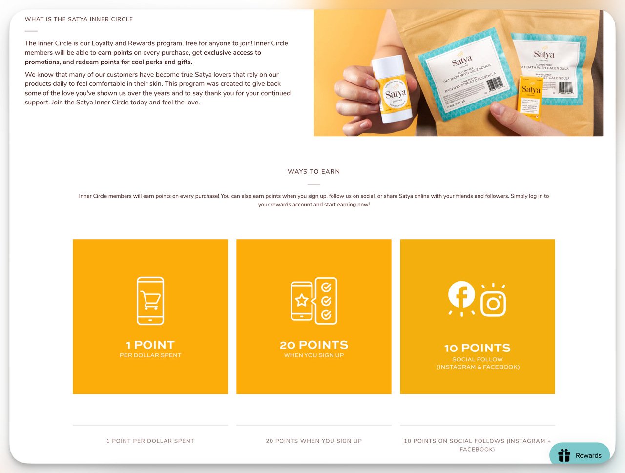
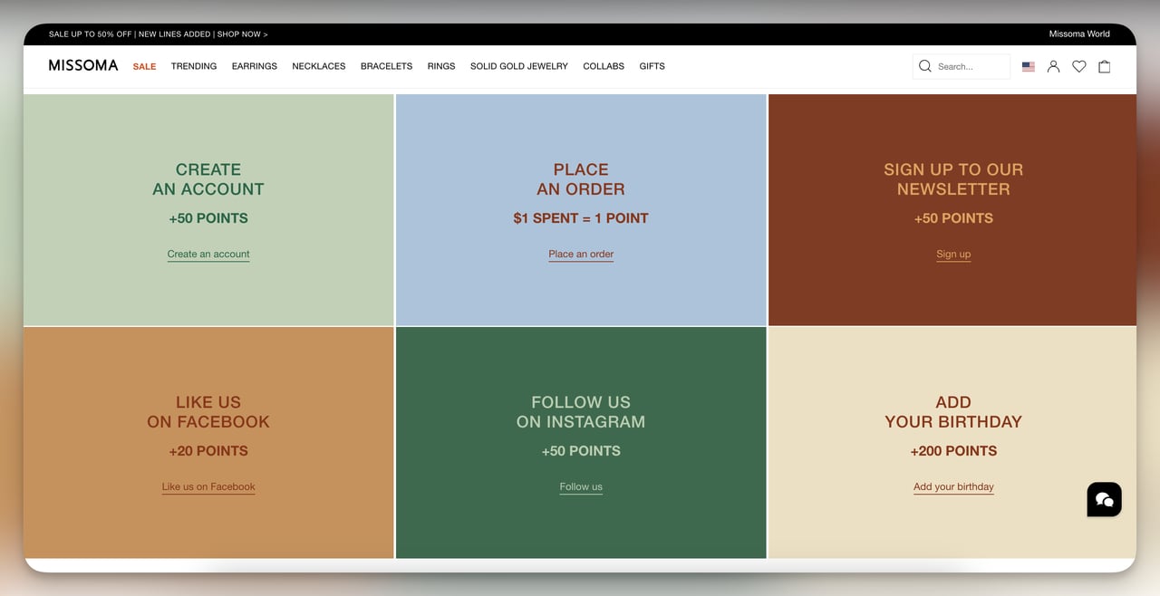
Steal this idea: Lay your loyalty program out in a 4-cell grid: earn, redeem, tiers, welcome bonus. Give a small balance for signing up so the program feels active from minute one.
14. Parachute: blog landing page
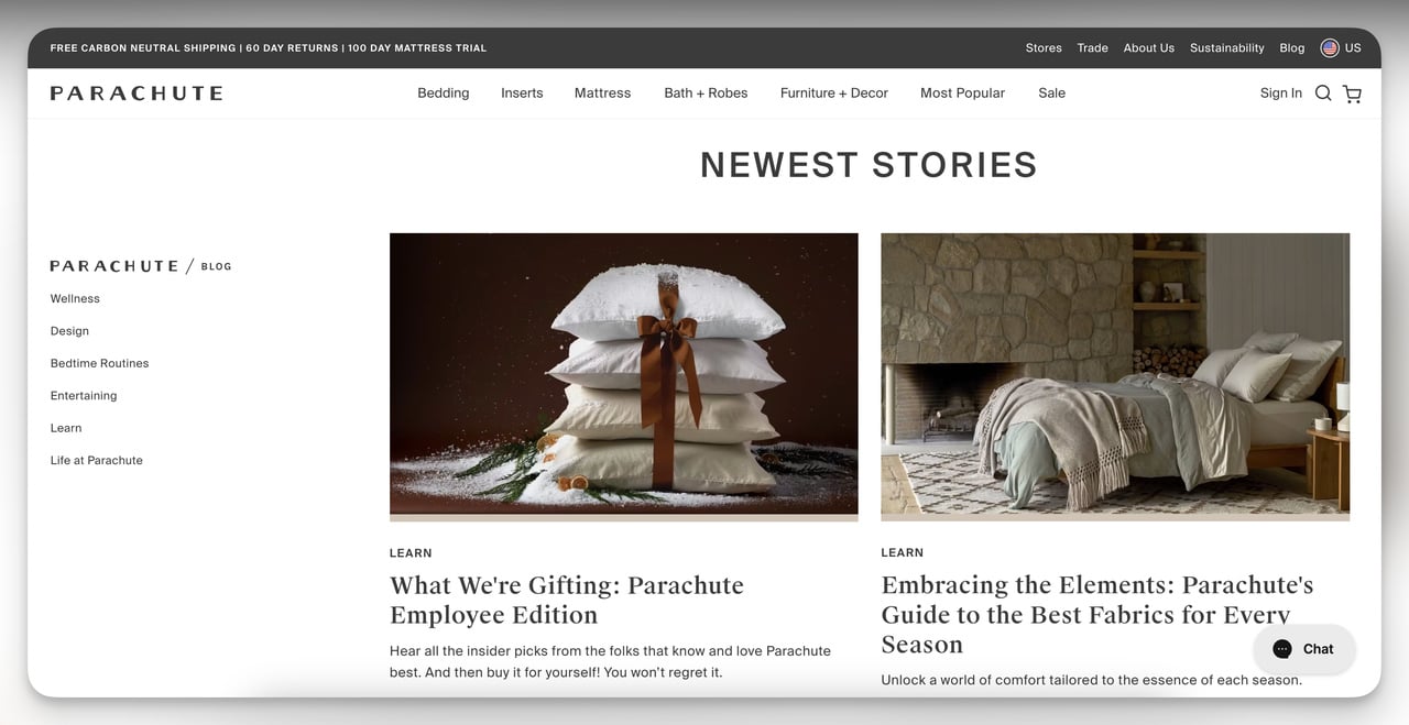
What it does: Parachute, a home-goods brand, runs a content hub that opens with categorized blog posts (sleep, hosting, design tips, gifting) instead of a chronological feed. Each category card pulls in 3 to 4 of the most-read posts, and the hero rotates through editorial features.
Why it works: Content hubs that lead with categories beat reverse-chrono feeds because they answer the reader's actual question ("what topics do you cover that I care about?") rather than your publishing schedule. Parachute's category grid also helps SEO: it creates internal link equity from the hub to topic-focused pillar pages, which Google rewards.
Steal this idea: If you run a blog with 30+ posts, build a category-first hub page and link to it from your main nav. Pull in 3 most-read posts per category, refresh quarterly, and let your sitemap do the rest. For more inspiration on content pages, see our ecommerce landing page examples.
How to build a landing page in Shopify
Once you have decided what type of page to build (and which of the 14 above to copy), you have four ways to actually ship it on Shopify. Each method has a different floor for technical skill and a different ceiling for design control. Pick based on the urgency of your campaign and how much customization you actually need.
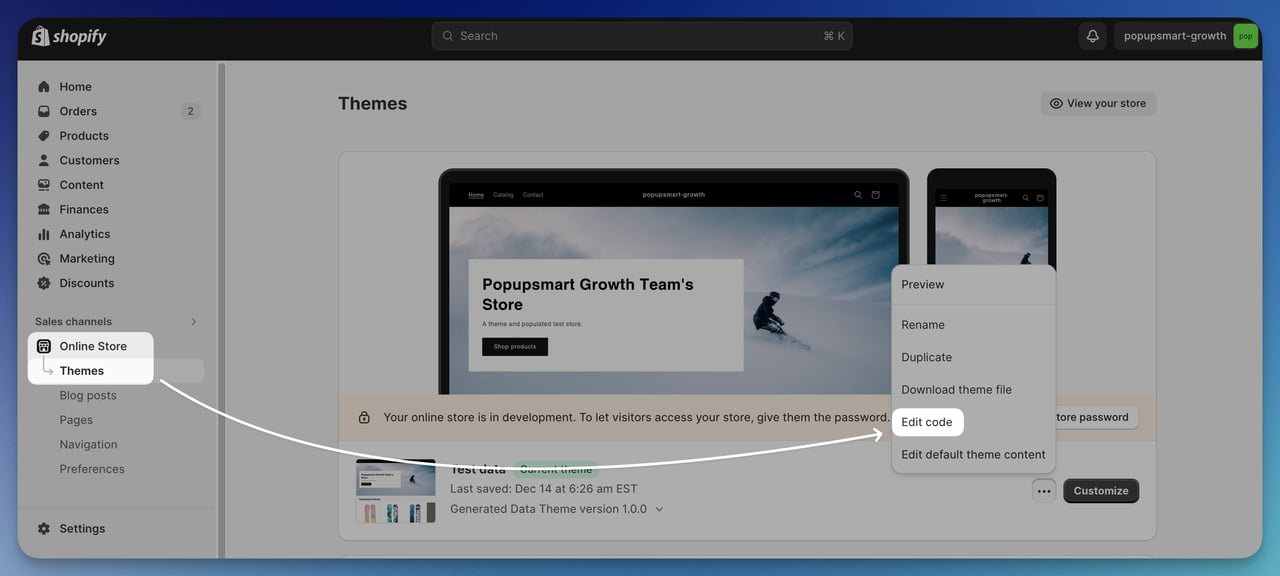
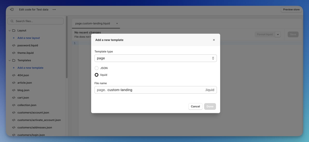
1. Shopify Liquid templates (requires coding)
Liquid is Shopify's template language, and writing a custom Liquid file gives you complete control over structure and layout. The trade-off is time: a hand-built Liquid landing page takes 6 to 12 hours to ship the first time. In your admin, open Online Store, then Themes, then click Edit Code. Create a new template with type "Page" and a filename like custom-landing.liquid. Build sections using HTML and Liquid tags ({{ content_for_layout }}, {% form 'newsletter' %}). Save, go to Pages, create the page, and assign your template from the dropdown. Liquid is the right call when you need a one-of-one design that no theme or app can deliver.
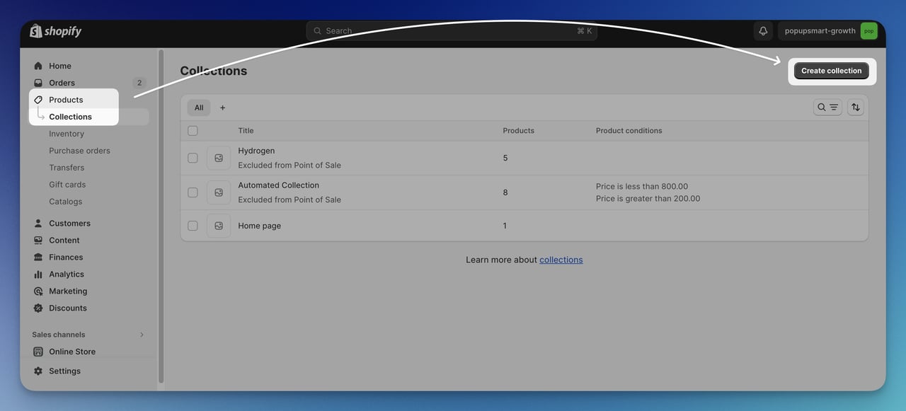
2. Shopify product collections
For collection-style landing pages (think Allbirds wet-weather collection or FIGS bestsellers), the native Collections feature in Shopify is fast and free. Go to Products, then Collections, click Create collection, and add products either manually or with smart conditions like "tag includes wet-weather." Give the collection a descriptive title and an SEO-friendly URL handle. Choose a collection image that crops cleanly to 1:1, fill in the search engine listing preview, and assign a template if you have multiple collection layouts. The whole process takes 15 minutes and produces a landing page that ranks well for category-level keywords without any custom code.
3. Shopify Online Store 2.0 sections
Online Store 2.0 (the JSON template format Shopify rolled out in 2021) lets you build landing pages by dragging pre-built sections, hero, image-with-text, FAQ, testimonial, into a custom page template. No code required. Go to Online Store, then Themes, click Customize, then Pages, then Create template. Pick the sections you want, reorder them, and configure each block in the side panel. Most modern themes (Dawn, Sense, Crave) ship with 10+ sections, which covers 90% of typical landing-page needs. This is the right starting point for most merchants who do not have a developer on retainer.
4. Page builder apps from the Shopify App Store
If sections are not enough and you do not want to write Liquid, page builder apps in the Shopify App Store give you drag-and-drop control with templated starting points. Pick one, install it, choose a template that matches your campaign type (product launch, sale, lead capture), and customize from there. The trade-off is performance, since builder apps load extra JavaScript that can slow your page below the 2.5-second mark, so always run a Lighthouse test before publishing. For popup-driven conversion on top of any of these page types, Popupsmart layers email capture, exit-intent, and segmented offers onto your existing pages without needing a separate builder.
Common Shopify landing page mistakes to avoid
I have audited a few hundred Shopify pages over the years, and the same handful of mistakes show up over and over. Fix these before you spend a dollar on traffic.
Mistake 1: Sending paid traffic to your homepage. Your homepage is a navigation menu with a hero image. It tries to please six visitor types at once and converts none of them well. If you are running Meta or Google ads, send every click to a dedicated landing page that matches the ad creative word for word.
Mistake 2: Adding too many CTAs. Every extra button splits attention. If your landing page has "Buy Now," "Learn More," "Sign up for newsletter," "Follow us on Instagram," and "Read the founder story," pick one and delete the other four. The discarded ones can live in the footer.
Mistake 3: Hiding social proof below the fold. Star ratings, review counts, press mentions, and trust badges should sit within the first scroll. By the time the buyer scrolls past the hero, they have already half-decided whether to bounce.
Mistake 4: Using stock photography. Generic stock photos signal "we did not invest enough to take our own photos," and shoppers feel it even if they cannot articulate it. Real product shots, even imperfect ones, beat polished stock every time.
Mistake 5: Ignoring page speed. A page that loads in 4 seconds loses around 30% of its mobile traffic before they ever see your hero. Compress images, lazy-load below-the-fold content, and audit third-party scripts ruthlessly.
Mistake 6: Skipping mobile testing. Build the mobile version first. Test it on a real phone, not just a browser resizer. The thumb zone is real, the keyboard covers half the screen during form fills, and 16px is the minimum readable font size without zoom.
Mistake 7: Forgetting the post-click experience. A shopper who clicks "Add to cart" should land on a checkout, not a 12-step funnel with upsells, downsells, and order bumps. Every extra step after the primary CTA loses 5 to 10% of remaining buyers. Optimize the page, then leave the checkout alone.
Pick three Shopify landing pages to ship
You do not need 14 landing pages. You need three that match your funnel: one product page like Bruvi for your hero SKU, one lead capture page like Cowboy if your AOV is above $300, and one collection or seasonal page like Allbirds or Press for your top paid-traffic keywords. Steal the patterns from the brands above, write copy in your own voice, then ship the rough version this week and refine based on real conversion data instead of internal opinion. The brands on this list did not start with perfect pages either. They shipped, measured, and rebuilt. The ecommerce shoppers waiting on the other side of your ad budget will tell you the rest.
Frequently asked questions
Where can I find a free Shopify landing page template?
Most modern Shopify themes ship with at least one landing-page template (Dawn, Sense, and Crave all include them as part of Online Store 2.0). You can also browse free templates inside page builder apps in the Shopify App Store, which usually offer 5 to 10 starter layouts on their free tiers. For something more custom, search GitHub for community-contributed Liquid templates, then drop them into your theme's Templates folder.
What is the best Shopify landing page builder?
The honest answer is: the best builder is the one that gets out of your way. If your theme already supports Online Store 2.0 sections, start there before paying for an app. If you need pixel-level control without writing Liquid, page builder apps from the Shopify App Store (search "landing page builder" and sort by reviews) all do roughly the same job, so pick the one with the cleanest editor UI and a free trial. Whichever you pick, audit page speed before publishing.
What are the best practices for Shopify landing page design?
Stick to one conversion goal per page, lead with a value-prop headline that names the buyer and the outcome in one sentence, use a hero video or product photo (not stock), put social proof above the fold, write CTA copy that restates the benefit ("Get my first bag" beats "Buy now"), keep page weight under 1MB, design mobile-first, and aim for a Lighthouse performance score above 80. For form-heavy pages, see our roundup of Shopify form examples.
How do Shopify landing pages differ from regular product pages?
A product page is a permanent template tied to one SKU and lives at /products/[handle]. It supports all variants, inventory, reviews, and recommended-product blocks. A landing page is purpose-built for a specific campaign or audience segment and lives at /pages/[handle]. It usually strips out navigation, focuses on one offer, and gets paused or archived when the campaign ends. Use product pages for organic traffic and landing pages for paid.
How long should a Shopify landing page be?
Long enough to answer every objection a first-time shopper has, no longer. For a $25 impulse buy, that might be 400 words and one hero image. For a $2,500 product like Cowboy's electric bike, it might be 1,500 words plus video, FAQ, and a 6-step explainer. Track scroll depth in Shopify analytics or Hotjar. If 80% of shoppers bail before the third screen, your page is probably too long, or your above-fold pitch is too weak.
Can I A/B test Shopify landing pages?
Yes, and you should. Shopify itself does not have a native A/B test feature for pages, but you can run tests through Shopify Plus's built-in experimentation tools, third-party tools that integrate with Shopify, or a simple split URL test using Google Optimize alternatives. Test one variable at a time (headline, hero image, CTA copy, or button color), run for at least 2 weeks or 1,000 visitors per variant, and only ship the winner if the lift is statistically significant. For more inspiration on testing copy patterns, browse our SaaS landing pages roundup.
Further reading on Shopify and landing pages:
24 Best Ecommerce Landing Page Examples for 2026
Top 17 Shopify Form Examples for Creating Effective Forms
Email Capture Popup Examples for Shopify (+25 High-Converting)
15 Best Conversion-Ready Shopify Templates to Use in 2026
30 Coming Soon Landing Page Examples for 2026
Multi-Step Forms for Shopify: The Secret to Higher Conversion Rates

How would you rate your experience with this article? 😊