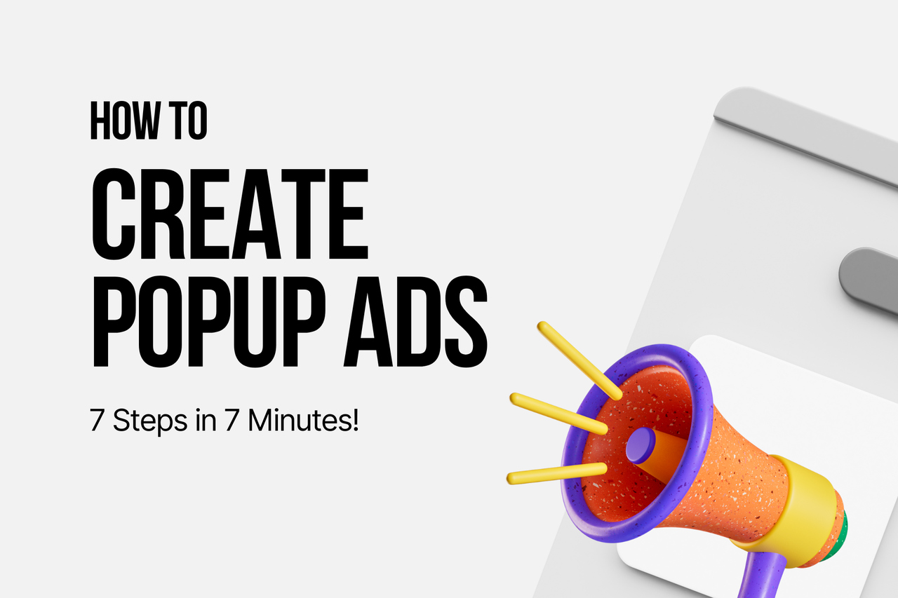
How to Create a Popup Ad in 7 Steps (2026 Guide + Templates)
Popup ads are small windows that overlay site content to drive goals like promotions, lead capture, engagement, and reducing cart abandonment. The text covers creating them in 7 steps, best practices, benefits, and success metrics (views, leads, conversions, ROI).
To create a popup ad, sign up for a no-code popup builder, name your campaign, pick a goal, choose a Playbook template, customize the copy and design, set targeting and triggers, then publish. The whole flow takes about seven minutes, and a basic popup ad usually converts between 3% and 11% of visitors.
What is a popup ad?
A popup ad is a small overlay that appears on top of a webpage to deliver a specific message — a discount, a newsletter signup, a survey, a cart-abandonment offer. Unlike banner ads buried in the layout, popup ads sit in front of the content and demand a quick yes/no decision from the visitor.
The format is broader than the full-screen modal most people picture. A popup ad can be a center modal, a sticky bar at the top of the screen, a corner slide-in, a fullscreen takeover, or a small teaser that expands when clicked. Each format has its own use case. A sticky bar suits a sitewide announcement. A slide-in fits a contextual content offer. A center modal works for a high-stakes ask like an exit-intent discount.
What makes popup ads different from any other on-site message is timing. They fire on specific behaviors — exit intent, scroll depth, time on page, returning visit — instead of sitting passively in the page.
Why popup ads still work?
Popup ads still pull their weight because they convert better than almost any passive on-site element when you target them correctly. According to Scalify, the average popup conversion rate sits at 3.09%, but campaigns built with proper targeting and timing can climb several times higher.
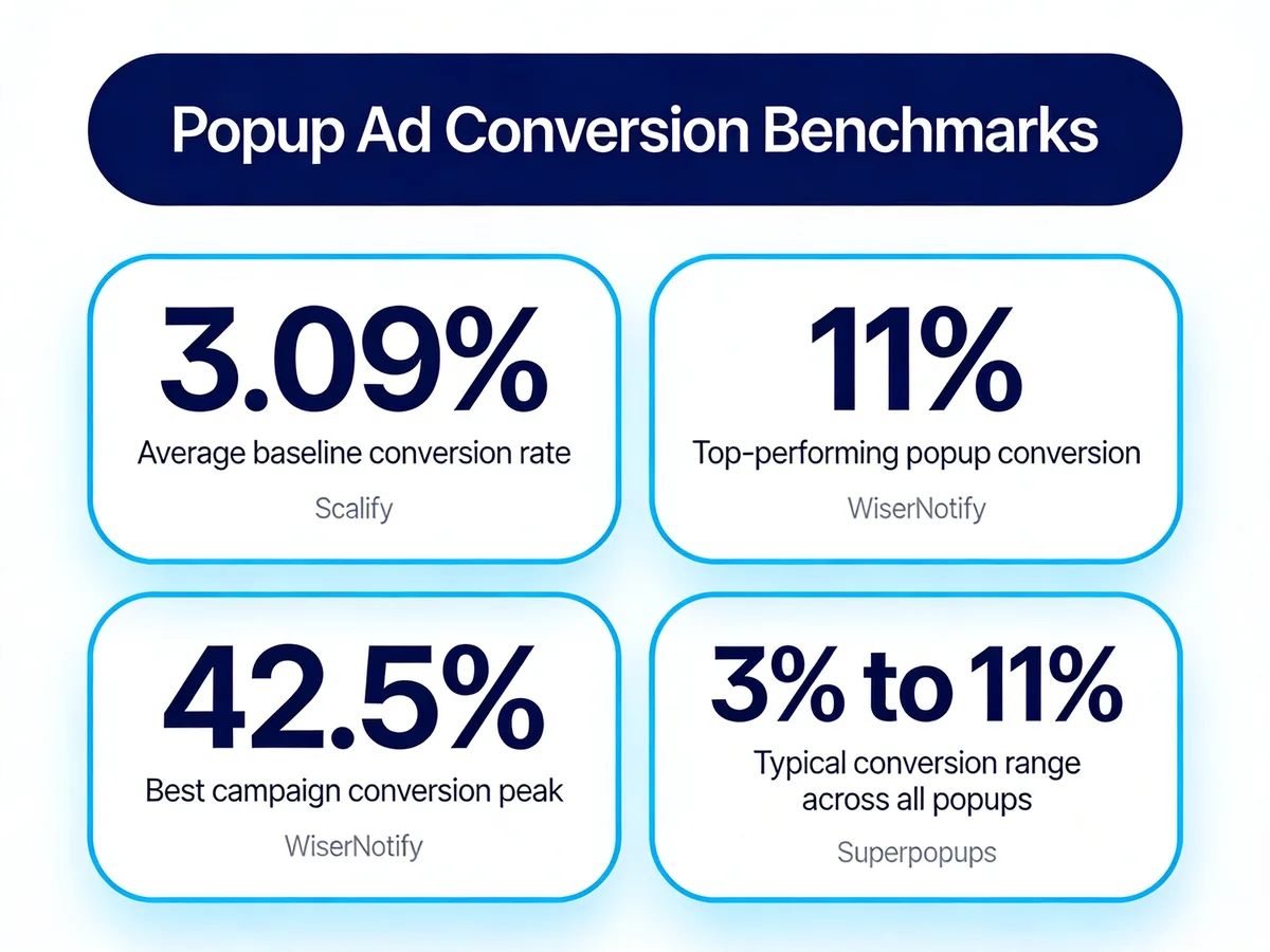
Popup ad conversion benchmarks across recent industry reports.
The numbers stack up further when you look at top-performing accounts. WiserNotify reports the average popup conversion rate is 11%, and the best campaigns reach 42.5%. Superpopups echoes the range, putting the typical popup conversion rate between 3% and 11% depending on offer, traffic source, and timing rules.
Why the spread? Two campaigns with the same template can perform very differently because of the audience setup. One pops on every visitor on page load. The other only fires for first-time visitors on a specific blog category, with a 30-second delay. The second one is what 11% looks like.
For e-commerce, the case is even stronger. A Zotabox case study documented a fashion brand that increased conversions by 25% after adding popup ads to their store. And in a head-to-head test from Convertibles, swapping a 15% off popup for a $30 off coupon with a spend threshold added $45,000 in monthly revenue for one wellness brand. Same popup, different offer math, very different result.
How to create a popup ad in 7 steps
Here's the full walkthrough. I'll use the Popupsmart builder for the screenshots since it's the tool I work in every day, but the structure of the steps applies to any no-code popup builder.
Step 1: Sign up and create a new campaign
Open Popupsmart, sign in (the free plan is enough to ship your first popup ad), and click the + New Campaign button on the dashboard. You'll be asked to name the campaign and choose the website it belongs to.
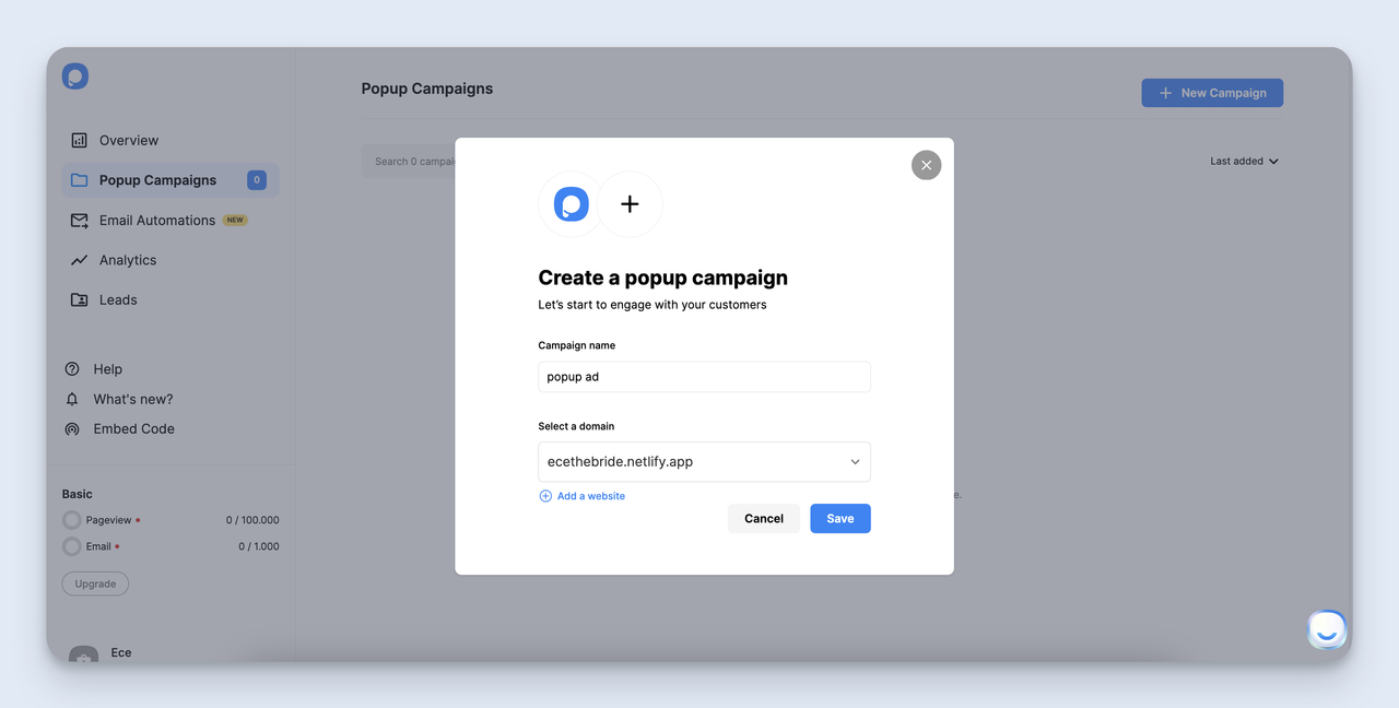
The first screen on a new popup ad campaign — name it after the offer, not the format.
Name the campaign after the offer, not the format. "Spring Sale 15% Off" beats "Center Modal Popup #3" by a mile when you have 30 active campaigns in the dashboard six months from now. Your future self will know exactly what each one does.
If you haven't connected your website yet, paste the domain in the URL field. The embed script that fires the popup ads on your live site comes from this connection — without it, the popup won't appear on your pages.
Watch out for: Connecting the wrong domain. I've done this — created a campaign on the staging URL, wondered for an hour why nothing showed up on production. Double-check the domain field matches the site you actually want the popup ad to fire on.
Step 2: Pick the business goal for this popup ad
Next screen, you pick a goal. Popupsmart presents a small set: collect emails, drive sales, get phone calls, gather feedback, and a few more. This isn't a cosmetic choice. The goal you pick changes the templates the builder shows you, and it changes the metrics the analytics tab tracks against the campaign.
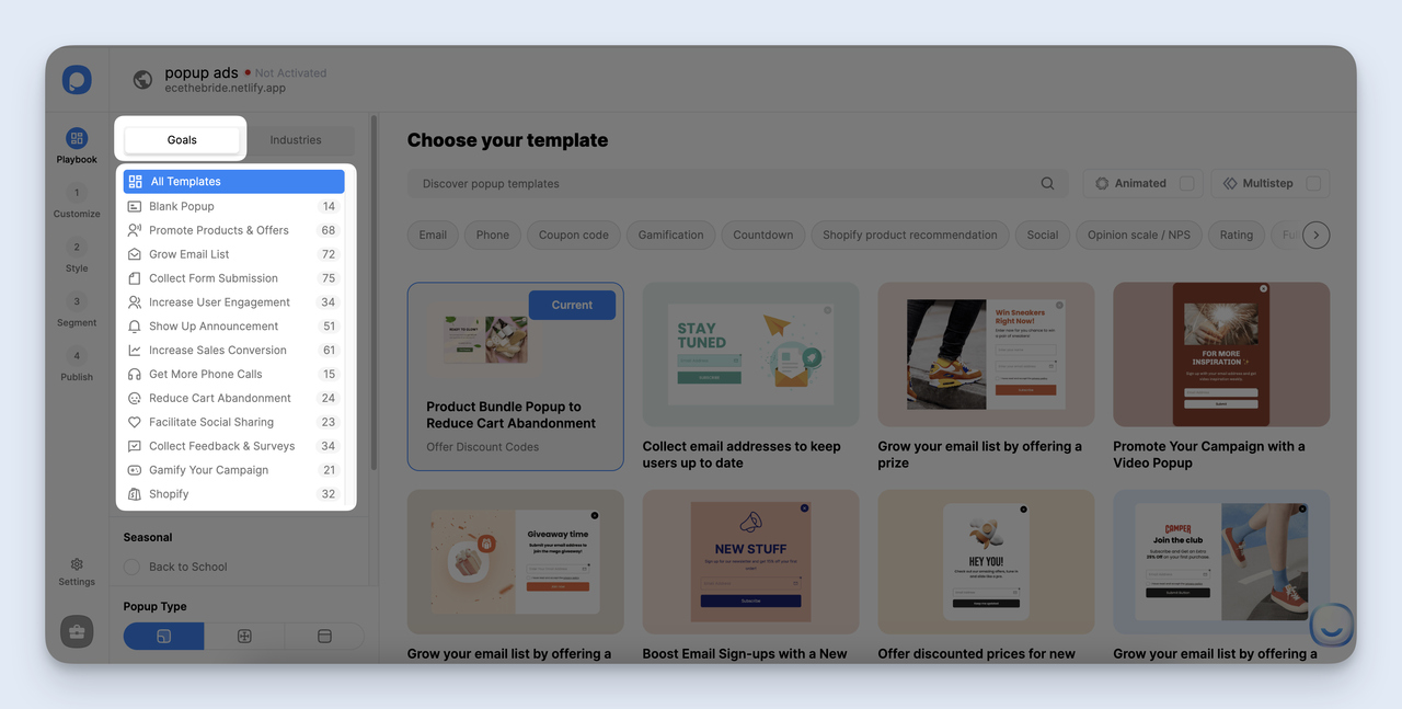
The goal you pick filters the templates and shapes the analytics view.
Pick one. Just one. The biggest mistake I see new users make is trying to combine goals — a popup ad that asks for an email AND offers a 10% discount AND links to a product page. Visitors don't read three asks. They close the popup. One popup ad equals one job.
If you genuinely have two goals, build two campaigns. Show one to first-time visitors and one to returning visitors. That kind of split usually outperforms a single Frankenstein popup ad.
Step 3: Pick a Playbook template (or start from scratch)
The Playbook is the template gallery. There are 350+ templates organized by goal, industry, and format. Browse it before you build anything from scratch — most of the time, a template gets you 80% of the way there in under a minute.
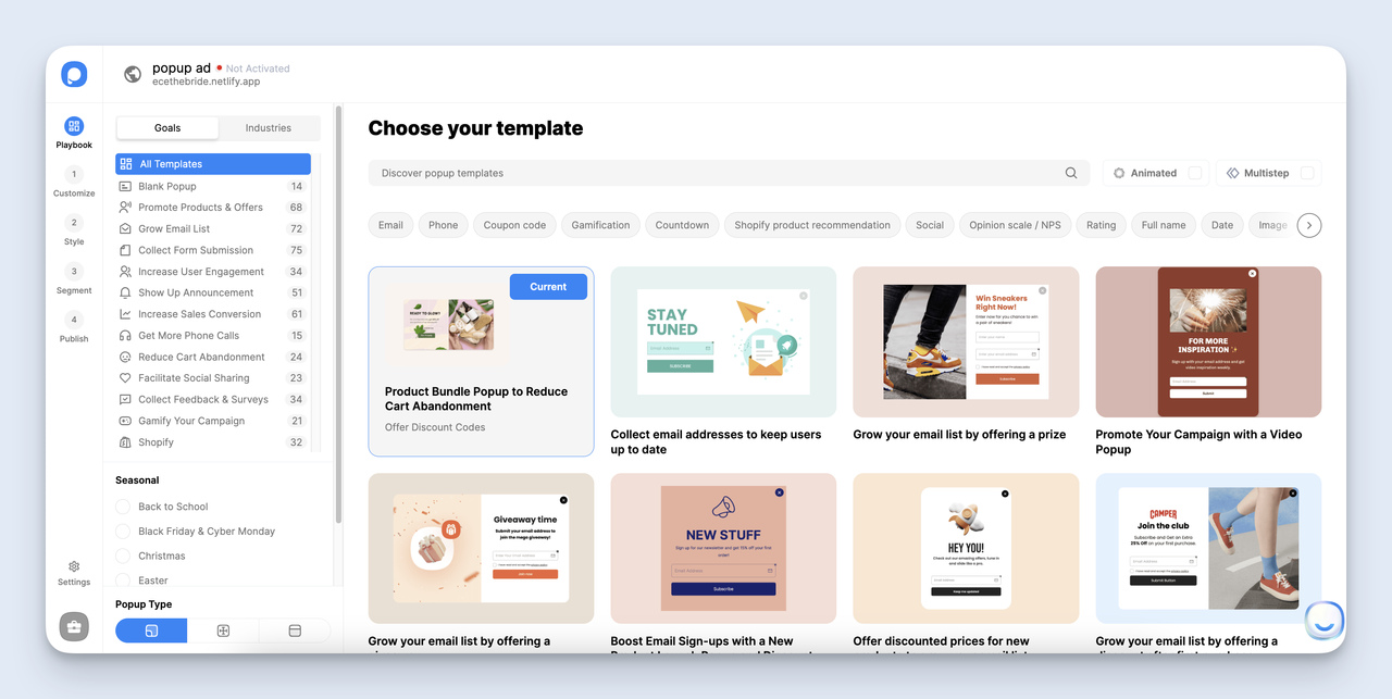
The Playbook — sort by goal first, then format, before you scroll through everything.
Sort by your selected goal first. If you're collecting emails, the email-capture templates are calibrated for that — single-field forms, short headlines, social proof copy where it makes sense. If you're driving sales, the offer templates lead with the discount.
If nothing fits and your offer is unusual, hit "Blank Template" and build from a clean canvas. But honestly, in most cases, picking a template and editing the copy is faster than designing from zero. I almost always start from a template even when I plan to swap most of the design.
Pro tip: If you find a template that you'll reuse across campaigns, save the customized version as your own template. The Playbook lets you star and reuse your designs, which saves a real amount of time when you're shipping multiple popup ads a month.
Step 4: Customize the popup with copy, visuals, and a CTA
This is where the popup ad goes from generic template to your brand. The customization screen is a drag-and-drop editor — text blocks, images, buttons, form fields, dividers, all on the left sidebar. Drop them onto the canvas, click any element to edit it.
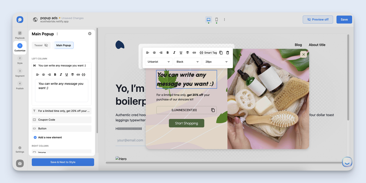
The customize screen — the headline does most of the heavy lifting, so spend the time there.
Spend the most time on the headline. The headline does about 70% of the conversion work — the body copy and CTA button are almost detail. A weak headline ("Subscribe to our newsletter") tanks the rest of the popup ad even if the design is great. A specific headline ("Get the weekly Shopify growth rundown — 5,300 stores read it") gives the visitor a reason to keep reading.
Keep body copy under 25 words. Most visitors scan, not read. Your CTA button should describe the outcome, not the action — "Send me the discount" beats "Submit." If your popup ad collects emails, use a single field for the email address. Every additional form field cuts conversions, sometimes hard.
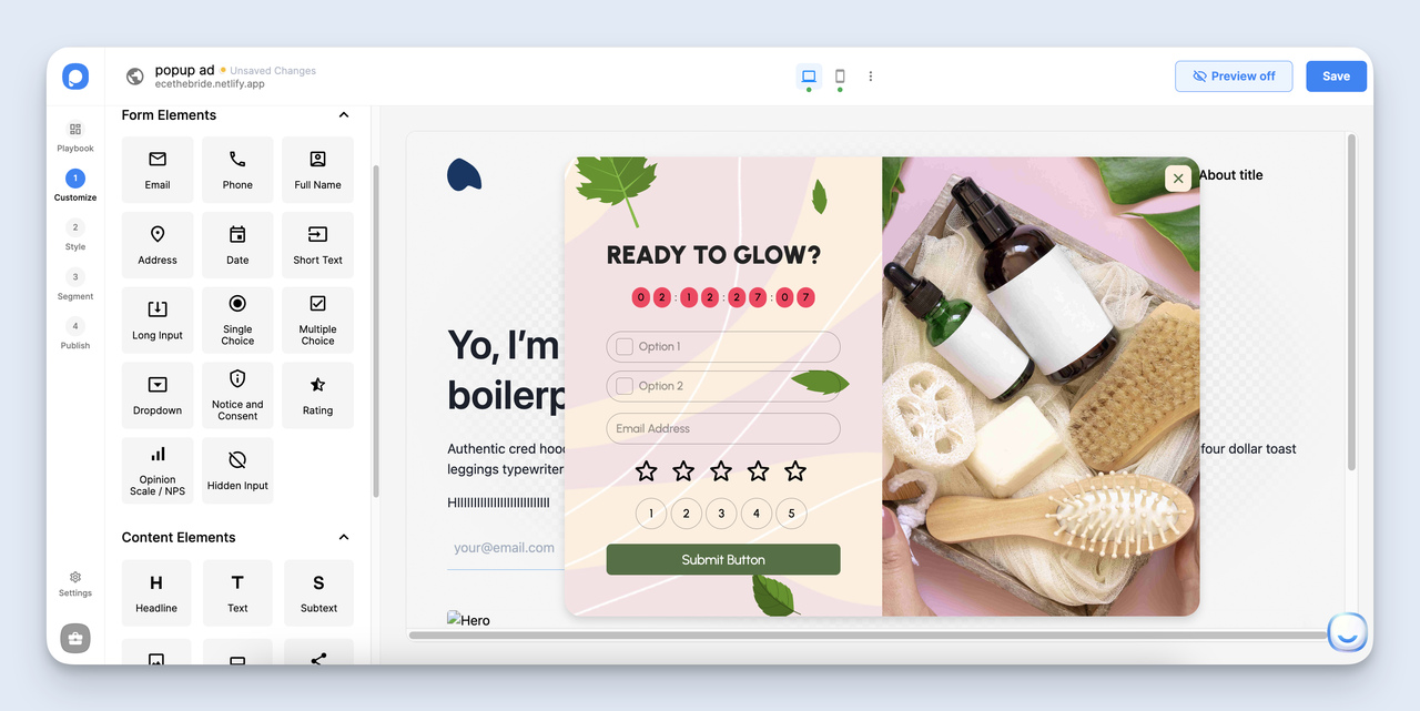
Form elements panel — add only what you'll actually use in your follow-up flow.
Need more than an email field? Popupsmart has phone, name, address, dropdown, rating scale, and countdown timer elements. Add them sparingly. Every extra field kills conversions.
Then move to styling. Color, size, padding, border radius, button style, close button position — every visual element is editable. Match the popup ad to your brand colors so it doesn't feel like a third-party intrusion.
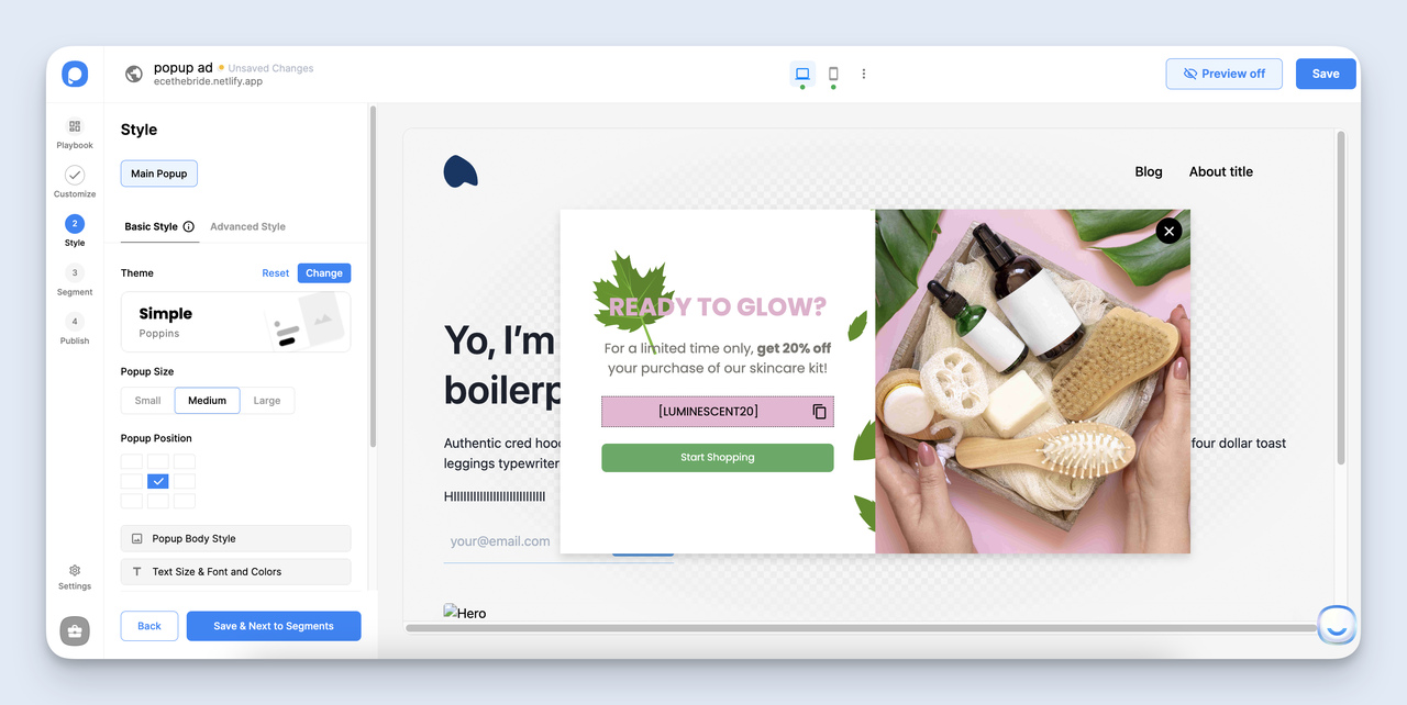
Styling panel — match brand colors but keep the CTA button in a contrasting accent.
One styling rule I follow: the CTA button should NOT match the rest of the popup. Use a contrasting accent color so the button is visually obvious. If the popup is white and gray, the button should be your brand's accent color (red, green, blue, whatever pops). Visual hierarchy beats brand consistency on conversion-critical elements.
Step 5: Set your audience and triggers
This step decides who sees the popup ad and when. Most of your conversion lift hides here, not in the design.
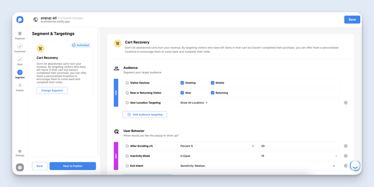
Segment and target — narrow the audience first, then layer in triggers.
Audience options worth using on day one:
• Visitor type: First-time vs. returning. Show your big offer to first-time visitors. Show a different popup (or no popup) to returning ones who already saw it.
• Device: Desktop vs. mobile vs. tablet. A popup that works on desktop can crush mobile UX. Build separate versions if you target both.
• Country / city: Run a US-only discount, or use geo-targeted popups to localize currency and offers by region.
• URL path: Show the popup ad only on specific pages — e.g., a blog post about email marketing only triggers your email-capture popup, not a generic discount.
• Traffic source: Different popup for paid traffic vs. organic vs. email subscribers.
Then layer triggers on top. The trigger options Popupsmart offers include time on page, scroll depth, exit intent, click on element, and inactivity. Exit-intent triggers fire when the visitor's mouse moves toward the close tab — they catch people about to bounce without interrupting earlier reading.
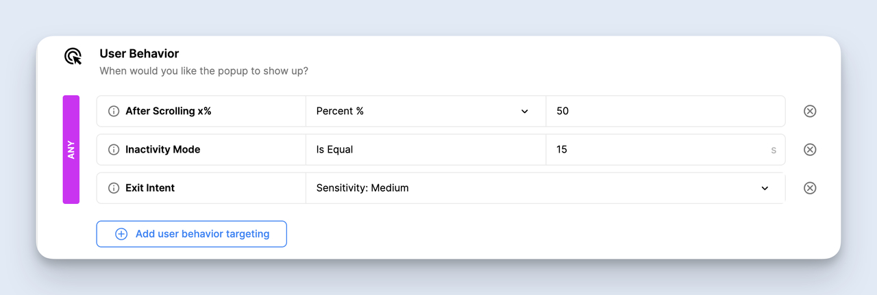
Exit-intent triggers fire as the cursor heads to the close tab — high-value catch for desktop visitors.
For mobile, exit intent doesn't work the same way (no cursor to track). Use scroll-depth triggers instead — fire the popup when the visitor scrolls 60-70% down the page, which signals real engagement.
Pro tip: Add a frequency cap so the popup doesn't show twice in the same session. A reader who closed your popup once doesn't want to see it again three pages later. Cap at one impression per 7 days per visitor for most campaigns.
Step 6: Add advanced touches like teasers and a polished close button
Two small details make a real difference: the close button and the teaser. Most marketers ignore both.
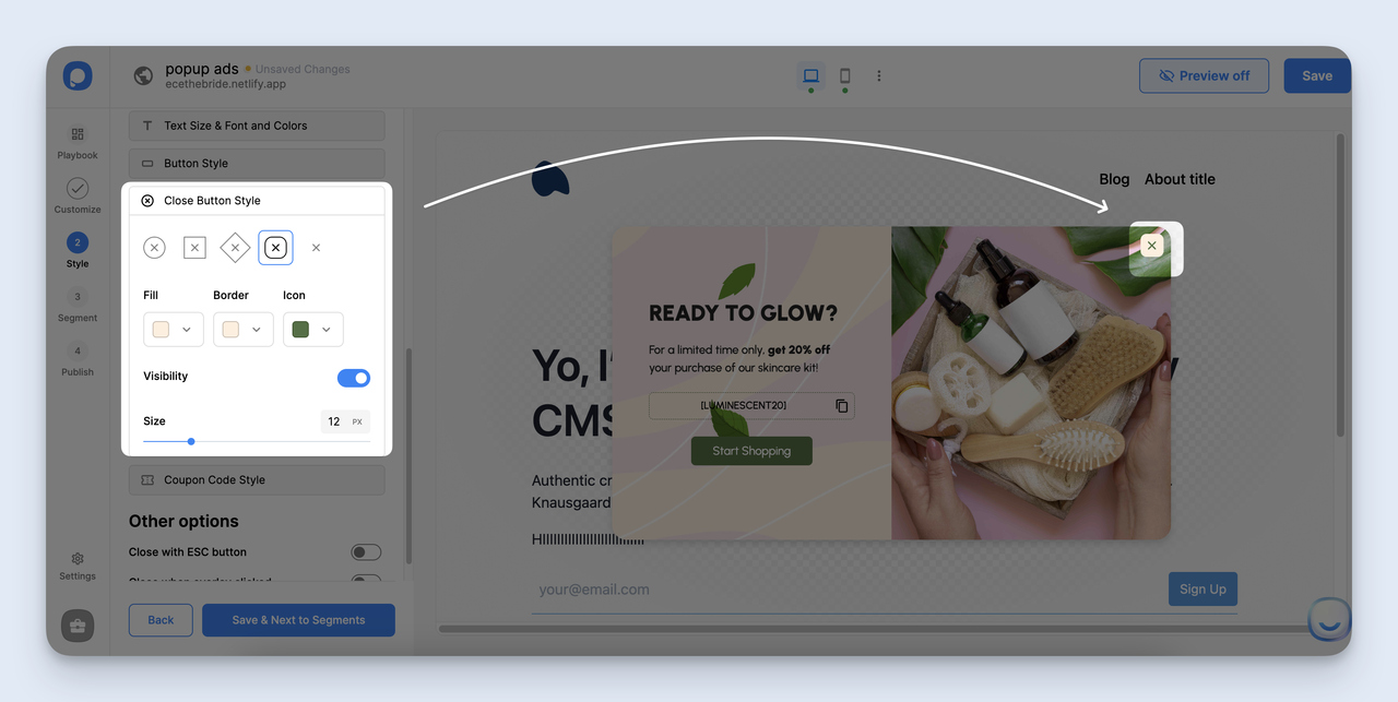
Close button styling — make it obvious. Hidden close buttons trash trust scores.
The close button needs to be obvious. A 10x10 px gray X in the corner of a busy popup ad isn't user-friendly, it's a dark pattern. Make the close button at least 24px, in a color that contrasts with the background, in the top-right corner where users expect it. Allow background-click-to-close as a backup.
Then the teaser. Instead of firing the full popup ad, you can drop a small slide-in tab in the corner that says "Get 15% off" or similar. Visitors who are interested click the teaser to expand it into the full popup. Visitors who aren't interested ignore the teaser and keep reading.
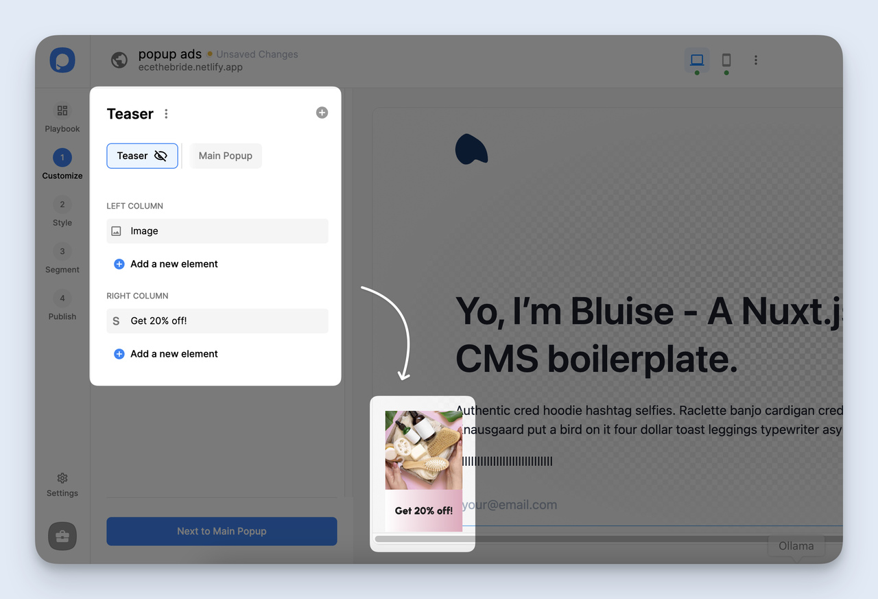
Teaser setup — the small slide-in that converts ignored popups into clicked ones.
Teasers convert about as well as standard popup ads in my testing, but with a much lower complaint rate. They're the right move for content-heavy pages where you don't want to interrupt reading. The downside: setup adds a couple of minutes per campaign. The upside: visitors who close the full popup ad still see the teaser, giving you a second chance.
Step 7: Publish the popup ad and review it on the live site
Hit Publish. The campaign goes live on the connected domain within a minute or two, depending on cache. But don't close the tab yet.
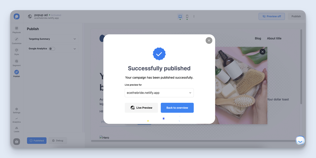
Publish flips the campaign live — but the real test is on your actual site, not the preview.
Open your live website in an incognito window. Trigger the popup ad the same way a real visitor would (wait the time, scroll, move toward the close tab). Check three things:
1. Does it look right? Fonts, spacing, image scaling can render slightly differently on the live site than in the builder preview. Look for cut-off text, misaligned buttons, weird padding.
2. Does the form work? Submit a test entry. Check that the email lands in your connected ESP or whatever integration you set up. A popup ad that collects emails into the void is worse than no popup at all.
3. Does the close button close it? Sounds obvious. I've shipped popup ads where I forgot to test this and the close X did nothing. Embarrassing.
Mobile-test it too. Open the site on your phone. Trigger the popup ad. Make sure it's readable, the form fields don't get hidden by the keyboard, and the close button is reachable with a thumb.
Best practices for popup ad design
Once you've shipped the basic popup, these are the design rules I keep coming back to. None of them are revolutionary. All of them move conversion noticeably.
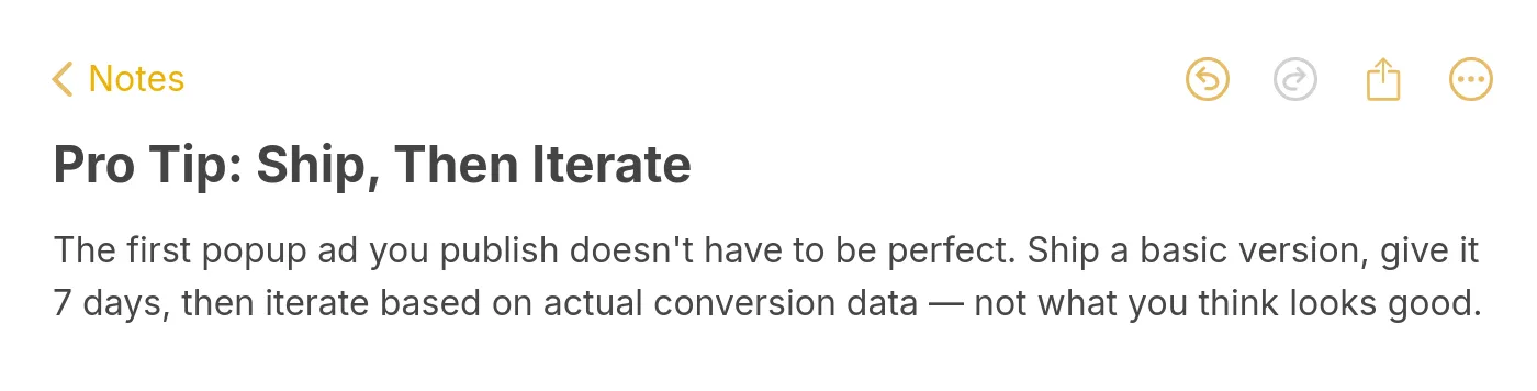
Pro tip — ship, measure for 7 days, then iterate.
Time the popup correctly. A popup that fires on page load before the visitor reads the first sentence is the fastest way to a bounce. Wait at least 5-10 seconds for a time-based trigger, or use scroll depth (40-60% down the page) to confirm the visitor is engaged. Exit-intent works on desktop. Returning-visitor triggers also work because the visitor has already shown they like your content.
Keep copy tight. Headline under 8 words. Body under 25 words. CTA button label under 5 words. If your popup ad has more than 50 words of total copy, you're asking too much from a visitor who didn't ask for the popup. Trim. Then trim again.
Optimize for mobile separately. Mobile traffic now makes up the majority for most B2C sites. A popup ad that converts well on desktop can break entirely on mobile — fields hidden by the keyboard, close button off-screen, text too small to read. Build a separate mobile version with larger tap targets, less copy, and a single field.
Use real contrast. The popup ad should pop visually from the page behind it. Most popup ads underuse contrast — they sit on a white background with white-ish design and gray text. Use a darker overlay behind the popup, a contrasting accent color for the CTA, and bold typography for the headline. Visitors should see the popup the moment it appears.
A/B test offers, not designs. A 15% discount vs. a $20 credit drives bigger conversion shifts than two visually different popup ads with the same offer. Test the value prop and the headline first. Test the design third. The Convertibles case study above proves the point — the offer math, not the popup design, added $45K/month for that brand.
Set a frequency cap. Show the popup ad once per visitor per 7 days. Repeat impressions to the same visitor cause complaints, ad-blocker installs, and zero new conversions. The campaign can run forever as long as you cap it correctly.
4 popup ad template examples to inspire your campaign
If you're not sure where to start, here are four template patterns that I see consistently outperform their alternatives. All four are available in the Popupsmart Playbook and can be cloned in one click.
Exit-intent discount popup ad
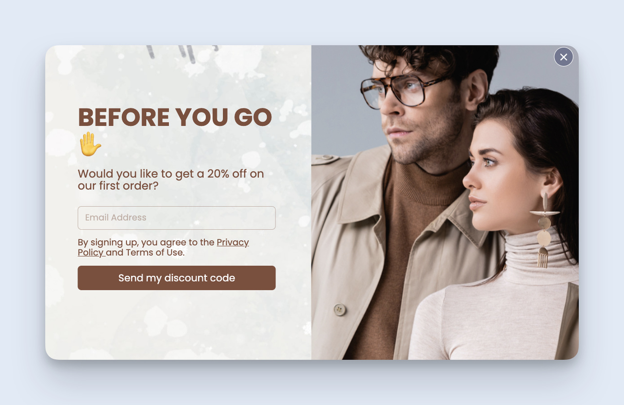
Exit-intent discount template — last-minute offer to visitors heading for the close tab.
This is the highest-ROI template for e-commerce sites. The popup ad fires only when the visitor's mouse moves toward the close tab. The offer is usually a discount code, free shipping, or a coupon that's only available right now. Because the popup only shows to people about to leave, it doesn't interrupt browsing visitors — it catches the ones who would have bounced anyway. Clone this template if you want a working version to start from.
Spin-to-win gamified popup ad
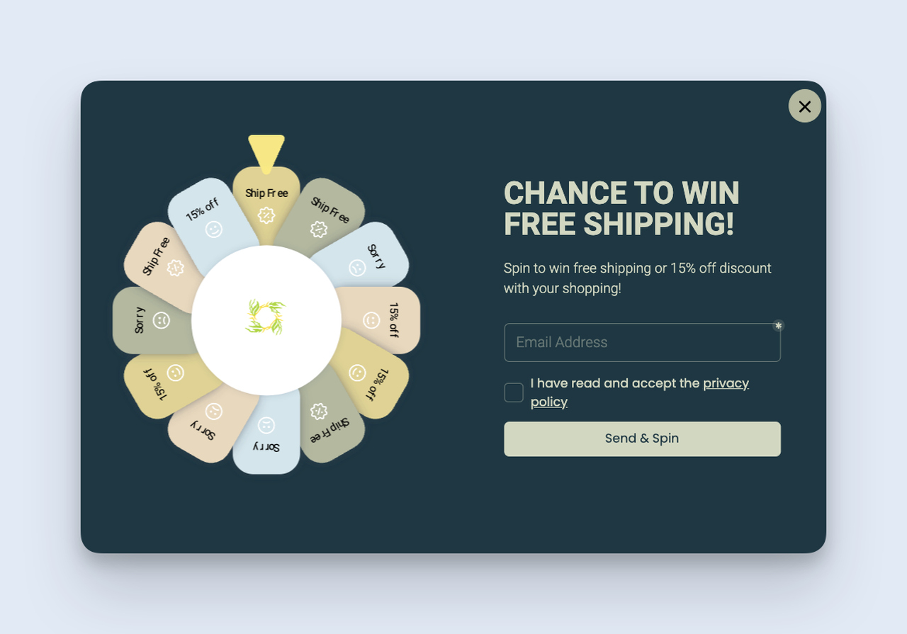
Spin-to-win gamification — interactive popup ads convert better than passive ones in most B2C tests.
Gamified popup ads ask the visitor to enter their email for a chance to win a prize from a spinning wheel. The interactivity itself drives a much higher engagement rate than a flat email-capture popup ad — visitors enjoy the game and the discount feels earned rather than handed out. Works best on Shopify and DTC e-commerce sites with discount-tolerant margins. Clone this template to drop one onto your store.
Feedback / NPS popup ad
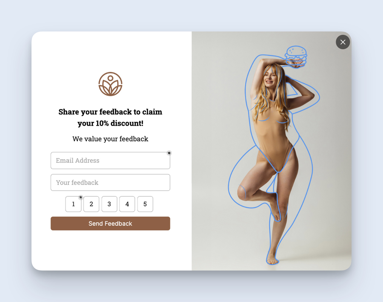
Feedback popup — small ask, big payoff for product and content teams.
This is the popup ad I run on long-form content. A small slide-in asks "Was this article helpful?" with a 1-5 rating and an optional comment field. Conversion rates on the rating click hit 8-12%, which gives me real signal on which posts deserve more investment. Trigger this popup ad on scroll depth (80% — the visitor finished reading) instead of time or exit. Clone this template to put it on your blog.
Announcement bar popup ad

Announcement bar — sitewide message with low intrusion, high visibility.
The announcement bar sits at the top of the page and stays visible across the visitor's whole session. It's the lowest-friction popup format — visitors keep reading the page underneath, but the message is permanently visible. Use this for sitewide events ("Free shipping ends Sunday"), launch announcements, or feature releases. It pairs well with a center modal popup ad that fires on the relevant page deeper in the funnel. Clone this template to add a bar to your site.
How to measure popup ad performance
You don't really know if a popup ad is working until you check the numbers. Popupsmart's Analytics tab shows the four metrics that matter for any popup campaign.
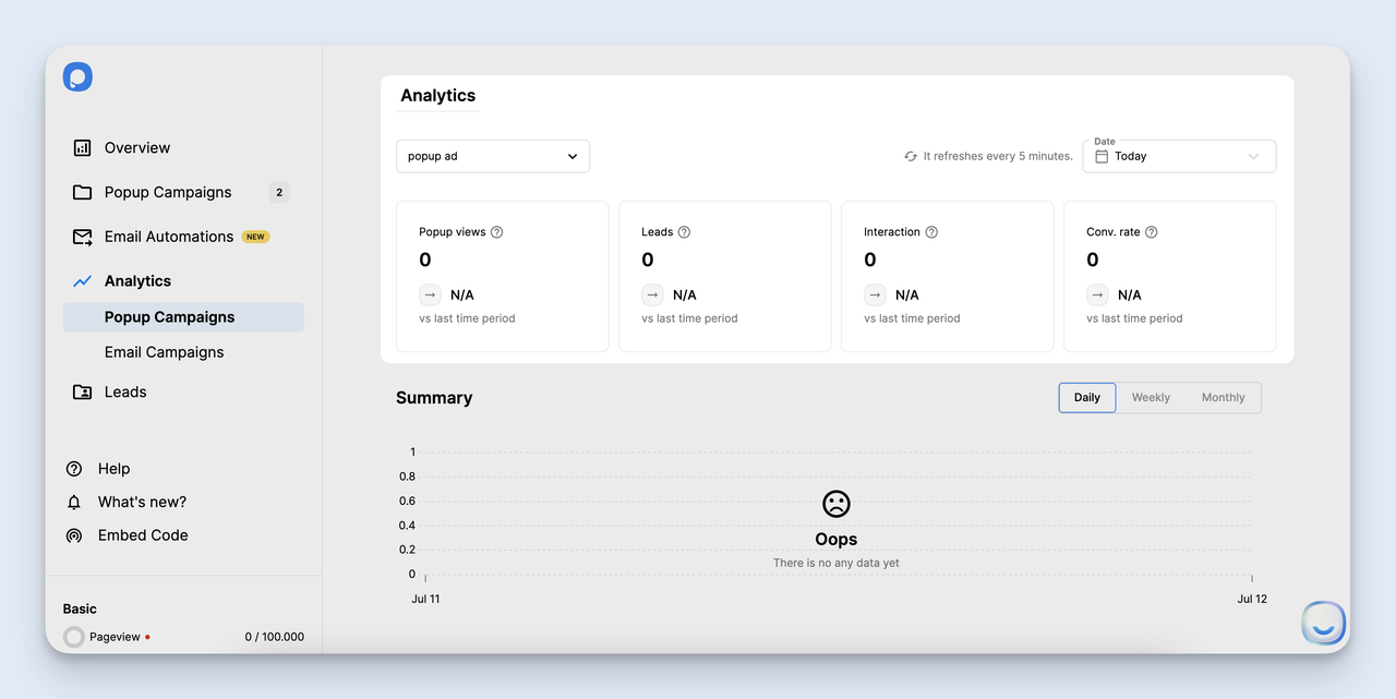
The Analytics tab — impressions, clicks, conversions, conversion rate.
The four metrics:
• Impressions: How many times the popup actually fired. Low impressions means your trigger settings are too narrow.
• Interactions / clicks: Visitors who clicked something inside the popup. The interaction-to-impression ratio tells you whether the offer is even noticed.
• Conversions: Visitors who completed the action — submitted the email, claimed the discount, clicked through to the offer page.
• Conversion rate: Conversions divided by impressions. Compare against the 3-11% benchmark range. Below 3%, the offer or targeting needs work. Above 11%, you've found something that's working — scale it.
For ROI, Popupsmart has a free popup ROI calculator that takes your traffic, conversion rate, and average order value and outputs the dollar value of a campaign. Useful when you need to defend the popup budget to a skeptical CMO.
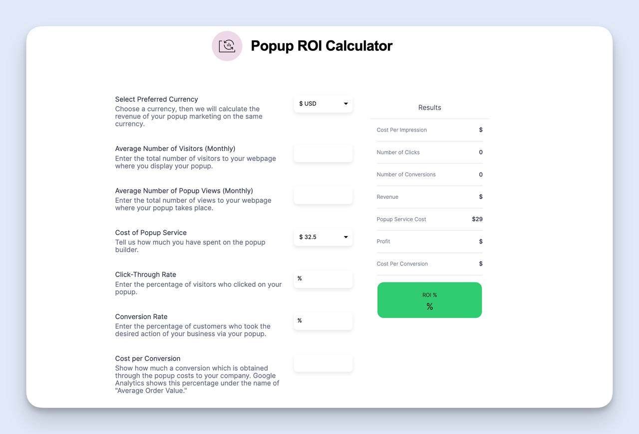
The ROI calculator — quick math for justifying the popup spend.
Look at conversion rate weekly, not daily. Daily numbers swing with traffic patterns and don't tell you anything useful. Seven-day rolling averages are the smallest unit that's worth optimizing against.
Launch your first popup ad this week
The biggest reason popup campaigns fail isn't bad design or weak copy. It's that they never ship. Marketers spend three weeks debating the headline, then never publish.
Here's the plan I'd run if I had to start tomorrow. Pick one goal — email capture is the easiest first win. Open Popupsmart, hit New Campaign, pick an exit-intent template from the Playbook. Edit the headline and the CTA button copy. Set the audience to first-time visitors only and the trigger to exit intent. Cap the frequency at one per 7 days. Publish.
Give it seven days. Look at the conversion rate. If it's above 3%, you're already at the industry average. If it's above 7%, you're beating most campaigns out there. Iterate from real data, not from design opinions. The first version of any popup ad I ship is rarely the best one — but the data from week one tells me exactly what to change for week two.
Start with the basic version. Ship it this week. Iterate next week.
Frequently asked questions
How can I make sure my popup ads aren't annoying to visitors?
Make it easy to close, time it right, and cap frequency. The close button should be at least 24px and obvious. The trigger should be exit intent, scroll depth, or a time delay of at least 5-10 seconds — never on page load. And cap the popup ad at one impression per visitor per 7 days. Three rules, and 90% of the "annoying popup" complaints disappear.
What generates popup ads?
Popup ads are generated by JavaScript embedded on a website. The script can be hand-coded by a developer or, more commonly, dropped in by a no-code popup builder like Popupsmart. The builder gives you a visual editor for the design, a targeting interface for the audience and triggers, and an embed snippet that activates the popup ads on your site. Once the snippet is on the page, the popup ad fires whenever the trigger condition is met.
What triggers popup ads?
Popup ads trigger on visitor behavior. The most common triggers are time on page (fire after X seconds), scroll depth (fire when the visitor scrolls past X%), exit intent (fire when the cursor moves toward the close tab), click on element (fire when the visitor clicks a specific button or link), and page load (fire immediately — almost always a bad idea). Advanced builders also trigger on returning visitors, traffic source, geographic location, device type, and URL path.
How long does it take to build a popup ad?
About 7-15 minutes for a basic popup ad if you start from a Playbook template. Add 10-20 minutes if you customize the design from scratch and another 10-15 minutes for testing on the live site. The first popup ad always takes longer because you're learning the builder. By your fifth campaign, you can ship one in under 10 minutes.
Explore more blog posts:
10 Popup Design Best Practices for Higher Conversion in 2026

How would you rate your experience with this article? 😊