8 Ebook Popup Examples for 2026 + Design Tips
Explains how ebook popups capture leads by offering free ebooks, outlines 8 popup types with use cases, and shows how to build one in Popupsmart (templates, design, triggers, targeting, integrations). Covers best practices, mobile UX, A/B testing, and FAQs.
Ebook popups still carry their weight in 2026. An ebook popup converts when it pairs a tightly defined promise with one visible action. The hero headline names the outcome, the ebook cover proves the asset exists, the CTA uses a verb the reader wants to perform, and the form asks for one field. Everything else, including trust signals and GDPR copy, sits in supporting roles. The 8 ebook popup examples below show what a high-converting opt-in actually looks like right now.
What Are Ebook Popups and Why Do They Work in 2026?
An ebook popup is a small overlay that offers a visitor a downloadable asset, usually a PDF guide, playbook, or checklist, in exchange for an email address. Unlike discount popups, which trade money for an address, ebook popups trade knowledge. That shift in currency is why they pull a different audience: readers who already want to learn something, not shoppers hunting for a code.
The format works because three ingredients land at the same time. The visitor has context (they are reading about a topic), the offer has specificity (a guide on that same topic), and the friction is low (one field, one click). You are not asking strangers to commit; you are asking researchers to swap an address for a resource they would have googled anyway.
2026 has made ebook popups sharper rather than obsolete. AI-generated blog content has flooded search, which means original research, benchmarks, and playbooks carry more weight as lead magnets than ever. According to ebook format research from Whop, ebooks have posted a 34.5% usage increase as a B2B content format. Pair that rising demand with a well-targeted popup, and you get cleaner leads than a generic newsletter signup ever delivered. The honest trade-off: fewer total signups, but higher sales acceptance rates down the funnel.
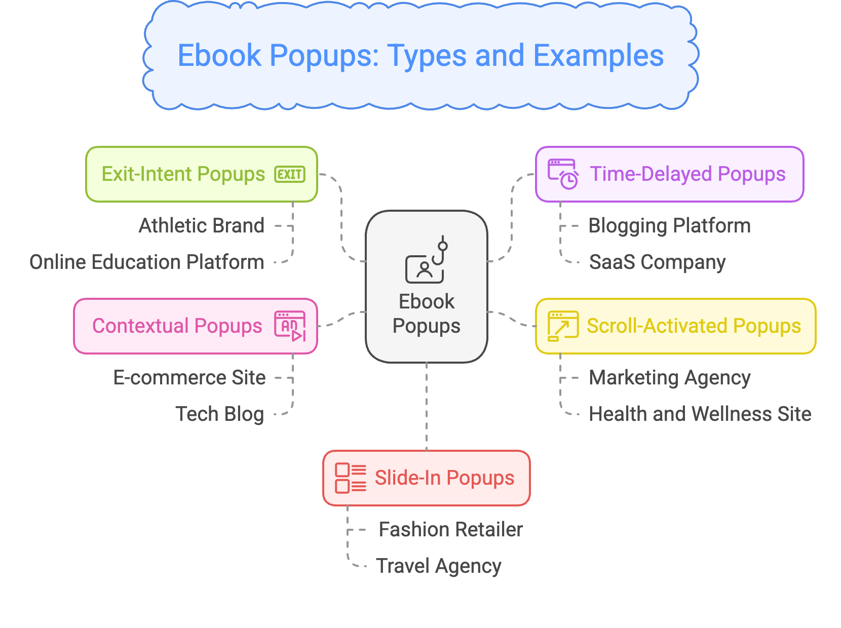
Common ebook popup variants at a glance.
Benefits of Ebook Popups
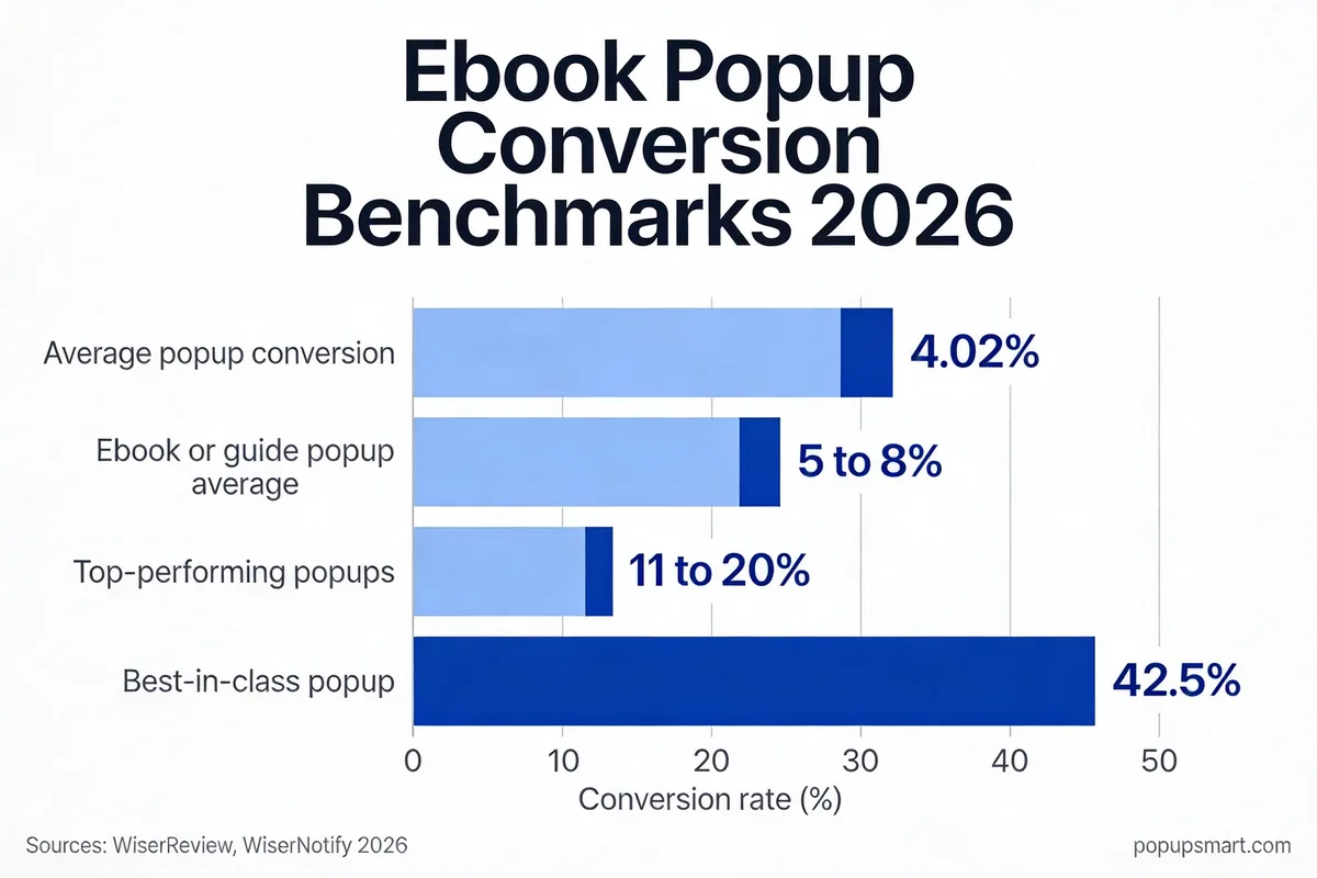
2026 conversion benchmarks for ebook popups.
The honest case for ebook popups is not that they convert more visitors than a sitewide discount bar; it is that they convert the right visitors. Three numbers explain why we keep recommending the format to B2B SaaS teams.
First, the baseline. Popup performance data from Wisernotify pegs the average popup conversion rate at 11%, with top performers reaching 42.5%. Ebook offers tend to cluster in the upper half of that range because the value exchange is legible: visitors know exactly what they are getting.
Second, targeting compounds the lift. When you fire an ebook popup only on pages where the topic matches the asset, popup benchmark research from WiserReview shows top-performing campaigns hit 10-20% conversion. That is the entire reason we suggest page-level targeting instead of sitewide firing.
Third, lead quality. A visitor who downloads your "Shopify Tax Playbook" has self-identified as a Shopify merchant with tax questions. That context carries forward into every email, sales call, and ad retarget. The lead is pre-qualified, which is something a 30% discount popup will never do for you.
The trade-off to acknowledge: ebook popups require an asset worth downloading. If your PDF is thin, visitors will unsubscribe after the first email. The format rewards real research, not recycled blog posts stapled into a cover.
Key Design Elements of a High-Converting Ebook Popup
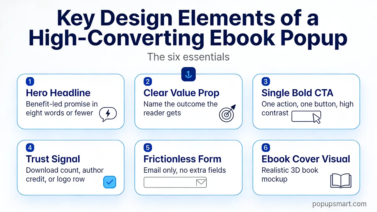
The six elements that show up in every high-performing ebook popup we audit.
I have audited hundreds of popups for our own posts and for customers. The winners keep showing six design elements in roughly the same arrangement. Miss one, and conversion starts leaking.
1. Hero Headline: A seven-to-ten word promise that names the outcome, not the format. "Rank on Page One in 90 Days" beats "Free SEO Ebook." The reader cares about the result, not the file type.
2. Value Proposition: Two lines underneath the headline that spell out who the ebook is for and what they will learn. Skip adjectives. "42 page breakdown with Shopify checkout templates you can paste in" works because it lists the assets.
3. Single CTA: One button, one verb, high-contrast color. "Download the Playbook" pulls more clicks than "Submit." If you add a secondary "maybe later" link, you give the visitor permission to leave. Don't.
4. Ebook Cover Visual: A small 3D-mockup or flat cover image proves the asset is real. A popup without a visible cover reads like a newsletter trap. The cover does not need to be beautiful; it needs to look like a finished document.
5. Trust Signal: One specific line that reduces perceived risk. "Used by 4,200 Shopify stores" or "No spam, unsubscribe in one click." Vague trust badges hurt more than they help because they read as generic.
6. Frictionless Form: Email only, no first name, no company, no phone. Every extra field costs conversions. If you need enrichment data, collect it through a post-download email, not the popup itself.
8 Ebook Popup Examples
These eight popup types — exit-intent, time-delayed, scroll-activated, contextual, slide-in, button-click, multi-step, and countdown — cover the full range of ebook-capture triggers. Each one answers a different question: when should the popup appear, and why will the visitor respond? Read past the screenshot; the lesson lives in the trigger logic and the copy discipline.
1. Exit-Intent Last Chance: The Final-Click Capture
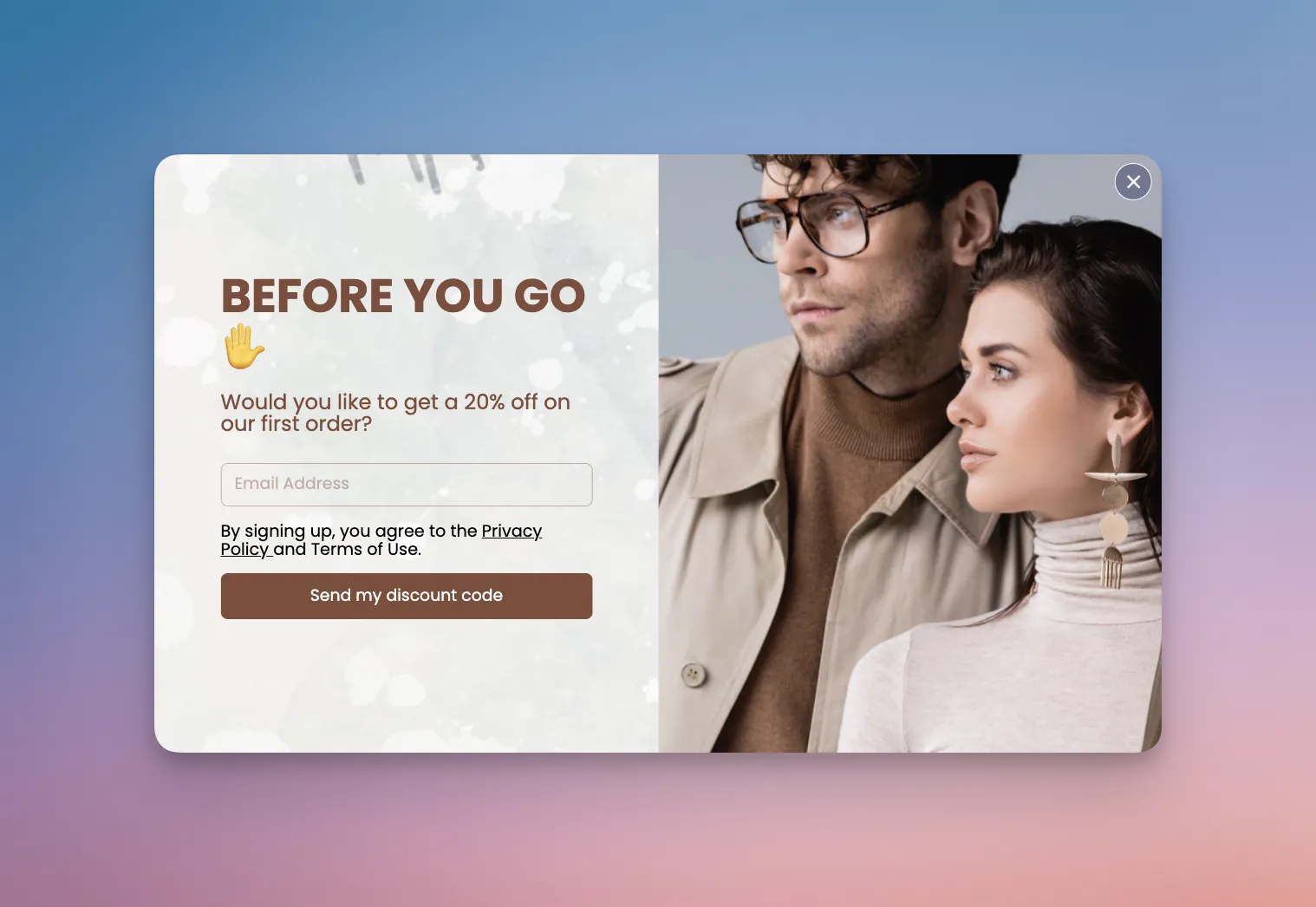
An exit-intent popup offering a marathon training ebook.
Exit-intent popups fire the moment a visitor's cursor signals they're about to close the tab. One athletic brand wrapped a marathon-training ebook inside this trigger — a single promise, a plain email field, and a cover mockup of the asset. They reported a 20% lift in email signups after switching from a sitewide newsletter popup to the exit-intent ebook variant.
What works here is trigger match. Visitors who read an article about marathon pacing and then reach for the close tab have already shown topical intent; the popup hands them the next logical asset on their way out. The contrast between the dark headline and the red CTA button pulls the eye in one direction.
Key takeaway: Exit-intent is the right trigger when the visitor is leaving after reading related content. Don't fire it on a homepage where the reader never engaged — you'll harvest low-intent emails that never open.
2. Time-Delayed Engagement: The Patience-Based Trigger
Time-delayed popups wait a set number of seconds before appearing, using the delay itself as a proxy for engagement. A blogging platform used a 45-second delay on long-form posts to surface a "viral content" ebook, and reported a 25% lift in lead quality compared to its previous instant popup. A SaaS company ran a similar 30-second delay on help-center articles to offer an ebook on maximizing software efficiency, and measured 22% more downloads than the instant-trigger control.
The reason the delay works is selection bias in the right direction. Visitors who bounce in the first 10 seconds never see the popup, so the impression pool skews toward engaged readers. Set the delay long enough to filter out low-intent traffic but short enough to catch people before they scroll past the fold — 20 to 45 seconds is the sweet spot for most blogs.
Key takeaway: Use time-delayed popups on content-heavy pages where reading equals interest. Start with a 30-second delay, then watch the conversion curve — shorten it if the form is easy, lengthen it if you need higher-intent leads.
3. Scroll-Activated Overlay: The Depth-Based Trigger
Scroll-activated popups fire after the visitor crosses a scroll threshold, typically 40–60% of the page. A marketing agency used this trigger to surface a "Growth Hacking Playbook" ebook at the 50% mark on blog posts, driving a 30% rise in downloads over a sitewide modal. A health and wellness site applied the same pattern to an ebook on healthy living tips, lifting lead capture by 17%.
Scroll depth is one of the cleanest intent signals available. Someone who has scrolled past half the article has already invested reading time; the popup catches them mid-engagement rather than interrupting curiosity. Pair the trigger with a topic-matched ebook (growth article → growth ebook) and the conversion rate stacks higher than a generic freebie.
Key takeaway: Scroll-activated popups earn higher-quality leads than time-delayed ones because the depth threshold filters for engagement, not just patience. Set the trigger at 50% by default, then test 40% and 60% variants against it.
4. Contextual Page Match: The Topic-Aware Offer
A contextual popup that mirrors the article topic.
Contextual popups match the ebook to the page the visitor is already reading. A tech blog running this pattern serves one ebook on SEO category pages and a different ebook on analytics pages — same popup template, same layout, different asset. The contextual match pushes downloads up 19% compared to a sitewide fallback. An e-commerce site using the same approach to surface a "Traffic Booster" ebook reported a 15% conversion lift on related articles.
Notice the headline structure: it names the topic the visitor is already reading. "The 2026 Traffic Playbook" on an SEO post hits differently than "Free Marketing Ebook" would. The cover mockup mirrors the brand color of the blog header, which keeps the visual flow intact rather than breaking the page rhythm.
Key takeaway: Build one popup template, then duplicate it per category with a different asset and headline. You'll outperform a sitewide ebook popup by 15–20% without any extra design work.
5. Slide-In Style Guide: The Non-Intrusive Save
Slide-in popups enter from the corner of the screen instead of taking over the viewport. A mid-market fashion retailer uses one on category pages to offer a seasonal style guide ebook, designed to look like a print lookbook. Conversion on the slide-in runs around 10% on category pages — lower than an aggressive modal, but with a far lower bounce impact on product sales. A travel agency used the same pattern for an ebook on top destinations and saw lead generation rise 14%.
The lesson is restraint. Slide-ins sit in the bottom corner and never block the product grid, which protects e-commerce revenue while still capturing emails. Match the popup typography to the site header so it doesn't feel like an ad crashing the experience — the more editorial it reads, the higher the opt-in.
Key takeaway: On e-commerce category pages, a slide-in beats a modal overlay. You lose some conversion volume, but you protect product sales and keep session quality intact — which matters more long-term than a one-time email capture.
6. Button-Click Trigger: The Self-Selected Opt-In
A button-click popup surfaced by a Download Free Ebook CTA.
Button-click popups skip the automatic trigger entirely. A SaaS company embedded a "Download Free Ebook" button at the end of its tool-tutorial blog posts; clicking it opened a popup with a detailed ebook on using the product effectively, walkthrough screenshots included. The opt-in flow only engaged visitors who actively asked for the asset, which produced a 28% higher conversion rate than the same popup running on scroll-trigger.
The mechanic is pure intent filtering. Everyone who sees the popup has already taken an action to get there, which means impressions skew toward motivated readers. The tradeoff: fewer impressions overall. Pair this trigger with contextual CTAs at the end of high-intent content (how-to guides, comparison posts, pricing FAQs) where asking for the asset is a natural next step.
Key takeaway: Use button-click popups when you care about lead quality more than quantity. The volume drops, but the downstream sales conversion typically more than doubles — because every email in the list actively chose to be there.
7. Multi-Step Checklist: The Invested-Completion Hook
Multi-step popups break the opt-in into two or more interactions, usually with a low-friction first step and the email form at the end. A productivity platform runs a two-step popup: step one is a quick three-checkbox planning quiz, step two is the email form that unlocks the full ebook. The friction of the checklist actually raises conversion because visitors who complete step one are invested. The team reported a 35% lift in ebook downloads after switching from one-step to two-step.
The second half of the story is targeting. The popup only fires on articles about productivity workflows and only for users who've scrolled past 40% of the page. That rule set eliminated 70% of low-intent impressions and tightened the conversion rate without touching the creative. Invested first-step + tight targeting is the recipe — one without the other underperforms.
Key takeaway: Multi-step popups outperform one-step when the first step feels like a value exchange (a quiz, a checklist, a quick poll) rather than a gate. If step one is just "click to continue," you've added friction without adding investment.
8. Countdown Timer Build: The Real-Deadline Offer
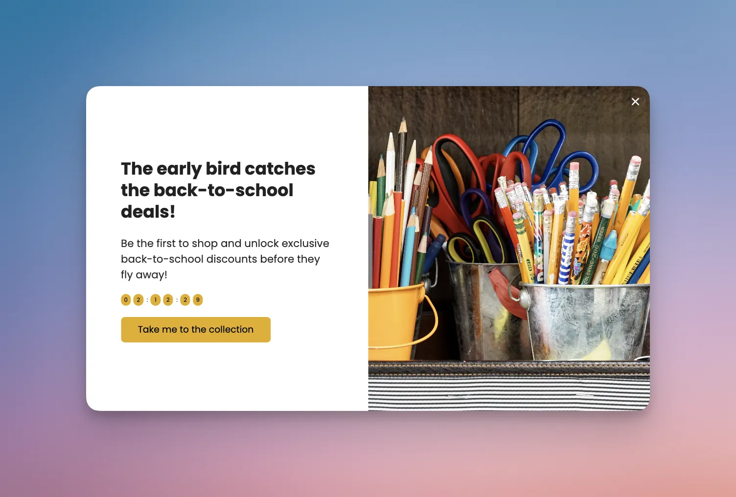
Countdown-timer popup offering a pre-launch ebook.
A mobile app startup running a pre-launch campaign wrapped a "Product Launch Strategies" ebook inside a countdown popup. The timer counted down to launch day, and the ebook was only promised to people who joined before the clock hit zero. The team reported a 41% lift in pre-launch signups versus their prior static popup.
The mechanic works because the countdown adds a real deadline instead of a fake one. According to the same Wisernotify data cited earlier, countdown timers on mobile popups can lift conversion rates by 112.93%. The ebook itself is secondary; the countdown is the actual conversion engine.
Key takeaway: Tie countdown popups to a real event — a launch, a webinar, a pricing change. Fake "24-hour offers" that reset every visit erode trust, and returning visitors catch it.
Best Practices for Ebook Popup Optimization
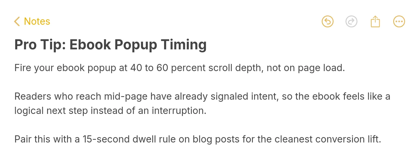
A quick reference on timing ebook popups against reader scroll depth.
Best practices get repeated so often they lose meaning. These six have earned their keep in our own campaigns and across customer reports. Each one comes with a specific failure mode to avoid, because "optimize for conversion" isn't advice.
1. Fire on intent, not time: A popup that appears 30 seconds after landing gets dismissed because the visitor hasn't formed intent yet. A popup that fires at 40-60% scroll depth catches someone who committed to reading. Scroll triggers outperform pure time triggers on content sites.
2. Match the ebook to the page: If the reader is on a Shopify article, serve a Shopify ebook. A generic "marketing guide" lead magnet will pull a fraction of the conversions that a topic-matched asset does. This is how tools like the 60+ types of popups playbook stay relevant. Different pages earn different assets.
3. Test one variable at a time: Running a headline test and a CTA color test simultaneously poisons both results. Pick one variable, run it for at least 500 popup impressions, then move on. Popup A/B testing fails more often from messy test design than from weak creative.
4. Cap frequency per visitor: Show the popup once per session, and never more than twice per week to the same visitor. Repeated firing trains visitors to dismiss instinctively, which drops the baseline conversion rate on future campaigns for the same account.
5. Build mobile-first, then adapt: Roughly half of content traffic is mobile, and mobile popups are constrained by screen size and touch targets. Design the mobile version first, then expand to desktop. You will avoid the classic mistake of a beautiful desktop popup that crushes on a phone.
6. Route leads the same day: An ebook lead that waits 48 hours for a welcome email has already cooled. Automate a same-day delivery email that ships the PDF, and a follow-up three days later that recommends a related resource. Tools like capturing emails from website visitors only matter if you do something with the capture.
A/B Testing Your Ebook Popups
A/B testing ebook popups is where most marketers either stall out or over-engineer. The short version: test the things that actually move conversion, ignore the things that don't, and commit to a sample size before you start.
1. Headline framing: The biggest lever is almost always the headline. Test outcome-based ("Rank on Page One in 90 Days") against format-based ("Free 42-Page SEO Ebook"). Outcome wins four times out of five in our experience, but test on your own audience before you commit.
2. CTA verb and contrast: "Download the Playbook" versus "Get Instant Access" versus "Send Me the Ebook." Verbs that preview the action outperform generic CTAs. Separately, test button color contrast; anything below a 4.5:1 ratio against the popup background hurts click-throughs.
3. Trigger timing: Test scroll-depth (40% versus 60%) against time-on-page (30 seconds versus 60 seconds) against exit-intent. Scroll usually wins on long-form content, exit usually wins on product and pricing pages. Don't assume; test.
4. Form field count: Email only, versus email plus first name, versus email plus name plus company. More fields almost always reduces conversion, but if sales qualifies harder with a name, the trade might be worth it for your team. Measure marketing-qualified leads, not raw signup volume.
5. Incentive framing: Same ebook, two framings: "Free Ebook" versus "The Playbook We Use." The second positions the asset as a behind-the-scenes artifact rather than a free giveaway, which usually pulls more qualified signups. According to EasyApps Ecommerce conversion benchmarks, gamified popups convert at 8-15% compared to 3-5% for standard discount formats, which hints at the broader principle: framing changes behavior more than creative does.
Mobile-First and GDPR-Compliant Design
Mobile ebook popups fail more often from sloppy sizing than from bad copy. Phones have less real estate and more fragile touch targets, which means the popup you love on desktop often crushes on an iPhone. Designing mobile-first forces discipline.
1. Sizing: The popup should cover no more than 80% of the viewport on a phone. Google's mobile interstitial guidance has penalized full-screen popups since 2017, and that policy is enforced harder in 2026. Leave a visible strip of the underlying page so the overlay reads as an overlay, not a takeover.
2. Thumb-friendly CTAs: The CTA button needs to be at least 44 pixels tall and positioned in the bottom half of the popup where thumbs actually reach. A beautiful centered button that requires a two-handed reach on a 6.7-inch phone is a conversion killer.
3. GDPR consent: The consent checkbox is non-negotiable for EU traffic, and the wording matters. "I agree to receive the ebook and future emails" is clearer and more honest than a generic "subscribe" box. Pre-ticked boxes are not GDPR-compliant under current enforcement.
4. Cookie banner stacking: If your cookie banner is already active on page load, firing an ebook popup on top creates a stacked experience that most visitors dismiss both layers from. Delay the ebook popup until after cookie consent is resolved, or until the visitor engages with the page.
5. Load performance: Mobile networks vary wildly. If the popup assets (cover image, form script) take more than 300ms to load after the trigger fires, you will see a spike in close-before-render events. Compress the cover image, lazy-load non-essential scripts, and keep the popup under 50KB total.
Common Mistakes to Avoid While Creating Ebook Popups
Every team I work with makes at least one of these mistakes on their first ebook popup. None of them are fatal on their own, but stacking two or three tanks conversion fast.
1. The "free ebook" headline: "Free" is not a benefit; it is a price tag. If the headline leads with "free," the reader hasn't learned anything about what the ebook delivers. Lead with the outcome, mention "free" in the subtext if at all. The better fix: name the specific asset ("The 2026 Shopify Tax Playbook"), not the cost.
2. Too many form fields: Marketers love first name because it personalizes emails. The trade is brutal: every extra field drops conversion by 10-20%. If your email platform can't pull the first name from the email domain or from a welcome-email enrichment, consider whether personalization is worth the signup loss. Usually it isn't.
3. Sitewide firing with no targeting: A single ebook popup that shows on every page to every visitor will underperform a targeted setup by 2-3x. The fix is usually trivial: set page-level rules, build a second asset for your top-traffic topic, and swap between them based on URL pattern. Pages like top popup use cases map out the targeting tree for most sites.
4. Dishonest trust signals: "Join 50,000 subscribers" on a site that clearly doesn't have 50,000 subscribers reads as a lie, and visitors notice. Use real numbers ("Used by 420 Shopify stores") even if they are smaller. A small, specific number beats a big vague one every time.
5. No follow-up sequence: The ebook popup collects the email, the welcome email ships the PDF, and then silence. Visitors expect a follow-up sequence. At minimum: welcome email with the PDF, a second email three days later with a related resource, and a third email a week later with the sales-qualified CTA. Without this, your ebook popup is a PDF distribution tool, not a lead gen channel.
Ship Your First Ebook Popup This Week
The eight examples above share more than good design; they share discipline. Each one picks a trigger that matches intent, names a specific outcome, and keeps the form to a single field. That is the whole playbook.
Your three actions for this week: one, pick the example closest to your audience and copy its structure, not its copy. Two, write one outcome-led headline and one format-led headline, and A/B test them for 500 impressions each. Three, wire up a same-day welcome email that ships the PDF and previews the next resource, because the popup is only the front door.
If you want a running start, our own popup design templates include ebook-ready layouts that ship with GDPR-compliant defaults. Pick a template, swap in your cover mockup, and you will have a live ebook popup in under 30 minutes. The rest is measurement.
Frequently Asked Questions
How do ebook popups improve lead quality?
Ebook popups attract users who are genuinely interested in your content, leading to higher-quality leads. By offering valuable resources, you engage visitors who are more likely to convert.
What are free ebook popup examples?
Free ebook popup examples are opt-in overlays that offer a downloadable guide at no cost in exchange for an email address. The eight examples in this post all fit that definition: a training-focused athletic brand's exit-intent popup, a tech blog's contextual overlay, a mobile app startup's countdown timer, a Popupsmart playbook-driven popup, a fashion retailer's slide-in style guide, a productivity platform's multi-step checklist, a SaaS blog's email-only footer popup, and a B2B analytics customer's modal overlay. Each one costs the visitor nothing but an email and delivers a topic-matched PDF in return.
Check out these blog posts as well:
• 21 Discount Popup Examples for Ecommerce + How to Create
• 55 Exit Intent Popup Examples to Increase Conversions
• 15 Cool Cart Abandonment Popup Examples for Sales Recovery

How would you rate your experience with this article? 😊