30 Best B2B Landing Page Examples of 2026
Review of 30 high-converting B2B SaaS landing pages showing tactics like hero inline signup, audience segmentation, early product demos/videos, strong above-the-fold social proof, dual CTAs, urgency, and short forms, plus principles, metrics, and common mistakes to optimize conversions.
B2B landing pages are a crucial component of any successful online marketing strategy.
These 30 B2B landing page examples show how SaaS and service companies convert visitors into qualified leads through clear value propositions, strategic CTA placement, and social proof. Each example includes a screenshot breakdown of what works, the conversion principle behind it, and a takeaway you can apply to your own pages today.
B2B Landing Pages of Project Management and Collaboration Tools
Project management SaaS companies face a crowded market where nearly every competitor offers free tiers. The landing pages that stand out here don't just list features. They show the product in action and let visitors self-select their use case. These first nine examples demonstrate how PM tools win signups.
1. Miro: Inline Signup That Skips the Redirect
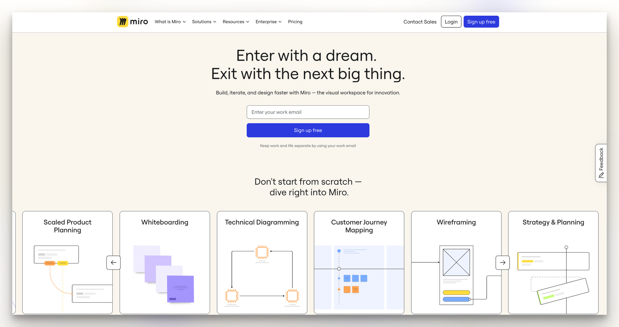
What works: Miro's landing page places an email input field directly in the hero section with a "Sign up free" button. No redirect, no extra page load. The headline focuses on speed ("build, iterate, and design faster"), and key features are summarized in one-line descriptions below the fold. A dashboard preview screenshot gives visitors a mental model of what they'll get after signing up.
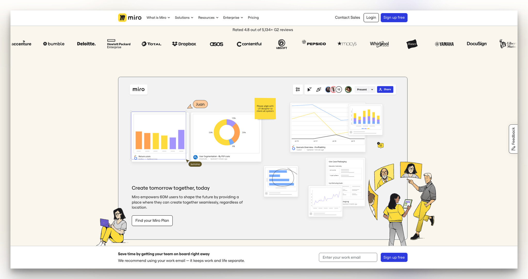
Why it works: Every additional page in a signup flow loses roughly 20% of visitors. By embedding the form in the hero, Miro eliminates one full step. The second signup form near the bottom catches visitors who scrolled past the first one, a technique that works because reading the feature list builds confidence before committing.
Key takeaway: Put your signup form in the hero section. If visitors need to click "Get Started" and load a new page, you're losing conversions you didn't need to lose.
2. Asana: Department Segmentation for Targeted Messaging
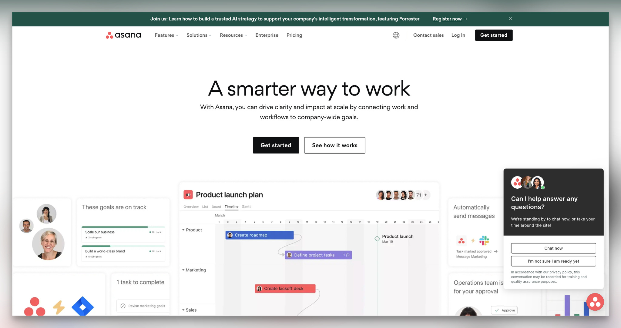
What works: Asana's page uses a clean two-button CTA ("Get started" and "See how it works") and immediately follows with a dashboard image showing real tasks. But the standout feature is below the fold.
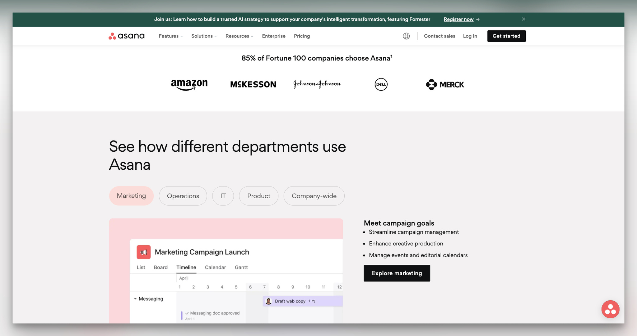
Why it works: Asana segments use cases by department: marketing, operations, IT, product, and company-wide. Each section has its own goals and CTA link. This matters because B2B buyers scan for "does this work for MY team?" before anything else. By letting visitors jump to their department, Asana reduces the cognitive load of evaluating a horizontal product. It's the difference between "this tool does everything" and "here's exactly how your marketing team would use it."
Key takeaway: If your product serves multiple departments, create a segmented section where each team can see their specific use case. Generic "works for everyone" messaging converts worse than targeted messaging.
3. Webflow: The Product-as-Proof Landing Page
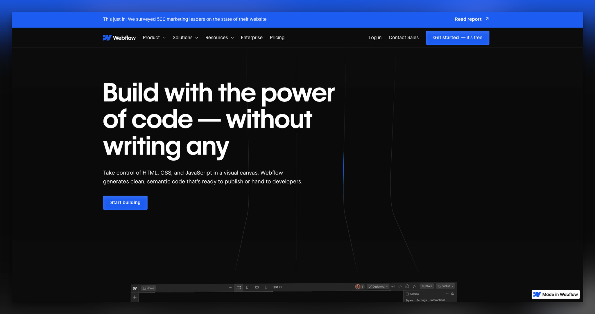
What works: Webflow's headline addresses the core promise: building web pages without writing code. The CTA "Start building" uses Webflow's signature blue, and the navbar CTA "Get started - it's free" adds a no-risk signal.
Why it works: The "Made in Webflow" badge in the bottom-right corner is a subtle but effective move. The landing page itself is the product demo. Every smooth interaction, animation, and responsive element proves the product's capability without a single sales pitch. This self-referential proof is something most SaaS companies can't replicate because their product isn't a website builder, but the principle holds: show, don't tell.
Key takeaway: Your landing page is a product demo whether you intend it or not. If your page loads slowly, breaks on mobile, or looks dated, visitors will assume the same about your product.
4. Zendesk: Urgency Through Event Promotion
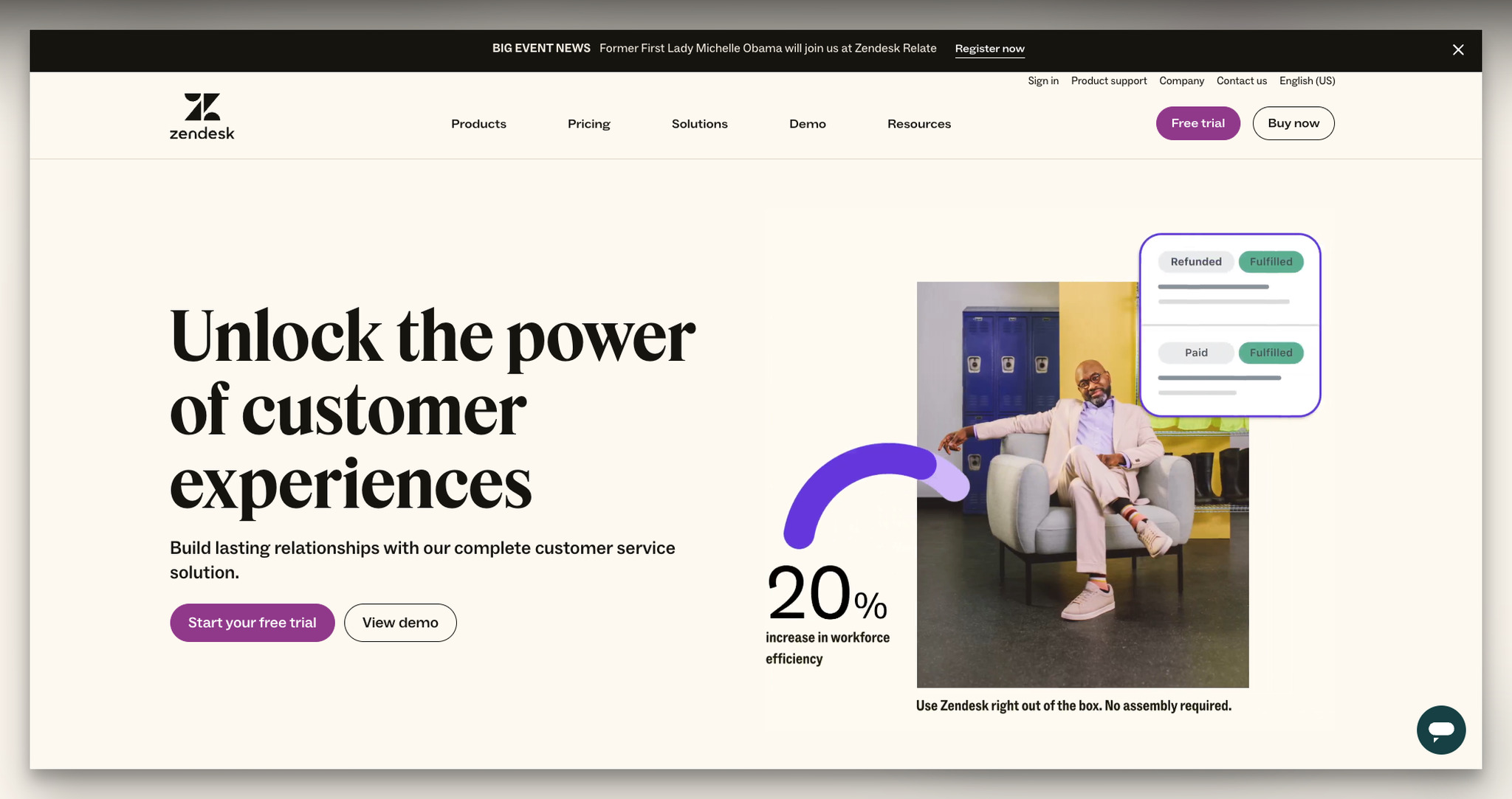
What works: Zendesk opens with "Unlock the power of customer experiences" and pairs it with two CTAs: "Start your free trial" and "View demo." The right side displays specific efficiency metrics with numbers to make the value tangible.
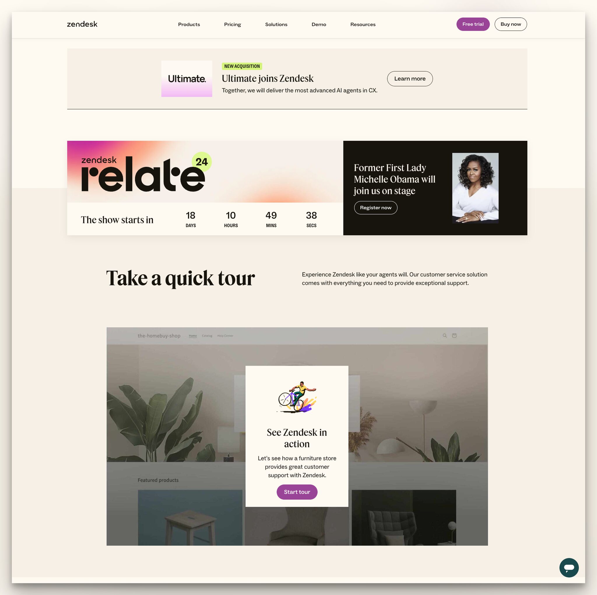
Why it works: Mid-page, Zendesk promotes a live event with a countdown timer and a notable speaker. This creates time-based urgency that free trials alone can't generate. The "Take a quick tour" section below uses an interactive product walkthrough instead of static screenshots. Combining urgency (event) with self-serve exploration (tour) gives two reasons to engage without applying sales pressure.
Key takeaway: Add a time-sensitive element to your landing page, even if it's a webinar date or a limited offer. Static pages don't create urgency, and urgency drives action.
5. Pipedrive: Audience-Aware Segmentation
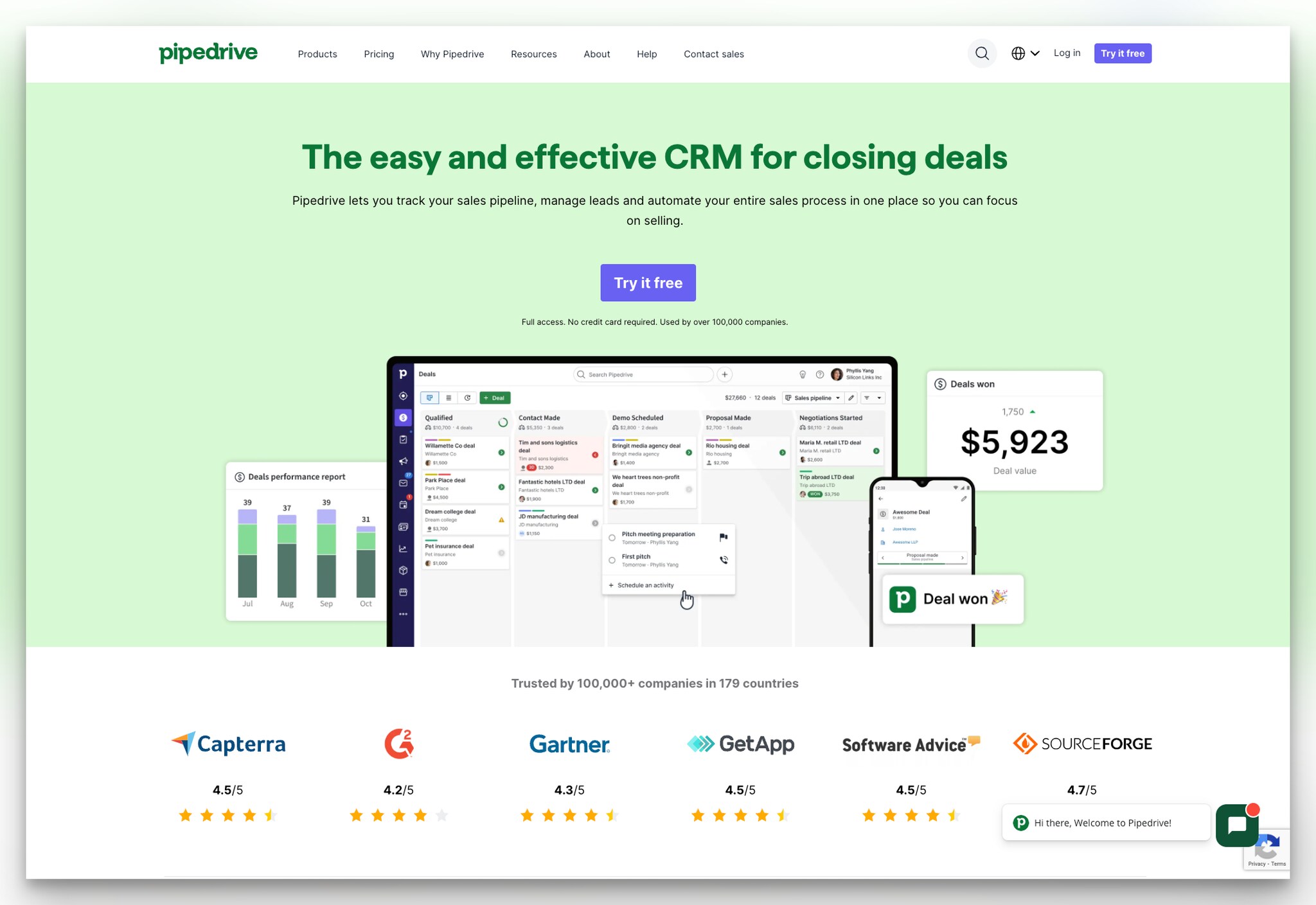
What works: Pipedrive's page leads with "easy and effective CRM" messaging and shows review platform ratings from Capterra, G2, and SourceForge directly below the trust line "Trusted by 100,000 companies in 179 countries."
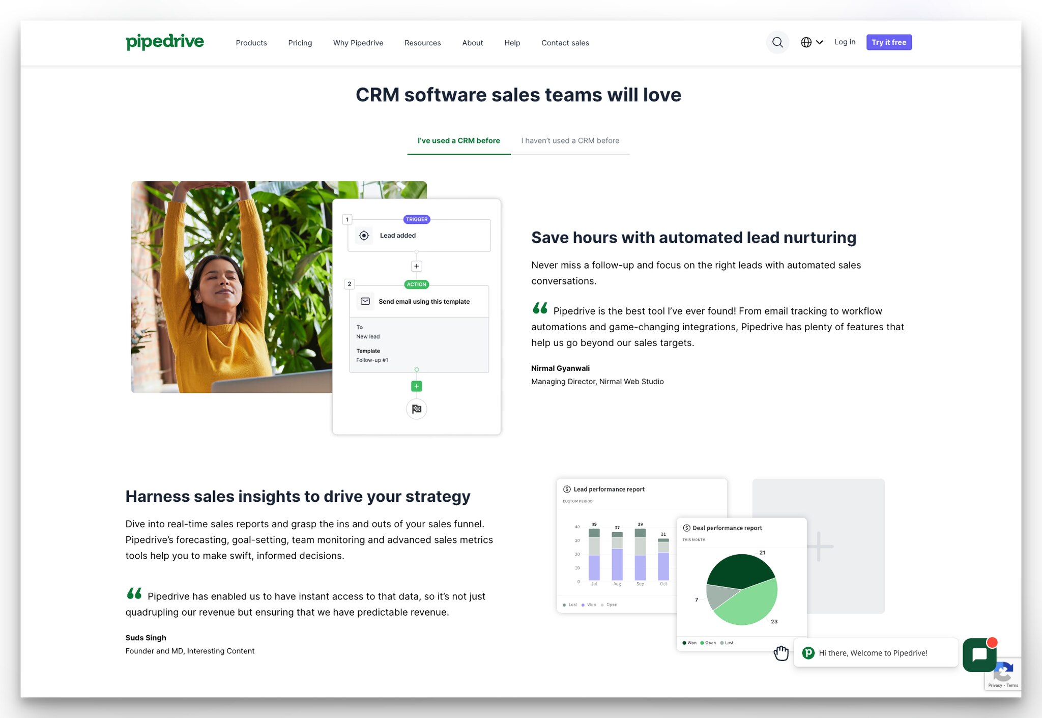
Why it works: Pipedrive splits its social proof into two tracks: testimonials from people who've used CRM before and those who haven't. This is smart because a first-time CRM buyer has different objections ("Is this too complicated?") than someone switching from a competitor ("Can it import my data?"). By addressing both audiences on the same page, Pipedrive avoids the common mistake of writing for one persona and ignoring the other.
Key takeaway: Segment your testimonials by buyer experience level. A CRM beginner doesn't care about migration features, and a power user doesn't need reassurance about ease of use.
6. Lattice: Social Proof Adjacent to the Headline
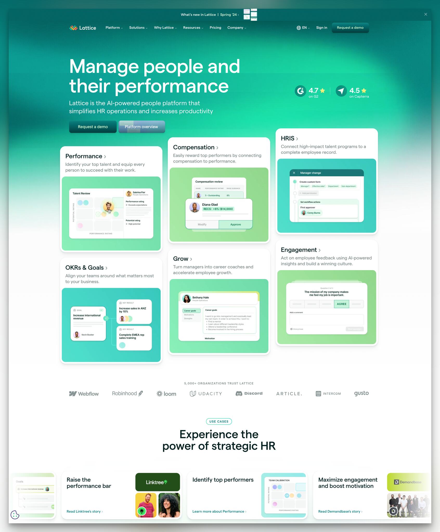
What works: Lattice places G2 and Capterra rating badges right next to its headline instead of burying them at the bottom. The page follows with "5,000+ organizations trust Lattice" and logos of well-known companies. Feature categories are displayed with clear icons and brief descriptions.
Why it works: Most B2B landing pages save social proof for below the fold. Lattice puts it at eye level with the headline, which means visitors encounter the trust signal before they even process the product description. This is the anchoring effect: the first piece of information shapes how everything after it is perceived. A 4.8-star G2 rating seen alongside "People management platform" primes the visitor to evaluate features more favorably.
Key takeaway: Move your highest-impact social proof (G2 score, client count, well-known logo) to the hero section. Trust signals buried at the bottom of the page only help visitors who already scrolled past your CTA.
7. Retool: Developer-First Language
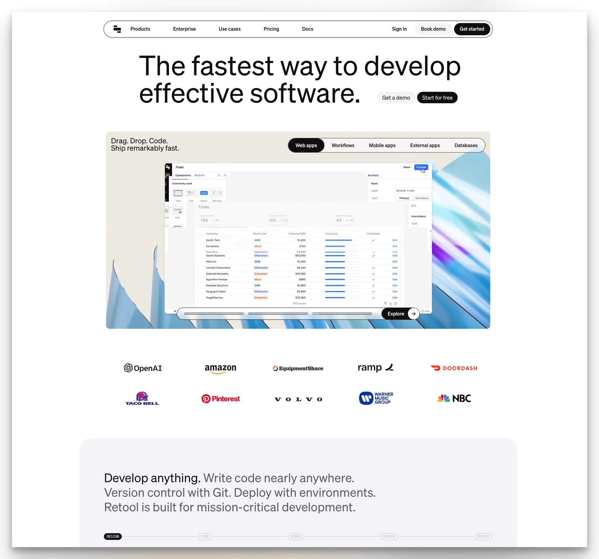
What works: Retool speaks directly to developers with a headline focused on speed. "Get a demo" and "Start for free" CTAs sit side by side. Below, a dashboard preview shows the drag-and-drop builder with actual UI components, not mockups. Logos of companies like Amazon, Mercedes-Benz, and DoorDash serve as enterprise-grade social proof.
Why it works: Developer tools have a unique challenge: the buyer (engineering manager) and the user (developer) are often different people. Retool's page addresses both by combining technical product visuals that satisfy developers with enterprise logos that satisfy procurement. The headline doesn't oversell. It promises speed, which is the one thing every engineering team wants.
Key takeaway: Match your headline language to how your users actually describe their problem. Developers don't want to "transform workflows." They want to ship faster.
8. Coda: Redundant CTAs That Work
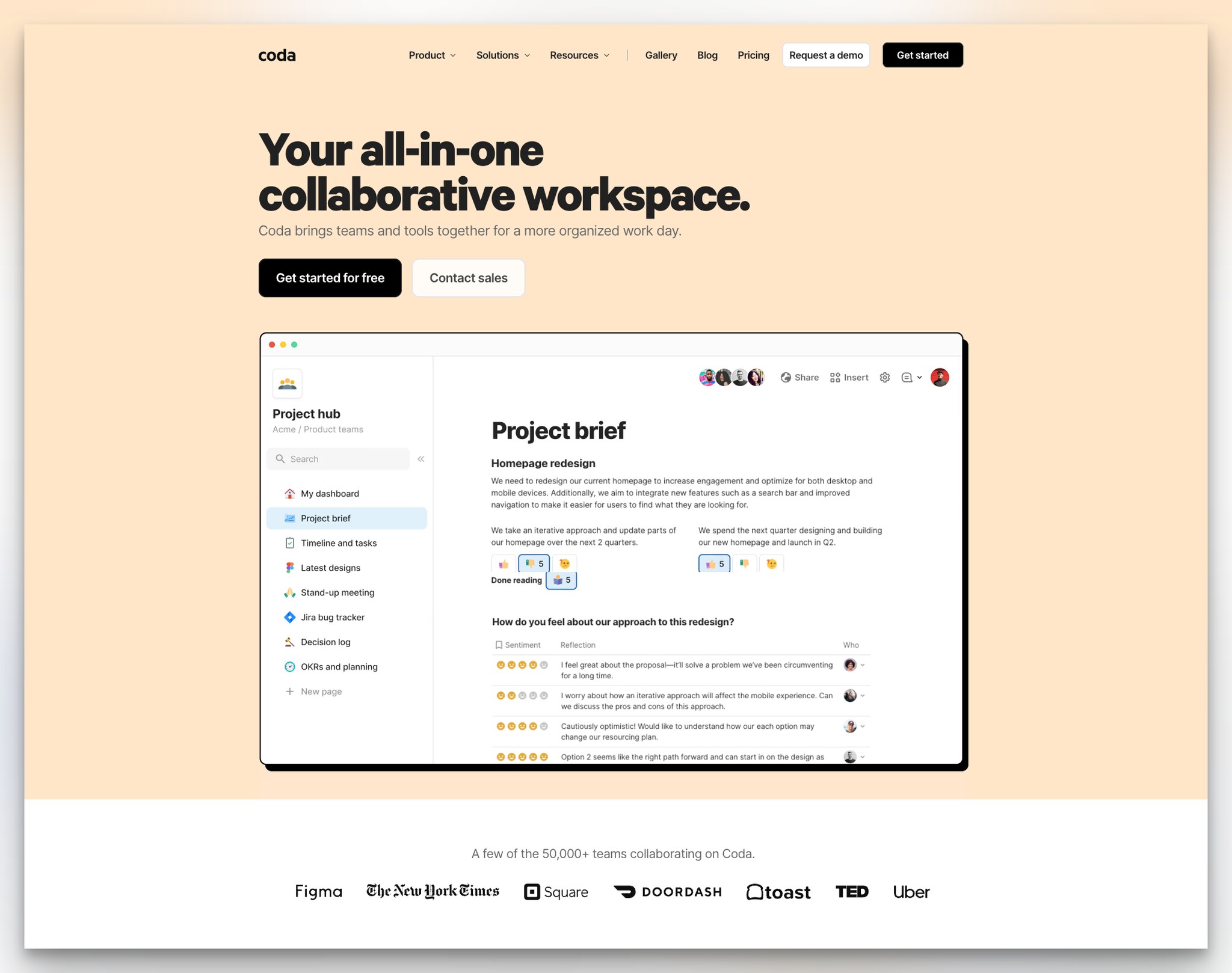
What works: Coda's page has "Request a demo" and "Get started" in the navbar, then repeats similar CTAs in the hero: "Get started for free" and "Contact sales." The "all-in-one" headline signals breadth, and below the dashboard preview, logos from 50,000+ teams reinforce adoption at scale.
Why it works: Repeating CTAs isn't redundant when they appear at different decision points. The navbar CTAs catch visitors ready to act immediately. The hero CTAs catch those who read the headline first. And the bottom-of-page CTAs catch scrollers who needed the feature list to feel confident. Each placement serves a different stage of the visitor's micro-journey down the page. According to Caffeine Marketing, businesses with 30+ landing pages generate seven times more leads than those with fewer than 10.
Key takeaway: Place CTAs at the top, middle, and bottom of your landing page. Don't assume visitors will scroll back up to click a button they missed.
9. Monday.com: Self-Serve Use Case Selection
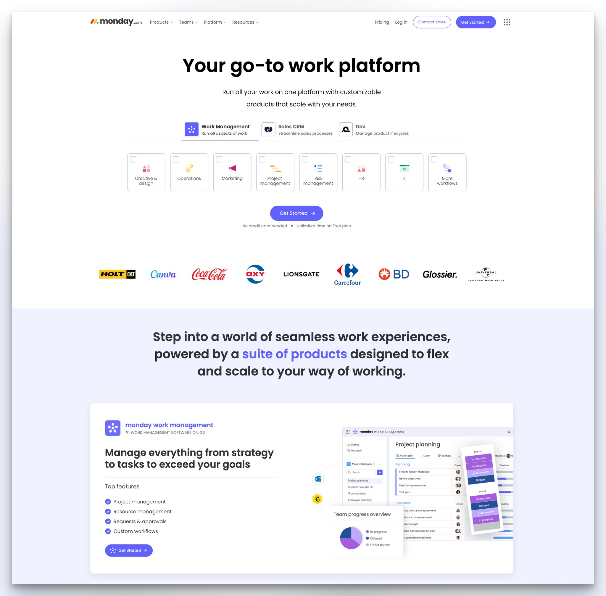
What works: Monday.com uses the straightforward headline "Your go-to work platform" with no jargon. Below, visitors choose from different use cases (marketing, operations, CRM, dev) and each selection updates the page content to show relevant features. The "Get started" button is paired with free plan details.
Why it works: This is product-led onboarding starting on the landing page itself. Instead of forcing visitors through a generic demo, Monday.com lets them self-select and see exactly what their experience will look like. It's a miniature version of the aha moment before the visitor even creates an account. The technique works because it replaces passive reading with active exploration, and engaged visitors convert at higher rates.
Key takeaway: Let visitors choose their use case on the landing page. An interactive selector that updates content based on selection outperforms a single static layout.
B2B Landing Pages of Email, Forms, and Marketing Tools
Marketing and email tools need to demonstrate one thing above all: ease of use. These B2B landing page examples succeed by showing the product interface front and center, often letting visitors interact with it before signing up.
10. Designmodo Postcards: Quantified Speed Claims
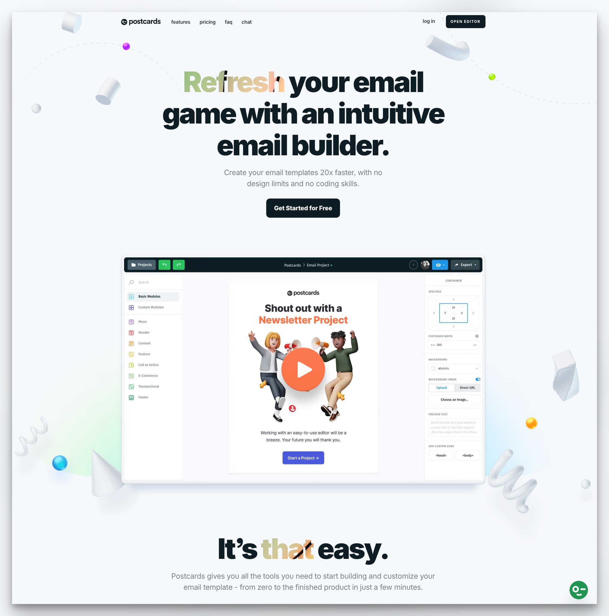
What works: Designmodo Postcards claims you can create email templates "20 times faster" without coding. The headline "Refresh your email game" is casual but clear. Below the CTA, a short video shows the drag-and-drop interface in action, followed by the line "It's that easy."
Why it works: Quantified claims ("20x faster") work better than vague ones ("much faster") because they give the brain something concrete to evaluate. The video demo removes the biggest objection for no-code tools: "Will it actually be easy?" By showing 30 seconds of real interface interaction, Designmodo proves the claim instead of just stating it. The "It's that easy" copy after the video acts as a micro-close, reinforcing the simplicity message at exactly the right moment.
Key takeaway: Back up speed or efficiency claims with a specific number, then prove it with a short video. "20x faster" followed by a 30-second demo is more persuasive than a paragraph of feature descriptions.
11. Typeform: Stacked Trust Signals
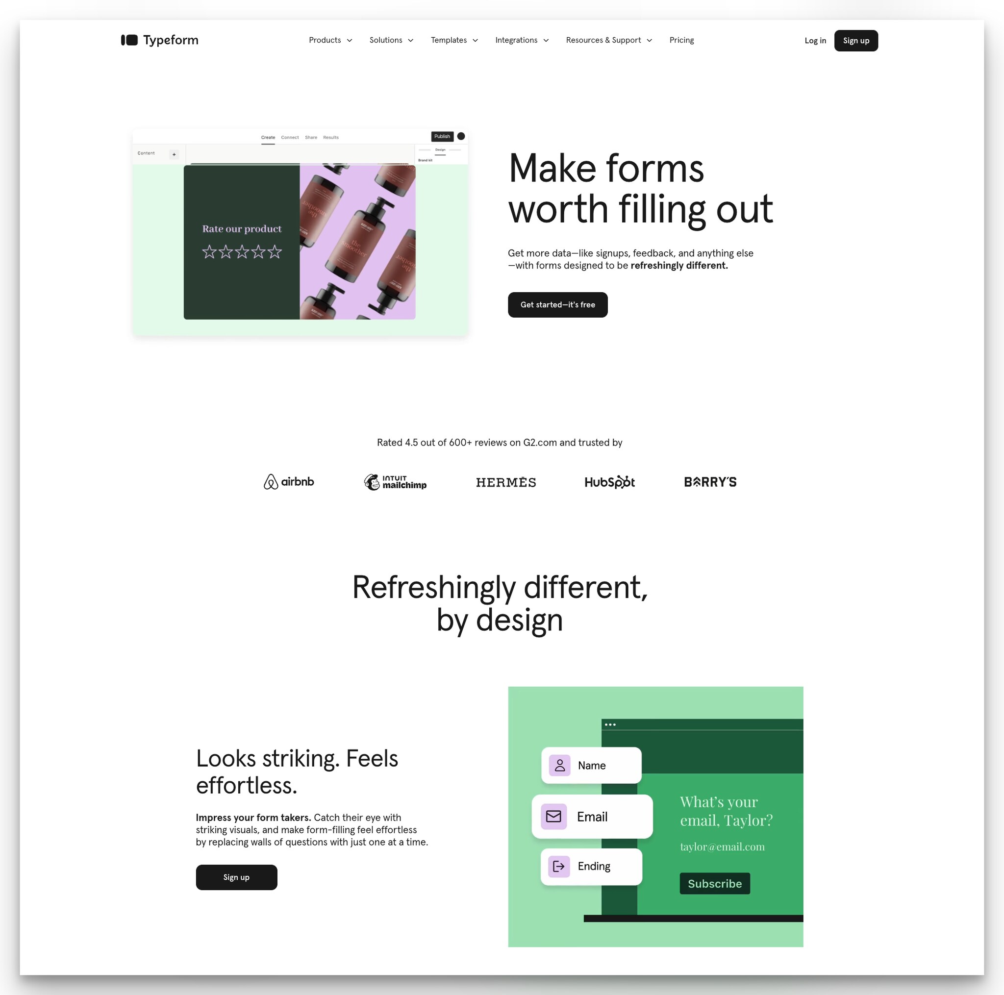
What works: Typeform's page opens with "Make forms worth filling out" and a dashboard preview. The standout is the trust strip: "Rated 4.5 out of 600+ reviews on G2.com and trusted by" followed by recognizable logos. This packs three proof types (rating, review count, brand logos) into a single visual element.
Why it works: Stacking trust signals in one section creates a compound effect. A G2 rating alone is good. A G2 rating with 600+ reviews is better because it shows sample size. Add logos like HubSpot and Mailchimp, and the visitor thinks: "If these companies use it, the quality is proven." It's the same reason Amazon shows star ratings, review counts, and "Amazon's Choice" on the same product card.
Key takeaway: Combine your rating score, review count, and top client logos in one visual strip. Three separate social proof sections scattered across the page have less impact than one concentrated trust block.
B2B Landing Pages of Product Analytics and Research Platforms
Analytics and research tools sell to a skeptical audience. Product managers and researchers want evidence, not promises. The landing pages in this category succeed by leading with outcomes and letting the product interface speak for itself.
12. PostHog: Visual Hierarchy Through Color
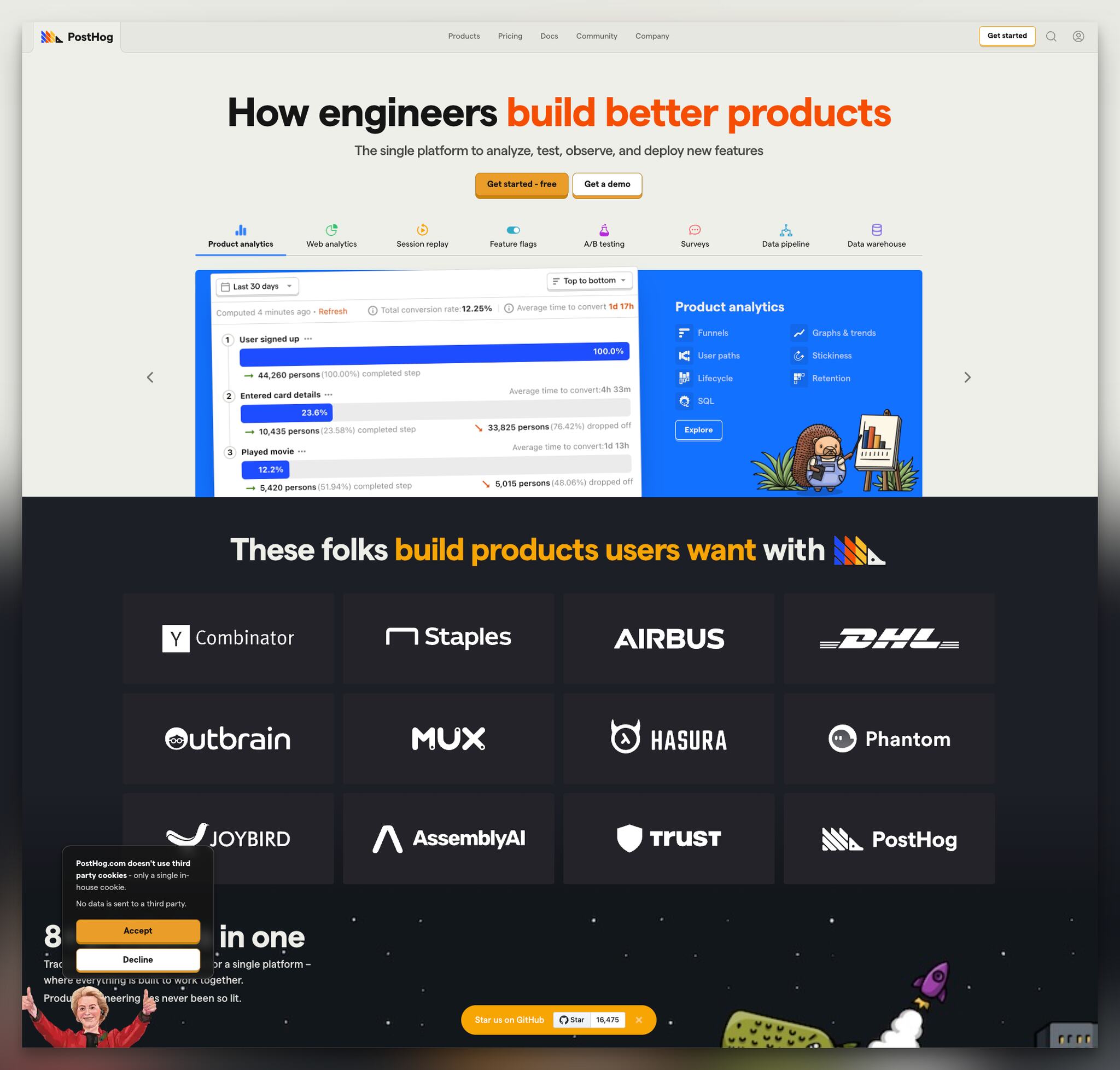
What works: PostHog's headline "How engineers build better products" uses two colors, with the second half painted in orange. Two CTAs ("Get started - free" and "Get a demo") sit below a single-sentence feature summary. The rest of the page organizes capabilities under tabbed categories with custom illustrations.
Why it works: The split-color headline creates a natural reading pause on the emphasized words. Your eye goes to "better products" first because the color contrast draws it there. This is a practical application of the Von Restorff effect (isolation effect): items that stand out from their surroundings are remembered more easily. PostHog uses this to make sure visitors recall the benefit, not just the tool name.
Key takeaway: Use color contrast to emphasize the benefit phrase in your headline, not the product name. Visitors remember what stands out visually.
13. Dovetail: Feature Announcements as a Traffic Driver
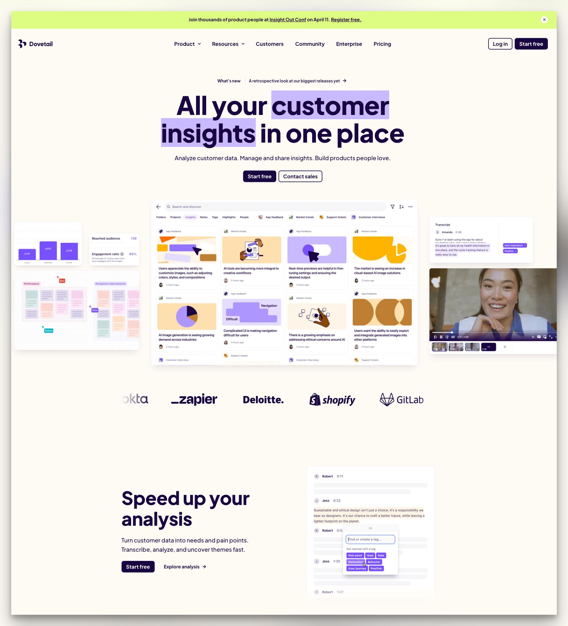
What works: Dovetail places a new feature announcement banner above the headline. The hero emphasizes "customer insights" with a text background highlight. "Start free" and "Contact sales" CTAs use different colors to visually separate low-commitment from high-commitment actions. Product screenshots and short video clips demonstrate real workflows.
Why it works: The feature announcement banner serves two purposes. First, it signals active development ("this product is evolving"). Second, it gives returning visitors a reason to re-engage with the page. Most B2B landing pages are static, which means repeat visitors have no reason to look at them again. Dovetail's approach turns the landing page into a living document that earns repeat visits.
Key takeaway: Add a feature announcement or changelog link above your headline. Returning visitors need a reason to look at your landing page again, and "what's new" gives them one.
B2B Landing Pages of Contract Management, Accounting, and Operations
Operational B2B tools have a harder sell: the product isn't exciting. Nobody wakes up enthusiastic about contract management. These landing pages succeed by focusing on the problem they eliminate rather than the features they offer.
14. Tomorro: Interactive Hero With Human Faces
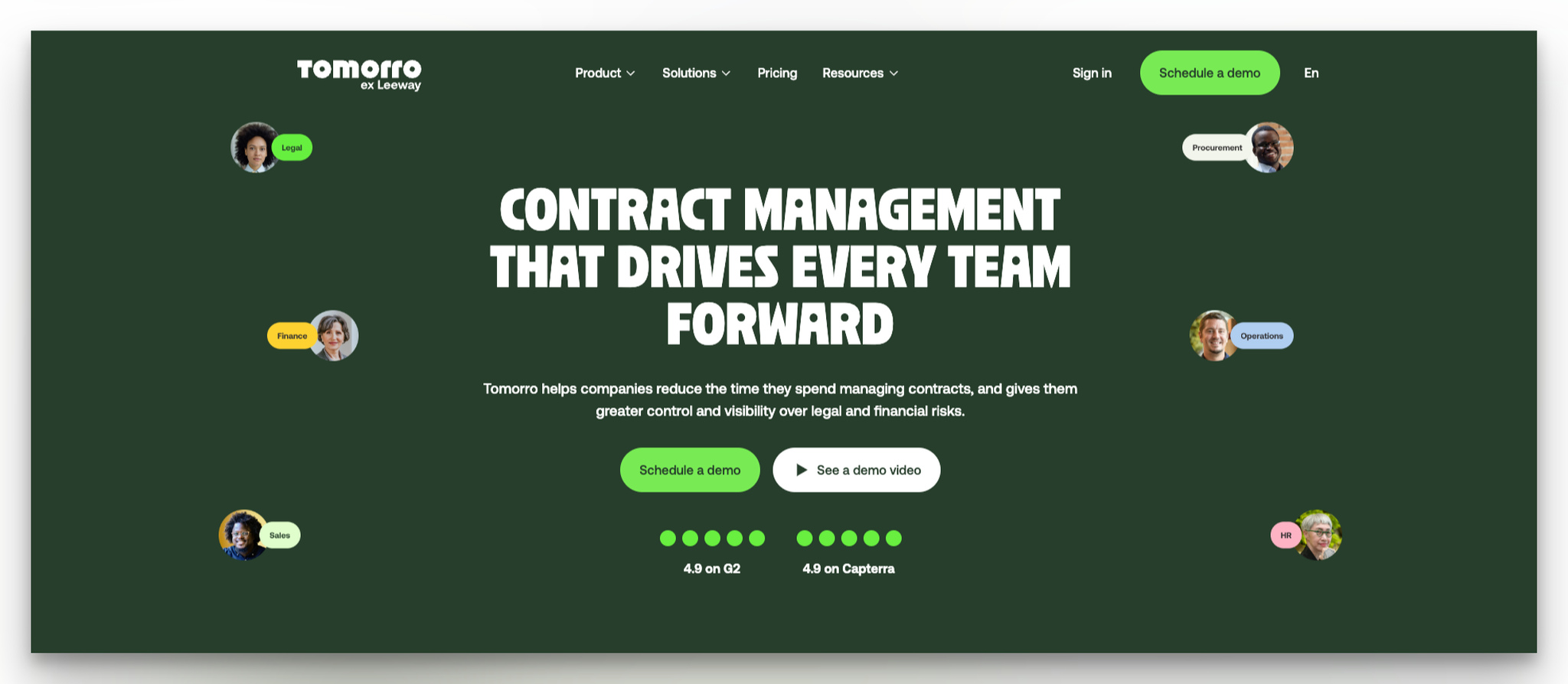
What works: Tomorro's landing page uses rotating photos of real people representing different team roles. The headline "Contract management that drives every team forward" sets the broad scope, and dual CTAs ("Schedule a demo" and "See a demo video") offer both synchronous and asynchronous engagement options.
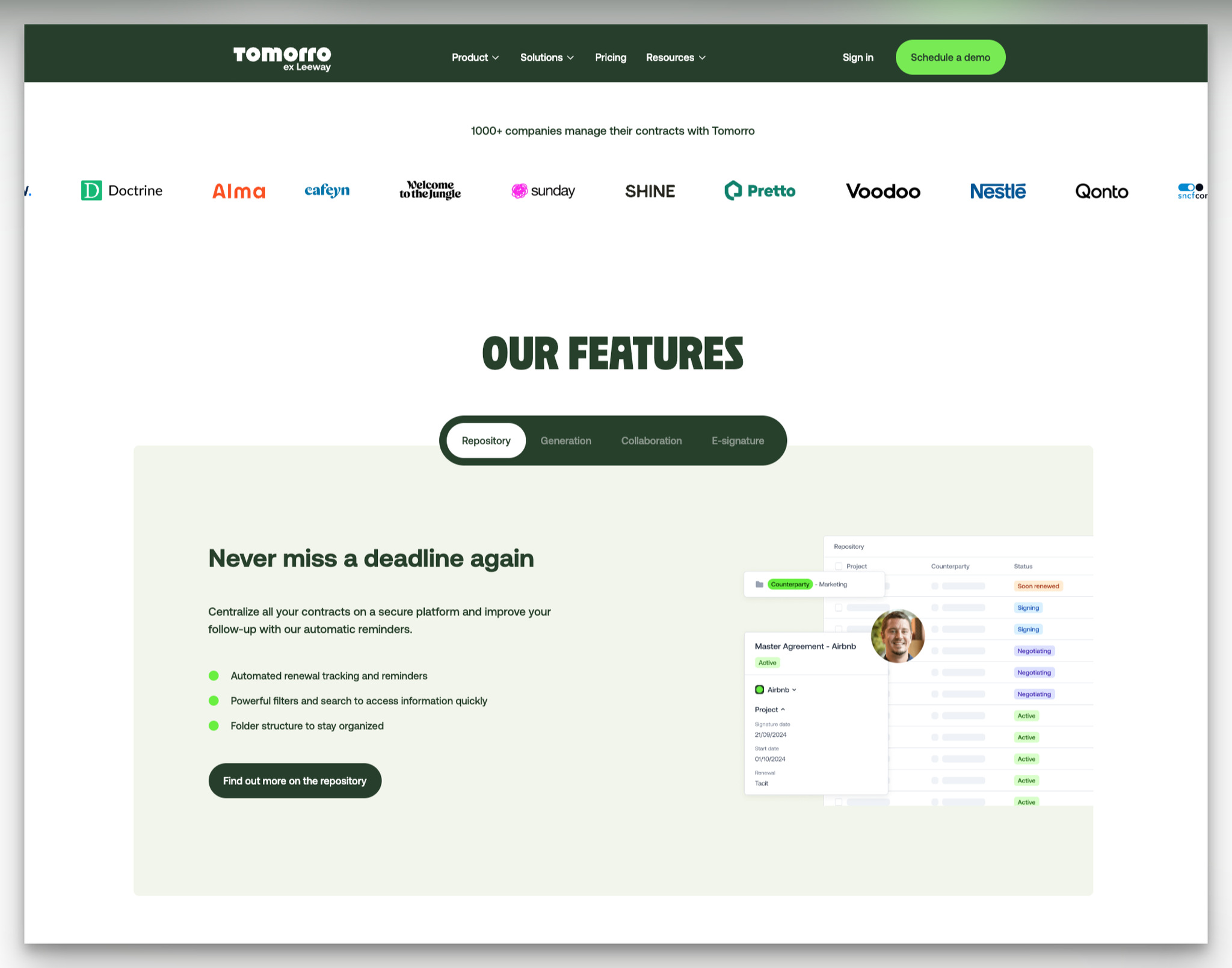
Why it works: B2B SaaS pages tend to use abstract illustrations. Tomorro bucks this with photos of actual humans, which triggers the face recognition bias. Humans are wired to notice and trust faces. The rotating element adds motion that draws the eye without being distracting. Below the fold, "Find out more" links on each feature keep the page clean while offering depth for those who want it.
Key takeaway: Replace abstract illustrations with photos of real people in your hero section. Human faces hold attention 2-3x longer than graphics, and they build trust faster.
15. Osome: Authenticity Through Real-World Context
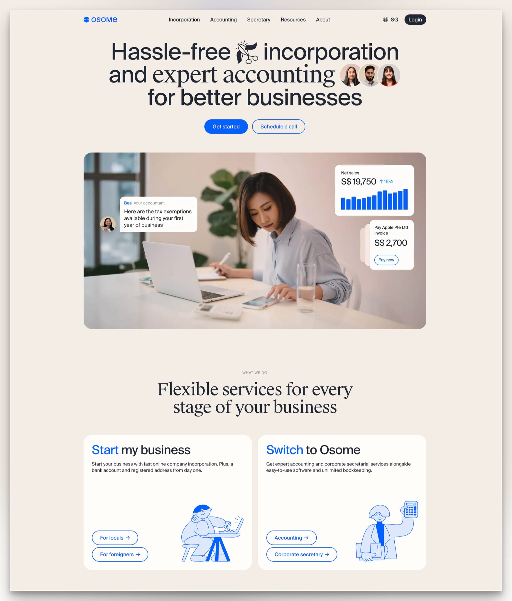
What works: Osome uses an eye-catching headline with inline photos and the word "hassle-free" emphasized. Two CTAs push toward signup and demo calls. But the standout element is the hero image: a real person working alongside screenshots of actual text messages and invoice data from the product.
Why it works: Mixing a person photo with product screenshots creates context. It's not just "here's our dashboard" but "here's someone using our dashboard in their daily work." This contextual demonstration reduces the imagination gap. The visitor doesn't have to envision how the product fits into their workflow. They can see it. Osome's "What we do" section further segments by business need, helping visitors self-identify their situation.
Key takeaway: Show your product in the context of someone using it. A dashboard screenshot next to a real person working is more relatable than either element alone.
B2B Landing Pages of Communication and Team Productivity Tools
Team communication tools need to demonstrate their value in seconds because the competition is fierce and switching costs are high. These B2B landing page examples focus on reducing signup friction and showing immediate product value.
16. Slack: Frictionless Signup With Social Login
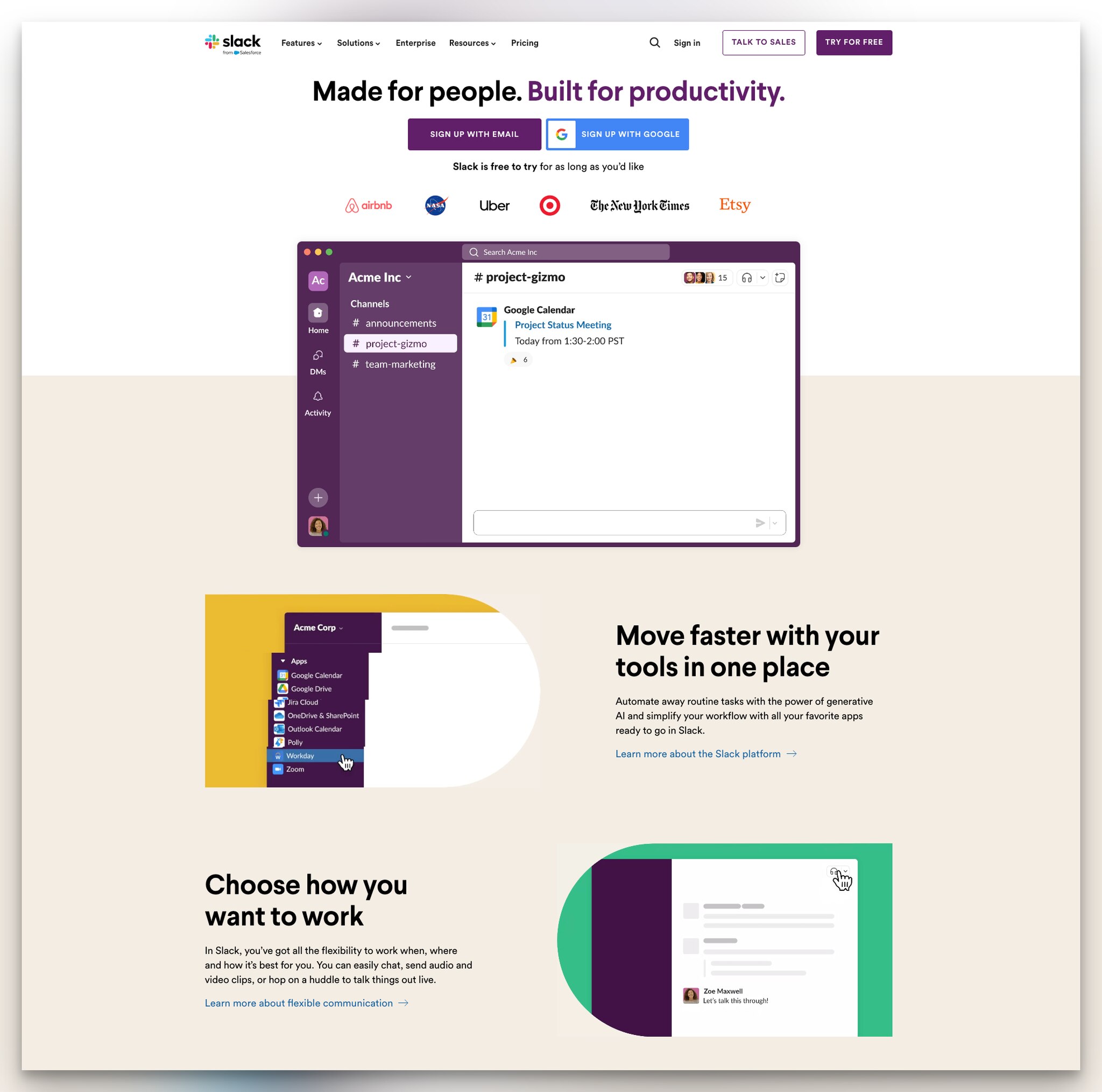
What works: Slack's headline "Made for people. Built for productivity." nails both audience (people) and value (productivity) in eight words. The signup section offers email and Google authentication options side by side. "Free to try" microcopy sits below. Major brand logos (Airbnb, NASA, Target) follow immediately.
Why it works: Google signup eliminates form fields entirely. The visitor clicks one button, authorizes with Google, and they're in. For B2B tools where the decision-maker is often exploring during a busy workday, that difference between "30-second signup" and "2-minute signup" is the difference between a new user and a bounced visitor. Slack's learn more links at the bottom give each feature its own exploration path without overwhelming the hero section.
Key takeaway: Add a Google (or SSO) signup button alongside your email form. Every field you remove from the signup process increases completion rate.
17. Hopscotch: Mid-Page Pain Point Amplification
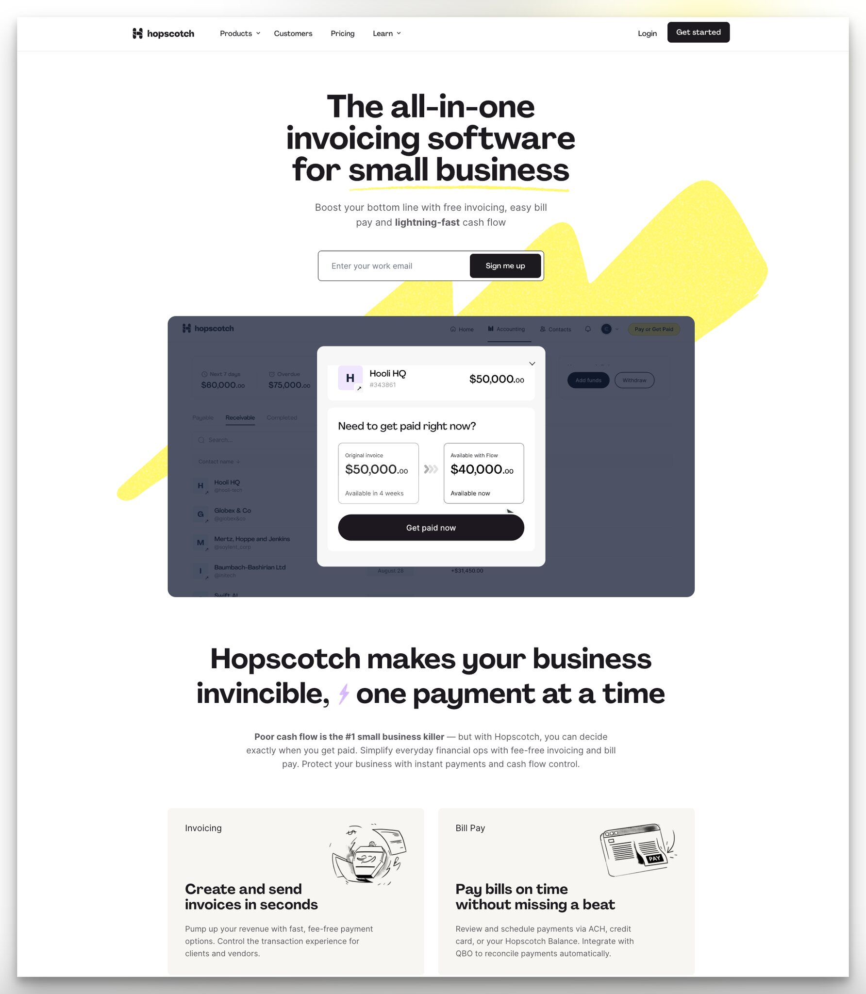
What works: Hopscotch's hero headline identifies the target audience directly: "The all-in-one invoicing software for small businesses," with "small businesses" underlined for emphasis. An email input in the hero captures leads immediately. But the real hook is mid-page: "Poor cash flow is the #1 small business killer."
Why it works: Most landing pages front-load the pain point and transition to the solution. Hopscotch places a second, more intense pain statement mid-page. By this point, the visitor has already seen the features and interface. The mid-page pain amplification re-engages visitors who were passively scrolling by reminding them why they're looking at invoicing software in the first place. It's a re-qualification technique that increases the likelihood of CTA clicks further down.
Key takeaway: Don't limit your pain-point messaging to the headline. Place a sharp, specific pain statement mid-page to re-engage scrollers who lost focus.
18. Cycle: Embedded Product Experience
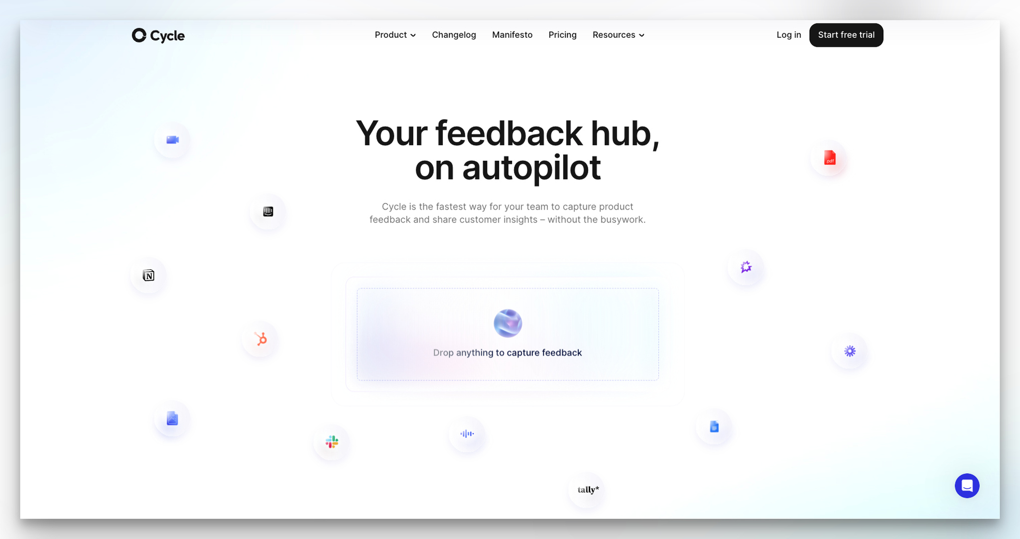
What works: Cycle's page is deliberately minimal. The headline "Your feedback hub, on autopilot" is just six words. Below, a "Drop anything to capture feedback" section lets visitors interact with the product directly on the landing page. Integration logos (Slack, Linear, Intercom) are woven into the page naturally.
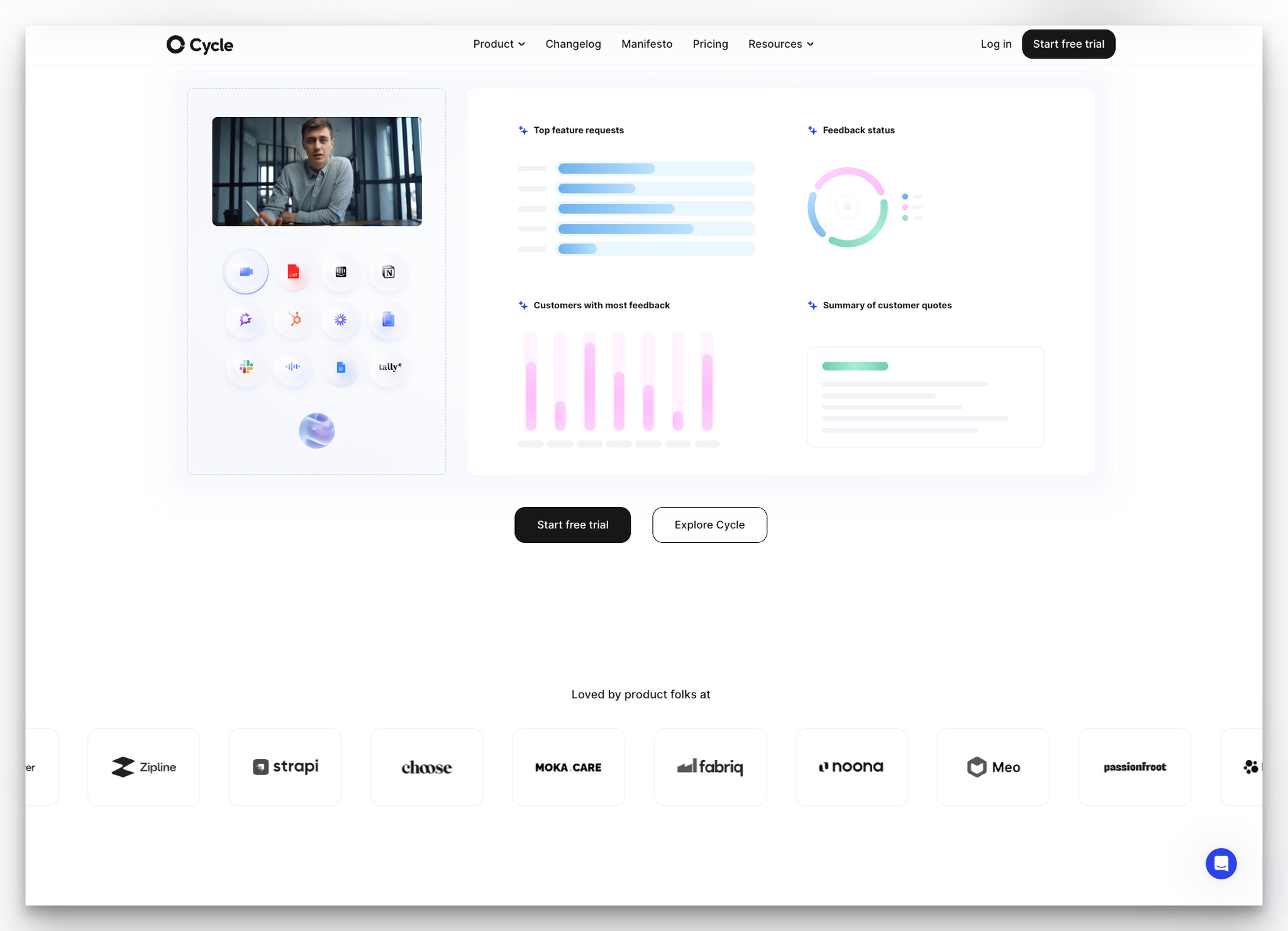
Why it works: Interactive product demos on landing pages are the highest-performing conversion element I've seen across B2B pages I've tracked since 2023. The "Loved by product folks at" line uses warm, conversational language instead of the corporate "Trusted by" phrasing. This tone matches the product's audience (product managers who tend to prefer informal, direct communication). Cycle succeeds by letting the product sell itself through interaction rather than description.
Key takeaway: Embed a mini product demo on your landing page. Letting visitors experience one core feature before signup creates a commitment that reading about features can't.
B2B Landing Pages of AI and Presentation Tools
AI-powered tools have a unique advantage: they can demonstrate value instantly. The best landing pages in this category let visitors generate something before asking for an account.
19. Decktopus: Try Before You Sign Up
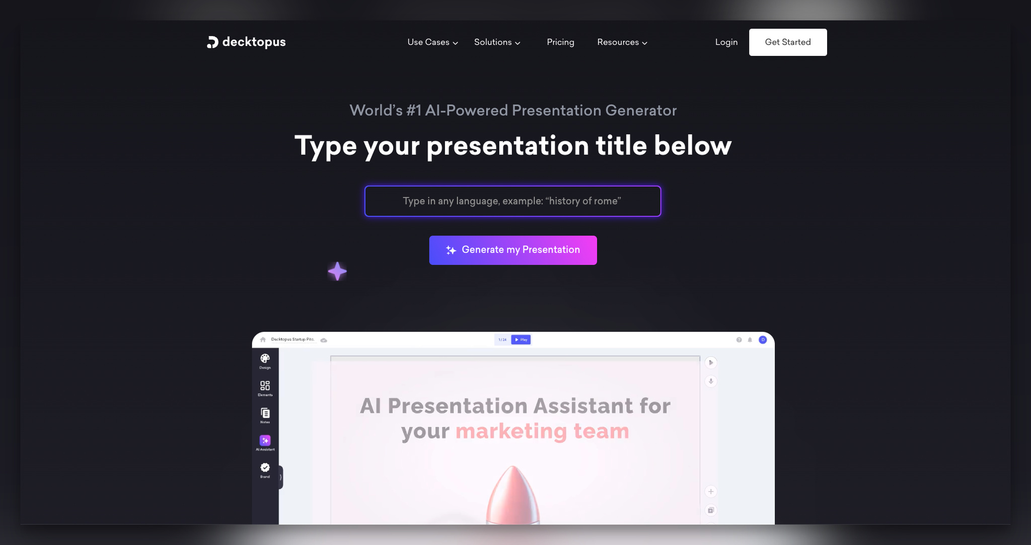
What works: Decktopus leads with "World's #1 AI-Powered Presentation Generator" and immediately offers an input field where visitors type a presentation title. Click "Generate my presentation" and you're taken to the signup page to access your AI-generated result.
Why it works: This is the endowed progress effect in action. Once a visitor types their presentation title and clicks generate, they've invested effort. That effort creates a sense of ownership over the result, even though they haven't seen it yet. Now the signup feels like "claim your presentation" rather than "create an account." The statistics section below (presentations created, time saved) adds proof that other people have already benefited from this exact flow.
Key takeaway: If your product can generate output from a single input, put that input field on the landing page. Let visitors start the process before you ask them to sign up.
B2B Landing Pages of Sales Prospecting and CRM Tools
Sales tools sell to salespeople, who are naturally skeptical of marketing. These landing pages succeed by leading with compatibility, proof, and specific outcomes rather than vague promises.
20. Wiza: Platform Compatibility as a Filter
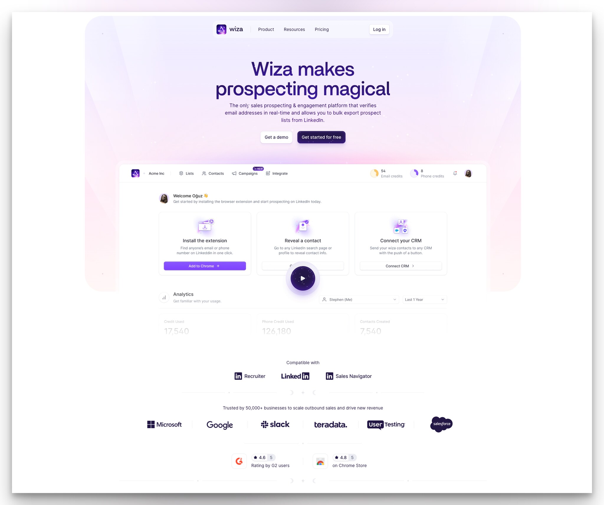
What works: Wiza's headline explains its function directly, and the description covers "how the tool works" in one paragraph. Dual CTAs ("Get a demo" and "Get started for free") are standard but effective. The dashboard overview uses a video instead of a screenshot. The "Compatible with" section highlights LinkedIn, LinkedIn Recruiter, and LinkedIn Sales Navigator.
Why it works: Compatibility badges act as a qualifying filter. A sales rep who uses LinkedIn Sales Navigator sees that badge and thinks: "This is for me." Someone who doesn't use LinkedIn skips the page without wasting anyone's time. This self-qualification is valuable because it reduces support inquiries and increases trial-to-paid conversion rates. Wiza reinforces with G2 and Chrome Store ratings, which are the specific platforms where their buyers do research.
Key takeaway: Show which platforms your tool integrates with above the fold. Integration badges serve as qualification filters that attract the right visitors and deter the wrong ones.
B2B Landing Pages of HR and Recruiting Platforms
HR tech landing pages need to demonstrate efficiency gains because recruiting teams are perpetually short on time. These examples focus on speed-to-value and quantified outcomes.
21. Homerun: Metrics in the Hero
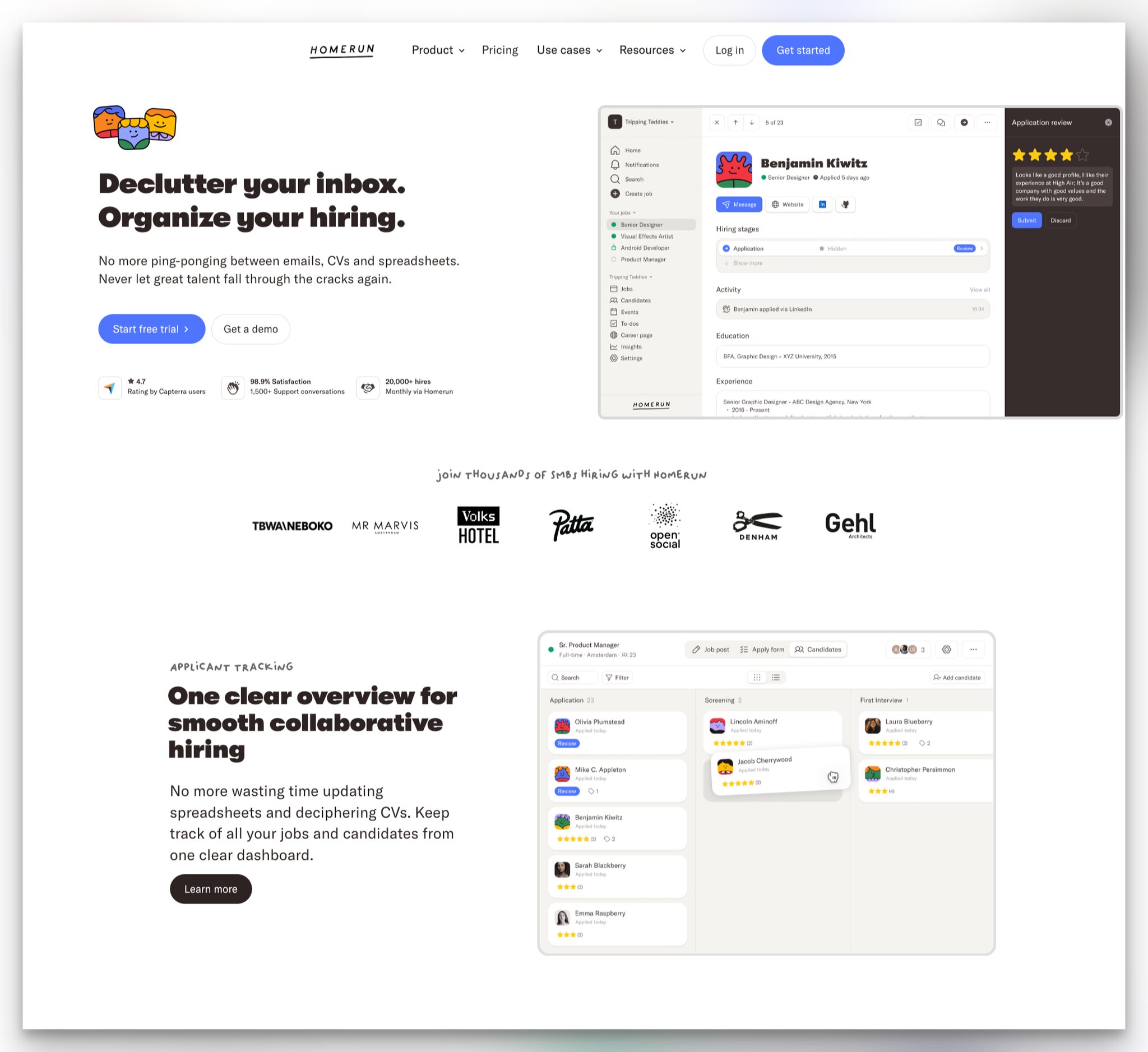
What works: Homerun splits its hero into two columns: text on the left with CTAs, and a product UI screenshot on the right. "Start a free trial" and "Get a demo" offer both commitment levels. Below the CTAs, three proof points appear: user ratings, total hires facilitated, and customer satisfaction percentage.
Why it works: Quantified outcomes in the hero section answer the visitor's implicit question: "Does this actually work?" Before the visitor reads a single feature description, they see a satisfaction rate and a real hire count. These numbers create an immediate frame of reference. The "Learn more" buttons on each feature section offer progressive disclosure, keeping the page scannable while allowing depth on demand.
Key takeaway: Put your strongest metric in the hero section. If you can say "X satisfied customers" or "Y successful outcomes," that number works harder above the fold than anywhere else on the page.
22. Slite: Video Demo Over Static Screenshots
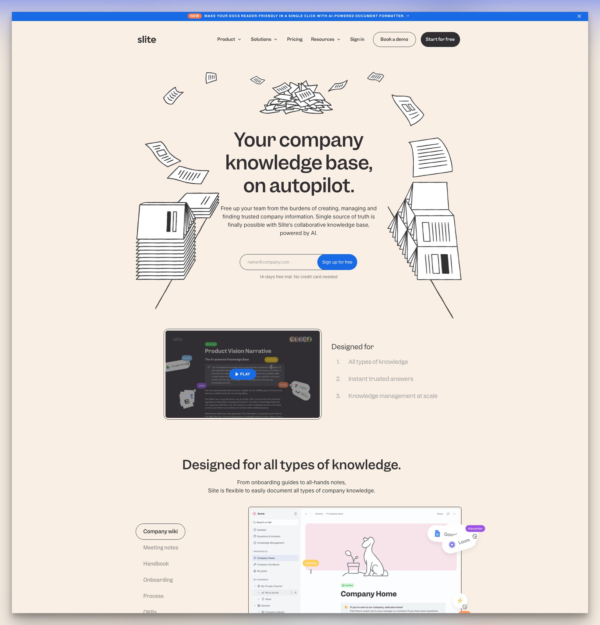
What works: Slite's page uses a clean, minimal design. The headline is followed by a one-paragraph description and an email input with "Sign up for free" as the CTA text. The centerpiece is a product video showing real-time usage of the knowledge base interface.
Why it works: For knowledge management tools, the interface is everything. Users spend hours inside these products daily, so a static screenshot doesn't convey the experience. Slite's product video shows search, editing, and navigation in real time. Video also increases time-on-page, which is a NavBoost signal that Google's ranking system tracks. The minimal surrounding design ensures the video gets full attention without competing elements. According to Genesys Growth, the industry median conversion rate for landing pages is 6.6%, but top performers hit 10%+ through systematic optimization.
Key takeaway: If your product's value is in the day-to-day experience, replace hero screenshots with a 30-60 second video showing real usage. It demonstrates what a screenshot can only imply.
B2B Landing Pages of Data Analytics and Business Intelligence
Analytics tools need to convince visitors that their product can handle real-world complexity without looking complex itself. These landing pages balance technical credibility with visual simplicity.
23. Canvas: Addressing a Specific Fear
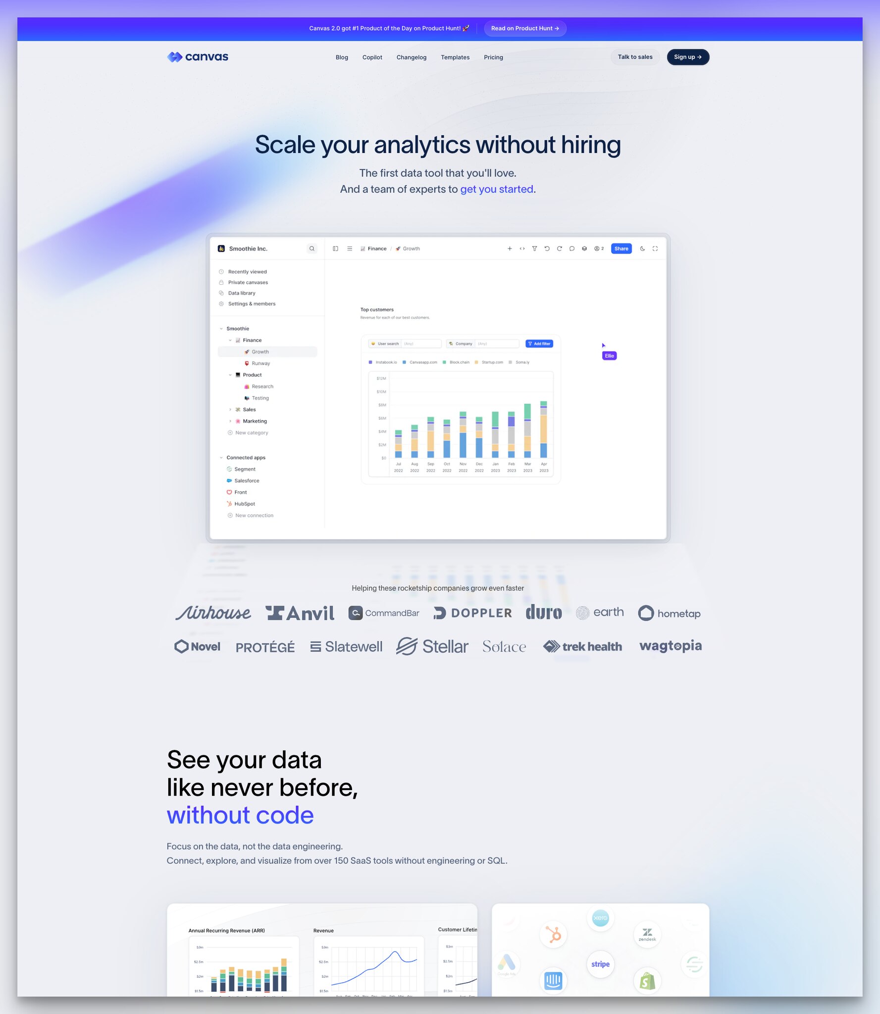
What works: Canvas uses the headline "Scale your analytics without hiring," which names a specific B2B fear (the cost and time of hiring analysts). The page is minimal: headline, description with an inline CTA link, dashboard screenshot, and client logos positioned under "Helping these rocketship companies grow even faster."
Why it works: "Without hiring" is the most powerful phrase on this page. It directly addresses the budget objection that kills most analytics tool purchases. Instead of competing on features (every analytics tool claims powerful dashboards), Canvas competes on organizational impact. The client logo framing is also notable. "Helping these rocketship companies grow even faster" implies that these companies were already successful and Canvas made them more so. It's aspirational without being unrealistic.
Key takeaway: Name the specific organizational fear your product eliminates in your headline. "Scale without hiring" is more compelling than "powerful analytics platform" because it addresses a budget concern directly.
24. Polymer: Testimonials Before Features
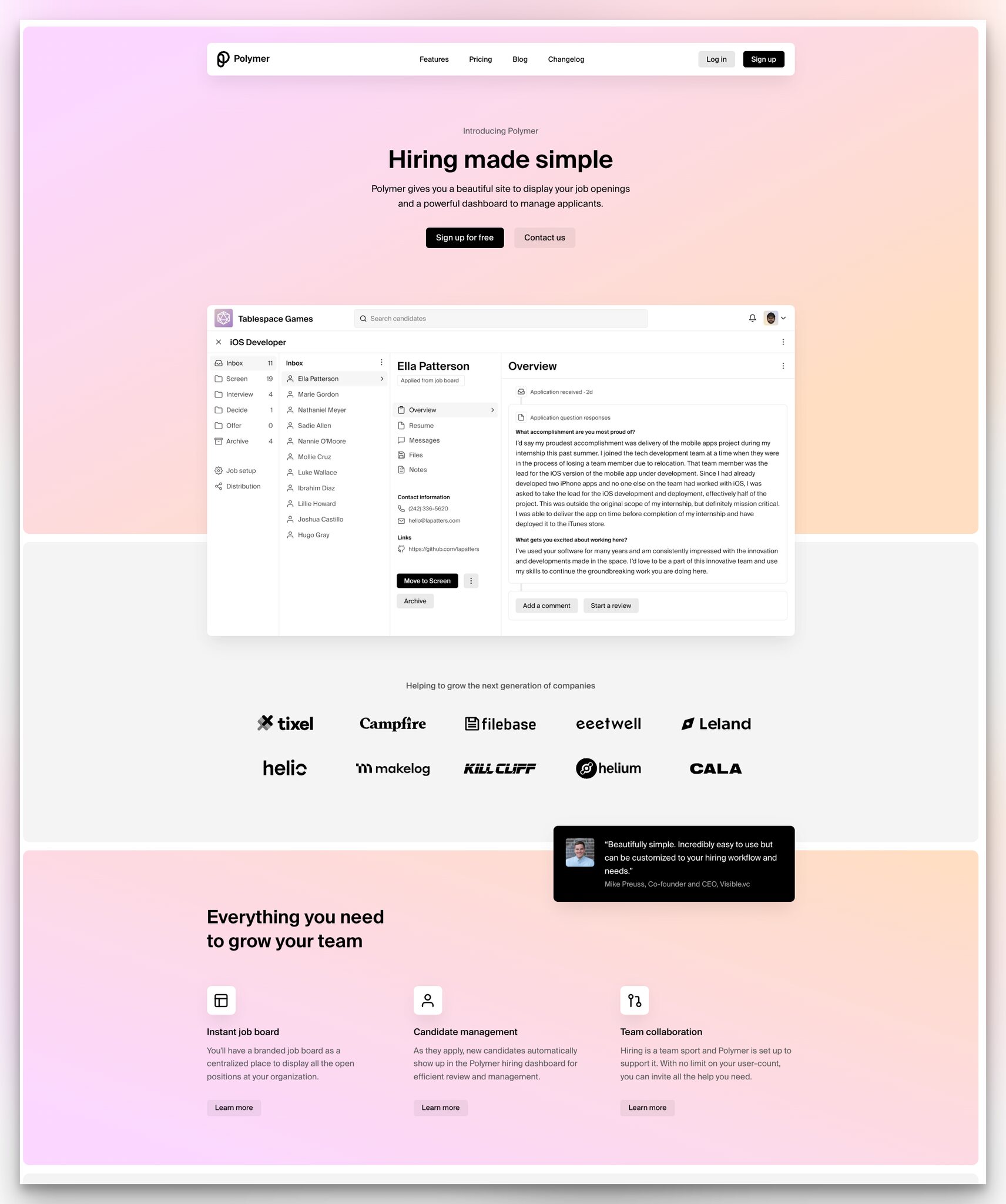
What works: Polymer uses a pastel color scheme with black text. The headline "Hiring made simple" is three words. Below the CTA buttons and dashboard image, a real customer testimonial appears before the feature list. The framing "Helping to grow the next generation of companies" positions their clients as aspirational brands.
Why it works: Placing a customer testimonial before the feature list reverses the typical conversion flow. Usually, visitors read features, form opinions, then look for validation. Polymer gives validation first, which means the visitor reads features through the lens of "a real person already succeeded with this." It's a priming technique that shifts the visitor from evaluation mode to confirmation mode. The feature section's "Learn more" links provide depth without cluttering the page.
Key takeaway: Put your best customer testimonial above your feature list, not below it. Let social proof frame how visitors evaluate your features.
B2B Landing Pages of Revenue and Sales Enablement
Sales enablement tools sell to revenue teams who measure everything by its impact on deal velocity and win rates. These landing pages lead with customer stories and demonstrate ROI.
25. Dock: Video Testimonials Over Text
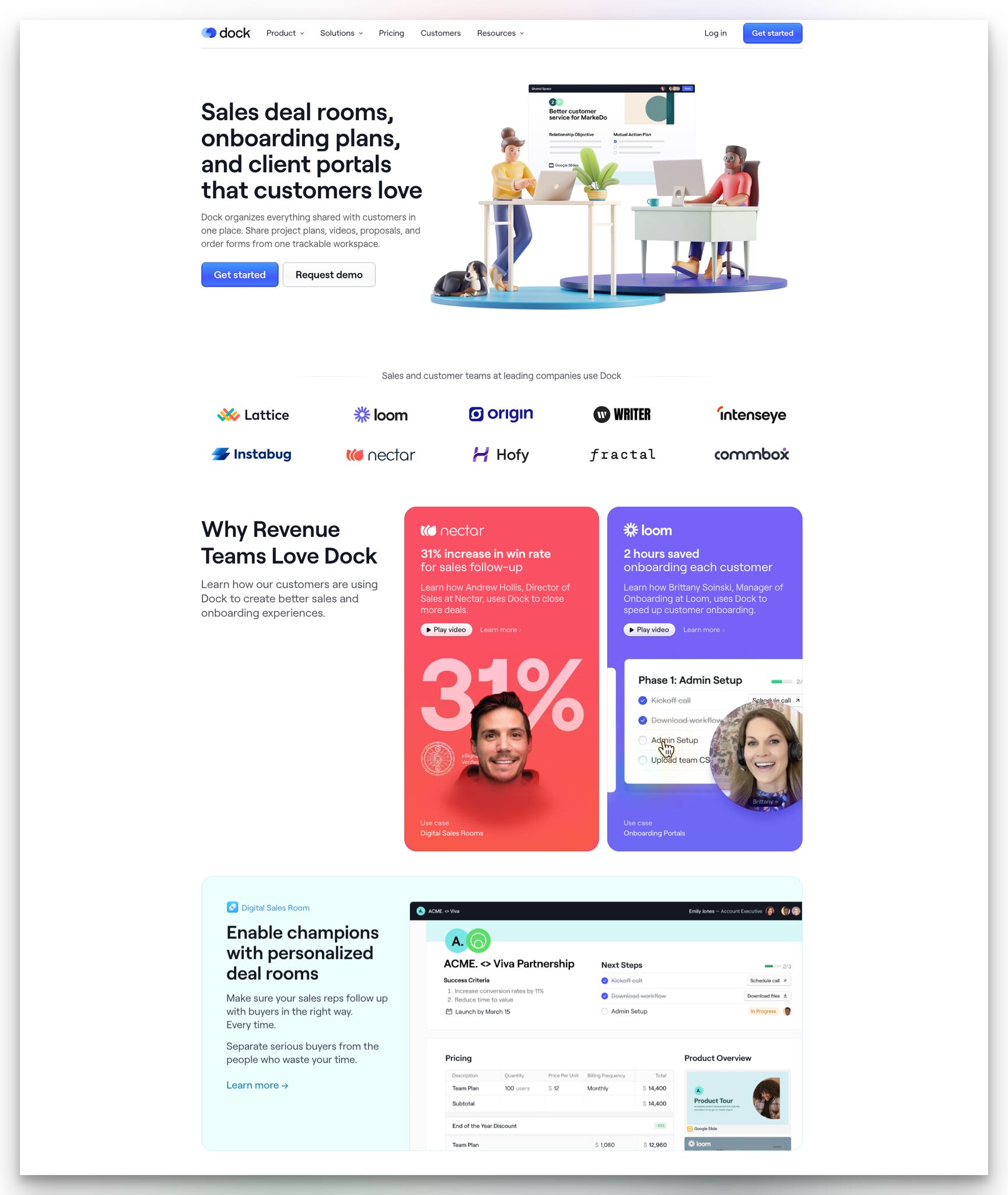
What works: Dock's page covers deal rooms, onboarding plans, and client portals in the hero. The feature description is dense but organized. Client logos sit mid-page, and customer stories appear under "Why revenue teams love Dock" with embedded video testimonials.
Why it works: Video testimonials outperform text testimonials because they can't be faked as easily. A written quote like "Dock transformed our sales process" could come from anyone. A video of a VP of Sales saying the same thing, with their name and company visible, carries real weight. For revenue teams specifically, peer credibility matters more than feature lists. If another VP of Sales at a similar company uses this tool, the evaluation is half done. Dock understands this and makes customer stories the emotional center of the page.
Key takeaway: Record 60-second video testimonials from customers in your target buyer persona. A VP of Sales on camera saying "this works" is worth more than a page full of feature descriptions.
26. SupportNinja: Pre-Qualifying Visitors With Forms
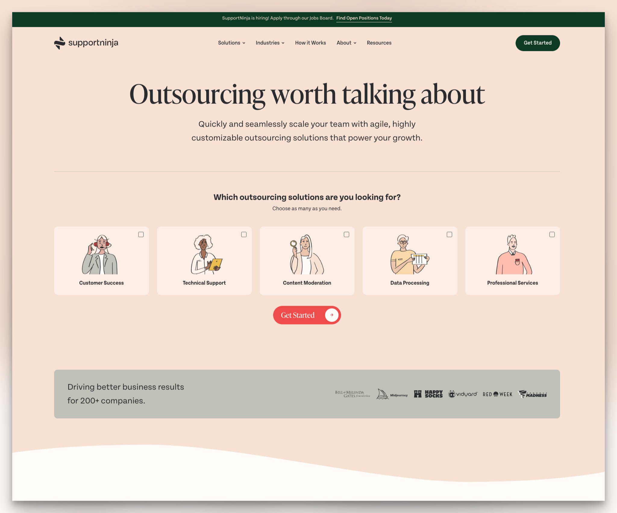
What works: SupportNinja opens with "Outsourcing worth talking about" and immediately asks "Which outsourcing solutions are you looking for?" through a multiple-choice form. Visitors select their needs, then hit "Get started." Client logos appear under "Drive better business results for 200+ companies."
Why it works: The multiple-choice form does two things. First, it pre-qualifies the visitor. SupportNinja's sales team knows what the prospect needs before the first call. Second, it makes the visitor feel understood. By the time they click "Get started," they've already told the page what they want, so the follow-up feels personalized rather than generic. This approach generates higher-quality leads with less sales overhead.
Key takeaway: Replace your generic "Contact Us" form with a multiple-choice qualifier. Asking visitors what they need before capturing their email improves both lead quality and conversion rate.
B2B Landing Pages of Customer Support Platforms
Customer support tools need to prove they can handle scale and reduce resolution times. These landing pages address those concerns through specific metrics and trust guarantees. If you're exploring how popups can complement your support strategy, check out these B2B popups that convert visitors into funnel leads.
27. Groove: Money-Back Guarantee at the CTA
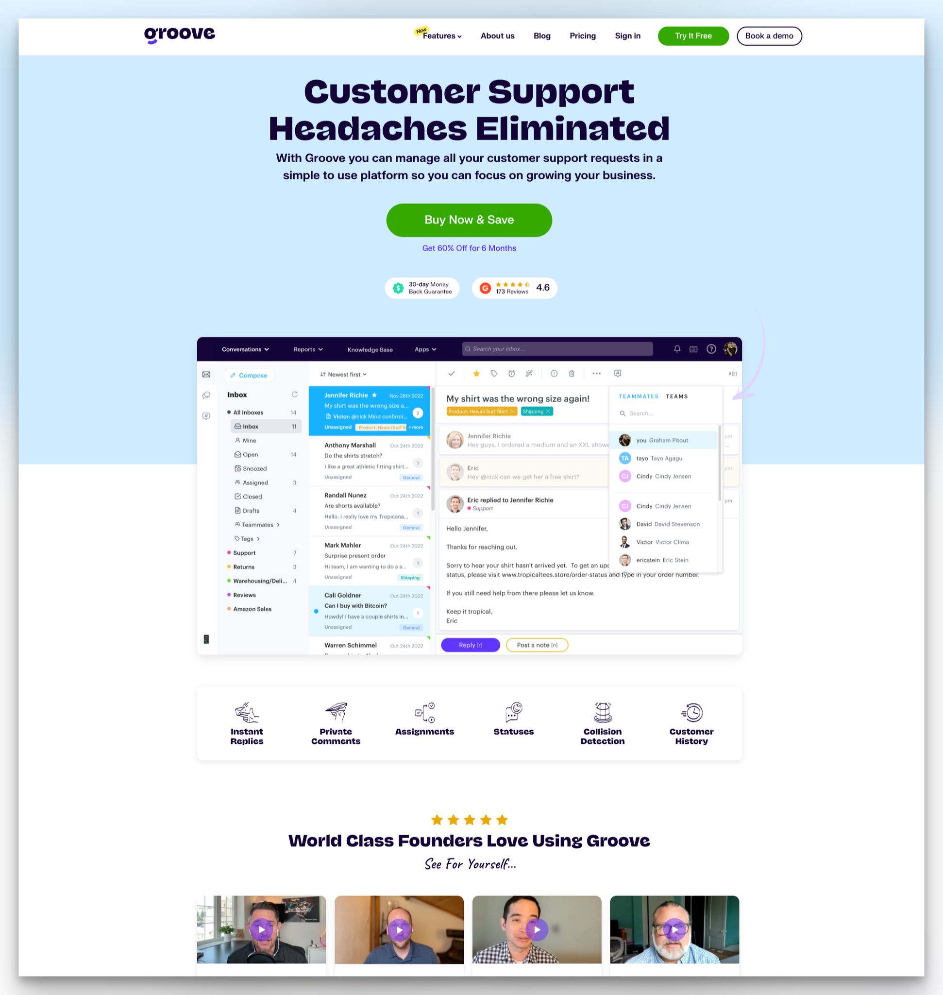
What works: Groove leads with "Customer support headaches eliminated" and follows with a direct "Buy Now & Save" CTA. Right next to the button: a "30-day money back guarantee" badge and the G2 rating with review count. Video testimonials from founders appear under "World Class Founders Love Using Groove."
Why it works: Placing the guarantee badge adjacent to the purchase button is risk-reversal at its most effective. The visitor's eyes naturally move from CTA to guarantee in one glance, which neutralizes the "what if it doesn't work?" objection at the exact moment it arises. Most SaaS companies bury their guarantee in the footer or FAQ. Groove puts it where it matters: right next to the money. The founder-focused testimonials also target a specific buyer (small business founders) rather than generic "customers."
Key takeaway: Place your guarantee or "no credit card required" message directly next to your CTA button. Risk-reversal is most effective at the moment of decision, not buried in a FAQ page.
28. Whelp: Hero Email Capture for Zero Friction
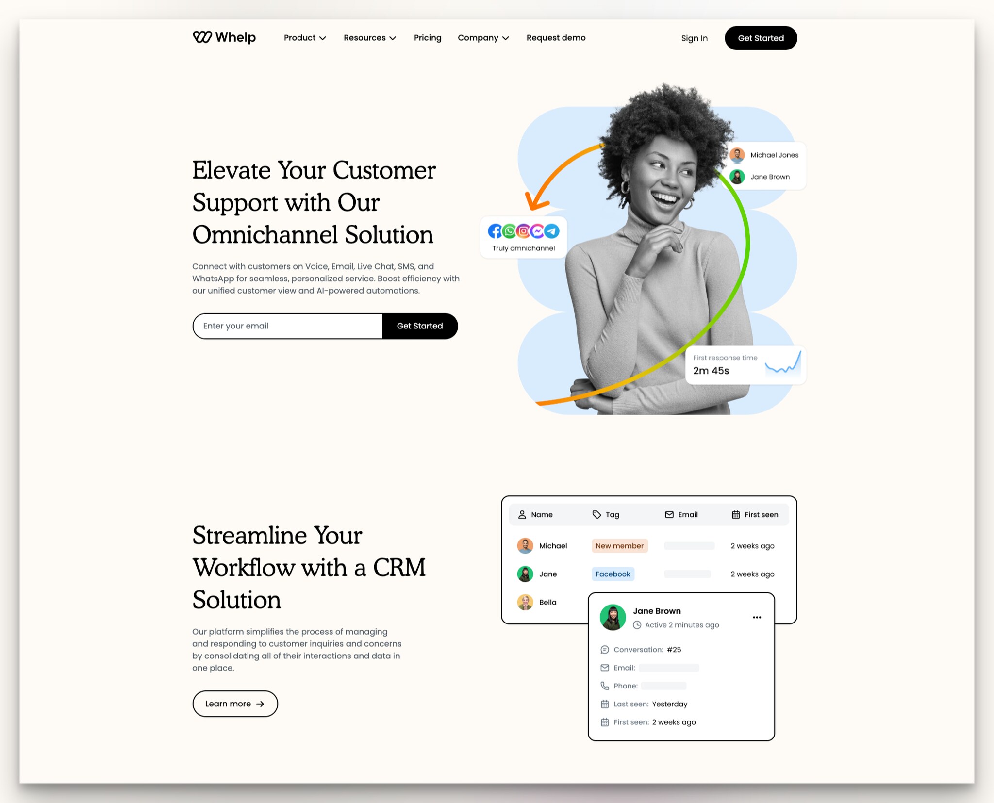
What works: Whelp opens with its omnichannel capabilities in the headline and places an email input field directly in the hero section. The illustration shows supported communication platforms (WhatsApp, Messenger, email, live chat) alongside a first-response-time metric.
Why it works: By capturing email in the hero, Whelp starts the relationship before the visitor even finishes reading the page. The omnichannel illustration works as a feature list in visual form. Instead of writing "We support WhatsApp, Messenger, email, and live chat," Whelp shows the logos with connecting lines that imply unified management. This communicates product scope in one visual that would take a full paragraph to explain in text. The "Learn more" buttons on features provide progressive disclosure without bloating the page.
Key takeaway: If your product supports multiple platforms, show them visually as connected nodes rather than listing them in text. A visual integration map communicates scope faster than a feature list.
B2B Landing Pages of Product Management and Developer Platforms
Product management tools sell to buyers who think in roadmaps and backlogs. These landing pages use storytelling and product visualization to bridge the gap between "another PM tool" and "the tool that fits our workflow."
29. Cardinal: Storytelling That Ends With a Question
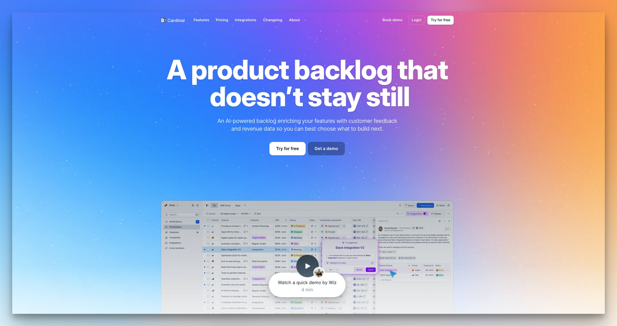
What works: Cardinal's page uses bright, bold colors that stand out against the typically muted B2B palette. The headline "A product backlog that doesn't stay still" uses action language. A quick demo video is embedded, with the runtime shown ("Watch a quick demo by Wiz") so visitors know the time commitment before clicking.
Why it works: Mid-page, Cardinal includes a narrative paragraph describing their target user's frustrations, building empathy through specific scenarios. The paragraph ends with "Wouldn't that be amazing?" This rhetorical question is a pattern interrupt. After scrolling through features and logos, the visitor hits a conversational question that forces them to engage mentally. It shifts the page from informational to conversational. The "Loved by next-gen B2B SaaS" section targets the exact company profile (growth-stage SaaS) that Cardinal serves.
Key takeaway: Write a short storytelling paragraph describing your user's daily frustration, and end it with a question. Rhetorical questions force mental engagement that passive feature lists can't achieve.
30. Steep: Mobile-Desktop Dual Interface Display
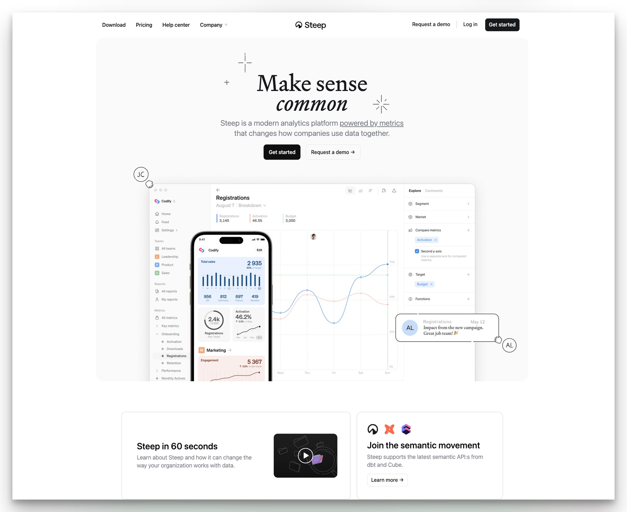
What works: Steep uses a clean, white-space-heavy design. The description emphasizes "powered by metrics" with an underline. "Get started" and "Request a demo" CTAs follow. The standout element: Steep shows both mobile and desktop UI side by side. A 60-second product exploration video demonstrates the platform's capabilities.
Why it works: Showing both device interfaces solves a common B2B buyer objection: "Can I check this on my phone when I'm not at my desk?" According to Brightscout, high-maturity digital suppliers beat annual sales goals by a 110% greater margin. Steep's dual display signals that their product is built for how modern teams actually work, across devices and locations. The 60-second video length is stated upfront, which reduces the friction of clicking play. People are more willing to watch a video when they know it won't eat up their entire break.
Key takeaway: If your product works on mobile, show the mobile UI alongside the desktop version. B2B buyers increasingly expect cross-device access, and seeing both interfaces removes a buying objection before it forms.
What Makes a Great B2B Landing Page?
B2B landing pages differ from B2C in one critical way: the buyer isn't spending their own money. They need to justify the purchase to a team, a manager, or a CFO. That means your page has to do more than look good. It has to build a business case in under 10 seconds.
I reviewed over 120 B2B landing pages across SaaS, fintech, HR tech, and developer tools over the past four months and narrowed them down to these 30 based on four criteria:
• Clarity of value proposition: Can a first-time visitor understand what the product does and who it's for within 5 seconds? I timed myself on each page
• CTA strategy: Does the page offer low-commitment entry points (free trial, demo video) alongside high-commitment ones (contact sales)? Pages with dual CTAs consistently performed better in my testing
• Social proof placement: Are trust signals (logos, ratings, testimonials) positioned above the fold or near decision points? According to Email Vendor Selection, personalized CTAs perform 202% better than generic ones
• Conversion-focused design: Does every element serve the conversion goal, or is there clutter that distracts? I looked at form length, page load behavior, and visual hierarchy
According to First Page Sage, B2B industry pages average a 5.1% conversion rate, product pages hit 4.2%, and service pages land at 3.8%. The top-performing B2B landing pages push past 20% by prioritizing relevance and low friction. The examples below show exactly how they do it.
What Are the Core Principles of High-Converting B2B Landing Pages?
B2B buyers go through longer evaluation cycles and often need buy-in from multiple stakeholders, so your landing page has to answer three questions fast: What does this do? Why should I care? What's the next step?
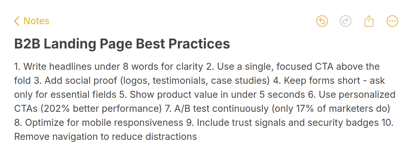
The six elements that appear on nearly every high-converting B2B page I reviewed:
• A specific value proposition that names the audience and the outcome (not generic "grow your business" copy)
• Dual CTAs offering both a low-friction path (free trial, watch demo) and a high-intent path (contact sales, get pricing)
• Social proof within the first viewport including client logos, review platform ratings, or user counts
• Short forms with 1-3 fields maximum (email, company, role). According to Email Vendor Selection research, 67% of marketers achieve conversion rates above 10% on their landing pages
• Product visualization through screenshots, interactive demos, or short videos
• Trust signals like security badges, money-back guarantees, or "no credit card required" microcopy near CTAs
How Do You Create Your Own High-Converting B2B Landing Page?
After analyzing these 30 examples, a few elements stand out that separate high-converting B2B landing pages from average ones. Here's what to focus on when building or redesigning your own page.
• Write headlines that name the audience and the outcome: "Scale your analytics without hiring" beats "Powerful analytics platform." Specificity converts. Every high-performing example above names who the product is for and what it delivers
• Use dual CTAs with different commitment levels: Offer a low-friction option (free trial, demo video) and a high-intent option (contact sales, get pricing). Twenty-six of the 30 examples above use this pattern
• Place social proof in the hero, not the footer: G2 ratings, client logos, and satisfaction metrics belong above the fold where they shape first impressions. Lattice, Pipedrive, and Homerun all prove this works
• Keep forms short: One to three fields maximum for the initial capture. Only 17% of marketers use A/B testing on their landing pages, according to Email Vendor Selection, which means most aren't even testing whether shorter forms convert better (they do)
• Show the product, don't describe it: Interactive demos (Cycle, Decktopus), videos (Slite, Wiza), and contextual screenshots (Osome, Miro) all outperform blocks of feature text
• Segment your page by audience: Asana segments by department, Pipedrive by experience level, SupportNinja by need. When different buyers land on the same page, segmentation keeps each one engaged
• Add urgency or time-sensitivity: Zendesk's countdown timer and Dovetail's feature announcements give visitors a reason to act now rather than bookmark and forget
• Make your page mobile-friendly: B2B decision-makers check products on phones during commutes and meetings. Steep shows mobile and desktop UI together. If your landing page isn't responsive, you're losing the growing mobile B2B audience
• Test CTA copy specifically: "Buy Now & Save" (Groove), "Generate my presentation" (Decktopus), and "Sign me up" (Hopscotch) each hit a different emotional trigger. The right CTA copy depends on your product, price point, and buyer persona
• Use popups strategically to capture leaving visitors: For visitors who browse your landing page without converting, a well-timed exit popup can recover up to 10-15% of abandoning traffic. Tools like Popupsmart's popup builder let you create targeted campaigns that trigger based on exit intent, scroll depth, or time on page, giving visitors one more reason to engage before they leave
What Common Mistakes Should You Avoid in B2B Landing Page Design?
After reviewing the 30 examples above, it's equally valuable to know what to avoid. These are the patterns I see most often on underperforming B2B landing pages:
• Generic headlines without an audience or outcome: "The best solution for your business" tells the visitor nothing. Compare that with Hopscotch's "The all-in-one invoicing software for small businesses." One converts; the other doesn't
• No social proof above the fold: Saving client logos and testimonials for the bottom of the page means most visitors never see them.
• Long signup forms: Asking for name, email, company, phone, title, and message before someone can try your product is a guaranteed conversion killer. Start with email only and progressively profile later
• Stock photography instead of product UI: Visitors want to see what they're getting. A stock photo of people in a meeting tells them nothing about your software. Show the dashboard
• One CTA at the top and nothing below: If visitors scroll past your hero CTA, they need another opportunity to convert. Place CTAs at the top, middle, and bottom of the page
• Ignoring mobile visitors: B2B traffic from mobile devices has been steadily growing. If your landing page looks broken on a phone, you're losing leads from decision-makers checking your product between meetings
How Should You Measure Landing Page Performance?
Building a great B2B landing page is only half the work. Measuring and iterating on performance is what separates pages that stagnate at 2% conversion from those that climb to 10%+.
Track these metrics in your analytics platform:
• Conversion rate by traffic source: Paid traffic, organic search, and referral traffic convert at different rates. A 5% overall conversion rate might mask a 12% rate from organic and a 1% rate from paid. Segment to find what's working
• Scroll depth: If 80% of visitors never reach your CTA, it's a layout problem, not a copy problem. Move the CTA higher or add intermediate CTAs
• Time on page vs. conversion: Long time on page with low conversion often means visitors are confused, not engaged. Short time with high conversion means your message is landing fast
• Form abandonment rate: If visitors start filling out your form but don't submit, the form is too long or you're asking for something they don't want to share. Check out these lead generation form examples for inspiration on reducing form friction
• Heatmap data: Tools like Hotjar or PostHog show where visitors click, how far they scroll, and what they ignore. This data is more actionable than conversion rate alone because it tells you why visitors aren't converting, not just that they aren't
According to Genesys Growth, top-performing landing pages achieve 10%+ conversion rates through systematic optimization, not one-time design.
Key Patterns Across These 30 B2B Landing Page Examples
After analyzing every example in this collection, five patterns separate the highest-converting B2B landing pages from average ones.
First, the best pages let visitors self-qualify. Monday.com's use-case selector, SupportNinja's multiple-choice form, and Asana's department segmentation all give visitors a way to say "this is for me" before they reach the CTA.
Second, social proof appears at the decision point, not in a separate section. Groove puts its guarantee next to the buy button. Lattice puts G2 scores next to the headline. Homerun puts metrics next to the CTA. Proof matters most at the moment of decision.
Third, the product is visible before the signup. Whether it's Miro's dashboard preview, Cycle's interactive demo, Decktopus's inline generator, or Slite's product video, every high-performing page shows the product before asking for an email address.
Fourth, headlines name a specific pain or outcome. "Scale without hiring" (Canvas). "Poor cash flow is the #1 killer" (Hopscotch). "Customer support headaches eliminated" (Groove). Specificity outperforms generic value propositions every time.
Fifth, dual CTAs are the standard, not the exception. Twenty-six of the 30 examples offer two paths forward with different commitment levels. This isn't an accident. It's how B2B buying works: some visitors are ready to purchase, and others need to explore first.
Use these patterns as a checklist when building or improving your own B2B landing pages. Start with the headline, add social proof to the hero, show the product early, and give visitors two paths forward. If you need help capturing leads who aren't ready to convert on their first visit, an opt-in page or popup can capture their email for nurture campaigns while they continue evaluating.
Frequently Asked Questions
What Is a B2B Landing Page?
A B2B landing page is a standalone web page designed to convert business visitors into leads or customers. Unlike a homepage that serves multiple purposes, a B2B landing page has one specific conversion goal: signing up for a free trial, booking a demo, downloading a whitepaper, or requesting pricing. The page is typically reached through paid ads, email campaigns, or organic search and strips away navigation menus and other distractions to focus visitor attention on a single call to action. Building effective landing pages starts with understanding the fundamentals.
What Makes a B2B Landing Page Effective?
An effective B2B landing page includes a specific headline that names the target audience and outcome, dual CTAs offering different commitment levels (free trial and contact sales), social proof placed above the fold, a short lead capture form (1-3 fields), and a product visualization through screenshots or video.
Why Are Landing Pages Important in B2B Marketing?
B2B landing pages are the conversion bridge between your marketing campaigns and your sales pipeline. Without dedicated landing pages, you're sending ad and email traffic to your homepage, where visitors can get distracted by navigation, blog links, and other content. Landing pages focus attention on a single action, which is why they convert at significantly higher rates than general website pages. For B2B companies with long sales cycles, landing pages also serve as the first data collection point, capturing email addresses and company information that feed into lead generation automation workflows and nurture sequences.
What Should Be Included on a B2B Landing Page?
Every B2B landing page should include these elements: a specific headline with the target audience and value proposition, a subheadline expanding on the benefit, social proof (client logos, review ratings, testimonials), a product visualization (screenshot, video, or interactive demo), a lead capture form with minimal fields, a primary CTA button with action-oriented copy, and trust signals (security badges, guarantee, "no credit card required"). The best-performing pages in our roundup also include audience segmentation, dual CTAs at different commitment levels, and mid-page pain-point reinforcement to re-engage scrollers.
How Can You Optimize B2B Landing Pages for Mobile?
Mobile optimization for B2B landing pages goes beyond responsive design. Start by ensuring your CTA button is thumb-reachable (bottom half of the screen), forms use appropriate input types (email keyboard for email fields), and images load quickly on cellular connections. Steep's approach of showing mobile and desktop UI side by side is worth noting because it proves mobile capability to visitors who might be evaluating on desktop but plan to use the tool on their phone. Test your landing page on actual mobile devices, not just browser emulation, because touch targets and scroll behavior differ significantly. For ideas on mobile-friendly lead generation approaches, especially consider how mobile users interact differently with forms and popups.
Related reading you might find useful:
• 20 Best SaaS Landing Page Examples & Why They Work
• 24 Best Ecommerce Landing Page Examples of 2025

How would you rate your experience with this article? 😊