ChatGPT
 Perplexity
 Claude
 Grok
Grok Google AI Mode
A modal is what you reach for when one message has to come first: an announcement, a product promotion, a form you want filled in. Vue modal popups cover all three, and you can put them to work on your sales conversions.
This guide builds one step by step. Everything below was checked against Vue 3.5.43, the current stable release on 1 October 2026. Vue 3.6 is still a release candidate.
What You’ll Need to Create Vue Modal Popups
What you'll need:
• Node.js 22.18 or later and npm installed on your machine (the minimum create-vue asks for in October 2026)
• A Vue 3 project created with npm create vue@latest, which scaffolds a Vite project. Vue CLI is in maintenance mode, so don't start new projects on it
• Vue 3.5 or later for the main example (it uses defineModel, useTemplateRef and useId); a version of the script for Vue 3.0 to 3.4 is included
• Basic familiarity with Vue single-file components (.vue files)
• Time estimate: 30 minutes for a basic modal, 2 hours for full customization
• Skill level: Beginner-friendly (Steps 1-4), Intermediate (Steps 5-7)
value/input v-model and event-bus patterns don't run on Vue 3. The Vue 2 to Vue 3 section maps the old code to the new.Quick overview of the process:
1. Understand what Vue modals are and when to use them
2. Set up your Vue 3 project environment
3. Build the core modal component from scratch
4. Add open/close triggers and transitions
5. Customize styling, positioning, and accessibility
6. Explore ready-made modal examples and templates
7. Integrate BootstrapVue for advanced modal features
8. Create modals with no-code tools if you don't want to write code
What is a Modal in Vue.js?
A modal in Vue.js is a UI component that renders as an overlay on top of the current page, blocking interaction with the background until the user takes action. Unlike non-modal dialogs (like tooltips or dropdowns), a modal forces a decision before the user can continue browsing.
Vue makes modals easy to build because of its reactive data binding. Toggle one boolean and the modal appears or disappears; you never touch the DOM by hand.
| Modal dialog | Non-modal dialog | |
|---|---|---|
| Background page | Blocked (inert) until the dialog closes | Stays usable |
| User action | Required: confirm, submit or dismiss | Optional: the user can ignore it |
| Typical use | Forms, confirmations, alerts | Notifications, tooltips, slide-ins |
| Backdrop overlay | Yes | No |
| HTML | <dialog> opened with showModal() |
<dialog> opened with show(), or a positioned element |
Here's when modals make sense in a Vue.js application:
• Newsletter signups and lead capture forms that collect emails at high-intent moments
• Login and sign-in flows that keep users on the same page
• Confirmation dialogs ("Are you sure you want to delete this?") before destructive actions
• Product announcements for time-sensitive promotions or feature updates
• Feedback forms that gather input without sending anyone to another page
According to Vue School's 2025 year-in-review, Vue.js adoption continues to grow across both enterprise and startup teams. So a Vue modal component is worth learning to build well, whatever else your stack runs.
The key difference between a modal and a standard popup is user flow control. A Bootstrap popup might slide in from the corner, but a modal demands attention with a backdrop overlay. In Vue, both are built as components, but modals carry accessibility requirements that standard popups don't. The same split applies outside Vue: our guide on how to create modal popups covers plain HTML, CSS and Tailwind versions.
How to Build a Vue Modal Popup
This section walks through building a Vue 3 modal component from scratch. You'll create a reusable modal that accepts content via slots, closes on backdrop click and Escape, returns focus to the button that opened it, and animates in and out.
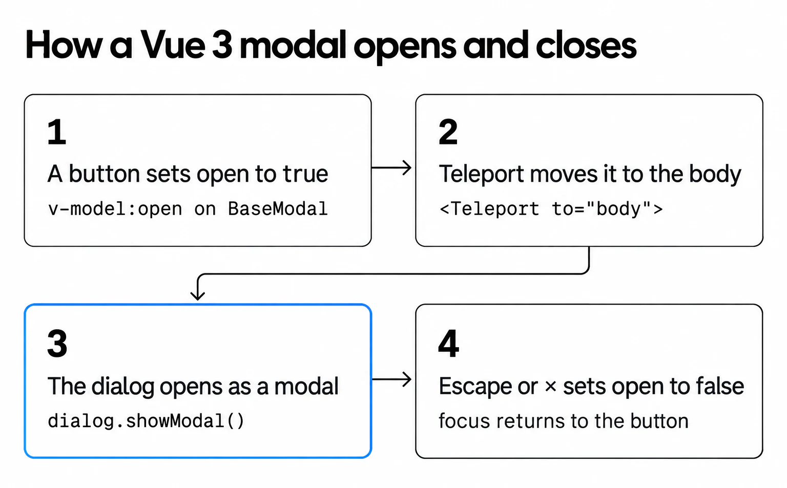
Two choices shape the code. The open state lives in the parent as a ref and reaches the modal through v-model:open, so the parent always knows whether the modal is open. The markup is a native <dialog>: opened with showModal(), it sits above everything else on the page, makes the background inert, moves focus inside and turns Escape into a cancel event, which is most of the accessibility work done for you (MDN's dialog reference lists the details).
Step 1: Create the Modal Component File
Start with a component file of its own. It's your reusable modal wrapper, and it handles the backdrop overlay, the content container and the close behavior.
1. In your Vue project, navigate to src/components/
2. Create a new file called BaseModal.vue
3. Add the <script setup> block with a defineModel('open') call, which declares the open prop and the update:open emit for you
4. Add the <template> block: a <Teleport to="body"> wrapping a <Transition>, wrapping a <dialog> with the content inside it
5. Use v-if="open" on the <dialog> to conditionally render the entire modal
Here is the whole component. The script and template come first; the styles are in Step 3.
<!-- src/components/BaseModal.vue (Vue 3.5+) -->
<script setup>
import { watch, useTemplateRef, useId } from 'vue'

defineProps({
  title: { type: String, required: true }
})

// v-model:open in the parent. defineModel declares the prop and the emit.
const open = defineModel('open', { type: Boolean, default: false })

const dialog = useTemplateRef('dialog')
const titleId = useId()
let opener = null

// After Vue has rendered the <dialog>, open it as a modal.
watch(open, (isOpen) => {
  if (isOpen) {
    opener = document.activeElement
    dialog.value?.showModal()
  }
}, { flush: 'post', immediate: true })

function close() {
  open.value = false
}

// Runs when the leave transition ends: send focus back to the trigger.
function restoreFocus() {
  opener?.focus()
  opener = null
}
</script>

<template>
  <Teleport to="body">
    <Transition name="modal" @after-leave="restoreFocus">
      <dialog
        v-if="open"
        ref="dialog"
        class="modal"
        :aria-labelledby="titleId"
        @cancel.prevent="close"
        @close="close"
        @click.self="close"
      >
        <div class="modal-panel">
          <h2 :id="titleId" class="modal-title">{{ title }}</h2>
          <slot />
          <div v-if="$slots.footer" class="modal-footer">
            <slot name="footer" :close="close" />
          </div>
          <button type="button" class="modal-close" aria-label="Close" @click="close">×</button>
        </div>
      </dialog>
    </Transition>
  </Teleport>
</template>
<!-- src/components/BaseModal.vue (Vue 3.0–3.4): same template -->
<script setup>
import { ref, watch } from 'vue'

const props = defineProps({
  open: { type: Boolean, default: false },
  title: { type: String, required: true }
})
const emit = defineEmits(['update:open'])

const dialog = ref(null) // matches ref="dialog" in the template
const titleId = `modal-title-${Math.random().toString(36).slice(2)}`
let opener = null

watch(() => props.open, (isOpen) => {
  if (isOpen) {
    opener = document.activeElement
    dialog.value?.showModal()
  }
}, { flush: 'post', immediate: true })

function close() {
  emit('update:open', false)
}

function restoreFocus() {
  opener?.focus()
  opener = null
}
</script>
Then use it from any parent. The open state is one ref:
<!-- App.vue -->
<script setup>
import { ref } from 'vue'
import BaseModal from './components/BaseModal.vue'

const showSignup = ref(false)
</script>

<template>
  <button type="button" @click="showSignup = true">Get 10% off</button>

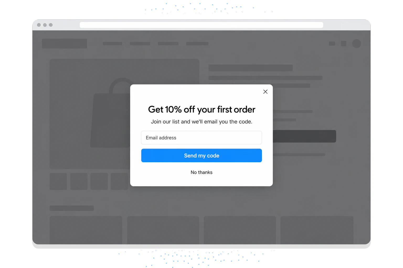
  <BaseModal v-model:open="showSignup" title="Get 10% off your first order">
    <p>Join our list and we'll email you the code.</p>
    <form @submit.prevent="showSignup = false">
      <label for="signup-email">Email address</label>
      <input id="signup-email" type="email" autocomplete="email" required autofocus />
      <button type="submit">Send my code</button>
    </form>
  </BaseModal>
</template>
With v-model:open, the parent opens and closes the modal by toggling one ref. The autofocus on the email field tells showModal() where to put focus; without it, focus lands on the first focusable element in the dialog.
You'll know it's working when: Importing BaseModal into any parent component and binding v-model:open="showSignup" toggles the overlay without errors in the browser console.
Watch out for:
• Forgetting the emit declaration: In the version for Vue 3.0 to 3.4, if you define the open prop but skip defineEmits(['update:open']), the modal still works, but Vue 3 logs a warning about "extraneous non-emits event listeners." Declare the emit to silence it and keep the component's contract explicit. defineModel does this for you.
• Using v-show instead of v-if: v-show keeps the modal in the DOM at all times (hidden with CSS). For modals that contain forms or fetch data on mount, this means unnecessary network requests and memory usage. Use v-if unless you need instant show/hide performance without remounting.
Pro tip: Keep the Teleport wrapper even though a modal <dialog> already renders above everything. Mounting the modal directly to document.body keeps it out of parents with overflow: hidden, transform or their own stacking context, so it inherits only the page's base styles, and it's what you need if you ever fall back to a plain <div role="dialog">.
Step 2: Add the Backdrop Overlay and Close Logic
The backdrop does two jobs. It dims the page behind the modal, and it gives users something to click when they want it gone. Get the close logic right here and you avoid the most common modal bugs.
1. Add a @click.self handler on the <dialog> that calls close(). With the dialog's own padding set to 0 and the panel filling it, a click on the dimmed backdrop reaches the dialog itself, and a click on the panel doesn't
2. The .self modifier is the important part. Clicks on the modal's content box no longer close it by accident; only clicks on the backdrop do
3. Add a close button inside the content area that calls the same close() function, with aria-label="Close" so a screen reader announces it
4. Handle Escape with @cancel.prevent="close". The browser fires cancel when the user presses Escape; preventing it hands the decision to Vue, which sets open to false and plays the leave transition. The extra @close="close" keeps Vue in sync if the browser closes the dialog anyway (Chrome does when Escape is pressed twice with no other interaction in between)
5. Style the backdrop with the ::backdrop pseudo-element, for example background: rgb(0 0 0 / 0.5), in the scoped style block
You'll know it's working when: clicking the dark backdrop area closes the modal, clicking inside the white content box does not close it, and pressing Escape closes it from anywhere on the page.
Watch out for:
• Missing .self modifier on backdrop click: Without .self, any click inside the modal content bubbles up and triggers the close handler. The classic symptom is a form modal that closes every time someone clicks a text input, because .self is missing on the parent element.
• Escape listener memory leak: If you build the modal as a <div role="dialog"> instead, you need your own Escape listener. If you add document.addEventListener('keydown', handler) in onMounted but forget to remove it in onUnmounted, you'll stack duplicate listeners every time the modal opens. After 10 open/close cycles, Escape triggers 10 close events simultaneously.
Pro tip: For the <div> version, use the onKeyStroke composable from VueUse instead of raw event listeners. It handles cleanup automatically and gives you a cleaner API: onKeyStroke('Escape', () => { open.value = false }).
Step 3: Add Transition Animations
Raw show/hide feels abrupt. Vue's built-in <Transition> component lets you add enter and leave animations without any external libraries.
1. Wrap your modal template in <Transition name="modal"> (it's already in the component above)
2. Define CSS classes for the transition stages: .modal-enter-from, .modal-enter-active, .modal-leave-to, and .modal-leave-active
3. Set the backdrop to fade from opacity: 0 to opacity: 1 over 200ms, using the same classes on ::backdrop
4. Set the content box to scale from transform: scale(0.96) to transform: scale(1) over 200ms for a subtle zoom-in effect
5. Use transition: opacity 200ms ease-out, transform 200ms ease-out in the active classes, and drop the scale for visitors who ask for reduced motion
<style>
/* Not scoped: it locks the page behind an open modal */
html:has(dialog.modal[open]) {
  overflow: hidden;
}
</style>

<style scoped>
.modal {
  padding: 0;
  border: none;
  border-radius: 12px;
  width: min(90vw, 480px);
  max-height: 85vh;
  box-shadow: 0 20px 50px rgb(0 0 0 / 0.25);
}
.modal::backdrop {
  background: rgb(0 0 0 / 0.5);
}
.modal-panel {
  position: relative;
  padding: 24px;
}
.modal-close {
  position: absolute;
  top: 8px;
  right: 8px;
  width: 40px;
  height: 40px;
  border: 0;
  background: none;
  font-size: 24px;
  cursor: pointer;
}

/* <Transition name="modal"> */
.modal-enter-active,
.modal-leave-active {
  transition: opacity 200ms ease-out, transform 200ms ease-out;
}
.modal-enter-active::backdrop,
.modal-leave-active::backdrop {
  transition: opacity 200ms ease-out;
}
.modal-enter-from,
.modal-leave-to {
  opacity: 0;
  transform: scale(0.96);
}
.modal-enter-from::backdrop,
.modal-leave-to::backdrop {
  opacity: 0;
}

@media (prefers-reduced-motion: reduce) {
  .modal-enter-from,
  .modal-leave-to {
    transform: none;
  }
}
</style>
The order matters here. Vue adds modal-enter-from when it inserts the <dialog>, the post-flush watcher calls showModal() in the same tick, and Vue swaps the classes on the next frame, so the browser animates from the start state. On close, Vue keeps the dialog in the page until the leave transition ends, then removes it, and @after-leave returns focus.
According to dev.to's Vue 3 modal tutorial, modal dialogs don't have to be complex. Transitions add polish with minimal code.
You'll know it's working when: The modal fades in when opened and fades out when closed, with no flash or jump. Then open and close it quickly a few times. The animation should still finish cleanly when you interrupt it.
Watch out for:
• Transition name mismatch: If your <Transition name="modal"> doesn't match your CSS class prefix (e.g., you write .fade-enter-from instead of .modal-enter-from), the animation won't run but the modal still works. This makes the bug easy to miss in testing.
• Animating display: none: CSS can't transition the display property. If you try using display: none instead of opacity and transform for your hidden state, the exit animation will never play.
Pro tip: Keep modal transition duration under 250ms, animate only opacity and transform, and use an ease-out curve so the modal arrives fast and settles. For more motion ideas, see our guide to animated popups.
How to Customize Vue Modal Popups for Your Site
A working modal is step one. Getting it to match your brand's design system and hold up on real pages takes more work, and the edge cases are where you'll spend the time.
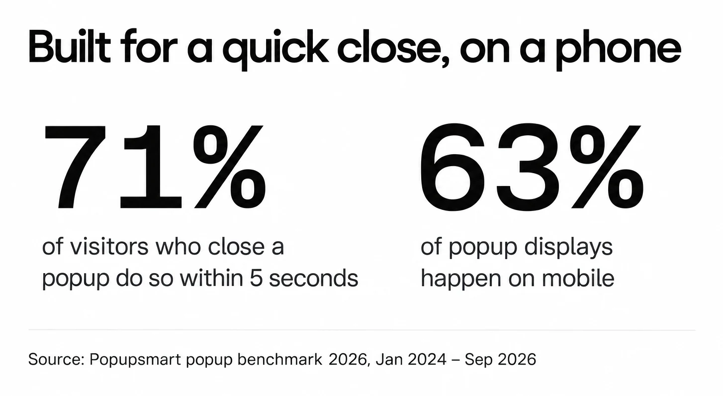
Two numbers from the popups we power explain why the close button and the phone layout deserve the most care: 71% of visitors who close a popup do so within 5 seconds of it appearing, and 63% of popup displays happen on mobile (Popupsmart popup benchmark 2026, January 2024 - September 2026).
Use Slots for Flexible Content
Vue's slot system lets you inject any content into your modal without modifying the base component. Define three named slots: header, default (body), and footer. Each slot should have fallback content so the modal works even when a slot isn't provided. This way, a confirmation dialog uses only the default slot, while a complex form uses all three. The footer slot in BaseModal passes close as a slot prop, so a Cancel button can use <template #footer="{ close }"> without the parent wiring its own handler.
Pass Configuration via Props
Add props for common customization needs: width (default: '500px'), closable (default: true), and overlayClose (default: true). Type them explicitly using Vue 3's defineProps with TypeScript generics or the runtime declaration. Avoid passing style objects as props: they bypass Vue's scoped styling and create specificity conflicts. Use CSS custom properties (variables) instead.
Handle Scroll Locking
When a modal opens, the background page should stop scrolling. The html:has(dialog.modal[open]) rule in Step 3 does it in CSS alone, with no cleanup to forget. If you support older browsers without :has(), set document.documentElement.style.overflow = 'hidden' in the watcher when the modal opens and reset it in restoreFocus(). Older iOS Safari versions also ignored overflow: hidden; there you'll also need to set position: fixed on the body and restore the scroll position when the modal closes.
The same scroll lock works if you're building React popup components. The browser doesn't care which framework opened the modal.
Accessibility Requirements
A <dialog> opened with showModal() already has the dialog role, is treated as modal (the same effect as aria-modal="true"), makes the page behind it inert and moves focus inside. You still owe it two things: a label, through aria-labelledby pointing to the modal title's ID (useId() makes one per instance), and focus returned to the trigger when it closes.
If you build the modal as a <div> instead, add role="dialog" and aria-modal="true" yourself and trap focus with a composable such as VueUse's useFocusTrap, so Tab and Shift+Tab cycle through focusable elements within the modal, not the background page. The WAI-ARIA modal dialog pattern lists the keyboard behaviour to test. As a developer noted on dev.to: "I'll be the first to admit that I have built dozens of these without building in accessible patterns." Don't repeat that mistake.
Watch out for:
• Forgetting focus trap cleanup: If you use a focus-trap composable on a <div> modal and it doesn't deactivate when the modal closes, keyboard navigation on the rest of your page breaks entirely. Always tie focus trap activation to your modal's lifecycle hooks.
• Hardcoding pixel widths: A 500px-wide modal looks great on desktop but overflows on mobile. Use width: min(90vw, 480px) (or max-width: 500px; width: 90%) so the modal shrinks to fit smaller screens. Our mobile popup guide covers phone layouts in more depth.
What Are the Benefits of Using Vue Modal Popups?
Vue modals give frontend teams a reactive, component-based way to handle user interactions that would otherwise need a full page load or a pile of hand-written JavaScript state. Here is what that buys you.
- The state stays in sync. With Vue's reactivity, your modal's open/closed state, form data and validation errors update as they change. Change a variable in the parent component and every child component reflects it at once, without a tangle of event listeners.
- They fit single-page applications. A Vue modal renders inside the existing DOM instead of opening a new browser window, so users stay on the same page and your Vue Router state stays intact.
- You write it once. Build the modal as a Vue single-file component and drop it into any Vue project. Props control the content, events handle the callbacks, and slots take your custom markup, so the core open, close and focus logic lives in one place.
- It costs nothing until it opens. With
v-if, the component isn't in the DOM until something triggers it, which keeps your initial page load fast. On e-commerce sites, where every millisecond of load time affects conversion rates, that conditional rendering is a real advantage.
<dialog> element moved the hard parts of a modal (top layer, inert background, Escape) from your code into the browser. What's left for Vue is the part it's good at: the open state, the content and the transition.Vue Modal Popup Examples and Templates
If you'd rather not write the component yourself, these are the Vue 3 modal libraries you're most likely to run into, with their latest release as listed on npm when we checked them on 1 October 2026.
| Library | Vue version | Latest release (checked 1 Oct 2026) | Best for |
|---|---|---|---|
| Reka UI Dialog | Vue 3.4+ | 2.10.5, September 2026 | Unstyled, accessible dialog you style yourself |
| PrimeVue Dialog | Vue 3 | 5.0.2, September 2026 | Teams already on the PrimeVue component set |
| Nuxt UI Modal | Vue 3 and Nuxt | 4.11.2, September 2026 | Nuxt or Vue projects with Tailwind |
| bootstrap-vue-next BModal | Vue 3.5+ | 1.2.2, September 2026 | Projects already on Bootstrap CSS |
| @kouts/vue-modal | Vue 2 and Vue 3 | 5.0.3 (Vue 3, next tag) and 2.1.13 (Vue 2), November 2025 |
Lightweight, backward-compatible |
| vue-final-modal | Vue 3.2+ | 4.5.5, September 2024 | Existing projects only: no release in two years |
| Jenesius Vue Modal | Vue 3 | 1.11.9, July 2024 | Existing projects only: no npm release since 2024 |
vue-final-modal (Vue 3)
For years this was the best-known Vue 3 modal library. It supports stacking multiple modals, dynamic modal creation via composables, and built-in accessibility, and you use the <VueFinalModal> component with v-model binding. But its last release, 4.5.5, came out on 10 September 2024, and its repository has had no commits since (checked 1 October 2026), so we no longer recommend it for new projects. If you already use it, it still works on current Vue 3.
Jenesius Vue Modal
A routing-style modal library that treats modals as routes. You push and pop modals onto a stack, making it natural for multi-step wizards. Good fit for SaaS applications where modals chain into workflows (e.g., select plan, enter billing, confirm subscription). Its last npm release was 1.11.9 in July 2024, so check the repository's activity before you adopt it.
@kouts/vue-modal
A lightweight option with 124 GitHub stars focused on simplicity. It provides a single <Modal> component with props for title, footer, and size. It works with both Vue 2 and Vue 3, so it suits teams maintaining older codebases that haven't migrated yet. Note the install tag: npm install @kouts/vue-modal still installs the Vue 2 line (2.1.13), so use @kouts/vue-modal@next (5.0.3) on Vue 3.
Nuxt UI Modal
If you're using Nuxt, the Nuxt UI Modal component comes with Tailwind CSS integration, named slots for header/body/footer, and built-in keyboard handling. It's built on Reka UI's dialog and follows the Nuxt UI design system out of the box, and Nuxt UI 4 also runs in plain Vue projects with Vite.
Reka UI and PrimeVue
Reka UI (formerly Radix Vue) gives you an unstyled, accessible Dialog with focus trapping and Escape handling built in, so you bring only the CSS. PrimeVue's Dialog is the styled opposite: a ready-made component for teams already using PrimeVue's forms and tables. Headless UI's Vue package, often recommended in older posts, hasn't had a release since September 2024.
useModal()-style API or a design system, and check its last release date before you add the dependency.How to Integrate BootstrapVue for Advanced Modals
BootstrapVue provides pre-built modal components that follow Bootstrap's design patterns. If your team already uses Bootstrap CSS, it's the fastest way to a production-ready modal without writing the modal logic yourself.
Installation and Setup
1. Install the packages: npm install bootstrap-vue-next bootstrap (for Vue 3 compatibility, use bootstrap-vue-next)
2. Import the plugin in your main.js: import { createBootstrap } from 'bootstrap-vue-next'
3. Register it: app.use(createBootstrap())
4. Import Bootstrap CSS and bootstrap-vue-next CSS in your entry file
5. Use <BModal> component anywhere in your templates with v-model binding
Key BootstrapVue Modal Features
The <BModal> component gives you named slots for title, body, and footer out of the box. Props like size="lg", centered, scrollable, and no-close-on-backdrop handle the most common configuration needs. For Vue 3 projects, bootstrap-vue-next also supports lazy rendering with the lazy prop, which defers DOM insertion until the first open.
You'll know it's working when: the <BModal> component renders with Bootstrap's standard styling (rounded corners, header separator, footer buttons) without any custom CSS.
Watch out for:
• Importing the wrong package: The original bootstrap-vue package only supports Vue 2. For Vue 3, you need bootstrap-vue-next. The API is similar but not identical: some prop names changed.
• CSS conflicts with existing styles: Bootstrap's global styles can override your project's existing typography and spacing. Import Bootstrap's CSS before your project's styles, or use the modular import approach to only include modal-related CSS.
Pro tip: If you only need modals and not the full Bootstrap component library, skip BootstrapVue entirely: you'd ship Bootstrap's CSS and a component library for one feature. Build the custom modal from Steps 1-3 above instead. If you already use Bootstrap without Vue components, our Bootstrap popup guide shows Bootstrap 5.3's own modal.
How to Migrate a Vue 2 Modal to Vue 3
Most Vue modal code on the web was written for Vue 2, and much of the web still runs it: according to W3Techs, version 2 is used by 97.1% of the websites that use Vue.js (30 September 2026). Vue 2 reached end of life on 31 December 2023, so new modal code should use the Vue 3 patterns on the right.
| Vue 2 modal code | Vue 3 replacement |
|---|---|
value prop and input event for v-model |
modelValue/update:modelValue, or defineModel() in 3.4+ |
:visible.sync="show" |
v-model:visible="show" |
An event bus ($on, $off, $once) to open modals from anywhere |
Removed in Vue 3: use props and emits, provide/inject or a Pinia store |
portal-vue to render at the body |
Built-in <Teleport to="body"> |
bootstrap-vue and <b-modal> |
bootstrap-vue-next and <BModal> |
.modal-enter and .modal-leave classes |
.modal-enter-from and .modal-leave-from |
The Vue 3 migration guide lists every breaking change; for a modal, the table above is usually the whole job.
How to Create Vue Modal Popup with Popupsmart
Not every modal needs to be coded. If you're a marketer, product manager, or running a store whose front end is built with Vue.js, a no-code popup builder gets you to a working modal in minutes instead of hours. Popup software tools now handle targeting, A/B testing and analytics, which would take weeks to build yourself.
Popupsmart is a no-code popup builder that works with any website framework, including Vue.js. You design the modal in a visual editor, set targeting rules, and embed it with a single script tag. You don't write a Vue component or change your build. Popupsmart measures its script at about 97 KB, and the free plan covers one website with 5,000 pageviews a month.
Here's how to create a modal with Popupsmart:
1. Create a free Popupsmart account and open the popup builder dashboard. Then, click on “Embed Code”.
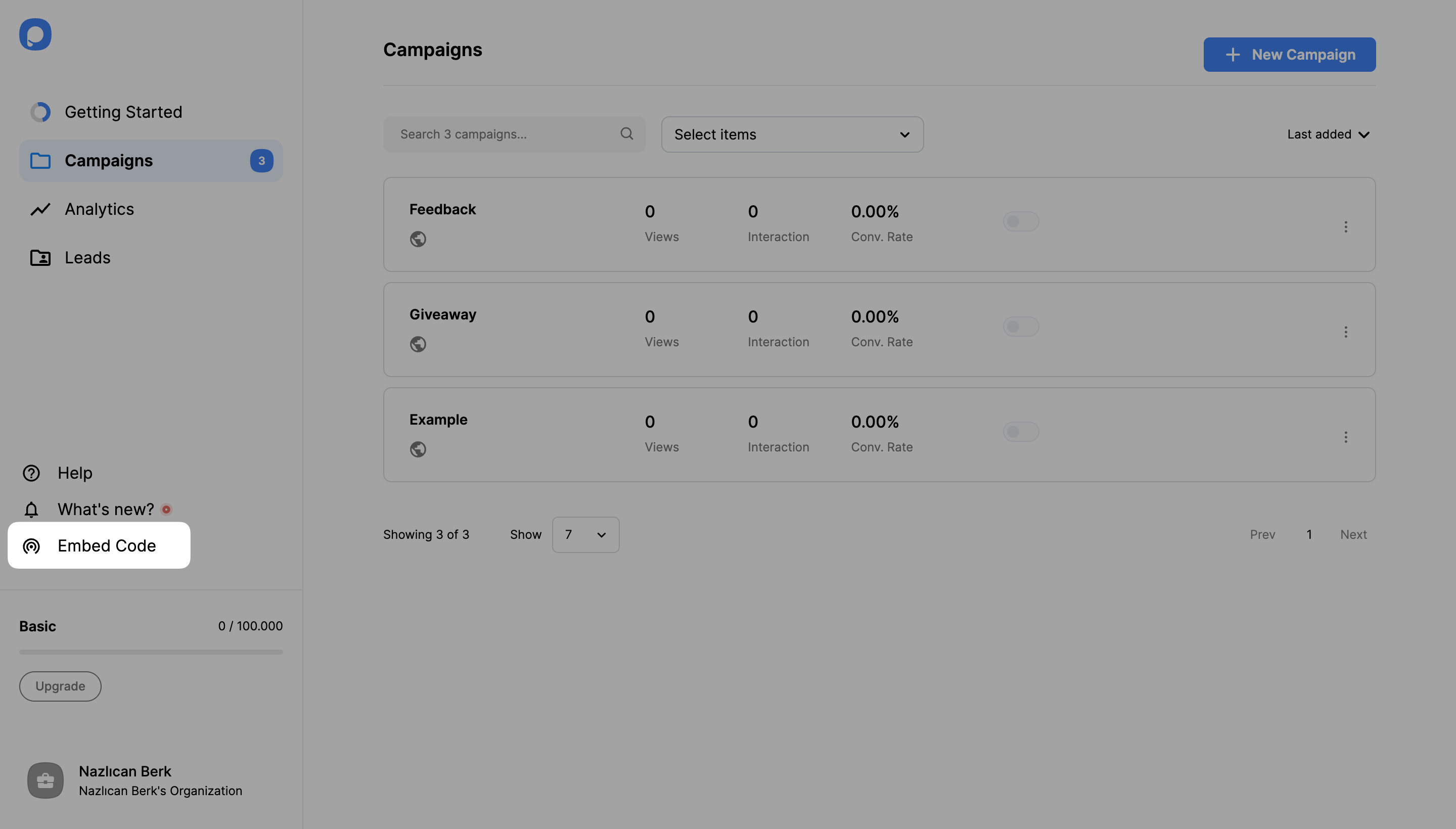
Copy the one-line embed code and paste it into your Vue app's index.html (or your site's global body section), right before the closing </body> tag. In a Vite project, index.html sits in the project root, next to package.json.
onMounted hook. Every remount would add the script again, and Popupsmart's help center warns that the same embed code added more than once may stop working. index.html loads it once for the whole app.For more details on how embed code works, check out our guide: "How to Embed the Code on your Site"
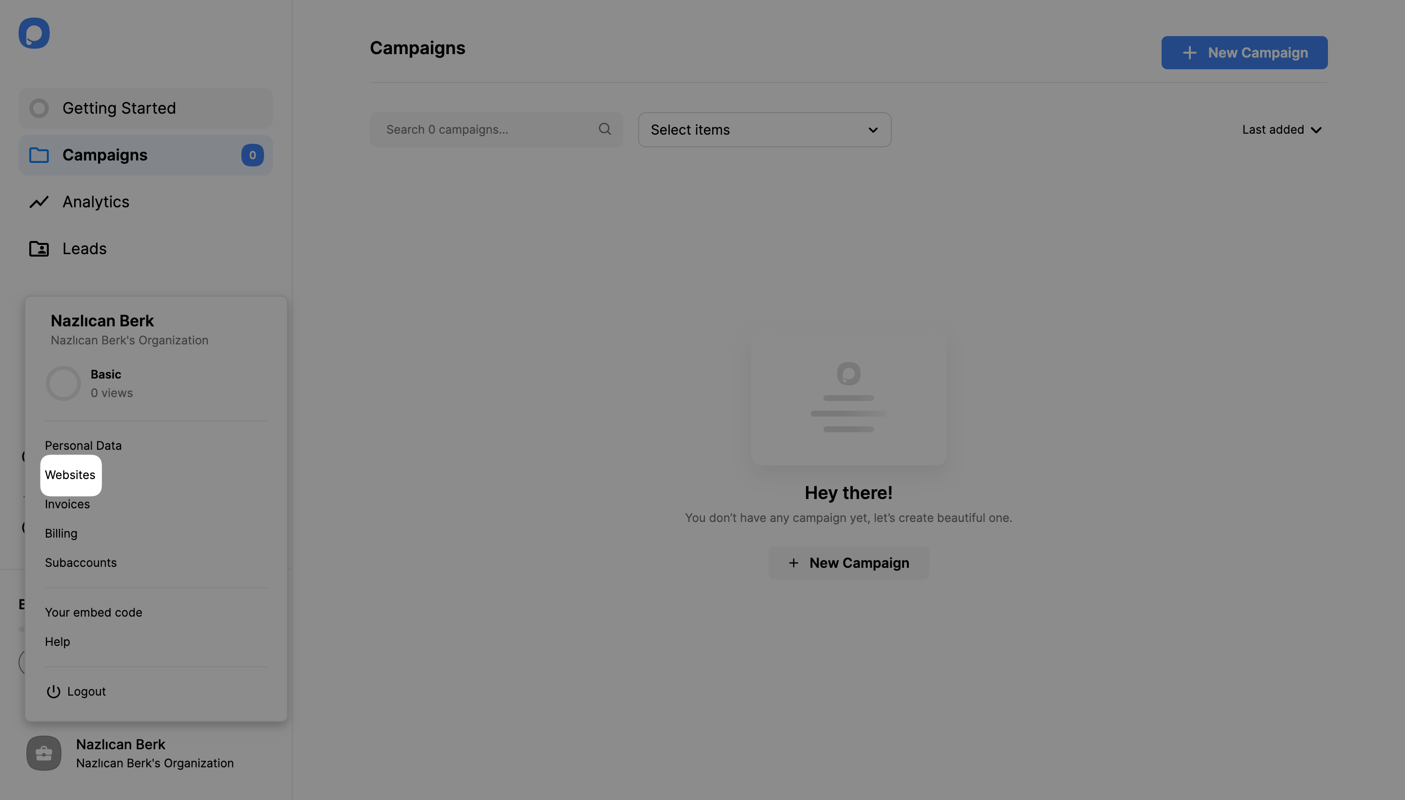
Click your account in the bottom-left corner, then click "Websites."
If you haven’t added a domain to create campaigns for, click on the "New Website" button and enter your website URL. Then click Save.
Also check out our documentation on how to verify your domain.
With the embed code and your domain in place, you can create your first campaign.
2. Click "New Campaign" and select your business objective.
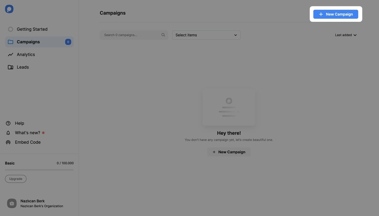
3. Pick an objective like "Show Up Announcement" for a standard modal dialog and choose your popup template from the "Playbook."
4. Customize your modal in the visual editor. Change headlines, images, colors, and call-to-action buttons.
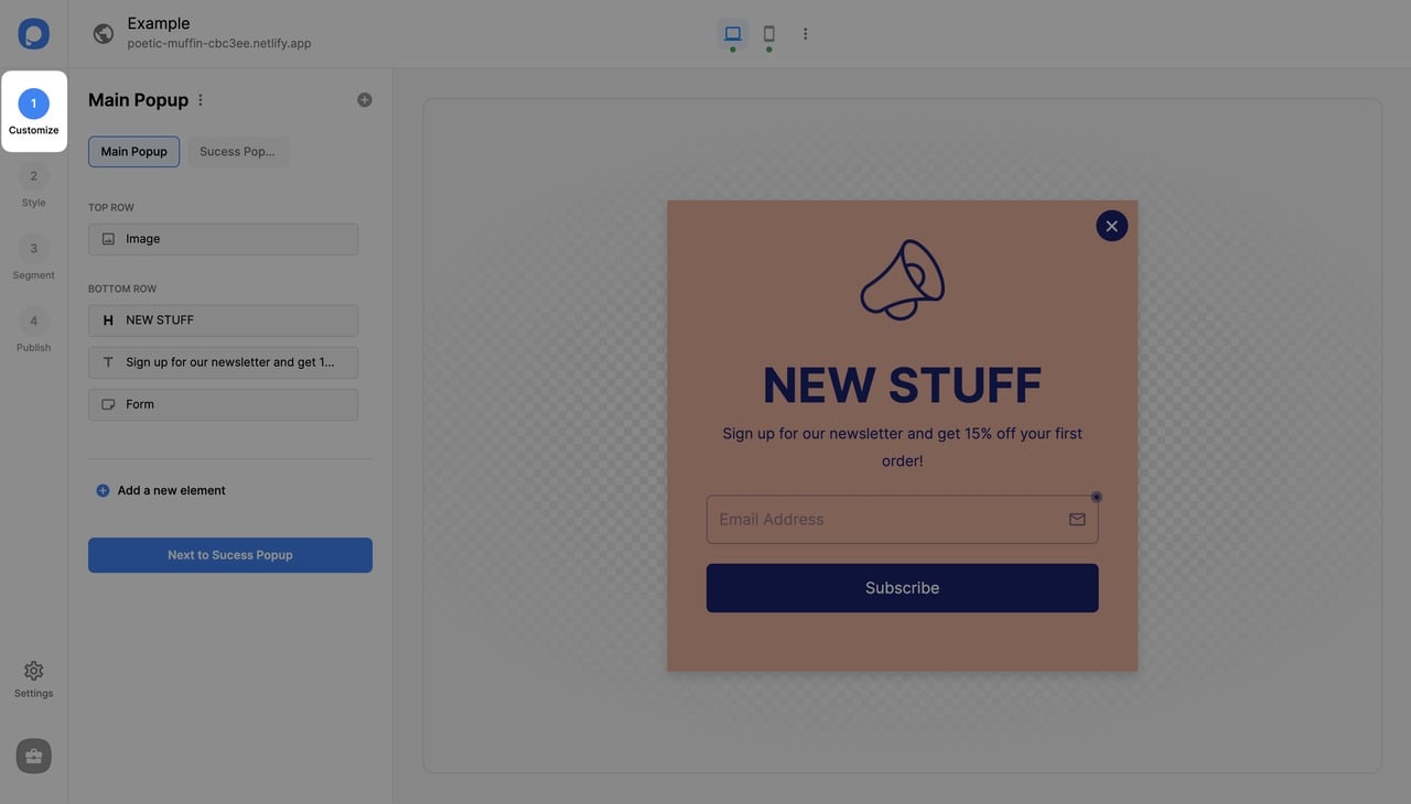
5. Set your targeting rules. Choose which pages show the modal, set trigger actions (exit-intent, scroll percentage, time delay), and define audience segments.
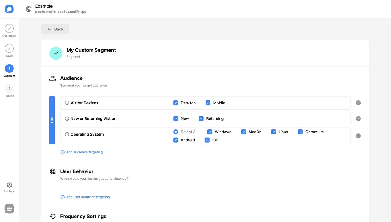
Save & Publish once your popup campaign is ready.
Open it from a Vue button. To show the popup only when someone clicks, turn on On-Click Targeting in the campaign's segment and call the snippet it gives you from a click handler. Vue templates can't reach window directly, so wrap the call in a function (replace 123456 with your campaign ID):
<script setup>
function openOffer() {
  window.ps?.show({ id: 123456 })
}
</script>

<template>
  <button type="button" @click="openOffer">Get 10% off</button>
</template>
Use a <button>, not a <RouterLink> or an <a href>: a link navigates before the popup can open. Our guide to popups that open on a button click covers the on-click setup step by step.
When to code vs. when to use no-code: If your modal contains dynamic data from your Vue app's state (user profile info, cart contents, real-time pricing), code it as a Vue component. If the modal is marketing-driven (announcements, email capture, promotions), use a no-code tool. Mixing both approaches on the same site works fine.
Common Mistakes to Avoid in Vue Modal Development
These mistakes cost the most debugging time in Vue modal code, and they're the ones users complain about.
1. Skipping the Teleport wrapper. Rendering a <div> modal inside a deeply nested component creates z-index stacking context problems. The modal might appear behind a sibling element's positioned parent. Always use Vue 3's <Teleport to="body"> to mount the modal at the document root. This is the single most common issue posted in Vue modal Stack Overflow threads.
2. Not handling multiple modals. When a modal opens another modal (confirm inside edit, for instance), you need a modal stack. Without one, closing the second modal also closes the first. Use a composable or store-based approach to manage multiple active modals independently. Two <dialog> elements opened with showModal() stack in the top layer in the order they were opened, which handles the visual side for you.
3. Forgetting body scroll lock on mobile. Lock scrolling on the root element while the modal is open (the :has() rule in Step 3), and test on a real phone: older mobile Safari versions ignored overflow: hidden on the body. There you need to also set position: fixed on the body, save the current scrollY, and restore it on close. Skip this and your users will scroll the entire page behind the modal on iPhones.
4. Using v-model on the wrong element. A common bug in Vue 3 modal data flow questions is binding v-model directly to a prop inside the child component. Vue 3 doesn't allow mutating props directly. Use defineModel() (Vue 3.4+), or defineEmits and emit the update event, instead of trying to set the prop value.
5. Ignoring accessibility from the start. Adding ARIA attributes, focus trapping, and keyboard navigation as an afterthought is far harder than building them in from step one. Start with a <dialog> opened by showModal() and labelled by its title, or a <div> with role="dialog", aria-modal="true" and a focus trap. Users who rely on screen readers need it in the first release, not a later one.
6. Loading heavy content eagerly. If your modal fetches data or renders a complex form, use v-if rather than v-show so the component only mounts when opened. For modals with images, lazy-load them using the loading="lazy" attribute on img tags inside the modal content.
7. Not returning focus. When the modal closes, keyboard and screen reader users should land back on the button that opened it. Store document.activeElement when the modal opens and focus it again in @after-leave, as BaseModal does.
Final Words About Vue Modal Popups
Building a Vue modal comes down to three things: a component with reactive visibility toggling, proper close/escape handling, and accessibility from day one. Whether you write the component yourself using Vue 3's Composition API, pull in a library like Reka UI or PrimeVue, or use a no-code builder like Popupsmart, the fundamentals stay the same.
Start with Step 1 above, create your BaseModal.vue file and get the basic open/close working. You can add transitions, slots, and customization as your project needs them. Working in another framework? The same pattern carries over to creating a popup in Angular and to React. If you want to skip the code entirely and get a working popup form on your website today, Popupsmart's free plan runs a modal from its embed code.
For design inspiration, explore the full list of popup overlay examples.
Frequently Asked Questions on Vue Modal Popups
What is the difference between a modal and a popup?
A modal blocks interaction with the rest of the page until dismissed. A popup is a broader term that includes any overlay element — tooltips, slide-ins, notification bars, and modals. All modals are popups, but not all popups are modals. In Vue.js, the technical difference is whether you add a backdrop overlay and prevent background scrolling. For a deeper look at the difference between alert boxes and popup windows, the Popupsmart community has a detailed breakdown.
How do I create a popup in Vue?
Create a Vue single-file component with <script setup> and a Boolean open model (defineModel in Vue 3.4 and later). Render a <dialog> inside <Teleport> and <Transition>, call showModal() when it opens, and bind it in the parent with v-model:open toggled by a button. For non-modal popups (tooltips, dropdowns), skip the backdrop and scroll lock. If you prefer working with established UI libraries, creating popups in Angular follows a similar component-based pattern.
Should I use the dialog element for a Vue modal?
Yes, for most modals. A <dialog> opened with showModal() sits above the page, makes the rest of the page inert, moves focus inside and fires a cancel event on Escape, so you write less code than with a <div>. Vue still owns the open state: prevent the cancel event, set your open ref to false and let the <Transition> finish before the dialog is removed.
How do I integrate Bootstrap with Vue modals?
Install bootstrap-vue-next (not the original bootstrap-vue, which is Vue 2 only). Register the plugin in your main.js file and import Bootstrap's CSS. Use the <BModal> component with v-model for open/close state. The component includes built-in header, body, and footer slots, size variants (sm, md, lg, xl), and props for scrollable content. Check the bootstrap-vue-next documentation for the full list of props and events.
What are the best practices for Vue modals in 2026?
Use Vue 3's Composition API with <script setup> for cleaner modal logic. Render modals at the document root with <Teleport>, and prefer the <dialog> element opened with showModal(). Build accessibility in from the start: a labelled dialog, focus moved inside and returned on close, and Escape to close. Keep transition duration under 250ms and respect reduced motion. Use v-if over v-show for modals with heavy content. For marketing modals, a no-code tool like Popupsmart adds targeting and A/B testing without new component code.
Is Vue 2 modal code compatible with Vue 3?
Not directly. Vue 3 changed v-model on components from value/input to modelValue/update:modelValue, replaced the .sync modifier with v-model arguments, removed $on, $off and $once (so event-bus modals stop working), and added <Teleport> in place of portal-vue. Vue 2 reached end of life on 31 December 2023, so a Vue 2 modal should be moved to the Vue 3 patterns. The Vue 3 migration guide covers the breaking changes in detail.
How do I add a Popupsmart popup to a Vue app?
Paste Popupsmart's embed code once, before the closing </body> tag of your app's index.html, not inside a Vue component, then verify your website in Popupsmart and publish a campaign. To open the popup from a Vue button, turn on On-Click Targeting and call window.ps.show with your campaign ID from the button's click handler.