ChatGPT
 Perplexity
 Claude
 Grok
Grok Google AI Mode
Angular ships in 2026 as version 22 (22.2 when we checked in October 2026), and the way you build a popup has changed a lot since Angular 19: standalone components, signals, the @if control flow, zoneless change detection and a new @Service() decorator. You still have the same core question, though: which library do I reach for when I need a modal, a toast, a tooltip, or a side panel inside my app? This guide walks through four ways to build an Angular popup that hold up in production, with full code, version notes, and the trade-offs between them. Every snippet below compiled with ng build and ran in a fresh Angular 22 project on 2 October 2026.
What you'll need before starting:
• Angular CLI 22 installed (npm install -g @angular/cli). New Angular 22 projects are standalone and zoneless by default, and every method below works with both.
• Node.js 22.22.3 or later, or 24.15 or later. The Angular 22 CLI refuses to run on older versions; it rejected Node 24.10 while we built these examples.
• Working knowledge of TypeScript and Angular components (for methods 1-3); none needed for method 4
• Skill level: Beginner to intermediate for code methods; beginner for Popupsmart
Quick overview: the four methods you'll learn:
1. Angular Material (MatDialog): Google's official component library, built by the Angular team. Best for enterprise apps that already use Material Design.
2. Ng-bootstrap (NgbModal): Native Angular widgets built on Bootstrap markup. Best when your design system is Bootstrap-based.
3. PrimeNG (p-dialog): Feature-rich UI suite with 90+ components, by PrimeNG's own count. Best for responsive, animated, theme-heavy popups.
4. Popupsmart (no-code embed): Hosted popup builder pasted in as a script tag. Best for marketing campaigns, MVP prototypes, or anything not tied to your component tree.
What Is a Popup in Angular?
In Angular, a popup is a small overlay window that appears on top of your page to grab attention, collect input, or surface a message. The framework doesn't ship a styled "popup" element of its own. Instead, you reach for a component library (Material, Ng-bootstrap, PrimeNG), the unstyled CDK Dialog in @angular/cdk/dialog, or the browser's native <dialog> element driven by a signal.
The word "popup" is loose. In practice it covers six common patterns you'll meet in any Angular app:
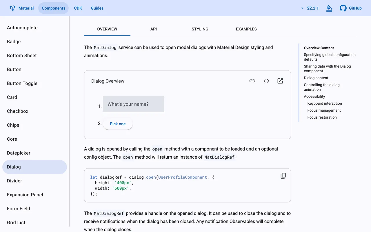
Modal dialogs. Full overlay with a backdrop that blocks the rest of the page until the user acts. Angular Material's MatDialog is the canonical example.
Toasts and snackbars. Short messages that slide in, deliver one piece of info, and disappear. Use MatSnackBar for these: they don't block the page and they dismiss themselves.
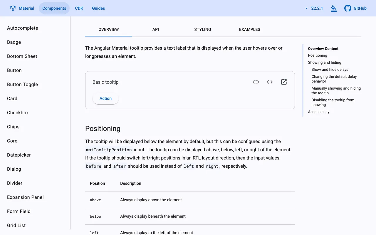
Tooltips. The small floating label that shows on hover or focus. Built with matTooltip, or hand-rolled with @if and a mouseenter binding.
Dropdown menus. A clickable trigger that reveals an anchored list. Built with custom components plus @for, with Material's mat-menu, or with the ngbDropdown directive in Ng-bootstrap.
Accordions. Expand-collapse panels controlled by Angular directives and state toggles.
Side panels (drawers). Off-canvas slide-outs, usually wired to an Angular Route or a Material MatSidenav.
A real Angular app usually mixes several of these. The point of using a library is consistent behaviour (keyboard handling, ARIA roles, animation timing) without re-deriving it for every component.
4 Ways to Create a Popup in Angular
The four step-by-step builds below cover the same job (open a dialog, render content, close on click) using Angular Material, Ng-bootstrap, PrimeNG, and the no-code Popupsmart embed. Each code sample is the exact file we compiled in a fresh Angular 22.2 project with strict template checking on, then opened, closed with Esc and closed with a button in a headless Chromium browser.
Pick the one that fits your stack and skill level. If you're starting a greenfield Angular dashboard, Material is the safest default. If your front end is already Bootstrap-themed, Ng-bootstrap saves you a re-skin. If you need rich animation and theming out of the box, PrimeNG is the deepest of the three. And if the popup is for a campaign or test page where you don't want a developer in the loop, the no-code option is faster than any CLI install.
Step 1: Build the Popup With Angular Material (MatDialog)
Angular Material is Google's official component library. MatDialog gives you an accessible modal (focus trap, backdrop, escape-key dismissal, ARIA roles) with about 30 lines of code split across a component and a service. It's the method to reach for in any app that already uses Material Design tokens.
Library scope. Angular Material 22.2 (checked October 2026) needs Angular 22; its versions track Angular's, so on Angular 21 install @angular/material@21. The open() call looks the same as in older guides. What changed is the wiring around it: standalone imports, inject() instead of constructor injection, and a signal for the result.
Step 1.1: Install Angular Material
Open your terminal in the project root and run:
ng add @angular/material
The schematic installs Material and the CDK, writes a Material 3 theme to src/material-theme.scss with mat.theme(), and adds the Roboto and Material Symbols fonts to index.html. It no longer asks about animations: Material 22 doesn't use the @angular/animations package at all.
Step 1.2: Generate the popup component
Use the CLI to scaffold the dialog component:
ng generate component popup
In Angular 22 this creates src/app/popup/popup.ts, popup.html and popup.css with a standalone class named Popup. Newer CLIs no longer add the .component suffix.
Step 1.3: Define the popup content
Edit popup.html and replace the boilerplate with the Material dialog template:
<h2 mat-dialog-title>Popup Dialog</h2>
<mat-dialog-content>
  <p>This is a popup dialog created using Angular Material.</p>
</mat-dialog-content>
<mat-dialog-actions align="end">
  <button matButton [mat-dialog-close]="false">Close</button>
  <button matButton="filled" [mat-dialog-close]="true">OK</button>
</mat-dialog-actions>
mat-dialog-title gives the dialog its accessible name, and [mat-dialog-close] closes it with the value you bind. Then list the directives the template uses in popup.ts:
import { Component } from '@angular/core';
import { MatButtonModule } from '@angular/material/button';
import {
  MatDialogActions,
  MatDialogClose,
  MatDialogContent,
  MatDialogTitle,
} from '@angular/material/dialog';

@Component({
  selector: 'app-popup',
  imports: [MatButtonModule, MatDialogTitle, MatDialogContent, MatDialogActions, MatDialogClose],
  templateUrl: './popup.html',
})
export class Popup {}
Step 1.4: Generate the popup service
A service keeps the open/close logic out of your components and makes the dialog reusable:
ng generate service popup/popup --type=service
Without --type=service, the Angular 22 CLI names the file popup.ts and the class Popup, which clashes with the component.
Step 1.5: Edit popup.service.ts
Wire MatDialog into the service:
import { Service, inject } from '@angular/core';
import { MatDialog } from '@angular/material/dialog';
import { Popup } from './popup';

@Service()
export class PopupService {
  private readonly dialog = inject(MatDialog);

  openPopup() {
    return this.dialog.open<Popup, void, boolean>(Popup, { width: '400px' });
  }
}
@Service() is new in Angular 22 and is shorthand for @Injectable({ providedIn: 'root' }), according to the Angular services guide. On Angular 21 or earlier, use @Injectable({ providedIn: 'root' }) instead.
Step 1.6: Use the service in your component
Replace src/app/app.ts with a button that opens the popup and shows the result:
import { Component, inject, signal } from '@angular/core';
import { PopupService } from './popup/popup.service';

@Component({
  selector: 'app-root',
  template: `
    <button type="button" (click)="openPopup()">Open Popup</button>
    @if (answer() !== undefined) {
      <p>The dialog closed with: {{ answer() }}</p>
    }
  `,
})
export class App {
  private readonly popupService = inject(PopupService);
  protected readonly answer = signal<boolean | undefined>(undefined);

  openPopup() {
    this.popupService
      .openPopup()
      .afterClosed()
      .subscribe((result) => this.answer.set(result));
  }
}
The result goes into a signal, so the template updates even though the app runs without zone.js. afterClosed() completes on its own after it emits, so this subscription doesn't need cleanup.
Step 1.7: Import what each component uses (no NgModule needed)
Standalone components import what their template uses. Popup lists the button module and the four dialog directives; App imports nothing, because MatDialog is injectable from the root. If your app still uses NgModules, add MatDialogModule to the module's imports, or run ng generate @angular/core:standalone to migrate.
Step 1.8: Run your popup
Start the dev server with ng serve and click the button. The dialog should open, move focus inside, and dismiss on Esc or backdrop click.
You'll know it's working when: the page dims with a semi-transparent backdrop, the dialog appears centred with a fade-in animation, focus jumps to the first focusable element inside it, and pressing Esc closes the dialog and restores focus to the trigger button. Clicking OK prints The dialog closed with: true; closing with Esc leaves the result undefined.
Step 1.9: Need a notification instead of a modal?
For a short, non-blocking message, inject MatSnackBar:
import { Component, inject } from '@angular/core';
import { MatSnackBar } from '@angular/material/snack-bar';

@Component({
  selector: 'app-save-button',
  template: `<button type="button" (click)="save()">Save</button>`,
})
export class SaveButton {
  private readonly snackBar = inject(MatSnackBar);

  save() {
    this.snackBar.open('Changes saved', 'Undo', { duration: 4000 });
  }
}
The snackbar disappears after four seconds, and Material announces its message to screen readers through the CDK's LiveAnnouncer.
Watch out for these mistakes:
• Following old animation advice: Guides written before Angular 20 tell you to import BrowserAnimationsModule or provideAnimations() for Material. Material 22 needs neither: its dialog animates with CSS, 150 ms in and 75 ms out. If the dialog opens with no animation at all, check the device's settings first, because Material switches its animations off when prefers-reduced-motion is set.
• Forgetting the directive imports: The component whose template uses the dialog directives must import them. A binding such as [mat-dialog-close] fails the build with "Can't bind to 'mat-dialog-close'", but a plain attribute such as mat-dialog-title is silently ignored, so the dialog loses its accessible name without an error.
• Missing the theme CSS: If ng add couldn't update angular.json automatically, the dialog opens without Material styles and looks like an unstyled <div>. Add src/material-theme.scss, or a prebuilt theme such as @angular/material/prebuilt-themes/azure-blue.css, to the styles array.
open(Popup, { data: { ... } }) and read it inside the popup with inject(MAT_DIALOG_DATA). Typing the call as open<Popup, Data, Result>() makes afterClosed() return the result type you expect, as in Step 1.5.Step 2: Build the Popup With Ng-bootstrap (NgbModal)
If your design system is already Bootstrap-themed, Ng-bootstrap is the cleaner choice over Material. It ships native Angular directives that match Bootstrap 5 markup, so the popup looks like the rest of your app without a re-skin. The NgbModal service is its dialog primitive. Our Bootstrap popup guide covers the same modal without Angular.
Library scope. Ng-bootstrap 21 supports Angular 22; v20 supports Angular 21, v19 supports Angular 20, and v18 supports Angular 19 (checked on npm, October 2026). Pin the right major to your Angular version or the install will fail with a peer-dependency error.
Step 2.1: Install Ng-bootstrap
Use ng add so the CLI handles the Bootstrap CSS imports for you:
ng add @ng-bootstrap/ng-bootstrap
This pulls in Bootstrap, the Ng-bootstrap module and @angular/localize (a peer dependency), adds the CSS reference to angular.json, and registers Ng-bootstrap's providers in app.config.ts.
Step 2.2: Generate the popup content component
Same pattern as the Material flow: scaffold a component first. This is the component the modal will render inside:
ng generate component popup-content
Step 2.3: Skip the NgbModule import
Older guides add NgbModule to an NgModule's imports. In a standalone app there's nothing to import for modals: NgbModal is a root service you inject, and ng add has already registered the providers. If you keep an NgModule-based app, import NgbModalModule in the host module.
Step 2.4: Add the popup template
Replace popup-content.ts with a component that uses Bootstrap's modal markup:
import { Component, inject } from '@angular/core';
import { NgbActiveModal } from '@ng-bootstrap/ng-bootstrap';

@Component({
  selector: 'app-popup-content',
  template: `
    <div class="modal-header">
      <h2 class="modal-title fs-5" id="popup-title">Popup Content</h2>
      <button type="button" class="btn-close" aria-label="Close" (click)="activeModal.dismiss('close')"></button>
    </div>
    <div class="modal-body">
      <p>This is the content of the popup.</p>
    </div>
    <div class="modal-footer">
      <button type="button" class="btn btn-secondary" (click)="activeModal.dismiss('cancel')">Cancel</button>
      <button type="button" class="btn btn-primary" (click)="activeModal.close('confirmed')">Confirm</button>
    </div>
  `,
})
export class PopupContent {
  protected readonly activeModal = inject(NgbActiveModal);
}
NgbActiveModal is the handle the content uses to close the modal with a result or dismiss it with a reason. The title's id is what the opener passes as ariaLabelledBy.
Step 2.5: Create the trigger button and wire up the modal service
Add a button to your root template that fires the open handler, inject NgbModal, and call open() with the popup component reference:
import { Component, inject, signal } from '@angular/core';
import { NgbModal } from '@ng-bootstrap/ng-bootstrap';
import { PopupContent } from './popup-content/popup-content';

@Component({
  selector: 'app-root',
  template: `
    <button type="button" class="btn btn-primary" (click)="openPopup()">Click me</button>
    <p>Last result: {{ lastResult() }}</p>
  `,
})
export class App {
  private readonly modalService = inject(NgbModal);
  protected readonly lastResult = signal('none yet');

  openPopup() {
    const modalRef = this.modalService.open(PopupContent, { ariaLabelledBy: 'popup-title' });
    modalRef.result.then(
      (result) => this.lastResult.set(`closed: ${result}`),
      (reason) => this.lastResult.set(`dismissed: ${reason}`),
    );
  }
}
Step 2.6: Run your popup
Start the dev server:
ng serve
You'll know it's working when: clicking the button slides the modal into view with the standard Bootstrap fade animation, the backdrop dims the page, and clicking the backdrop or pressing Esc closes the modal and hands focus back to the button. The page then shows dismissed: 1 (1 is ModalDismissReasons.ESC) or, after Confirm, closed: confirmed.
Watch out for these mistakes:
• Mismatched Bootstrap CSS version: If your project already imports Bootstrap 4 and Ng-bootstrap installs Bootstrap 5, you'll get conflicting grid classes and the modal positioning will drift. Pick one Bootstrap major and remove the other from angular.json.
• Calling open() with a string template: NgbModal.open() accepts both component references and TemplateRef. A string is rendered as plain text, not HTML. Always pass the imported component class or a #ref template read with viewChild().
• Leaving out ariaLabelledBy: Without it, the modal window has role="dialog" but no accessible name, so a screen reader announces "dialog" and nothing else. Give the title an id and pass it in the open() options.
modalRef.result returns a Promise: resolved when you call modalRef.close(value), rejected when you call modalRef.dismiss(reason) or the user presses Esc. Wrap the call in .then(...).catch(...) or pass both callbacks, as in Step 2.5, and you've got a clean two-button confirm dialog without writing any extra wiring.Step 3: Build the Popup With PrimeNG (p-dialog)
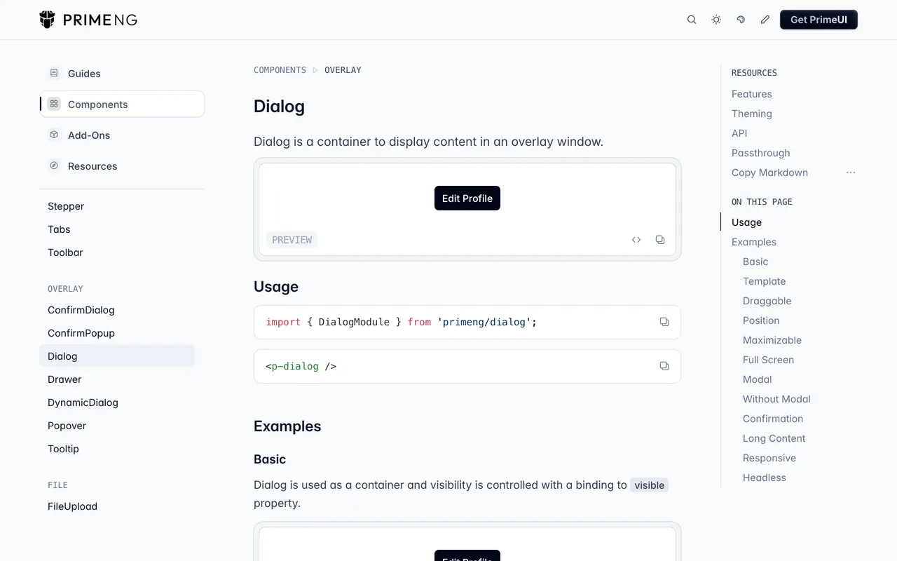
PrimeNG lists 90+ components on its documentation site and has the most polished animation and theming story of the three code libraries. The p-dialog component (and the related DialogService for dynamic dialogs) covers everything from a simple modal to a draggable, resizable, multi-instance dialog with custom headers and footers.
Library scope. PrimeNG's major version matches Angular's: PrimeNG 22.1 supports Angular 22 (from 22.1), v21 supports Angular 21, and v20 supports Angular 20. The theming model changed too: presets such as Aura, Lara and Nora now ship in the separate @primeuix/themes package, and the old primeng/resources/themes/... CSS files are gone in PrimeNG 22.
Step 3.1: Install PrimeNG and its themes
npm install primeng @primeuix/themes
PrimeIcons (primeicons) is a separate, optional package for the pi pi-* icon classes.
Step 3.2: Register the theme
Add providePrimeNG() to src/app/app.config.ts with a preset:
import { ApplicationConfig, provideBrowserGlobalErrorListeners } from '@angular/core';
import { provideRouter } from '@angular/router';
import { providePrimeNG } from 'primeng/config';
import Aura from '@primeuix/themes/aura';
import { routes } from './app.routes';

export const appConfig: ApplicationConfig = {
  providers: [
    provideBrowserGlobalErrorListeners(),
    provideRouter(routes),
    providePrimeNG({ theme: { preset: Aura } }),
  ],
};
PrimeNG 22 doesn't need provideAnimationsAsync() either: none of its components import @angular/animations, and our test app ran its dialogs without the package installed.
Step 3.3: Add p-dialog to a component
Import DialogModule and bind the dialog's visibility to a signal:
import { Component, signal } from '@angular/core';
import { ButtonModule } from 'primeng/button';
import { DialogModule } from 'primeng/dialog';

@Component({
  selector: 'app-root',
  imports: [ButtonModule, DialogModule],
  template: `
    <button #trigger type="button" (click)="visible.set(true)">Show Popup</button>
    <p-dialog
      header="Popup Content"
      [(visible)]="visible"
      [modal]="true"
      [style]="{ width: '25rem' }"
      (onHide)="trigger.focus()"
    >
      <label for="popup-name">Enter your information:</label>
      <input id="popup-name" type="text" placeholder="Name" />
      <p-button label="Close" (onClick)="visible.set(false)" />
    </p-dialog>
  `,
})
export class App {
  protected readonly visible = signal(false);
}
visible is a model signal in PrimeNG 22, so [(visible)] binds straight to a signal(). Esc and the dialog's close icon set it back to false. The (onHide) line matters: in our test, PrimeNG 22 moved focus into the dialog but dropped it on the page body when the dialog closed, so the example hands focus back to the button itself.
Step 3.4: Create the popup content component
For dialogs you open from code, define a component that holds the dialog body (popup-content.ts):
import { Component, inject } from '@angular/core';
import { DynamicDialogConfig, DynamicDialogRef } from 'primeng/dynamicdialog';

@Component({
  selector: 'app-popup-content',
  template: `
    <label for="dd-name">Enter your information, {{ config.data?.greeting }}:</label>
    <input #name id="dd-name" type="text" placeholder="Name" />
    <button type="button" (click)="ref.close(name.value)">Save</button>
  `,
})
export class PopupContent {
  protected readonly ref = inject(DynamicDialogRef);
  protected readonly config = inject(DynamicDialogConfig);
}
Step 3.5: Open via DialogService
In a host component next to it (popup-host.ts), inject DialogService from primeng/dynamicdialog and open the popup with configuration:
import { Component, inject, signal } from '@angular/core';
import { DialogService } from 'primeng/dynamicdialog';
import { PopupContent } from './popup-content';

@Component({
  selector: 'app-popup-host',
  providers: [DialogService],
  template: `
    <button #trigger type="button" (click)="showPopup(trigger)">Show Popup</button>
    @if (savedName()) {
      <p>Saved: {{ savedName() }}</p>
    }
  `,
})
export class PopupHost {
  private readonly dialogService = inject(DialogService);
  protected readonly savedName = signal('');

  showPopup(trigger: HTMLButtonElement) {
    const ref = this.dialogService.open(PopupContent, {
      header: 'Popup Title',
      width: '70%',
      modal: true,
      closable: true,
      contentStyle: { 'max-height': '500px', overflow: 'auto' },
      data: { greeting: 'friend' },
    });

    ref?.onClose.subscribe((name?: string) => {
      if (name) this.savedName.set(name);
      trigger.focus();
    });
  }
}
open() returns DynamicDialogRef | null in PrimeNG 22, hence the ?.. Dynamic dialogs show no close icon unless you set closable: true, and onClose completes shortly after the dialog closes. The trigger.focus() call returns focus to the button, for the same reason as in Step 3.3.
Step 3.6: Run your popup
ng serve
You'll know it's working when: the dialog opens with the Aura theme's header bar, focus moves inside it, and Esc closes it and puts focus back on the Show Popup button. In the dynamic version, typing a name and pressing Save closes the dialog and shows Saved: with the name you typed.
Watch out for these mistakes:
• Old theme paths from PrimeNG 17-era guides: Older tutorials add node_modules/primeng/resources/themes/saga-blue/theme.css to angular.json. That folder doesn't exist in PrimeNG 22; configure a preset in providePrimeNG() instead.
• Trying to use DialogService without the providers array: DialogService isn't a root service like MatDialog. You need to add it to the host component's providers array, or you'll get "NullInjectorError: No provider for DialogService".
• Keeping BrowserAnimationsModule out of habit: It doesn't break anything, but PrimeNG 22 doesn't need it, and leaving @angular/animations out keeps the deprecated package out of your bundle.
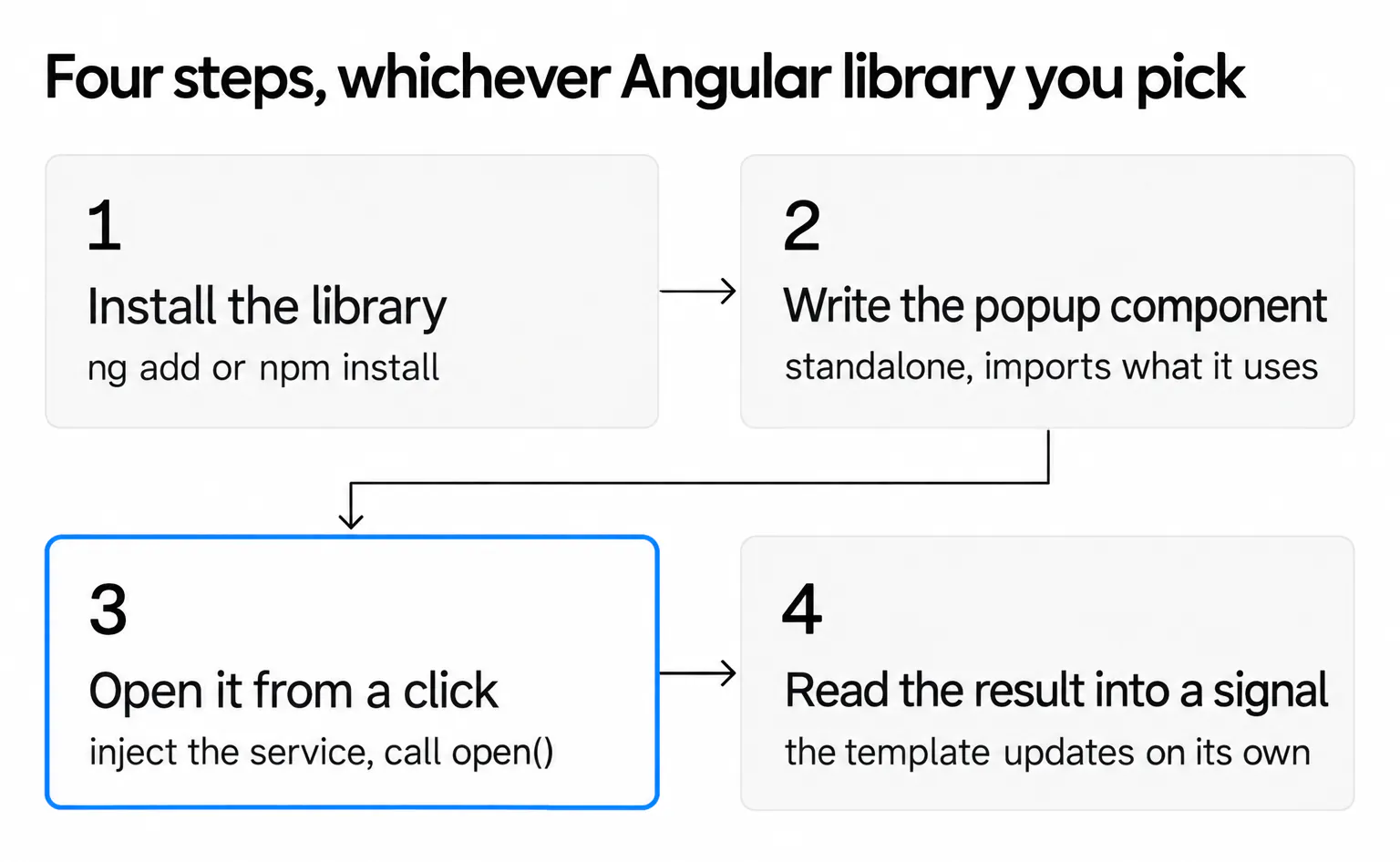
DialogService.open() call in a typed helper that injects strongly-typed data into the dialog component via the data config option. PrimeNG's DynamicDialogConfig exposes that data through DI inside the popup, which beats passing inputs through a global event bus.Across all three code libraries (Material, Ng-bootstrap, PrimeNG), the steps follow the same shape: install, write the popup as a standalone component, open it from a click handler, and read the result into a signal. The differences are in styling defaults and what extras the API gives you for free.
Step 4: Build the Popup With Popupsmart (No-Code)
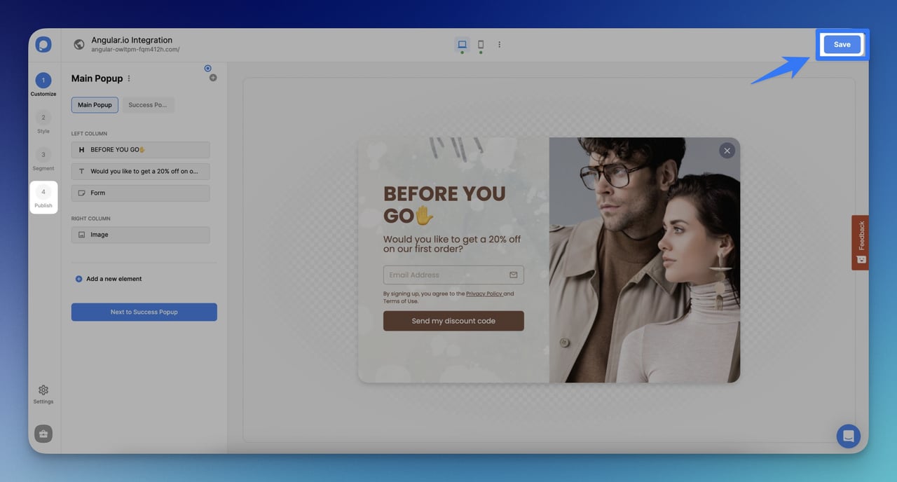
If the popup isn't tied to your component tree (for example, a newsletter signup on a marketing page, a discount banner for a campaign, or a quick MVP test), a no-code popup builder is faster than installing a library and writing a service. Popupsmart is a no-code popup builder: you build the popup in its visual editor and paste a single script tag into your Angular app's index.html.
Important caveat: this is not a replacement for MatDialog, NgbModal, or p-dialog when you need the popup to participate in your Angular component lifecycle, share state with services, or render Angular components inside it. For in-app modals tied to your data layer, stick with one of the three code methods above.
Step 4.1: Sign up for an account
Create an account on the platform. There's a free plan that covers 5K pageviews a month, which is enough for prototypes and small campaigns.
Step 4.2: Pick a template from the playbook
Choose a popup template that matches the goal: email capture, discount offer, exit-intent retention, or feedback survey.
Step 4.3: Customise the copy, design, and triggers
Edit headline, body, button text, colours, and rules (page targeting, exit intent, time delay, scroll depth) inside the visual editor; the rules live in the campaign's Segment section. Save the campaign.
Step 4.4: Install the embed in your Angular project
In the dashboard's left bar, click Embed Code and copy the snippet. Paste it into src/index.html just before the closing </body> tag, then add your domain under Websites and verify it, as the embed code guide in Popupsmart's help center shows.
Step 4.5: Publish and test
Hit publish in the dashboard, reload your Angular dev server, and trigger the popup based on the rules you set (for example, scroll to 50%).
Step 4.6: Open it from an Angular button (optional)
Turn on On-Click Targeting under User Behavior in the campaign's Segment, copy the campaign id from the snippet it generates, and call window.ps.show() from a click handler:
import { Component } from '@angular/core';

declare global {
  interface Window {
    ps?: { show(options: { id: number }): void };
  }
}

// Copy the campaign id from the snippet Popupsmart generates under On-Click Targeting.
const CAMPAIGN_ID = 12345;

@Component({
  selector: 'app-newsletter-button',
  template: `<button type="button" (click)="openCampaign()">Get the newsletter</button>`,
})
export class NewsletterButton {
  openCampaign() {
    window.ps?.show({ id: CAMPAIGN_ID });
  }
}
The optional chaining keeps the button harmless before the embed script has loaded. Popupsmart's help center advises against calling show() from links or buttons that navigate to another page.
You'll know it's working when: the popup renders on top of your Angular app without any console errors, and the campaign's Analytics page in the Popupsmart dashboard starts counting popup views.
If you work with an AI coding agent, Popupsmart's MCP server and CLI let the agent do what the app's UI does: generate a popup from a template, set targeting and triggers, connect integrations and publish, on every plan including the free one.
Watch out for these mistakes:
• Pasting the script into a component template: Angular sanitises <script> tags inside component templates and they won't execute. Put the script in index.html (outside the Angular root) and it loads normally.
• Expecting Angular component lifecycle hooks: The popup lives in a separate DOM tree from your Angular app. You can't reach it from viewChild(), and it can't read Angular services directly. If you need the leads in your own backend, send them with Popupsmart's webhook integration.
• Forgetting to set page-level targeting: Without a URL rule, the popup will fire on every route, including your admin pages. Configure path-based targeting in the campaign's Segment under URL Targeting. Angular's router changes the URL without a page load, so test the rule by navigating inside the app, not only by reloading.
MatDialog or NgbModal for the logged-in app shell. One tool for marketing, another for product, and it keeps your Angular bundle small. We've also covered this pattern in a deeper walkthrough on popups triggered by button click, which carries over cleanly to Angular templates.Why Build Popups in Angular at All?
Once you've picked a library, Angular's structure does most of the work. A few specific reasons developers reach for Angular over a hand-rolled vanilla JS modal:
• Component-based architecture: A popup is just another standalone component, which means you can reuse the same dialog across routes and feed it different inputs.
• Signals: The popup's open state and its result live in a signal(), and the template re-renders when they change, with or without zone.js.
• Two-way data binding: Forms inside the popup stay synced with the parent component's state without manual DOM reads.
• Dependency injection: Services like MatDialog, NgbModal, and DialogService are injected, mocked, and tested without global singletons.
• Reactive forms: Built-in validation, typed forms (since v14), and async validators are easy to drop into a popup template.
• Testing surface: Angular's TestBed and Material's MatDialogHarness let you mount and interact with dialogs in isolation, which catches focus-trap and ARIA regressions before they ship.
The cross-framework equivalents are similar, but each has its own quirks. We've covered the same pattern in walkthroughs for PHP-based popups and Vue modal popups, and the lifecycle hooks differ enough between frameworks that the porting effort is real.
How Do the Four Methods Compare?
The four methods differ mostly in how you install them, how you open the popup, and how the result comes back. The table below maps the four methods on the same axes, checked against Angular 22 in October 2026:
| Angular Material | Ng-bootstrap | PrimeNG | Popupsmart | |
|---|---|---|---|---|
| Version for Angular 22 | @angular/material 22.2 |
@ng-bootstrap/ng-bootstrap 21.0 |
primeng 22.1 |
Any (script tag) |
| Install | ng add @angular/material |
ng add @ng-bootstrap/ng-bootstrap |
npm install primeng @primeuix/themes |
Embed code in index.html |
| Open the popup | inject(MatDialog).open(Popup) |
inject(NgbModal).open(PopupContent) |
[(visible)] signal or DialogService.open() |
Targeting rules or window.ps.show() |
| Get the result | afterClosed() Observable |
result Promise |
onClose Observable |
Leads on the Analytics page |
Needs @angular/animations |
No | No | No | No |
| Best for | Apps on Material Design | Bootstrap-themed apps | Apps that need many components and preset themes | Marketing popups edited without a deploy |
How do you build an Angular popup without a library?
You can build an Angular popup without any library by putting the browser's native <dialog> element in a component and calling showModal() on it. The browser then handles the backdrop, Escape to close, the inert background and focus return, and a signal carries the result back into the template:
import { Component, ElementRef, signal, viewChild } from '@angular/core';

@Component({
  selector: 'app-native-popup',
  template: `
    <button type="button" (click)="open()">Open popup</button>

    <dialog #dialog aria-labelledby="native-popup-title" (close)="choice.set(dialog.returnValue)">
      <h2 id="native-popup-title">Get our Angular tips</h2>
      <p>One email a week. Press Esc or choose an option to close.</p>
      <form method="dialog">
        <button value="no">No thanks</button>
        <button value="yes">Subscribe</button>
      </form>
    </dialog>

    @if (choice()) {
      <p>You chose: {{ choice() }}</p>
    }
  `,
})
export class NativePopup {
  private readonly dialog = viewChild.required<ElementRef<HTMLDialogElement>>('dialog');
  protected readonly choice = signal('');

  open() {
    this.choice.set('');
    this.dialog().nativeElement.showModal();
  }
}
A <form method="dialog"> closes the dialog and sets its returnValue to the value of the button that was pressed, so no click handlers are needed inside it. In our test, Esc closed the dialog and focus went back to the Open popup button with no extra code. The MDN reference for the dialog element lists the rest of its behaviour. This is the right choice for a simple confirm or signup popup in an app that doesn't otherwise need a component library.
To animate a popup or toast without a library, use animate.enter and animate.leave. Angular 20.2 deprecated the @angular/animations package in their favour; they add a CSS class when an element enters and wait for its animation before removing it, as the Angular enter and leave animations guide explains:
import { Component, signal } from '@angular/core';

@Component({
  selector: 'app-toast',
  template: `
    <button type="button" (click)="show.set(!show())">Toggle toast</button>
    @if (show()) {
      <div class="toast" role="status" animate.enter="toast-in" animate.leave="toast-out">
        Changes saved
      </div>
    }
  `,
  styles: `
    .toast-in { animation: slide-in 200ms cubic-bezier(0.23, 1, 0.32, 1); }
    .toast-out { animation: slide-in 150ms cubic-bezier(0.23, 1, 0.32, 1) reverse; }
    @keyframes slide-in {
      from { opacity: 0; transform: translateY(8px); }
      to { opacity: 1; transform: translateY(0); }
    }
    @media (prefers-reduced-motion: reduce) {
      .toast-in, .toast-out { animation: none; }
    }
  `,
})
export class Toast {
  protected readonly show = signal(false);
}
role="status" marks the toast as a status message without moving focus; when the announcement has to be reliable, MatSnackBar or the CDK's LiveAnnouncer is the safer choice. The reduced-motion query turns the slide off for people who've asked for less motion.
How Do You Choose the Right Popup Method for Your SaaS App?
The right method depends on three questions: who's building it, what's inside the popup, and where it lives in the app. Run through this short decision flow and you'll land in one of four buckets without much guesswork.
1. Pick Angular Material if: your app already uses Material Design tokens, your design system depends on Material typography and components, or you need the most predictable accessibility out of the box. The Angular team maintains it, and its versions ship in step with Angular's. Trade-off: themes are opinionated and customising them past a certain point fights the framework.
2. Pick Ng-bootstrap if: your front end is already Bootstrap-themed, your team is more comfortable with Bootstrap CSS classes than Material's theming system, or you want a small install for confirm/cancel dialogs. Trade-off: animation and theming options are thinner than Material or PrimeNG.
3. Pick PrimeNG if: you need 90+ components beyond the dialog (data tables, charts, calendars), you want preset themes you can swap with a single config line, or you need draggable/resizable dialogs without extra wiring. Trade-off: the theming engine changed between v17 and v22, so older guides break.
4. Pick Popupsmart if: the popup is on a marketing page or landing page, the popup needs to be edited by a non-engineer (marketing, growth, content), or you're prototyping and want to skip the install altogether. Trade-off: it lives outside Angular's lifecycle and can't read your services.
For a typical SaaS product, the practical answer is a split: one Angular library for the in-app modals (delete confirms, settings dialogs, billing flows) and a no-code tool for the marketing surface (newsletter capture, free-trial nudges, exit intent). Trying to use one tool for both is where teams end up rebuilding work.
What Are the Most Common Angular Popup Mistakes to Avoid in 2026?
Across all four methods, the same handful of bugs keep showing up in production code. None of them are dramatic, but each one silently breaks UX or accessibility in ways your QA might miss until a user complaint comes in.
1. Z-index conflicts with sticky headers and bottom nav. The CDK overlay container that holds Material dialogs sits at z-index: 1000, Bootstrap 5.3 puts its modal at 1055 (backdrop 1050), and PrimeNG's modal layer starts at 1100. If your sticky nav has a higher z-index, the dialog opens behind it and looks like it never opened. Fix: audit z-index globally in your stylesheet, or override the CDK overlay container's z-index (.cdk-overlay-container).
2. Broken focus on dynamic content. MatDialog moves focus to the first tabbable element when it opens (autoFocus: 'first-tabbable'). When the content loads asynchronously (lazy-loaded form fields, an async data fetch), there may be nothing to focus yet. Fix: set autoFocus: 'dialog' to focus the dialog container, or render the loading state with a focusable element.
3. Memory leaks from subscriptions inside the dialog. afterClosed() in Material and onClose in PrimeNG complete on their own, and Ng-bootstrap's result is a Promise, so a single subscription to them doesn't leak. Subscriptions you open inside the popup component to long-lived streams (a store, route params, an interval) do. Fix: pipe them through takeUntilDestroyed(), or use signals.
4. Skipping ARIA roles in custom dialogs. If you roll your own popup with @if and a <div>, you have to add role="dialog", aria-modal="true", aria-labelledby, a focus trap and Escape handling yourself. Screen-reader users will land outside the dialog without these. The native <dialog> element opened with showModal() handles the modal state, Escape and focus return for you.
5. Animation jank on slow devices. MatDialog animates in for 150 ms and out for 75 ms by default (enterAnimationDuration and exitAnimationDuration change it), and it turns animations off for users who set prefers-reduced-motion. If you hand-roll motion with animate.enter, add the same reduced-motion rule yourself and keep entrances short.
6. Forgetting the standalone-component migration. Standalone components became the default in Angular 19, and new Angular 22 projects also use the @if/@for control flow and run without zone.js. Code from NgModule-era guides still works inside a module, but in a standalone app each component imports what its template uses. The dialog APIs themselves barely changed; where you import them did. Angular ships both migrations: ng generate @angular/core:standalone and ng generate @angular/core:control-flow.
7. Sizing the popup for desktop only. 63% of popup displays happen on mobile, according to Popupsmart's 2026 popup benchmark of 28,674 campaigns from January 2024 to September 2026. A dialog fixed at 600 px or width: '70%' leaves little room on a phone. Give Material dialogs a maxWidth, use PrimeNG's breakpoints option, check the popup at 375 px, and follow our mobile popup design guide for the layout.
How Should You Handle Accessibility in Angular Popups?
WCAG 2.2, published by the W3C in 2023, is the current version of the Web Content Accessibility Guidelines. For popups specifically, five things have to be right:
• ARIA attributes: Use role="dialog", aria-labelledby pointing to the dialog title's ID, and aria-modal="true". Ng-bootstrap and PrimeNG add all three for you. Angular Material leaves aria-modal false by default and hides the rest of the page from screen readers with aria-hidden instead; set ariaModal: true in the dialog config if your audit requires the attribute. Custom popups have to do all of this by hand.
• Keyboard navigation: Tab and Shift+Tab should cycle through focusable elements inside the dialog only. Esc should close the dialog. Enter (on a primary button) should confirm.
• Focus management: When the dialog opens, focus moves to the first interactive element. When it closes, focus returns to the trigger button. Material's dialog, Ng-bootstrap's modal and the native <dialog> element did both in our Angular 22 test app. PrimeNG 22's dialogs moved focus in but left it on the page body when they closed, which is why the PrimeNG examples above call focus() on the trigger.
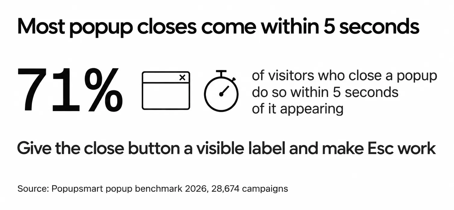
• A close control people can find: 71% of visitors who close a popup do so within 5 seconds of it appearing, in Popupsmart's 2026 benchmark. Give the close button a visible label or an aria-label, put it where people look for it, and make sure Esc works.
• Screen reader testing: Test with NVDA on Windows and VoiceOver on macOS. Both should announce the dialog title and the focused element when the dialog opens.
mat-dialog-title, ariaLabelledBy or header leaves screen-reader users with an unnamed dialog.Accessibility isn't optional. Skipping ARIA roles or focus management locks out keyboard and screen-reader users, which is a real cost, not a hypothetical one. The W3C's ARIA Authoring Practices guide for dialogs is the canonical reference if you need a deeper checklist.
Ship Your First Angular Popup This Week
You've got four working options now: Angular Material's MatDialog, Ng-bootstrap's NgbModal, PrimeNG's p-dialog, and Popupsmart's no-code embed, plus the native <dialog> element when you don't want a library. Pick one based on the decision flow above (Material for Material apps, Ng-bootstrap for Bootstrap apps, PrimeNG for animation-heavy use cases, Popupsmart for non-engineering work) and run the install in the first ten minutes of your next dev session.
@angular/animations, with standalone components and with a signal holding the result. If a tutorial still starts with an NgModule and BrowserAnimationsModule, it was written for an older Angular.If you want to start with the no-code path while your team is still discussing which library to standardise on, sign up at app.popupsmart.com, pick a template, paste the embed code into index.html, and you'll have a working popup on your Angular dev server before lunch. The code methods can wait until you've validated whether the popup is worth keeping.
Frequently Asked Questions
Can I Create Custom Animations for Popups in Angular?
Yes. In Angular 20.2 and later, put animate.enter and animate.leave on the popup element inside an @if block and define the motion as CSS classes with @keyframes. Angular waits for the leave animation to finish before it removes the element. The older @angular/animations package still works but is deprecated. If you'd rather not write animation code, Popupsmart's style panel has an opening effect setting and supports Lottie animations in popups.
What's the Difference Between a Modal Dialog and a Popup in Angular?
The terms are used as synonyms most of the time, but there's a real distinction. A modal dialog blocks the rest of the page: you can't interact with anything outside it until you dismiss it. A popup is the broader category and includes non-blocking patterns like tooltips, dropdown menus, snackbars, and small floating panels. In Angular, MatDialog, NgbModal, and p-dialog all default to modal behaviour. For a non-modal dialog, set hasBackdrop: false on Material or backdrop: false on Ng-bootstrap.
How Do I Show a Notification or Alert Popup in Angular?
Use Angular Material's MatSnackBar for a short notification: inject it and call open('Changes saved', 'Undo', { duration: 4000 }). It doesn't block the page, and screen readers announce the message. For an alert that needs an answer, such as a delete confirmation or a session timeout, use a modal instead: MatDialog, NgbModal or a native dialog element. The browser's window.alert() also works, but you can't style it.
How Can I Track User Interactions With Popups in Angular?
Two paths. The DIY route is wiring up listeners for your dialog's open, close, and form-submit events, then pushing those events to a website analytics tool like Google Analytics 4 or Plausible. The shortcut route is using a popup builder like Popupsmart that ships built-in tracking (popup views, leads, interactions and conversion rate on its Analytics page) without writing any analytics code. The same approach works in any stack, as in our guide to popups in Python web apps.
What's the Best Angular Popup Library for SaaS Apps in 2026?
If you're starting fresh, Angular Material is the most reliable default: the Angular team maintains it, its accessibility is solid, and its releases track Angular's own. If your front end is already Bootstrap, Ng-bootstrap removes the re-skin pain. PrimeNG wins on breadth of components. For marketing-page popups, a no-code tool is faster than installing any of the three. There's no universal best; it tracks to your existing stack.
How Do I Create a Popup Form on Button Click in Angular?
Wire a click handler to your trigger button, inject the dialog service (MatDialog, NgbModal or DialogService), and open a component that holds a reactive form. Read the submitted value from afterClosed() in Material, result in Ng-bootstrap or onClose in PrimeNG. Keep the form short: in Popupsmart's 2026 benchmark, popups asking for one or two fields convert 0.88% and 0.94%, against 0.56% for three fields (median campaign; spin-to-win and other gamified popups are counted separately).