What This Guide Is About 🧭
This guide focuses on the practical, real-world use of cart recovery popups, not as generic popups, but as intentional tools designed to win back shoppers who are just one step away from completing their purchase.
🛒 What cart recovery popups really are — and when they should appear
🧠 The behavioral and UX reasons behind cart abandonment (with real data)
📊 Research-backed statistics that show why recovery matters
🎛️ Different types of cart recovery popups and when each one works best
✍️ Copywriting approaches that reduce hesitation instead of adding pressure
🧭 Proven best practices shaped by real CRO insights and usability patterns
By the end of this guide, you’ll have a clear understanding of where cart recovery popups fit in the checkout journey, how to use them without harming user experience, and how to turn them into a reliable, repeatable recovery mechanism for your store. 🟣
🛒 What Is Cart Abandonment? (With Data & Sources)
When someone adds an item to their cart but leaves before finishing checkout, that’s cart abandonment. And it’s not just an occasional issue, it’s one of the biggest revenue leaks in ecommerce.
According to research from the Baymard Institute, the average global cart abandonment rate is 70.19% across industries. You can check the full dataset here:
That means most shoppers who start the buying journey never actually convert, which is exactly why recovery strategies matter so much.
Here’s a quick snapshot of how abandonment looks across devices:
📊 Cart Abandonment by Device (Data Overview)
Even when we break cart abandonment down by device, the numbers still show how serious the problem is. Mobile users abandon their carts at significantly higher rates than desktop shoppers, which aligns with industry research. For example, the Baymard Institute’s global cart abandonment benchmark highlights how ecommerce stores consistently lose a large share of potential orders during checkout.
Similarly, Statista’s breakdown of mobile vs. desktop abandonment rates shows that mobile abandonment remains the highest, mainly due to smaller screens, longer forms, and UX friction.
When I first saw numbers like these, it became clear that abandonment isn’t a “minor friction point”, it’s a massive opportunity to recover lost revenue with the right timing and messaging.
So instead of trying to generate more traffic all the time, sometimes the smarter move is to re-engage the shoppers who already showed intent. And that’s exactly where cart recovery popups come into the picture. 👀
🧠 Why Shoppers Abandon Their Carts
Whenever I look at cart abandonment data, one thing becomes clear; most people don’t leave because they don’t want the product. They leave because something in the buying experience makes them hesitate, doubt, or slow down.
And the research backs this up strongly. According to a large checkout usability study by the Baymard Institute, the most common reason shoppers abandon their carts is unexpected extra costs like shipping, taxes, or fees appearing late in the process. In fact, this single factor is cited as the top abandonment driver in their research. When I think about my own shopping behavior, I can totally relate, nothing breaks the flow faster than surprise fees at the last step.
Another major reason is forced account creation or long, complicated checkout forms. Here are some of the most common abandonment triggers I keep seeing across studies and real-world stores:
- Unexpected shipping costs appearing at checkout 😕
- Checkout process taking too long or requiring too many steps
- Forced account creation instead of guest checkout
- Lack of trust signals or secure-payment reassurance
- Limited payment or shipping options
- Slow or confusing mobile checkout experience
When you zoom out, cart abandonment isn’t just a “lost sale”, it’s usually a signal of friction, uncertainty, or timing. And that’s exactly why cart recovery popups can make a meaningful difference: they step in at the moment hesitation appears and offer clarity, reassurance, or incentive before the shopper disappears.
🧩 What Are Cart Recovery Popups & How Do They Work?
Let me break this one down simply, because cart recovery popups aren’t complicated, they’re just smartly timed messages that appear when someone is about to leave their cart or checkout page.
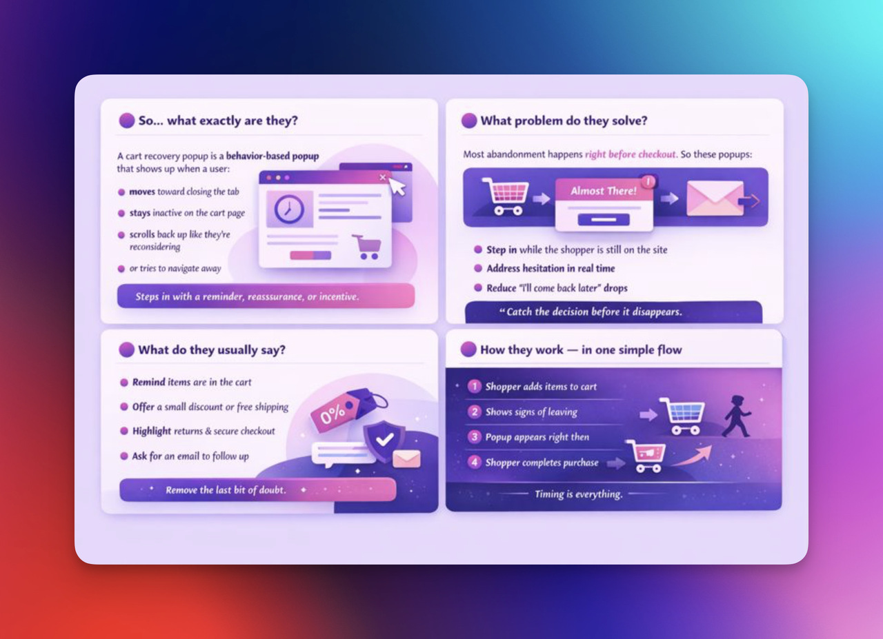
🟣 So… what exactly are they?
A cart recovery popup is a behavior-based popup that shows up when a user:
- moves their cursor toward closing the tab (exit-intent)
- stays inactive on the cart or checkout page
- scrolls back up like they’re reconsidering
- or tries to navigate away
Instead of losing that shopper, the popup steps in with a reminder, reassurance, or incentive.
🟣 What problem do they solve?
Cart recovery popups exist because most abandonment happens right before checkout is completed — a pattern highlighted across Baymard Institute research on abandonment behavior and checkout friction.
So instead of reacting later with emails or ads, these popups:
- step in while the shopper is still on the site
- address hesitation in real time
- reduce the “I’ll come back later” drop-off moment
It’s not about pressure, it’s about catching the decision before it disappears.
🟣 What do they usually say?
Depending on the situation, the popup might:
- remind the shopper that items are still in the cart
- offer a small incentive (like free shipping or a discount)
- highlight trust elements — returns, guarantees, secure checkout
- encourage checkout continuation
- or ask for an email to follow up later
Here’s the way I like to think of it:
The shopper already showed intent.
The popup simply removes the last bit of doubt.
🟣 How they work — in one simple flow
1️⃣ Shopper adds items to cart
2️⃣ Shopper shows signs of leaving
3️⃣ Popup triggers at that moment
4️⃣ Shopper either completes purchase or leaves — but now with an extra nudge
No constant interruptions — only context-aware timing.
📈 Benefits of Using Cart Recovery Popups
Instead of thinking of cart recovery popups as “just another popup,” I like to look at them as a conversion safety net. They step in exactly when a shopper is about to leave and give the purchase one more chance, and the numbers behind that are pretty convincing.
🎯 Why they matter — in plain terms
- They target users who already showed real buying intent
- They intervene at the last step of the funnel, not the first
- They work before abandonment happens — not after it
That timing alone changes outcomes.
📊 What the data tells us
Here’s what stood out to me while researching:
- The average cart abandonment rate sits around 70% globally, according to the Baymard Institute. That means most potential sales slip away right at checkout — which makes recovery opportunities extremely valuable.
- Behavior-based and exit-intent popups help brands re-engage users before they drop off, by interrupting abandonment moments with a relevant prompt
- Some recovery popups also collect email addresses for follow-up. So instead of trying to bring buyers back later, cart recovery popups work in the same session, when intent is still warm.
💡 How they actually translate into results (practical view)
Rather than abstract benefits, here’s how they help in real life:
No dramatics, no gimmicks — just timing, relevance, and context working together at a critical decision moment.
🎛️ Types of Cart Recovery Popups
Instead of thinking of cart recovery popups as one single format, I like to look at them as a toolbox — different popup styles for different abandonment scenarios. Each one serves a slightly different purpose, depending on why the shopper is about to leave.
Let me walk through the most common types I see working well in real stores, with examples and context for when to use them.
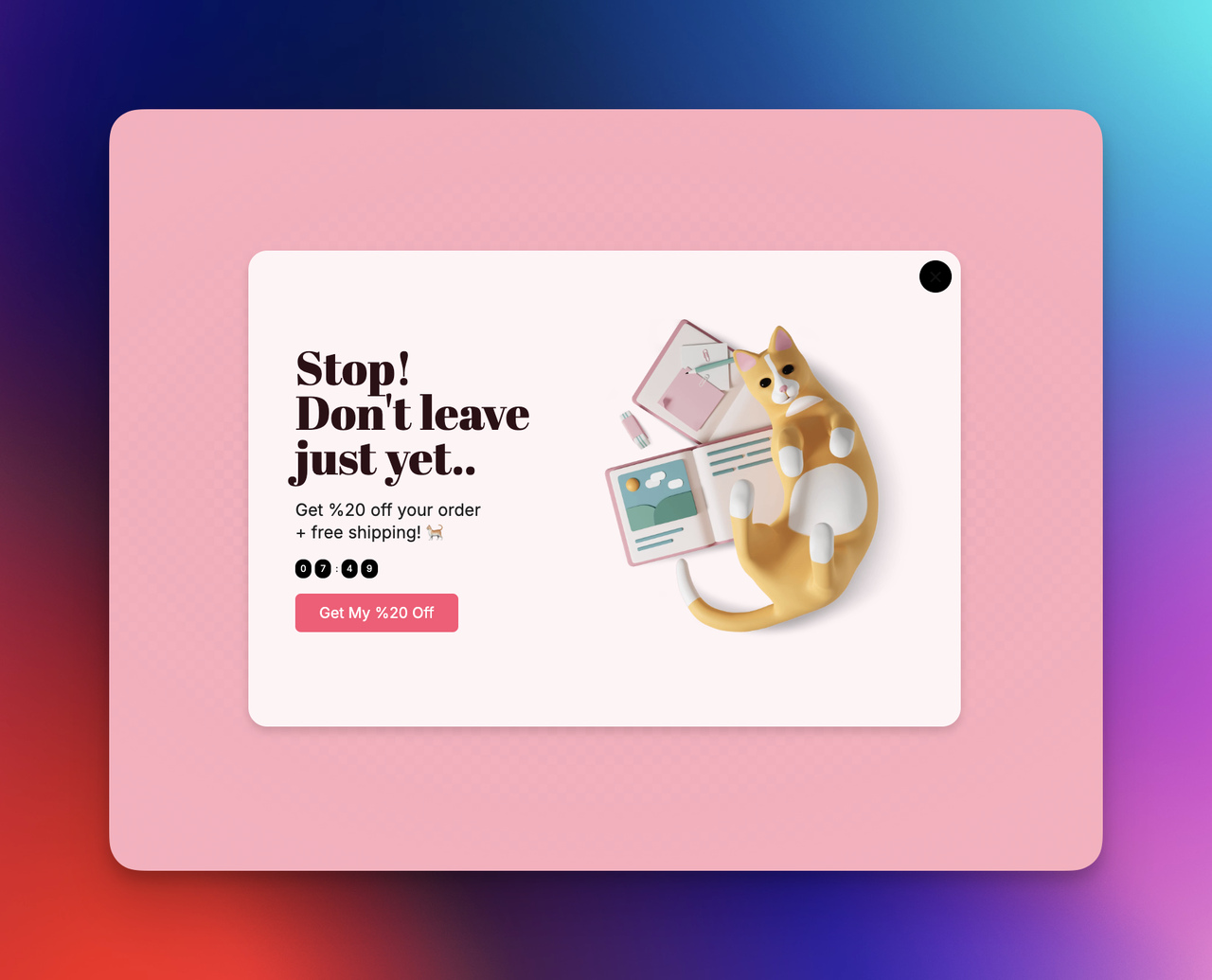
🟡 1) Discount-Based Cart Recovery Popups
This is the type most people recognize: the shopper moves to leave, and the popup offers something like “Hey—don’t leave yet! Here’s 10% off your order.”
I usually see these work best when the hesitation is clearly price-related. And that’s not a random guess, research on checkout behavior from the Baymard Institute shows that unexpected or high extra costs are one of the top reasons people abandon their carts. So when the barrier is cost, a small incentive can flip the decision.
👉 I like using this style especially for:
- first-time buyers
- seasonal campaigns
- high-margin items where a small discount is reasonable
The key, at least in my experience, is not to turn it into a “discount habit,” but to use it strategically — only when there’s clear hesitation.

🟢 2) Free-Shipping Reminder Popups
Sometimes the problem isn’t the product price — it’s the shipping fee shock at checkout. Instead of offering a discount, some stores show a popup like:
“You’re only $X away from free shipping — want to complete your order?”
This style connects directly with user behavior trends that many ecommerce studies highlight: shipping costs are one of the most common friction points behind abandonment. I usually see this popup perform well when:
- shipping thresholds exist
- shoppers are close to the free-shipping limit
- the brand prefers value-preserving incentives over discounts
It feels less like a “deal” and more like a smart reminder.
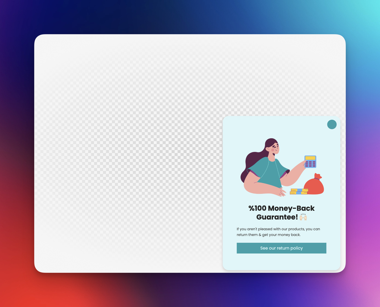
🔵 3) Trust & Reassurance Popups
Not every abandoned cart is about money — sometimes the hesitation is emotional:
- “Is this store reliable?”
- “What if the product doesn’t fit?”
- “Is payment secure?”
In those cases, I really like reassurance-focused popups that highlight things like free returns, secure checkout, warranties, or customer guarantees.
🟣 4) Reminder-Only “You Left Something Behind” Popups
Sometimes the most effective popup isn’t a discount or an incentive at all — it’s a simple reminder.
This works especially well for shoppers who were:
- browsing casually
- comparing products
- or got distracted mid-checkout
The popup just says something like:
“Your items are still in the cart — want to finish your order before leaving?”
I like this approach because it focuses on gentle continuity rather than pressure. It fits situations where abandonment isn’t driven by frustration — just interrupted intent.

🟠 5) Email Capture Cart Recovery Popups
This type shows up when someone is about to leave, but instead of pushing them back to checkout, the popup asks for an email to send a reminder or recovery follow-up.
So even if the shopper doesn’t convert immediately:
- you don’t lose them completely
- you turn the abandoned cart into a remarketing opportunity
- and the conversation continues beyond that moment
I see this as the long-game version of cart recovery — still valuable, just on a different timeline.

🧩 Choosing the right popup for the right situation
The takeaway here isn’t that one popup type is “the best.” What matters is matching the popup style to the reason behind the hesitation:
- price friction → discount or free-shipping
- doubt or uncertainty → reassurance
- distraction → simple reminder
- future recovery → email capture
When the popup fits the context instead of acting as a one-size-fits-all message, it feels more natural and far more effective.
🧭 Best Practices for High-Converting Cart Recovery Popups
Instead of guessing what “might” work, I like approaching cart recovery popups as something you can optimize deliberately, almost like tuning a growth lever step-by-step. So here’s a set of best practices I’ve found most effective, shaped by research, UX insights, and real-world ecommerce behavior patterns.
Think of this as a do-this, not-that checklist you can follow while building your own campaigns.
✅ Show the popup at the right moment, not too early
Cart recovery popups only work when they appear at genuine abandonment moments — not while the shopper is still exploring. That’s why I prefer triggers like:
- exit-intent on cart or checkout pages
- long inactivity during checkout
- scroll-back or hesitation signals
Showing the popup too early = interruption.
Showing it at hesitation = relevance.
✅ Keep the message short and goal-focused
I’ve noticed that the most effective cart recovery popups don’t over-explain. They usually do one of three things:
- reduce doubt
- reduce cost
- or remind the shopper to continue checkout
That simplicity also reflects broader checkout-usability findings. The Baymard Institute’s research highlights how unnecessary friction and cognitive load contribute to abandonment; meaning clarity often performs better than persuasion overload.
If the intent is strong, the shopper only needs a small push — not a speech.
✅ Match the popup to the reason behind hesitation
Instead of using the same popup everywhere, I like mapping messages to likely user behavior:
- price friction → small discount or free-shipping nudge
- trust hesitation → security, returns, or guarantee reassurance
- distraction → reminder-only message
- undecided shopper → save cart or email capture
Right message + right context = natural conversion lift.
✅ Avoid showing discounts to everyone
One mistake I see quite often is using blanket discounts for all cart exits. Instead, I prefer:
- limiting discounts to first-time buyers
- excluding repeat purchasers
- or using threshold-based incentives only when necessary
That way, the popup feels intentional — not like a permanent price reduction strategy. It also helps protect margins while still recovering vulnerable checkouts.
Cart recovery shouldn’t train users to wait for discounts — it should intervene only when there’s real drop-off risk.
✅ Always prioritize a smooth, “no-pressure” interaction
Above everything, I try to make cart recovery popups feel supportive instead of pushy:
- clear close button
- no guilt-trip wording
- gentle framing instead of urgency spam
This philosophy aligns with general UX and trust-factor discussions across ecommerce research — where experiences that feel intrusive or manipulative tend to harm user confidence rather than improve conversions over time.
A popup should feel like a helping hand — not an interruption.
📝 Quick recap — best practices checklist
Here’s the short version you can use while building:
- Trigger only at real abandonment signals
- Write short, focused messages
- Match popup type to abandonment cause
- Use discounts strategically, not by default
- Keep tone supportive, not aggressive
- Make the experience easy to dismiss when needed
If a popup feels natural, contextual, and helpful — it almost always performs better.
📊 How to Measure Cart Recovery Popup Performance
When I’m evaluating whether a cart recovery popup is actually doing its job, I try to avoid looking only at surface-level results like “more conversions.” Instead, I treat it almost like an analytics experiment. The goal isn’t just to see whether people clicked — it’s to understand how the popup influences behavior across the checkout journey.
Rather than guessing, I focus on a few core metrics that signal whether the popup is genuinely helping recovery — or just adding noise.
🎯 Metric 1 — Popup Conversion Rate (Did the popup influence action?)
This is the most basic but necessary metric:
👉 How many users who saw the popup continued to checkout or completed the purchase afterward?
I like using it to answer one simple question — did the popup move the session forward?
That mindset also connects with how abandonment patterns are analyzed in ecommerce usability research, such as the Baymard Institute’s findings on checkout behavior and recovery opportunities, where progress-based outcomes are considered more meaningful than shallow interactions.
If conversions don’t increase after the popup — it’s not doing its job, no matter how many people click it.
🕓 Metric 2 — Session Continuation Rate
This one matters a lot to me because it shows whether the popup kept the shopper from leaving — even if they didn’t buy immediately.
In simple terms:
👉 Did users stay on the site longer or continue navigating after the popup appeared?
If session continuation increases, it usually signals that the popup helped reduce hesitation — especially in cases where abandonment happened due to uncertainty rather than rejection.
💰 Metric 3 — Recovered Revenue vs. Discount Cost (if incentives are used)
Whenever discounts are involved, I try to measure performance from a value perspective — not just volume.
I look at two numbers side-by-side:
- revenue generated from recovered orders
- total discount cost applied to those orders
If the recovered revenue meaningfully outweighs the discount cost, the popup is creating ROI. If not, it might be recovering sales at the expense of margins, which isn’t a win in the long term.
🧾 Metric 4 — Email / SMS Capture Value (for follow-up recovery popups)
For popups that focus on collecting emails instead of immediately pushing checkout, I don’t judge success only by direct conversions. Instead, I evaluate how many recovered orders come later through abandoned-cart flows.
So in those cases, the popup’s value isn’t just the popup — it’s the future revenue stream it unlocks.
🧠 Metric 5 — Impact on User Experience (qualitative signals)
Not every result shows up in numbers, so I also pay attention to qualitative outcomes:
- Do support tickets about checkout friction decrease?
- Do fewer users drop off suddenly on the payment step?
- Does user behavior feel smoother in session recordings or heatmaps?
If the popup improves recovery without increasing frustration, that’s usually a sign that it’s aligned with natural shopper behavior instead of forcing it.
📝 How I evaluate success overall
When I put all these signals together, I don’t ask:
“Did the popup get clicks?”
I ask:
“Did the popup reduce abandonment and support checkout progress in a meaningful, sustainable way?”
If the answer is yes — that’s when I know the popup isn’t just present.
It’s actually working.
⚠️ Common Mistakes to Avoid
If there’s one thing I’ve noticed while looking at different cart recovery popup setups, it’s that many of the issues don’t come from the idea of using popups — they come from how they’re implemented. And sometimes, a popup fails not because it’s a bad concept, but because it’s working against the very behavior it’s supposed to support.
Here are a few mistakes I try to avoid whenever I’m thinking about cart recovery.
❌ Showing the popup too early
A recovery popup only makes sense when a shopper is actually at risk of leaving. If it appears while they’re still browsing or reviewing the cart, it stops feeling helpful and starts feeling interruptive.
If the user isn’t abandoning yet — the popup doesn’t belong there.
❌ Using the same message for every situation
One-size-fits-all messaging usually leads to one-size-fits-nothing results. A shopper hesitating because of price needs a different nudge than a shopper hesitating because of trust or uncertainty.
If the popup doesn’t reflect why they’re leaving, it can’t really help them stay.
❌ Training shoppers to wait for discounts
If every exit triggers a coupon, customers eventually learn the pattern — and instead of buying right away, they wait for the popup to appear.
That leads to an uncomfortable situation where the brand isn’t recovering lost sales — it’s discounting sales it might have earned anyway.
For that reason, I try to treat discounts as situational tools, not default behavior. Otherwise, recovery turns into dependency.
❌ Overcomplicating the message
A cart recovery popup isn’t the place for long explanations or emotional storytelling. At that moment, the shopper already knows what they were trying to buy — they just need a reason to continue.
When the message is simple, the decision feels simpler too.
❌ Forgetting that dismissal should always be easy
One thing I always try to keep in mind is that a popup shouldn’t trap the user. If closing the popup feels difficult or forced, the experience shifts from supportive to manipulative — and that rarely ends well for long-term trust.
A dismissal option should always be visible, intuitive, and respectful of the shopper’s choice.
Because at the end of the day, a cart recovery popup isn’t there to win every checkout — only the ones that can be recovered without breaking the user experience in the process.

🏁 Conclusion: Bringing It All Together
When I step back and look at everything around cart recovery popups, I don’t really see them as a “growth hack” or a quick optimization trick. To me, they’re more like a second chance in the buying journey — a moment where you gently reconnect with a shopper who was already interested but hesitated for one reason or another.
Across the research, examples, and best practices we’ve walked through, one idea keeps repeating itself:
Cart recovery popups work best when they respect the shopper’s intent instead of pushing against it.
They don’t fix every abandoned cart.
They don’t replace good UX or a smooth checkout.
But when they’re timed well, written thoughtfully, and matched to the real reason behind hesitation, they can turn uncertain exits into completed decisions — and sometimes, that’s all a customer really needs.
If there’s one takeaway I’d emphasize, it’s this:
A great cart recovery popup doesn’t force a sale — it removes the last piece of doubt standing in the way of one.
And when that happens, recovery feels less like persuasion…
and more like helping the shopper finish something they already wanted to do.
🙋♀️ FAQ - Cart Recovery Popups
What is the main purpose of a cart recovery popup?
The main purpose of a cart recovery popup is to re-engage shoppers who are about to abandon their cart or checkout page by giving them a gentle reminder, reassurance, or incentive to continue the purchase. It appears only at moments where exit behavior or hesitation is detected — not during normal browsing.
Do cart recovery popups always need to include a discount?
No — and in many cases, they actually work well without discounts. Research on abandonment reasons from the Baymard Institute shows that hesitation is often caused by friction, uncertainty, or interruption — not just price.
That’s why reminders or reassurance-based messages can sometimes perform just as well — or even better — than coupons.
Where should cart recovery popups appear — cart page or checkout page?
They’re most effective when triggered on high-intent pages such as:
- the cart page
- the checkout page
- or just before tab-close during checkout
The goal is to intervene only when abandonment is likely, rather than interrupting earlier browsing stages.
Are cart recovery popups better than abandoned-cart emails?
They don’t replace each other — they work together.
- Cart recovery popups help recover users in the same session
- Abandoned-cart emails (or SMS) help recover users after they leave
A popup is the first rescue attempt — email is the second.
Final Thought 🐾
A good cart recovery popup doesn’t chase the shopper — it gently invites them back, like a curious cat circling a warm spot it almost walked away from. When the message feels calm, reassuring, and well-timed, they don’t just return… they choose to stay. 🐱✨
- 60+ Types of Popups for Every Goal and Beyond
- Top 13 Popup Use Cases To Increase Conversions


