
What Is a Call-To-Action (CTA)?
A call to action is a phrase or a statement that tells your customers to take a specific action.
It is the step-by-step direction of what you want them to do next if they are interested in your offer.
If you want more leads from your website, you need to use high-quality calls-to-action on every website page, and using persuasive and attractive call-to-actions can make or break any business.
We will go over different kinds of CTA examples from different areas and platforms to guide you better. Let's start!
Landing Page & Website Call-to-Action (CTA) Examples
The landing page represents the first interaction with the visitors, so you need to pay great attention to it.
You can increase your customers' curiosity with your CTA, which is a step to knowing the product you serve.
1. Target
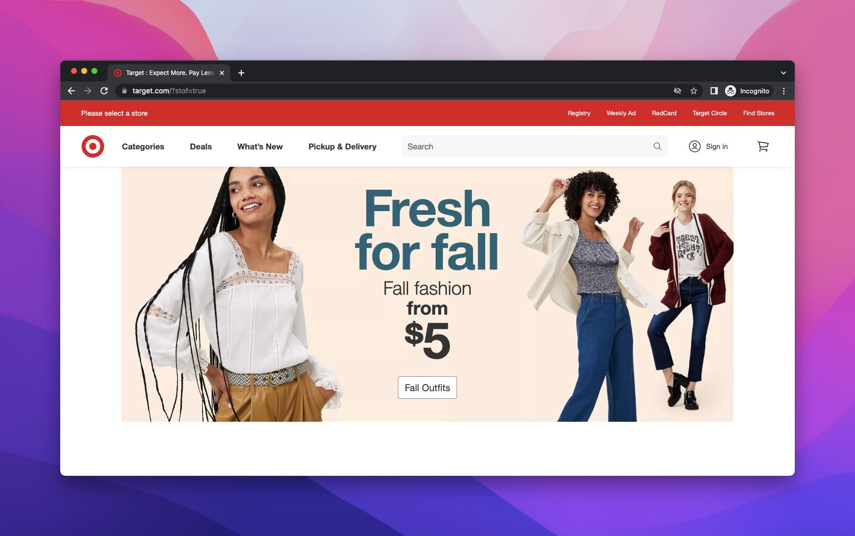
The first example is for the Target website. We see a seasonal marketing campaign on the CTA button.
CTA: Fall Outfits
They have a discount on the page, and it is a useful activity to share the tagline based on the discount and the season you are in. Also, the page highlights the images to make the customers look for a CTA.
2. Adidas

Our second example is Adidas's homepage, where they promote the school season.
Again, the CTA button is above the fold with a simple explanation above.
CTAs: Shop Women, Shop Men, Shop Kids
CTAs are abundant and ordered in order to show customers their concern and diversity.
Also, they share the models wearing Adidas products in the picture, and the buttons are located apparently.
3. Grammarly

The following example is Grammarly's homepage.
CTA: Download Grammarly. It's free
Since the CTA stands out, and there is enough white space around it, which directs the visitors' focus to the action.
Also, they stated "It's free" in the CTA, which is also highly effective for the decisions of the users.
The design of the page is simple and clear enough to see all properly, so the CTA matters as you see.
4. Simplified

The next one is from Simplified. The landing page is designed practically, and there are few colors to set up.
However, the design shows simplicity, and this correlation is essential for the prospects since it evokes trust.
CTA: Get Started For Free
The color contrast is also made correctly so that CTA can stand out easily from the other content, even if the page is not crowded with images and other content on the above-the-fold part.
5. Netflix

Netflix's CTA is also a great example since it is highly distinguished, and it is clearly stated what you should do to do the action on the button.
CTA: Get Started
In this case, you have to enter your email address to "Get Started".
Their offerings are also directly put above the CTA, making their work easier to attract attention.
Also, the CTA seems more on the floor since there are movies and series on Netflix with a blurred view.
6. Special K

With a particular product promotion on the landing page, the CTA and the color of the product create such harmony together that it is clear the brand wants to make the website chic.
CTA: Explore Fruit & Yogurt"
There is a description on the CTA button explaining the food, and the CTA button is a proper supplement with the explanation by Special K.
Additionally, the products on the above-the-fold part are changeable, and when we control all, they have adequate CTAs to trigger.
7. Headspace
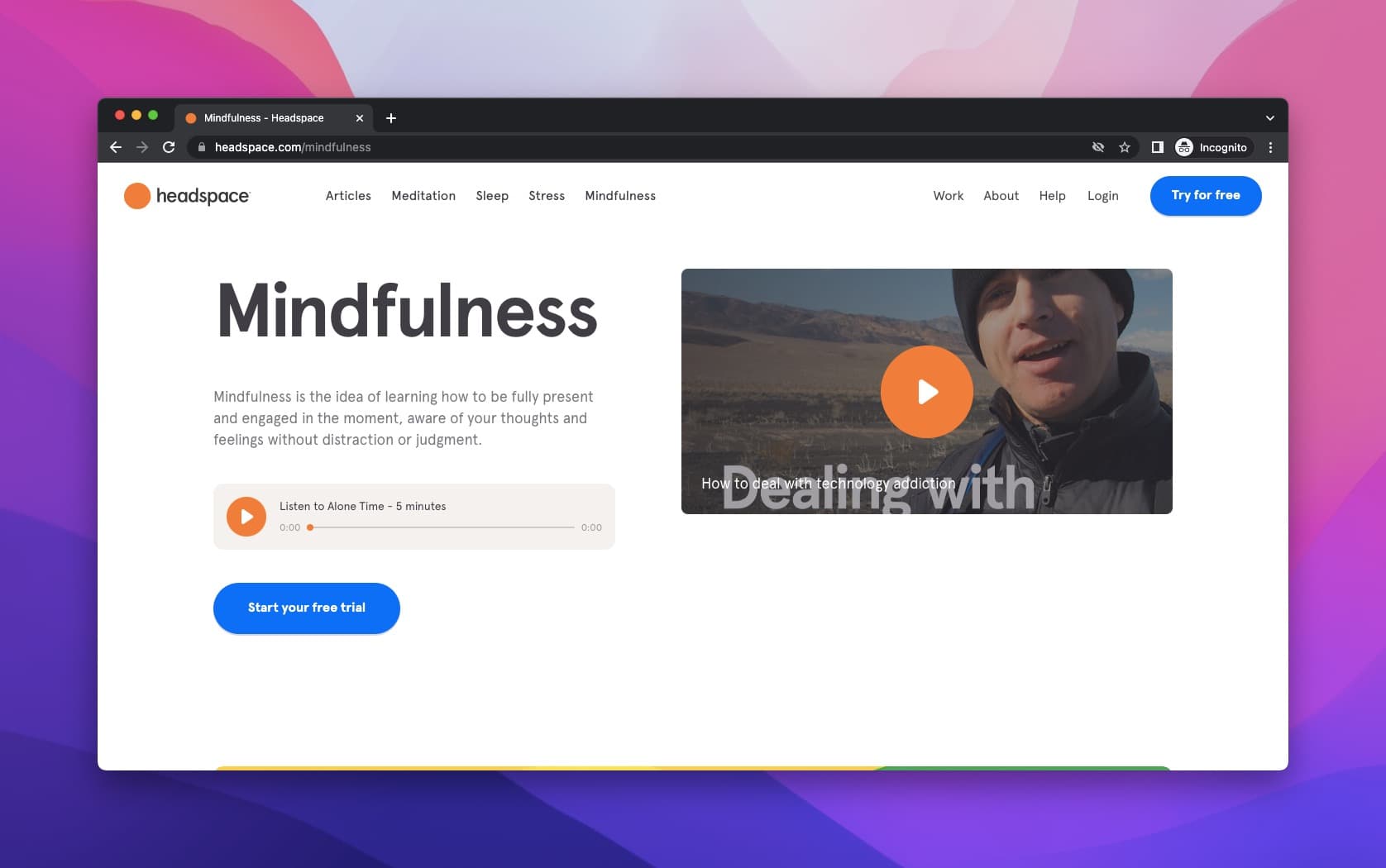
The last example of landing pages is Headspace. Let's look at one of their CTA buttons which belongs to different offerings.
It is important to see a free recording before making a start since it could help people be ready for what they will see and what they should expect.
For this case, they offer a 5 min meditation for their "Mindfulness" category. After the recording, you can click the CTA button and start your meditation.
CTA: Start your free trial
E-commerce Call-to-Action (CTA) Examples
When we consider e-commerce growth statistics, e-commerce is a rapidly growing industry.
Some brands struggle to convert their online traffic into sales. That's why we've compiled several examples of effective CTA strategies you can use for your site.
1. Shopify
The first example for eCommerce CTAs is an eCommerce platform Shopify.

Shopify's choice of CTA is an offer for a free trial. They show the platform with a very effective narration and scenes right next to the desired action.
Therefore, it can be considered a subsidiary element of the CTA.
Right below the CTA, Shopify closely details what will happen when they perform the desired action.
CTA: Start free trial
This CTA is quite sufficient for a well-known brand like Shopify, and sometimes the clear details provide everything to take action with such kinds of buttons.
2. Versace

Let's look at the Versace's example for the e-commerce CTAs. The image is from the product page of Versace, and it is too simple.
As you can see, there is no way that you miss the CTA button. Furthermore, both the placement of the CTA and the color choice are set correctly.
CTA: Add to Bag
Having all the information right around the CTA button on the product page is crucial.
For example, they have the price, the sizes, the product image, and the product description.
Though it is not clearly given in the image, there are subtitles of the product if you wonder about the details related to the product.
3. Victoria's Secret

Another e-commerce retail CTA example is from Victoria's Secret. The window below pops up after you add an item to your cart.
There are two CTA buttons here, but the main goal of VS is to convince customers to continue shopping with offerings like the "Pairs Perfectly With" section.
These items back up the CTA "Continue Shopping."
They also put "Check Out" CTA if the shopper wants to go straight to the basket.
4. La Roche Posay

The fourth example is from the La Roche Posaywebsite when you enter the website, a popup that you a chance to alter your location.
Then, you move on, and the image shows the mini sets that the brand prepares for the customers to sell more.
Also, the code which provides discounts is another leading factor to move on when it becomes one with a strong CTA.
CTA: Shop Now
5. Best Buy

The last example for this category is from Best Buy.
They offer a protection warranty with a popup window when you add a product to the cart.
There are multiple CTAs on this window.
According to your purchase, they offer two different protection options for you, which allows them to show their offerings regarding that product.
CTA: Select A Plan, Go to Cart, Add Totaltech
Popup Call-to-Action (CTA) Examples
Popup call-to-action examples are a great way to get visitors to interact with your website.
They allow you to ask for an email address, download a file, or even take the visitor directly to another page on your site.
1. Popupsmart
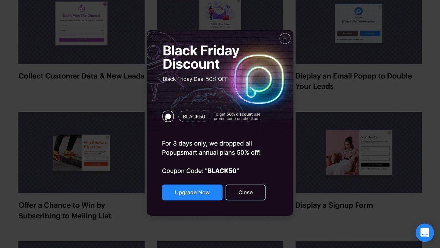
Our first example is one of the popups prepared by Popupsmart, no code popup builder for Black Friday.
As you can see, the CTA stands out from the rest of the content. What the prospect should expect from taking the desired action is also summarized in the popup.
!!CTA: Upgrade Now
2. WWF

The second example for popup CTA's is from WWF. This CTA is to get visitors' subscriptions and their contact information.
CTA: Subscribe now
This one is an emotional trigger since the cause of WWF is to protect the planet, climate & animals with "Care about our planet?"
The message they put on the popup directly plays a massive role in the prospect's decision-making process.
3. Everlane

The following example is fromEverlane's Black Friday popup. They sure know how to grab the visitors' attention with those colors!
They also put a countdown timer to trigger FOMO.
Finally, they put two CTA's, which can be counted as one since one is for women, and the other is for men.
4. Beefeater

The next one is from Beefeater. They show a popup to collect prospects' emails with an offering.
This time they offer a discount on their online shop for a newsletter subscription.
CTA: Subscribe
Also, their CTA button is red, which correlates with the brand and other colors.
Email Call-to-Action (CTA) Examples
Every single email you send has the potential to convert a lead into a customer, but only if it's compelling.
And to be compelling enough to make someone take action, your call-to-action (CTA) needs to stand out from all the other emails floating around in your reader's inbox.
1. LinkedIn
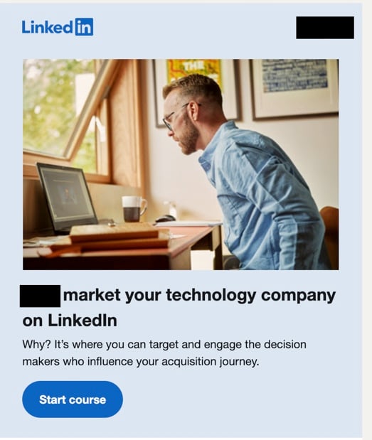
The first example is from LinkedIn marketing emails. As an informative email example, it is also highly guiding.
They send entirely personalized emails based on your company and company industry.
In this email, they are promoting their courses. The CTA button is clear and tells you precisely what you will be about to do if you press the button.
CTA: Start Course
2. Loom

The next one is from Loom. Again, they remind customers that their trial is about to end, highlighting what they will lose if they don't upgrade their plan before the CTA.
CTA: Add Payment Details Now
3. Mixpanel

Mixpanel is promoting their webinar in this example by giving necessary information about the webinar.
First, they put the CTA at the end of the email, which is very common for email CTAs.
Then, just before the CTA, they placed the date, venue, and other details for the webinar to leave no question marks for the prospects.
CTA: Save your seat
4. Grammarly

We have another Grammarly example in email CTAs for you this time.
First, they start by asking an engaging joke to engage the reader with the email, which leads them to read the rest of the mail.
Then, they have an offer for their premium plan after the joke.
CTA: Get Grammarly Premium
Instagram Call-to-Action (CTA) Examples
Instagram is the most popular social media platform, with over 1 billion monthly active users.
So it's no surprise that brands are taking Instagram as a new way to reach their target demographics, and it works!
By using attractive imagery paired with a call-to-action (CTA), you can prompt consumers to take action with your branded hashtag or website link.
1. Milagron
Our first instance is from the Stories property of Instagram. Milagron shows their products via a short story and adds a CTA to lead prospects to the site.
CTA: Shop Now

2. P&G
The second example is from P&G.
They chose the post property of Instagram for their ad with a simple explanation of the description and an image supporting the description.
They put the CTA as Apply Now since they offer an internship.

3. Coursera
The following example is from Coursera. It is from a post again.
They are promoting their courses via this ad, and they choose a CTA "Learn More " to help the prospects get more information about the courses.

4. KylieBaby
The last example for Instagram is for KylieBaby's own Instagram profile. Instagram provides multiple CTA buttons, and they also put the "View Shop" button along with others.
So the customers can view the shop of KylieBaby directly if they please easily.

Google Ads Call-to-Action Examples
Call-to-Action (CTA) is one of the essential elements of creating a successful Google Ads campaign.
A CTA is an instruction for the user on proceeding, such as "Buy Now" or "Learn More."
1. Cigna

The first example of Google Ads CTA is Cigna, an insurance company.
They put two different CTA for their ad:
- The first one is a "Contact Us" button for more contact.
- The other CTA matches the headline to persuade people.
2. Spotify

The second one is Spotify's Ad. Their headline includes CTA "Try 1 Month Free" and "Unlimited Skips" to promote their offerings.
They also add multiple features in the meta description, which supports the main ad.
The subheadings include Listen Free on Spotify and an offer for students.
3. Atlassian

Atlassian gives the CTA right at the beginning of the ad; "Make Tasks More Affordable" is also a common approach to CTA use in Google Ads.
It makes Atlassian seem more to the point and targets the audience.
4. Trello

The following example is from Trello.
They promoted themselves with the headline "To-Do List Software" and added two CTAs.
These CTAs are Pricing Plans and Take A Tour. In comparison, the first one refers to the customer's payments. The second one is about the promotion of Trello.
Creative Call-to-Action (CTA) Examples
To be effective, a call-to-action needs to accomplish a few things:
- It needs to be noticeable.
- It needs to stand out from the rest of the page somehow, in shape or form.
- It needs to invite interaction.
Plus, if you want a successful CTA, you need a creative one!
1. Full Bundle
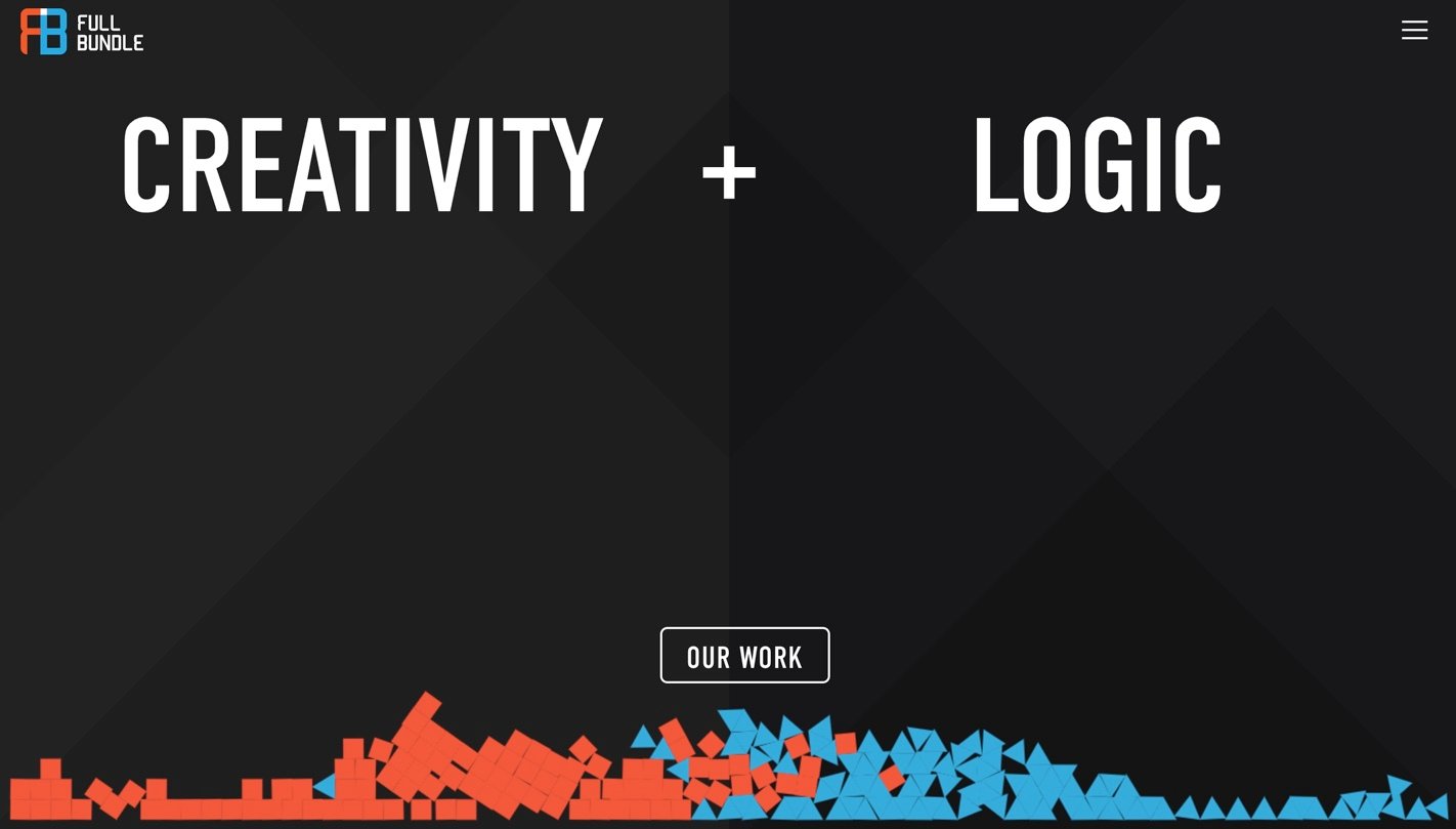
Our first example is from Full Bundle, a web design agency.
They created a minimal and straightforward homepage with a different CTA.
Their most powerful tool to get conversions is to show what they have done before.
Therefore, the CTA choice is a strategic one.
2. Uber

The next one is from Uber.
Their CTA is "Sign up to ride," which is perfect for Uber's business model.
Although they put a small CTA on above-the-fold part, it is still apparent.
3. Dunkin' Donuts
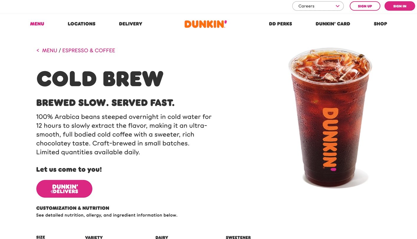
The third one is from the delicious donut shop Dunkin' Donuts.
When you choose an item from the menu, this screen shows a CTA: Dunkin' Delivers.
This one is also creative since they put "Let us come to you" right above the CTA. The choice of colors and fonts also fit the brand image and are noticeable.
Call-to-Action (CTA) Statistics
- Hubspot shares that personalized CTAs convert 202% better than default versions.
- The research made by Vye displays that the Average Click-Through Rate of CTAs is 4.23%.
- The same source reveals that the average CTR for button CTAs is 5.31%. The highest button CTA click-through rate was almost 70%.
- "Including One Clear CTA in Emails Boosts Clicks by 371%, Sales by 1617%" based on the article of Wordstream
- 70% of small business B2B websites lack CTA.
- According to the article of Lancashire Business View, 47% of websites have a clear call-to-action button that takes users 3 seconds or less to see.
Wrap Up
All in all, it is apparent that CTA can change the way you go and lead your business because it boosts sales, leads generation, and more.
If you want to have more clicks and better conversions, you'd better not waste your time any longer and find your ideal CTA from the examples we share.
We hope you have enjoyed the CTA examples, and may these inspire you for better steps. Share your favorite in the comments!


