Device-Based Targeting
Non-responsive mobile popups annoy users as they block the content on small screens.The good news is you don't need to lose customers by showing them the wrong campaign.
Non-responsive mobile popups annoy users as they block the content on small screens.
The good news is you don't need to lose customers by showing them the wrong campaign.
Popupsmart has device-based targeting for popup campaigns to let you show your popup in optimal size for desktop or mobile devices.
Pro Tip
You don't have to start from scratch! You can always use Popupsmart's ready-to-convert popup templates prepared with built-in segmentation features.
Quick Method: Device Icons
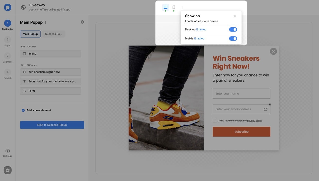
Check Device Status
See the mobile and desktop icons on the upper center of your popup builder screen. You can see if they are "enabled" (green) or "disabled" (red) and make the necessary changes by clicking on the three dots and toggling on the buttons.
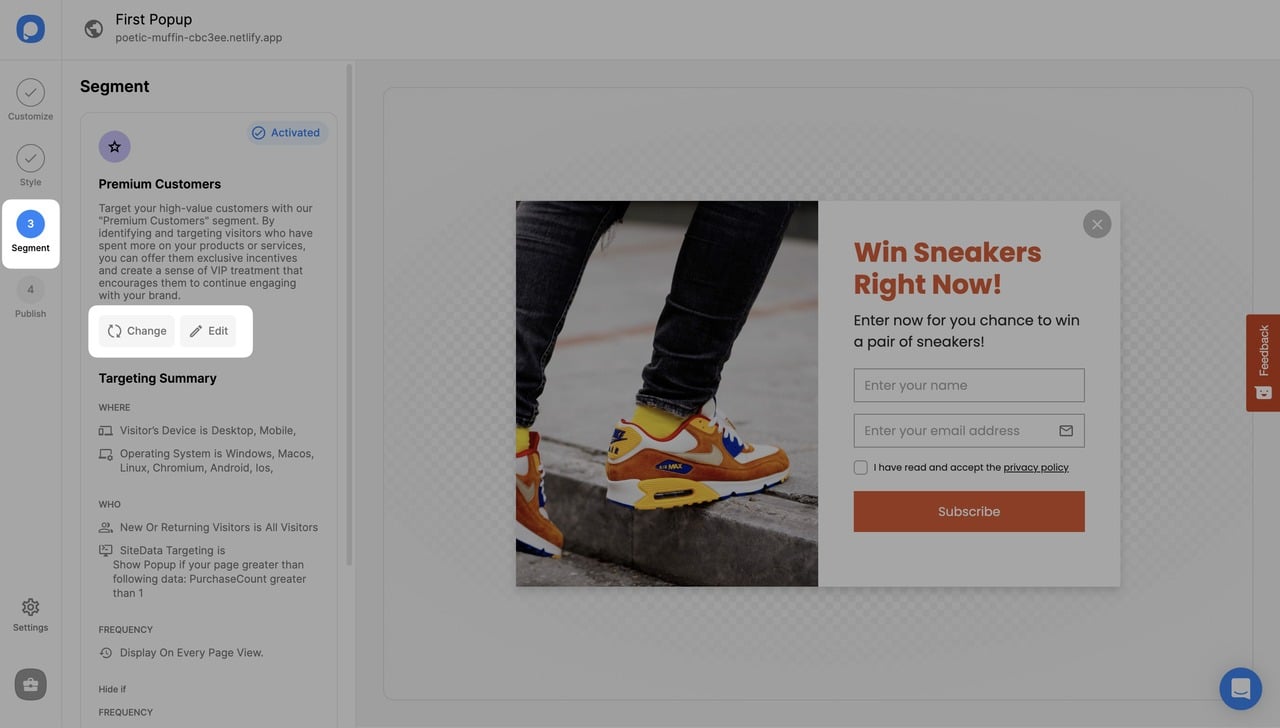
From Segment Tab
Navigate to Segment
On the popup builder screen, navigate to the "Segment" section and click "Edit Segment." (If it's a new campaign, click the two circular arrows to choose a predefined segment or create one from scratch in "My Segment.")
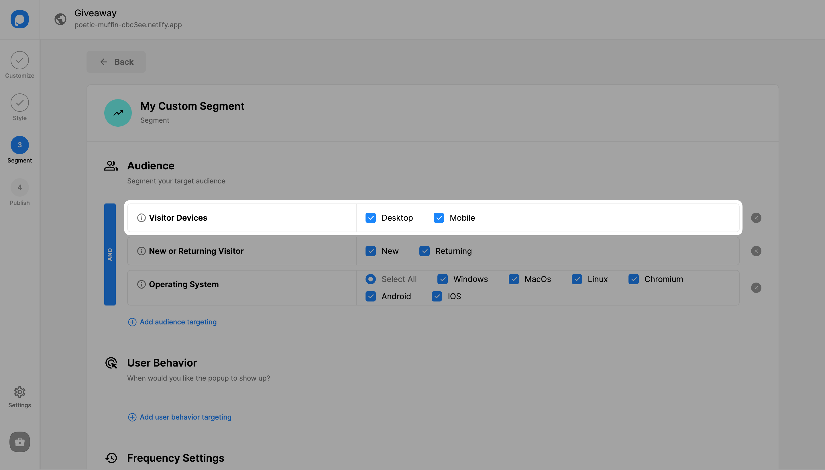
View Default Settings
"Visitor Device" targeting comes by default with both "Desktop" and "Mobile" checked.
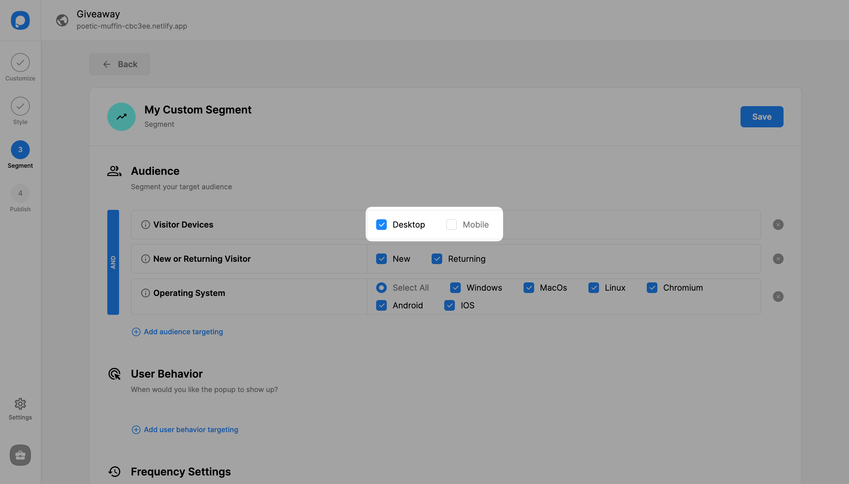
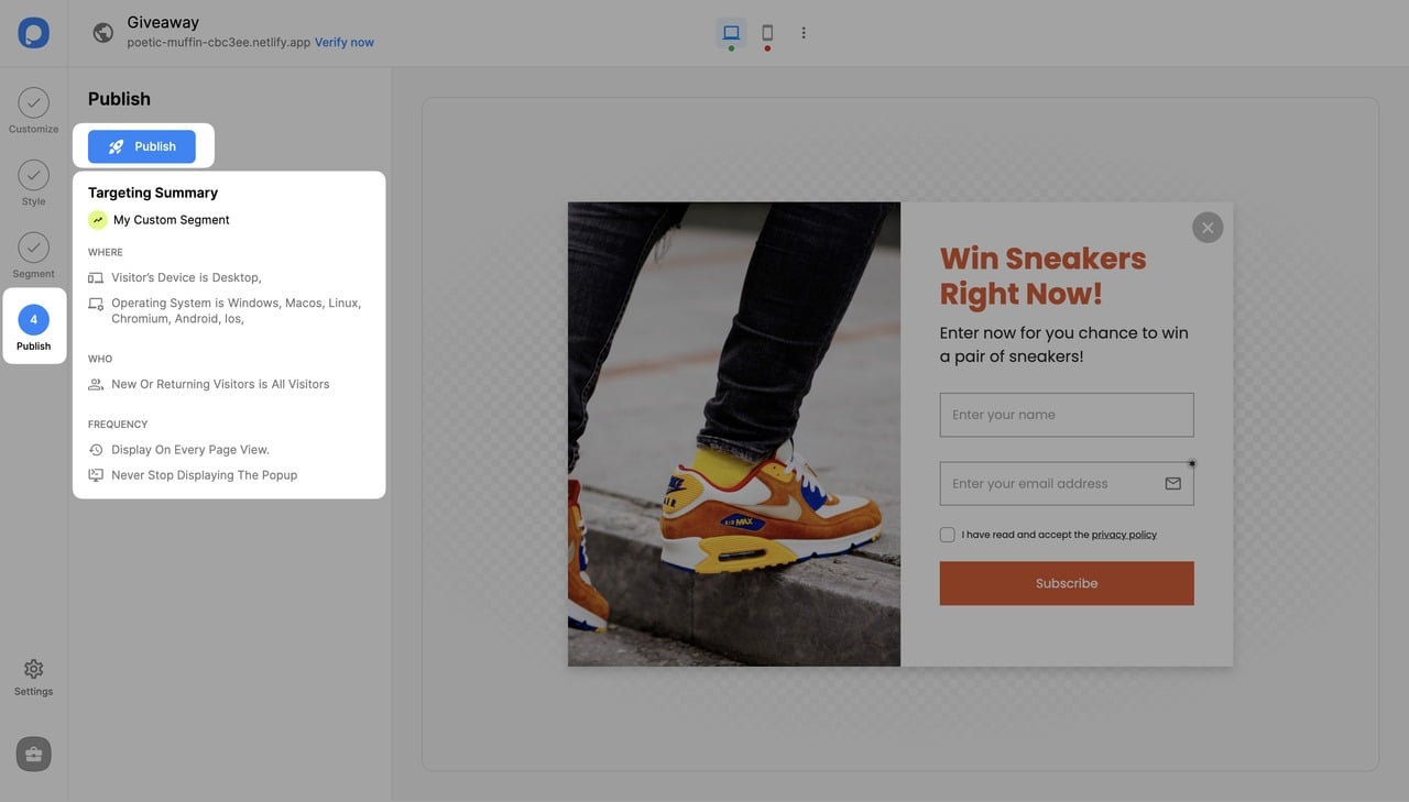
Save and Publish
Save your segmentation once you finalize the customization and continue with the "Publish" step from the left-hand menu to see the Targeting Summary.
Flexibility
You can select only one type of device or both mobile and desktop, too. Now your popup is activated for the devices you set.
How is this guide?