Why is the FAQ Page Important?

FAQ pages are important because they help you answer your customers' questions.
They serve as a resource for users who are either unfamiliar with the business or who may want to learn more about the company. You can reach your target audience and get unique visitors. They can also help you identify what's missing from your website and make improvements.
You can use the FAQ page to improve your customer service, for example, by offering them a way to contact you via email or phone.
Also, if people can't find answers to their questions in the FAQ part, customer support can help them as you include contact information there.
Top 16 FAQ Page Examples for Inspiration
FAQ pages effectively improve your relationship with your customers and answer their questions on one page. These pages can help you to reach your target customers and convert them more.
Here we gathered the top 16 FAQ page examples that can inspire you to develop your own:
1. Popupsmart

Popupsmart's FAQ page is designed simple yet functional. A search bar is added before the questions, allowing people to search for their specific questions.
As a popup builder, Popupsmart includes its features in the FAQ section as well. The tool's main features are explained along with frequently asked questions. By expanding the question with an arrow, people can see the answers to questions they are interested in.
There are many questions in this FAQ section, and the "load more questions" part is added at the end.
On the left side, "Can't find what you are looking for? We would like to chat with you." is written as well. In that way, people who can't find answers to particular questions are redirected to customer support.
2. Zapier

Zapier's FAQ page functions as a help center that offers answers to many questions. Questions are given as a list and designed to be expandable by clicking. Questions are answered briefly, and side notes are given with a "Note" section with an eye icon.
Zapier links its other documents in the FAQ section and redirects people to the particular pages that explain the question. In that way, the FAQ part looks more minimal and straightforward.
There are only three questions in the FAQ part, but more resources are given above the section as part of the help center.
In the end, the "Need more help?" part is added for those who couldn't find what they expected as well.
3. Shopify

Shopify's FAQ section starts with the headline "Shopify FAQ," and the function of this page is explained in the description part. Also, an attractive illustration of two people speaking is added on the right side.
For detailed information, the help center page is also linked in the description part.
This FAQ page is divided into different categories, which makes it easier for people to find related questions quickly. Categorizing your FAQ page can help your visitors make the most of this page.
Since Shopify divides frequently asked questions into various categories, people can quickly save time and solve their problems.
Shopify explains these questions briefly and links related pages in the answers. Using the same strategy, you can also improve your link building on your FAQ page.
4. Octopus

Octopus' FAQ page starts with the headline "Let's talk about site mapping," which is among the solutions it provides. The essential features of the tool are explained quickly in the first section.
Then, the frequently asked questions are divided into categories such as "General" and "Account & Pricing." Both of these categories involve short questions with short explanations.
Questions that need further explanation are explained in detail, whereas some are answered with a single sentence.
Apart from these, the design of this FAQ page is simple, and consistent colors are used. It can be said that the division of categories with boxes makes it more functional to differentiate that there are two different categories.
5. Postcards

Postcards' FAQ page is very simple and straightforward. It starts with the headline "Frequent Answers and Questions," and questions are given below the headline.
A list of questions is given, and for answers, the question part can be expanded by clicking the plus sign. Although it doesn't provide categories, questions are given smoothly and related to each other.
The answers in this section are short yet descriptive. Also, Postcards include links to related pages that provide more detailed information.

Below the questions, the headline "Can't find an answer to your question?" is added with a well-designed illustration. In addition, it includes a CTA button that says "Ask your question," which redirects people to customer support.
That way, people that don't find the FAQ section sufficient can ask their questions to customer support quickly through the chat box.
6. Spendesk

Spendesk's FAQ page starts with the headline "F.A.Q," and the description part states that people can learn everything about the tool. In addition, two CTA buttons, "Book a demo" and "Try it out," are added below the description part.
Below the description, questions are divided into various categories. FAQ page categories of Spendesk include the basics, Spendesk cards, general information, and contact information.
Questions are answered with well-developed paragraphs and short sentences. Bullet points are used in the long ones, making it easy to read the whole section.
Overall, the UI design of this page looks minimal and consistent with the brand's identity. Exact brand colors and fonts are used, which is crucial to consider while forming your FAQ page.
7. Miro

Miro's help center includes an FAQ section that is designed to be very functional. Questions are expandable, and the page doesn't look so crowded. There are short questions with to-the-point answers in this section as well.
On the other hand, these short explanations include links to articles with well-developed information. Moreover, questions are very general and simple and go hand in hand with the page's function.
Below the FAQ section, useful parts, such as getting started and using Miro, are included. That way, people can use the resources they need to solve their problems and properly use the tool. Also, these parts have illustrations that look appealing.
8. Glide

Glide's support page also functions as an FAQ page. The page starts with the headline "Get Help," and a search bar is included. On the search bar, "FAQs, videos, documentation and forum posts" is written, which emphasizes the resources for visitors.
Below the description, mostly asked questions are listed in different categories. There are a lot of questions on this page, and all of these questions are explained in well-developed copies.
Also, on the right side, the quick links part provides links for the community page, documentation, and hire an expert part.
Overall, it can be said that this page functions well as an FAQ page since it provides many questions on different topics with a minimal design.
9. FlowMapp
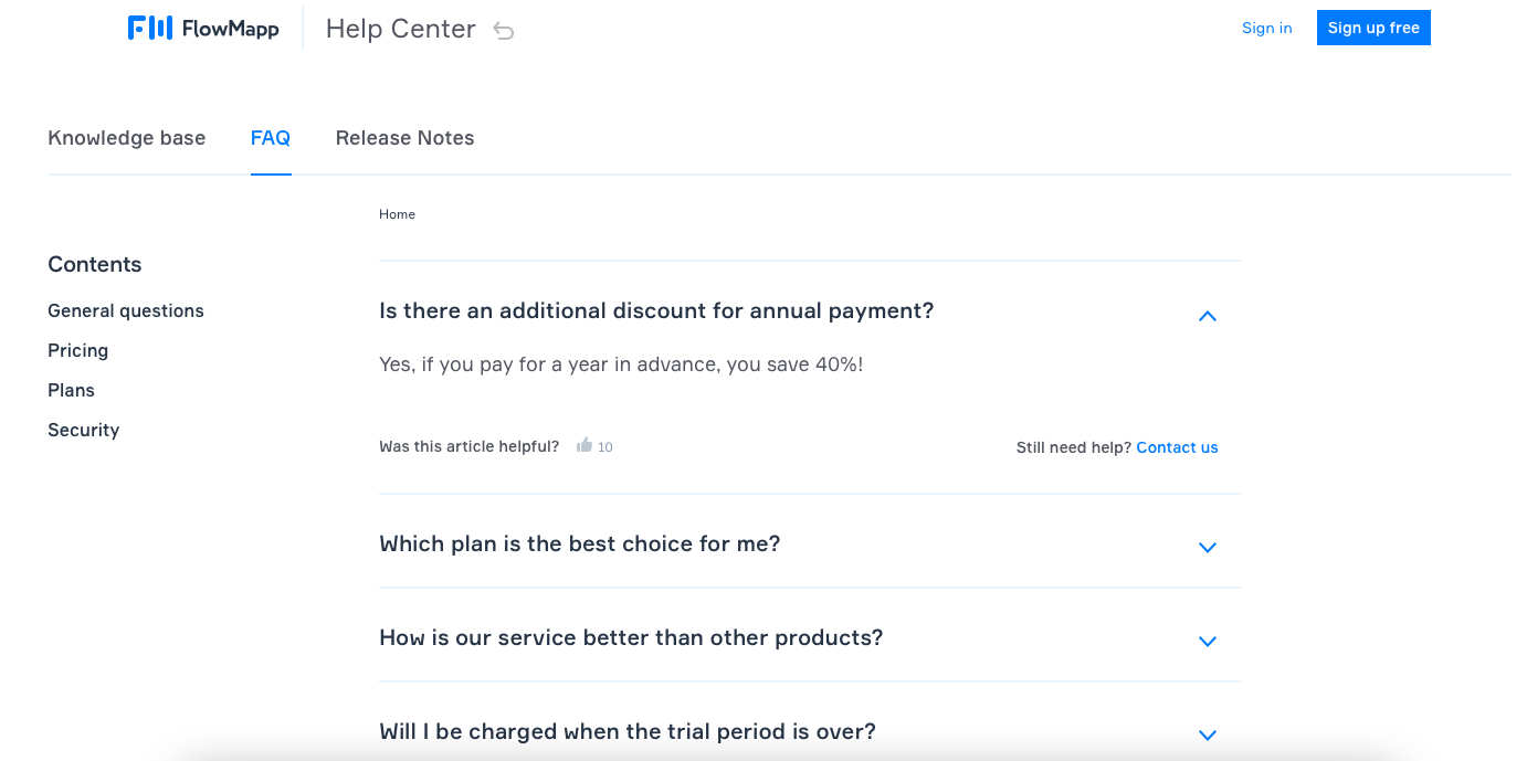
FlowMapp's FAQ page exists in the help center, along with a knowledge base and release notes. This FAQ page example is text-oriented and can be applied to any business.
On the left side, FAQ categories are given under the headline "Contents." In each category, short questions with to-the-point answers are given.
Below every answer, "Was this article helpful?" is written with a thumbs up sign. That way, the company can collect feedback from their questions. Also, people who read the FAQ section can see whether the answer is helpful or not.
Apart from it, "Still need help? Contact us" is written next to the answer. FlowMapp leads its visitors to its customer support if they can't find any solution to their questions in this part.
10. Magic Spoon
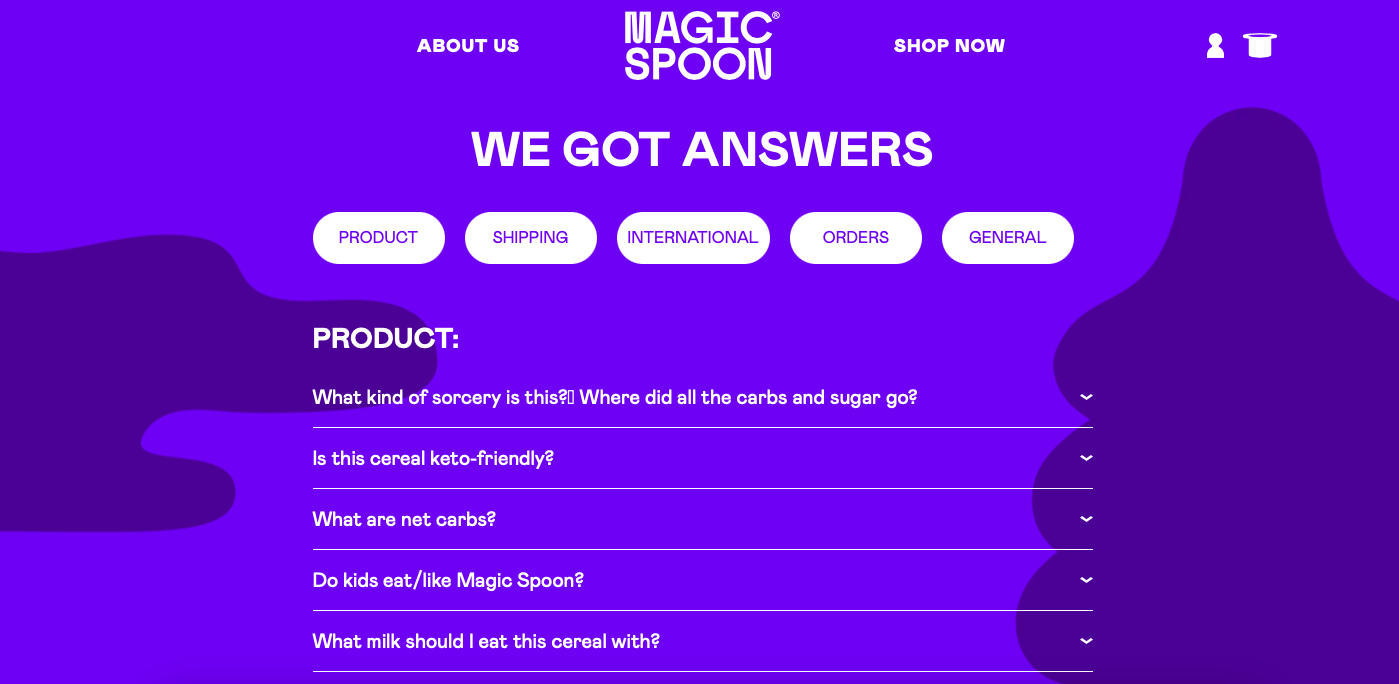
Magic Spoon's FAQ page is an excellent example of a witty copy. The headline is "We got answers," which is proper to grab attention. Below the headline, various categories on the FAQ page are given.
Questions and answers are written in a conversational tone, and phrases used on this page are sincere. There are many questions in Magic Spoon's FAQ section, which is proper since it is a food company.
Although many questions provide short and precise answers, the company's contact information is also given at the end of the page.
11. Thirdlove

Thirdlove's help page includes an FAQ section. It starts with the headline "Frequently Asked Questions" and a search bar that can make people's jobs easier.
Since it is a lingerie company, the description part says, "Our bras aren't the only thing that offers support," which can be considered a witty copy example. The brand includes its contact information in the description part as well.
Frequently asked questions are divided into sections, each with a related icon. That way, the FAQ page looks more aesthetically pleasing and is easy to manage. Questions in these categories are to-the-point, and short answers are given.
12. Haley's Beauty
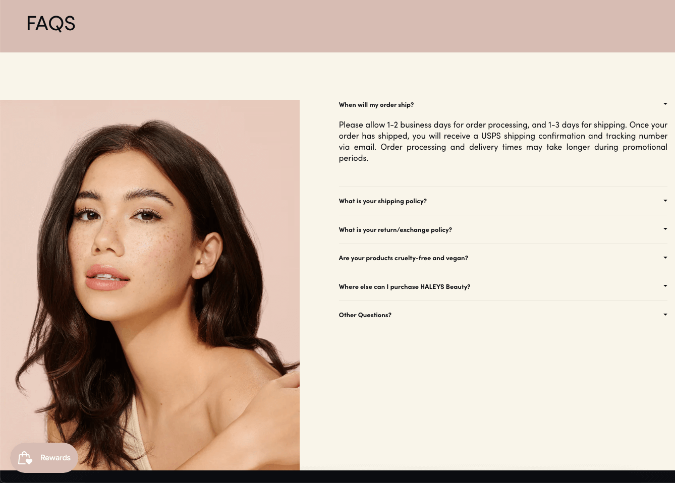
Haley's Beauty's FAQ page is an example of a well-designed and appealing FAQ page. Considering that it is a cosmetics brand, an image of a woman wearing the brand's products is given on the left side of the page.
On the right side, only five frequently asked questions are given, which can be considered sufficient for a company like this. After these questions, customer support's contact information is given below the subheadline "Other questions?"
Overall, this FAQ page is designed according to the brand's identity, with the consistent use of color and fonts. It serves customers' needs and offers customer support for those who couldn't find an answer to their questions.
13. McDonald's

McDonald's' FAQ page starts with "Get your questions answered." It includes a search bar that says "Search for a question" since there are many questions on this page.
Besides this, McDonald's FAQ page has filters that include different question categories. Below that, frequently asked questions are given in many boxes. Questions are very detailed, and answers are correctly written. Also, links to related pages are provided in the answer sections.
In general, the FAQ page of McDonald's is detailed and full of texts. The usage of fonts is consistent, considering the whole website. Also, there aren't many colors on this page besides yellow, which is among the brand's colors.
14. Nintendo Switch
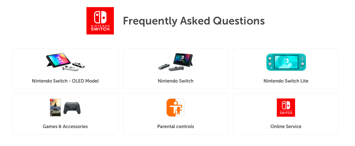
Nintendo Switch's FAQ page starts with the headline "Frequently Asked Questions," which is next to the brand's logo.
This page is divided into different categories, which are various products. By building these categories, the brand includes product-related questions and answers.
Clear product images are given with the categories, which is great for promoting products. Also, people can find what they are searching for thanks to images and categories.
Each of these categories has various questions, and these questions are explained briefly. Questions are given in a list format, and visitors can see the answers by clicking each question. Related links are added to these answers, and link building is made properly.
15. The Sill
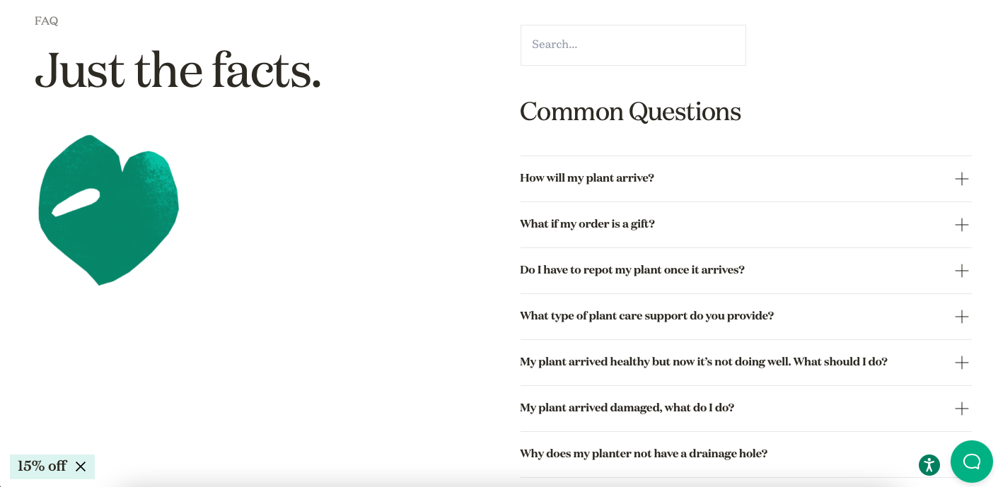
The Sill's FAQ page has a minimal style that suits the brand's style. The page starts with the headline "Just the facts." which is a direct and confident headline example.
Below the headline, there is an illustration of a heart shape, which goes hand in hand with the website's overall design. The page includes a search bar at the top, and then questions are given below the headline "Common questions."
The questions are divided into categories and explained with short answers. Also, explanations have conversational tones and are appropriately clarified.
Apart from these, a CTA button that says "15% off" is added, which is an excellent way to increase sales conversions.
16. Pipcorn
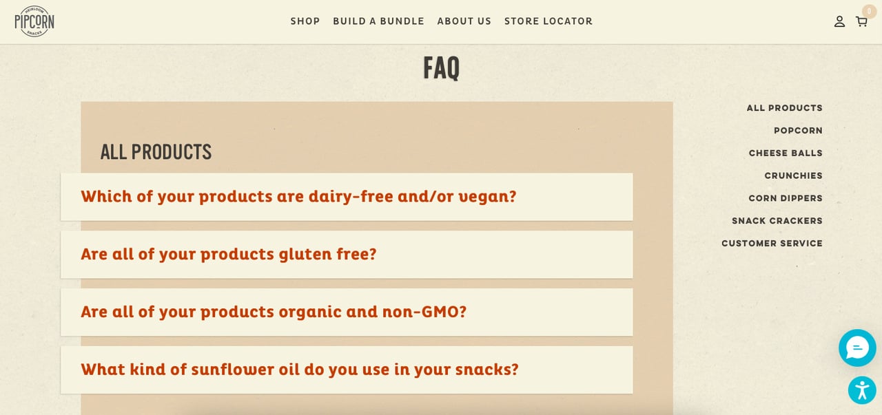
Pipcorn's FAQ page is an appealing FAQ design example. It goes hand in hand with the website's whole look. The usage of colors and fonts is consistent, and the page is designed for a great user experience.
The page begins with the headline "FAQ," and question categories are given on the right side. Below the headline, questions are provided in each category. These questions are answered with one or two sentences that are easy to read and understand.
Apart from these, the contact information of customer service is stated for those who have more questions.
Quick Tips for Creating Effective FAQ Pages
FAQ pages are essential to any website, as they give users a place to find answers to their questions. If you're creating an FAQ page, it's vital to make sure that your content is clear, concise, and correct.
Here are some tips for creating effective FAQ pages:
- Use clear headings that outline each section so that readers can easily and quickly find what they're looking for easily and quickly.
- Be sure to check any facts or statistics before posting them on your website because otherwise, it could lead to confusion among visitors who may think they're getting incorrect information.
- Keep your FAQ page short and sweet. The longer your FAQ page, the less likely people are to read through it, and the more likely they are to leave if they don't find what they're looking for right away.
- If you want to add a lot of information, consider explaining what you've learned with blog posts or other help documentation that readers can easily digest. You can add these articles' links to your FAQ page as well.
Wrap Up
Now you know what an effective FAQ page looks like!
Adding FAQ pages like these examples to your website can improve your user experience and increase your visibility in search engine page results.
In addition, by answering frequently asked questions, you can boost your chances of getting clicks from your target audience and increase user engagement.
We hope you liked exploring these FAQ page examples of famous companies we have listed. Thanks to these examples, you can optimize your own for better results. Feel free to share your ideas and suggestions about this topic in the comments section!
Frequently Asked Questions

Why You Should Add an FAQ Page to Your Website?
FAQ pages are a great way to establish your company as a resource for all of your customers' questions. It's your chance to tell your story engagingly and answer questions that people might have before they even think to ask them.
FAQ pages save time and increase the trust of your company. Also, it allows you to build an SEO-friendly website since you can appear in search results with these pages.
What Makes a Good FAQ Page?
A good FAQ page includes various questions with well-written answers. These questions and answers should be related to the topic itself and have to offer valuable information for visitors.
Also, a helpful FAQ page should demonstrate a company's features and solutions. So, rather than writing long and unnecessary copies, adding an FAQ page with to-the-point questions and solution-oriented answers can work out well.
Apart from these, an FAQ page that takes its audience and their needs into account can be considered an effective one.
What Should Be Added to an FAQ Page?
Depending on your business type, you can include your customers' questions.
While answering these questions properly, you can add extra resources for those looking for an in-depth guide. Preparing comprehensive articles that answer these questions thoroughly can be helpful in that sense.
Also, it would be better if you included your customer support's contact information so that people can get in touch with them if they have more detailed questions on specific matters.
Explore these blog posts while you are here: