Arranging Close Button Size and Position by Custom CSS
Explore how to arrange your popup's close button size and position with custom CSS. You can customize the close button for a better user experience.
This guide explains how to change the close button size and position using custom CSS.
Before We Start
- There should be a space between "block" and the previous definitions.
- Always test your CSS changes in preview mode before publishing.
How to Customize Close Button
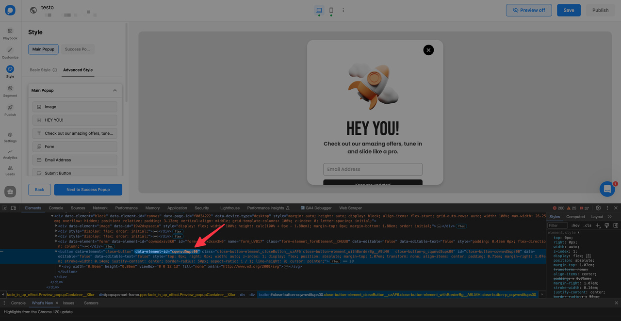
Get Element ID
Right-click on the close button on the popup, click inspect, and copy "data-element-id" in the box brackets.
pre code:not(.hljs):not([class*=language-]) { background: #f8f8f8; line-height: 1.5; display: block; overflow-x: auto; padding: 1rem !important; color: inherit; border-radius: 2px; }
[data-element-id="cqwnvd5ups00"]
Customization Options
To increase the size of the close button proportionally, use "transform: scale(1.5)". This property scales the close button according to your input value.
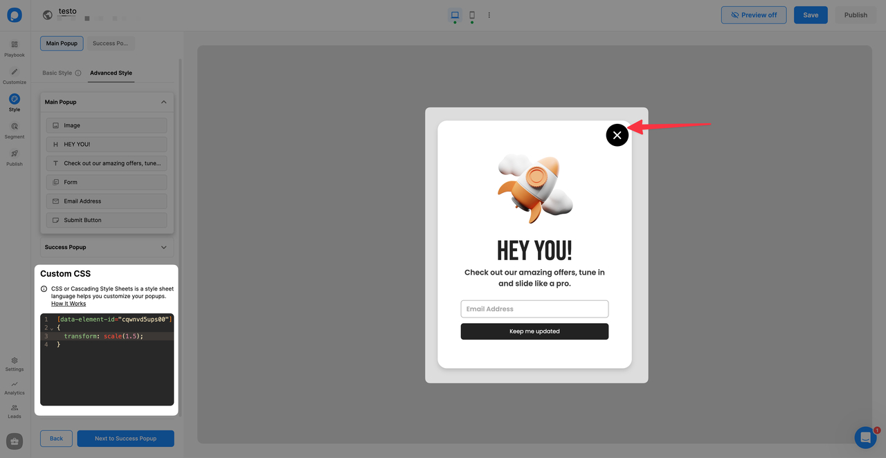
[data-element-id="cqwnvd5ups00"] { transform: scale(1.5); }
To set specific dimensions for the close button, use width or height properties.
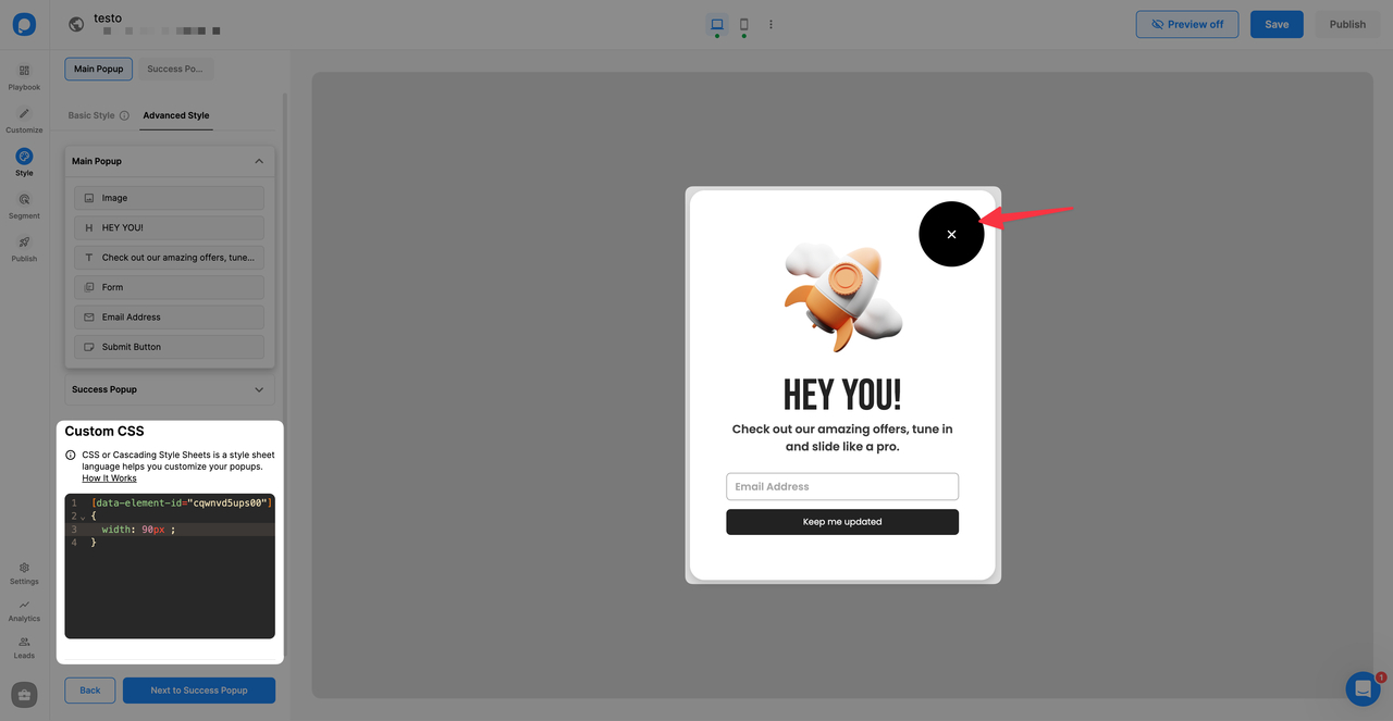
[data-element-id="cqwnvd5ups00"]
{
  width: 90px;
}
To change the position of the close button relative to its original location, use CSS's relative position properties.
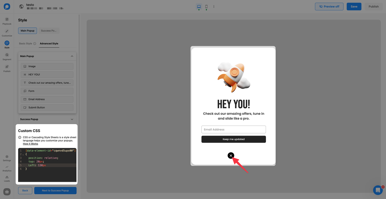
[data-element-id="cqwnvd5ups00"]
{
  position: relative;
  top: 20px;
  left: 130px;
}
To position the close button outside or above the popup, use absolute positioning.
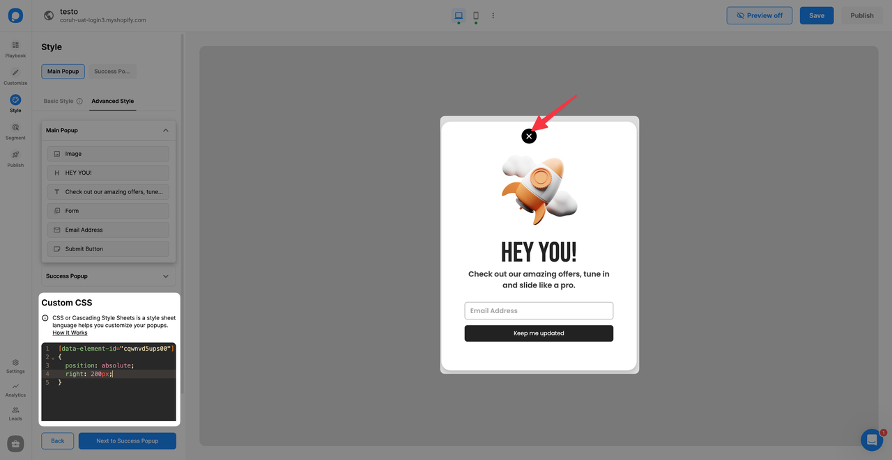
[data-element-id="cqwnvd5ups00"]
{
  position: absolute;
  right: 200px;
}
Don't Forget
Make sure your CSS is correctly formatted. Once you complete all the settings, save and publish the popup. Do not forget to turn the status toggle on to make your popup visible on your website.
Do you have additional questions about how to add custom CSS to your popup? Contact Us!
How is this guide?